Note: This is part 2 in a series for high school students about reading and interpreting science on the internet. Read the intro and get the index here, or go back to part 1 here.
In Part 1, we covered things that fake you out by presenting themselves as real when they are just pretty much made up. While those are some of the most obnoxious issues on the internet, they are not really the most insidious issues. For the remaining parts of this series, we’re going to be covering things that attempt to twist, overstate or otherwise misrepresent themselves to sound more convincing than they really are. For those of us who may be skimming through Facebook/Twitter/whatever new thing the kids are using these days, it’s good to start at the beginning….so I’ve called this section:
Headlines and First Impressions
Okay, so what’s the problem here?
NPR probably put it best when they said it in this article last year…Why Doesn’t America Read Anymore?
Did you check it out? Go ahead. I’ll wait.
Back yet?
Okay, so if you clicked you see the issue. If you’re too lazy to click, well that’s part of my point. That was a fake article….but not in the “made up untrue” sense we covered earlier. See the good folks over at NPR started getting the impression that people were just reading the headlines and then freaking out and commenting before they read further. They decided to test this (on April Fool’s Day no less), and posted a story with the headline above paired with an article that said “Happy April Fools Day!” and explained they were performing a test to see how many people read even a few words of the article before reacting. The reaction is chronicled here, but basically they got thousands of comments about what people presumed the article said. Now clearly some portion of those people were trying to be funny, but some of the screenshots taken suggest many really were reacting to just the headline. Interestingly, the worst effect was not on the NPR website (where you’d have to scroll through the article to get to the comment section), but rather on my arch-nemesis Facebook.
Okay, so what kind of things should we be looking out for?
If nothing else, the above prank should convince you to always make sure there’s something attached to whatever article you want to comment on. Once that’s out of the way, you should be looking for more subtle bias. Slate Star Codex recently had a really good side by side of a few different headlines that all came out of the same study:

Same results, same press release, four different ways of framing the issue. Unsurprisingly, it’s these subtle issues that are actually bigger problems in real life. The New Yorker did a great piece on the power of headlines to frame perceptions, and the results were a little unnerving. They focused on a recent study that paired articles with different headlines to see how people’s memories and interpretations of information were effected. Some of what they found:
- Inaccurate headlines skewed what people remembered the article said, but their inferences from the information stayed sound
- More subtle framing bias changed both people’s memory and their interpretation of information
- People have trouble separating visuals from headlines. If the headline talked about a crime perpetrator but the picture was of the victim, people felt less sympathy for the victim later
Yikes.
So why do we fall for this stuff?
Well, because it was designed to make us fall for it. One of the more interesting articles on the topic is this one from Neiman Lab, and it had a quote I loved:
That new environment is, for instance, the main reason headlines have become so much more emotional and evocative. In a print newspaper, a headline is surrounded by lots of other contextual clues that tell you about the story: Is there a photo with it? Do I recognize the byline? Is it blazed across the top of Page 1 or buried on C22? Online, headlines often pop up alone and disembodied amid an endless stream of other content. They have a bigger job to do.
Basically, news sites that can get you to click will thrive, and those that can’t, won’t. More than ever, headlines are essentially mini commercials…and who better than the advertising industry to take advantage of all of our cognitive biases?
So what can we do about it?
When it comes to headlines, especially ones that make claims about science or data, I think it’s important to think of this as a group of concentric circles. As you move outward, the claims get bolder, brasher, and all caveats get dropped:
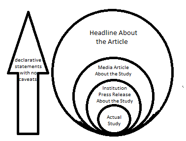
It’s also important to remind yourself that it’s frequently editors writing headlines, not journalists. If you view headlines as a commercial and not a piece of information, it may help you spot inconsistencies between the way information was presented and the way the article actually reads. We haven’t progressed far enough in the research to know how much we can negate the impact of headlines by being more aware of them, but it seems reasonable that being a little paranoid couldn’t hurt.
For some specialized and frequently misrepresented fields, it’s also a good idea to read up on what frustrates scientists within the field. I’ve never looked at headlines about brain function or neuroscience the same way after I watched Molly Crockett’s Ted talk:
On the plus side, the internet makes it easier than ever for people to complain about headlines and actually get them fixed. For example, last year a Washington Post op-ed got published with a headline “One Way to End Violence Against Women? Stop Taking Lovers and Get Married” with a sub-headline that read “the data shows that #yesallwomen would be safer married to their baby daddies”. People were upset, and many took umbrage with the headline for giving the impression that violence against women was women’s fault. Even the author of the piece jumped in and disavowed the headlines, saying the were disappointed in the tone. The paper ended up changing the headline after admitting it was causing a distraction. Now whatever you think of this particular story, it’s a good sign that this is a type of bias you can actually do something about. It’s a really good example of a place where “see something, say something” might make a difference.
Interestingly, these headline changes are pretty easy to track by checking out the URL at the top of the page:
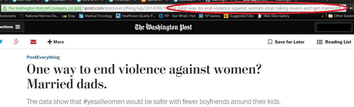
This almost never gets changed, and sometimes shows some sneaky/unannounced updates. If you’re looking for a place to make a real difference, headline activism may be a good place to start.
We’ll dive more in to the pictures in Part 3.

WRT neuroscience: you know this story, right? https://www.sciencenews.org/article/trawling-brain
LikeLike
I hadn’t seen this! My adviser in college used a lot of fMRI data, and he had mentioned some of the issues to us then (2003), but I hadn’t really kept up on the field. The TED talk I linked to goes over some reasons for skepticism in neuroscience, so I’d always glazed over it a bit when any of that data comes up.
I like the dead fish thing though, that’s a good touch.
LikeLike
Pingback: Presentation: How they Reel You In (Part 1) | graph paper diaries
Pingback: Intro to Internet Science: A Prelude | graph paper diaries
THIS ONE WEIRD TRICK WILL MAKE YOU SKEPTICAL OF SCIENCE.
LikeLiked by 1 person
I can’t believe I didn’t think of using this title. It’s going in the talk.
LikeLike
If you have not seen this, you might like:

LikeLike
I like that, thank you!
LikeLike