Refugees and Resettlement

It’s always somewhat gratifying when I hear someone in my personal life change the way they speak about an issue because of my blogging. It’s even more gratifying when I get the sense they’ve actually internalized some of the ideas and aren’t just being careful because I’m around. This happened last weekend when my brother casually mentioned that he’d heard that the US actually resettled about a third of the world’s refugees. He mentioned that he wasn’t sure how that was possible since he knew the number of refugees the US took in was dropping, but he wondered if there was some meaning to “resettled” he was missing. As a thank you to him for being so conscientious about his adjectives, I figured I’d look in to the stats and definitions for him.

First, I have to admit it took me a few minutes to find anything on this, mostly because I thought he said the data came from “UNH”, which I took to mean the University of New Hampshire. Turns out he actually said the UNHCR, or the UN High Commissioner for Refugees. Oops.

When I finally found the right page, I was impressed to see that they actually have really wonderful resources defining all of what their terms mean. For refugees, the three solutions they work towards are voluntary repatriation (returning to their home country when it is more stable), resettlement (moving permanently to another country) or integration (becoming part of your host country).

It’s those last two that seemed to be causing the confusion (at least for me), but it made sense when I read it. A host country is the country the refugees initially go to when they flee their own country. Unsurprisingly, these are most often countries closer in proximity to them that will allow them to stay there. From their fact sheets, the top host countries are Turkey, Pakistan, Lebanon, Iran and Uganda: The refugees that stay in those countries aren’t considered “resettled”, because it’s considered temporary. The UNHCR works with those refugees to identify those who are most vulnerable (you cannot apply), and then submits their application. They don’t get to pick the country they go to. Unlike the host country, the countries that accept refugees through this program agree to give them permanent legal status in their country.

So does the US really accept a third of all resettled refugees cases? Yes, last year that was true. In other years it’s been even higher. I can’t embed it here, but this page has a really nifty graph of the total applications/departures each year, and you can filter it by resettlement country. In 2017 there were about 75,000 UNHCR applications for resettlement, the US took 26,000 of those.  In 2016 there were 163,000 applications, and the US took 108,000. Now I should mention that by “took” I mean took the application. Countries still do their own screening process before people are actually resettled.

Question 1, answered! Oh, did I mention there was a second question?

As we were talking about the plausibility of this stat, we raised the issue that we were constantly hearing about how many refugees countries like Germany were taking in. We were trying to figure out what category those people fell in to, and how they fit in to this picture.

As far as I can tell, the migrants making the headlines in Europe are either asylum seekers or economic migrants. Asylum seekers differ from resettled refugees in that resettled refugees are sent to a country under an agreement/discussion with the UNHCR and after a screening, and asylum seekers just show up and are screened after the fact. Since only 1% of the world’s refugees are ever resettled, the vast majority of refugee discussions are talking about asylum seekers. I won’t pontificate much more on the differences as that gets in to all sorts of legal issues, but I can say I had fun playing around with the graph generator on the UNHCR website. Here’s the number of resettled refugees France, Germany and the US have taken since 2003, and what countries they came from:


What I’m Reading – July 2018

Hey hey! I’m back from Juneau and a brief stop in San Diego, and life is good. The wedding was great, the bride gorgeous, and I made it through my toast/maid of honor duties/boat ride to the venue without an issue. Juneau was as lovely as promised, and we had a great time.

I have to say though, I have never been to a place with less predictable weather than Juneau. Ever single day we were there it said it would be 60 degrees and raining, yet the temperature would vary wildly and the amount of time it rained was highly uneven. Sometimes “rain” meant 30 minutes, sometimes hours. One of the groomsman told me that if you predicted rain in Juneau every day, you’d be right 2/3rds of the time.  Of course I looked this up and discovered that it’s pretty much true.

Quite the leap to go to San Diego right after, where if you predicted sun every day you’d also be right about 2/3rds of the time. Also, San Diego is a borderline desert with 12 inches of precipitation a year, and Juneau gets enough rain to make it a rain forest (77 inches) and a healthy dose of snow (78 inches). For reference, Boston gets 43 inches of rain/year (close to the national average of 39) and 44 inches of snow.

Other than weather reports, I enjoyed this article about some recent discoveries that shed some light on human sacrifice practices among the Aztecs. Much of our information about human sacrifice comes from the Conquistadors, and there have always been questions about how accurate they were, given that they used it to justify a lot of their own killing. Recent discoveries suggest that the practice may have been quite widespread in the capital, as a whole temple of skulls was discovered. Sounds like the start of a horror movie to me.

This article about Crossfit covers a lot of ground, but the accusations of scientific fraud were pretty interesting to me. Basically, for several years Crossfit employees had been accusing the National Strength and Conditioning Association of publishing/sponsoring bogus papers designed to make Crossfit look bad because they were a rival. Some of their accusations sounded like the stuff of conspiracy theories, until a few lawsuits proved they were actually right. Now three papers alleging problems with Crossfit have been retracted, and internal memos from the NSCA show they did consider Crossfit a rival, and that they did encourage paper authors to put more negative data in their papers. Unfortunately for the investigators, they now can’t produce how they got that data, and the papers have been yanked. It sounds all good for Crossfit, until one of the employees who led the charge started tweeting anti-LGBT things and got fired. Still an interesting and troubling case for those concerned about scientific integrity.

This is old, but I had no idea NASA scientists ranked the least/most realistic science fiction movies back in 2011. It came up because Jurassic Park was #6, and we were talking about the De-extinction Project.

The AVI did not like my “50 Songs for 50 States” link in the comments section on my Alaska post, so I started looking around for other versions. I found a few other versions, but it occurred to me I’m judging all of the lists off of what they list for Massachusetts and New Hampshire. Really I think Ben just needs to write one of these. In the meantime in honor of our heat wave, here’s a song about summer in New Hampshire that’s better than the of the picks on any of these lists:


Off to Alaska

I’m off to Alaska shortly, to see my sister get married. I’ve never been before, and I believe this trip puts me up to 31 states visited. Here’s my map:

(Map drawing here)

Road trips from Massachusetts to Georgia and one from San Diego to Seattle got me the coasts, and a surprising amount of my midwest experience is from various conferences. Alabama, West Virginia and Alaska are the states I will have visited solely to watch someone get married, though I got to/will get to take a good look around each before leaving. With any luck I’ll add Nebraska to my list in September.

Amusingly, my 5 year old son has never been outside of New England, and Alaska will be his first experience with the rest of the US.

I looked it up, and apparently the average American adult has been to 12 states, with Florida, California, Georgia, New York and Nevada being the most visited. The map of visitation is here:

In many ways my map reflects the average, though my time in New England snagged me all the rarer states there.

Overall I’ve loved every new state I’ve been to, and I expect to enjoy Juneau quite a bit. The plane ride with a 5 year old may be tough, but the end result should be awesome. Wish us luck!

On Accurate Evaluation

It’s no secret that I have a deep fascination with people’s opinions about “popular opinion”. While sometimes popular opinion is easy to ascertain, I’ve noticed that accurately assessing what “most people know/believe” is a bit of an art form. This is particularly true in the era of social media hottakes, all of which seem to take the form of “this thing you love is terrible” or “this thing you hate is actually great”.

I have such an obsession with this phenomena that I gave it a name (the Tim Tebow effect) which I define as “The tendency to increase the strength of a belief based on an incorrect perception that your viewpoint is underrepresented in the public discourse”.

I was thinking about this recently after reading the Slate Star Codex post on the “Intellectual Dark Web” called “Can Things Be Both Popular and Silenced?” In typical SSC fashion it’s really long and very thorough, and basically discusses how many different ways there are of measuring things like “popular” and “silenced”. For example, Jordan Peterson appears to make an absurd amount of money through Patreon ($19-84k per month by this estimate), so in some sense he is clearly popular. OTOH, he has also had threats made against him and people attempt to shut down his lectures, so in some sense there are also attempts to silence him. It’s this tension that Alexander explores, and he covers a lot of ground.

Given that my brain tends to uh, bounce around a little bit, this essay got me thinking of another topic entirely: the situation of women in the Victorian Era.

This connects, I promise.

Anyone who knows me or has seen my Kindle knows that I have a very bad habit of acquiring an enormous backlog of books to read. It’s so bad that I keep a running spreadsheet of how much I should be reading each week, because of course I do, and I tend to be flipping between at least a dozen at a time. Recently I picked up two I’d had hanging around for a while Unmentionable: the Victorian Lady’s Guide to Sex, Marriage and Manners and Victorian Secrets: What a Corset Taught Me about the Past, the Present, and Myself. I had thought these two would go well together as they appeared to be on the same topic, but they ended up being almost diametrically opposed.

Unmentionable took the stance that we all (or at least women) idolized the Victorian era, and it’s stated goal was to make us realized how bad it actually was. Victorian Secrets OTOH took the stance that we all thought too little of the Victorian era, and wanted to explain some of the good things about it.

I spent a lot of time mulling those two statements, and ended up deciding that they really both had some truth to them. In Unmentionable, she talks about how Jane Austen movies make it all look like romance and pretty dresses, which is a fair charge. Her chapters on how those pretty dresses were never washed, and how you’re not taking a shower or washing your hair much, and how unsanitary most things are was pretty interesting and made me quite grateful for modern conveniences. In Victorian Secrets, the author wore a corset for a year and ended up wearing lots of other Victorian clothes, and mentioned that the corset had gotten a rather unfair rap. She had done a lot of research and had some interesting points about how Victorian’s weren’t as backwards as they are sometimes portrayed. This also felt fair.

Interestingly, in order to make their points, both authors relied on different sources. Unmentionable stuck to advice from books and magazines during the era, and Victorian Secrets made the case that trying to mimic the habits of everyday people from an era was the path to understanding. I suspect both methods have their pros and cons. A person from the year 2150 trying to read Cosmopolitan magazine would get a very different impression of our era than someone who walked around in our (now vintage) clothing. Both would have truth to them, but neither would be the whole picture.

I think this ties in to all these discussions about “popular opinion” or “the general consensus”, because I like the thought that sometimes there can be competing popular opinions on the same topic. Pride and Prejudice is still a favorite book for many girls because they both love the romance and the feel of the era, while also disliking all the rules and the lack of choice for women. While I’m sure there are some women who either love the Victorian Era or hate it, I’d actually suspect that many women love the thought of parts of it and dislike others. Given that most of us have very little exposure to it outside of a brief mention in history class and our English Lit curriculum, it is entirely possible that the likes and dislikes could be somewhat ill informed. This actually leaves a good bit of room for authors to truthfully claim “your love is misguided” and “so is your dislike”.

Yet another way popular opinion gets slippery when you try to nail it down.

By the way, weird fact about me: I’ve never actually read Pride and Prejudice, only Sense and Sensibility. I think my high school English teacher was getting a little bored with P&P by the time I got there, and I never picked it up on my own. I’ve seen two film versions and I read Bridget Jones Diary though, so I pretty much got the gist.

Just kidding librarian/English teacher friends, adding it to my spreadsheet now.

Tick Season 2018

I was walking in the woods yesterday, on a trail on the property I grew up on. In the course of a 45 minute walk on a (mostly) clear trail I had to pull at least 12 ticks off of me. Between the group of 3 adults and 1 child who went for a walk, we estimate we pulled 40 off of us.

I’ve been walking that trail for decades now and that was by far the worst I’d seen it.

Anyone else seeing similar things this year? It looks like the were predicting a tough year for New England, and the CDC has been warning about an increase in tick-borne illnesses, but I didn’t think it would be quite that bad.

Related: Vox did a good explainer about Lyme Disease a few weeks ago, which is worth reading if you don’t know much about it.  I’ve had a family members and friends have rather scary experiences with it, and it’s worth learning about if you’re in (or traveling to) an affected area.

Observer Effects: 3 Studies With Interesting Findings

I’ve gotten a few links lately on the topic of “observer effects”/confirmation biases, basically the idea that the process of observing a phenomena can actually influence the phenomena you’re observing. This is an interesting issue to grapple with, and there’s a lot of misconceptions out there, so it seemed about right for a blog post.

First up, we have a paper on the Hawthorne effect. The Hawthorne effect was originally a study done on factory workers (in the Hawthorne factory) in order to see how varying their working conditions  improved their productivity. What the researchers found was that changing basically anything in the factory work environment ended up changing worker productivity. This was so surprising it ended up being dubbed “the Hawthorne effect”. But was it real?

Well, likely yes, but the initial data was not nearly as interesting as reported. For several decades it appeared to have been lost entirely, but it was found again back in 2011. The results were published here, and it turns out most of the initial effect was due to the fact that all the lighting conditions were changed over the weekend, and the productivity was measured on Monday. No effort was made to separate the “had a day off” effect from the effect of varying the conditions, so the 2011 paper attempted to do that. They found subtle differences, but nothing as large as originally reported. The authors state they believe the effect is probably real, but not as dramatic as often explained.

Next up, we have this blog post that summarizes the controversy over the “Pygmalion effect“. (h/t Assistant Village Idiot). This another pretty famous study that showed that when teachers believed they were teaching high IQ children, the children’s actual IQs ended up going up. Or did they? It turns out there’s a lot of controversy over this one, and like the Hawthorne effect paper the legend around the study may have outpaced its actual findings. The criticisms were summed up in this meta-analysis from 2005:

  1. Self-fulfilling prophecies in the classroom do occur, but these effects are typically small, they do not accumulate greatly across perceivers or over time, and they may be more likely to dissipate than accumulate
  2. Powerful self-fulfilling prophecies may selectively occur among students from stigmatized social groups
  3. Whether self-fulfilling prophecies affect intelligence, and whether they in general do more harm than good, remains unclear
  4. Teacher expectations may predict student outcomes more because these expectations are accurate than because they are self-fulfilling.

I find the criticisms of both studies interesting not because I think either effect is completely wrong, but because these two studies are so widely taught as definitively right. I double checked the two psych textbooks I have laying around and both mention these studies positively, with no mention of controversy. Interestingly, the Wikipedia pages for both go in to the concerns….score one for editing in real time.

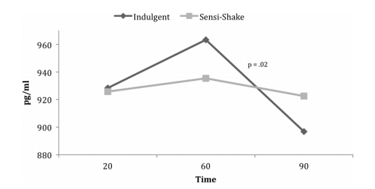
Finally, here’s an observation effect study I haven’t seen any criticism of that has me intrigued “Mind Over Milkshakes: Mindsets, Not Just Nutrients, Determine Ghrelin Response” (h/t Carbsane in this post). For this study, the researchers gave people a 380 calorie milkshake two weeks in a row, and measured their ghrelin response to it. The catch? In one case it was labeled as a 620 calorie “indulgent” milkshake, and in the other case it was labeled as a 120 calorie “sensible” shake. The ghrelin responses are seen below:

This is a pretty brilliant test, as everyone served as their own control group. Each person got each shake once, and it was the same shake in each case. Not sure how large the resulting impact on appetite would be, but it’s an interesting finding regardless.

Overall I think the entire subject of how viewing things can change reality is rather fascinating. For the ghrelin example in particular, it’s interesting to see how a hormone none of us could consciously manipulate can still be manipulated by our expectations. It’s also interesting to see the limitations of what can be manipulated. For the Pygmalion effect, it’s found that if the teachers know the kids for at least 2 weeks prior to getting IQ information, there is actually no effect whatsoever. Familiarity appears to breed accurate assessments I suppose. All of this seems to point to the idea that observation does something, but the magnitude of the change may not be easy to predict. Things to ponder.

What I’m Reading: May 2018

I saw a few headlines about  new law in Michigan that would exempt most white Medicaid recipients from work requirements, but keep the work requirement for most black people in the same spot. This sounded like a terrible plan,  so I went looking for some background and found this article that explains the whole thing. Basically some lawmakers thought that the work requirements didn’t make sense for people who lived in areas of high unemployment, but they decided to calculate employment at the county level. This meant that 8 rural-ish counties had their residents exempted, but Detroit and Flint did not. Those cities have really high unemployment, but they sit in the middle of counties that do not. The complaints here seem valid to me….city dwellers tend not to have things like cars, so the idea that they can reverse commute out to the suburbs may be a stretch. 10 miles in a rural area is really different from 10 miles in the middle of a city (see also: food deserts/access issues/etc). Seems like a bit of a denominator dispute.

I’ve talked before about radicalization of people via YouTube, and this Slate article touched on a related phenomena: Netflix and Amazon documentaries. With the relative ease of putting content up on these platforms, things like 9/11 truther or anti-vaccine documentaries  have found a home.  It’s not clear what can be done about it unfortunately, but it’s a good thing to pay attention to.

I liked this piece from Data Colada on “the (surprising?) shape of the file drawer“.  It starts out with a pretty basic question: if we’re using p<.05 as a test for significance, how many studies does a  researcher before he/she gets a significant effect where none should exist? While most people (who are interested in this sort of thing) get the average right (20), what he points out is that most of us do not intuit the median (14) or mode (1) for the same question. His hypothesis is that we’re all thinking about this as a normal distribution, when really it’s geometric. In other words the “number of studies” graph would look like this (figure from the Data Colada post):

And that’s what it would look like if everyone was being honest or only had one hypothesis at a time.

Andrew Gelman does an interesting quick take post on why he thinks the replication crisis is centered around social psychology. In short: lower budget/easier to replicate studies (in comparison to biomedicine), less proprietary data, vaguer hypotheses, and the biggest financial rewards come through TED talks/book tours.

Given my own recent bought with Vitamin D deficiency, I was rather alarmed to read that 80% of African Americans were deficient in Vitamin D. I did some digging and found that apparently the test used to diagnose Vitamin D deficiency is actually not equally valid across all races, and the suspicion is that African Americans in particular are not served well by the current test. Yet another reason to not assume research generalizes outside it’s initial target population.

This Twitter thread covered a “healthy diets create more food waste” study that was getting some headlines. Spoiler alert: it’s because fruits and veggies go bad and people throw them out, whereas they tend to eat all the junk food or meat they buy. In other words, if you’re looking at environmental impact of your food, you should look at food eaten + food wasted, not just food wasted. The fact that you finish the bag of Doritos but don’t eat all your corn on the cob doesn’t mean the Doritos are the winner here.

On Average: 3 Examples

A few years ago now, I put up a post called “5 Ways that Average Might Be Lying to You”. I was thinking about that post this week, as I happened to come across 3 different examples of confusing averages.

First up was this paper called “Political Advertising and Election Results” which found that (on average) political advertising didn’t impact voter turnout. However, this is only partially true. While the overall number of voters didn’t change, it appeared the advertising increased the number of Democrat voters turning out while decreasing Republican turnout. The study was done in Illinois so it’s not clear if this would generalize to other states.

The second paper was “How does food addiction influence dietary intake profile?“, which took a look at self reported eating habits and self reported score on the Yale Food Addiction Scale. Despite the fact that people with higher food addiction scores tend to be heavier, they don’t necessarily report much higher food intake than those without.  The literature here is actually kind of conflicted, which suggests that people with food addiction may have more erratic eating patterns than those without and thus may be harder to study with 24 hour dietary recall surveys. Something to keep in mind for nutrition researchers.

Finally, an article sent to me by my brother called “There is no Campus Free Speech Crisis” takes aim at the idea that we have a free speech problem on college campuses. It was written in response to an article on Heterodox Academy that claimed there was a problem. One of the graphs involved really caught my eye. When discussing what percentage of the youngest generation supported laws that banned certain types of speech, Sachs presented this graph:

From what I can tell, that’s an average score based on all the different groups they inquired about. Now here’s the same data presented by the Heterodox Academy group:

Same data, two different pictures. I would have been most interested to hear what percentage of the age ranges supported laws against NO groups. People who support laws against saying bad things about the military may not be the same people who support laws against immigrants, so I’d be interested to see how these groups overlapped (or not).

Additionally, the entire free speech on campus debate has been started by outliers that are (depending on who you side with) either indicative of a growing trend or isolated events that don’t indicate anything. Unfortunately averages give very little insight in to that sort of question.

Maternal Mortality and Miscounts

I’m a bit late to the party on this one, but a few weeks ago there was a bit of a kerfluffle around a comment from a Congressman from Minnesota’s comments about maternal mortality in states like Texas and Missouri:

Now I had heard about the high maternal mortality rate in Texas, but it wasn’t until I read this National Review article about the controversial Tweet that I discovered that the numbers I’d heard reported may not be entirely accurate.

While it’s true that Texas had a very high rate of maternal mortality reported a few years ago, the article points to an analysis done after the initial spike was seen. A group of Texas public health researchers went back and recounted the maternal deaths within the state, this time trying a different counting method. Instead of relying on deaths that were coded as occurring during pregnancy or shortly afterward, they decided to actually look at the records and verify  that the women had been pregnant. In half the cases, they found that no medical records could be found to corroborate that the woman was pregnant at the time of death. This knocked the maternal mortality rate down from 38.4 per 100,000 to 14.6 per 100,000.  Yikes.

The problem appeared to be the way the death certificate itself was set up. The “pregnant vs not-pregnant” status was selected via dropdown menu. The researcher suspected that the 70 or so miscoded deaths were due to people accidentally clicking on the wrong option. They suggested replacing a dropdown with a radio button. To make sure this error wasn’t being made in both directions, they did actually go back and look at fetal death certificates and other death certificates for women of child bearing age to make sure that some weren’t incorrectly classified in the other direction. Unsurprisingly, it appears that when people want to classify a death as “occurring during pregnancy” they didn’t tend to make a mistake.

The researchers pointed out that such a dramatic change in rate suggested that every state should probably go back and recheck their numbers, or at least assess how easy it would be to miscode something. Sounds reasonable to me.

This whole situation reminded me of a class I attended a few years back that was sponsored by the hospital network I work for. Twice a year they invite teams to apply with an idea for an improvement project, and they give resources and sponsorship to about 13 groups during each session. During the first meeting, they told us our assignment was to go gather data about our problem, but they gave us an interesting warning. Apparently every session at least one group gathers data and discovers the burning problem that drove them to apply isn’t really a problem. This seems crazy, but it’s normally for reasons like what happened in Texas. In my class, it happened to a pediatrics group who was trying to investigate why they had such low vaccination rates in one of their practices. While the other 11 clinics were at >95%, they struggled to stay above 85%. Awareness campaigns among their patients hadn’t helped.

When they went back and pulled the data, they discovered the problem. Two or three of their employees didn’t know that when a patient left the practice, you were supposed to click a button that would take them off the official “patients in this practice” list. Instead, they were just writing a comments that said “patient left the practice”. When they went back and corrected this, they found out their vaccination rates were just fine.

I don’t know how widespread this is, but based on that classroom anecdote and general experience, I wouldn’t be surprised to find out 5-10% of public health data we see has some serious flaws. Unfortunately we probably only figure this out when it gets bad enough to pay attention to, like in the Texas case. Things to keep in mind.

Public Interest vs Public Research

Slate Star Codex has up an interesting post up about a survey he conducted on sexual harassment by industry. While he admits there are many limitations to his survey (it was given to his readers), the data is still interesting and worth looking at.  He has a decent overview of why some surveys yield low numbers (normally by asking “have you been harassed at work?”) and some high (by asking specific questions like “have you been groped at work?”), that actually serves as an interesting case study for how to word survey questions.  Words like “harassed” tend carry emotional weight for people, so including them in surveys can be a mixed bag.

Anyway, data questions aside, I was a little fascinated by something he said at the end of his post that caught my interest “This may be the single topic where the extent of public interest is most disproportionate to the minimal amount of good research done.”

His complaint is that for all we hear about certain industries being rife with sexism and harassment (and those two terms frequently being conflated), he couldn’t find much real research on which industries were truly the worst.

I think that’s a really interesting point, but it got me wondering what other public interest questions don’t have much research behind them. My first thought was gun research. While not technically banned, back in 1996 an amendment went through that cut the CDC budget by the amount they had previously been spending on firearm research and included a rule that federal dollars couldn’t be spent “to advocate or promote gun control”. This comes up every time there’s a shooting like Parkland, and people are looking to overturn it. While I’ve mostly heard gun control advocates talk about this, it’s interesting to note that not all the pre-Dickey amendment research cast guns in a bad light. Reason magazine recently put up an article highlighting how little we know about how often guns are used for self-defense purposes, and how the CDCs last numbers put it at much higher than I would have thought (1.5% of Americans per year).

I’m curious if people can think of other topics like this.