5 Things About Appendicitis Rates Over Time

A close relative of mine had a bit of a scare this week when she ended up admitted to the hospital for (what was ultimately diagnosed as) acute appendicitis. She ended up in surgery with a partially ruptured appendix, though she’s doing fine now.

When I mentioned this saga to a coworker, she said she felt like she didn’t hear much about appendicitis anymore. We started wondering what the rates were, and if they were going down over time. Of course this meant I had to take a look, so here’s what I found:

  1. The rates have fallen over the decades, and no one is really sure why. This paper suggests that rates fell by 15% between 1970 and the mid 80s, but no one’s sure what happened. Did appendicitis become less common? Less deadly? Or did our diagnostic tools get better and some number of cases get reclassified? This is a valid question because of this next point….
  2. A surprisingly high number of appendectomies aren’t necessary. An interesting study from 2011 showed that about 12% of patients who get an appendectomy end up not getting diagnoses with appendicitis. They suggest that this rate has been falling over time which could have helped the numbers in point #1. Is it the whole story? It’s not clear! But definitely something to keep in mind.
  3. The number of incorrectly removed appendixes may not be going down. Contrary to the assertions of the study above, it’s not certain that misdiagnosed appendicitis is going down. Despite better diagnostics, it appears that easier surgical techniques (i.e. laparoscopic surgeries) actually may have increased the rate of unnecessary surgeries. This sort of makes sense. If you have to do a big complicated surgery, you are going to really want to verify that it’s necessary before you go in. As the surgery get easier, you make focus more on getting people to surgery more quickly.
  4. The data sources may not be great. One of the more interesting papers I found compared the administrative database (based off insurance coding) vs a pathology database and found that insurance coding consistently underestimated the number of cases of appendicitis. Since most studies have been done off of insurance code databases, it’s not clear how this has skewed our view of appendicitis rates.
  5. Other countries seem to be seeing a drop too Whatevers going on with appendicitis diagnosis, the whole world seems to be seeing a similar trend. Greece has seen a 75% decrease. England has also seen falling rates. To be fair though, some data shows it’s mixed. Developed countries  seem to be stabilizing, newly developed countries seem to see high rates.

So who knew how hard it was to get a handle on appendicitis rates? I certainly thought it would be a little more straightforward. Always fascinating to explore the limits of data.

5 Things About Crime Statistics

Commenter Bluecat57 passed along an article a few weeks ago about the nightclub shooting in Thousand Oaks, California. Prior to the tragedy, Thousand Oaks had been rated the third safest city in the US, and it quickly lost that designation after the shooting. He raised the issue of crime statistics and how a city could be deemed “safe”. This seemed like a decent question to look in to, so I thought I’d round up a few interesting debates that crime statistics have turned up over the years.

Ready? Here we go!

  1. There’s no national definition for some crimes In this age of hyperconnectedness, we tend to all assume that having cities report crime is a lot like reporting your taxes or something. Unfortunately, that’s not the case. Participation in most national crime databases is voluntary, and every jurisdiction has their own way of counting things. For example, 538 reported that in New York City, people who were hit by glass from a gunshot weren’t counted as victims of a shooting, but other jurisdictions do count them as such. Thus, any city that reports those as shootings will always look like they have a higher rate of crime than those that don’t.
  2. Data is self-reported by cities and states Self reporting of anything can be known to influence the rates, and crime is no exception. One doesn’t have to look hard to find stories of cities changing how they classify crimes in response to public pressure. Even when everyone’s trying to be honest though, self-reports can be prone to typos and other issues. That’s why earlier this year NPR found that national school shooting numbers appear to have been skewed upward by reporting mistakes made by districts in Cleveland and California. One way of catching these issues is to ask people themselves how often they’ve been victimized and to compare it to the official reported statistics, but this can lead to other problems….
  3. Crimes are self-reported by people For all crimes other than murder (most of the time) police can’t do much if they don’t know about a crime. Some crimes are underreported because people are embarrassed (falling for scams comes to mind), but some are underreported for other reasons. In some places, people don’t believe  the police will help, that they will make things worse, or that they won’t respond quickly, so they will not report. Unauthorized immigrants frequently will not call the police for crimes committed against them, and some studies show that when their legal status changes their crime reporting rate triples. Additionally, crimes are typically not reported when the others involved were also committing crimes. Gang members will probably not report assault, and sex workers likely won’t report being robbed.
  4. Denominators fluctuate One of the more interesting ideas Bluecat57 brought up when he passed the article on to me is that some cities suffer from having changing populations. For example, cities with a lot of tourists will get all of the crimes committed against the tourists, but the tourists will not be counted in their denominator. In Boston, the city population fluctuates by 250,000 people when the colleges are in session, but I’m not clear what population is used for crime reporting. Interestingly, this is the same reason we see states like Hawaii and Nevada reporting the highest marriage rates in the country…they get tourist weddings without keeping the tourists.
  5. Unusual events can throw everything off Getting back to the original article that sparked this whole discussion, it’s hard to calculate crime rates when there’s one big event in the data. For example, people have struggled with whether or not to include 9/11 in NYCs homicide data. Some have, some haven’t. It depends on what your goal is, really. For a shooting like the one in Thousand Oaks, this would put them well ahead of the national average for this year (around 5 murders per 100,000 people) at 9 per 100,000, and immediately on par with cities like Tampa, FL. A big event in a small population can do that.

So overall, some interesting things to keep in mind when you read these things. As a report in Vox a few years ago said “In order for statistics to be reliable, they need to be collected for the purpose of reliability. In the meantime, the best that the public can do is to acknowledge the problems with the data we have, but use it as a reference anyway.” In other words, caveat emptor, caveats galore.


5 Things About the Many Analysts, One Data Set Paper

I’ve been a little slow on this, but I’ve been meaning to get around to the paper “Many Analysts, One Data Set: Making Transparent How Variations in Analytic Choices Affect Results. This paper was published back in August, but I think it’s an important one for anyone looking to understand why science can often be so difficult.

The premise of this paper was simple, but elegant: give 29 teams the same data set and the same question to answer, then see how everyone does their analysis and if all of those analyses yield the same results. In this case, the question was “do soccer referees give red cards to dark skinned players more than light skinned players”. The purpose of the paper was to highlight how seemingly minor choices in data analysis can yield different results, and all participants had volunteered for this study with full knowledge of what the purpose was. So what did they find? Let’s take a look!

    1. Very few teams picked the same analysis methods. Every team in this study was able to pick whatever method they thought best fit the question they were trying to answer, and boy did the choices vary. First, the choice of analysis method varied: Next, the choice of covariates varied wildly. The data set had contained 14 covariates, and the 29 teams ended up coming up with 21 different combinations to look at:
    2. Choices had consequences As you can imagine, this variability produced some interesting consequences. Overall 20 of the 29 teams found a significant effect, but 9 didn’t. The effect sizes they found also varied wildly, with odds ratios running from .89 to 2.93. While that shows a definite trend in favor of the hypothesis, it’s way less reliable than the p<.05 model would suggest.
    3. Analytic choices didn’t necessarily predict who got a significant result. Now because all of these teams signed up knowing what the point of the study was, the next step in this study was pretty interesting. All the teams methods (but not their results) were presented to all the other teams, who then rated them. The highest rated analyses gave a median odds ratio of 1.31, and the lower rated analyses gave a median odds ratio of…..1.28. The presence of experts on the team didn’t change much either. Teams with previous experience teaching or publishing on statistical methods generated odds ratios with a median of 1.39, and the ones without such members had a median OR of 1.30. They noted that those with statistical expertise seemed to pick more similar methods, but that didn’t necessarily translate in to significant results.
    4. Researchers beliefs didn’t influence outcomes. Now of course the researchers involved in this had self-selected in a to a study where they knew other teams were doing the same analysis they were, but it’s interesting to note that those who said up front they believed the hypothesis was true were not more likely to get significant results than those who were more neutral. Researchers did change their beliefs over the course of the study however, as this chart showed:While many of the teams updated their beliefs, it’s good to note that the most likely update was “this is true, but we don’t know why”, followed by “this is true, but may be caused by something we didn’t captured in this data set (like player behavior)”.
    5. They key differences in analysis weren’t things most people would pick up on. At one point in the study, the teams were allowed to debate back and forth and look at each others analysis. One researcher noted that those teams that had included league and club as covariates were the ones who got non-significant results. As the paper states “A debate emerged regarding whether the inclusion of these covariates was quantitatively
      defensible given that the data on league and club were
      available for the time of data collection only and these
      variables likely changed over the course of many players’
      careers”. This is a fascinating debate, and one that would likely not have happened had these papers just been analyzed by one team. This choice was buried deep in the methods section, and I doubt under normal circumstances anyone would have thought twice about it.

That last point gets to why I’m so fascinated by this paper: it shows that lots of well intentioned teams can get different results even if no one is trying to be deceptive. These teams had no motivation to fudge their results or skew anything, and in fact were incentivized in the opposite direction. They still got different results however, for reasons that were so minute and debatable, they had to take multiple teams to discuss them. This shows nicely Andrew Gelman’s Garden of Forking Paths, how small choices can lead to big changes in outcomes. With no standard way of analyzing data, tiny boring looking choices in analysis can actually be a big deal.

The authors of the paper propose more group approaches may help mitigate some of these problems and give us all a better sense of how reliable results really are. After reading this, I’m inclined to agree. Collaborating up front also takes the adversarial part out, as you don’t just have people challenging each others research after the fact. Things to ponder.

5 Things About the Challenges of Nutritional Epidemiology

Anyone who’s been reading this blog for any amount of time knows that I’m a pretty big fan of the work of John Ioannidis, and that I like writing about the challenges of nutrition research. Thus, you can imagine my excitement when I saw that JAMA had published this opinion piece from him called “The Challenge of Reforming Nutritional Epidemiologic Research“. The whole article is quite good, but for those who don’t feel like wading through it, I thought I’d pull together some of the highlights. Ready? Let’s go!

  1. Everything’s a problem (or maybe just our methods) Ioannidis starts out with an interesting reference to a paper from last year called “Food groups and risk of all-cause mortality: a systematic review and meta-analysis of prospective studies“. This meta-analysis looked at the impact of various food groups on mortality, and reported the significant associations. Ioannidis points out that almost every food they looked at had a statistically significant association with mortality, even at relatively small intakes. Rather than get concerned about any one finding, Ioannidis raises concerns about the ubiquitousness of significant findings. Is every food we eat really raising or lowering our all cause mortality all the time? Or are we using methods that predispose studies to finding things significant?
  2. Reported effect sizes are large aren’t necessarily cumulative The second thing Ioannidis points out is exactly how large the effect sizes are. The study mentioned in point #1 suggests you get  1.7 extra years of life for eating a few extra hazelnuts every day? And that eating bacon every day is worse than smoking? That seems unlikely. The fundamental problem here is that most food consumption is heavily correlated with other types of food consumption, making it really difficult to tease out which foods are helping or hurting. If (hypothetically) vegetables were actually bad for us, but people ate them a lot with fruit (which was good for us) we might come to the conclusion that vegetables were good merely because their consumption was tied to other things. As Ioannidis puts it “Almost all nutritional variables are correlated with one another; thus, if one variable is causally related to health outcomes, many other variables will also yield significant associations in large enough data sets. “
  3. We focus too much on food itself Speaking of confounders, Ioannidis goes on to make another interesting point about how food consumption is always assumed to be beneficial or risky based on properties of the food itself, with potential confounders being ignored. For example, he cites the concern that grilling meat can create carcinogens, and the attempts to disentangle the cooking method from the meat itself. Drinking scalding hot beverages is known to increase the risk for esophageal cancer, separate from what the beverage itself actually is. It’s entirely plausible there are more links like that out there, and entirely plausible that various genetic factors could make associations stronger for some groups than others. Teasing those factors out is going to be extremely challenging.
  4. Publication methods encourage isolation of variables One of the other interesting things Ioannidis points out is that even very large long term studies (such as the nurses health study) tend to spread their results out over hundreds if not thousands of papers. This is a problem that we talked about in the Calling Bullshit class I reviewed: researchers are more rewarded for publishing in volume rather than for the quality of each paper. Thus, it makes sense that each nutrient or food is looked at individually, and headline writers magnify the issue. Unfortunately this makes the claims look artificially strong, and is probably why randomized trials frequently fail to back up the observed claims.
  5. Nutritional epidemiology uniquely impacts the public So what’s so bad about an observational study failing to live up to the hype? Well, nothing, unless clinical recommendations are based on it. Unfortunately, this study found that in 56% of observational studies, the author recommended a change to clinical practice. Only 14% of those recommendations came with a caveat that further studies might be needed to corroborate the findings. This is particularly concerning when you realize that some studies have found that very few observational studies replicate. For example, this one looked at 52 findings from 12 papers, and found that none of them replicated in randomized trials, and 5 actually showed a reverse in correlation. Additionally, headlines do little to emphasize the type of study that was done, leading to a perception that science in general is unreliable. This has long term implications both for our health and for our perception of the scientific method.

Overall I enjoyed the piece, and particularly its link to promising new recommendations to help address these issues. While criticizing nutritional epidemiology has become rather popular, better ways of doing things have been more elusive. Given the level of public interest however, we definitely need more resources going in to this. Given that the NUSI model appears to have failed, new suggestions should be encouraged.

5 Things About Peak Desirability

A couple weeks ago after my College Educated White Women post, the AVI sent along an Atlantic article about how everyone on dating apps is trying to date almost exactly 25% out of their league. 

The bigger more attention grabbing headline from this study though, was the finding that women’s desirability peaked at age 18, whereas men’s peaked at age 50. They included this chart:

Since I always get hung up on how these things are calculated and what they’re really telling us, I decided to take a look at the paper and the supplementary materials. Here’s what I found:

  1. Desire = PageRank When looking at a study like this, one of the first things I always want to know is how they defined their terms. Here, the authors decided that using a model where desirability = the number of messages received would be too simplistic, so they decided to use the PageRank equation. Yes, from Google. This equation is useful because it doesn’t just measure overall number of messages received, but how desirable the people who got in touch with you were. So ten messages from desirable people were worth more than 100 from less desirable people…sort of like one link from a famous blogger is worth more than ten links from lesser known bloggers. This choice made a lot of sense as “desire” is not just about how many people want something, but also how hard it is to get. However, choosing this definition does have some interesting consequences, which I’ll get to in a minute.
  2. The pool was not randomly selected, and the most desirable people were the outliers When the AVI initially sent me this article, one of his first comments was that generalizing from a sample of dating website users was probably not a great idea. After looking at the sample, he was completely right. Not only are these dating website users, but they were exclusively dating website users in large cities. There were other interesting differences….like check out the demographics table:  As a reminder, only about a third of US adults have a college degree. Those numbers for NYC are really unusual. You’ll also note that the average age of a user tended to be just over 30. So where did our highly desirable 18 year old women and 50 year old men fall? On the long tails:  Yes, I drew pink and blue arrows to show where the most desirable men and women fell. Sorry about that. Anyway, as you can see, those who showed up as the most desirable were not the best represented. This makes a certain amount of sense….18 year olds don’t join dating sites as often because they are frequently still in high school and have lots of access to people their own age. 50 year old tend to be married, partnered, or otherwise not looking. This is important because it introduces the idea that those not in the peak age range for use (23-33 from what I can tell) may have some survivor bias going on. In other words, if they log on and are successful, they stay on the site. If they aren’t, they leave. From what I can tell in my friend group, a 30 year old will stick it out on dating sites until they find someone, because that’s simply what everyone does. Other age groups may have different strategies. Since all the data came from one month (January 2014) it would not capture people who came and went quickly.
  3. Desirable men and women probably don’t have the same experience One of the more interesting discussions in the “network analysis” section of the paper, was when the authors mentioned that they had to include two different measures of interest in order to cover both genders. Because men send 80% of the first messages, they realized that assessing “interest” only by first messages would basically mean they only knew who men were interested in. Given this, they decided to also include replies as markers of interest. Thus, while the same equation was applied to both genders, one suspects this plays out differently. Desirable women are likely those who get many messages from men, and desirable men are likely those who get a lot of replies from women. For example, the study authors note that the most popular person they found in their data was a 30 year old woman in NYC who received over 1500 messages (!) in the one month they studied. They don’t list how the most popular male did, but one has to imagine it’s an order of magnitude less than that woman. It’s simply much harder to compose messages than it is to receive them, and with reply rates hovering at 15-20% one imagines that even extremely popular men may only be hearing back from around 100 women a month. In other words, the experiences of the genders are hard to compare, even when you use the same grading criteria.
  4. Decreasing your messages out would increase your page rank Okay, back to the PageRank system. Ever since Google first released their PageRank algorithm, people have been trying to optimize their sites for it. While Google has definitely tweaked their algorithm since releasing it, this study used the original version, which used the number of links your site makes as a divisor. In other words, the less you link to other sites, the higher your own rank. An example: suppose an 18 year old woman and a 30 year old woman get 100 messages from the exact same group of men. The 18 year old kinda freaks out and only replies to 1 or 2. The 30 year old woman seriously wants to find someone and replies to 20. Per PageRank, the 18 year old is rated more highly than the 30 year old. Now take a 30 year old man and a 50 year old man. The 30 year old man is all in on his dating app game, and messages 100 women, receiving 20 replies. The 50 year old man isn’t quite as sure and carefully selects 10 messages to women he thinks he has a chance with, getting 3 replies. If those replies came from “higher ranking” women than the 20 the other guy got, the 50 year old is now more “highly desirable”. In other words, users who are highly engaged with the dating site and taking chances will not do as well ranking-wise. Being choosy about who you reply to/message helps.
  5. Some of this may be up front decision making rather than personal One of the weirder downsides to online dating is the ability to set hard stops on certain characteristics of others. While in pre-computer days you would generally find out someone’s attractiveness first, now you can ask the site only to show you matches that are taller than 6’/older than 25/younger than 40, and the algorithm will do exactly what you say. This almost certainly impacts messaging behavior, and it turns out men and women approach ages limits really differently. OKCupid pulled their data on this, and here’s what they found: So our median male keeps 18 year old women in his age range for 5 years of his life (18-23), while our median female will only date 18 year old men for 2 years (18-20). It appears once women get out of college and hop on a dating site they pretty much immediately want to drop college aged men. On the other end, 48 year old men have a preferred age range nearly double the size of the age range 48 year old women set. Men raise their floor as they age, just not nearly as quickly as women do. Both genders appear to raise their ceiling at similar rates, though women always keep theirs a little higher. Thus, younger women will always be receiving messages from a much larger pool of men than older women, particularly since participation in dating sites drops off precipitously with age. A 30 year old woman (the average age) has men 26-46 letting her through their filter, whereas a 30 year old man has women 26-35 letting him through theirs.

Well there you have it, my deep dive in to desirability and PageRank as applied to dating! For any of you single folks out there, it’s a good time to remind you that just like Google results, online dating can actually be hacked to optimize your results, and that the whole thing is not a terribly rational market. Good luck out there!


5 More Things About Fertility Rates

Normally when I write a blog post, it’s because some topic was rattling around in my head too much and I want to get it out of there. This works most of the time, and after hitting publish I tend to stop thinking as often about whatever it is I wrote about. Sometimes however, this works in reverse and my initial post sparks me and various readers/others in my life to keep talking about the topic. My last post on fertility rates was of the latter group, and I’ve spent the past week discussing it with people both online and in real life. The roundup below is 5 of the most interesting things that came out of those discussions:

  1. Male fertility is dropping I mentioned last week that while fertility rates are always counted in children/woman, we shouldn’t forget the role of men in the whole thing. To help prove that point, commenter Christopher B pointed me to an interesting article I hadn’t seen about dropping sperm counts in Western men. According to the meta-analysis cited, sperm counts have dropped 50-60% since about 1973. There wasn’t a particular reason cited, but the Assistant Village Idiot mentioned sleep deprivation, and the authors didn’t rule out chemical exposures or increasing obesity. I also found a paper that found that “After adjusting for female age, conception during a 12-month period was 30% less likely for men over age 40 years as compared with men younger than age 30 years”. This is almost certainly playing a role in dropping fertility rates, particularly if you approach it from the “why don’t people have 3 or more children as often anymore?” angle. If you struggle to have a first child, you may pay for infertility treatments, but very few people go through the time and expense of them for a third child. The biggest impact however, may be on my next topic…..
  2. Reducing unplanned pregnancies reduces fertility rates The sentiments “lower teen pregnancy rate” and it’s close cousin “reduce unintended pregnancies” are pretty non-controversial as far as public health goals go. While the methods proposed to meet these goals can be quite controversial (abortion, free birth control, abstinence only education, etc), most people actually agree on the end game. Thus when we look at the fertility rate and why it’s dropping, we have to consider that 45% of pregnancies in America are still considered “unintended”, with about 40% of those ending in an abortion. This got me wondering a few things. First, I wonder if the dropping sperm counts have actually impacted how frequently unplanned pregnancies occur. Teen pregnancy rates have been trending downward for quite some time, and one wonders if that’s been helped by things like dropping sperm counts. It’s probably not the whole reason, but it certainly seems unlikely to hurt.
  3. Our messages around teen and unplanned pregnancies may bleed over in to our thinking about planned pregnancies. One of the posts that kicked off all my thoughts on fertility rates was this one by the Assistant Village Idiot. I don’t know that I agreed with the example he gave, but the core thought of his post seems true: it is really really hard to discourage teens from having babies without saying things about how challenging kids are or how important it is that you have your ducks in a row before you have them. I mean, imagine that you find out that a 15 year old you know and care about is having unprotected sex with a partner. What do you say to them? Your first thoughts are almost certainly about how many opportunities they’ll be giving up and how much work kids are. This is the dominate message most kids receive until at least 18, longer if they’re college bound, and almost always including some time to figure yourself out. Even groups that don’t necessarily support the “figure yourself out” phase tend to have their own pressures. For example, in my Baptist high school, you definitely needed to find someone to marry first (that you wouldn’t divorce), and you needed to have enough money to make sure you never had to rely on welfare. The point here is not that any of this advice is wrong, but rather that it’s the dominant message for the first 10-15 years most people are biologically capable of having children, and people likely take them to heart for much longer than that.
  4. Kin influence One of the more interesting theories I read while reading up on fertility rates was the theory of “kin influence”. As I mentioned, it’s been noted that increased education drops fertility rates quite quickly. One proposed mechanism for this is that it’s not necessarily what education adds, but what it subtracts: 24-7 time around your family. The idea is that biologically, your family has a high motivation to encourage you to have kids, because this helps your families DNA continue. Educators and friends may care for you, but they don’t not have the same interest in encouraging you to have kids. Interestingly, even in the developed world, people who live closer/are closer emotionally to their family tend to have more children. Some of this is likely also related to resources…most people take advantage of grandma/grandpa babysitters before they look at other options. The paper didn’t mention it, but I have to wonder how this theory overlaps with the issues in #3. Parents tend to be some of the strongest voices telling teens not to get pregnant, which suggests that development doesn’t just shift the attitudes of those who might be having children, but the generation above them as well. When fertility rates fall rapidly in a country like Iran, is that all men and women of childbearing age deciding to have fewer children, or are their own parents there encouraging them to take advantage of more educational opportunities first?
  5. Child mortality rates To end on a sad note, it’s terrible to realize that some of the very high fertility rates in the developing world may actually be driven by child mortality. While it’s hard to prove causality, it appears that everywhere child mortality drops, fertility rates drop with it. From Our World in Data:  This is a good reminder that countries with total fertility rates of 6 children/woman or more almost never result in families of 6 adult children, and that our drops in fertility rate aren’t always as dramatic as they sound. For example, in the year 1800 in the US, the fertility rate was nearly 7 children/woman, while today it is just under 2. However, if you factor child mortality in, the drop is much less dramatic: I don’t know exactly what to make of this, but I can speculate that if you have good confidence your children will live, you may plan more for each of their births. It also just reminds me how grateful I am to live in this time period.

Overall this has been an interesting discussion and I appreciate everyone’s comments!

5 Things About Fertility Rates

Birth order is a hot topic in my family. I’m the oldest of four, and for as long as I can remember I’ve been grousing that being the oldest child is a bad deal. Your parents try out all their bright shiny untested parenting theories on you, relaxing the rules for all the subsequent kids, you’re held responsible for everything, and generally it’s just not faaaaaaaaaaaaaaaaair. Of course all this extra pressure does have some upsides later in life, like an increased likelihood of being a CEO or President. Anyway, given how often I’ve brought this up over the years, my parents (a youngest-of-3 and middle-of-5, respectively) were quick to point me to this article about the disappearance of the middle child in the US. After reading this article and the AVIs post about birthrates earlier this week, I went on a bit of a Google-bender on the whole topic. I figured I’d do a roundup of the most interesting numbers I found.

A quick note before I get started: for ease-of-counting purposes, fertility rates and family sizes are normally measured by “number of kids per woman”. This makes the data less messy, since you don’t have to worry about controlling for people who have children with multiple partners. However, it does often make discussions of fertility rates sound as though women are having kids in a vacuum and that men have nothing to do with it. This is simply not true. Social and economic pressures that encourage women to have fewer kids are almost certainly impacting men as well, and the compounding effect can decrease birthrates quite quickly.  So basically while I’ll be making a lot of references to women below, that’s just a data thing, not a “this is how it actually works” thing. Also, I’m going to mostly stick to numbers here as opposed to speculate on causality, because that’s just how I roll.

Alright, with that out of the way, let’s get started!

  1. Birthrates are declining worldwide. It’s not surprising that most discussions of birthrates and family size in the US immediately start with a discussion of the factors in the US that could have led to falling birthrates. However, it’s important to realize that declining fertility rates is a global phenomena. Our World in Data shows that in 1950, the total fertility rate (TFR) for women everywhere was 5 children. In 2015, it was at 2.49. In that same time period, the US went from about 3 children per woman to 1.84.  This is notable because sometimes the explanations that are offered for declining birthrates in the US (like expensive daycare or lack of parental leave policies) don’t hold when you compare them to other countries. Sweden and Denmark are both known for having robust childcare/time off policies for parents, yet their fertility rates are identical to or lower than ours. Whatever it is that pushes birth rates lower, it seems to have a pretty cross cultural impact.
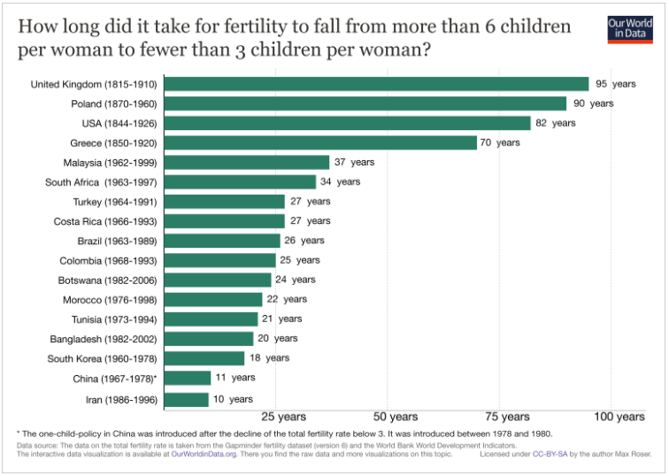
  2. Birthrates can fall fast. Like, really really fast. Growing up in the US, I always thought of birthrates as something that sort of slowly trended downward as countries grew more developed. What I didn’t realize is that it doesn’t always happen this way. Our World in Data has an interesting chart that shows how long it took for various countries to go from a birthrate of 6 or more children to 3 or fewer:  What’s stunning about this is that some of these numbers are half a generation. For birthrates to fall that quickly in Iran for example, it doesn’t just mean women were having fewer children than their mothers, it means they started having fewer children than their older sisters. In case you’re curious if these trends were just a product of instability in those countries during those times: today the birthrate in Bangladesh is 2.17, South Korea is 1.26, China is 1.60, Iran is 1.97 (per Wiki/CIA Factbook). It seems like all the downward trends shown here kept up or accelerated. China obviously made this a formal policy, but it does not appear the other countries did. I found this interesting because we often hear about subtle factors/cultural messages that impact birthrates, but there’s nothing subtle about these drop offs.
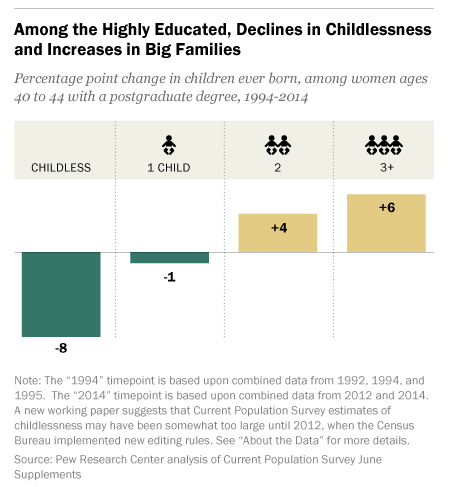
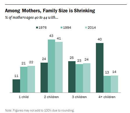
  3. A reduction in those having large families impacts the average as much (or more) than the number of women going childless. One of the first things that comes up when you talk about dropping fertility rates is the number of women who remain childless. While childless women certainly cause a drop in fertility rates, it’s important to note that they are also lowered by the number of women who don’t have large numbers of kids. I don’t have the numbers, but I would guess that the countries in point #2 ended up with lower fertility rates not because of a surge in childless women, but by a major decrease in women having 6 or more children. If we look at the change in family size in the US since 1976, the most notable drop is women having 4+ kids. From Pew Research:My first takeaway from this is that the appeal of having 3 children is timeless. My second takeaway is that it appears a large number of people aren’t crazy about having a large family. This matches my experience, because while you often hear people ask those without children or with one child “why don’t you have more kids?” you don’t often hear people ask those with 2 children the same thing. My friends with 3 children inform me that they actually start getting”you’re not having more are you?” type comments and I’d imagine those with 4 or more get the same thing routinely. Now I grew up going to Baptist school and my siblings were all home schooled at some point, so I am well aware that there are still groups that support/encourage big families. However, even among those who like “big families”, I think the perception of what “big” is has shrunk. I have friends who talked incessantly about wanting big families, married early and were stay at home moms, and none of them have more than 5 children. Most of us don’t have to go more than a generation or two back in our family trees to find a family of 5 kids or more. It seems like even those who want a big family think of it in terms of “more children than others” as opposed to an absolute number. Yes, the Duggars exist, but they are so rare they got a TV show out of the whole thing.
  4. International adoption likely doesn’t get factored in. As mentioned above, I probably know an above average number of people with 4+ children. Many of these families have a mix of biological and adopted children, frequently foreign adoptions. According the the CDC though, it doesn’t appear those adopted children are not counted in birthrate data, as they calculate that off of birth certificates issued for live births taking place in the US during a given year. Now of course this isn’t a huge impact on overall numbers: there are currently only about 5,000 international adoptions/year in the US, down from a high of 15,000 or so, vs 4,000,000 overall births. However, it is interesting to note that “number of kids” does not always equal birthrate. Since the US is the biggest adopter of foreign children in the world, it is a thing to keep in mind here.
  5. The demographics of who doesn’t have kids are changing When you mention “women without children” the vision that immediately springs to mind is a well educated white woman who put her career first. Interestingly enough, this stereotype is increasingly untrue, and is changing in many countries. According to Pew Research, childlessness among women with post-graduate degrees has dropped quite a bit in the last 20 years, and the number of women in that group with 3+ kids has gone up:According to the Economist, in Finland women with a basic education are less likely to have children than their more educated peers, and other countries are trending the same way. The US is nowhere near flipping, but it is an interesting trend to keep an eye on. Historically, education has always been associated with dropping fertility rates, so this would be huge if it switched.

Overall, I thought the data out there on the topic was pretty interesting. The worldwide trends make it interesting to try to come up with a hypothesis that fits all scenarios. For example, we know that effective birth control must impact the number of children people have, but Britain and the US both had birthrates under 3 decades before oral contraceptives came in to play. Economic resources must play a part, and yet it’s the richest countries that have the lowest birthrates. Wealth is sometimes linked to higher numbers of children (particularly among men), but sometimes it’s not. Education always lowers fertility rates, except that’s started to reverse. Things to puzzle over.
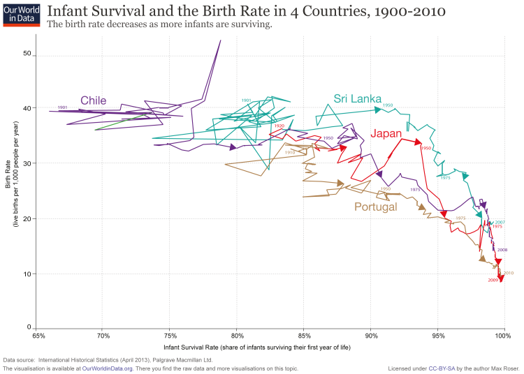
5 Things About Precognition Studies

Several months ago now, I was having dinner with a friend who told me he was working on some science fiction based on some interesting precognition studies he had heard about. As he started explaining them to me and how they was real scientific proof of ESP, he realized who he was talking to and quickly got sheepish and told me to “be gentle” when I ended up doing a post about it. Not wanting to kill his creative momentum, I figured I’d delay this post for a bit. I stumbled on the draft this morning and realized it’s probably been long enough now, so let’s talk about the paranormal!

First, I should set the stage and say that my friend was not actually wrong to claim that precognition has some real studies behind it. Some decent research time and effort has been put in to experiments where researchers attempt to show that people react to things that haven’t happened yet. In fact the history of this work is a really interesting study in scientific controversy and it tracks quite nicely with much of the replication crisis I’ve talked about. This makes it a really interesting topic for anyone wanting to know a bit more about the pluses/minuses of current research methods.

As we dig in to this, it helps to know a bit of background: Almost all of the discussions about this are referencing a paper by Daryl Bem from 2011, where 9 different studies were run on the phenomena. Bem is a respected psychological researcher, so the paper made quite a splash at the time. So what did these studies say and what should we get out of them, and why did they have such a huge impact on psychological research? Let’s find out!

  1. The effect sizes were pretty small, but they were statistically significant Okay, so first things first….let’s establish what kind of effect size we’re talking about here. For all 9 experiments the Cohen’s d was about .22. In general, a d of .2 is considered a “small” effect size, .5 would be moderate, .8 would be large. In the real world, this translated in to participants picking the “right” option 53% of the time instead of the 50% you’d expect by chance.
  2. The research was set up to be replicated One of the more interesting parts of Bem’s research was that he made his protocols publicly available for people trying to replicate his work, and he did this before he actually published the initial 2011 paper. Bem particularly pointed people to experiments #8 and #9, which showed the largest effect sizes and he thought would be the easiest to replicate. In these studies, he had people try to recall words off of a word list, writing down those they could remember. He then gave them a subset of those words to study more in depth, again writing down what they could remember. When they looked back, they found that subjects had recalled more of their subset words than control words on the first test. Since the subjects hadn’t seen their subset words at the time they took the first test, this was taken as evidence of precognition.
  3. Replication efforts have been….interesting. Of course with interesting findings like these, plenty of people rushed to try to replicate Bem’s work. Many of these attempts failed, but Bem published a meta-analysis stating that on the whole they worked. Interestingly however, the meta-analysis actually analyzed replications that pre-dated the publication of Bem’s work. Since Bem had released his software early, he was able to find papers all the way back to 2001. It has been noted that if you remove all the citations that pre-dated the publication of his paper, you don’t see an effect. So basically the pre-cognition paper was pre-replicated. Very meta.
  4. They are an excellent illustration of the garden of forking paths. Most of the criticism of the paper comes down to something Andrew Gelman calls “The Garden of Forking Paths“. This is a phenomena in which researchers make a series of tiny decisions as their experiments and analyses progress, which may add up to serious deviation from the original results. In the Bem study for example, it has been noted that some of his experiments actually used two different protocols, then combined the results. It was also noted that the effect sizes got smaller as more subjects were added, suggesting that the number of subjects tested may have fluctuated based on results. There are also decisions so small you mostly wouldn’t notice. For example, in the word recall study mentioned above, word recall was measured by comparing word lists for exact matches. This meant that if you spelled “retrieve” as “retreive”, it didn’t automatically give you credit. They had someone go through and correct for this manually, but that person actually knew which words were part of the second experiment and which were the control words. Did the reviewer inadvertently focus on or give more credit to words that were part of the “key word” list? Who knows, but small decisions like this can add up. There were also different statsticall analyses performed on different experiments, and Bem himself admits that if he started a study and got no results, he’d tweak it a little and try again. When you’re talking about an effect size of .22, even tiny changes can add up.
  5. The ramifications for all of psychological science were big It’s tempting to write this whole study off, or to accept it wholesale, but the truth is a little more complicated. In a thorough write-up over at Slate, Daniel Engber points out that this research used typical methods and invited replication attempts and still got a result many people don’t believe is possible. If you don’t believe the results are possible, then you really should question how often these methods are used in other research. As one of the reviewers put it “Clearly by the normal rules that we [used] in evaluating research, we would accept this paper. The level of proof here was ordinary. I mean that positively as well as negatively. I mean it was exactly the kind of conventional psychology analysis that [one often sees], with the same failings and concerns that most research has”. Even within the initial paper, the word “replication” was used 23 times. Gelman rebuts that all the problems with the paper are known statistical issues and that good science can still be done, but it’s clear this paper pushed many people to take good research methods a bit more seriously.

So there you have it. Interestingly, Bem actually works out of Cornell and has been cited in the whole Brian Wansink kerfluffle, a comparison he rejects. I think that’s fair. Bem has been more transparent about what he’s doing, and did invite replication attempts. In fact his calls for people to look at his work were so aggressive, there’s a running theory that he published the whole thing to make a point about the shoddiness of most research methods. He’s denied this, but that certainly was the effect. An interesting study on multiple levels.

5 Things About IQ Errors in Intro Psych Textbooks

A few months ago I did a post on common errors that arise when people try to self-estimate their IQ.  One concern I sort of covered at the time was that many people may not truly understand what IQ was. For example, there seems to be a tendency to confuse educational attainment with IQ, which is likely why many of us think our grandparents were not nearly as smart as we are.

I was thinking about this issue this past week when I saw a newly published study called “What Do Undergraduates Learn About Human Intelligence? An Analysis of
Introductory Psychology Textbooks“. As the study suggests, the authors took a look at intro psych textbooks to see what they say about IQ, and how well it aligns with the actual published research on IQ. So what did they find? Let’s take a look!

  1. Most of what undergrads learn about intelligence will be learned in intro psych. To back up the premise of the study, the authors looked at the topics covered in psych programs around the country. They determined that classes on intelligence were actually pretty rare, and that the primary coverage the topic got was in intro psych. Once they’d established this, they were able to pull the 30 most popular intro psych textbooks, and they chose to analyze those. Given the lack of subsequent classwork and the popularity of the textbooks used, they estimate that their study covers a huge proportion of the formal instruction/guidance/learning on intelligence that goes on in the US.
  2. The percent of space dedicated to discussing intelligence has dropped The first research question the authors wanted to look at was how much space was dedicated to explaining IQ/intelligence research to students. In the 80s, this was 6% of textbook space, but now it’s about 3-4%. Now it’s possible that this is because textbooks got longer (and thus the percent dropped), or it could be that the topic got de-emphasized. Regardless, an interesting note.
  3. IQ Fallacies were pretty common The list of possible IQ “fallacies” was drawn from two sources. The first was from this article by Gottfredson et al, which was published after “The Bell Curve” came out and had 52 signatories who wanted to clear up what current research on IQ said. The second paper was a statement from the American Psychological Association, also in response to the publicity around the Bell Curve. They used these two papers to generate the following list:  The most common fallacies they found were #2, 3 4 and 6. These were present in 8 books (2 and 3) and 6 books (4 and 6) respectively. Interestingly, for #3 they specifically clarified that they only called it a fallacy if someone asserted that you could raise IQ by adding a positive action as opposed to eliminating a negative action. Their example was that lead poisoning really does provably lower IQ, but fish oil supplements during pregnancy have not been proven to raise IQ. The initial two papers explain why these are viewed as fallacies.
  4. Briefs discussions led to inaccuracies In addition to fallacies, the authors also took a look at inaccuracies, questionable theories, and the proportionate amount of time authors spent looking at various topics. Many of the textbooks committed the errors of citing part of the story, but not the full story. For example, it was noted that testing bias was well covered, but not the efforts that have been made to correct for testing bias. Some textbooks went so far as to say that all IQ tests required you to speak English, where as nonverbal tests have been available as far back as 1936. Additionally, some theories of intelligence that have not born out well (Gardner’s theory of multiple intelligences and Sternberg’s triarchic theory of intelligence) were two of the most discussed topics in textbooks, but did not include a discussion of the literature supporting those vs the g theory of intelligence. I imagine the oversimplification issue is one that affects many topics in intro textbooks, but this does seem a bit of an oversight.
  5. Overall context of intelligence scores was minimized Despite good proof that intelligence scores are positively correlated with various good outcomes, the most surprising finding was that several textbooks said directly that IQ only impacted education and had little relevance to every day life (4 textbooks). This directly contradicts most current research, and also a certain amount of common sense. Even if IQ only helped you in academia, having a degree helps you in many other areas of life, such as income and all the advantages that brings.

Overall this was a pretty interesting paper, especially when they gave examples of the type of statements they were talking about. Reading the statement from the APA and comparing it to the textbooks was rather interesting, as it shows how far it is possible it is to drift from consensus if you’re not careful.

Additionally, the authors cited some interesting work to show that some popular public misconceptions around IQ are directly mirrored in the intro psych textbooks errors. Overall I think the point is well taken that intro to anything textbooks should be given a lot of scrutiny in making sure their claims are factual before being assigned.

5 Things About that “Republicans are More Attractive than Democrats” Study

Happy Valentine’s Day everyone! Given the spirit of the day, I thought it was a good time to post about a study Korora passed along a few days ago called “Effects of physical attractiveness on political beliefs”, which garnered a few headlines for it’s findings that being attractive was correlated with being a Republican. For all of you interested in what was actually going on here, I took a look at the study and here’s what I found out:

  1. The idea behind the study was not entirely flattering. Okay, while the whole “my party is hotter than your party” thing sounds like compliment, the premise of this study was actually a bit less than rosy. Essentially the researchers hypothesized that since attractive people are known to be treated better in many aspects of life, those who were more attractive may get a skewed version of how the world works. Their belief/experience that others were there to help them and going to treat them fairly may cause them to develop a “blind spot” that caused them to believe people didn’t need social programs/welfare/anti-discrimination laws  as much as less attractive people might think.
  2. Three hypotheses were tested Based on that premise, the researchers decided to test three distinct hypotheses. First, that attractive people were more likely to believe things like “my vote matters” and “I can make a difference”, regardless of political party. Second, they asked them about ideology, and third partisanship. I thought that last distinction was interesting, as it drew a distinction between the intellectual undertones and the party affiliation.
  3. Partisans are more attractive than ideologues. To the shock of no one, better looking people were much more likely to believe they would have a voice in the political process, even when controlled for education and income. When it came to ideology vs partisanship though, things got a little interesting. Attractive people were more likely to rate themselves as strong Republicans, but not necessarily as strong conservatives. In fact in the first data set they used (from the years 1972, 1974 and 1976) only one year should any association between conservatism and attractiveness, but all 3 sets showed a strong relationship between being attractive and saying you were a Republican. The later data sets (2004 and 2011) show the same thing, with the OLS coefficient for being conservative about half (around .30) of what the coefficient for Republicanism was (around .60). This struck me as interesting because the first headline I saw specifically said “conservatives” were more attractive, but that actually wasn’t the finding. Slight wording changes matter.
  4. We can’t rule out age cohort effects When I first saw the data sets, I was surprised to see some of the data was almost 40 years old. Then I saw they used data from 2004 and 2011 and felt better. Then I noticed that the 2004 and 2011 data was actually taken from the Wisconsin Longitudinal Study, whose participants were in high school in 1957 and have been interviewed every few years ever since. Based on the age ranges given, the people in this study were born between 1874 and 1954, with the bulk being 1940-1954. While the Wisconsin study controlled for this by using high school yearbook photos rather than current day photos, the fact remains that we only know where the subjects politics ended up (not what they might have been when they were young) and we don’t know if this effect persists in Gen X or millenials. It also seems a little suspect to me that one data set came during the Nixon impeachment era, as strength of Republican partisanship dropped almost a whole point over the course of those 4 years. Then again, I suppose lots of generations could claim a confounder.
  5. Other things still  are higher predictors of affiliation. While overall the study looked at the effect of attractiveness by controlling  for things like age and gender, the authors wanted to note that those other factors actually still played a huge role. The coefficients for the association of Republican leanings with age (1.08) and education (.57) for example  were much higher than attractiveness the coefficient for attractiveness (.33). Affinity for conservative ideology/Republican partisanship was driven by attractiveness (.37/.72) but also by income (.60/.62) being non-white (-.59/-1.55) and age (.99/1.45). Education was a little all over the place…it didn’t have an association with ideology (-.06), but it did with partisanship (.94). In every sample, attractiveness was one of the smallest of the statistically significant associations.

While this study is interesting, I would like to see it replicated with a younger cohort to see if this was a reflection of an era or a persistent trend. Additionally, I would be interested to see some more work around specific beliefs that might support the initial hypothesis that this is about social programs. With the noted difference between partisanship and ideology, it might be hard to hang your hat on an particular belief as the driver.

Regardless, I wouldn’t use it to start a conversation with your Tinder date. Good luck out there.