This is not a particularly new question, but a few friends and readers have asked me over the past few months about the data behind the “Evangelicals support Trump” assertions. All of the people who asked me about this are long term Evangelicals who attend church regularly and typically vote Republican, but did not vote for Trump. They seemed to doubt that Evangelical support for Trump was as high as was being reported, but of course weren’t sure if that was selection bias on their part.
The first data set of interest is the exit polling from right after Election Day. This showed that Evangelical support had gone up from 78% for Romney to 81% for Trump. The full preliminary analysis is here, but I thought it would be interesting to see how all of the tracked religions had changed over the years, so I turned the table in to a bar chart. This shows the percent of people who claimed affiliation with a particular religious group AND said the voted for the Republican candidate:Since some religions tend to show large disparities along racial lines (such as Catholicism), race is included. White evangelical Christian was added as its own affiliation after the 2000 election, when those voters were given credit for putting Bush in office. Mormonism has not been consistently tracked, which is why the 2008 data is missing.
Anyway, I thought it was interesting to see that while support for Trump did increase over Romney’s support, it wasn’t a huge change. On the other hand, Mormons saw a fairly substantial drop in support for Trump as opposed to Romney or Bush. Hispanic Catholics and “other faiths” saw the biggest jump in support for Trump over Romney. However, white Evangelicals remained the most likely to vote for Trump at a full 21 points higher than the next closest group, white Catholics.
So with those kind of numbers, why aren’t my friends hearing this in their churches? A few possible reasons:
We don’t actually know the true percentage of Evangelicals who voted for Trump Even with a number like 81% , we still have to remember that about half of all people don’t vote at all. I couldn’t find data about how likely Evangelicals were to vote, but if it is at the same rate as other groups then only 40% of those sitting in the pews on Sunday morning actually cast a vote for Trump.
Some who have raised this objection have also objected that we don’t know if those calling themselves “Evangelical” actually were sitting in the pews on Sunday morning, so Pew decided to look at this question specifically. At least as of April, Evangelicals stating that they attended church at least once a month were actually the most likely to support Trump and the job he is doing, at 75%. Interestingly, that survey also found that there are relatively few people (20%) who call themselves Evangelical but don’t attend church often.
The pulpit and the pews may have a difference of opinion While exit polls capture the Evangelical vote broadly, some groups decided to poll Evangelical pastors specifically. At least a month before the election, only 30% of Evangelical pastors said they were planning on voting for Trump and 44% were still undecided. While more of them may have ended up voting for him, that level of hesitancy suggests they are probably not publicly endorsing him on Sunday mornings. Indeed, that same poll found that only 3% of pastors had endorsed a candidate from the pulpit during this election.
People weren’t voting based on things you hear sermons about After the data emerged about the Evangelical voting, many pundits hypothesized that the Supreme Court nomination and abortion were the major drivers of Evangelical voting. However, when Evangelicals were actually asked what their primary issues were, they told a different story. When asked to pick their main issues, they named “improving the economy”and “national security”, with the Supreme Court nominee ranking 4th with 10% picking it and abortion ranking 7th, with 4%. Even when allowed to name multiple issues, the Supreme Court and abortion were ranked as less concerning than terrorism, the economy, immigration, foreign policy and gun policy.
Now the motivation may seem minor, but think about what people actually discuss in church on Sunday morning. Abortion or moral concerns are far more likely to come up in that context than terrorism. Basically, if Evangelicals are voting for Trump based on their beliefs about things that aren’t traditionally talked about on Sunday morning, you are not likely to hear about this on Sunday morning.
National breakdowns may not generalize to individual states I couldn’t find an overall breakdown of the white Evangelical vote by state, but it was widely reported that in some key states like Florida, Evangelical voters broke for Trump at even higher rates than the national average (85%), which obviously means some states went lower. What might skew the data even further however, is the uneven distribution of Evangelicals themselves. The Pew Research data tells us that about 26% of the voting public is white Evangelical, and Florida is very close to that at 23%. The states where my friends are from however (New Hampshire and Massachusetts) are much lower at 13% and 9% respectively. This means some small shifts in Evangelical voting in Florida could be the equivalent of huge shifts in New Hampshire.
As an example: According to the Election Project numbers, Florida had 9.5 million people cast votes and New Hampshire had 750,000. If Evangelicals were represented proportionally in the voting population, that means about 2.18 million Evangelicals cast a vote in Florida, and about 97,500 cast their vote in NH. That’s 22 times as many Evangelical voters in Florida as NH. Roughly speaking, this means a 1% change in Florida would be about 20,000 people….almost 20% of the NH Evangelical population. Massachusetts Evangelicals are similarly outnumbered at about 7 to 1 in comparison to Florida. If 0% of NH/MA Evangelical voters went for Trump but 85% of Florida Evangelicals did vote for him, that would still average out to 71% of Evangelicals voting for Trump across the three states. New England states just really don’t have the population to move the dial much, and even wildly divergent voting patterns wouldn’t move the national average.
Hopefully that sheds a bit of light on the numbers here, even if it is about 7 months too late to be a hot take.
Welcome to “From the Archives”, where I dig up old posts and see what’s changed in the years since I originally wrote them.
I’ve had a rather interesting couple weeks here in my little corner of the blogosphere. A little over a year ago, a reader asked me to write a post about a video he had seen kicking around that used gumballs to illustrate world poverty. With the renewed attention to immigration issues over the last few weeks, that video apparently went viral and brought my post with it. My little blog got an avalanche of traffic and with it came a new series of questions, comments and concerns about my original post. The comments on the original post closed after 90 days, so I was pondering if I should do another post to address some of the questions and concerns I was being sent directly. A particularly long and thoughtful comment from someone named bluecat57 convinced me that was the way to go, and almost 2500 something words later, here we are. As a friendly reminder, this is not a political blog and I am not out to change your mind on immigration to any particular stance. I actually just like talking about how we use numbers to talk about political issues and the fallacies we may encounter there.
Note to bluecat57: A lot of this post will be based on various points you sent me in your comment, but I’m throwing a few other things in there based on things other people sent me, and I’m also heavily summarizing what you said originally. If you want me to post your original comment in the comments section (or if you want to post it yourself) so the context is preserved, I’m happy to do so.
Okay, with that out of the way, let’s take another look at things!
First, a quick summary of my original post: The original post was a review of a video by a man named Roy Beck. The video in question (watch it here) was a demonstration centered around whether or not immigration to the US could reduce world poverty. In it, pulls out a huge number of gumballs, with each one representing 1 million poor people in the world, defined by the World Bank’s cutoff of “living on less than $2/day” and demonstrates that the number of poor people is growing faster than we could possibly curb through immigration. The video is from 2010. My criticisms of the video fell in to 3 main categories:
The number of poor people was not accurate. I believe it may have been at one point, but since the video is 7 years old and world poverty has been falling rapidly, they are now wildly out of date. I don’t blame Beck for his video aging, but I do get irritated his group continues to post it with no disclaimer.
That the argument the video starts with “some people say that mass immigration in to the United States can help reduce world poverty” was not a primary argument of pro-immigration groups, and that using it was a strawman.
That people liked, shared and found this video more convincing than they should have because of the colorful/mathematical demonstration.
My primary reason for posting about the video at all was actually point #3, as talking about how mathematical demonstrations can be used to address various issues is a bit of a hobby of mine. However, it was my commentary on #1 and #2 that seemed to attract most of the attention. So let’s take a look at each of my points, shall we?
Point 1: Poverty measures, and their issues: First things first: when I started writing the original post and realized I couldn’t verify Beck’s numbers, I reached out to him directly through the NumbersUSA website to ask for a source for them. I never received a response. Despite a few people finding old sources that back Beck up, I stand by the assertion that those numbers are not currently correct as he cites them. It is possible to find websites quoting those numbers from the World Bank, but as I mentioned previously, the World Bank itself does not give those numbers. While those numbers may have come from the World Bank at some point he’s out of date by nearly a decade, and it’s a decade in which things have rapidly changed.
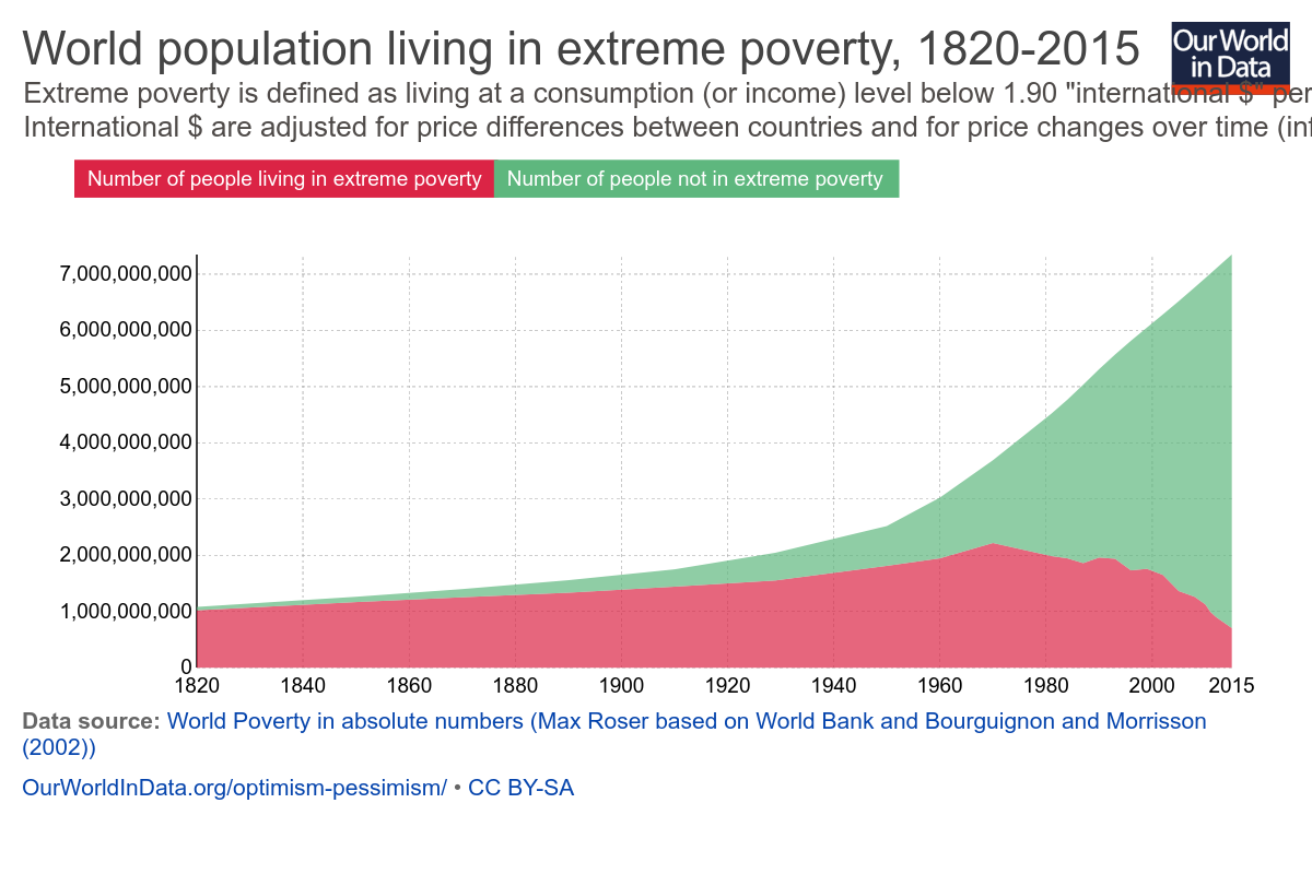
Now this isn’t necessarily his fault. One of the reasons Beck’s numbers were rendered inaccurate so quickly was because reducing extreme world poverty has actually been a bit of a global priority for the last few years. If you were going to make an argument about the number of people living in extreme poverty going up, 2010 was a really bad year to make that argument:
Basically he made the argument in the middle of an unprecedented fall in world poverty. Again, not his fault, but it does suggest why he’s not updating the video. The argument would seem a lot weaker starting out with “there’s 700 million desperately poor people in the world and that number falls by 137,000 people every day”.
Moving on though…is the $2/day measure of poverty a valid one? Since the World Bank and Beck both agreed to use it, I didn’t question it much up front, but at the prompting of commenters, I went looking. There’s an enormously helpful breakdown of global poverty measures here, but here’s the quick version:
The $2/day metric is a measure of consumption, not income and thus is very sensitive to price inflation. Consumption is used because it (attempts to) account for agrarian societies where people may grow their own food but not earn much money.
Numbers are based on individual countries self-reporting. This puts some serious holes in the data.
The definition is set based on what it takes to be considered poor in the poorest countries in the world. This caused it’s own problems.
That last point is important enough that the World Bank revised it’s calculation method in 2015, which explains why I couldn’t find Beck’s older numbers anywhere on the World Bank website. Prior to that, it set the benchmark for extreme poverty based off the average poverty line used by the 15 poorest countries in the world. The trouble with that measure is that someone will always be the poorest, and therefore we would never be rid of poverty. This is what is known as “relative poverty”.
Given that one of the Millennium Development Goals focused on eliminating world poverty, the World Bank decided to update it’s estimates to simply adjust for inflation. This shifts the focus to absolute poverty, or the number of people living below a single dollar amount. Neither method is perfect, but something had to be picked.
It is worth noting that country self reports can vary wildly, and asking the World Bank to put together a single number is no small task. While the numbers presented, it is worth noting that even small revisions to definitions could cause huge change. Additionally, none of these numbers address country stability, and it is quite likely that unstable countries with violent conflicts won’t report their numbers. It’s also unclear to me where charity or NGO activity is counted (likely it varies by country).
Interestingly, Politifact looked in to a few other ways of measuring global poverty and found that all of them have shown a reduction in the past 2 decades, though not as large as the World Bank’s. Beck could change his demonstration to use a different metric, but I think the point remains that if his demonstration showed the number of poor people falling rather than rising, it would not be very compelling.
Edit/update: It’s been pointed out to me that at the 2:04 mark he changes from using the $2/day standard to “poorer than Mexico”, so it’s possible the numbers after that timepoint do actually work better than I thought they would. It’s hard to tell without him giving a firm number. For reference, it looks like in 2016 the average income in Mexico is $12,800/year . In terms of a poverty measure, the relative rank of one country against others can be really hard to pin down. If anyone has more information about the state of Mexico’s relative rank in the world, I’d be interested in hearing it.
Point 2: Is it a straw man or not? When I posted my initial piece, I mentioned right up front that I don’t debate immigration that often. Thus, when Beck started his video with “Some people say that mass immigration in to the United States can help reduce world poverty. Is that true? Well, no it’s not. And let me show you why…..” I took him very literally. His demonstration supported that first point, that’s what I focused on. When I mentioned that I didn’t think that was the primary argument being made by pro-immigration groups, I had to go to their mission pages to see what their argument actually were. None mentioned “solving world poverty” as a goal. Thus, I called Beck’s argument a straw man, as it seemed to be refuting an argument that wasn’t being made.
Unsurprisingly, I got a decent amount of pushback over this. Many people far more involved in the immigration debates than I informed me this is exactly what pro-immigration people argue, if not directly then indirectly. One of the reasons I liked bluecat57’s comment so much, is that he gave perhaps the best explanation of this.To quote directly from one message:
“The premise is false. What the pro-immigration people are arguing is that the BEST solution to poverty is to allow people to immigrate to “rich” countries. That is false. The BEST way to end poverty is by helping people get “rich” in the place of their birth.
That the “stated goals” or “arguments” of an organization do not promote immigration as a solution to poverty does NOT mean that in practice or in common belief that poverty reduction is A solution to poverty. That is why I try to always clearly define terms even if everyone THINKS they know what a term means. In general, most people use the confusion caused by lack of definition to support their positions.”
Love the last sentence in particular, and I couldn’t agree more. My “clear definitions” tag is one of my most frequently used for a reason.
In that spirit, I wanted to explain further why I saw this as a straw man, and what my actual definition of a straw man is. Merriam Webster defines a straw man as “a weak or imaginary argument or opponent that is set up to be easily defeated“. If I had ever heard someone arguing for immigration say “well we need it to solve world poverty”, I would have thought that was an incredibly weak argument, for all the reasons Beck goes in to….ie there are simply more poor people than can ever reasonably be absorbed by one (or even several) developed country. Given this, I believe (though haven’t confirmed) that every developed/rich country places a cap on immigration at some point. Thus most of the debates I hear and am interested in are around where to place that cap in specific situations and what to do when people circumvent it. The causes of immigration requests seem mostly debated when it’s in a specific context, not a general world poverty one.
For example, here’s the three main reasons I’ve seen immigration issues hit the news in the last year:
Illegal immigration from Mexico (too many mentions to link)
Now there are a lot of issues at play with all of these, depending on who you talk to: general immigration policy, executive power, national security, religion, international relations, the feasibility of building a border wall, the list goes on and on. Poverty and economic opportunity are heavily at play for the first one, but so is the issue of “what do we do when people circumvent existing procedures”. In all cases if someone had told me that we should provide amnesty/take in more refugees/lift a travel ban for the purpose of solving world poverty, I would have thought that was a pretty broad/weak argument that didn’t address those issues specifically enough. In other words my characterization of this video as a straw man argument was more about it’s weakness as a pro-immigration argument than a knock against the anti-immigration side. That’s why I went looking for the major pro-immigration organizations official stances….I actually couldn’t believe they would use an argument that weak. I was relieved when I didn’t see any of them advocating this point, because it’s really not a great point. (Happy to update with examples of major players using this argument if you have them, btw).
In addition to the weaknesses of this argument as a pro-immigration point, it’s worth noting that from the “cure world poverty” side it’s pretty weak as well. I mentioned previously that huge progress has been made in reducing world poverty, and the credit for that is primarily given to individual countries boosting their GDP and reducing their internal inequality. Additionally, even given the financial situation in many countries, most people in the world don’t actually want to immigrate. This makes sense to me. I wouldn’t move out of New England unless there was a compelling reason to. It’s home. Thus I would conclude that helping poor countries get on their feet would be a FAR more effective way of eradicating global poverty than allowing more immigration, if one had to pick between the two. It’s worth noting that there’s some debate over the effect of healthy/motivated people immigrating and sending money back to their home country (it drains the country of human capital vs it brings in 3 times more money than foreign aid), but since that wasn’t demonstrated with gumballs I’m not wading in to it.
So yeah, if someone on the pro-immigration side says mass immigration can cure world poverty, go ahead and use this video….keeping in mind of course the previously stated issue with the numbers he quotes. If they’re using a better or more country or situation specific argument though (and good glory I hope they are), then you may want to skip this one.
Now this being a video, I am mindful that Beck has little control over how it gets used and thus may not be at fault for possible straw-manning, any more than I am responsible for the people posting my post on Twitter with Nicki Minaj gifs (though I do love a good Nicki Minaj gif).
Point 3 The Colorful Demonstration: I stand by this point. Demonstrations with colorful balls of things are just entrancing. That’s why I’ve watched this video like 23 times:
Welp, this went on a little longer than I thought. Despite that I’m sure I missed a few things, so feel free to drop them in the comments!
I had thought this was just random bluster (on Twitter????? Never!), but then someone sent me this article. Apparently that comment was presumably based on an actual study, and the study author is now giving interviews. It turns out he’s pretty unhappy with everyone….not just with Trump, but also with Trump’s opponents who claim that no non-citizens voted. So what did his study actually say? Let’s take a look!
Some background: The paper this is based on is called “Do Non-Citizens Vote in US Elections” by Richman et all and was published back in 2014. It took data from a YouGov survey and found that 6.4% of non-citizens voted in 2008 and 2.2% voted in 2010. Non-citizenship status was based on self report, as was voting status, though the demographic data of participants was checked with that of their stated voting district to make sure the numbers at least made sense.
So what stood out here? A few things:
The sample size While the initial survey of voters was pretty large (over 80,000 between the two years) the number of those identifying themselves as non-citizens was rather low: 339 and 489 for the two years. There were a total of 48 people who stated that they were not citizens and that they voted. As a reference, it seems there are about 20 million non-citizens currently residing in the US.
People didn’t necessarily know they were voting illegally One of the interesting points made in the study was that some of this voting may be unintentional. If you are not a citizen, you are never allowed to vote in national elections even if you are a permanent resident/have a green card. The study authors wondered if some people didn’t know this, so they analyzed the education levels of those non-citizens who voted. It turns out non-citizens with less than a high school degree are more likely to vote than those with more education. This actually is the opposite trend seen among citizens AND naturalized citizens, suggesting that some of those voters have no idea what they’re doing is illegal.
Voter ID checks are less effective than you might think If you’re first question up on reading #2 was “how could you just illegally vote and not know it?” you may be presuming your local polling place puts a little more in to screening people than they do. According to the participants in this study, not only were non-citizens allowed to register and cast a vote, but a decent number of them actually passed an ID check first. About a quarter of non-citizen voters said they were asked for ID prior to voting, and 2/3rds of those said they were then allowed to vote. I suspect this issue is that most polling places don’t actually have much to check their information against. Researching citizenship status would take time and money that many places just don’t have. Another interesting twist to this is that social desirability bias may kick in for those who don’t know voting is illegal. Voting is one of those things more people say they do than actually do, so if someone didn’t know they couldn’t legally vote they’d be more likely to say they did even if they didn’t. Trying to make ourselves look good is a universal quality.
Most of the illegal voters were white Non-citizen voters actually tracked pretty closely with their proportion of the population, and about 44% of them were white. The next most common demographic was Hispanic at 30%, then black, then Asian. In terms of proportion, the same percent of white non-citizens voted as Hispanic non-citizens.
Non-citizens are unlikely to sway a national election, but could sway state level elections When Trump originally referenced this study, he specifically was using it to discuss national popular vote results. In the Wired article, they do the math and find that even if all of the numbers in the study bear out it would not sway the national popular vote. However, the original study actually drilled down to a state level and found that individual states could have their results changed by non-citizen voters. North Carolina and Florida would both have been within the realm of mathematical possibility for the 2008 election, and for state level races the math is also there.
Now, how much confidence you place in this study is up to you. Given the small sample size, things like selection bias and non-response bias definitely come in to play. That’s true any time you’re trying to extrapolate the behavior of 20 million people off of the behavior of a few hundred. It is important to note that the study authors did a LOT of due diligence attempting to verifying and reality check the numbers they got, but it’s never possible to control for everything.
If you do take this study seriously, it’s interesting to note what the authors actually thought the most effective counter-measure against non-citizen voting would be: education. Since they found that low education levels were correlated with increased voting and that poll workers rarely turned people away, they came away from this study with the suggestion that simply doing a better job of notifying people of voting rules might be just as effective (and cheaper!) than attempting to verify citizenship. Ultimately it appears that letting individual states decide on their own strategies would also be more effective than anything on the federal level, as different states face different challenges. Things to ponder.
Content note: Big contentious political issues ahead. Proceed with care. As with most of my posts, the intent here is not to take a stance on a political issue, but rather to discuss the ways numbers are used to talk about them.
Last week I got tagged in a rather interesting Facebook discussion about abortion and Planned Parenthood. It centered around this video from the group LiveAction, that focused on debunking the “abortion is only 3% of what Planned Parenthood does”.
What stuck out to me about this video (and the associated Slate and Washington Post articles it referenced) is that despite the contentious issue being addressed, this is fundamentally a debate about denominators. No one seems to question the numerator here….Planned Parenthood readily states that they performed 323,999 abortions in fiscal year 2014-2015. What’s up for debate is what you divide that by to get an accurate picture of their business, and what questions those denominator choices answer. There are a couple of options here:
Number of billed procedures or “discrete clinical interactions” Every year, Planned Parenthood provides 10.6 million different types of services in it’s clinics. This is the denominator used to get the 3% figure. As the video above (and the Slate and Washington Post article) point out, a pregnancy test, abortion, STI screening and follow up contraception prescription would count as 4 separate line items, despite not being even remotely equal in time, cost, or overall impact. What this number does answer is “what does Planned Parenthood do other than abortion?”.
Pregnancy services provided The Washington Post article that investigated the 3% claim also investigated the claim by the Susan B Anthony foundation that 94% of “pregnancy services provided by Planned Parenthood” were abortions. To get this number, they took the number of services offered exclusively to pregnant women: abortions, prenatal services and adoption referrals. Those last two categories total a little over 20,000/year, so you end up with a denominator of 344,000 or so. This gets you to 94%. This number answers the question “what does Planned Parenthood do exclusively for women who present at the clinic already pregnant?”. I keep repeating exclusively because there’s no way of seperating out pregnancy tests or STI screenings for pregnant vs non-pregnant women.
Amount of revenue Another way of calculating the percent of a business is calculating the percent of revenue derived from that one service. The Washington Post attempts to crunch these numbers based on published rates, and comes up with something in the 15-37% range. Since Planned Parenthood does not actually publish this data, there are a lot of assumptions built in. Essentially though, this is the number of procedures times the approximate cost per procedure divided by total PP revenues. The approximations are difficult to make mostly because costs vary and Planned Parenthood tends to have a sliding scale for those who can’t afford the full cost. This number is probably closer to what most people think of as “percent of business”.
Number of abortions in the country I’ll come back to this one later, but The Blaze article notes that if you use the denominator of “total abortions performed in the USA” you find the Planned Parenthood performs a little over 30% of abortions. This answers the question “what percentage of abortions are actually performed at Planned Parenthood”.
Number of patients In the LiveAction video, it is noted that Planned Parenthood saw about 2.7 million patients. This means about 1 out of every 8 patients seen by Planned Parenthood in a year got an abortion in that year. This is a stat to be careful with because people can have multiple visits, so this does not answer the question “what are the chances a person walking in to a Planned Parenthood clinic is there to have an abortion”, but rather “what percent of all patients had an abortion in a given year”. It should be noted that the assumption here is that no one got more than one abortion in a year. That is probably mostly, but not entirely, true.
Number of total clinic visits Finally we get to the number of overall visits. This number is given at 4.6 million, and for my money is probably the most accurate representation of “what percent of their business is abortion”. This comes out to about 7% of visits per year, but if you count follow up visits (which may or may not occur), it could be up to 14%. This answers the question “what are the chances that a person walking in to Planned Parenthood is there to have an abortion”.
Some quick notes on this data: all of this was from other sources, I didn’t crunch any numbers myself. Since the original Blaze article didn’t quibble with any of Planned Parenthood’s published data, I took it as is. I also switched back and forth a few times between the 2013 data and 2014 data, so some numbers may be slightly off.
So overall, what do I think? Well, as you can see, denominators matter. For a less contentious issue, parsing this data would be purely a matter of intellectual debate, and no one would really care that much. When it comes to something like abortion however, the stakes are raised. Changing the denominator you use is inherently a political statement, as you change the ability of your data to answer a particular question.
Interestingly, I don’t think any of this data answers the real question. To me, the crux of the issue is something along the lines of “why is Planned Parenthood so important”? This is not answered by any of the above data. While they certainly perform a lot of abortions, they don’t perform the majority of them. So why all the focus on their business model?
Basically I think it comes down to political organization. I couldn’t find good data on where the other 2/3rds of abortions are performed, but my guess is they are probably independent doctors or clinics that have nowhere near the organizational or advocacy power of Planned Parenthood. Even if Planned Parenthood doesn’t perform those abortions, I think both sides probably agree they make it easier for the groups that do the procedures to continue their practices. By drawing the political fire and filing the lawsuit challenges themselves, Planned Parenthood ends up with an impact that is felt by everyone but would be nearly impossible to quantify in numbers. Additionally, many Planned Parenthood clinics are intentionally built in areas without easy access to other similar services. How much of this business would be picked up by other doctors/clinics/hospitals if Planned Parenthood closed is debatable. Whether or not that’s a good thing depends almost entirely on your pre-existing political beliefs.
As much as I love numbers, it’s important to remember the limits of data. Any time someone rattles off a statistics, a helpful first question is “does that answer the question we’re really asking?”. Not all important issues can be quantified, and not all statistics hit the heart of the issue. Most important, very few people have ever (or should ever) change a profound moral conviction because of a denominator choice. In the immortal words of Andrew Lang: “try not to use statistics as a drunken man uses lamp-posts, for support rather than for illumination”.
With the Olympics officially coming to a close this past Sunday, a reader contacted me and asked about the performance of the female athletes of Team USA. He was curious if the number of medals won by US women in the Olympics had increased as a percentage, absolute count or both since the passing of Title IX. In a year that female athletes got a substantial amount of coverage, this seemed like an interesting question so I ran a few numbers.
Some caveats: Figuring out how many events there are each year is tougher than I thought, especially for the early Olympics. Because some of my data sources disagreed, some of these percentages might be off. Additionally, I may be slightly off on the percent won by women by a few points. In both the winter and summer Olympics, there are some mixed gender events…think paired figure skating. I couldn’t figure out how the data I pulled below was counting that, so it could vary a bit. Since there’s only 3 of those events in the winter Olympics and 9 in the summer, I decided to let it go. Finally, this only counts events, not athletes. Michael Phelps counts as a medal in each of his events, but the relay team also only counts as one. So basically, this reflects the gender breakdown by medal count, not by the number of male or female medalists we have. So Team USA basketball is one medal for each gender, despite making quite a few people “gold medalists”. All data sources at the bottom of the post
Okay, so let’s take a look!
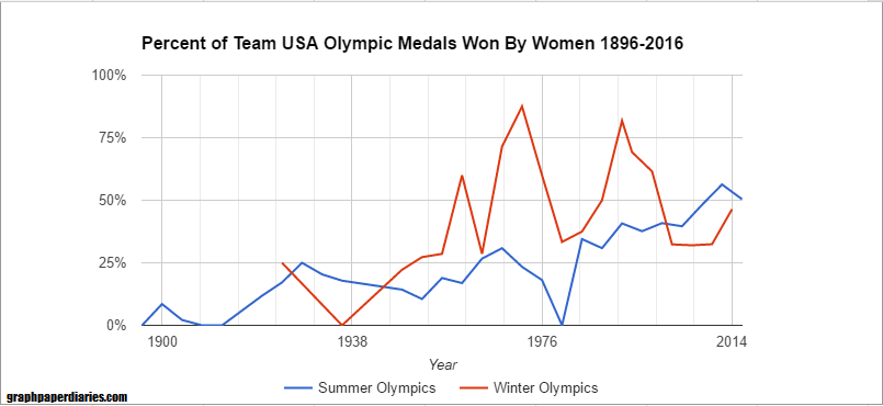
First, how has the percent of Team USA medals won by women changed over time?
Each of the lines is 8 years, if you’re trying to orient yourself. For the youngsters, the dip in 1980 is because we boycotted that year. As you can see though, the percentage has gone steadily up.
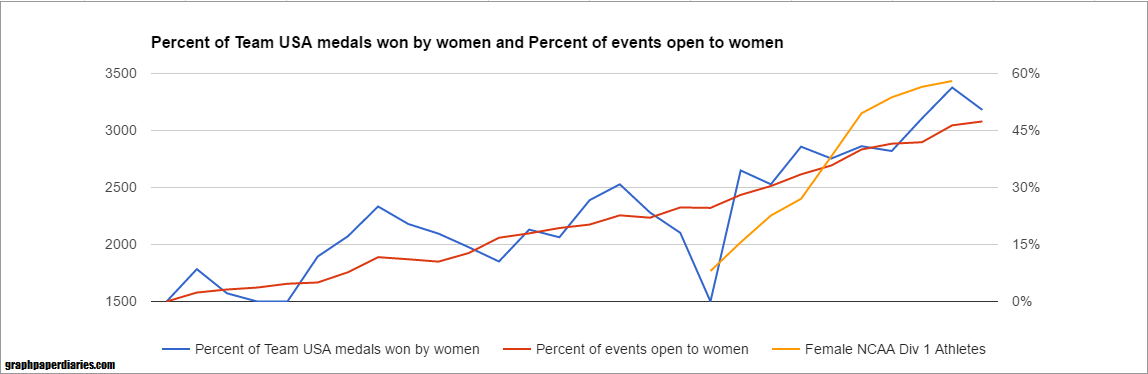
But what was the driver of this? The initial asker suggested the driver was Title IX, but I wondered if it might be more closely correlated with the expansion of women’s events. Of course neither of these would be entirely independently causal….we know the social forces that drove one likely drove the other. Anyway, here’s how the percentage of medals available to women varied with the percentage of medals won by women on Team USA for the Summer Olympics:
And winter:
The winter medals variability is almost all because of the low medal counts. The two years they were high were actually not very high medal count years (5 and 9), but basically the men only got 2. I ran a quick regression and the r-squared for the Summer Olympics is around .75, and the Winter about .4.
For juxtaposition, here’s the number of female NCAA Div 1 athletes superimposed on a different scale:
I’m not going to do the overall regression because correcting for the multicollinearity (aka, a regression with two factors that are correlated) can be a bit of a hassle, but I’m guessing it’s the expansion of events driving the medal count more than the number of D1 female athletes. However, it may be the increased number of athletes allowed the US to immediately take advantage of every expansion in medal events. Additionally having more talented female athletes probably incentivized the IOC to add more events.
Confusing correlation, but a great question!
The Team USA Medal Count came from here. The count for female athletes came from here. The number of events came from here for winter and here for summer. The number of events available to women is here. NCAA athlete counts are here.
This post comes from a reader question I got asking for my opinion on the Body Mass Index (BMI). Quick intro for the unfamiliar: the BMI is a calculated value that related your height and weight. It takes your weight (in kilograms) and divides it by your height (in meters) squared. For those of you in the US, that’s weight (in pounds) times 703, divided by height (in inches) squared. Automatic calculator here. A BMI score of less than 18.5 is considered underweight, 18.5-24.9 is normal, 25-29.9 is overweight, and >30 is obese. So what’s the deal with this thing?
It was developed for use in population health, and it’s been around longer than you might think. The BMI was invented by Adolphe Quetlet in between 1830 and 1850. He was a statistician who needed an easy way of comparing population weights that actually took height in to account. Now this makes a lot of sense….height is more strongly correlated with weight than any other variable. In fact as a species we’re about 4 inches taller than we were when the BMI was invented. Anyway, it was given the name “Body Mass Index” by Ancel Keys in 1972. Keys was conducting research on the relative obesity of different populations throughout the world, and was sorting through all the various equations that related height and weight and how they correlated with measured body fat percentage. He determined this was the best, though his comparisons did not include women, children or those over 65, or non-Caucasians.
Being outside the normal range means more than being inside of it. So if Keys was looking for something that correlated to body fat percent, how does the BMI do? Well, a 2010 study found that the correlation is about r = .66 for men and r=.84 for women. However, the researchers also looked at it’s usefulness as a screening test….how often did it accurately sort people in to “high body fat” or “not-high body fat”? Well, for those with BMIs greater than 30, the positive predictive value is better than the negative predictive value. So basically, if you know you have a BMI over 30, you are also likely to have excess body fat (87% of men, 99% of women). However, if you have a BMI of under 30, about 40% of men and 46% of women still had excess body fat. If you move the line down to a BMI of 25, some gender differences show up: 69% of men with BMIs over 25 actually have excess body fat, compared to 90% of women. This means a full 30% of “overweight” males are actually fine. About 20% of both genders with BMIs under 25 actually have excess body fat. So basically if you’re above 30, you almost certainly have excess body fat, but being below that line doesn’t necessarily let you off the hook.
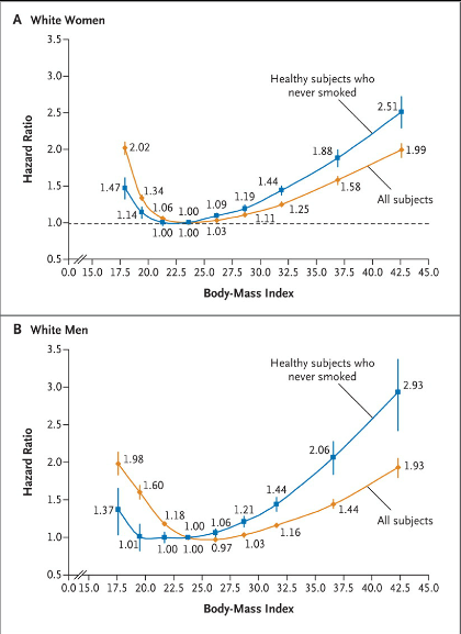
Overall it’s a pretty well correlated with early mortality. So with all the inaccuracies, why do we use it? Well, this is why: That graph is from this 2010 paper that looked at 1.46 million white adults in the US. The hazard ratio is for their all cause mortality at the ten year mark (median start age was 58). Particularly for the higher numbers, that’s a pretty big difference. To note: some other observational studies have had a slightly different shaped curve, especially at the lower end (25-30 BMI) that suggested an “obesity paradox”. More recent studies haven’t found this, and there’s some controversy about how to correctly interpret these studies. The short version is that correlation isn’t causation, and we don’t know if losing weight helps with these numbers.
For individuals on the borderline, you need another metric Back to individuals though….should you take your BMI seriously? Well maybe. It’s pretty clear if you’re getting a number over 30 you probably should. There’s always the “super muscled athlete” exception, but you pretty much would know if that were you. If you need another quick metric to assess disease risk though, it looks like using a combination of waist circumference and BMI may yield a better picture of health than BMI alone, especially for men. Here’s the suggested action range from that paper:While waist circumference is obviously not something that most people know off the top of their head, it should be easy enough for doctors to take in an office visit.
Overall, it’s important to remember that metrics like the BMI or waist circumference are really just screening tests and you get what you pay for. While we hope they catch most people who are at high risk, there will always be false positives and false negatives. While in population studies these may balance each other out, for any individual it’s important to take a look at all the various factors that go in to health. So, um, talk to your doctor and avoid over-interpretation.
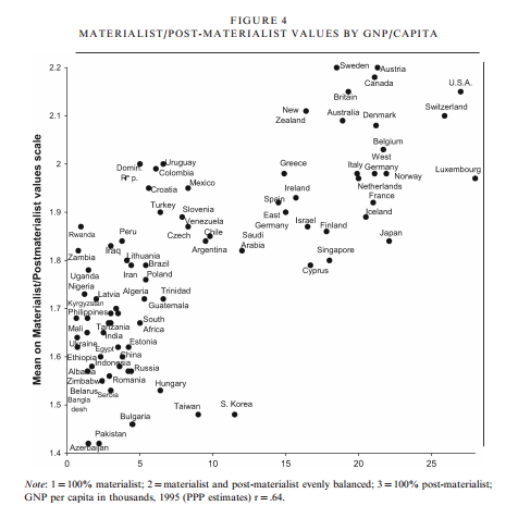
I got an interesting question from the Assistant Village Idiot recently, pointing me to this blog post1 on materialism and post-materialism in various countries by year, wealth of nation, wealth of individual, age and education level of respondent. It’s an interesting compilation of graphs and research that seem to show us, as a world, moving from a materialistic mindset, to a post-materialistic mindset. So what does that mean and what’s my take?
First, some definitions.
Up front the definitions are given as follows:
Materialist: mostly concerned with material needs and physical and economic security Post-materialist: strive for self-actualization, stress the aesthetic and the intellectual, and cherish belonging and esteem
What interested me is that if you go all the way to the end, you find that the question used to categorize people was actually a little more specific. They asked people the following question:
“If you had to choose among the following things, which are the two that seem most desirable to you?”
Maintaining order in the nation. (Materialist)
Giving the people more say in important political decisions. (Post-materialist)
Fighting rising prices. (Materialist)
Protecting freedom of speech. (Post-materialist)
People then receive a score between 1 and 3. If you pick both materialist options (#1 and #3), you get a score of 1. If you pick both post-materialist options (#2 and #4), you get a score 3. If you pick one of each, you get a score of 2.
Every country in the world scores (on average) between a 1.4 and a 2.2. There were also graphs that showed that higher class people moved toward post-materialist mindset, and that the world as a whole has been moving towards it over the years.
I do think it’s worth noting that only about 8 countries score over a 2, with a few more on the line. On the whole, more countries skew materialist than post-materialist on this scale…..though the 8 that are higher are all fairly high on the development index.
So what does this mean?
Well, it seems to be a matter of focus. In my opinion, these questions seem to serve as a proxy for current concerns as much as actual preferences. For example, I did not rank “fighting rising prices” very high, but I also live in a country that has only slow inflation for most of my life. Essentially, this appears to be a sort of political Maslow’s hierarchy of needs. It’s most likely not that people don’t care about safety or price stability, but rather they don’t prioritize it if they already have it. Additionally, I would suspect that many people would argue that they like free speech because it maintains order in a country, as opposed to actually desiring free speech over order.
Most of the data comes from one particular researcher, Ronald Inglehart, who focuses on changing values and theorizing what impact that might have on society. Inglehart is not particularly hypothesizing that being post-materialist is bad, but rather that it represents a departure from the way most people have lived for thousands of years. Because it appears our values slant is set earlier in life, he proposes that those of us growing up in relative safety and security will always bias towards a post-materialist focus. He researches what effect that may have on society.
While some of this may seem obvious, he brings up a couple related outcomes that were fairly subtle. For instance, he points out in this paper that we have seen a reduction in voting stratified by social class, and an increase in voting stratified around social issues. This suggests that even a very basic level of security like the type provided by our welfare systems allows people more time to focus on their values and ideals. It varied by country, but in the US there was almost NO difference in materialist/post-materialist values by education class.
This was an interesting point, because I think many people are troubled by how contentious some of our social issue debates have gotten (abortion, women’s rights, the environmental movement, etc) have all gotten. The idea that these issues are now more contentious because more people are devoting more thought to them is intriguing. Additionally, it seems that there would be less national agreement on those types of issues in comparison to safety and security issues. If your country is under attack, there is no debate about defending yourself. We may debate the method, but the outcome is widely agreed upon. With social issues that’s not true. What effect this will have on country level stability is unknown.
Interesting stuff to keep an eye on going forward, and keep in mind this election season.
“Medical Errors are No. 3 Cause of US Deaths“. As someone who has spent her entire career working in hospitals, I was interested to see this headline a few weeks ago. I was intrigued by the data, but a little skeptical. Not only have I seen a lot of patient deaths, but it seems relatively rare in my day-to-day life that I see someone reference a death by medical error. However, according to Makary et al in the BMJ this month, it happens over 250,000 times a year.
Since the report came out, two of my favorite websites (Science Based Medicine and Health News Review ) have come out with some critiques of the study. The pieces are both excellent and long, so I thought I’d go over some highlights:
This study is actually a review, combined with some mathematical modeling. Though reported as a study in the press, this was actually an extrapolation based off of 4 earlier studies from 1999, 2002, 2004 and 2010. I don’t have access to the full paper, but according to the Skeptical Scalpel, the underlying papers found 35 preventable deaths. It’s that number that got extrapolated out to 250,000.
No one needs to have made an error for something to be called an error. When you hear the word “error” you typically think of someone needing to do “x” but instead doing “y” or doing nothing at all. All 4 studies used in the Makary analysis had a different definition of “error”, and it wasn’t always that straightforward and required a lot of judgment calls to classify. Errors were essentially defined as “preventable adverse events”, even in cases where no one could say how you would have prevented it. For example, in one study serious post-surgical hemorrhaging was always considered an error, even when there was no error identified. Essentially some conditions were assumed to ALWAYS be caused by an error, even if they were a known risk of the procedure. That definition wasn’t even the most liberal one used by the way….at least one of the studies called ALL “adverse events” during care preventable. That’s pretty broad.
Some of the samples were skewed. The largest paper included actually looked exclusively at Medicare recipients (aka those over 65), and at least according to the Science Based Medicine review, it doesn’t seem they controlled for the age issue when extrapolating for the country as a whole. The numbers ultimately suggest that 1/3 of all deaths occurring in a hospital are due to error…..which seems a bit high.
Prior health status isn’t known or reported. One of the primary complaints of the authors of the study is that “medical error” isn’t counted in official cause of death statistics, only the underlying condition. This means that someone seeking treatment for cancer they weren’t otherwise going to die from who dies of a medical error gets counted as a cancer death. On the other hand, this means that someone who was about to die of cancer but also has a medical error gets counted as a cancer death. Since sick people receive far more treatment, we do know most of these errors are happening to already sick people. Really the ideal metric here would be “years of life lost” to help control for people who were severely ill prior to the error.
Over-reporting of medical errors isn’t entirely benign. A significant amount of my job is focused on improving the quality of what we do. I am always grateful when people point out that errors happen in medicine, and draw attention to the problem. On the other hand, there is some concern that stories like this could leave your average person with the impression that avoiding hospitals is safer than actually seeking care. This isn’t true. One of the reasons we have so many medical errors in this country is because medicine can actually do a lot for you. It’s not perfect by any means, but the more options we have and the longer we keep people alive using medicine, the more likely it is that someone administering that care is going to screw up. In many cases, delaying or avoiding care will kill you a heck of a lot faster even the most egregiously sloppy health care provider.
Again, none of this is to say that errors aren’t a big deal. No matter how you define them, we should always be working to reduce them. However, as with all data, it’s good to know exactly what we’re looking at here.
Recently I had a discussion with a friend from childhood who is now a teacher. She had liked my “Intro to Internet Science” series, and we were discussing the possibility of me coming and chatting with her AP chemistry class about it. We were discussing time frames, and she mentioned it might be best to come in April when the kids started writing their thesis. “Every year they get upset I won’t let them use blog posts instead of peer-reviewed journal articles.” she said.
Oh boy. As a long time blogger who likes to think she’s doing her part to elevate the discourse, let me say this clearly: NEVER CITE A BLOG POST AS A PRIMARY SOURCE. Not even mine. Here’s why:
Anybody can be a blogger. One of the best things about blogging is that it’s an incredibly easy field to enter. It takes less than 15 minutes to set up a blogger or WordPress account and get started. It takes about $20 to register a custom domain name. This is awesome because you can hear lots of voices on lots of topic you wouldn’t have otherwise had access too. This is also terrible because there are lots of voices on lots of topics you wouldn’t have otherwise had to deal with.
Nothing stops people from fabricating credentials, using misleading titles or just flat out making stuff up. Don’t believe me? Health and wellness blogger Belle Gibson built an enormous empire based on her “I cured my cancer through whole foods” schtick…..only to have it revealed she never had cancer and had no idea what she was talking about.
Peer review isn’t perfect, but any deception perpetrated in published papers will have taken a huge amount of time to pull off. Simply out of laziness, that means there will be less outright fraud (although it does still happen).
No one checks bloggers before we hit publish. Like many bloggers, I do most of my blogging late at night, early in the morning or on weekends. I have a full time job, a husband, a child, and I take classes. I’m tired a lot. Despite my best intentions, sometimes I say things poorly, let my biases slip in, or just do my math wrong1. I happen to have smart commenters who call me out, but it’s plausible even they miss something.
I try to adhere to a general blogger code of conduct and provide sources/update mistakes/be clear on my biases when I can, but I will not always be perfect. No one will be. With peer-reviewed papers, you know MANY people looked at the papers before they went to press. Doesn’t make them perfect, but it does mean they’ll far less likely to contain glaring errors before publication.
Blog posts can mislead. While many bloggers are driven by nothing more than a desire to share their thoughts with the world, many are doing it for money or other motivations. Assuming that blog posts are actually marketing tools until they prove otherwise. I wrote a whole 10 part series on this here, but suffice it to say there are many ways blog posts can deceive you or make things sound more convincing than they are.
Science changes, but the internet is forever. Even if you find a good solid blog post from a thoughtful person who cited sources and knew what they were talking about, you’re still not out of the woods. The longer the internet sticks around, the more things will outdate or need updating, even if they were right at the time the author wrote them. I’ve started a series where I go back to posts I wrote back in 2012/2013 and update them with new developments, but nothing will stop Google from pulling them up in search results as is.
Using blog posts robs you of a good chance to learn how to read scientific papers. Reading scientific papers is a bit of an art form, and it takes practice. Learning how to find critical information, how to figure out what was done well (or not at all!), and doing more than just reading the press release can take some practice. Everyone has a slightly different strategy, and you’re not going to find the one that works for you unless you read a lot of them. If you’re still at the point in your life where you have external motivations to read papers (like, say, a teacher requesting that you do it), take advantage of that. It’s a skill you’ll value later, one of those “you’ll thank my when you’re older” things.
In conclusion: One of my favorite blog taglines ever is from Scott Greenfield’s Simple Justice blog “Nothing in this blog constitutes legal advice. This is free. Legal advice you have to pay for.” Same goes for science blogging. If it’s free, you get what you pay for.
1. I’m actually perfect, but I figured I’d throw the hypothetical out there.↩
A reader named Doug has sent me a couple of awesome articles about p-values (thanks Doug!) and why we should regard them with suspicion. As often happens with these things, I subsequently tried to explain to someone unfamiliar with stats/math why this is such an interesting topic that everyone should be aware of and realized I needed a whole blog post.
While most people outside of research/stats circles won’t ever understand the math part of a p-value calculation, it’s actually a pretty important concept for anyone who wants to know what researchers are up to. Thus, allow me to go all statsplainer on you to get you up to speed.
Okay, so why are you anthropomorphizing p-values and accusing people of being mad at them?
P-values and the calculation thereof are a pretty fundamental part of most basic statistics courses, so to see a large group of statisticians push back against their use is a bit of a surprise.
Gotcha. So the people who taught us to use them in the first place are now telling us to watch out for them. Fantastic.
Yeah, they kind of acknowledge that. Their paper on the issue actually starts with this joke:
Q: Why do so many colleges and grad schools teach p=0.05 A: Because that’s still what the scientific community and journal editors use
Q: Why do so many people still use p=0.05 A: Because that’s what they were taught in grad school
That’s a terrible joke. I’m not even sure I get it.
Yeah, statistical humor tends to appeal to a limited audience. What it’s trying to point out though is that we’ve gotten ourselves in to a difficult spot by teaching “what everyone does” and then producing a group of people who only know how to do what they were taught.
Okay, that makes sense I guess…but what does the whole p=0.05 thing even mean?
Well, when you’re doing research, at some point or another you’ll want to do something called “hypothesis testing”. This is the basis of most published studies you hear about. You set up two opposing sides, formally called the null and alternative hypothesis, and then you figure out if you have the evidence to support one or the other.
The null hypothesis H0, is typically the theory that nothing interesting is happening. Two groups are equal, there’s no change in behavior, etc etc.
The alternative hypothesis Ha, is typically the theory you REALLY want to be true…at least in terms of your academic career. This would mean that something interesting is occurring: two groups are different, there’s a change in behavior, etc etc.
Okay, I’m with you so far…keep going.
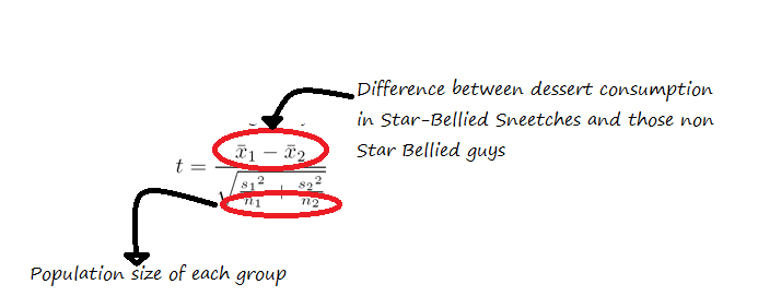
This next step can work differently depending on the experiment/sample size/lots of other details, but lets say we’re comparing Star Bellied Sneetches to those without stars on their bellies and seeing if the groups eat a different amount of dessert. After we calculated the average dessert eaten by both groups, we would calculate something called a t statistic using this equation.
Once we have that value, we take the amusingly old school step of pulling out a table that looks like this, and then finding the value we want to compare our value to.
Okay, so how do we figure out where on this table we’re looking?
Well, the degrees of freedom part is another whole calculation I threw in just to be annoying, but the other part is your α, or alpha. Alpha is what we’re really referencing when we say p=0.05….we set our significance level (or alpha) at .05, so now that’s what we’re aiming for. If the value we calculated using that equation up there is larger than the value the table gives, then it’s considered a finding significant at the level of alpha.
I think I lost you.
That’s fine. Most stats software will actually do this for you, and spit out a nice little p-value to boot. Your only decision is whether or not the value is acceptable. The most commonly used “significant” value is p < .05.
Okay, how’d we pick that number?
Arbitrarily.
No really.
No, that’s really it. This is why that joke up there was funny. After all the fancy technical math, we compare it to a value that’s basically used because everyone uses it. Sometimes people will use .1 or .01 if they’re feeling frisky, but .05 is king. There’s even an XKCD comic about it:
In theory, the p-value should mean “the chances we’d see an effect larger the one we are seeing if the null hypothesis was true”, but the more people aspire to the .05 level, the less accurate that becomes.
Why’s that?
Well, a couple reasons. First, the .05 value will always mean that 1 out of 20 p-values could be due to chance. For some studies that gather a lot of data points, this means they will almost always be able to get a significant finding.
This tactic was used by the journalist who published an intentionally fake “chocolate helps you lose weight” study last year. He did a real study, but collected 18 different measures on people who were eating chocolate, knowing that chances were good that he would get a significant result on one of them. Weight loss ended up being the significant result, so he led with that just downplayed the other ones. Other researchers just throw the non-significant effects in the drawer.
There’s also the issue of definitions. It can be really hard to grasp what a p-value is, and even some stats text books end up saying wrong or misleading definitions. This paper gives a really good overview of some of the myths, but suffice it to say the p-value is not “the chance the null hypothesis is true”.
Okay, so I think I get it. But why did the American Statistical Society speak out now? What got them upset?
Yeah, let’s get back to them. Well as they said in their paper, the problem is not that no one has warned about this previously, it’s that they keep seeing the issue. Their exact words:
Let’s be clear. Nothing in the ASA statement is new. Statisticians and others have been sounding the alarm about these matters for decades, to little avail. We hoped that a statement from the world’s largest professional association of statisticians would open a fresh discussion and draw renewed and vigorous attention to changing the practice of science with regards to the use of statistical inference.
As replication crises have rocked various fields, statisticians have decided to speak out. Fundamentally, p-values are really supposed to be like the SAT: a standardized way of comparing findings across fields. In practice they can have a lot of flaws, and that’s what the ASA guidance wanted to point out. Their paper essentially spelled out their view of the problem and proposed 6 guidelines for p-value use going forward.
And what were those?
P-values can indicate how incompatible the data are with a specified statistical model.
P-values do not measure the probability that the studied hypothesis is true, or the probability that the data were produced by random chance alone.
Scientific conclusions and business or policy decisions should not be based only on whether a p-value passes a specific threshold.
Proper inference requires full reporting and transparency
A p-value, or statistical significance, does not measure the size of an effect or the importance of a result.
By itself, a p-value does not provide a good measure of evidence regarding a model or hypothesis.
They provide more explanation in the paper, but basically what they’re saying is what I was trying to get across above: p-values are useful if you’re being honest about what you’re using them for. They don’t tell you if your experimental set up was good, if your explanation for your data is reasonable, and they don’t guard against selection bias very well at all. The number “.05” is good but arbitrary, and the whole thing is a probability game, not a clear “true/false” line.
Okay, I think I get it….but should statisticians really be picking on other fields like this?
That’s a good point, and I’d like to address it. Psychologists don’t typically walk in to stats conferences and criticize them, so why do statisticians get to criticize everyone else? Andrew Gelman probably explains this best. He was one of the authors on the ASA paper, and he’s a baseball fan. In a post a few months ago, he said this:
Believing a theory is correct because someone reported p less than .05 in a Psychological Science paper is like believing that a player belongs in the Hall of Fame because hit .300 once in Fenway Park.
This is not a perfect analogy. Hitting .300 anywhere is a great accomplishment, whereas “p less than .05” can easily represent nothing more than an impressive talent for self-delusion. But I’m just trying to get at the point that ultimately it is statistical summaries and statistical models that are being used to make strong (and statistical ridiculous) claims about reality, hence statistical criticisms, and external data such as come from replications, are relevant.
As Bill James is quoted as saying, “the alternative to good statistics isn’t no statistics…it’s bad statistics.”
Got a question you’d like an unnecessarily long answer to? Ask it here!
 Since some religions tend to show large disparities along racial lines (such as Catholicism), race is included. White evangelical Christian was added as its own affiliation after the 2000 election, when those voters were given credit for putting Bush in office. Mormonism has not been consistently tracked, which is why the 2008 data is missing.