What’s a Normal Winter Anyway? (Boston Edition)

Mid-March is here, and all of Boston is breathing a sigh of relief that this winter was more “normal” than last winter. Last winter was completely record breaking in terms of snow, and we all have a bit of a hangover from it. I was discussing this with a few people at work, and we started to wonder what “normal” really looks like for this area. Obviously this meant I needed a graph!  I wanted to check out what the snow curve normally looks like for each winter, and I found some decent looking data here.  A few notes:

  1. The data is almost 100 years worth….1920 through 2016
  2. After 1936, measurements are from Boston Logan Airport. Apparently that’s when the weather station opened there. I’m not completely sure where they came from prior to that, but presumably it was somewhere in the area.
  3. For all data, the year means “season ending in”. So my 2016 totals include November and December of 2015.
  4. I only looked at November-April.  October and May have both had snow, but the snow that fell in those months has never gone over 1.5 inches for any season.

Okay, so what’s normal?  First I took a look by month. The blue box represents the middle two quartiles, or where half of all years fall. The lines on either end are the top/bottom 25% of years:

Snowbymonth

So it appears January and February are approximately equal for most years, but February can pack a bigger punch.

But let’s just look at averages for the months, then see where last year and this year fall:

Recentyearsvsaverages

Interesting. This shows that this year we actually had a slightly above average February, we just didn’t notice because last year was insane.

Okay, but what about total snowfall? Where are we so far?

Well, since 1920, here’s what it takes to make each quartile:

Min 8 inches
25% of winters < 28 inches
Median < 39 inches
75% of winters < 53 inches
Maximum 112 inches

As it stands right now, Boston has gotten about 25 inches of snow so far this winter. That puts us in the lowest quartile for snowfall. We’re not quite the least snowy winter in recent memory (2012, 2007 and 2002 all had less snow), but we’re certainly on the lower end. Only 18 years (since 1920)

So basically we have a year with legitimately low snow totals that was preceeded by a year with outrageous snow totals.Kind of explains the whiplash.

But where are we on the whiplash scale? Is this the biggest year to year change in snow totals ever?

Well, we hit a record for that this year for sure. An 87 inch difference in snowfall totals for consecutive years is pretty record breaking.  Interestingly though, there were two streaks I found that actually gave people whiplash for 4 years in a row. The  1994-1997 run, where the snow totals swung up to almost 100 inches for two winters (1994 and 1996) and then hit low totals on the alternating years (16 inches and 30 inches in 1995 and 1997, respectively).  2002-2006 was similar, though less dramatic.  In order to compete, 2017 will have to hit 90 inches or more of snow.

Don’t do that 2017, don’t do that.

How Do They Call Elections so Early?

I live in Massachusetts now, but for the first 18 or so years of my life I lived in New Hampshire. I still have most of my family and many friends there, so every 4 years around primary time my Facebook feed turns in to a front row seat for the “first in the nation primary” show1.  This year the primary was on Tuesday February 9th, and it promised to be an interesting time as both parties have unexpected races going on. I was interested in the results of the primary, but since I tend to go to bed early, was unsure I’d stay up late enough to see it through. Thus like many others, I was completely surprised to see CNN had called the race around 8:30 for Trump and Sanders with  only 8% of the votes counted. By 8:45 I had a message in my inbox from a NH family member/Sanders supporter saying “okay, how’d they do that????”.

It’s a great question and one I was interested to learn more about. It turns out most networks keep their exact strategies secret, but I figured I’d take a look at the most likely general approach. I start with some background math stuff, but I include pictures!

Okay, first things first, what information do we need?

Whenever you’re doing any sort of polling (including voting), there are a couple things you need to think through.  These are:

  1. What your population size is
  2. How confident you want to be in your guess (confidence level)
  3. How close you want your guess to be to reality  (margin of error)
  4. If you have any idea what the real value is
  5. Sampling bias risk

#1 is pretty easy here. About 250,000 voters voted in the Democrat primary, and 280,000 voted in the Republican primary. This doesn’t matter much when it’s this large.

#2 Confidence is up to the individual network, but they’re almost ubiquitously pretty conservative. They’re skittish here because every journalist to ever pick up a pen has seen this image and lives in fear of it:
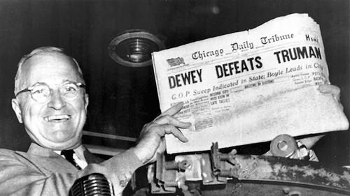
If you’re missing the reference Wikipedia’s got your back, but suffice it to say networks live in fear of a missed call.

#3 is how close you want to be to reality. We’ll come back to this, but basically it’s how much you need your answer to look like the real answer. When polls say “the margin of error is +/- 3 percentage points”, this is what they’re saying.  If you look at this diagram:

Margin of error is basically how close those x’s need to be to the target, confidence interval (#2) is how close you need them to be to each other.

#4 is whether or not you’re working from scratch or you have a guess. Basically, do you know ahead of time what percent of people might be voting for a candidate or are you going in blind?

#5 is all the other messy stuff that has nothing to do with math.

Okay, so what do we do with this?

Well factors 1-4 all end up in this equation:

MEeq

So basically what that’s saying is that the more confident and precise you need to be, the more people you need to poll. Additionally, the larger the gap between your “percent saying yes” and “percent saying something else”, the fewer people you need before you can make a call. A landslide result may be bad for your candidate, but great for predictions.

Okay, thanks for the math lesson. Now what?

Now things get dirty. What I showed you above is basically how we’d do an estimate for each of the candidates, putting in their prior polling numbers for p one at a time. What about the other numbers though? We know we have to set our confidence high so we’re not embarrassed, but what about our margin of error?  Well here’s where all those phone calls you get prior to the election help.

Going in to voting day, the pollsters had Trump in the lead at 31%, with his next closest rival at 14%. This 17 point lead means we can set our margin of error pretty wide. After all, CNN doesn’t have to know what percent of the vote Trump got as much as it needs to know that someone is really unlikely to beat him. If you split it down the middle, you get a margin of error of 8. Their count could be off by that much and still only lower Trump to 23% of the vote and raise his opponent to 22%. However, that assumes all of his error would go to his closest opponent. With so many others in the race that’s unlikely to happen, so they could probably go with +/- 10.

For the Democrats, I found the prior polls showed Sanders leading 54% to Hillary’s 41%. Splitting that difference you could go about +/- 6.

In a perfect world this means we’d need about 160 random votes to predict Trumps win and about 460 to predict Sanders win at the 99% confidence level.

Whoa that’s it? Why’d they wait so long then?

Well, remember #5 up there? That’s the killer. All those pretty equations I just showed you only work if you get a random sample, and that’s really hard to come by in a situation like this. Even in a small state like New Hampshire you will have geographic differences in the types of candidates people like.  This post from smartblogs had a map shows some of the differences:

So as precincts report, we know there’s likely some bias to those numbers. If the 8% of the votes you’ve counted are from throughout the state, you have a lot more information than if those 8% are just from Manchester or Nashua. Because of this most networks have eschewed strict stats limits like that one I did above in favor of slightly messier rules.

So why’d you tell us all that other stuff?

Because frequentist probability theory is great and you should know more about it. Also, those are still the steps that underlie everything else the networks do. As we discussed above, the size of the leads made the initial/perfect world required number quite small.  To highlight this, watch what would happen to that base number of votes needed as we close the margin of error:
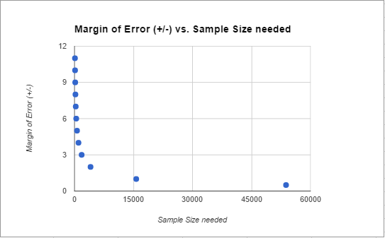
Samplesize

Anything lead closer than about +/- 4 (or about an 8 point difference) gets increasingly more difficult to call. If you’re over that though, you can act a little faster. In this case, both leads were bigger than that from the get go.

To hedge their bets against bias, the networks likely produce some models of the state based on past elections, polling, exit polls and demographic shifts, call the election the day before, then spend election night validating their models/predictions. Bayesian inference would come in handy here, as the networks could rapidly update their guesses with new information. So they’re not really calculating “what is the probability that Trump is winning” they’re calculating “given that the polls said Trump was winning, what are the chances he is also winning now”.  That sounds like semantics, but it can actually make a huge difference. If they saw anything unusual happening or any conflicting information, they could delay (justifying a few veteran election watchers hanging out to pick up on this stuff), but in this case all their information sources were agreeing.

As the night went on, it became apparent that Trump and Sanders were actually out performing the pre-election polls, so this probably increased the network’s confidence rapidly. In pre-election polls, the most worrying thing is non-response bias. You get concerned that those answering the polls are not the same as those who are going to vote. Voting results eliminate this bias….in a democracy we only count the opinions of those who show up at the polls. So if you get two different types of samples with different error sources saying the same things, you increase your confidence.

Overall, I don’t totally know all the particulars about how the networks do it, but they almost certainly use some of the methods above in addition to some gut reactions. With today’s computing power, they could be individually computing probabilities for every precinct or have very advanced models to predict which areas that were most likely to go rogue. It’s worth noting that the second place Clinton and Kasich won very few individual districts, so this strategy would have produced results quickly as well.

So there you have it. The more accurate the prior polling, the greater the gap between candidates, the more regions reporting at least some of their votes, and the less inter-region variability, the faster the call. An hour and a half after the polls close seems speedy until you consider that statistically they probably could have called it accurately after the first 1% came in. No matter how mathematically backed however, that definitely would have gotten them the same level of love that my over-zealous-in-class-question-answering habits got me in middle school. They had to be quick, but not too quick. My guess is that last half hour was more a debate over the respectability of calling so soon rather than the math. Life’s annoying like that some times.

Got a stats question? Send it in here!

Updated to add: Based on a Facebook conversation about this post, I thought I should add that if the race is REALLY close, the margin of error with the vote counting itself starts to come in to play. Typically things like absentee ballots aren’t even counted if it won’t make a difference, but in very close races when every ballot matters, which ballots are valid becomes a big deal. The weirdest example of this I know of is the Al Franken/Minnesota senate seat election from 2008. It took 8 months to resolve which votes were valid and get someone sworn in.

1. This is the quadrennial tradition where New Hampshire acts like a hot girl in a bar who totally hates the fact that she’s getting so much attention yet never seems to want to leave.

Immigration, Poverty and Gumballs

A long time reader (hi David!) forwarded this video and asked what I thought of it:

It’s pretty short, but if you don’t feel like watching it, essentially it’s a video put out by a group attempting to address whether or not immigration to the US can reduce global poverty.  He uses gumballs to represent the population of people in the world living in poverty (one gumball = one million people), and ultimately concludes that immigration will not solves global poverty.

Now, I’m not the most educated of people when it comes to immigration issues, but I was intrigued by his math based demonstration. At one point he even has gumballs fall all over the floor, which drives home exactly how screwed we are when it comes to fixing global poverty. But do I buy it? Are the underlying facts correct? Is this a good video? Well, lets take a look:

First, some context: Context is frequently missing on Facebook, and it can be useful to know the background of what you’re seeing when there’s a video like this.  I did some digging, so here goes:  The man in the video is Roy Beck, who founded a group called Numbers USA, website here. Their tag line is “for lower immigration levels”, and unsurprisingly, that’s what they want.  The video, and presumably the numbers in it, are from 2010.  I thought the name NumbersUSA sounded ambitious, but I did find they have an “Accuracy Guarantee” on their FAQ page promising they would take down any inaccurate numbers or information. I don’t know if they do it (and they have not responded to my complaint yet), but that was cool to see.

Now, the argument:  To start the video, Mr Beck lays out his argument by quantifying the number of desperately poor people in the world. He clarifies that “desperately poor” is defined by the World Bank standard of “making less than two dollars a day”. He begins to name the number of desperately poor people in various regions of the world, and stacks gumballs to represent all of these regions. The number is heartbreakingly high and it worsens as he continues….but when his conclusion came to about half the globe (3 billion people or 8 larger containers of gumballs) living at that level, I was skeptical. I’ve done some reading on extreme poverty, and I didn’t think it was that high. Well, it turns out it isn’t. It’s actually about 12.7% or 890 million. That’s only about 30% of the number he presents….maybe about 3 containers of gumballs instead of 8.

Given that that the video was older (and that extreme world poverty has been declining since the 1980s) I was trying to figure out what happened, so I went to this nifty visualization tool the World Bank provides. You can set the poverty level (less than $1.90/day or less than $3.10/day) and you can filter by country or region.  Not one of the numbers given is accurate. They haven’t even been accurate recently, as far as I can tell. For example, in 2010, China had 150 million people living on under $2/day.  In the video, he says 480 million, where China was in the year 2000 or so.  For India, he uses 890 million, a number I can’t find ever published by the World Bank.  The highest number they list for India at all is 430 million. The best I can conclude is that the numbers he shows here are actually those living under the $3.10/day level, which seem closer. Now $3.10/day is not rich by any means, but it’s not what he asserted either. He emphasizes the “less than 2 dollars a day” point multiple times.  At that point I figured I wasn’t going to check out the rest of the numbers….if the baseline isn’t accurate, anything he adds to it won’t be either. [Edit: It’s been pointed out to me that at the 2:04 mark he changes from using the $2/day standard to “poorer than Mexico”, so it’s possible the numbers after that timepoint do actually work better than I thought they would. It’s hard to tell without him giving a firm number. For reference, it looks like in 2016 the average income in Mexico is $12,800/year .]  It was at this point I decided to email the accuracy check on his website to ask for clarification, and will update if I hear back. I am truly interested in what happened here, because I did find a few websites that gave similar numbers to his….but they all cite the World Bank and all the links are now broken. The World Bank itself does not appear to currently stand by those statistics.

So did this matter? Well, yes and no. His basic argument is that we have 5.6 billion poor people. That grows every year by 80 million people each year. Subtract out 1 million immigrants to the US each year, and you’re not making a difference.  Even if those numbers are wildly different from what’s presented, the fundamental “1 million immigrants doesn’t make much of a dent in world poverty” probably stands.

But is that the question?

On the one hand, I’ll grant that it’s possible “some people say that mass immigration in to the United States can help reduce world poverty”, as he says to open his video. I do not engage much in immigration debates, but I wasn’t entirely sure that “reduce world poverty” was the primary argument. NumbersUSA puts out quite a few videos on many different topics, so it’s interesting that this one appears to be their most viral.  It currently has almost 3 million views, and most of their other videos don’t have even 1% of that. Given that “solve world poverty” is not one of the stated goals or arguments of the immigration organizations I could find, why was this so shared? I did find some evidence that people argue about immigrants sending money back to their home countries helping poverty, but that is not really addressed in this video. So why did so many people want to debunk an argument that is not the primary one being made?

My guess is the pretty demonstration. I covered in this post about graphs and technical pictures, that these sorts of additions seem to make us think an argument is more powerful than we would have otherwise. In this case, it seems a well demonstrated about magnitude and subtraction is trumping most people’s realizations that this is not arguing a point that is commonly made.

Now if the numbers aren’t accurate, that’s even more irritating (his demonstration would not have looked quite as good if it had 3 containers at the start instead of 8), but I’m not sure that’s really the point. These videos work in two ways, both by making an argument that will irritate people who disagree with you, and by convincing those who agree with you that you’ve answered the challenges you’ve gotten. It’s a classic example of a straw man…setting up an argument you can knock down easily. My suspicion is when you do it with math and a colorful demonstration, it convinces people even more. Not the fault so much of the video maker, as that of the consumer.  While it’s possible Mr Beck will reply to me and clarify his numbers with a better source, it looks unlikely. Caveat emptor.

Got a question/meme/thing you want explained or investigated? I’m on it! Submit them here.

New Feature: Reader Questions

I’m starting a new feature here that I’ve been doing informally for a while now: reader questions. While I like to amuse myself with my stats based/personal life advice column, I get far more requests for feedback on random things readers come across and want someone to weigh in on.  So….if you have a question, see something irritating on Facebook, or just generally want someone to take a look at the numbers, get in touch here.