Welcome to “From the Archives”, where I dig up old posts and see what’s changed in the years since I originally wrote them.
A few years ago after the now infamous James D’Amore/Google memo incident, I decided to write a post about one of the most famous “unconscious sexism” studies of all time. Known as the “blinded orchestra auditions” study, it is frequently used to claim that when orchestras started hiding the appearance of the applicant by using a screen, they increased the number of women getting a job. When I started reading the paper however, I realized the situation was a bit more complicated. Sometimes women were helped by the blinding, sometimes they weren’t. It certainly wasn’t as clear cut as often got reported, and I thought there was some interesting details that got left out of popular retellings. Read my original post if interested.
This post was decently well received when I put it up in 2017, but I was surprised back in May to see it suddenly getting traffic again. Turns out a data scientist from Denmark, Jonatan Pallesen, had written a very thorough post criticizing this study. That post got flipped to Andrew Gelman, who agreed the conclusions of the paper were much murkier than the press seemed to think they were. He also pointed out that these observations weren’t new, and as proof pointed to….my post. That felt good.
After all this, I was interested to see my post spike again this week, and I wondered what happened. A quick jaunt to Twitter showed me that Christina Hoff Sommers had done a YouTube video explainer about this study, raising some of the same objections. She also wrote a Wall Street Journal op-ed on the same topic.
Now obviously I was pretty happy to see that my original concerns concerns had some merit. I had felt a little crazy when I originally wrote my post because I couldn’t figure out how a paper with so many caveats had been portrayed as such definitive proof for the effectiveness of blinding. However, I started to get some concerns that the pushback was overstepping a bit too.
For example, Jesse Singal (who I follow and whose work I generally like) said this:
Christina Hoff Sommers is right about this, and the fall of the blind-audition orchestra study is one of the worst blows yet to the validity of contemporary social science. It's a disaster, especially given that the evidence was just sitting there.https://t.co/H0xu2vQK0l
I questioned this on Twitter, as typically when we say a study “fell” we mean failed to replicate or that the authors had evidence of fraud. In this case there was neither. All the evidence we have that these conclusions were not as strong as often repeated comes from the paper itself. I questioned Singal’s wording on Twitter, and got a reply from Sommers herself:
Yes. A strong rebuke to populizers, and mild rebuke to authors for their lack of clarity. Especially their final paragraph. I agree with @jonatanpallesen concluding remarks here: https://t.co/fINPZfs4B1
I think this statement needs to be kept in mind. While the replication crisis has rocked a lot of our understanding of social science studies, it’s a little incredible that so many people cited this study without noticing the very clear limitations that were presented within the paper itself. As Gelman said in his post “Pallesen’s objections are strongly stated but they’re not new. Indeed, the authors of the original paper were pretty clear about its limitations. The evidence was all in plain sight.”
Additionally, while the author’s 50% claim in the concluding paragraph seems unwise, it should be noted that this is the paper abstract (bold mine):
A change in the audition procedures of symphony orchestras adoption of “blind” auditions with a “screen” to conceal the candidate’s identity from the jury provides a test for sex-biased hiring. Using data from actual auditions, in an individual fixed-effects framework, we find that the screen increases the probability a woman will be advanced and hired. Although some of our estimates have large standard errors and there is one persistent effect in the opposite direction, the weight of the evidence suggests that the blind audition procedure fostered impartiality in hiring and increased the proportion women in symphony orchestras.
Journalists and others quoting this study weren’t being limited by a paywall and relying on the abstract, because that stat wasn’t in the abstract. Those stats appear to have been in the press release, and that seems to be what everyone copied them from.
While I totally agree that the study authors could have been more careful, I do think they deserve credit for putting the caveats and limitations in the abstract itself. They didn’t know when that press release was put together that this study would still be quoted as gospel 2 decades later, and it’s not clear how much control they had over it. They deserve credit for not putting those stats in their abstract, and for making sure some of the limitations were mentioned there instead.
I’m hammering on this because I think it’s worth examining what really went wrong here. I suspect at some point people stopped reading this study entirely, and started just copying and pasting conclusions they saw printed elsewhere. This is a phenomena I noted back in 2017 and have dubbed The Bullshit Two-Step: A dance in which a story or research with nuanced points and specific parameters is shared via social media. With each share some of the nuance or specificity is eroded, finally resulting in a story that is almost total bullshit but that no one individually feels responsible for.
While I do think the researchers bear some responsibility, it’s worth noting that there’s no clear set of ethics for how researchers should handle seeing their studies misquoted. Misquotes or unnuanced recitations of studies can happen at any time, and researchers may not see them, or might be busy with an illness or something. I do think it would be interesting for someone to pose a set of standards for this….if anyone knows of such a thing, let me know.
For the rest of us, I think the moral of this story is that no matter how often you hear a study quoted, it’s always worth taking a look at the original information. You never know what you could find.
I was thinking about this recently, and found out it now had its own Wikipedia page.
The Wiki informed me that there had been a follow up problem released by the same university:
Albert and Bernard now want to know how old Cheryl is. Cheryl: I have two younger brothers. The product of all our ages (i.e. my age and the ages of my two brothers) is 144, assuming that we use whole numbers for our ages. Albert: We still don’t know your age. What other hints can you give us? Cheryl: The sum of all our ages is the bus number of this bus that we are on. Bernard: Of course we know the bus number, but we still don’t know your age. Cheryl: Oh, I forgot to tell you that my brothers have the same age. Albert and Bernard: Oh, now we know your age.
So what is Cheryl’s age?
It’s a fun problem if you have a few minutes. I thought it was easier than the first one, but still requires actually sitting down and doing a few steps to get to the answer. Very hard to short cut this one. It also retains the charm of the original problem of making you flip your thinking around a bit to think about what you don’t know and why you don’t know it.
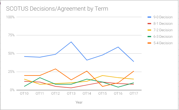
With all the talk about Supreme Court nominations going on, I thought I’d take this opportunity to revisit a post I did back in 2012 about the level of agreement between Supreme Court Justices. I wrote the post because there seemed to be a perception that the Supreme Court was deeply divided, when the reality is that the most common outcome is a 9-0 decision. I got my data from the very cool SCOTUSblog Stat Pack, and they’ve kept putting them out every year since I posted. They now have 7 years worth of data, so I decided to make a graph of how often the Justices agree each term:
As you can see, the unanimous decision is still the most common outcome, with the 8-1 decision generally being the least common.
Back in 2012 (at the end of OT11), I mentioned that Roberts and Kennedy were the most likely to vote with the majority. Per the stats, they still are. At the time, Ginsberg was the most likely to dissent, now it’s Sotomayor.
The justices most likely to agree are Ginsberg/Sotomayor and Alito/Thomas, and the justices least likely to agree are basically the same, but with the partners swapped. Even the justices who agreed the least agreed 50% of the time on disputed cases. When you add in that half of all cases are unanimous, that means our most dissimilar justices agree 75% of the time.
To note on the above stats: SCOTUSblog breaks this down by both all cases and non-unanimous cases, and it basically doesn’t change. Focusing on just 5-4 cases changes things a bit, but that’s mostly because there’s so few of them.
I’ll be interested to see who the next Justice is, and if the way the cases are decided change substantially. In evaluating the impact of any change though, we have to have a sense of what the baseline is. Thanks to SCOTUSblog for making that easier.
I mentioned a few days ago I was going to be taking a bit of a break and reposting things from my archives. Sifting through my old posts, I was intrigued to come across this one I did 6 years ago about the rise of the datasexual. My comments were based on this article called “Meet the Urban Datasexual”., which introduced the term as someone who is “preoccupied with their personal data” and “relentlessly digital, they obsessively record everything about their personal lives, and they think that data is sexy. In fact, the bigger the data, the sexier it becomes. Their lives – from a data perspective, at least – are perfectly groomed.”
With all the recent Facebook/data/etc concerns, I was curious if this term was still a thing. A quick Google suggests it is not. It made it as far as a mention in a TED talk in 2013, but the trail mostly goes cold after that. Google trends confirms that the Big Think article was the height of this term.
It’s interesting to note that this term was introduced at a time when interest in the quantified self movement was gaining steam, with interest in that term peaking about a year later. Since then, things appear to have died down a bit, which is odd considering there’s more ways than ever to track your data.
Part of me wonders if that’s why the interest waned. When you’re logging your own heart rate on a regular basis, you need a community to give you tips about where/when/how to log. Now that my Fitbit logs my heart rate and sleep and all my data can be accessed any time I want, is there really a reason to join a group to get tips on this? With data and charts more easily available for everything, it seems like we all got a little more data in our lives.
Additionally, it appears the biggest concern now for most of us is not how to get our data, but how to keep it private. With some of the recent data privacy scandals, not as many people are as excited to broadcast their data obsession to everyone else.
Finally, it seems we’ve mostly stopped appending -sexual to things to describe things other than sexuality? I’m not really up on slang, but it seems like after metrosexual, that suffix kinda faded. Someone with teenagers let me know if that’s true.
Anyway, I wasn’t too sad to see that term go, but it is interesting to see what a difference a few years can make in how we view a topic. RIP datasexual.
Welcome to “From the Archives”, where I dig up old posts and see what’s changed in the years since I originally wrote them.
I’ve had a rather interesting couple weeks here in my little corner of the blogosphere. A little over a year ago, a reader asked me to write a post about a video he had seen kicking around that used gumballs to illustrate world poverty. With the renewed attention to immigration issues over the last few weeks, that video apparently went viral and brought my post with it. My little blog got an avalanche of traffic and with it came a new series of questions, comments and concerns about my original post. The comments on the original post closed after 90 days, so I was pondering if I should do another post to address some of the questions and concerns I was being sent directly. A particularly long and thoughtful comment from someone named bluecat57 convinced me that was the way to go, and almost 2500 something words later, here we are. As a friendly reminder, this is not a political blog and I am not out to change your mind on immigration to any particular stance. I actually just like talking about how we use numbers to talk about political issues and the fallacies we may encounter there.
Note to bluecat57: A lot of this post will be based on various points you sent me in your comment, but I’m throwing a few other things in there based on things other people sent me, and I’m also heavily summarizing what you said originally. If you want me to post your original comment in the comments section (or if you want to post it yourself) so the context is preserved, I’m happy to do so.
Okay, with that out of the way, let’s take another look at things!
First, a quick summary of my original post: The original post was a review of a video by a man named Roy Beck. The video in question (watch it here) was a demonstration centered around whether or not immigration to the US could reduce world poverty. In it, pulls out a huge number of gumballs, with each one representing 1 million poor people in the world, defined by the World Bank’s cutoff of “living on less than $2/day” and demonstrates that the number of poor people is growing faster than we could possibly curb through immigration. The video is from 2010. My criticisms of the video fell in to 3 main categories:
The number of poor people was not accurate. I believe it may have been at one point, but since the video is 7 years old and world poverty has been falling rapidly, they are now wildly out of date. I don’t blame Beck for his video aging, but I do get irritated his group continues to post it with no disclaimer.
That the argument the video starts with “some people say that mass immigration in to the United States can help reduce world poverty” was not a primary argument of pro-immigration groups, and that using it was a strawman.
That people liked, shared and found this video more convincing than they should have because of the colorful/mathematical demonstration.
My primary reason for posting about the video at all was actually point #3, as talking about how mathematical demonstrations can be used to address various issues is a bit of a hobby of mine. However, it was my commentary on #1 and #2 that seemed to attract most of the attention. So let’s take a look at each of my points, shall we?
Point 1: Poverty measures, and their issues: First things first: when I started writing the original post and realized I couldn’t verify Beck’s numbers, I reached out to him directly through the NumbersUSA website to ask for a source for them. I never received a response. Despite a few people finding old sources that back Beck up, I stand by the assertion that those numbers are not currently correct as he cites them. It is possible to find websites quoting those numbers from the World Bank, but as I mentioned previously, the World Bank itself does not give those numbers. While those numbers may have come from the World Bank at some point he’s out of date by nearly a decade, and it’s a decade in which things have rapidly changed.
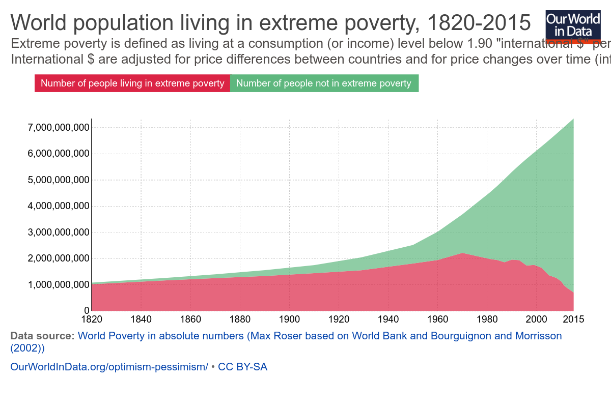
Now this isn’t necessarily his fault. One of the reasons Beck’s numbers were rendered inaccurate so quickly was because reducing extreme world poverty has actually been a bit of a global priority for the last few years. If you were going to make an argument about the number of people living in extreme poverty going up, 2010 was a really bad year to make that argument:
Basically he made the argument in the middle of an unprecedented fall in world poverty. Again, not his fault, but it does suggest why he’s not updating the video. The argument would seem a lot weaker starting out with “there’s 700 million desperately poor people in the world and that number falls by 137,000 people every day”.
Moving on though…is the $2/day measure of poverty a valid one? Since the World Bank and Beck both agreed to use it, I didn’t question it much up front, but at the prompting of commenters, I went looking. There’s an enormously helpful breakdown of global poverty measures here, but here’s the quick version:
The $2/day metric is a measure of consumption, not income and thus is very sensitive to price inflation. Consumption is used because it (attempts to) account for agrarian societies where people may grow their own food but not earn much money.
Numbers are based on individual countries self-reporting. This puts some serious holes in the data.
The definition is set based on what it takes to be considered poor in the poorest countries in the world. This caused it’s own problems.
That last point is important enough that the World Bank revised it’s calculation method in 2015, which explains why I couldn’t find Beck’s older numbers anywhere on the World Bank website. Prior to that, it set the benchmark for extreme poverty based off the average poverty line used by the 15 poorest countries in the world. The trouble with that measure is that someone will always be the poorest, and therefore we would never be rid of poverty. This is what is known as “relative poverty”.
Given that one of the Millennium Development Goals focused on eliminating world poverty, the World Bank decided to update it’s estimates to simply adjust for inflation. This shifts the focus to absolute poverty, or the number of people living below a single dollar amount. Neither method is perfect, but something had to be picked.
It is worth noting that country self reports can vary wildly, and asking the World Bank to put together a single number is no small task. While the numbers presented, it is worth noting that even small revisions to definitions could cause huge change. Additionally, none of these numbers address country stability, and it is quite likely that unstable countries with violent conflicts won’t report their numbers. It’s also unclear to me where charity or NGO activity is counted (likely it varies by country).
Interestingly, Politifact looked in to a few other ways of measuring global poverty and found that all of them have shown a reduction in the past 2 decades, though not as large as the World Bank’s. Beck could change his demonstration to use a different metric, but I think the point remains that if his demonstration showed the number of poor people falling rather than rising, it would not be very compelling.
Edit/update: It’s been pointed out to me that at the 2:04 mark he changes from using the $2/day standard to “poorer than Mexico”, so it’s possible the numbers after that timepoint do actually work better than I thought they would. It’s hard to tell without him giving a firm number. For reference, it looks like in 2016 the average income in Mexico is $12,800/year . In terms of a poverty measure, the relative rank of one country against others can be really hard to pin down. If anyone has more information about the state of Mexico’s relative rank in the world, I’d be interested in hearing it.
Point 2: Is it a straw man or not? When I posted my initial piece, I mentioned right up front that I don’t debate immigration that often. Thus, when Beck started his video with “Some people say that mass immigration in to the United States can help reduce world poverty. Is that true? Well, no it’s not. And let me show you why…..” I took him very literally. His demonstration supported that first point, that’s what I focused on. When I mentioned that I didn’t think that was the primary argument being made by pro-immigration groups, I had to go to their mission pages to see what their argument actually were. None mentioned “solving world poverty” as a goal. Thus, I called Beck’s argument a straw man, as it seemed to be refuting an argument that wasn’t being made.
Unsurprisingly, I got a decent amount of pushback over this. Many people far more involved in the immigration debates than I informed me this is exactly what pro-immigration people argue, if not directly then indirectly. One of the reasons I liked bluecat57’s comment so much, is that he gave perhaps the best explanation of this.To quote directly from one message:
“The premise is false. What the pro-immigration people are arguing is that the BEST solution to poverty is to allow people to immigrate to “rich” countries. That is false. The BEST way to end poverty is by helping people get “rich” in the place of their birth.
That the “stated goals” or “arguments” of an organization do not promote immigration as a solution to poverty does NOT mean that in practice or in common belief that poverty reduction is A solution to poverty. That is why I try to always clearly define terms even if everyone THINKS they know what a term means. In general, most people use the confusion caused by lack of definition to support their positions.”
Love the last sentence in particular, and I couldn’t agree more. My “clear definitions” tag is one of my most frequently used for a reason.
In that spirit, I wanted to explain further why I saw this as a straw man, and what my actual definition of a straw man is. Merriam Webster defines a straw man as “a weak or imaginary argument or opponent that is set up to be easily defeated“. If I had ever heard someone arguing for immigration say “well we need it to solve world poverty”, I would have thought that was an incredibly weak argument, for all the reasons Beck goes in to….ie there are simply more poor people than can ever reasonably be absorbed by one (or even several) developed country. Given this, I believe (though haven’t confirmed) that every developed/rich country places a cap on immigration at some point. Thus most of the debates I hear and am interested in are around where to place that cap in specific situations and what to do when people circumvent it. The causes of immigration requests seem mostly debated when it’s in a specific context, not a general world poverty one.
For example, here’s the three main reasons I’ve seen immigration issues hit the news in the last year:
Illegal immigration from Mexico (too many mentions to link)
Now there are a lot of issues at play with all of these, depending on who you talk to: general immigration policy, executive power, national security, religion, international relations, the feasibility of building a border wall, the list goes on and on. Poverty and economic opportunity are heavily at play for the first one, but so is the issue of “what do we do when people circumvent existing procedures”. In all cases if someone had told me that we should provide amnesty/take in more refugees/lift a travel ban for the purpose of solving world poverty, I would have thought that was a pretty broad/weak argument that didn’t address those issues specifically enough. In other words my characterization of this video as a straw man argument was more about it’s weakness as a pro-immigration argument than a knock against the anti-immigration side. That’s why I went looking for the major pro-immigration organizations official stances….I actually couldn’t believe they would use an argument that weak. I was relieved when I didn’t see any of them advocating this point, because it’s really not a great point. (Happy to update with examples of major players using this argument if you have them, btw).
In addition to the weaknesses of this argument as a pro-immigration point, it’s worth noting that from the “cure world poverty” side it’s pretty weak as well. I mentioned previously that huge progress has been made in reducing world poverty, and the credit for that is primarily given to individual countries boosting their GDP and reducing their internal inequality. Additionally, even given the financial situation in many countries, most people in the world don’t actually want to immigrate. This makes sense to me. I wouldn’t move out of New England unless there was a compelling reason to. It’s home. Thus I would conclude that helping poor countries get on their feet would be a FAR more effective way of eradicating global poverty than allowing more immigration, if one had to pick between the two. It’s worth noting that there’s some debate over the effect of healthy/motivated people immigrating and sending money back to their home country (it drains the country of human capital vs it brings in 3 times more money than foreign aid), but since that wasn’t demonstrated with gumballs I’m not wading in to it.
So yeah, if someone on the pro-immigration side says mass immigration can cure world poverty, go ahead and use this video….keeping in mind of course the previously stated issue with the numbers he quotes. If they’re using a better or more country or situation specific argument though (and good glory I hope they are), then you may want to skip this one.
Now this being a video, I am mindful that Beck has little control over how it gets used and thus may not be at fault for possible straw-manning, any more than I am responsible for the people posting my post on Twitter with Nicki Minaj gifs (though I do love a good Nicki Minaj gif).
Point 3 The Colorful Demonstration: I stand by this point. Demonstrations with colorful balls of things are just entrancing. That’s why I’ve watched this video like 23 times:
Welp, this went on a little longer than I thought. Despite that I’m sure I missed a few things, so feel free to drop them in the comments!
Welcome to “From the Archives”, where I dig up old posts and see what’s changed in the years since I originally wrote them.
From time to time something fun reminds me of an old post of mine and I get all excited to go back and research what’s changed since I originally wrote them.
This is not one of those times.
A past post popped in to my head last week, but not for a good reason. A childhood friend of mine was diagnosed with ovarian cancer recently, which is a bit of a shock since she’s only 35, and hits close to home since she has a daughter just a bit younger than my son. Working at a cancer hospital I am unfortunately used to seeing early and unfair diagnoses, but it still has an extra sting when it’s someone you know and when they’re in the same phase of life you are. This friend actually has an interesting intersection with this blog, as she’s a science teacher whose class I’ve visited and given a version of my Intro to Internet Science talk to. She does great work with those kids, and I loved meeting her class. If you’re the prayers/good thoughts type, send some her way.
Not the happiest of introductions, but the whole experience did remind me about how important it is for people to know the signs of ovarian cancer, as it can be easily missed. Additionally, it made me think of my 2013 post “What Can Your Dentist Tell You About Your Risk For Ovarian Cancer?” where I blogged about the link between congenitally missing teeth and ovarian cancer. I wondered if there had been any updates since then, and it looks like there are! Both scientifically and with a couple dozen spammers who left comments on my original post. Cosmetic dentistry folks apparently have a lot of bots working for them. Anyway, let’s take a look! At the science, not the spammers that is.
First, some background: For those of you who didn’t read the original post, it covered a study that found that women who have ovarian cancer are 8 times more likely to have congenitally missing teeth than women who don’t have ovarian cancer. Since I have quite a few congenitally (ie born that way not knocked out or pulled) missing teeth (both mandibular second molars and both mandibular second bicuspids), I was pretty interested in this fact. I used it as a good example of a correlation/causation issue, because there is likely a hidden third variable (like a gene mutation) causing both the missing teeth and the cancer as opposed to one of those two things causing the other one.
So why missing teeth? Well, first, because it’s kind of fascinating to think of tooth abnormalities being linked to your cancer risk. Dental medicine tends to be pretty separate from other types of medicine, so exploring possible overlaps feels pretty novel. When someone has teeth that fail to develop (also known as hypodontia or angenesis), it’s thought to be a sign of either an early developmental interruption or a gene mutation. Missing teeth are an intriguing disease marker because they are normally spotted early and conclusively. Knowing up front that you are at a higher risk for certain types of cancer could help guide screening guidelines for years.
So what’s the deal with the ovarian cancer link? Well, it’s been noted for a while that women are more likely to have hypodontia then men. Since hypodontia is likely caused by some sort of genetic mutation or disruption in development, it made a certain amount of sense to see if it was linked with cancer specific to women. The initial study linking missing teeth and ovarian cancer showed women with ovarian cancer were 8 times as likely to have missing teeth, but subsequent studies were less certain. A 2016 meta-analysis showed that overall it appears about 20% of ovarian cancer patients have evidence of hypodontia, as opposed to the general population rate of 2-11%. Unfortunately there’s still not a definitive biological mechanism (ie a gene that clearly drives both), and there’s not enough data to say how predictive missing teeth are (ie what my risk as a healthy person with known hypodontia is). We also don’t know if more missing teeth means greater risk, or if it’s only certain teeth that prove the risk. So while we’re part way there, we’re missing a few steps in the proving causality chain.
Are there links to other cancers here too? Why yes! This paper from 2013 reviewed the literature and discovered that all craniofacial abnormalities (congenitally missing teeth, cleft palate, etc) seem to be associated with a higher family cancer risk. That paper actually interviewed people about all their family members cancer histories, to cast a wider net for genetic mutations. Interestingly, the sex-linked cancers (prostate, breast, cervical and ovarian) were significantly associated with missing teeth, as was brain cancer. In some families it looks like there is a link to colorectal cancer, but this doesn’t appear to be broadly true.
So where does this leave us? While the evidence isn’t yet completely clear, it does appear that people who are missing teeth should be on a slightly higher alert for signs of ovarian or prostate cancer. Additionally, I’ve sent my dentist and my PCP the literature to review, since neither of them had ever heard of this link. Both found it noteworthy. It’s probably not worth losing sleep over, since we don’t know what the absolute increase is at this point. However, it’s good to keep in the back of your mind. Early detection saves lives.
My primary grouse was that they seemed to be extrapolating the 2015 data from the 2008 and 2009 data. I decided to take a look and see how the Bloomberg prediction had turned out.
Interestingly enough, at this point it appears to be a statistical tie. The Violence Policy Center has a chart up through 2014 showing a slight lead for motor vehicle deaths:
According to this post, the numbers for gun deaths ended up being 33,599 and the car deaths were 33,736. It is interesting to note that Bloomberg underestimated the car deaths by a little less than 2,000 /year, and the gun deaths by about 600/year. So they were wrong in their assumption that motor-vehicle deaths would continue to drop at the same pace they had been, but right in their assumption gun deaths would continue to rise. I’ll give myself half credit on this one. Of course, we do have one more year to go before we get the 2015 data, so I could still entirely eat crow.
Well hi! If you got here via Google, this is probably not the type of post you are looking for. This one has math, and the only pictures are graphs. Sorry about that.
For everyone else, welcome to “From the Archives” where I revisit old posts to see where the science (or my thinking) has gone since I put them up originally.
Back in 2013, a concerned reader had sent me a headline that warned men about a terrible scourge depriving them of all that was good in life. Oh yes, I’m talking about housework. The life advice started from the headline “Want to Have More Sex? Men, stop helping with chores.” The article covered at study that had devised a mathematical model of a couples sexual frequency vs the number of chores they did. I couldn’t resist, and ended up writing a post called “Sex, Models and Housework“. It’s still one of my most viewed posts, though probably not the most read.
A few things to know about the original study (found here):
That headline was pretty misleading. The study never said that men who didn’t do chores had more sex, the study said that men who did more traditionally female chores had less sex. Men who did more traditionally male chores actually had more sex.
Despite being released in 2013, the data the study used was from 1992. The people in the study had an average age of early to mid 40s at that time, so this is a study looking at Baby Boomers and their relationships in the early 90s. With shifting culture, this is important to keep in mind.
The model extrapolated out to men who do 100% of the traditionally female housework. One of my core concerns was how many data points they had in that range, or if they extrapolated beyond the scope of the model. Men reported doing an average of 25% of the “traditionally female chores” at baseline, with a standard deviation of .19. It does not look likely they had many men in the 100% range, and those relationships may have had something else unusual going on.
Given #3, you’ll excuse me if I doubt that this model really should have been perfectly linear:
Those were my original thoughts, and rereading the paper I wanted to add a few more:
One point I can’t believe I didn’t mention the first time around is the inherent selection bias in this data. You had to be a married couple to be included in the data. So a hypothetical couple who had an uneven distribution of housework and divorced was not counted. To be perfectly fair, they did take a bit of a look at this. These respondents were surveyed in 1988 and then again in 1992-1994. They did look at those who were married in 1988 but divorced by 1992 to see if the chore distribution/sexual frequency was different. It wasn’t. However, given the ages of the respondents (born in the 40s-60s) many of them could have actually already been divorced before 1988 rolled around1. Additionally, those who are going through a divorce or in an otherwise rocky marriage likely didn’t take part in the survey. We don’t know if those numbers would have changed things, but I think we have reason to suspect that those most bothered by chore arrangements would be more likely to divorce.
The women in the study worked an average of 15 hours fewer per week than men at paid labor. The women in the study spent 18 more hours per week than men at household chores. It’s worth noting that an “average” man in this study doing half of the chores would have actually been doing more labor for the house than the “average” woman. It would have been interesting to see a total on “labor for household” to see what the effect of an even vs uneven total workload was. This is important to rule out that it’s not the “gender” of the chores, but potential perceived unfairness that drives the decrease in sex.
Child care hours were not included anywhere for either partner.
Other than that, how has this research fared?
Well, as you can imagine, it caused a stir in academic circles. There was a New York Times Magazine cover story about it provocatively asking “Do More Equal Marriages Mean Less Sex?” based heavily on the study. Many people walked away concerned about the age of the data, and how applicable it was to people over 20 years later. Researchers from Georgia State University were able to (somewhat) replicate the study (pre-published copy) using data from 2006. A few things about that study:
The study population was younger by about a decade and less wealthy than the original study population, and they had more sex overall
Cohabiting but not married couples were included, but couples without children were not.
They tossed 10 respondents who said they had sex 50 times a month
This study ended up with three categories of couples: traditional, egalitarian, and counter-conventional. Of those
Egalitarian: Divided housework approximately evenly, with anywhere from a 35%-65% split. This group was 30% of the sample size had the most sex and highest satisfaction.
Traditional: The woman did more than 65% of the housework. This was about 63% of the sample, and had slightly less sex and women had slightly less satisfaction than the egalitarian couples.
Counter-cultural: The man did more than 65% of the housework. This was only 5% of the sample size, and did not work out well. These couples had a lower sexual frequency than either of the first two groups, and were less satisfied overall.
I felt thoroughly vindicated by this line “No research, however, has considered the possibility that the observed effect of men’s shares of domestic labor on sexual frequency and satisfaction could be non-linear.”
So I was at least correct in my concerns. Presuming that this data holds, the line is likely fairly straight until it hits the extreme on one end, then plummets. Interestingly, this study still didn’t compare total labor, and the women in this study worked 20 hours fewer at paid labor than the men, and about 15 hours more per week in housework. Again, child care was not included in the work totals. Since this group was younger, it’s likely at least some of that discrepancy is child care.
So where does this leave us?
Well, it looks like my concerns about assuming a linear model are valid, and that assuming relationships haven’t changed between Baby Boomers and Gen Xers is not a great idea. While some changes to marital set ups can have a negative effect (say a wife working longer hours) they are frequently immediately offset by a positive effect (increased income). This paper here has some interesting examples of these sorts of trade offs. I’m increasingly convinced that the details of the division of labor matter much less than sufficient and equally divided labor.
I would love to see a break down of just the couples on the “man doing all the housework” end. In the second study that was only 24 couples, and we don’t know if the arrangement was through conscious choice or because of circumstances such as unemployment. In fact, I think further research should ask people “how much does your current relationship reflect your expectations prior to the relationship?”. That might catch some of the effect of cultural script changes better than just asking people what they are doing.
Regardless, I have to go do some dishes.
1. According to this the median age at first marriage in 1975 was 21. If you got married in 1975, your chance of being divorced 13 years later was about 30%. This is not a negligible amount of people ↩
Welcome to “From the Archives” where I revisit old posts to see where the science (or my thinking) has gone since I put them up originally.
Back in good old October of 2012, it was an election year and I was getting irritated1. First, I was being bombarded with Elizabeth Warren vs Scott Brown for Senate ads, and then I was confronted with this study:The fluctuating female vote: politics, religion, and the ovulatory cycle (Durante, et al), which purported to show that women’s political and religious beliefs varied wildly around their monthly cycle, but in different ways if they were married or single. For single women they claimed that being fertile caused them to get more liberal and less religious, because they had more liberal attitudes toward sex. For married women, being fertile made them more conservative and religious so they could compensate for their urge to cheat. The swing was wide too: about 20%. Of note, the study never actually observed any women changing their vote, but compared two groups of women to find the differences. The study got a lot of attention because CNN initially put it up, then took it back down when people complained. I wrote two posts about this, one irritated and ranty, and one pointing to some more technical issues I had.
With a new election coming around, I was thinking about this paper and wanted to take a look at where it had gone since then. I knew that Andrew Gelman had ultimately taken shots at the study for reporting an implausibly large effect2 and potentially collecting lots of data/comparisons and only publishing some of them, so I was curious how this study had subsequently fared.
Well, there are updates! First, in 2014, a different group tried to replicate their results in a paper called Women Can Keep the Vote: No Evidence That Hormonal Changes During the Menstrual Cycle Impact Political and Religious Beliefs by Harris and Mickes. This paper recruited a different group, but essentially recreated much of the analysis of the original paper with one major addition. They conducted their survey prior to the 2012 election AND after, to see predicted voting behavior vs actual voting behavior. A few findings:
The first paper (Durante et al) had found that fiscal policy beliefs didn’t change for women, but social policy beliefs did change around ovulation. The second paper (Harris and Mickes) failed to replicate this finding, and also failed to detect any change in religious beliefs.
In the second paper, married women had a different stated preference for Obama (high when low feritility, lower when high fertility), but that difference went away when you looked at how they actually voted. For single women, it was actually the opposite. They reported the same preference level for Obama regardless of fertility, but voted differently based on the time of the month.
The original Durante study had taken some heat for how they assessed fertility level in their work. There were concerns that self reported fertility level was so likely to be inaccurate that it would render any conclusions void. I was interested to see that Harris and Mickes clarified that the Durante paper actually didn’t accurately describe how they did fertility assessments in the original paper, and that they had both ultimately used the same method. This was supposed to be in the supplementary material, but I couldn’t find a copy of that free online. It’s an interesting footnote.
A reviewer asked them to combine the pre and post election data to see if they could find a fertility/relationship interaction effect. When pre and post election data were kept separate, there was no effect. When they were combined, there was.
Point #4 is where things got a little interesting. The authors of the Harris and Mickes study said combining their data was not valid, but Durante et al hit back and said “why not?”. There’s an interesting piece of stat/research geekery about the dispute here, but the TL;DR version is that this could be considered a partial replication or a failure to replicate, depending on your statistical strategy. Unfortunately this is one of those areas where you can get some legitimate concern that a person’s judgement calls are being shaded by their view of the outcome. Since we don’t know what either researchers original plan was, we don’t know if either one modified their strategy based on results. Additionally the “is it valid to combine these data sets” question is a good one, and would be open for discussion even if we were discussing something totally innocuous. The political nature of the discussion intensifies the debate, but it didn’t create it.
This study, by Scott and Pound, addressed some of the “how do you measure fertility when you can’t test” concerns by asking about medical conditions that might influence fertility to screen out women whose self reporting might be less accurate. They also ranked fertility on a continuum as opposed to the dichotomous “high” and “low”. This should have made their assessment more accurate.
The other two studies both asked for voting in terms of Romney vs Obama. Scott and Pound were concerned that this might capture a personal preference change that was more about Obama and Romney as people rather than a political change. They measured both self-reported political leanings and a “moral foundations” test and came up with an overall “conservatism” rank, then tracked that with chances of conception.
They controlled for age, number of children, and other sociological factors.
So overall, what did this show? Well, basically, political philosophy doesn’t vary much no matter where a woman is in her cycle.
The authors have a pretty interesting discussion at the end about the problems with Mechanical Turk (where all three studies recruited their participants in the same few months), the differences of measuring person preference (Obama vs Romney) vs political preference (Republican vs Democrat), and some statistical analysis problems.
So what do I think now?
First off, I’ve realized that getting all ranty when someone brings up women’s hormones effecting things may be counterproductive. Lesson learned.
More seriously though, I find the hypothesis that our preferences for individuals may change with hormonal changes more compelling than the hypothesis that our overall philosophy of religion or government changes with our hormones. The first simply seems more plausible to me. In a tight presidential election though, this may be hopelessly confounded by the candidates actual behavior. It’s pretty well known that single women voted overwhelmingly for Obama, and that Romney had a better chance to capture the votes of married women. Candidates know this and can play to it, so if a candidate makes a statement playing to their base, you may see shifts that have nothing to do with hormones of the voters but are an actual reaction to real time statements. This may be a case where research in to the hypothetical (i.e. made up candidate A vs B) may be helpful.
The discussions on fertility measures and statistical analysis were interesting and a good insight in to how much study conclusions can change based on how we define particular metrics. I was happy to see that both follow up papers hammered on clear and standard definitions for “fertility”. If that is one of the primary metrics you are assessing, then the utmost care must be taken to assess it accurately, or else the signal to noise ratio can go through the roof.
Do I still think CNN should have taken the story down? Yes….but just as much as I believe that they should take most sensational new social/psych research stories down. If you follow the research for just two more papers, you see the conclusion go from broad (women change their social, political and religious views and votes based on fertility!) to much narrower (women may in some cases change their preference or voting patterns for particular candidates based on fertility, but their religious and political beliefs do not appear to change regardless). I’ll be interested to see if anyone tries to replicate this with the 2016 election, and if so what the conclusions are.
This concludes your trip down memory lane! 1. Gee, this is sounding familiar↩ 2. This point was really interesting. He pointed out that around elections, pollsters are pretty obsessive about tracking things, and short of a major scandal breaking literally NOTHING causes a rapid 20 point swing. The idea that swings that large were happening regularly and everyone had missed it seemed implausible to him. Statistically of course, the authors were only testing that there was a difference at all, not what it was….but the large effect should possibly have given them pause. It would be like finding that ovulation made women spend twice as much on buying a house. People don’t change THAT dramatically, and if you find that they do you may want to rerun the numbers.↩ 3. Okay, so I can’t be the only one noticing at this point that this means 3 different studies all recruited around 1000 American women not on birth control, not pregnant, not recently pregnant or breastfeeding but of child bearing age, interested in participating in a study on politics, all at the same time and all through Amazon’s Mechanical Turk. Has anyone asked the authors to compare how much of their sample was actually the same women? Does Mechanical Turk have any barriers for this? Do we care? Oh! Yes, turns out this is actually a bit of a problem.↩