This post comes from a reader question I got asking for my opinion on the Body Mass Index (BMI). Quick intro for the unfamiliar: the BMI is a calculated value that related your height and weight. It takes your weight (in kilograms) and divides it by your height (in meters) squared. For those of you in the US, that’s weight (in pounds) times 703, divided by height (in inches) squared. Automatic calculator here. A BMI score of less than 18.5 is considered underweight, 18.5-24.9 is normal, 25-29.9 is overweight, and >30 is obese. So what’s the deal with this thing?
- It was developed for use in population health, and it’s been around longer than you might think. The BMI was invented by Adolphe Quetlet in between 1830 and 1850. He was a statistician who needed an easy way of comparing population weights that actually took height in to account. Now this makes a lot of sense….height is more strongly correlated with weight than any other variable. In fact as a species we’re about 4 inches taller than we were when the BMI was invented. Anyway, it was given the name “Body Mass Index” by Ancel Keys in 1972. Keys was conducting research on the relative obesity of different populations throughout the world, and was sorting through all the various equations that related height and weight and how they correlated with measured body fat percentage. He determined this was the best, though his comparisons did not include women, children or those over 65, or non-Caucasians.
- Being outside the normal range means more than being inside of it. So if Keys was looking for something that correlated to body fat percent, how does the BMI do? Well, a 2010 study found that the correlation is about r = .66 for men and r=.84 for women. However, the researchers also looked at it’s usefulness as a screening test….how often did it accurately sort people in to “high body fat” or “not-high body fat”? Well, for those with BMIs greater than 30, the positive predictive value is better than the negative predictive value. So basically, if you know you have a BMI over 30, you are also likely to have excess body fat (87% of men, 99% of women). However, if you have a BMI of under 30, about 40% of men and 46% of women still had excess body fat. If you move the line down to a BMI of 25, some gender differences show up: 69% of men with BMIs over 25 actually have excess body fat, compared to 90% of women. This means a full 30% of “overweight” males are actually fine. About 20% of both genders with BMIs under 25 actually have excess body fat. So basically if you’re above 30, you almost certainly have excess body fat, but being below that line doesn’t necessarily let you off the hook.
- It doesn’t always take population demographics into account One possible reason for the gender discrepancy above is height….BMI is actually weaker the further you fall outside the 5’5”-5’9” range. I would love to see the data from #2 actually rerun not by gender but by height, to see if the discrepancy holds. In terms of health predictions though, BMI cutoffs show variability by race. For example, a white person with a BMI of 30 carries the same diabetes risk as a South Asian with a BMI of 22 or a Chinese person with a BMI of 24. That’s a huge difference, and is not always accounted for in worldwide obesity tables.
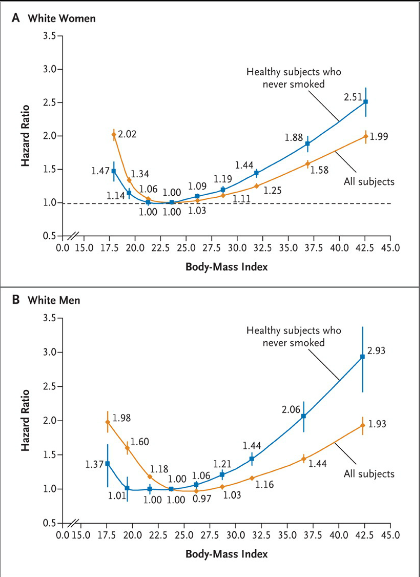
- Overall it’s a pretty well correlated with early mortality. So with all the inaccuracies, why do we use it? Well, this is why:
 That graph is from this 2010 paper that looked at 1.46 million white adults in the US. The hazard ratio is for their all cause mortality at the ten year mark (median start age was 58). Particularly for the higher numbers, that’s a pretty big difference. To note: some other observational studies have had a slightly different shaped curve, especially at the lower end (25-30 BMI) that suggested an “obesity paradox”. More recent studies haven’t found this, and there’s some controversy about how to correctly interpret these studies. The short version is that correlation isn’t causation, and we don’t know if losing weight helps with these numbers.
 - For individuals on the borderline, you need another metric Back to individuals though….should you take your BMI seriously? Well maybe. It’s pretty clear if you’re getting a number over 30 you probably should. There’s always the “super muscled athlete” exception, but you pretty much would know if that were you. If you need another quick metric to assess disease risk though, it looks like using a combination of waist circumference and BMI may yield a better picture of health than BMI alone, especially for men. Here’s the suggested action range from that paper:
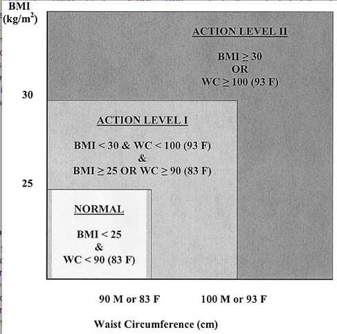 While waist circumference is obviously not something that most people know off the top of their head, it should be easy enough for doctors to take in an office visit.

Overall, it’s important to remember that metrics like the BMI or waist circumference are really just screening tests and you get what you pay for. While we hope they catch most people who are at high risk, there will always be false positives and false negatives. While in population studies these may balance each other out, for any individual it’s important to take a look at all the various factors that go in to health. So, um, talk to your doctor and avoid over-interpretation.
