I don’t normally get that involved with sports statistics, if only because it’s the one place in the stats world where you could study them for an hour every day and still be barely a rookie. However, something awfully strange is happening in my house recently, and I feel it’s worth mentioning: the Orioles are leading the AL East (in fact the whole American League), and the Red Sox are last.
Now, this is particularly interesting to my household, as my husband happens to be a lifelong Orioles fan. I on the other hand, have always been a Red Sox fan. Since we met almost 6 years ago, this has pretty much meant that I have had exclusive bragging rights when it came to baseball. I know it’s not even a quarter of the way in to the season, but this is the longest we’ve gone so far, and it’s surreal.
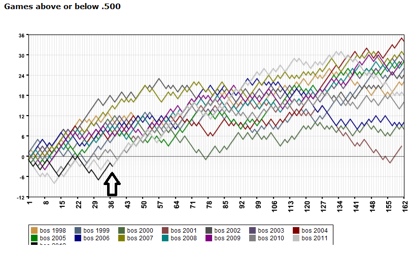
Yesterday, Grantland put up an article on the Orioles under .500 curse. Apparently they have not finished over .500 since 1997….more than enough seasons for the baseball stats guys to go nuts with. I was curious exactly how bad it was, so I looked around until I found this graph generator*.
For those of you who don’t know much about the Orioles, here’s what they’ve looked like since 1998