Millenials and Parenting

Recently Time Magazine ran an article called “Help! My Parents are Millennials!” that caught my interest.  Since I am both a parent and (possibly) a millennial, I figured I’d take a look to see what exactly they were presuming my child would complain about.

I was particularly interested in how they were defining “millennial”, since Amanda Hess pointed out over a year ago that many articles written about millennials actually end up interviewing Gen Xers and just hoping no one notices. Time’s article started off doing exactly that, but then they quickly clarified that they define “millennial” as those born from the late 70s to the late 90s.  This is actually about a seven year shift from what most other groups consider millennials, with the most commonly cited years of birth being 1982 to 2004 or so. Interestingly, only Baby Boomers get their own official generational definition1 endorsed by the Census Bureau: birth years 1946 to 1964.

I bring all this up, because the Time article include some really interesting polling data that purports to show parental attitude differences. Those results are here. Now it looks like they polled 2,000 parents, representing 3 generations with kids under 18.  I DESPERATELY want to know what the number of respondents for each group was. See, if you do the math with the years I gave above, the only Boomers who still have kids under the age of 18 are those who had them after the age of 33….and that’s for the very youngest year of Boomers. While of course it’s not impossible to have or adopt children over that age, it does mean the available pool of Boomers that meet the criteria is going to be smaller and skewed toward those who had children later. Additionally, if you look at the Gen X range, you realize that Time cut this down to just 10 years because of how early they started the Millennials. I don’t know for sure, but I’d guess the 2,000 was heavily skewed towards Millennials.  Of course, since we couldn’t even get numbers, we can’t possibly know which of the attitude differences they looked at were statistically significant. This annoys me, but is pretty common.

What irritated me the most though, is the idea that you can really compare parenting attitudes for parents who are in entirely different phases of parenting.  For example, there was a large discrepancy in Millennial vs Boomer parents who worried that other people judge what their kids eat. Well, yeah. Millennials are parenting small children right now, and people do judge parents more for what a 5 year old eats than a 16 year old.

Additionally, there were some other oddities in the reporting that made me think the questions were either asked differently than reported, the respondents were unclear on what they should answer, or the sample size was small.  For example, equal numbers of Boomers and Millennials said they were stay-at-home parents, which made me wonder how the question was phrased. Are 22% of Boomers still really staying home with their teenagers? My guess is some of them answered what they had done.  Another oddity was the number who said they’d never shared a picture of their child on social media. I would have been more interested in the results if they’d sorted this out by those who actually had a social media account. I also am thinking this phrasing could be deceptive. I know a few Boomers who would probably say they don’t share pictures of their kids, but will post family photos. YMMV.

Anyway, I think it’s always good to keep in mind how exactly generations are being defined, and what the implications of these definitions are. Attitude surveys among generations will always be tough to do in real time, as much of what you’ll end up testing is really just some variation of “people in their 50s think differently from those in their 20s”.

1. Typical

Blog Updates

As many of you know, I used to run a blog called Bad Data Bad! and this morning I figured out how to import all of those old blog posts in to this blog. I’ll be going back and tinkering a bit…tagging the posts, possibly removing some if I don’t like them anymore, etc. and I may be mucking about with other parts of the site as well.

Stay tuned.

Guns and Graphs Part 2

In the comment section on my last post about guns and graphs there was some interesting discussion about some of the data.  SJ had some good data to toss in, and DH made a suggestion that a graph of gun murders vs non-gun murders might be interesting.  I thought that sounded pretty interesting as well, so I gave it a whirl:

Gun graph 4

Apologies that not every state abbreviation is clear, but at least you get the outliers. Please note that the axes are different ranges (it was not possible to read if I made them the same) so Nevada is really just a 50/50 split, whereas Louisiana is actually pretty lopsided in favor of guns.  That being said, the correlation here is running at about .6, so it seems fair to say that states that have more gun homicides have more homicides in general. Now to be fair, this chart may underestimate non-gun murders, as those are likely a little harder to count than gun related murders. I don’t have hard data on it, but I’m somewhat inclined to believe that a shooting is easier to classify then a fall off a tall building.  Anyway, I pulled the source data from here.

While I was looking at that data, I thought it would be interesting to see if the percent of the population that owned guns was correlated with the number of gun murders:
Gun graph 5

Aaaaaaaaand…there’s no real correlation there. It’s interesting to note that Hawaii and Wyoming are dramatically different in ownership percentage, but not gun homicide rate. Louisiana and Vermont OTOH, have nearly identical ownership rates and completely different gun homicide rates.

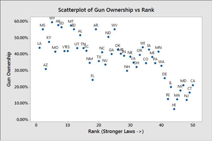
Then, just for giggles I decided to go back to the original gun law ranking I was using, and see if gun ownership percentage followed that trend:

Gun graph 6

There does appear to be a trend there, but as the Assistant Village Idiot pointed out after the last post, it could simply be that places with lower gun ownership have an easier time passing these laws.


Bitterness and Psychopathy

I’m having some insomnia problems at the moment, so it was about 4am today when I turned on my coffee maker and sat down to do some internet perusing. I was just taking my first sip, when I stumbled upon this article titled “People Who Take Their Coffee Black Have Psychopathic Tendencies“.

Oh. Huh.

As a fairly dedicated black coffee drinker, I had to take a look.  The article references a study here that tested the hypothesis that an affinity for bitter flavors might be associated with the “Dark Tetrad” traits: Machiavellianism, psychopathy, every day sadism and narcissim.

I read through the study1, and I thought it was a good time to talk about effect sizes. First, lets cover a few basics:

  1. This was a study done through Mechanical Turk
  2. People took personality tests and rated how much they liked different foods, the researchers ran some regressions and reported the correlations  for these results
  3. They did some other interesting stuff to make sure people really liked the bitter versions of the foods they were rating and to make sure their results were valid

Alright, so what did they find? Well, there was a correlation between preference for bitter tastes and some of the “Dark Tetrad” scores, especially everday sadism2. The researchers pretty much did what they wanted to do, and they found statistically significant correlations.

So what’s my issue?

My issue is we need to talk about effect sizes, especially as this research gets repeated. The correlation between mean bitter taste preference and the “Dark Tetrad” scores over the two studies ranged from .14 to .20.  Now that’s a significant finding in terms of the hypothesis, but if you’re trying to figure out if a black coffee drinker you love might be a psychopath3? Not so useful.

See, an r of .14 translates in to an R2 of about .02. Put in stats terms, that means that 2% of the variation in psychopathy score can be explained by4 variation in the preference for bitter foods or beverages. The other 98% is based on things outside the scope of this study. For r = .2, that goes up to 4% explained, 96% unexplained.

Additionally, it should be made clear that no one bitter taste was associated with these traits, only the overall score on ALL bitter foods was.  So if you like coffee black, but have an issue with tonic water or celery, you’re fine.

The researchers didn’t include the full list of foods, but I was surprised to note that they included beer as one of the bitter options. Especially when looking at antisocial tendencies, it seems potentially confounding to include a highly mood altering beverage alongside foods like grapefruit. I’d be interested in seeing the numbers rerun with beer excluded.


1. And no, I didn’t add cream to my coffee. Fear me.
2. It’s worth noting that the mean score for this trait was lower than any other trait however…1.77 out of 5. It’s plausible that only the bottom of the range was tested.
3. Hi honey!
4. In the mathematical sense that is, this does not prove causation by itself

Popular Opinion

A few years ago, there was a brief moment in the NFL where all anyone could talk about was Tim Tebow.  Tebow was a controversial figure who I didn’t have much of an opinion on, but he sparked a comment from Chuck Klosterman (I think) that changed the way I think about political discussions.  I’ve never been able to track the exact quote down, but it was something like “half the country loves him, half the country hates him, but both sides think they’re an oppressed minority.” Now I don’t know if that was really true with Tebow, but I think about it every time someone says “what no one is talking about…” or “the conventional wisdom is….” or even just a basic “most people think is….” I always get curious about how we know this.  It’s not unusual that I’ll hear someone I know and love assert that the media never talks about something I think the media constantly talks about. It’s a perplexing issue.

Anyway, that interest is why I was super excite by this Washington Post puzzle that showed how easily our opinions about what others think can be skewed even if we’re not engaging in selection bias.  It also illustrates two things well: 1) why the opinion of well known people can be important and 2) why a well known person advocating for something does not automatically mean that issue is “settled”.

Good things to consider the next time I find myself claiming that “no one realizes” or “everyone thinks that”.

Guns and Graphs

One of my favorite stats-esque topics is graphs. Specifically how we misrepresent with graphs, or how we can present data better.  This weeks gun control debate provided a lot of good examples of how we present these things….starting with this article at Slate States With Tighter Gun Control Laws Have Fewer Gun Deaths.  It came with this graph:

Gun graph 1

Now my first thought when looking at this graph was two-fold:

  1. FANTASTIC use of color
  2. That’s one heck of a correlation

Now because of point #2, I looked closer. I was sort of surprised to see that the correlation was almost a perfect -1….the line went almost straight from (0,50) to (50,0).  But that didn’t make much sense….why are both axes using the same set of numbers? That’s when I looked at the labels and realized they were both ranks, not absolute numbers. Now for gun laws, this makes sense. You can’t count number of laws due to variability in the scope of laws, so you have to use some sort of ranking system. The gun control grade (the color) also gives a nice overview of which states are equivalent to each other. Not bad.

For gun deaths on the other hand, this is a little annoying. We actually do have a good metric for that: deaths per 100,000.  This would help us maintain the sense of proportion as well.  I decided to grab the original data here to see if the curve change when using the absolute numbers.  I found those here.   This is what I came up with:

Gun graph 2

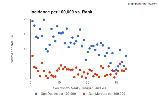
Now we see a more gradual slope, and a correlation of probably around -.8 or so (Edited to add: I should be clear that because we are dealing with ordinal data for the ranking, a correlation is not really valid…I was just describing what would visually jump out at you.). We also get a better sense of the range and proportion.  I didn’t include the state labels, in large part because I’m not sure if I’m using the same year of data the original group was.1

The really big issue here though, is that this graph with it’s wonderful correlation reflects gun deaths, not gun homicides….and of course the whole reason we are currently having this debate is because of gun homicides. I’m not the only one who noticed this, Eugene Volokh wrote about it at the Washington Post as well. I almost canned this post, but then I realized I didn’t particularly like his graph either. No disrespect to Prof Volokh, it’s really mostly that I don’t understand what the Brady Campaign means when it gives states a negative rating.  So I decided to plot both sets of data on the same graph and see what happened.  I got the data on just gun homicides here.

Gun graph 3

That’s a pretty big difference.  Now I think there’s some good discussion to have around what accounts for this difference – suicides and accidents – and if that’s something to take in to account when reviewing gun legislation, but Volokh most certainly handles that discussion better than I.  I’m just a numbers guy.


1. I also noticed that Slate flipped the order the Law Center to prevent Gun Violence had originally used, so if you look at the source data you will see a difference. The originally rankings had 1 as the strongest gun laws and 50 as the weakest. However, Slate flipped every state rank to reflect this change, so no meaning was lost. I think it made the graph easier to read.