In the comment section on my last post about guns and graphs there was some interesting discussion about some of the data. SJ had some good data to toss in, and DH made a suggestion that a graph of gun murders vs non-gun murders might be interesting. I thought that sounded pretty interesting as well, so I gave it a whirl:
Apologies that not every state abbreviation is clear, but at least you get the outliers. Please note that the axes are different ranges (it was not possible to read if I made them the same) so Nevada is really just a 50/50 split, whereas Louisiana is actually pretty lopsided in favor of guns. That being said, the correlation here is running at about .6, so it seems fair to say that states that have more gun homicides have more homicides in general. Now to be fair, this chart may underestimate non-gun murders, as those are likely a little harder to count than gun related murders. I don’t have hard data on it, but I’m somewhat inclined to believe that a shooting is easier to classify then a fall off a tall building. Anyway, I pulled the source data from here.
While I was looking at that data, I thought it would be interesting to see if the percent of the population that owned guns was correlated with the number of gun murders:

Aaaaaaaaand…there’s no real correlation there. It’s interesting to note that Hawaii and Wyoming are dramatically different in ownership percentage, but not gun homicide rate. Louisiana and Vermont OTOH, have nearly identical ownership rates and completely different gun homicide rates.
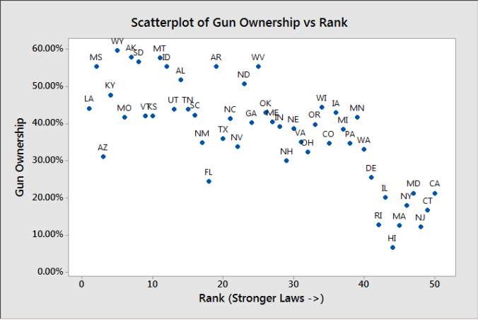
Then, just for giggles I decided to go back to the original gun law ranking I was using, and see if gun ownership percentage followed that trend:
There does appear to be a trend there, but as the Assistant Village Idiot pointed out after the last post, it could simply be that places with lower gun ownership have an easier time passing these laws.


These graphs are interesting, even if they say that correlation isn’t obvious.
Is it possible to color-code some of the charts, for States which contain at least one urban center with population above 500,000 ?
LikeLike
Pingback: 5 Definitions You Need to Remember When Discussing Mass Shootings This Week | graph paper diaries