Terrorist Timelines and Bar Graphs

A reader going by the name of “Sound Information” sent along the following graph from this Brietbart article, with this comment:

Just saw the following graph in a Breitbart article, and thought “wow! those increasing bar lengths really indicate increase” — except really they are just an artifact of earlier dates being closer to the y-axis than later ones.

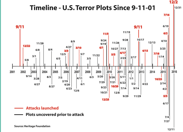
It’s a good point. The bar lengths do, at first glance, appear to represent something in terms of magnitude. It’s only when you look closely that you realize their length is mostly about making the dates readable.  I was curious how this graph would look if I just took the absolute numbers for each year so I did that and I came up with this graph:

attacksplots2

Note: all I did was transcribe their data. They got it from this Heritage Foundation timeline, and I didn’t look to see what got counted or not. I did however, take a look at discrepancies. I think I found 2 typos and 1 intentional addition to the Brietbart data:

  1. Breitbart lists a plot on  June 3, 2008 that the Heritage Foundation doesn’t list and I couldn’t find (probably typo).
  2. The Heritage Foundation has a plot listed on May 16, 2013 that Brietbart did not include (probably typo).
  3. September 11th, 2012 is included on the Breitbart list but not the Heritage Foundation one. This is the date of the Benghazi attacks on the US embassy in Libya (almost certainly intentionally added)

So overall there does appear to be an increase in absolute number, at least of the plots and events we know about or have record of.  This is one of those strange areas where we never quite know how big the sample size was. Some plots (especially single person events) likely fizzle with no one knowing, and more massive plots might be kept from us by FBI/CIA/etc for ongoing investigation reasons.

The other thing  missing from both graphs of course is the magnitude of any of these attacks. 2015 had 15 plots or attacks overall, but 9 of those involved just one person, and 5 involved 2 people. It’s hard to know if it’s more accurate to show number of events, magnitude of events or both. It feels strange to look at 9/11/01 and say “that’s one”, but there also is some value in seeing trends of smaller events.

Regardless of how you do the numbers, I think we all hope 2016 is a record low in every way possible.

5 Ways to Statistically Analyze Your Fantasy Football League

For the past few years I’ve been playing in a fantasy football league with a few folks I grew up with. One of the highlights of the league is the weekly recap/power rankings sent out by our league commissioner. Recently I had to fill in for him, and it got me thinking about how to use various statistical analysis methods to figure out who the best team was overall and who was doing better as the season progressed. I figured since I put the work in, I might as well put a post together going over what I did.  Also, I’m completely tanking this year, so this gives me something a little more fun to focus on1. Our league is a ten team, head to head match-up, PPR league, for what it’s worth.

  1. Mean Comparison Using Tukey’s Method: The first and most obvious question I had when looking at the numbers was who was really better than who to a statistically significant level? ESPN provides a good running total of points scored by each team, but I was curious at what level those differences were statistically significant. The Tukey method lets you calculate a number that shows how far apart average scores have to be before the difference is significant. I had Minitab help me out and got that 36 points was the critical difference in our league at this point in the season. It also gave me this nifty table, with my score and feelings in red:FFtukeySo really there are three distinct groups, each connoted with a different letter. Kyle is showing a bit of spunk here though and rising a bit above the rest, while Heidi is drifting towards the bottom.  I also did this analysis using the scores of each person’s opponents, and despite the perception that some people have gotten lucky, none of the means were significantly different when it came to opponent score.
  2. Box Plot or Box and Whisker Diagram: So if the mean comparison gives us a broad picture of the entire season’s performance, with many teams clumped together, how do we tease out some further detail? I decided to use a box plot, because using quartiles and medians rather than averages helps account for fluky games. As anyone who has ever played fantasy sports knows, even the worst team can have a player explode one week…or have normally good players tank completely. Showing the median performance is more informative of how the player is doing week to week, and how likely they are to outscore opponents. Since I did this at week 11, the box represents about 6 games, and each tail represents about 3.
    FFBoxplot

    The worst part about this graph is it called my best game an outlier.  Why you gotta be so negative there box plot? What did I ever do to you?

    This shows a few interesting things, namely that three players in our league (Ryan, David and JA) have nearly the same median but are having wildly different seasons. It also is one of the clearest ways of putting all the data on one graph. I tried a histogram, and boy did that get messy with 10 different people to keep track of.

  3. Regression Lines/Line of Best FitOkay, so now that we have a good picture of the season, let’s see some trends! Because of course fantasy football, like all sports, cares a lot more about where you end than where you start. Players get injured, people have weak benches, people come back from suspensions, etc etc. By fitting a regression line we can see where everyone started and where they’re headed:FFregression Now this shows us some interesting patterns. I checked the significance levels on these, and 7 of them actually had significant patterns (my scores, David and Jonathan’s were not significant at the .05 level). This is how I ultimately determined the rankings I sent out. Amusingly, one of our most all over the place players didn’t actually get a linear relationship as the best fitting model. I ignored that, but it made me laugh.
  4. Games over League Median (GOLM): This is one I’m working on just for giggles. Basically it’s the number of games each player has played where they scored over the median number of points our league scores. For example, out of the 110 individual performances so far in our league this year, the median score is 133.2 I then calculated the percentage of games each team scored above that number. I was hoping to figure out something a little more accurate than just wins and losses, because of course it doesn’t matter what the league scores…only what your opponent scores. Here’s what I got:FFGOLMI added a line that I will dub “the line of fairness”. Basically, this is where everyone should be based on their scores. If you’re above the line, you’ve actually had a lucky season with more wins then scores over the median. If you’re below the line, you’ve had an unlucky season. On the line is a perfectly fair season. The further away from the line, the more out of range your season has been.
  5. Normal Distribution Comparisons: This one isn’t for the overall league, but does give you a good picture of your weekly competition. I wasn’t actually sure I could do this one because I wasn’t sure my data was normally distributed, but Ryan-Joiner assured me that was an okay assumption to make in this case. Basically, I wanted to see what my chances were of beating my opponent (Ryan) this week. I wasn’t expecting much, and I didn’t get it: FFNormal I did the math to figure out my exact chances, but gave up when it got too depressing. Let’s just say my chances are rather, um, slim. Svelte even. Sigh.

So that’s that! Got any interesting ways of looking at small sample sizes like this? Let me know! I’ll need something to keep me entertained during the games tomorrow, as I certainly won’t be enjoying watching my team.

1. I renamed my team the Sad Pandas. That’s how bad it is. I grabbed Peyton with my first pick and everything has been downhill from there.
2. I also checked the medians for each week, then took the median of that to see if there was a significant difference on a week to week basis. That number was 135, so I didn’t worry about it.

Guns and Graphs Part 2

In the comment section on my last post about guns and graphs there was some interesting discussion about some of the data.  SJ had some good data to toss in, and DH made a suggestion that a graph of gun murders vs non-gun murders might be interesting.  I thought that sounded pretty interesting as well, so I gave it a whirl:

Gun graph 4

Apologies that not every state abbreviation is clear, but at least you get the outliers. Please note that the axes are different ranges (it was not possible to read if I made them the same) so Nevada is really just a 50/50 split, whereas Louisiana is actually pretty lopsided in favor of guns.  That being said, the correlation here is running at about .6, so it seems fair to say that states that have more gun homicides have more homicides in general. Now to be fair, this chart may underestimate non-gun murders, as those are likely a little harder to count than gun related murders. I don’t have hard data on it, but I’m somewhat inclined to believe that a shooting is easier to classify then a fall off a tall building.  Anyway, I pulled the source data from here.

While I was looking at that data, I thought it would be interesting to see if the percent of the population that owned guns was correlated with the number of gun murders:
Gun graph 5

Aaaaaaaaand…there’s no real correlation there. It’s interesting to note that Hawaii and Wyoming are dramatically different in ownership percentage, but not gun homicide rate. Louisiana and Vermont OTOH, have nearly identical ownership rates and completely different gun homicide rates.

Then, just for giggles I decided to go back to the original gun law ranking I was using, and see if gun ownership percentage followed that trend:

Gun graph 6

There does appear to be a trend there, but as the Assistant Village Idiot pointed out after the last post, it could simply be that places with lower gun ownership have an easier time passing these laws.


Guns and Graphs

One of my favorite stats-esque topics is graphs. Specifically how we misrepresent with graphs, or how we can present data better.  This weeks gun control debate provided a lot of good examples of how we present these things….starting with this article at Slate States With Tighter Gun Control Laws Have Fewer Gun Deaths.  It came with this graph:

Gun graph 1

Now my first thought when looking at this graph was two-fold:

  1. FANTASTIC use of color
  2. That’s one heck of a correlation

Now because of point #2, I looked closer. I was sort of surprised to see that the correlation was almost a perfect -1….the line went almost straight from (0,50) to (50,0).  But that didn’t make much sense….why are both axes using the same set of numbers? That’s when I looked at the labels and realized they were both ranks, not absolute numbers. Now for gun laws, this makes sense. You can’t count number of laws due to variability in the scope of laws, so you have to use some sort of ranking system. The gun control grade (the color) also gives a nice overview of which states are equivalent to each other. Not bad.

For gun deaths on the other hand, this is a little annoying. We actually do have a good metric for that: deaths per 100,000.  This would help us maintain the sense of proportion as well.  I decided to grab the original data here to see if the curve change when using the absolute numbers.  I found those here.   This is what I came up with:

Gun graph 2

Now we see a more gradual slope, and a correlation of probably around -.8 or so (Edited to add: I should be clear that because we are dealing with ordinal data for the ranking, a correlation is not really valid…I was just describing what would visually jump out at you.). We also get a better sense of the range and proportion.  I didn’t include the state labels, in large part because I’m not sure if I’m using the same year of data the original group was.1

The really big issue here though, is that this graph with it’s wonderful correlation reflects gun deaths, not gun homicides….and of course the whole reason we are currently having this debate is because of gun homicides. I’m not the only one who noticed this, Eugene Volokh wrote about it at the Washington Post as well. I almost canned this post, but then I realized I didn’t particularly like his graph either. No disrespect to Prof Volokh, it’s really mostly that I don’t understand what the Brady Campaign means when it gives states a negative rating.  So I decided to plot both sets of data on the same graph and see what happened.  I got the data on just gun homicides here.

Gun graph 3

That’s a pretty big difference.  Now I think there’s some good discussion to have around what accounts for this difference – suicides and accidents – and if that’s something to take in to account when reviewing gun legislation, but Volokh most certainly handles that discussion better than I.  I’m just a numbers guy.


1. I also noticed that Slate flipped the order the Law Center to prevent Gun Violence had originally used, so if you look at the source data you will see a difference. The originally rankings had 1 as the strongest gun laws and 50 as the weakest. However, Slate flipped every state rank to reflect this change, so no meaning was lost. I think it made the graph easier to read.