For the past few years I’ve been playing in a fantasy football league with a few folks I grew up with. One of the highlights of the league is the weekly recap/power rankings sent out by our league commissioner. Recently I had to fill in for him, and it got me thinking about how to use various statistical analysis methods to figure out who the best team was overall and who was doing better as the season progressed. I figured since I put the work in, I might as well put a post together going over what I did. Also, I’m completely tanking this year, so this gives me something a little more fun to focus on1. Our league is a ten team, head to head match-up, PPR league, for what it’s worth.
- Mean Comparison Using Tukey’s Method: The first and most obvious question I had when looking at the numbers was who was really better than who to a statistically significant level? ESPN provides a good running total of points scored by each team, but I was curious at what level those differences were statistically significant. The Tukey method lets you calculate a number that shows how far apart average scores have to be before the difference is significant. I had Minitab help me out and got that 36 points was the critical difference in our league at this point in the season. It also gave me this nifty table, with my score and feelings in red:
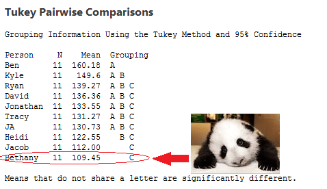 So really there are three distinct groups, each connoted with a different letter. Kyle is showing a bit of spunk here though and rising a bit above the rest, while Heidi is drifting towards the bottom. I also did this analysis using the scores of each person’s opponents, and despite the perception that some people have gotten lucky, none of the means were significantly different when it came to opponent score.
 - Box Plot or Box and Whisker Diagram: So if the mean comparison gives us a broad picture of the entire season’s performance, with many teams clumped together, how do we tease out some further detail? I decided to use a box plot, because using quartiles and medians rather than averages helps account for fluky games. As anyone who has ever played fantasy sports knows, even the worst team can have a player explode one week…or have normally good players tank completely. Showing the median performance is more informative of how the player is doing week to week, and how likely they are to outscore opponents. Since I did this at week 11, the box represents about 6 games, and each tail represents about 3.

The worst part about this graph is it called my best game an outlier. Why you gotta be so negative there box plot? What did I ever do to you?
This shows a few interesting things, namely that three players in our league (Ryan, David and JA) have nearly the same median but are having wildly different seasons. It also is one of the clearest ways of putting all the data on one graph. I tried a histogram, and boy did that get messy with 10 different people to keep track of.
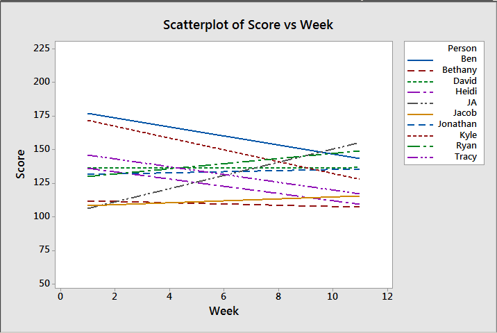
- Regression Lines/Line of Best Fit: Okay, so now that we have a good picture of the season, let’s see some trends! Because of course fantasy football, like all sports, cares a lot more about where you end than where you start. Players get injured, people have weak benches, people come back from suspensions, etc etc. By fitting a regression line we can see where everyone started and where they’re headed:
 Now this shows us some interesting patterns. I checked the significance levels on these, and 7 of them actually had significant patterns (my scores, David and Jonathan’s were not significant at the .05 level). This is how I ultimately determined the rankings I sent out. Amusingly, one of our most all over the place players didn’t actually get a linear relationship as the best fitting model. I ignored that, but it made me laugh.
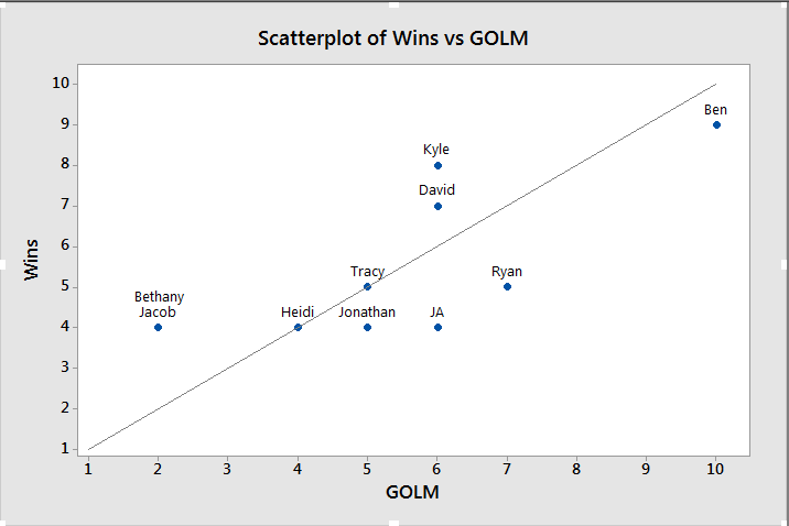
 - Games over League Median (GOLM): This is one I’m working on just for giggles. Basically it’s the number of games each player has played where they scored over the median number of points our league scores. For example, out of the 110 individual performances so far in our league this year, the median score is 133.2 I then calculated the percentage of games each team scored above that number. I was hoping to figure out something a little more accurate than just wins and losses, because of course it doesn’t matter what the league scores…only what your opponent scores. Here’s what I got:
 I added a line that I will dub “the line of fairness”. Basically, this is where everyone should be based on their scores. If you’re above the line, you’ve actually had a lucky season with more wins then scores over the median. If you’re below the line, you’ve had an unlucky season. On the line is a perfectly fair season. The further away from the line, the more out of range your season has been.
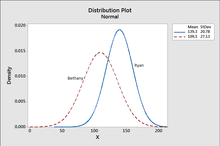
 - Normal Distribution Comparisons: This one isn’t for the overall league, but does give you a good picture of your weekly competition. I wasn’t actually sure I could do this one because I wasn’t sure my data was normally distributed, but Ryan-Joiner assured me that was an okay assumption to make in this case. Basically, I wanted to see what my chances were of beating my opponent (Ryan) this week. I wasn’t expecting much, and I didn’t get it:
 I did the math to figure out my exact chances, but gave up when it got too depressing. Let’s just say my chances are rather, um, slim. Svelte even. Sigh.


So that’s that! Got any interesting ways of looking at small sample sizes like this? Let me know! I’ll need something to keep me entertained during the games tomorrow, as I certainly won’t be enjoying watching my team.
1. I renamed my team the Sad Pandas. That’s how bad it is. I grabbed Peyton with my first pick and everything has been downhill from there.↩
2. I also checked the medians for each week, then took the median of that to see if there was a significant difference on a week to week basis. That number was 135, so I didn’t worry about it. ↩
