Health Expenditures and Obesity

So I dropped my laptop 2 weeks ago and the internet connection has been off and on, dying completely yesterday. Until I either fix it or get a new one, posts will be limited to what I can type on my phone without getting aggravated.

This week I came across a post by Random Critical Analysis analyzing the fairly famous “US spends more on healthcare and has lower life expectancy” graphs. As part of this analysis, he graphs life expectancy vs obesity and shows that the US is very well in line with other developed countries given our above average obesity rate.

To further the point, he breaks down the states individually and shows that this holds within our countries as well:

In other words, low obesity Colorado has a life expectancy in with the other developed countries, while higher obesity states are much lower. He also redid the analysis by splitting other countries up in to regions, and found this pattern holds for other countries as well. The post then goes on to build the causal chain, and it’s pretty fascinating. It even throws in maternal mortality, and shows that if we adjust for BMI, we’re right on par there as well.

I obviously suggest reading the whole post, but it’s a good reminder that this factor has been under discussed in the conversation about healthcare. We often say “other countries have figured out how to deliver healthcare more effectively than we have”, but no country has figured out how to do that with a population as obese as ours. In other words, it seems that unless we really start finding some good ways of preventing obesity or facilitating weight loss, it may be hard to ever reduce our costs. Sobering thought.

An Anecdote About Paranoia and Baseline Assumptions

The Assistant Village Idiot has re-posted one of my favorite anecdotes of his. For those not familiar with him, he has 40+ years experience in a state mental hospital. It’s short, so I’ll repost it in its entirety here (source):

A paranoid patient of ours had taken the book 1984 out of the patient library.  His particular paranoia is very much concerned with thought reading and thought broadcasting. He is not a person one might expect to have good general knowledge of literature and political culture, and he did not have much preconceived notion what it might be about.  He had heard somewhere it was an important book.  We were a little concerned what he might take away from the book, but we don’t get much involved in people’s selections.

He found it sad.  This guy had a girlfriend, but he lost her.

He didn’t really notice the paranoia-inducing parts of the book.  Those were just normal background to him

I think about that a lot, most often when I see a poll question asking people how they feel about current events or to compare previous years to this one. Getting people’s impressions without knowing their baseline can be highly misleading.

5 Disorders With Suprising Sex Differences in Diagnoses

There was a great article in the Atlantic this past week called “What Joe Biden Can’t Bring Himself to Say“.  The article focused on his (and the authors) struggle with stuttering, and contained a lot of fascinating information about stuttering that I never knew. Regardless of your political orientation and/or feelings about Joe Biden, it’s a very worthwhile read.

One of the interesting stats it contained was that stuttering was twice in common in boys than in girls, and that girls have a higher recovery rate. I was interested in this, because aside from a vague “girls have better verbal skills earlier, so I guess that makes sense” train of thought, there doesn’t seem to be a clear reason for this. I Googled a bit and found that no one is really clear on the reason for the discrepancy, though there is a thought that girls may tend to get earlier help because people expect them to be more verbal. This discussion got me interested in other similar disorders. We’re not surprised to hear that issues like prostate cancer or breast cancer are more common in one sex than the other, but some things feel like they should be more gender neutral.

I decided to look up a few other examples, though I excluded mental health type disorders since some of the sex differences there can be a bit controversial, and excluded diseases or disorders that seem to be linked to differences in behavior (such as lung cancer):

Student Debt: A Few Facts and Figures

I wasn’t intending to write about student debt this week, but oddly enough I had two different people ask me about it on the same day. The first was a younger coworker, who had heard Elizabeth Warren say that student loan debt disproportionately affected African Americans and was curious if that was true. He also wanted to where “average student loan debt” numbers came from. The second was the AVIs wife, who sent me a new report looking at the return on investment from different types of colleges, and wanted to know if family income was taken in to account.

Okay, so let’s take this one thing at a time. First, Warren’s comments came from a Tweet where she also shared this article. For clarity, I want to note that this article ISN’T by Warren, but her Tweet would seem to indicate some agreement. The article started with the stat that the average student loan debt was $37,102. My colleague (a fairly recent grad) thought that sounded low.

The average student loan debt number comes from this Chamber of Commerce report. Now this report was interesting because it is looking only at those people who graduated in 2017. When my colleague had first mentioned this to me, I had wondered if the “average” number was including those further from graduation, but it doesn’t. It did however, point out that student loan debt varies wildly based on the region of the country you live in:

New England is one of the highest average levels, so those of us living here will tend to see higher loan totals among our peers. Additionally, borrowers owing 6 figures are the fastest growing group of borrowers,  with about 2 million people owing over $100,000. While much of that is due to graduate school debt, one would suspect those folks would be concentrated in the same areas as the higher levels of debt.

So what about the disproportionate impact claim? Well, that also came from the Chamber of Commerce report. More black students take out loans to pay for their education (77% vs a national average of 60%), they take out higher amounts ($29,000 vs $25,000) and are more likely to default on their loans within 12 years of graduation (50% vs 36% of Hispanic students and 21% of white students). However, it’s important to note that this is comparing graduating students to other graduating students….it excludes those who didn’t go to college or didn’t graduate. Those groups are also disproportionately comprised of minorities. Inside Higher Ed has a good graph of the outcomes by race 6 years after people matriculate:

I think this is striking because it’s something I always wonder about when we talk about student loan forgiveness. Some people choose not to go to college or start in community colleges because of the expense of college. Forgiveness of debt may really help some people, but in many cases big choices have already been made. If there is inequality in those initial choices, then loan forgiveness will not solve those inequalities. We know that white 18 to 24 year olds are more likely to enroll in college than black or Hispanic students, so while the loans taken out by black students may be higher, the proportion of people taking them out is lower. It may still be true, but I think it should be clearer that we’re only talking about students here.

I think this is an important point because if we’re talking fairness, then we have to consider the poorest among us may be among the least likely to take out student loans to begin with. Indeed, an analysis of Warren’s plan showed only 10% of the benefits of this plan would go to the bottom 20% of households. By contrast, the top 20% of qualifying households would get 18% of the benefits. This may even out as the other parts of her plan were implemented (reduction in college cost going forward), but it’s something to consider.  (Note: I will fully admit I haven’t spent much time studying Warren’s proposal, so I may be missing something. Let me know in the comments if I’ve misstated something and I’ll update. I’m using her plan as an example to discuss the broader point about who currently carries student loan debt, not to knock her proposal over others. I really appreciate that she was willing to publicly release her plan for discussion like this.)

Alright so now to the last point….what’s the return on investment for college students? Well according to this calculation in the short run (10 years) it’s better to have gone to a public school than a private one, but by the 40 year mark it’s better to have gone to a private school. For example, my alma mater is Boston University. At the 10 year mark, it’s the 3,318th best ROI in the country. By year 20 post grad, it jumps to 464. By year 30, it’s at 142, and by 40 years it’s almost one of the top 100 best values at 116. The calculator is fun to play around with because you note some interesting patterns. Small schools in the Boston area do better than small schools in New Hampshire, which I will guarantee is a function of the graduates staying near cities. There’s no cost of living adjustment in alumni salary calculations. Some of the Protestant colleges my friends and family went to don’t fare well, but I’d suspect an inordinate number of graduates go in to things like social work, teaching or other ministry positions. In fact a good number of the “worst” ROI schools are actually Rabbincal colleges.

So are these institutions cherry picking rich students and then taking credit for their earnings? Possibly. Nothing in the calculations takes your family’s wealth in to consideration, so a kid who inherits the family business gets counted the same way as a kid who comes from nothing. Additionally, it’s interesting to note that some specialty schools do really well (pharmacy) and some really poorly (art). Schools who don’t have a lot of different types of graduates are very tied to how the professions associated with them are doing.

Additionally, families with money probably tend to send their kids to private schools to begin with. For example, Stephanie and Shane McMahon (children of Vince and Linda McMahon, owners of the WWE) both went to Boston University and then promptly went to work for the family business. I don’t know for sure, but I suspect they never looked at UCONN when they were applying. Now this wasn’t every kid at BU, but having even a handful of the already wealthy can be enough to boost your lifetime earnings scores. In other words, we don’t know if BU is a better deal for a kid from a middle class household who wants to be a high school teacher, or if UMASS would be equal in those circumstances. We only know that overall, BU grads do better 40 years out.

So overall we don’t really know what we don’t know here, but we do know that many college stats leave out some confounders (who didn’t go to college, who was going to have money handed to them regardless of college status). Overall I think they are good for getting a general sense of things, but up close they have some issues. Like a Monet painting or something.

What I’m Reading: November 2019

My migraines have been in full swing this week, so we’ve got a few lighter ones here. Like the Audobon “What Kind of Owl Are You?” quiz. I’m apparently a spotted owl, but that may just be because a dark woods sounds good right about now.

For those who Tweet, if you ever want to see how many words you’ve racked up over time, this link hooks you up.  It tells you what your Twitter feed would be if it were a book. I’m slacking at “Where the Wild Things Are”. The goal apparently is to beat Proust at 1.5 million words.

The above led me down a rabbit hole of “longest novel” Googling, which got me here. Turns out a lot of long novels end up with controversy over whether they are one or many books. Regardless, I’d only even heard of 3 of these. Interesting.

For a slightly longer read, I thought SSCs post on the fall of New Atheism was pretty interesting. As someone who blogged for one of the websites involved in all this for a few years, I’d say Scott hits on a lot of interesting things, and he’s right that more people should be asking “what happened here?”. My two cents: I think people involved in the movement were there for two different reasons. One group rejected religion primarily because they believed religion opposed science and reason, the other because they believed religion promoted oppression. When the second group started to accuse the first group of being oppressive, they were upset to find the first group didn’t care as much as they’d assumed. When the first group started hearing about oppression, they got upset because they believed it to be a secondary concern. I think this was a case of finding out the hard way that the enemy of your enemy isn’t always your friend, but if any readers who were involved have other thoughts I’d like to hear them.

On a related note, the AVI wrote me this week to tell me he wants to lend me The Genesis of Science, which chronicles the history of science and the church in the middle ages. It looks interesting.


There’s More to that Story: 4 Psych 101 Case Studies

Well it’s back to school time folks, and for many high schoolers and college students, this means “Intro to Psych” is on the docket. While every teacher teaches it a little differently, there are a few famous studies that pop up in almost every textbook. For years these studies were taken at face value, however with the onset of the replication crisis many have gotten a second look and have been found to be a bit more complicated than originally thought.  I haven’t been in a classroom for psych for quite a few years so I’m hopeful the teaching of these has changed, but just in case it hasn’t, here’s a post with the extra details my textbooks left out.

Kitty Genovese and the bystander effect: Back in my undergrad days, I learned all about Kitty Genovese, murdered in NYC while 37 people watched and did nothing. Her murder helped coin the term “bystander effect”, where large groups of people do nothing because they assume someone else will. It also helped prompt the creation of “911” the emergency number we all can call to report anything suspicious.

So what’s the problem? Well, the number 37 was made up by the reporter, and likely not even close to true. The New York Times had published the original article reporting on the crime, and in 2016 called their own reporting “flawed“. A documentary was made in 2015 by Kitty’s brother investigating what happened, and while there are no clear answers, what is clear is that a murder that occurred at 3:20am probably didn’t have 38 witnesses who saw anything, or even understood what they were hearing.

Zimbardo/Stanford Prison Experiment: The Zimbardo (or Stanford) Prison Experiment is a famous experiment in which study participants were asked to act as prisoners or guards in a multi-day recreation of a prison environment. However, things got quickly out of control and the guards got so cruel and the prisoners so rowdy that the whole thing had to be shut down early. This showed the tendency of good people to immediately conform to expectations when they were put in bad circumstances.

So what’s the problem? Well, basically the researcher coached a lot of the bad behavior. Seriously, there’s audio of him doing it. This directly contradicts his own statements later that there were no instructions given. Reporter Ben Blum went back and interviewed some of the participants who said they were acting how they thought the researchers wanted them to act. One guy said he freaked out because he wanted to get back to studying for his GREs and thought the meltdown would make them let him go early. Can bad circumstances and power imbalances lead people to act in disturbing ways? Absolutely, but this experiment does not provide the straightforward proof it’s often credited with.

The Robber’s Cave Study: A group of boys are camping in the wilderness and are divided in to two teams. They end up fighting each other based on nothing other than assigned team, but then come back together when facing a shared threat. This shows how tribalism works, and how we can overcome it through common enemies.

So what’s the problem? The famous/most reported on study was take two of the experiment. In the first version the researchers couldn’t get the boys to turn on each other, so they did a second try eliminating everything they thought had added group cohesion in the first try, and finally got the boys to behave as they wanted. There’s a whole book written about it and it showcases some rather disturbing behavior on the part of the head researcher Muzafer Sherif. He was never clear with the parents what type of experiment the boys were subjected to, and he actually both destroyed personal belongings himself (to blame it on the other team) and egged the boys on in their destruction. When Gina Perry wrote her book she found that many of the boys who participated (and are now in their 70s) were still unsettled by the experiment. Not great.

Milgram’s electric shock experiment: A study participant is brought in to a room and asked to administer an electric shock to a person they can’t see who is participating in another experiment. When the hidden person gets a question “wrong” they are supposed to zap them to help them learn. When they zap them, a recording plays of someone screaming in pain. It is found that 65% of people will administer a fatal shock to a person as long as the researcher keeps encouraging them to do so. This shows that our obedience to authority can override our own ethics.

So what’s the problem? Well, this one’s a little complicated. The original study was actually 1 of 19 studies conducted, all with varying rates of compliance. The most often reported findings were from the version of the experiment that resulted in the highest amount of compliance. A more recent study also reanalyzed participants behavior in light of their (self-reported) belief that the subject was actually in pain or not. One of the things the researchers told people to get them to continue was that the shocks were not dangerous, and it also appears many participants didn’t think what they were participating in was real, and it wasn’t. They found that those who either believed the researchers assurances or expressed skepticism about the entire experiment were far more likely to administer higher levels of voltage than those who believed the experiment was legit. To note though, there have been replication attempts that did find comparable compliance rates to Milgram’s, though the shock voltage has always been lower due to ethics concerns.

So overall, what can we learn from this? Well first and foremost that once study results hit psych textbooks, it can be really hard to correct the error. Even if kids today aren’t learning these things, many of us who took psych classes before the more recent scrutiny of these tests may keep repeating them.

Second, I think that we actually can conclude something rather dark about human nature, even if it’s not what we first thought. The initial conclusion of these studies is always something along the lines of “good people have evil lurking just under the surface”, when in reality the researchers had to try a few times to get it right. And yet this also shows us something….a person dedicated to producing a particular outcome can eventually get it if they get enough tries. One suspects that many evil acts were carried out after the instigators had been trying to inflame tensions for months or years, slowly learning what worked and what didn’t. In other words, random bad circumstances don’t produce human evil, but dedicated people probably can produce it if they try long enough. Depressing.

Alright, any studies you remember from Psych 101 that I missed?

Absolute Numbers, Proportions and License Suspensions

A few weeks ago I mentioned a new-ish Twitter account that was providing a rather valuable public service by Tweeting out absolute vs relative risk as stated in various news articles. It’s a good account because far too often scientific news is reported with things like “Cancer risk doubled” (relative risk) when the absolute risk went from .02% to .04%. Ever since I saw that account I’ve wondered about starting an “absolute numbers vs proportions” type account where you follow up news stories that compare absolute numbers for things against proportional rates to see if they are any different.

I was thinking about this again today because I got a request from some of my New Hampshire based readers this week to comment on a recent press conference held by the Governor of New Hampshire about their recent investigation in to their license suspension practices.

Some background: A few months ago there was a massive crash in Randolph, New Hampshire that killed 7 motorcyclists, many of them former Marines. The man responsible for the accident was a truck driver from Massachusetts who crossed in to their lane. In the wake of the tragedy, a detail emerged that made the whole thing even more senseless: he never should have been in possession of a valid drivers license. In addition to infractions spread over several states, a recent DUI in Connecticut should have resulted in him losing his commercial drivers license in Massachusetts. However, it appears that the Massachusetts RMV had never processed the suspension notice, so he still was driving legally. Would suspending his license have stopped him from driving that day? It’s not clear, but it certainly seems like things could have played out differently.

In the wake of this, the head of the Massachusetts RMV resigned, and both Massachusetts and New Hampshire ordered reviews of their processes for handling suspension notices sent to them by other states.

So back to the press conference. In it, Governor Sununu revealed the findings of their review, but took great care to emphasize that New Hampshire had done a much better job than Massachusetts in reviewing their out of state suspensions. He called the difference between the two states “night and day” and said “There was massive systematic failure in the state of Massachusetts. [The issue in MA was] so big; so widespread; that was not the issue here.”

He then provided more numbers to back up his claim. The two comparisons in the article above say that NH found their backlog of notices was 13,015, but MAs was 100,000. NH had sent suspension notices to 904 drivers based on the findings, MA had to send 2,476. Definitely a big difference, but I’m sure you can see where I’m going with this. The population of MA is just under 7 million people, and NH is just about 1.3 million. Looking at just the number of license drivers, it’s 4.7 million vs 1 million. So basically we’ve got a 5:1 ratio of MA to NH people. Thus a backlog of 13,000 would proportionally be 65,000 in MA (agreeing with Sununu’s point) but the 904 suspensions is proportionally much higher than MAs 2,476 (disagreeing with Sununu’s point). If you were to change it to the standard “per 100,000 people”, MA sent suspension notices to 52 people per 100,000 drivers, NH sent 90 per 100,000.

I couldn’t find the whole press conference video nor the white paper they said they wrote so I’m not sure if this proportionality issue was mentioned, but it wasn’t in anything I read. There were absolutely some absurd failures in Massachusetts, but I’m a bit leery of comparing absolute numbers when the base populations are so different. Base rates are an important concept, and one we should keep in mind, with or without a cleverly named Twitter feed.

Math aside, I do hope that all of these reforms help prevent similar issues in the future. This was a terrible tragedy, and unfortunately one that uncovered really gaps in the system that was supposed to deal with this sort of thing. Here’s hoping for peace for the victim’s families, and that everyone has a safe and peaceful Labor Day weekend!


Are You Rich?

A few weeks ago the New York Times put up a really interesting interactive “Are You Rich?” calculator that I found rather fascinating. While I always appreciate “richness” calculators that take metro region in to account (a surprising number don’t), I think the most interesting part is when they ask you to define “rich” before they give you the results.

This is interesting because of course many people use the word “rich” to simply mean “has more than I do”, so asking for a definition before giving results could surprise some people. In fact, they include this graph that shows that about a third of people in the 90th percentile for incomes still say they are “average”:

Now they include some interesting caveats here, and point out that not all of these people are delusional. Debt is not taken in to account in these calculations, so a doctor graduating med school with $175,000 in debt might quite rightfully feel their income was not the whole story.  Everyone I know (myself included) who finishes up with daycare and moves their kid in to public school jokes about the massive “raise” you get when you do that. On the flip side, many retirees have very low active income but might have a lot in assets that would give them a higher ranking if they were included.

That last part is relevant for this graph here, showing perceived vs actual income ranking. The data’s from Sweden, but it’s likely we’d see a similar trend in the US:

The majority of those who thought they were better off than they were are below 25th percentile, but we don’t know what they had in assets.

For the rest of it, someone pointed out on Twitter that while “rich people who don’t think they’re rich” get a lot of flack, believing you’re less secure than you are is probably a good thing. It likely pushes you to prepare for a rainy day a bit more. A country where everyone thought they were better off than they were would likely be one where many people made unwise financial decisions.

Interesting to note that the Times published this in part because finding out where you are on the income distribution curve is known to change your feelings about various taxation plans. In the Swedish study that generated the graph above, they found that those discovering they were in the upper half tended to be less supportive of social welfare taxation programs after they got the data. One wonders if some enterprising political candidate is eventually going to figure out how to put in kiosks at rallies or in emails to help people figure out if they benefit or not.

Life Expectancy and Record Keeping

Those of you who follow any sort of science/data/skepticism news on Twitter will have almost certainly have heard of the new pre-print taking the internet by storm this week: “Supercentenarians and the oldest-old are concentrated into regions with no birth certificates and short lifespans“.

This paper is making a splash for two reasons:

  1. It is taking on a hypothesis that has turned in to a cottage industry over the years.
  2. The statistical reasoning makes so much sense it makes you feel a little silly for not questioning point #1 earlier.

Of course #2 may be projection on my part, because I have definitely read the whole “Blue Zone” hypothesis (and one of the associated books) and never questioned the underlying data. So let’s go over what happened here, shall we?

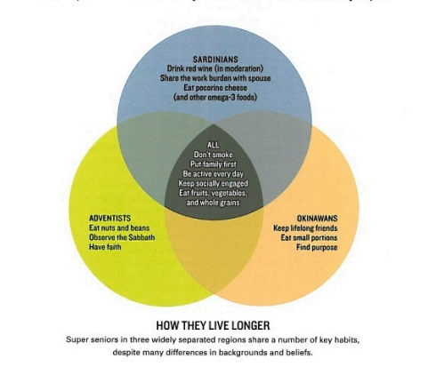
For those of you not familiar with the whole “Blue Zone” concept, let’s start there. The Blue Zones were something popularized by Dan Buettner who wrote a long article about them for National Geographic magazine back in 2005. The article highlighted several regions in the world that seemed to have extraordinary longevity: Sardinia (Italy), Okinawa (Japan) and Loma Linda (California, USA). All of these areas seemed to have a very above average number of people living to be 100. They studied their habits to see if they could find anything the rest of us could learn. In the original article, that was this:

This concept proved so incredibly popular that Dan Buettner was able to write a book, then follow up books, then a whole company around the concept. Eventually Ikaria (Greece) and Nicoya Peninsula (Costa Rica) were added to the list.

As you can see the ultimate advice list obtained from these regions looks pretty good on its face. The idea that not smoking, making good family and social connections, daily activity and fruits and vegetables are good certainly isn’t turning conventional wisdom on it’s head. So what’s being questioned?

Basically the authors of the paper didn’t feel that alternative explanations for longevity had been adequately tested, specifically the hypothesis that maybe not all of these people were as old as they said they were or that otherwise bad record keeping was inflating the numbers. While many of the countries didn’t have clean data sets, they were able to pull some data sets from the US, and discovered that the chances of having people in your district live until they were 110 fell dramatically once state wide birth registration was introduced:

Now this graph is pretty interesting, and I’m not entirely sure what to make of it.  There seems to be a peak at around -15 years before implementation, which is interesting, with some notable fall off before birth registration is even introduced. One suspects birth registration might be some proxy for expanding records/increased awareness of birth year. Actually, now that I think about it, I bet we’re catching some WWI and WWII related things in here. I’m guessing the fall off before complete birth registration had something to do with the draft around those wars, where proving your age would have been very important. The paper notes that the years 1880 to 1900 have the most supercentenarians born in those years, and there was a draft in 1917 for men 21-30. Would be interesting to see if there’s a cluster of men at birth years just prior to 1887. Additionally the WWII draft start in 1941 went up to 45, so I wonder if there’s a cluster at 1897 or just before. Conversely, family lore says my grandfather exaggerated his age to join the service early in WWII, so it’s possible there are clusters at the young end too.

The other interesting thing about this graph is that it focused on supercentenarians, aka those who live to 110 or beyond. I’d be curious to seem the same data for centenarians (those who live to 100) to see if it’s as dramatic. A quick Google suggests that being a supercenetarian is really rare (300ish in the US out of 320 million) but 72,000 or so centenarians. Those living to 90 or over number well over a million. It’s much easier to overwhelm very rare event data with noise than more frequent data. I have the Blue Zone book on Kindle, so I did a quick search and noticed that he mentioned “supercenterians” 5 times, all on the same page. Centenarians are mentioned 167 times.

This is relevant because if we saw a drop off in all advanced ages when birth registrations were introduced, we’d know that this was potentially fraudulent. However, if we see that only the rarest ages were impacted, then we start to get in to issues like typos or other very rare events as opposed to systematic misrepresentation. Given the splash this paper has made already, I suspect someone will do that study soon. Additionally, the only US based “Blue Zone”, Loma Linda California, does not appear to have been studied specifically at all. That also may be worth looking at to see if the pattern still holds.

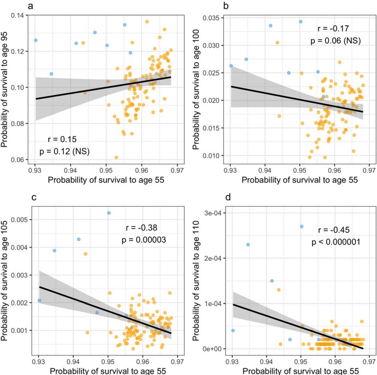
The next item the paper took a shot at was the non-US locations, specifically Okinawa and Sardinia. From my reading I had always thought those areas were known for being healthy and long lived, but the paper claims they are actually some of the poorest areas with the shortest life expectancies in their countries. This was a surprise to me as I had never seen this mentioned before. But here’s their data from Sardinia:

The Sardinian provinces are in blue, and you’ll note that there is eventually a negative correlation between “chance of living to 55” and “chance of living to 110”. Strange. In the last graph in particular there seem to be 3 provinces in particular that are causing the correlation to go negative, and one wonders what’s going on there. Considering Sardinia as a whole has a population of 1.6 million, it would only take a few errors to produce that rate of longevity.

On the other hand, I was a little surprised to see the author cite Sardinia as having on of the lowest life expectancies. Exact quote “Italians over the age of 100 are concentrated into the poorest, most remote and shortest-lived provinces,”. In looking for a citation for this, I found on Wiki this report (in Italian). It had this table:

If I’m using Google translate correctly, Sardegna is Sardinia and this is a life expectancy table from 2014. While it doesn’t show Sardinia having the highest life expectancy, it doesn’t show it having the lowest either. I tried pulling the Japanese reports, but unfortunately the one that it looks the most useful is in Japanese. As noted though, the paper hasn’t yet gone through peer review, so it’s possible some of this will be clarified.

Finally, I was a little surprised to see the author say “[these] patterns are difficult to explain through biology, but are readily explained as economic drivers of pension fraud and reporting error.” While I completely agree about errors, I do actually think there’s a plausible mechanism that would cause poor people who didn’t live to 55 as often to have longer lifespans. Deaths under 55 tend to be from things like accidents, suicide, homicide and congenital anomalies….external forces. The CDC lists the leading causes of death by age group here:

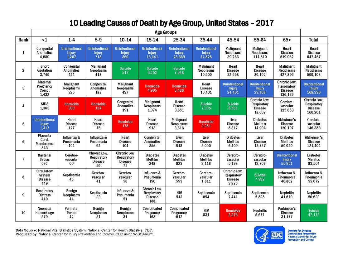
Over 55, we mostly switch to heart disease and cancer. A white collar office worker with a high stress job and bad eating habits may be more likely to live to 55 than a shepherd who could get trampled, but once they’re both 75 the shepherd may get the upper hand.

I’m not doubting the overall hypothesis by the way….I do think fraud or errors in record keeping can definitely introduce issues in to the data. Checking outliers to make sure they aren’t errors is key, and having some skepticism about source data is always warranted. After writing most of this post though, I decided to check back in on the Blue Zones book to see if they addressed this.  To my surprise, the book claims that at least in Sardinia, this was actually done. On page 25 and 26, they mention specifically how much doubt they faced and how one doctor personally examined about 200 people to help establish their truthfulness about their age. Dr Michel Poulain (a Belgian demographer) apparently was nominated by a professional society specifically to go to Sardinia to check for signs of fraud. According to the book, he visited the region ten times to review records and interview people. I have no idea how thorough he was or how his methods hold up, but his work seems at odds with the idea that someone just blindly pulled ages out of a database or the papers claim that “These results may reflect a neglect of error processes as a potential generative factor in remarkable age records”. Interestingly, I’d imagine WWI and WWII actually help with much of the work here. Since I’d imagine most people have very vivid memories of where they were and what they were doing during the war years, those stories might go far to establishing age.

Basically, it seems like sporadic exaggeration, error or fraud might give mistaken impressions about how many supercenteranian people there are overall, but I do wonder if having an unusual cluster brings enough scrutiny that we don’t have to worry as much that something was missed. In the Blue Zone book, they mention the group that brought attention to the Sardinians had helped debunk 3 other similar claims. Also, as mentioned, the paper doesn’t mention if the one US blue zone was one of the ones to get late birth registration, but I do know the Seventh Day Adventists are one of the most intensely studied groups in the country.

Anyway, given the attention and research that has been paid to these areas, I’d imagine we’re going to hear some responses soon.  Dr Poulain appears to still be active, and one suspects he will be responding to this questioning of his work. This post is getting my “things to check back in on” tag. Stay tuned!


Beard Science

As long as I’ve been alive, my Dad has had a full beard [1].

When I was a kid, this wasn’t terribly common. Over the years this has become surprisingly more common, and now the fact that his is closely trimmed is the uncommon part.

With the sudden increase in the popularity of beards, studying how people perceive bearded vs clean shaven men has gotten more popular. Some of this research is about how women perceive men with beards, and there’s actually a “peak beard” theory that suggests that women’s preferences for beards goes up as the number of men with beards goes down and vice versa.

This week though, someone decided to study a phenomena that has always fascinated me: small children’s reaction to men with beards. Watching my Dad (a father of 4 who is pretty good with kids) over the years, we have noted that kids do seem a little unnerved by the beard. Babies who have never met him seem to cry more often when handed to him, and toddlers seem more frightened of him. The immediacy of these reactions have always suggested that there’s something about his appearance that does it, and the beard is the obvious choice.

Well, some researchers must have had the same thought because a few weeks ago a paper “Children’s judgements [sic] of facial hair are influenced by biological
development and experience” was published that looks at children’s reactions to bearded men. The NPR write up that caught my eye is here, and it led with this line “Science has some bad news for the bearded: young children think you’re really, really unattractive.”. Ouch.

I went looking for the paper to see how true that was, and found that the results were not quite as promised (shocking!). The study had an interesting set up. They had 37 male volunteers get pictures taken of themselves clean shaven, then had them all grow a beard for the next 4-8 weeks and took another picture. This of course controls for any sort of selection bias, though to note the subjects were all of European decent. Children were then shown the two pictures of the same man and asked things like “which face looks best?” and “which face looks older?”. The results are here:


So basically the NPR lead in contained two slight distortions of the findings: kids never ranked people as “unattractive”, they just picked which face they thought looked best, and young kids actually weren’t the most down on beards, tweens were.

Interestingly, I did see a few people on Twitter note that their kids love their father with a beard, and it’s good to note the study actually looked at this too. The rankings used to make the graph above were done purely on preferences about strangers, but they did ask kids if they had a father with a beard. For at least some measures in some age groups, having exposure to beards made kids feel more positively about beards. For adults, having a father or acquaintances with beards in childhood resulted in finding beards more attractive in adulthood. It’s also good to note that the authors did use the Bonferri correction to account for multiple comparisons, so they were rigorous in looking for these associations.

Overall, some interesting findings. Based on the discussion, the working theory is that early on kids are mostly exposed to people with smooth faces (their peers, women) so they find smooth faces preferable. Apparently early adolescence is associated with an increased sensitivity to sex specific traits, which may be why the dip occurs at age 10-13. They didn’t report the gender breakdown so I don’t know if it’s girls or boys changing their preference, or both.

No word if anyone’s working on validating this scale:

[1] Well, this isn’t entirely true, there were two exceptions. Both times he looked radically different in a way that unnerved his family, but I was fascinated to note that some of his acquaintances/coworkers couldn’t figure out what was different. The beard covers about a third of his face. This is why eye witness testimony is so unreliable.