A few weeks ago the New York Times put up a really interesting interactive “Are You Rich?” calculator that I found rather fascinating. While I always appreciate “richness” calculators that take metro region in to account (a surprising number don’t), I think the most interesting part is when they ask you to define “rich” before they give you the results.
This is interesting because of course many people use the word “rich” to simply mean “has more than I do”, so asking for a definition before giving results could surprise some people. In fact, they include this graph that shows that about a third of people in the 90th percentile for incomes still say they are “average”:
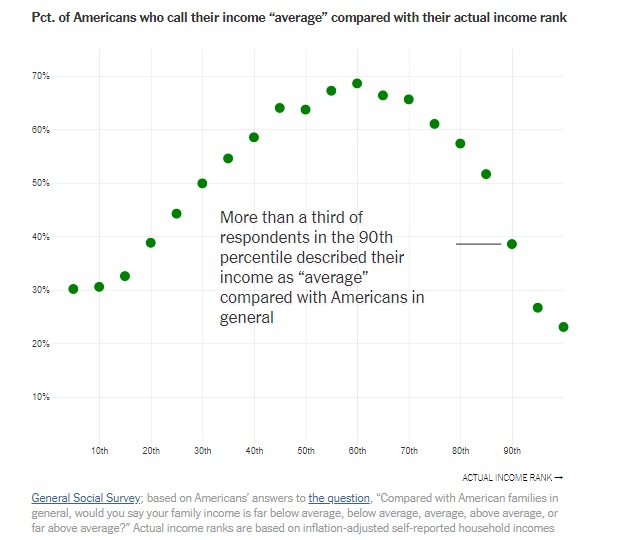
Now they include some interesting caveats here, and point out that not all of these people are delusional. Debt is not taken in to account in these calculations, so a doctor graduating med school with $175,000 in debt might quite rightfully feel their income was not the whole story. Everyone I know (myself included) who finishes up with daycare and moves their kid in to public school jokes about the massive “raise” you get when you do that. On the flip side, many retirees have very low active income but might have a lot in assets that would give them a higher ranking if they were included.
That last part is relevant for this graph here, showing perceived vs actual income ranking. The data’s from Sweden, but it’s likely we’d see a similar trend in the US:

The majority of those who thought they were better off than they were are below 25th percentile, but we don’t know what they had in assets.
For the rest of it, someone pointed out on Twitter that while “rich people who don’t think they’re rich” get a lot of flack, believing you’re less secure than you are is probably a good thing. It likely pushes you to prepare for a rainy day a bit more. A country where everyone thought they were better off than they were would likely be one where many people made unwise financial decisions.
Interesting to note that the Times published this in part because finding out where you are on the income distribution curve is known to change your feelings about various taxation plans. In the Swedish study that generated the graph above, they found that those discovering they were in the upper half tended to be less supportive of social welfare taxation programs after they got the data. One wonders if some enterprising political candidate is eventually going to figure out how to put in kiosks at rallies or in emails to help people figure out if they benefit or not.

You are about average income for the people you live near and hang around with, and so perceive yourself that way. Unless your area is very wealthy or very poor, you don’t tend to figure that in all that much. You are average for the pond you swim in.
LikeLike