Two Minor Points on Viral Graphs

There’s been a couple graphs trending on Twitter this week, and a couple of people have made sure to pass them on to me (thank you!). Both of them are trends over time for two of the hottest topics you can discuss: sex and religion.

The first was this one from the Washington Post, and shows the percentage of people not having sex is steadily increasing. The most stunning chart was this one:

Of course your eyes immediately go to the right of the chart. It’s rather stunning that the percent of those not having sex in their 20s is twice as high as those not having sex in their 50s. A lot has been written about that right part of the graph and the sudden change in 2008 when the economy crashed/iPhone debuted, but I’ll admit the sudden dip and jump around 1998 caught my eye. What happened?

Well, as someone in their teens at that time, I have a guess. That was right when the Bill Clinton impeachment hearing was happening, and there was a large national debate about oral sex, and whether that counted as sex. Is it possible that having the definition so nationally debated changed the way young people answered the question temporarily? I may be wildly off on that, but it’s certainly an odd hiccup.

Next up, the latest GCS data shows that those saying they have no religious affiliation has surpassed those saying they are Evangelical in the US:

This is the first time “no religion” has surpassed all the other groupings, though to be fair 4 of those are just different groups of Christians.

As I looked at this graph, I was interested in how relatively stable Black Protestant has been….until I saw 1970. Did they really have about 14% of the population then suddenly drop to 8 or 9% then stay there for almost 5 decades? That seems unlikely.

I couldn’t figure out what happened there until I realized that 1970 appears to be the year Evangelicalism started to spike. I couldn’t find any specifics, but I am guessing that there was some reshuffling around what denominations were considered “Black Protestant” and which were considered “Evangelical”. When I did my post on religious classifications a few months ago, I noted that churches with “Baptist” in the name could be counted as Evangelical, Black Protestant or Mainline. My guess is it took a bit to get that sorted out on the GCS.

Anyway, no idea if I’m right on either of these theories, but I like to look at parts of the graphs that don’t get all the attention. Sometimes you can get interesting insights in to the data gathering process by looking at the parts that aren’t under scrutiny.


GPD Lexicon: Broken Record Statistics

Today’s addition to the GPD Lexicon is made in honor of my Dad.

It will come as no surprise to anyone that after years of keeping up this blog, people now have a tendency to seek me out when they have heard a particularly irritating statistic or reference during the week. This week it was my Dad, who heard a rather famous columnist (Liz Bruenig) mention on a podcast that “even conservative New Hampshire is considering getting rid of the death penalty”. He wasn’t irritated at the assertion that NH is looking to get rid of the death penalty (they are), but rather the assertion that NH was representative of a “conservative state”.

You see while NH certainly has a strong Republican presence, it is most famous for being a swing state and has actually gone for Democrats in every presidential election since 1992, except for the year 2000. Currently their Congressional delegation is 4 Democrats. Their state legislature is Democrat controlled. Slightly more people (3%) identify as Democrat or lean that way than Republican. The Governor is a Republican, and it is definitely the most conservative state in New England, but calling it a conservative state on a national level is pretty untrue. Gallup puts it at “average” at best.

What struck me as interesting about this is that New Hampshire actually did used to be more conservative. From 1948 to 1988, a Democrat only won the Presidential election there once. From 1900 to 2000, the Governor was Republican for 84 out years out of the century. In other words, it wasn’t a swing state until around 1992 (per Wiki).

It’s interesting then that Liz Bruenig, born in 1990, would consider NH a conservative state. NH has not been “conservative” in nearly her entire life, so what gives? Why do things like this get repeated and repeated even after they’ve changed? I’ve decided we need a word for this, so my new term is Broken Record Statistics:

Broken Record Statistic: A statistic or characterization that was once true, but is continuously repeated even after the numbers behind it have moved on.

In the course of looking this up btw, I found another possible broken record statistic. If you ask anyone from New Hampshire about the blue shift in the state, they will almost all say it’s because people from Massachusetts are moving up and turning the state more blue. However, the Wiki page I quoted above had this to say “A 2006 University of New Hampshire survey found that New Hampshire residents who had moved to the state from Massachusetts were mostly Republican. The influx of new Republican voters from Massachusetts has resulted in Republican strongholds in the Boston exurban border towns of Hillsborough and Rockingham counties, while other areas have become increasingly Democratic. The study indicated that immigrants from states other than Massachusetts tended to lean Democrat.” The source linked was a Union Leader article (“Hey, don’t blame it on Massachusetts!”) name but no link. Googling showed me nothing. However, the town by town maps do indicate that NH is mostly Republican at the border.

Does anyone know where these numbers are coming from or the UNH study referenced?

Praiseworthy Wrongness: Open-Minded Inventories

I haven’t done one of these in a while, but recently I saw an excellent example of what I like to call “Praiseworthy Wrongness”, or someone willing to publicly admit they have erred due to their own bias. I like to highlight these because while in a perfect world no one would make a mistake, the best thing you can do upon realizing you have made one is to own up to it.

Today’s case is from a research Keith Stanovich, who created something called the Active Open-Thinking Questionnaire back in the 90s. In their words, this questionnaire was supposed to measure “a thinking disposition encompassing the cultivation of reflectiveness rather than impulsivity; the desire to act for good reasons; tolerance for ambiguity combined with a willingness to postpone closure; and the seeking and processing of information that disconfirms one’s beliefs (as opposed to confirmation bias in evidence seeking).”

For almost 20 years this questionnaire has been in use in numerous psychological studies, but recently Stanovich became trouble when he noted that several studies showed that being religious had a very strong negative correlation (-.5 to -.7) with open-minded thinking. While one conclusion you could draw from this is that religious people are very closed minded, Stanovich realized he had never intended to make any statement about religion. This correlation was extremely strong for a psychological finding, and the magnitude concerned him. He also got worried as he realized that neither he nor anyone else in his lab were religious. Had they unintentionally introduced questions that were biased against religious people? In his new paper “The need for intellectual diversity in psychological science: Our own studies of actively open-minded thinking as a case study“, he decided to take a look.

In looking back over the questions, he realized that the biggest difference seemed to be appearing in questions addressing the tendency towards”belief revision”. These questions were things like “People should always take into consideration evidence that goes against their beliefs”, and he realized they would probably be read differently by religious vs non-religious people. A religious person would almost certainly read that statement and jump immediately to their core values: belief in God, belief in morality, etc etc. In other words, they’d be thinking of moral or spiritual beliefs. A secular person might have a different interpretation, like their belief in global warming or their belief in H Pylori causing stomach ulcers….their factual beliefs. It would therefore be unsurprising that religious people would be less likely to answer “sure I’ll change my mind ” than secular ones.

To test this, they decided to make the questions more explicit. Rather than ask generic questions, they decided to create a secular and a religious version of each question as well. The modifications are shown here:

They then randomly assigned groups of people to take a test with each version of the questions, along with identifying how religious they were. The results confirmed his suspicions:

When non-religious people were given generic questions, they scored higher on open-mindedness than highly religious people. When the questions cited religious examples, they continued to score as open minded. However, when the questions changed to specific secular examples, such as justice and equality, their scores dropped. Religious people showed the reverse, however their drop with religious questions wasn’t quite as profound. Overall, the negative correlation with religion still remained, but it got much smaller under the new conditions.

So basically the format of the belief revision questions resulted in a correlation as high as -.60 for specifically religious questions, down to -.27 for secular questions. The -.27 was more in line with the score for other types of questions on the test (-.22), so they recommended that secular versions be used.

At the end of the paper, things get really interesting. The authors go meta and start to ask why it took them 20 years to figure out this set of questions was biased. A few issues they raise:

  1. They believed they had written a neutral set of questions, and had never considered that the word “belief” could be interpreted differently by different groups of people
  2. They missed #1  “because not a single member of our lab had any religious inclinations at all.”
  3. They correlations fit their biases, so they didn’t question them. They admitted that if religion had ended up positively correlating with open mindedness, they would probably have re-written the test.
  4. They believe this is a warning both against having a non-diverse staff and believing in effect sizes that are unrealistically big. While they reiterate that the negative correlation does exist, they admit that they should have been suspicious about how strong it was.

Now whatever you think of the original error, it is damn impressive to me for someone to come forward and publicly say 20 years worth of their work may not be totally valid and to attempt to make amends. Questionnaires and validated scales are used widely in psychology, so the possible errors here go beyond just the work of this one researcher. Good on them for coming forward, and doing research to actually contradict themselves. The world needs more of this.


Women, Equality, Work and Statistics

A reader sent along an article recently with a provocative headline “U.S. not in top 60 nations for equality for working women“, along with a request for my opinion. As a working woman I was of course immediately interested in which 60ish countries were ahead of us, so I took a look. The article itself is based on a report from the World Bank called “Women, Equality and the Law 2019” which can be found here. It looks at laws in 8 different areas that impact women’s equality in the workplace, and assigns countries a score based on whether they have them or not. The areas looked at were:

  • Going places: constraints on freedom of movement
  • Starting a job: analyzes laws affecting women’s decision to work
  • Getting paid: Measures laws and regulations affecting women’s pay
  • Getting married: Assesses legal constraints
  • Having children: Examines laws affecting women’s ability to work after having children
  • Running a business: Analyzes constraints to women starting and running businesses
  • Managing assets: Considers gender differences in property and inheritance
  • Getting a pension: Assesses laws affecting the size of a woman’s pension

Given this approach, it seems that the initial headline was a little misleading as to what this study actually found. This study looks only at the existence of laws, not whether they are enforced or not or actual equality for women. Headline writers gonna headline, I guess. The article itself was better, as it covered the basics of the report and why legal equality is important. Snark aside, I would absolutely prefer to live in a country that gave me the legal right to sign a contract or inherit property over one that didn’t have such a law, even if the law was imperfectly enforced. So where did the US fall down? Well, we had a “no” on 6 different questions, which gave us a score of 83.75. These were in three different categories:

  • Getting paid: “Does the law mandate equal renumeration for work of equal value”, the US got a “no”
  • Getting a pension: “Does the law establish explicit pension credits for periods of childcare?”, the US got a “no”
  • Having children, we had “no” on 4 questions:
    • Is there paid leave of at least 14 weeks available to women?
    • Does the government pay 100% of maternity leave benefits, or parental leave benefits (where maternity leave is unavailable)?
    • Is there paid paternity leave?
    • Is there paid parental leave?

Now this struck me as interesting. Our biggest ding was in the one category where they also asked about men’s legal rights, i.e. paternity leave. In other words, the US got marked as unequal under the law because men and women were equal under the law, but in the wrong direction. I can see where they were going with this, but it’s an interesting paradox. I was curious about their justification for putting these laws up there along with the other ones, so I read the explanation they provided. From page 6 of the report: “Women are more likely to return to work if the law mandates maternity leave (Berger and Waldfogel 2004). Though evidence on the impact of paternity and parental leave is mixed, parental leave coverage encouraged women to return to work in the United Kingdom, the United States and Japan (Waldfogel, Higuchi and Abe 1999).” To note, this was the only criteria they included where they explicitly stated the evidence was mixed. Now as part of this report, the World Bank had stated that legal equality was correlated with equal incomes and equal workforce participation, and showed this graph to support its claim: 
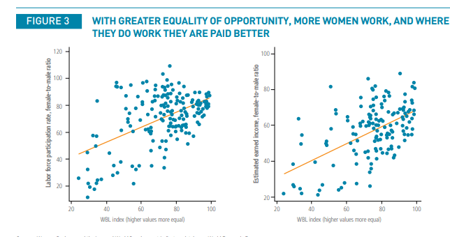
Now this graph struck me as interesting because while it does show a nice correlation (that they explicitly remind everyone may not equal causation), the correlation for countries scoring above the mid-70s is much less robust. While workforce participation for women in countries earning a perfect score is very high (left chart), it’s interesting to note that the pay ratio for men and women in those countries goes anywhere from the 50 to 80% range. I looked up the individual numbers for the 6 countries getting a perfect score (Belgium, Denmark, France, Latvia, Luxembourg and Sweden) and the US, and found this. The labor force participation ratio and the F/M pay ratio are from the reports here. I added the other metrics they put under “Economic Opportunity and Participation” just for fun.

Country USA BEL DNK FRA LVA LUX SWE
Labor Force Participation .86 .87 .93 .90 .92 .83 .95
Wage Equality .65 .71 .73 .48 .67 .71 .72
Income Ratio .65 .65 .67 .72 .70 1.0 .78
Legislators, Senior Officials,
Managers
.77 .48 .37 .46 .80 .21 .65
Professional and Technical
Workers
1.33 1.00 1.01 1.02 1.93 .93 1.09
Total Economic Participation
and Opportunity Score
.75 .73 .74 .68 .79 .75 .80

So out of the 6 countries with perfect scores in legal equality, 2 have overall economic participation/opportunity scores higher than the US, 1 is equal, and 3 are lower. Many countries that have high scores end up with high numbers of women in the workforce, but low numbers in positions of power (2nd and 3rd rows from the bottom). The US and Latvia led the pack with women in higher profile jobs, even with the US having (relatively) low workforce participation.

Oh, and in case you’re wondering how Luxembourg got a perfect income ratio score but not a perfect equal pay score: incomes for the ratio calculation were capped at $75k. Luxemborg has a very small population (600,000) and a very high average income (about $75K), so it really kinda broke the calculation. Including incomes above $75k would probably have changed that math.

Now, I want to be clear: I am not saying legal equality isn’t important. It is. But once you get beyond things like “are women allowed to legally go out at night” and in to things like “do pensions give explicit credit for child care”, the impact on participation is going to vary a lot. Different cultures have different pluses and minuses, so the same culture that gives extensive maternity leave may not end up encouraging women to go for the highest professional jobs. In cultures with low relative incomes like Latvia, women may use their legal equality to get better paying jobs more often. This confirms the pattern we see in engineering and science degrees….the most gender equal countries are not the ones producing the most female science grads.

Still, the hardest thing about calculating equality is probably relative income. While Latvia may have more women in higher level jobs, most women would prefer the US average income of $43k to the Lativian $20k. While many of the other top countries are OECD countries, some of the ones scoring the same as the US were not. Even with equal legal situations, I’d imagine that life for women in the Bahamas, Kenya, Malawi and the US are very different. That doesn’t make the metric wrong, it just means equality can be very different depending on where the overall median is.

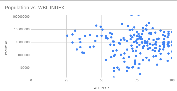
One final thought: it struck me as I was researching these countries exactly how big the US is in comparison. If you add up the populations of the 6 countries with perfect scores, you get about 96 million people. This is less than a third of the 325 million people who live in the US. Large countries tend to be less equal than small ones, and I do wonder how much of that is simply supporting a large and disparate population. The US is the third largest country in the world by population, and the first one with a higher legal equality score than us is #10 on the list, Mexico with 38% of our population and a score of 86.25. The next one to have a higher score is #17 (Germany) then France. To test my theory, I put together a graph of population size vs WBL index. Note: it’s on a log scale because otherwise China and India just kinda dwarf everything else.

So basically no country with a population over 100 million has gotten over a score of 86. Speculating on why is a little out of my wheelhouse, but I think it’s interesting.

And with that I’ve gone on long enough for today, but suffice it to say I find global statistics and inter-country comparisons fascinating!

What I’m Reading: March 2019

The AVI sent this along, and man do I feel seen.  Source.

This is an utterly bonkers NSFW article about how alarmingly easy it is to fake your credentials if you talk about sex, try this one.  Seriously, is there any other field where you could get this much media attention with this little media scrutiny? Anything more political would have been looked in to by opponents, and anything more boring probably wouldn’t have gotten media attention.

I took this creativity test and got  76.32. My breakdown was pretty accurate. My best moments of creativity come when I’m trying to improve the status quo  (curiosity – my highest), but I don’t really go much further once the problem is fixed (persistence – my lowest). Applied laziness is kinda my super power.