Jesse Singal had an interesting post in his (subscriber only) newsletter this week about a some articles promoting an Amnesty International report that ran under the headline “Amnesty reveals alarming impact of online abuse against women“. I was intrigued because I love dissections of survey data, and this didn’t disappoint. He noted some inappropriate extrapolations from the results (the Mozilla article claimed that data showed women were harassed more than men online, but the Amnesty survey didn’t survey any men and thus has no comparison), and also that the numbers were a little lower than he thought. Overall in 8 countries, an average of 23% of women had experienced online harassment, with an average of 11% saying they’d experienced online harassment more than once.
This statistic struck me as interesting, because it sounds really different depending on how you phrase it. From the Amnesty article:
“Nearly a quarter (23%) of the women surveyed across these eight countries said they had experienced online abuse or harassment at least once, ranging from 16% in Italy to 33% in the US.”
If you reverse the language, it reads like this:
“Over three quarters (77%) of the women surveyed across these eight countries said they had never experienced online abuse or harassment even once, ranging from 84% in Italy to 67% in the US.”
Now it is possible those two paragraphs sound exactly the same to you, but to me they give slightly different impressions. By shifting the focus from the positive responses to the negative, two reporters could report the exact same data but give slightly different impressions.
While reading this, all I could think of was the famous Rubin Vase illusion. If you don’t recognize the name, you will almost certainly recognize the picture: 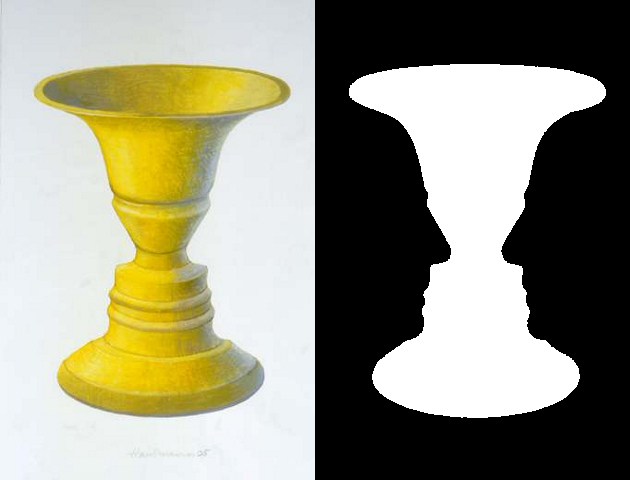
It struck me as a good analogy for a certain type of statistics reporting, enough so that I decided to give it a name:
Rubin Vase Reporting: The practice of grounding a statistic in either the positive (i.e. % who said yes) or negative (i.e. % who said no) responses in order to influence the way the statistic is read and what it appears to show.
Now of course not every statistic is reported this way intentionally (after all you really do have to pick one way to report most statistics and then stick with it), but it is something to be aware of. Flipping statistics around to see how you feel about them when they’re said in the reverse can be an interesting practice.
Also, I have officially updated my GPD Lexicon page, so if you’re looking for more of these you may want to check that out! I have 19 of these now and have been pondering putting them in to some sort of ebook with illustrations, just for fun. Thoughts on that also welcome.

This can be – and is – made even more dramatic at the extreme percentages by focusing on the increase or decrease. For example, if the number of hamster-related deaths increased from .01% to .015% from 2017 to 2018, one could describe that as a 50% increase in hamster-related deaths. But looking at through the other end of the telescope, one would say that hamster-related deaths were unchanged, as 99.85% and 99.9% are essentially the same.
LikeLike
I STILL think 80% is a pretty small percentage for not experiencing harassment.
LikeLike