Moving on, this Atlantic article about why for profit education fails was really interesting. Key point: education does best when it’s targeted to local conditions, which means it actually becomes less efficient when you scale it up.
More replication/data error issues, but this time with a legal angle. Crossfit apparently is suing a researcher and journal who 1. worked for a competitor 2. published data that made Crossfit look bad that they later clarified was incorrect 3. had evidence that the journal/reviewers implied that they wouldn’t publish the paper unless it made Crossfit look bad. The judge has only ruled that this can proceed to trial, but it’s an interesting case to watch.
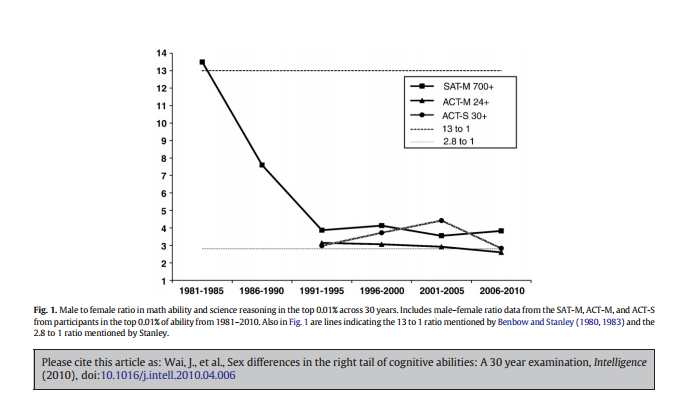
This paper on gender differences in math scores among highly gifted students was pretty interesting. It takes a look at the gender ratios for different SAT (and ACT) scores over the years (for 7th graders in the Duke Gifted and Talented program) and the trends are interesting. For the highest scorers in math (>700), it went from extremely male dominated (13:1 in 1981) to “just” very male dominated (4:1 by 1991) and then just stayed there. Seriously, that ratio hasn’t gone lower than 3.55 to 1 in the 25 years since. Here’s the graph:
In case you’re curious, top verbal scores are closer to 1:1. Curious what the recruitment practices are for the Duke program.
The white-ish sparkly dress on the top is one my grandmother gave me when I was a little kid to play “princess dress up” in (it was a floor length gown when I was 5!). Someone set it aside for me after she died, and I found it this week while sorting through some boxes. I checked the tag out, and it’s marked as a size 14. The dress below it is a bridesmaids dress I wore about 6 years ago at my brothers wedding….also marked a size 14. I don’t know how long my grandmother had the top dress when she gave it to me in the 80s, but my guess is it’s from the late 70s. That’s 4 decades of size inflation right there folks.
If it followed this chart at all, the top dress would be a size 4 by today’s standards. The bottom dress would have been a size 20 in the late 70s.
My own vanity now compels me to mention that I don’t actually fit in the 2010 size 14 any more, I’m a 1987 size 14 thank-you-very-much.
Okay, so after writing 5 Things about Introverts and 5 Things About Extroverts, it has come time for me to talk about MY people: the ambiverts. Sometimes referred to as an introverted extrovert or an extroverted introvert, ambiverts are the people who don’t really fit either mold. So what’s up with this category? Is it a real thing? If it is real is it a good thing? Let’s take a look!
Ambiversion has been around for a while Okay, so when I first heard about ambiversion, I thought it was a made up thing. Apparently though Carl Jung actually did write about this category when he originally developed the introvert/extrovert scale, though he didn’t name it. According to the Wall Street Journal, the name came about in the 1940s. And to think, I was just blaming Buzzfeed.
Most people are probably ambiverts If you think of introversion and extroversion as a spectrum of traits, ambiverts are the ones in the middle. It makes sense that most people would be there, though the exact percentage is a little in question: some say 1/3rd of all people, some say 2/3rds. The exact percentage is probably in question because it depends where you draw the line. If you’re 40-60% extroverted, does that make you an ambivert, or is it 35-65%? Regardless, it’s probably not a small number.
The Big 5 recognizes them, Myers Briggs not so much One of the reasons ambiversion doesn’t get much press is because Myers Briggs (the 500 lb gorilla in the personality testing room) doesn’t really recognize it. Where the Big 5 Personality Scale is based on a sliding scale and generally recognizes “low” “moderate” and “high” scores, Myers Briggs insists on binary classifications.
The ability to recognize both sides is probably helpful Not a lot of research has been done in to ambiversion, but the little that has been done suggests good things. When studying salespeople, it was found that ambiverts actually made more money than either introverts or extroverts. The researchers think this is because they can work with both types of people and adapt their style more easily to fit the customer. Obviously there would still be a social intelligence aspect to this, but the ability to vary the approach does seem to have it’s benefits.
The need for both types of recharging can lead to burnout In my previous posts, I asserted that introverts want people to pay more attention to their strengths, and extroverts want people to pay less attention to their faults. Reading through the things written about ambiverts, I realized that their biggest problem seemed to be paying attention to themselves. If you know you need quiet to recharge, that’s straightforward. If you know you need noise, that’s also straightforward. However, if it kind of depends, you have to make a judgment call…..and you very well could be wrong. A lot.
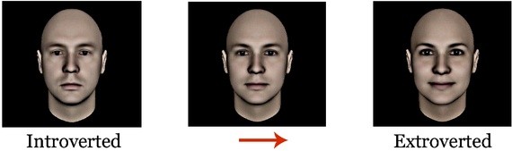
So there you have it! Research in this area is clearly a little light, but I still think it’s interesting to think about how we classify these things. Also, fun fact I learned after writing this….there apparently is an introverted, ambivert and an extroverted facial type:
The article was a little unclear on how good the correlation between facial structure and actual personality type was, but it did raise some questions about the chicken and egg nature of how others perceive us. If someone looks like an extrovert are they more likely to be treated like one and therefore become one? Or is there some “extrovert gene” that determines both? Since all introversion/extroversion measures are self reported it’s hard to know, but it’s an interesting thought. Now I’m gonna go look in the mirror and figure out which type of face I have.
Ever since James the Lesser pointed me to this article about some problems with physics, I’ve been thinking a lot about salami slicing. For those of you who don’t know, salami slicing (aka using the least publishable unit) is the practice of taking one data set and publishing as many papers as possible from it. Some of this is done through data dredging, and some if it is just done by breaking up one set of conclusions in to a series of much smaller conclusions in order to publish more papers. This is really not a great practice, as it can give potentially shaky conclusions more weight (500 papers can’t be wrong!) and multiply the effects of any errors in data gathering. This can then have other effects like increasing citation counts for papers or padding resumes.
A few examples:
Physics: I’ve talked about this before, but the (erroneous) data set mentioned here resulted in 500 papers on the same topic. Is it even possible to retract that many?
Medical findings: In this paper, it was determined that nearly 17% of papers on specific topics had at least some overlapping data.
To be fair, not all of this is done for bad reasons. Sometimes grants or other time pressures encourage researchers to release their data in slices rather than in one larger paper. The line between “salami slicing” and “breaking up data in to more manageable parts” can be a grey one….this article gives a good overview of some case studies and shows it’s not always straightforward. Regardless, it’s worth keeping in mind if you see multiple studies supporting the same conclusion that you should at least check for independence among the data sources. This paper breaks down some of the less obvious problems with salami slicing:
Dilution of content/reader fatigue More papers mean a smaller chance anyone will actually read all of them
Over-representation of some findings Fewer people will read these papers, but all the titles will make it look like there are lots of new findings
Clogging journals/peer review Peer reviewers and journal space is still a limited resource. Too many papers on one topic does take resources from other topics
Increasing author fatigue/sanctions An interesting case that this is actually bad for the authors in the long run. Publishing takes a lot of work, and publishing two smaller papers is twice the work of one. Also, duplicate publishing increases the chance you’ll be accused of self-plagiarism and be sanctioned.
Overall, I think this is one of those possibilities many lay readers don’t even consider when they look at scientific papers. We assume that each paper equals one independent event, and that lots of papers means lots of independent verification. With salami slicing, we do away with this element and increase the noise. Want more? This quick video give a good overview as well:
Now that I have my new shiny “Numbers Aren’t Magic” tag, I thought I’d use it for a bit of a PSA. I’m on a lot of laboratory testing related email lists for work, and I recently got a notification from the College of American Pathologists with a rather intriguing headline “Beauty Fad’s Ugly Downside: Test Interference“.
The story was about biotin (also called Vitamin H) a supplement widely touted as a beauty aid because it (allegedly) makes your hair and nails look better (example here). Unfortunately, it turns out that quite a few widely used immunoassays actually use biotin to capture their target antibodies during testing, and unusually high levels in the blood interfere with this. In other words, high doses of biotin in your supplement could interfere with your lab results. Uh oh.
The news of this first broke in January, when it was discovered that some patients were getting bad thyroid test results that had resulted in an incorrect diagnosis of Graves’ disease. Since then, the awareness among endocrinologists has grown, but there’s concern that other potentially affected tests are being missed. Apparently cardiac markers, HIV and HCV tests could also be affected.
The problem here is really megadoses. These assays were designed to work with normal blood levels of biotin. The recommended daily amount is only 30 micrograms, but supplements like the one I linked to above actually give doses of 5000 micrograms….166 times higher, and in to the range of test interference. You only have to stop taking it for a day or two before the interference issues go away, but most people and doctors don’t know this.
I’m bringing this up for two reasons:
I didn’t know it, and I think more people should be aware of this.
It’s a good reminder that almost every number ever generated is based on a certain set of assumptions that you may or may not be aware of.
Numbers don’t often spring out of the head of Zeus fully formed, they are almost always assessed and gathered in ways that have vulnerabilities. For anyone attempting to make sense of those numbers, recognizing vulnerabilities is critical. If even lab tests (some of the most highly regulated medical products we have) can have issues like this, imagine what numbers with less stringent requirements could fall prey to.
Last week I wrote a post that was sort of about denominators and sort of about abortion. At the end of that post I touched briefly on the limits of data, what the data will never tell us, and how often people attempt to use data to bolster beliefs they already have. That’s been a bit of a running theme on this blog, and it’s something I think about a lot. People seem to give numbers almost a magical power at times, and I’m not entirely sure why. It seems to get down to the idea that numbers and statistics are objective information and that as long as their on your side, you can’t be too wrong. Now, I really wish this sort of confidence was well founded, but quite frankly anyone who’s spent any time with numbers knows that they’re a little too easily influenced to be trusted without some investigation.
I was thinking about that this week when I got in a discussion with a coworker about one of the worst examples of “numbers are magic when they tell me what I want to hear”: vanity sizing.
For those of you not aware of this phenomena, vanity sizing is when clothing manufacturers increase the size of their clothes, but keep the number of the smaller size on it. The theory is that people like to say/believe they are a certain size, so they will gravitate towards brands that allow them to stay in that size even as they gain weight.
This is not a small problem. The Washington Post ran an article on this last year that showed the trend with women’s clothes:
While individual clothing manufacturers vary, my friends and I have definitely noticed this. Most of us are in smaller sizes than we were a decade ago, despite the fact that it’s really not supposed to work like that.
Anyway, this makes discussing women’s clothing a little difficult. It was recently reported that the average American woman wears a size 16 , but which size 16 is it? A size 16 from 2011 has a waist size 4 inches bigger than the 16 from 2001. Tim Gunn recently wrote an op-ed in which he blasted the fashion industry for not designing for anyone over a size 12, but he never mentions this trend. If you look at that chart again, you realize that any retailer accommodating a size 12 today is covering would would have been a size 16 a decade ago. Weirdly, this means the attempt to cater to vanity means the fashion industry isn’t getting credit for what they are actually doing.
And lest you think this is a women only problem men, sorry, that “36 inch” waist thing? Not at all accurate unless you’re shopping high end retail. Here’s what a “36 inch” waist can mean:
I think that’s actually worse than women’s clothes, because at least we all sort of know “Size 8” has no real definition. “36 inches” does leave one with the strong impression that you’re actually getting a specific measurement.
Anyway, I don’t really care what the fashion industry does or doesn’t get credit for, or what the sizes actually are. The broader point I’m trying to make is that we do give numbers a bit of a magical power and that we heavily gravitate towards numbers that make us feel good rather than numbers that tell us the truth.
Keep this in mind the next time someone says “the numbers are clear”.
Ah, at last we come to the end. This chapter is about the knowns, the known unknowns and the unknown unknowns. While that’s a somewhat hard to follow sentence, it does make for a nice contingency matrix, and is really the crux of the Black Swan argument. Here’s my take:
One of the most dangerous mistakes you can make is to confuse unfamiliar and improbable. What you don’t know CAN hurt you.
Last week I gave a run down of all the interesting stuff I found out about introverts, so naturally this week is going to be about extroverts. Since extroverts are the opposite of introverts, much of what I said last week still applies (or applies in reverse): extroverts tend to need more stimulation from their environment. While this is often phrased as “they get their energy from people”, that’s not entirely true. Being extroverted does not mean social interaction trumps sleep, food, water, or that you can’t get sick of people (all things I’ve heard people claim). So what is true of extroverts? Let’s take a look:
I’ve been spelling “extrovert” wrong, and apparently Jung would be annoyed Before I wrote my post last week, I tried to look up “extrovert vs extravert” to see which was the correct spelling. It turns out that the debate about this runs a little deeper than I thought. While my spellchecker insists that “extrovert” is correct, Carl Jung (the guy who invented the whole concept) felt strongly it should be “extravert”. This was based on the Latin root and the actual definition he was going for. I’m going to stick with the one that makes my spell checker calmer, but it’s worth noting that we probably should be using “extravert”.
There may be two types of extroverts Just like introversion, it turns out extroversion may not be a monolith. The two types (agenetic and affiliative) are described here, but basically they boil down to “social leadership” and “social warmth”. The first one has a lot to do with going after rewards, and the second one just wants to hang out with everyone. They are correlated, but some people have more of one than the other. Think the person who wants to be in charge of every group vs the person who just wants to be in every group.
The success of extroverts is kinda bimodal Despite all the rumors that being an extrovert is some sort of cultural ideal, it turns out it’s actually kind of a mixed bag. For example, if you go to Urban Dictionary and type in “introvert” and you get a thoughtful description of what an introvert is. Try the same with the word “extrovert” and you get “asshole who doesn’t know how to shut their goddamn mouth“. I’m serious. In fact 5 out of the top 7 definitions of extroverts slam extroverts. Interestingly, 5 of the top 7 definitions of introverts ALSO slam extroverts. If the chronic complaint from introverts is that their strengths go unnoticed, then the equivalent extrovert complaint would probably be that their faults get a little too noticed. This makes a lot of sense….having attention on you is great if you’re good at something, but probably worse for you if you’re bad at something. Interestingly, this plays out with things like leadership. Leaders are more likely to be extroverts, but if you control for social skills there actually isn’t an extrovert advantage.
Some extrovert “benefits” are just circular reasoning Okay, so here’s the extrovert bias introverts so often complain about. Many of the supposed benefits of being an extrovert come not from actual benefits, but by using some of the definition for extroversion as a definition for other things. For example, for years it was noted that extroverts were happier than introverts. Then it was finally noted that many of the tests that measured happiness did so by asking things like “do you have a lot of friends?”, which is also a question used to determine if you’re an extrovert or not. This works in the negative direction too. When you hear criticisms of extroverts, it’s often things like “they hog the spotlight” (random example here). However “do you like to be the center of attention” is a pretty frequently used question on personality tests, and it makes complete sense that people who say “yes” to that would end up spending more time as the center of attention than those that say “no”. I think this is important because sometimes I hear this get referenced as though personality tests were objective neurological tests, but they are really all rating and self assessment. The same answers that landed you in one category or another tend to persist even when you’re not taking the test.
Test taking is often biased against them So if personality and psychological tests favor extroverts, then extroverts must really love test taking, right? Well, not all tests. It turns out that our most common testing environments (ie quiet rooms with no ambient noise) actually are biased against extroverts. Because of their need for stimulation, some research has found that extroverts actually perform better on tests when there is noise present. Unsurprisingly, introverts are the opposite, and ambiverts are in the middle: In school settings this is an obvious disadvantage, but in real life may explain why some professions end up extrovert dominated. In many settings, you actually will have to make your toughest calls while there is a lot of noise and chaos around you. By the way, there’s a rather persistent rumor (normally stated in the form of “introverts think more deeply”) that extroverts are less intelligent than introverts. Actually the most recent research says extroverts have a tiny advantage here, but thecorrelation on that is pretty shaky, and depends heavily on exactly how intelligence is measured. There’s some suggestion that the high IQ (>160) may lean introvert, but that’s a really small slice of the population and wouldn’t be enough to move the dial.
So there you have it! Next week I may try to take on ambiverts, who can’t make up their mind about anything.
Content note: Big contentious political issues ahead. Proceed with care. As with most of my posts, the intent here is not to take a stance on a political issue, but rather to discuss the ways numbers are used to talk about them.
Last week I got tagged in a rather interesting Facebook discussion about abortion and Planned Parenthood. It centered around this video from the group LiveAction, that focused on debunking the “abortion is only 3% of what Planned Parenthood does”.
What stuck out to me about this video (and the associated Slate and Washington Post articles it referenced) is that despite the contentious issue being addressed, this is fundamentally a debate about denominators. No one seems to question the numerator here….Planned Parenthood readily states that they performed 323,999 abortions in fiscal year 2014-2015. What’s up for debate is what you divide that by to get an accurate picture of their business, and what questions those denominator choices answer. There are a couple of options here:
Number of billed procedures or “discrete clinical interactions” Every year, Planned Parenthood provides 10.6 million different types of services in it’s clinics. This is the denominator used to get the 3% figure. As the video above (and the Slate and Washington Post article) point out, a pregnancy test, abortion, STI screening and follow up contraception prescription would count as 4 separate line items, despite not being even remotely equal in time, cost, or overall impact. What this number does answer is “what does Planned Parenthood do other than abortion?”.
Pregnancy services provided The Washington Post article that investigated the 3% claim also investigated the claim by the Susan B Anthony foundation that 94% of “pregnancy services provided by Planned Parenthood” were abortions. To get this number, they took the number of services offered exclusively to pregnant women: abortions, prenatal services and adoption referrals. Those last two categories total a little over 20,000/year, so you end up with a denominator of 344,000 or so. This gets you to 94%. This number answers the question “what does Planned Parenthood do exclusively for women who present at the clinic already pregnant?”. I keep repeating exclusively because there’s no way of seperating out pregnancy tests or STI screenings for pregnant vs non-pregnant women.
Amount of revenue Another way of calculating the percent of a business is calculating the percent of revenue derived from that one service. The Washington Post attempts to crunch these numbers based on published rates, and comes up with something in the 15-37% range. Since Planned Parenthood does not actually publish this data, there are a lot of assumptions built in. Essentially though, this is the number of procedures times the approximate cost per procedure divided by total PP revenues. The approximations are difficult to make mostly because costs vary and Planned Parenthood tends to have a sliding scale for those who can’t afford the full cost. This number is probably closer to what most people think of as “percent of business”.
Number of abortions in the country I’ll come back to this one later, but The Blaze article notes that if you use the denominator of “total abortions performed in the USA” you find the Planned Parenthood performs a little over 30% of abortions. This answers the question “what percentage of abortions are actually performed at Planned Parenthood”.
Number of patients In the LiveAction video, it is noted that Planned Parenthood saw about 2.7 million patients. This means about 1 out of every 8 patients seen by Planned Parenthood in a year got an abortion in that year. This is a stat to be careful with because people can have multiple visits, so this does not answer the question “what are the chances a person walking in to a Planned Parenthood clinic is there to have an abortion”, but rather “what percent of all patients had an abortion in a given year”. It should be noted that the assumption here is that no one got more than one abortion in a year. That is probably mostly, but not entirely, true.
Number of total clinic visits Finally we get to the number of overall visits. This number is given at 4.6 million, and for my money is probably the most accurate representation of “what percent of their business is abortion”. This comes out to about 7% of visits per year, but if you count follow up visits (which may or may not occur), it could be up to 14%. This answers the question “what are the chances that a person walking in to Planned Parenthood is there to have an abortion”.
Some quick notes on this data: all of this was from other sources, I didn’t crunch any numbers myself. Since the original Blaze article didn’t quibble with any of Planned Parenthood’s published data, I took it as is. I also switched back and forth a few times between the 2013 data and 2014 data, so some numbers may be slightly off.
So overall, what do I think? Well, as you can see, denominators matter. For a less contentious issue, parsing this data would be purely a matter of intellectual debate, and no one would really care that much. When it comes to something like abortion however, the stakes are raised. Changing the denominator you use is inherently a political statement, as you change the ability of your data to answer a particular question.
Interestingly, I don’t think any of this data answers the real question. To me, the crux of the issue is something along the lines of “why is Planned Parenthood so important”? This is not answered by any of the above data. While they certainly perform a lot of abortions, they don’t perform the majority of them. So why all the focus on their business model?
Basically I think it comes down to political organization. I couldn’t find good data on where the other 2/3rds of abortions are performed, but my guess is they are probably independent doctors or clinics that have nowhere near the organizational or advocacy power of Planned Parenthood. Even if Planned Parenthood doesn’t perform those abortions, I think both sides probably agree they make it easier for the groups that do the procedures to continue their practices. By drawing the political fire and filing the lawsuit challenges themselves, Planned Parenthood ends up with an impact that is felt by everyone but would be nearly impossible to quantify in numbers. Additionally, many Planned Parenthood clinics are intentionally built in areas without easy access to other similar services. How much of this business would be picked up by other doctors/clinics/hospitals if Planned Parenthood closed is debatable. Whether or not that’s a good thing depends almost entirely on your pre-existing political beliefs.
As much as I love numbers, it’s important to remember the limits of data. Any time someone rattles off a statistics, a helpful first question is “does that answer the question we’re really asking?”. Not all important issues can be quantified, and not all statistics hit the heart of the issue. Most important, very few people have ever (or should ever) change a profound moral conviction because of a denominator choice. In the immortal words of Andrew Lang: “try not to use statistics as a drunken man uses lamp-posts, for support rather than for illumination”.
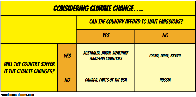
This chapter had some great stuff about climate change and models of climate change. One of the more interesting parts (to me) was the review of the motivations of various countries when it comes to climate change treaties. Not every country arrives at the table on the same page, no matter what their leaders believe:


 In school settings this is an obvious disadvantage, but in real life may explain why some professions end up extrovert dominated. In many settings, you actually will have to make your toughest calls while there is a lot of noise and chaos around you. By the way, there’s a rather persistent rumor (normally stated in the form of “introverts think more deeply”) that extroverts are less intelligent than introverts. Actually the