Born to Run Fact Check: USA Marathon Times

I’ve been playing/listening to a lot of Zombies, Run! lately, and for a little extra inspiration I decided to pull out my copy of “Born to Run” and reread it. Part way through the book I came across a statistic I thought was provocative enough that I decided to investigate it. In a chapter about the history of American distance running, McDougall is talking about the Greater Boston track club and says the following:

“…by the early ’80s, the Greater Boston Track club had half a dozen guys who could run a 2:12 marathon. That’s six guys, in one amateur club, in one city. Twenty years later, you couldn’t find a single 2:12 marathoner anywhere in the country.”

Now this claim seemed incredible to me. Living in Boston, I’d imagine I’m exposed to more marathon talk every year than most people, and I had never heard this. I had assume that like most sports, those who participated in the 70s would be getting trounced by today’s high performance gear/nutrition/coached/sponsored athletes. Marathoning in particular seems like it would have benefited quite a bit from the entry of money in to the sport, given the training time required.

So what happened?

Well, the year 2000 happened, and it got everyone nervous.

First some background In order to make the US Olympic marathon team, you have to do two things 1) finish as one of the top 3 in a one off qualifying race 2) be under the Olympic qualifying time.  In 1984, pro-marathoners were allowed to enter the Olympics. In 1988, the US started offering a cash prize for winning the Olympic trials. Here’s how the men did, starting from 1972:

I got the data from this website and the USATF. I noted a few things on the chart, but it’s worth spelling it out: the winners from 1976 and 1984  would have qualified for every team except 2008 and 2012. The 1980  winner would have qualified for every year except 2012, and that’s before you consider that the course was specifically chosen for speed after the year 2000 disaster.

So it appears to be relatively well supported that the guys who were running marathons for fun in the 70s really would keep pace with the guys today, which is pretty strange. It’s especially weird when you consider how much marathoning has taken off with the general public in that time. The best estimates I could find say that 25,000 people in the US finished a marathon in 1976, and by 2013 that number was up to about 550,000. You would think that would have swept up at least a few extra competitors, but it doesn’t look like it did. All that time and popularity and the winning time was 2 minutes faster for a 26 mile race.

For women it appears to be a slightly different story. Women got their start with marathoning a bit later than men, and as late as 1967 had to dodge race officials when they ran. Women’s marathoning was added to the Olympics in 1984, and here’s how the women did:

A bit more of a dropoff there.

If you’ve read Born to Run, you know that McDougall’s explanation for the failure to improve has two main threads: 1) that shoe companies potentially ruined our ability to run long distances and 2) that running long distances well requires you to have some fun with your running and should be built on community. Both seem plausible given the data, but I wanted to compare it to a different running event to see how it stacked up. I picked the 5000 m run since that’s the most commonly run race length in the US. The history of winning times is here, and the more recent times are here. It turns out the 5k hasn’t changed much either:

So that hasn’t changed much either….but there still wasn’t a year where we couldn’t field a team. Also complicating things is the different race strategies employed by 5000m runners vs marathon runners. To qualify for the 5k, you run the race twice in a matter of a few days. It is plausible that 5k runners don’t run faster than they have to in order to qualify. Marathon runners on the other hand may only run a few per year, especially at the Olympic level. They are more likely to go all out. Supporting this theory is how the runners do when they get to the Olympics. The last man to win a 5000m Olympic medal for the US is Paul Chelimo. He qualified with a 13:35 time, then ran a 13:03 in the Olympics for the silver medal. Ryan Hall on the other hand (the only American to ever run a sub 2:05 marathon), set the Olympic trials record in 2008 running a 2:09 marathon. He placed 10th in the Olympics with a 2:12.  Galen Rupp won the bronze in Rio in 2016 with a time 1 minute faster than his qualifying time. I doubt that’s an unusual pattern….you have far more control over your time when you’re running 3 miles than when you’re running 26.  To further parse it, I decided to pull the data from the Association of Road Racing Statisticians website and get ALL men from the US who had run a sub 2:12 marathon. Since McDougall’s original claim was that there were none to be found around the year 2000, I figured I’d see if this was true. Here’s the graph:

So he was exaggerating. There were 5.

Pedantry aside, there was a remarkable lack of good marathoners in those years, though it appeared the pendulum started to swing back. McDougall’s book came out in 2009 and was credited with a huge resurgence in interest in distance racing, so he may have partially caused that 2010-2014 spike. Regardless, it does not appear that Americans have recaptured whatever happened in the early 80s, even with the increase in nearly every resource that you would think would be helpful. Interestingly enough, two of the most dominate marathoners in the post-2000 spike (Khalid Khannouchi and Meb Keflezighi) came here in poverty as immigrants when they were 29 and 12, respectively. Between the two of them they are actually responsible for almost a third of the sub-2:12 marathons times posted between 2000 and 2015. It seems resources simply don’t help marathon times that much. Genetics may play a part, but it doesn’t explain why the US had such a drop off. As McDougall puts it “this isn’t about why other people got faster; it’s about why we got slower.”

So there may be something to McDougall’s theory, or there may be something about US running in general. It may be that money in other sports siphoned off potential runners, or it may be that our shoes screwed us or that camaraderie and love of the sport was more important than you’d think. Good runners may run fewer races these days, just out of fear that they’ll get injured. I don’t really know enough about it, but the stagnation is a little striking. It does look like there was a bit of an uptick after the year 2000 disaster….I suspect seeing the lack of good marathon runners encouraged a few who may have focused on other sports to dive in.

As an interesting data point for the camaraderie/community influence point, I did discover that women can no longer set a marathon world record in a race where men also run.  From what I can tell, the governing bodies decided that being able to run with a faster field/pace yourself with men was such an advantage that it didn’t count. The difference is pretty stark (2:15 vs 2:17), so they may have a point. The year Paula Radcliffe set the 2:15 record in London, she was 16th overall and presumably had plenty of people to pace herself with. Marathoning does appear to be a sport where your competition is particularly important in driving you forward.

My one and only marathon experience biases me in this direction. In 2009 I ran the Cape Cod Marathon and finished second to last. At mile 18 or so, I had broken out in a rash from the unusually hot October sun, had burst in to tears and was ready to quit. It was at that moment that I came across another runner, also in tears due to a sore knee. We struck up a conversation and laughed/talked/yelled/cried at each other for the remaining 7 miles to the finish line. Despite my lack of bragging rights for my time I was overjoyed to have finished, especially when I realized over 400 people (a third of entrants)  had dropped out. I know for a fact I would not have made it if I hadn’t run in to my new best friend at that moment of despair, and she readily admitted the same thing. McDougall makes the point that this type of companionship running is probably how our ancestors ran, though for things like food and safety as opposed to a shiny medal with the Dunkin Donuts logo. Does this sort of thing make a difference at the Olympic level? Who knows, but the data and anecdote does suggest there’s some interesting psychological stuff going on when you get to certain distances.

Race on folks, race on.

Linguistic vs Numeric Probability

It will probably come as a surprise to absolutely no one that I grew up in the kind of household where the exact range of probabilities covered by the phrase “more likely than not” was a topic of heavy and heated debate. While the correct answer to that question is obviously 51%-60%1, I think it’s worth noting for everyone that this sort of question that actually has some scholarly resources for it.

Sherman Kent, a researcher for the CIA decided to actually poll NATO officers to see how they interpreted different statements about probability and came up with this:

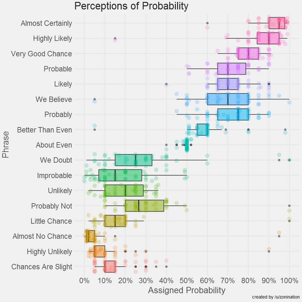
Interesting that the term “probable” itself seems to cause the widest range of perceptions in this data set.

A user on reddit’s r/samplesize decided to run a similar poll and made a much prettier graph that looked like this:

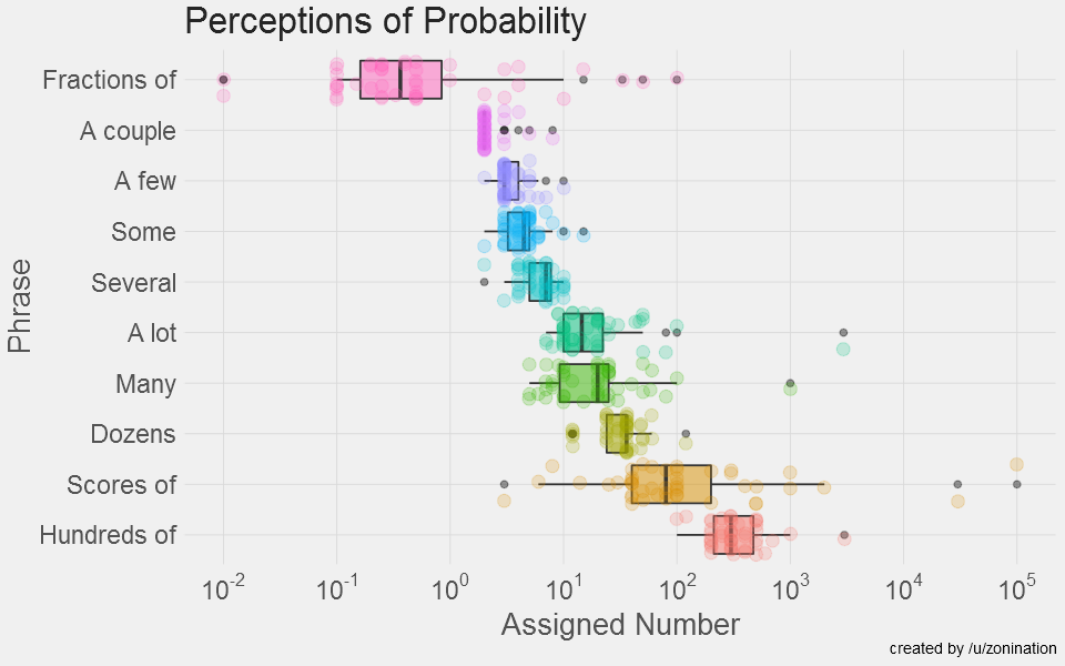
The results are similar, though with some more clear outliers. Interestingly, they also took a look at what people thought certain “number words” meant, and got this:

This is some pretty interesting data for any of us who attempt to communicate probabilities to others. While it’s worth noting that people had to assign just one value rather than a range, I still think it gives some valuable insight in to how different people perceive the same word.

I also wonder if this should be used a little more often as a management tool. Looking at the variability, especially within the NATO officers, one realizes that some management teams actually do use the word “probable” to mean different things. We’ve all had that boss who used “slight chance” to mean “well, maybe” and didn’t use “almost no chance” until they were really serious. Some of the bias around certain terms may be coming from a perfectly rational interpretation of events.

Regardless, it makes a good argument for putting the numeric estimate next to the word if you are attempting to communicate in writing, just to make sure everyone’s on the same page.

1. Come at me Dad.

Using Data to Fight Data Fraud: the Carlisle Method

I’m creating a new tag for my posts “stories to check back in on”, for those times when I want to remember to see how a sensational headline played out once the dust settled.

The particular story prompting this today is the new paper “Data fabrication and other reasons for non-random sampling in 5087 randomised, controlled trials in anaesthetic and general medical journals” that is getting some press under headlines like “Dozens of recent clinical trials may contain wrong or falsified data, claims study“. The paper author (John Carlisle) is one of the people who helped expose the massive fraud by Yoshitaka Fujii, an anesthesiologist who ended up having 183 papers retracted due to fabricated results.

While his work previously focused on the work of anesthesiologists, Carlisle decided to use similar statistical techniques on a much broader group of papers. As he explains in the paper, he started to question if anesthesiology journals were retracting more papers because anesthesiologists were more likely to fabricate, or if the community was simply keeping a sharper eye out for fabrications. To test this out he examined over 5,000 papers published in both specialty anesthesia journals and major medical journals like the New England Journal of Medicine and the Journal of the American Medical Association, looking for data anomalies that might point to fraud or errors.

The method Carlisle used to do this is an interesting one. Rather than look at the primary outcomes of the papers for evidence of fabrication, he looked at the baseline variables like height and weight of the patients in the control groups vs the intervention groups. In a proper randomized control trial, they should be about the same. His statistical methods are described in depth here, but in general his calculations  focuses on the standard deviation of both populations.  The bigger the difference between the control group and the intervention group, the more likely your numbers are wrong. The math isn’t simple, but the premise is: data frauds will probably work hard to make the primary outcome realistic, but likely not pay much attention to the more boring variables. Additionally, most of us reading papers barely glance at patient height and weight, particularly the standard deviations associated with them. It’s the data fraud equivalent of a kid telling their mom they cleaned their room when really they just shoved everything in the closet….you focus on where people will look first, and ignore everything else.

This paper gets REALLY  interesting because Carlisle not only opened the closets, but he published the names (or rather the journal locations) of the studies he thinks are particularly suspect….about 90 in all or 1-2% of the total. He also mentions that some authors have multiple studies that appear to have anomalous baseline data. Given the information he provided, the journals will most certainly have to investigate and people will likely be combing over the work of those named. If you want to see at least some of the named papers, check out this post.

Now I definitely am a fan of finding and calling out data frauds, but I do have to wonder about the broad net cast here. I have not looked up the individual studies, nor do I know enough about most of the fields to know the reputations of the authors in question, but I do wonder what the explanations for the issue with the 90 trials will be. With all the care taken by Carlisle (ie setting his own p-value cutoff at < .0001) It seems likely that a large number of these will be real fraud cases, and that’s great! But it seems likely at least some will have a different explanation, and I’m not sure how many will be in each bucket. The paper itself raises these possibilities, but it will be interesting to see what proportion of the sample was innocent mistakes vs fraud.

This is an interesting data point in the whole ethics of calling BS debate. While the paper is nuanced in its conclusions and raises multiple possibilities for the data issues, it’s hard to imagine the people named won’t have a very rough couple of months. This is why I want to check back in a year to see what happened. For more interesting discussion of the ethics and possible implications, see here. Some interesting point raised there include a discussion about statute of limitations (are we going back for decades?) and how to judge trials going forward now that the method has been released to the public.

To note: Carlisle has published a sensational paper here, but he actually has a great idea about how to use this going forward. He recommends all journals should do this analysis on papers submitted or accepted for publication, so they can inquire about discrepancies with authors up front. This would make sure that innocent mistakes were caught before being published, and that possible frauds would know there were extra safeguards in place. That seems a nice balance of addressing a problem while not overreaching, and apparently has already been implemented by the journal Anaesthesia.


Dietary Variability and Fasting Traditions

This is one of those posts that started with a conversation with friends then sort of spiraled in to way too much time with Google, then I realized there’s a stats tie in and a post was born. Bear with me.

Some background:  Ramadan started this week, so I’ve been thinking a lot about dietary traditions in different cultures. In the book Antifragile, there is a moment where author Nicholas Nassim Taleb takes a surprising detour in to the world of human health and nutrition. As an economist/statistician who is best known for making predictions about the stability of financial markets, this seems like an odd road to go down. His take on diet is, unsurprisingly, unique: every Wednesday and Friday, he is vegan. Apparently in the Greek Orthodox tradition on Wednesdays, Fridays, Lent (48 days) and in the lead up to Christmas (40 days), you give up all animal products and oil. I am not clear how widely this is followed, but the US Greek Orthodox website calendar confirms this is the general set up. Since the thesis of the book is that some things actually improve when subject to disorder/inconsistency, Taleb wonders if the much touted benefits of the Mediterranean diet are due to the overall consumption, or the inherent variability in the diet due to the religious practices in the area.

Research tie in: I was interested by this point, as I’d definitely heard about the Mediterranean diet and its health benefits, but I’d never heard that this tradition was so common in that area. When it came back up last week I decided to ask a few other people if they’d ever heard of it. It was hardly a scientific poll, but out of the dozen or so people I asked, everyone knew the Mediterranean diet was supposed to be very healthy but no one had heard of the Wednesday/Friday fasting tradition. I even asked a few vegetarian and vegan friends, and they were similarly surprised. Given that two days a week plus all of Lent works out to over a third of the year, this seemed relevant.

Of course I am not sure what this might prove, but it did strike me as an interesting example of a time an average might be lying to you. The Greek Orthodox adherents who spawned the interest in the Mediterranean diet didn’t have one way of eating…they really had 2: normal days and fasting days. (Note: It appears not many American Greek Orthodox still follow the fasting calendar, but since Crete got on the map 70 years ago with the 7 countries study, it’s likely those who kicked this whole Mediterranean craze off were following it). By hearing only the average recommendations, it seems like some information got lost. Given that food recall questionnaires and epidemiological reports tend to only come up with one set of recommendations, I decided to take a look around and see if I could find other examples of populations whose “average” consumption might be deceptive. While many religions have a tradition of fasting, I’m only including the ones where the duration is substantial according to my own arbitrary standards. I’m also not including traditions that prohibit or discourage certain foods all the time, as that’s not the type of variability I was interested in.

Greek Orthodox I was curious if Taleb’s question had been addressed by any research, and it actually has been. This group noticed the same gap he did, and decided to follow a bunch of people on the island of Crete for 1 year. They all were eating the same famous Mediterranean diet, but those who followed the fasting traditions had better health markers after the holy days. This gives some credibility to the idea that something about the fasting that effects the health outcomes, though it could be that those who follow the fasting traditions are different in some other way.

Muslims This paper shows some interesting effects of Ramadan (no eating during daylight hours for 28-30 days) on health outcomes, but reaches no direct conclusions. Many of the studies didn’t include things like smoking status, so it’s hard to tell if there’s any benefit. Still, changing your eating patterns dramatically for a full month every year is probably enough to throw your “average” consumption a bit.

Ethiopian Orthodox According to this NPR story, the Ethiopian Orthodox Church observes a 40 day vegan fast prior to Christmas, where they only eat one meal a day.

Vacations and Holidays On the flip side, there are also occasions where people seem to consistently overeat in such a way that may change their “average”. Vacations appear to be correlated with weight gain that doesn’t immediately disappear, as does the holiday season. Interestingly, neither of these gains are that much (a little less than a pound overall for each), but if those persist after each holiday season and vacation, you could eventually see a real increase. Regardless, few of us call our vacation or holiday eating “typical”, but since holiday eating and vacations actually can take up a lot of days (November, December, 2 week vacation or so), this very well might skew our perception on what’s “typical”.

I’d be interested to hear any other examples anyone has.


A Loss for so Many

I was greatly saddened to hear late on Monday that a long time friend of mine, Carolyn Scerra, died on Monday of ovarian cancer. She was 35, and leaves behind a husband and a two year old daughter.

Carolyn was a high school science teacher, and she had promoted my Intro to Internet Science series and given me feedback based on her experiences in the classroom. A year ago, before her illness had made its ugly appearance, I got to speak to her class in person and see her at work. A fire alarm went off half way through my presentation, and we actually finished most of it in the parking lot. We laughed as she held her laptop up so they could see my slides and I talked about lizard people, while other classes looked on in confusion. Through it all she kept the class orderly, calm, and engaged. We had a great discussion about science education and how to support kids and science teachers, and it was a great day despite the interruptions. She was great at what she did, and I was honored to be part of it.

When she got sick in November, she ended up at my workplace for her treatment. I was able to see her a few times during some of her hospitalizations and chemo treatments, and we still talked about science. I would tell her about the latest clinical trials we were working on and we would talk about genetics research and cancer, some of which I turned in to a post. For many people that would not have been a soothing conversation, but it was for Carolyn. She liked to think about the science behind what was going on and where the science was going, even as the best science was failing her. When another friend taught her how to paint, she started painting representations of how the chemotherapy looked in her blood and would interact with the cancer cells. That’s the kind of person she was.

This is a huge loss for so many, and I will truly miss her. Science has lost an advocate, a community has lost an amazing person, kids lost a great teacher, her family has lost a daughter/sister/cousin, and her husband and daughter have lost a wife and mother. A fundraiser has been set up for her family here.

May peace find all of them.

Final Exam Rollercoasters

Last week I managed to take what I think is the last exam of my current degree program. I only have a practicum left, and since those are normally papers and projects, I’m feeling pretty safe in this assumption.

Now as someone who has gotten off and on the formal education carousel more than a few times, wracked up a few degrees and has been in the workforce for over a decade, you’d think I’d have learned how to control my emotions around test taking.

You’d be wrong.

I literally have the exact same reaction to tests that I had in first grade, though I use more profanity now. Every time I get near a test, my emotions go something like this:

I should note that this reaction is entirely unrelated to the following variables:

  1. How much I like the class
  2. How well I am doing prior to the test
  3. How much I have studied
  4. How much the test is worth
  5. How I actually do on the test

The following things are also true:

  1. Every time a test is put in front of me, I have a dreamlike moment where I believe I have sat down in the wrong class and that’s why nothing looks familiar. For language related tests, I believe all the words are in a different language.
  2. I have doubted every grade I have ever been given, believing that both good grades and bad grades are mistakes the professor is about to correct.
  3. The question “how do you think you did?” is completely flummoxing for me. I struggle to answer something other than “I have envisioned scenarios everywhere between a 20% and 100%, and they all feel equally plausible at the moment.”

Once I realized this pattern wasn’t going to stop, I actually felt much better. Now when I get the test I merely do one of those CBT type things where I go “ah yes, this is the part where I believe the test is written in Chinese. It’ll pass in a few minutes, just slog on until then”. It’s not that bad if you know it’s coming.

(I did fine by the way, thanks for asking)

Mistakes Were Made, Sometimes By Me

A few weeks ago, I put out a call asking for opinions on how a blogger should correct errors in their own work. I was specifically interested in errors that were a little less clear cut than normal: quoting a study that later turned out to be less convincing it initially appeared (failed to replicate), studies whose authors had been accused of misconduct, or studies that had been retracted.

I got a lot of good responses, so thanks to everyone who voted/commented/emailed me directly. While I came to realize there is probably not a perfect solution, there were a few suggestions I think I am going to follow up on:

  1. Updating the individual posts (as I know about them) It seemed pretty unanimous that updating old posts was the right thing to do. Given that Google is a thing and that some of my most popular posts are from over a year ago, I am going to try to update old posts if I know there are concerns about them. My one limitation is not always indexing well what studies I have cited where, so this one isn’t perfect. I’ll be putting a link up in the sidebar to let people know I correct stuff.
  2. Creating a “corrected” tag to attach to all posts I have to update. This came out of jaed’s comment on my post and seemed like a great idea. This will make it easier to track which type of posts I end up needing to update.
  3. Creating an “error” page to give a summary of different errors, technical or philosophical, that I made in individual posts, along with why I made them and what the correction was. I want to be transparent about the type of error that trip me up. Hopefully this will help me notice patterns I can improve upon. That page is up here, and I kicked it off with the two errors I caught last month. I’m also adding it to my side bar.
  4. Starting a 2-4 times a year meta-blog update Okay, this one isn’t strictly just because of errors, though I am going to use it to talk about them. It seemed reasonable to do a few posts a year mentioning errors or updates that may not warrant their own post. If the correction is major, it will get its own post, but this will be for the smaller stuff.

If you have any other thoughts or want to take a look at the initial error page (or have things you think I’ve left off), go ahead and meander over there.

State Level Representation: Graphed

I got in to an interesting email discussion this past weekend about a recent Daily Beast article “The Republican Lawmaker Who Secretly Created Reddit’s Women-Hating ‘Red Pill’“, that ended up sparking a train of thought mostly unrelated to the original topic (not uncommon for me). The story is an investigation in to a previously anonymous user who started an infamous subreddit, and the Daily Beast’s discovery that he was actually an elected official in the New Hampshire House of Representatives.

Given that I am originally from New Hampshire and all my family still lives there, I was intrigued by the story both for the “hey! that’s my state!” factor and the “oh man, the New Hampshire House of Representatives is really hard to explain to a national audience” level. Everyone I was emailing with either lives in New Hampshire or grew up there (as I did), so the topic quickly switched to how unusual the New Hampshire state legislature is, and how it’s hard for a national news outlet to truly capture that. For starters, the NH state House of Representatives has nearly as many seats (400) as the US House of Representatives (435), and double the number of seats of the next closest state (Pennsylvania with 200), all while having a state population of a little over 1 million people. Next is the low pay. For their service, those 400 people make a whopping $200 dollars for a two year term. Some claim this is not the lowest paying gig in the state level representation game, since other states like New Mexico pay no salary, but a quick look at this page shows that those state pay a daily per diem that would quickly go over $200. New Hampshire has no per diem, meaning most members of the House will spend more in gas money than they make during their term.

As you can imagine, this set up does not pull from a random sample of the population.

This conversation got me thinking about how often state level politicians get quoted in news articles, and got me wondering about how we interpret what those officials do. Growing up in NH gave me the impression that most state level representatives didn’t have much power, but in my current state (Massachusetts) they actually do have some clout and frequently move on to higher posts.

This of course got me curious about how other states did things. When lawmakers from individual states make the news, I suspect most of us assume that they operate much the same way as lawmakers in our own state do and that could lead to confusion about how powerful/not powerful the person we’re talking about really is. Ballotpedia breaks state legislatures down in to 3 categories: full time or close (10 states), high part-time (23 states), low part-time (17 states). A lot of that appears to have to do with the number of people you are representing. I decided to do a few graphs to illustrate.

First, here is the size of each states “lower house” vs the number of people each lower house member represents:

Note: Nebraska doesn’t have a lower house, at least according to Wikipedia. NH and CA are pretty clear outliers in terms of size and population, respectively.

State senates appear much less variable:

So next time you read an article about a state level representative doing something silly, keep this graph in mind. For some states, you are talking about a fairly well compensated person with lots of constituents, who probably had to launch a coordinated campaign to get their spot and may have higher ambitions. For other states, you’re talking about someone who was willing to show up.

Here’s the data  if you’re in to that sort of thing. I got the salary data here, the state population data here and the number of seats in the house here. As always, please update me if you see any errors!

I Got a Problem, Don’t Know What to do About It

Help and feedback request! This past weekend I encountered an interesting situation where I discovered that a study I had used to help make a point in several posts over the years has come under some scrutiny (full story at the bottom of the post). I have often blogged about meta-science, but this whole incident got me thinking about meta-blogging, and what the responsibility of someone like me is when you find out a study you’ve leaned on may not be as good as you thought it was. I’ve been poking around the internet for a few days, and I really can’t find much guidance on this.

I decided to put together a couple quick poll questions to gauge people’s feelings on this. Given that I tend to have some incredibly savvy readers, I would also love to hear more lengthy opinions either in the comments or sent to me directly.  The polls will stay open for a month, and I plan on doing a write up of the results. The goal of these poll questions is to assess a starting point for error correction, as I completely acknowledge the specifics of a situation may change people’s views. If you have strong feelings about what would make you take error correction more or less seriously, please leave it in the comments!

Why I’m asking (aka the full story)

This past weekend I encountered a rather interesting situation that I’m looking for some feedback on. I was writing my post for week 6 of the Calling BS read-along, and remembered an interesting study that found that  people were more likely to find stories with “science pictures” or graphs credible than those that were just text. It’s a study I had talked about in one of my Intro to Internet Science posts  and I have used it in presentations to back up my point that graphs are something you should watch closely. Since the topic of the post was data visualization and the study seemed relevant, I included it in the intro to my write up.

The post had only been up for a few hours when I got a message from someone tipping me off that the lab the study was from was under some scrutiny for some questionable data/research practices. They thought I might want to review the evidence and consider removing the reference to the study from my post. While the study I used doesn’t appear to be one of the ones being reviewed at the moment, I did find the allegations against the lab concerning. Since the post didn’t really change without the citation, I edited the post to remove the citation and replaced it with a note alerting people the paragraph had been modified. I put a full explanation at the bottom of the post that included the links to a summary of the issue and the research lab’s response.

I didn’t stop thinking about it though. There’s not much I could have done about using the study originally….I started citing it almost a full year before concerns were raised, and the “visuals influence perception” point seemed reasonable. I’ll admit I missed the story about the concerns with the research group, but even if I’d seen it I don’t know if I would have remembered that they were the ones who had done that study. Now that I know though, I’ve been mulling over what the best course of action is in situations like this. As someone who at least aspires to blog about truth and accuracy, I’ve always felt that I should watch my own blogging habits pretty carefully. I didn’t really question removing the reference, as I’ve always tried to update/modify things when people raise concerns. I also don’t modify posts after they’ve been published without noting that I’ve done so, other than fixing small typos. I feel good about what I did with that part.

What troubled me more was the question of “how far back to I go?” As I mentioned, I know I’ve cited that study previously. I know of at least one post where I used it, and there may be more. Given that my Intro to Internet Science series is occasionally assigned by high school teachers, I feel I have some obligation to go a little retro on this.


Current hypothesis (aka my gut reaction)

My gut reaction here is that I should probably start keeping an updates/corrections/times I was wrong page just to discuss these issues. While I think notations should be made in the posts themselves, some of them warrant their own discussion. If I’m going to blog about where others go wrong, having a dedicated place to discuss where I go wrong seems pretty fair.  I also would likely put some links to my “from the archives” columns to have a repository for posts that have more updates versions. Not only would this give people somewhere easy to look for updates, give some transparency to my own process and weaknesses, but it would also probably give me a better overview of where I tend to get tripped up and help me improve. If I get really crazy I might even start doing root cause analysis investigations in to my own missteps. Thoughts on this or examples of others doing this would be appreciated.


Blood Sugar Model Magik?

An interesting new-to-me study came on my radar this week “Personalized Nutrition by Prediction of Glycemic Responses” published by Zeevi et al in 2015. Now, if you’ve ever had the unfortunate experience of talking about food with me in real life, you probably know I am big on  quantifying things and particularly obsessed with blood sugar numbers. The blood sugar numbers thing started when I was pregnant with my son and got gestational diabetes. 4 months of sticking yourself with a needle a couple of times a day will do that to a person.

Given that a diagnosis of gestational diabetes is correlated with a much higher risk of an eventual Type 2 diabetes diagnosis, I’ve been pretty interested in what effects blood sugar numbers. One of those things is the post-prandial glucose response (PPGR) or basically how high your blood sugar numbers go after you eat a meal. Unsurprisingly, chronically high numbers after meals tend to correlate with overall elevated blood sugar and diabetes risk. To try and help people manage this response the glycemic index was created, which attempted to measure what an “average” glucose response to particular foods. This sounds pretty good, but the effects of using this as a basis for food choices in non-diabetics have been kind of mixed. While it appears that eating all high glycemic index foods (aka refined carbs) is bad, it’s not clear that parsing things out further is very helpful.

There are a lot of theories about why glycemic index may not work that well: measurement issues (it measures an area under a curve without taking in to account the height of the spike), the quantities of food eaten (watermelon has a high glycemic index, but it’s hard to eat too much of it calorie-wise), or the effects of mixing foods with each other (the values were determined by having people eat just one food at a time). Zeevi et al had yet another theory: maybe the problem was taking the “average” response. Given that averages can often hide important information about the population they’re describing, they wondered if individual variability was mucking about with the accuracy of the numbers.

To test this theory, they recruited 800 people, got a bunch of information about them, and hooked them up to a continuous glucose monitor and had them log what they ate. They discovered that while some foods caused a similar reaction in everyone (white bread for example), some foods actually produced really different responses (pizza or bananas for example). They then used factors like BMI, activity level, gut microbiome data to build a model that they hoped would predict who would react to what food.

To give this study some real teeth, they then took the model they built and applied it to 100 new study participants. This is really good because it means they tested if they overfit their model….i.e. tailored it too closely to the original group to get an exaggerated correlation number. They showed that their model worked just as well on the new group as the old group (r=.68 vs r=.70). To take it a step further, they recruited 26 more people, got their data, then feed them a diet predicted to be either “good” or “bad” for them.  They found overall that eating the “good” diet helped keep blood sugar in check as compared to just regular carbohydrate counting.

The Atlantic did a nice write up of the study here, but a few interesting/amusing things I wanted to note:

  1. Compliance was high Nutrition research has been plagued by self reporting bias and low compliance to various diets, but apparently that wasn’t a problem in this study. The researchers found that by emphasizing to people what the immediate benefit to them would be (a personalized list of “good” and “bad” foods, people got extremely motivated to be honest. Not sure how this could be used in other studies, but it was interesting.
  2. They were actually able to double blind the study Another chronic issue with nutrition research is the inability to blind people to what they’re eating. However, since people didn’t know what their “good” foods were, it actually was possible to do some of that for this study. For example, some people were shocked to find that their “good” diet had included ice cream or chocolate.
  3. Carbohydrates  and fat content were correlated with PPGR, but not at the same level for everyone At least for glucose issues, it turns out the role of macronutrients was more pronounced in some people than others. This has some interesting implications for broad nutrition recommendations.
  4. Further research confirmed the issues with glycemic index  In the Atlantic article, some glycemic index proponents were cranky because this study only compared itself to carb counting, not the glycemic index. Last year some Tufts researchers decided to focus just on the glycemic index response and found that inter-person variability was high enough that they didn’t recommend using it.
  5. The long term effects remain to be seen It’s good to note that the nutritional intervention portion of this study was just one week, so it’s not yet clear if this information will be helpful in the long run. On the one hand, it seems like personalized information could be really helpful to people…it’s probably easier to avoid cookies if you know you can still have ice cream. On the other hand, we don’t yet know how stable these numbers are. If you cut out cookies entirely but keep ice cream in your diet, will your body react to it the same way in two years?

That last question, along with “how does this work in the real world” is where the researchers are going next. They want to see if people getting personalized information are less likely to develop diabetes over the long term. I can really see this going either way. Will people get bored and revert to old eating patterns? Will they overdo it on foods they believe are “safe”? Or will finding out you can allow some junk food increase compliance and avoid disease? As you can imagine, they are having no trouble recruiting people. 4,000 people (in Israel) are already on their waiting list, begging to sign up for future studies. I’m sure we’ll hear more about this in the years to come.

Personally, I’m fascinated by the whole concept. I read about this study in Robb Wolf’s new book “Wired to Eat“, in which he proposes a way people can test their own tolerance for various carbohydrates at home. Essentially you follow a low to moderate carbohydrate paleo (no dairy, no legumes, no grain) plan for 30 days, then test your blood glucose response to a single source of carbohydrates every day for 7 days. I plan on doing this and will probably post the results here. Not sure what I’ll do with the results, but like I said, I’m a sucker for data experiments like this.