Does race or profession affect sleep?

I’ve commented before on my skepticism about self reported sleep studies.

Two recent studies on sleep piqued my interest, and while my original criticisms hold, there was yet another issue I wanted to bring up.

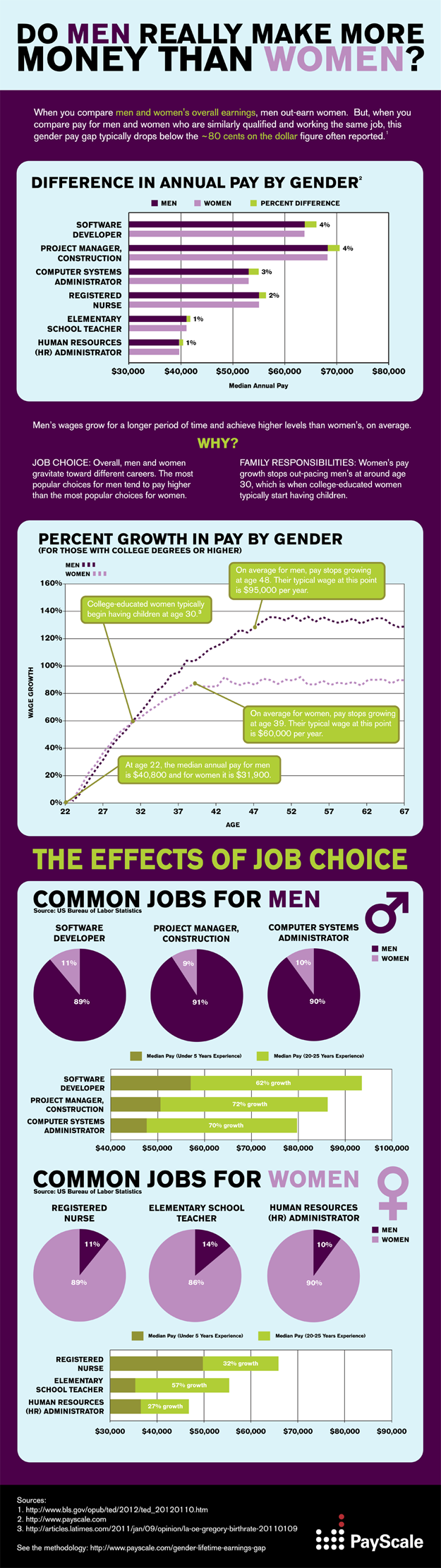
The first was from a few months back at the NYT blog, commenting on the most sleep deprived professions.
The second is from Time magazine, and talks about sleep differences among the races.

My gripe with both studies is the extremely small difference between the rankings.

In the professions study (sponsored by Sleepy’s btw), the most sleep deprived profession (home health aide) clocks in at 6hr57m.  The most well rested is loggers, with 7h20m.   On a self reported survey, how significant is 23 minutes?

From the study on races:

Overall, the researchers found, blacks, Hispanics and Asians slept less than whites. Blacks got 6.8 hours of sleep a night on average, compared with 6.9 hours for Hispanics and Asians, and 7.4 hours a night for whites. 

Here we see the same thing….there’s a 6 minute difference between the totals for Blacks and Hispanics and Asians.   Whites get 30 minutes more than Hispanics/Asians and 36 minutes more than blacks.

I question the significance of this, since I can’t remember whether I went to bed at 9:00 or 9:30 last night, and would have to guess if someone asked me.  Both surveys state this was self reported, and thus the chance these averages could be even closer together is huge.

Additionally, these differences do not actually reach the level of significance that the studies showing the dangers of sleep deprivation reach.

For example, in this study about sleep and overeating, subjects were woken up 2/3rds of the way through their normal sleep time.  That would be 2 hours early for nearly everyone above.  The studies on heart disease were only linked with chronic insomnia.  Cancer and diabetes are both more common in shift workers, but as someone who worked overnights for 3 years, I can tell you that’s not the same as waking up 30 minutes early.

Kaiser Fung has a great post about the popularizing of tiny effects that will be a hit if you didn’t like Freakonomics.

Soda bans and research misapplications

When I first read about Mayor Bloomberg’s proposed soda restrictions for NYC, I immediately thought of this post where I mentioned the utter failure of removing vending machines from schools.  Thus, I was extremely skeptical that this ban would work at all, and it seemed quite an intrusion in to private business for what I saw as an untested theory.

To be honest, I didn’t put much more thought in to it.  I saw the studies about people eating more from large containers floating around, but I dismissed on the basis that (like with the vending machine theory) they were skipping a crucial step.  Even if this ban got people to drink less soda, that doesn’t actually prove it would reduce obesity.  You have to prove all the steps in the series to prove the conclusion.

A few days ago, the authors of the “bigger containers cause people to eat more” study published their own rebuttal to the ban.  In an excellent example of the clash of politics and research, they claim that to apply their work on portion sizes in this manor is a misreading of the body of their work.  They highlight that the larger containers study was done by assigning portion sizes at random, to subjects who had no expectations as to what they would be getting.  In their words, the ban is a problem because (highlight mine):

Banning larger sizes is a visible and controversial idea. If it fails, no one will trust that the next big — and perhaps better — idea will work, because “Look what happened in New York City.” It poisons the water for ideas that may have more potential.

Second, 150 years of research in food economics tells us that people get what they want. Someone who buys a 32-ounce soft drink wants a 32-ounce soft drink. He or she will go to a place that offers fountain refills, or buy two. If the people who want them don’t have much money, they might cut back on fruits or vegetables or a bit of their family meal budget.

In essence, by removing the random element and forcibly replacing what people want with something the don’t, you frequently will have the worst possible effect: rebellion.

Mindless eating can be a problem, but rebellious eating is even worse.

When the researchers you’re trying to use to back yourself up start protesting your policies, you know you got it all wrong.

It’s all (culturally) relative

Last week I put up a post regarding a study on sexism levels in men whose wives stay at home.  I argued that due to the diversity of that group of men, and the variety of reasons a woman might stay home, this study was essentially meaningless.

Another issue came up in the comments section that I wanted to touch on: cultural relevance of data.

Most studies that get press here in the US are from the US, performed on American subjects.  This is sketchy business.

In the study about stay at home moms, mothers who worked part time were lumped in with the stay at home mothers.  Interestingly, in the Netherlands, this would actually be 90% of the women.  Does that mean that nearly every Dutch man married to a woman is more likely to be sexist?  Or does it mean that part time work has different value in different cultures?

I took a look around for some other examples, and found that in China, many women see working as part of a new found freedom.  At a conference I attended a few months ago, I talked to a man from Shanghai who mentioned that his wife went back to work because she couldn’t have handled trying to fight off the two grandmother’s, both of whom wanted to watch the child.  Due to the one child policy, this was the only chance they would get to have a grandbaby.  In many ways, it was actually the hierarchical/patriarchal culture there that pushed his wife to go back to work, as opposed to having her stay home.  

As the world continues to flatten out, and as America continues to welcome new immigrants, we must be conscious of who studies are actually looking at and how generalizable the results are.  In the sexism study, even the authors admitted their findings were meant to be a commentary on the US only….but it should raise some questions that they seemed to be chasing after a structure that doesn’t exist in some very liberal countries.

Something to consider, depending on the goal of the study.

Sexism and stay at home moms

I was just thinking I wanted to find a good marriage and family research paper to sink my teeth in to.

This one came across my inbox today, and I didn’t have to get much further than the abstract before I knew it was going to be a doozy.  Read for yourself:

In this article, we examine a heretofore neglected pocket of resistance to the gender revolution in the workplace: married male employees who have stay-at-home wives. We develop and empirically test the theoretical argument suggesting that such organizational members, compared to male employees in modern marriages, are more likely to exhibit attitudes, beliefs, and behaviors that are harmful to women in the workplace.

*Bias Alert*
My mother was a stay at home mom.  Therefore my father would have qualified for this study, and it is hard for me to even read their hypothesis without remembering that.  I happen to credit my father with giving me my passion for statistics and data analysis, and he has never once discouraged me from doing anything I wanted to professionally (with the exception of when I mentioned law school….that he soundly discouraged as a waste of talent….and this was  15 years before anyone was talking about a law school bubble).  I will not go in to all the details of my parents marriage here, but I doubt you could find anyone who would call my parents marriage anything less than an equal partnership focused on doing what was best for the family.

As an extra level of bias, I will be continuing my (full-time) job post baby.
*End Alert*

I’ve noticed a disturbing trend in both the general population and academic research: people seem to get very hung up on conflating “stay at home mom” with “traditional marriage”.  The study authors do this openly….they admit that they classify a marriage as “modern” based solely on whether or not the wife works full time.  The only criteria for “traditional” is that she doesn’t work at all, and part time work is all classified as “neo-traditional”.

To ignore the economic realities that drive families to make decisions about work seems to me to be an immense oversight.  I have met plenty of stay at home mothers who were in very equitable marriages, and I have met quite a few working mothers whose primary source of stress was their husbands continued expectation that they were still responsible for all child care/household duties.  I believe that using only one metric to rank a marriage as “traditional” or “modern” is a horrible over generalization….especially since most women with small children would prefer to work part time.  In fact (from the Pew study):

The public is skeptical about full-time working moms. Just 14% of men and 10% of women say that a full-time job is the “ideal” situation for a woman who has a young child. A plurality of the public (44%) say a part-time job is ideal for such a mother, while a sizable minority (38%) say the ideal situation is for her not to work outside the home at all.

So 90% of women don’t think the “modern” setup is ideal when there are young children involved.  If one of these women than chooses to stay home with her kids, has her husband truly regressed from “modern” to “traditional”?

For both the economic reasons and the “women’s choice” reasons, I reject studies that try to tie stay at home motherhood to anything else.  The sample is just too broad, and the reasons too varied.  It also undermines exactly how expensive child care can be….by my estimate, my mom would have had to bring home at least $4000 a month (in today’s dollars)  to pay for child care for 4 children.  $4000 after tax is a pretty hefty before tax salary.

I don’t argue that personal life can affect professional attitudes, and I would never advocate for sexism in the workplace.  In this study however, I really had to question the motives.  Is it really the best idea to fight gender stereotypes with stereotypes about very broad choices?  Is the point here that the workplace will only be fair when women participate as much as men?  Isn’t it a bit sexist to totally disregard the role women play in the decision to work or not work?  Shouldn’t we all just be able to do what’s best for our families, no questions asked?

Quote of the week and more recall coverage

Statistics are like bikinis.  What they reveal is suggestive, but what they conceal is vital.  ~Aaron Levenstein


I’ve been reading more of the Scott Walker recall election coverage, and was struck by the frequent references to Walker being “the first governor to survive a recall election”.  Of course this made me curious how many governor’s had been recalled.  I remembered the California governor a few years back, so I had been imagining it would be at least a dozen or so.

Nope.

It’s two.  Lynn Frazier from North Dakota in 1921, and Gray Davis from California in 2003.

I had to laugh at my own sampling bias.  My assumptions were pretty understandable….I’ve been of voting age since 1999, and in that time this has happened twice.  Therefore it was reasonable to assume this happened at least occasionally.   I figured about once every 10 years, which would be 23 or 24 in American history.  I was pretty sure not every state had a recall option, so I halved it.  12 felt good.

This is the problem when data leaves out key points….it relies on our own assumptions to fill in the details.  Engineers are normally trained to get explicit with their assumptions when estimating, as evidenced by the famous Fermi problem.  However, even the most carefully thought through assumptions are still guesses.

That’s why it’s important to remember the quote above: what you’re shown is important, but it’s not half as interesting as what’s hidden.

More adjectives, more problems

I’ve written before about the dangers of adjectives, but today on Instapundit there was a link to a great example of a misused adverb.

The headline on CNN late last night apparently described Scott Walker as “narrowly defeating” Barrett.  Ultimately he beat him by 7% of the vote.

Now, some may call that narrow, but most would not.  Words like that are dangerous because they can obscure your view of the real numbers.  Other words that can skew your view are “spike” “surge” “plummeted” etc.

While all probably at least indicate the direction of the change, there is no standard for how big the change must be to use one of these words.  If possible, check the numbers first, then the headlines.

It’s better than trusting journalists.

More on metrics: what about college?

After my post yesterday on metrics, the AVI left a good comment, and then wrote his own follow up post using  sports as an example.  It’s worth a read.

I’ve been thinking more about metrics today, and wondering about other areas where there’s no consensus on outcomes.  Before I get in to the rest of my thoughts, I wanted to mention a quick anecdote I once heard a pastor give.

Back when he was in high school, this man’s class had been handed a poll.  In it, they were asked what they most wanted to be in life:  rich, successful in their field, famous, successful in love, well traveled or happy.  According to him, when the teacher wrote the results on the board, he was the only one who had put “happy”.  As he discussed this with his classmates afterwards, he realized this was because they all had so closely associated happiness with one of the other metrics that it had never occurred to them that checking off “rich” might not be the same thing as checking off “happy”.

This occurs to me as a common mistake with metrics….we start associating two traits so closely that we forget they do not actually have to coexist.

This brings me to college.

In the student loan debates, there’s been much wailing over how much debt undergraduates are taking on, while the ability to obtain salaries that enable repayment has decreased.  In reading these articles, one would be left with the impression that we had some sort of national consensus on what the point of college actually is: to get a good job.

This is wrong.

According to the Pew Research Center:

Just under half of the public (47%) says the main purpose of a college education is to teach work-related skills and knowledge, while 39% say it is to help a student grow personally and intellectually; the remainder volunteer that both missions are equally important. College graduates place more emphasis on intellectual growth; those who are not college graduates place more emphasis on career preparation.

Even college presidents don’t agree on what they’re trying to do:

(College) Presidents are evenly divided about the main role colleges play in students’ lives: Half say it is to help them mature and grow intellectually, while 48% say it is to provide skills, knowledge and training to help them succeed in the working world. Most heads of four-year colleges and universities emphasize the former; most heads of two-year and for-profit schools emphasize the latter.

So half of the people heading up colleges never thought that their primary goal would be to get kids good jobs, and 40% of the public didn’t prioritize getting a good job.  Loans are generally based on an ability to repay, but a good chunk of those taking out the loans weren’t focused on ability to repay when they signed on.

My guess is that this is not what actually went through these people’s heads, at least not in those words.  My guess is that maturing and intellectual growth is so conflated with being qualified for a good job that it’s unfathomable to some people that they’re not the same thing.

Maybe they should start asking this on student loan applications.  I certainly think it should be at least be part of the conversation.

Outcome metrics and the research we do not do

I’ve spent most of last week at work trying to perfect a grant proposal that pretty much everyone in our program has to sign off on.  On Thursday, Friday and today there was a great deal of discussion about what metrics we could use to measure our outcomes, should we get funding.

It’s actually not an easy question, as the project we’re working on is a general good thing (patient education) designed to address a multitude of issues, as opposed to something more targeted.

Watching half a dozen people go back and forth about all this got me thinking about how often it is taken for granted that somewhere out there is a definition for “success” in various topics.

When I took a child development class in grad school, I remember in one of the first classes someone asked what the best parenting methods were.  Our professor replied that there really couldn’t be a consensus, because no one could agree on what would qualify as a success.  He proceeded to use religion as an example:  for parents of strong religious persuasion, a child who grew up a financially successful atheist would not necessarily be what they were going for.  Conversely, secular atheist parents might be distressed at a strong religious conversion.

There are probably scores of good studies that could have been done on parenting methods if we actually had a definition of success we could all agree on.  Too frequently, I think people overlook this point.  The reason so many strange fads in parenting can get going is because it is really really hard to prove anyone right or wrong.  Even if you try, you might just wind up with the dodo bird verdict.

If you can’t agree on where you’re going, you most certainly can’t tell people how to get there.  The studies you don’t do are often as important as the studies you do.

Cutting and pasting OR always check the source data

I’ve mentioned before that I don’t like infographics.

Normally this is because the infographic itself is misleading, but today I found an equally hideous incarnation of this.

It all started over at feministing.com, where I was greeted with this graph:

This pretty much set off my alarm bells immediately.  I had quite a few questions about all of this, as the graph obviously said very little about the methodology.  Who was included?  How did they account for gaps in years worked?  Most importantly, did they control for profession?

I clicked on the link provided, which took me to this blog post on the New York Times website.  It shows the same picture as above, with an intro of the following two sentences:

We’ve written before about how the gender pay gap grows with age. Generally speaking, the older a woman is, the wider the gap between what she earns and what her male counterpart earns.

I was struck by that phrase “male counterpart”.  Were we really talking about counterparts here?  I was curious again about the profession question.  It struck me that many female dominated professions are actually “terminal” professions….i.e. the job you enter can remain pretty unchanged for years: teachers, nurses, therapists, etc.  On the other hand, many male dominate professions have far more steps on the ladder, which would be a pretty non-sexist explanation for the continued growth seen throughout the decades.

With this in mind, I went to find the methodology for the graph.  I not only found the methodology, but the rest of the infographic.

As it turns out, the profession issue was directly addressed on the original….but it was completely edited out in subsequent reprints.  Profession does have an effect on earnings growth, and the original captured that.  I’m a little concerned about how far this graphic went without all of the important qualifying information they took care to include.

 Interestingly, the NYT columnist did actually write a more comprehensive article on the topic 2 years ago that she linked to in this article, but I’m surprised she didn’t do a recap.  With the ease of transport of info on the web, I don’t think the cut and paste job is an okay thing to do.  It sets up less diligent bloggers to merely reprint, and it undermines the original work.  Someone out there is quoting this right now, having no idea that they’re missing 2/3rds of the information.

Bad data, bad.

Real World Bad Data: The Airlines

I hate flying.  I hate nearly everything about the entire experience really….getting to airports, the way they look, the lines, the fees, the TSA, the complete absence of food I’m not allergic to in most terminals, the boarding process, the plane itself, the proximity to other people, the feeling of being totally trapped, trying to get up and maneuver the aisles at all, and baggage claim.

Flying is terrible.

That being said, I was quite interested in reading this article that addressed why airline seats are so darn uncomfortable.  While they address the obvious issues such as increasing obesity and airline companies incentives to cram as many seats in as possible, I was struck by this quote:

In 1962, the U.S. government measured the width of the American backside in the seated position. It averaged 14 inches for men and 14.4 inches for women. Forty years later, an Air Force study directed by Robinette showed male and female butts had blown up on average to more than 15 inches…..But the American rear end isn’t really the important statistic here, Robinette says.  Nor are the male hips, which the industry mistakenly used to determine seat width sometime around the 1960s, she says.

“It’s the wrong dimension. The widest part of your body is your shoulders and arms. And that’s much, much bigger than your hips. Several inches wider.” Furthermore, she says, women actually have larger hip width on average than men.

So even back when the airlines might have made an attempt at having adequate seat size, they picked the wrong metric to play to, and everybody suffers.

I thought this was an interesting example of picking your data points.  Hip width makes intuitive sense to build a seat around, but it turns out it’s wrong.

The article also has some good discussion of perception and how moving rows closer together can give you a sense the seat itself has gotten smaller.  Interesting real world applications of statistics.