Some infographic love for my little brother

My wonderfully liberal little brother is having a rough week, so I thought I’d cheer him up in the best way I know how….by criticizing a Republican infographic.

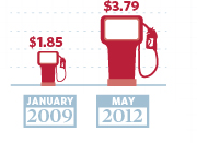
He sent me this one this morning, and while it’s a little sparse, the bottom right hand corner caught my eye:

Now, I have no idea how much was given to Solyndra, or how many jobs wind energy has left, but I do know a thing or two about gas prices and infographic figures.

First, those gas pumps are totally deceptive. $3.79 is almost exactly 2 times $1.85.   Fine.  However, let’s look closely at those gas pumps:

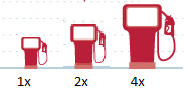
I pulled out the ruler when I cropped the photo, and confirmed my suspicions.  The larger pump in the picture doubles both the height and the width of the first pump.  That’s not twice as big….that’s four times as big.  I’m sure they’d defend it by pointing to the dashed lines in the background and saying only the height was supposed to be reflective, but it’s still deceptive.  Curious what a gas pump actually twice as big would look like?  Here you go….original low price on the left, original “double” price on the right, actual double in the middle.

Graphics aside, let’s look at the numbers.

2009 was just not that long ago, and I know that $1.85 was quite the anomalous price at the time.  I’ve seen that stat more than once recently, and I have been annoyed by it every time.  Tonight, I decided to check my memory on it, and see if that dip really was the aberration I remember it being.  Don’t remember either?  Here’s the graph of average gas prices since 1978, per the BLS generator:

That dip towards the end there with the arrow?  That hit right as Obama was taking office.  In July of 2008, gas was an average of  $4.15 per gallon.  By January of 2009, it was $1.84.    I have not a clue why that drop happened, but I do know that to treat that $1.85 number as though it was standard at the time is a misrepresentation.

You can see this a bit better if you isolate George W Bush’s presidency:

Now, you could accurately say that George Bush took office with gas prices at $1.53 and left with them at $1.74….but clearly that would ignore a whole lot of data in between.  
Now here’s the averages and standard deviations for each term of the presidencies:
GWB – 1st term GWB – 2nd term BHO – current term
Average Gas Price 1.63 2.78 2.99
Standard Deviation 0.22 0.56 0.56
Now, none of this adjusted for inflation.  By adjusting the yearly averages to 2010 dollars, I got the second term of GWB to $2.99, and the current term for BHO to $3.00.  
You don’t have to like Barack Obama, and you certainly don’t have to like gas prices.  No matter what your political affiliation, I think we can all agree on one thing: ALWAYS beware of infographics.

Who represents you best?

Another day, another infographic:
Via: TakePart.com

 Sigh. It’s an election year, so I know I’m going to be seeing a lot of these types of things and I should just get over it but…I can’t.

I really dislike this one, because while the data may be good (I haven’t checked it), I think the premise is all wrong and perpetuates faulty ideas.

Congress is a nationally governing body that is split up by state.  Thus, even if Congress was perfectly representative on a state to state basis, it would still very likely not look like the USA as a whole.  

For example, let’s take Asian Americans and Pacific Islanders.  According to the census bureau, 51% of this demographic lives in just 3 states:  California, New York and Hawaii. Nine states pull fewer than 1% of their population from this demographic:  Alabama, Kentucky, Mississippi, West Virginia, North Dakota and South Dakota, Montana, Wyoming and Maine.  4.2% may be the national average, but Hawaii is 58% Asian, and West Virginia is 0.7% Asian.  For one, it would be ethnically representative to have at least half of their reps be Asian every year, for the other it’s statistically unlikely to happen.

If you wanted a really impressive infographic, you’d take each state’s individual ethnic breakdown and cross reference it with how many representatives they had in Congress to figure out what a representative sample should be.  Adding those up would give you the totals for racial diversity when judged on a state level, not a national level.

Of course, that’s only the racial numbers, though the same could apply to the religion questions.  This doesn’t work for the gender disparity…gender ratios are pretty close to 50/50 (Alaska has the highest percentage of men, Mississippi has the lowest).  I think that’s a more complex issue, since you have to take in to account the number of women desiring to run for office (lower than men), and then the counterargument that fewer women want to run because they believe they’re less likely to win or more likely to be crticized.  It’s a tough call how many women there should be to be truly representative since both sides can argue the data.

The income, age, and education numbers I’d argue are all due to the nature of the job.  Campaigning is expensive, and neither Representative nor Senator are not exactly entry level jobs.

As the comments from yesterday’s post showed,  one of the least representative parts of Congress is profession.  Lawyers make up 0.38% of the population, and yet 222 members of Congress have law degrees (38% of the House, 55% of the Senate).  That seems highly unrepresentative right there.

At the end of the day, we vote for people who represent our state, not necessarily our gender, religion or race.  In Massachusetts, our current Senate race is between a 52 year old white male lawyer and a 62 year old white female lawyer. The biggest difference demographically in my eyes?  One has lived in Massachusetts for decades, and the other….lived here long enough to qualify to run.  No one’s going make a pretty picture out of that factor, but it’s pretty important when it comes to getting adequately represented.

Are Republicans Stupid?

One of my favorite things about blogging is it’s potential to actually change the way I personally think about things.  I don’t mean just through the comments section, though that is immensely helpful, but more so through the process of researching, writing, posting and following up.  A few posts on one topic, and suddenly I find myself passionate on topics that had previously been mere blips on my radar.  God bless the internet.

All that is to say, a month ago I didn’t really care what people said about politics and science.  Sure, in my own blog rules, rule number 2 said I would stay non-partisan:

I will attempt to remain non-partisan. I have political opinions.  Lots of them.  But really, I’m not here to try to go after one party or another.  They both fall victim to bad data, and lots of people do it outside of politics too.  Lots of smart people have political blogs, and I like reading them…I just don’t feel I’d be a good person to run one.  My point is not to change people’s minds about issues, but to at least trip the warning light that they may be supporting themselves with crap. 

Even so, if someone had casually made the comment that Republicans were anti-science, I probably would have let it go.  After all, I spent most of my pre-adulthood years in a Baptist school that had plenty of Republican voting ignorants to color my view.

But…..then I did this post.
And this one.
And of course this one.

And now I don’t feel those comments are quite as innocuous as I once did.

My feelings on this were backed up by this article from Forbes magazine (where this posts title came from), which I really really recommend if you have the time.

I’m not going back on my non-partisan premise, but as Mr Entine so eloquently posits, one party laying claim to “science” does nobody any good.  Science never fares well when put in the hands of politicians (does anything really?) and giving one party the moral upper hand in a subject as broad as “science” can cause damaging oversights.

To be honest, I don’t know which party is more “pro-science”.  The data required to prove that one way or the other would require compiling a complete list of scientific topics, ranking them in order of possible impact to both people and the world at large, ranking the conclusiveness of the data, and conducting public opinion polls broken down by party and controlled for race, class and gender.  That’s an enormous amount of work, and nobody has done it.

Thus, until further research is done, I will stick with the following conclusions:

  1. Politicians will exploit everything they can if they think it will get them more votes
  2. Ditto for journalists (sub “readers” for “votes”)
  3. Saying you’re “pro-science” is not the only requirement for being “pro-science”
  4. Increasing the general level of knowledge around research methods, data gathering and statistical analysis is probably a good thing
Seriously though, read the Forbes article.  

You are getting sleepy….

It’s been one of those weeks.  I feel I would pay good money to be able to fast forward through tomorrow and jump straight to the weekend, as I’m pretty sure my brain is leaking out of my ear.

Given that, the headlines about this announcement by the CDC caught my eye.  The headline reads “30% of US Workers Don’t Get Enough Sleep”.

Now, I’m in a pretty forgiving mood towards that sentiment.  I’m tired today, and I know when I got in this morning most of my coworkers were dragging too.  Any comment on sleep deprivation would have most certainly gotten lots of knowing looks and nods of commiseration.  This study backs us up right?  We’re all veeeeeeeeery sleepy.

Except that studies like this are almost all misleading.

Several years ago, I read a pretty good book by Laura Vanderkam called 168 Hours: You have more time than you think.  It was through this book that I got introduced to the Bureau of Labor Statistics American Time Use Survey.

Now, most time use surveys….the type that people use to give reports about how much we sleep or work….are done by just asking people.  Now that’s great, except that people are really terrible at reporting these things accurately.  The ATUS however, actually walks people through their day rather than just have them guess at a number.  It’s interesting how profound these differences can be.  In another survey using time diary methodology, it was found that people claiming to work 60 – 64 hours per week actually averaged 44.2 hours of work.  More here, if you’re interested.

Unsurprisingly, sleep is one area that people chronically underestimate how much they’re getting.  The CDC study, which it admits was all data from calling up and asking people “how many hours of sleep do you get on average?” found that 30% of workers sleep fewer than 6 hours per night.  The ATUS however, finds that the average American sleeps 8.38 hours per night….and that’s on weekday nights alone.  Weekends and holidays, we go up to 9.34.

I couldn’t find the distribution for this chart, but I did find the age breakdown, so we can throw out those 15-24 and those over 65 (all of whom get about 9 hours of sleep/night).  We’re left with those 25 – 65 who average roughly around 8.3 hours of sleep per night.

Alright, now lets check the CDC number and figure out how much sleep the other 70% of the population would have to be getting in order to make these two number work.

If we take some variables:
a = percent of people sleeping an average of fewer than 6 hours per night
x = the maximum number of hours to qualify as “fewer than 6 hours”
b = percent of people sleeping more than 6 hours per night
y = average amount they are sleeping to balance out the other group
c = average amount of sleep among workers according to the ATUS survey

We get this:  ax + by = c
And then substituting:  (0.3*5.9) + (0.7*y) = 8.3
Solving for y:  y = 9.33 hours of sleep per night

Are 70% of Americans of working age actually getting 9.33 hours of sleep per night?  That would be pretty impressive.  It would also mean that instead of a normal distribution of sleep hours, we’d actually have a bimodal distribution….which would be a little strange.

There is, of course, the caveat that those answering the ATUS represent the whole population while the CDC targeted working adults.  It’s a little tough figuring out how profoundly this would affect the numbers since the BLS reports workforce participation rates for those 16 and up.  The unemployment rate for 2010 (the year the survey was completed) hovered just under 10%, but the “not in labor force” numbers are a little harder to get without skewing by the under 25 or over 65 crowd.  The CDC also didn’t report an average, so I can’t compare the two….but given the 30% number, the six 6 hours or less would be less than half a standard deviation from the mean (if the sleep data was roughly normal).

So does this mean I’m not as tired as I think I am?  Nope, I’m pretty sure I’m still going to bed early tonight. I will however, be aware that a tiring week does not necessarily mean a sleep deprived one.

Hey, at least someone’s thinking

Best idea I’ve seen all day….people taking Congress to task for having no system for vetting scientific testimony.  (H/T to Maggie’s Farm)

Apparently what sent them over the edge was when a scientist misquoted his own paper during testimony,  skewing his own research.  Yikes.

One of the authors website is here….haven’t had time to look around much.

Everybody loves a (certain sort of) hypocrite

Last week I posted my annoyance at studies that put more work in to proving that substitute a potential proximal cause for the real issue without adequately proving that was a valid substitution.  At the time I was talking about food deserts, but today I found another great example.  A study that has gone viral links homophobic behavior with secret homosexual desires.

Now, when I first heard these results in passing, I was pretty surprised.  I spent years in a Baptist school with plenty of people who were quite clear about their homophobia, and I have always thought it overly simplistic when people say that’s all repressed homosexuality.  I think the reasons behind any prejudice are likely to be complicated and multifaceted.  Plus, the logic seemed pretty sensationalistic…..and after all, we don’t accuse misogynists of wanting to be women.

Anyway, I hadn’t had time to look in to this study, but I ran across this takedown by Daniel Engber on Slate today.   I thoroughly enjoyed the article (and extra credit to Slate for not being 100% PC).  The author points out that the results of this study are only as trustworthy as the semantic association method (the implicit association test) they used to prove it.  This technique, which essentially involves showing a subliminal message followed by a picture, can be questionable.  From the Slate article:

Should we trust this interpretation of the data? In the Times op-ed, the authors claim that the reaction-time task “reliably distinguishes between self-identified straight individuals and those who self-identify as lesbian, gay or bisexual.” Their formal write-up of the work for the Journal of Personality and Social Psychology is a bit less sanguine on the method, citing just one other study that has used this approach, and saying it “showed moderate correspondence with participants’ self-reported sexual orientation.”

So there’s that.

The other issue that Engber didn’t mention is that this study was performed on college freshmen.  I REALLY hate when people generalize from that age group because….stop me if I’m getting crazy here…I am pretty sure kids that age have a less well developed sense of identity than the adult population at large.

Even if the data were 100% accurate, I think that the youngness of this sample would skew the results.  At least when I went to college, quite a few kids came out during that time, and it was a time of questioning  identity for pretty much anyone.  According to the best research I could find, the average gay person doesn’t even self-identify as gay until 16, and the majority of people come out either in college or after developing an independent life.  So the chances that expressions of sexual identity, especially subconscious expressions, may look different at 18-20 is pretty well supported.

Now I’m pretty sure there will always be Ted Haggard’s or Larry Craig’s in this world…just like there will always be John Edwards or Elliot Spitzer’s.  Sex, gay or straight, will always capture headlines more than boring things like tax evasion, even though they are both hypocritical.   Still, with studies like this, I urge caution. Accepting the result means accepting that words on a screen and hundreths of a second of reaction time can accurately capture homophobia, and that a 19 year olds perspective on the world can translate to all adults.  If you believe both of those, then go ahead and quote the study.  Otherwise, you may want to hold your judgement for a bit longer.

Circumventing the Middle Man

Well, my post on justifiable skepticism (Paranoia is just good sense if people actually are out to get you) certainly was the big winner for traffic/comments this week.  I was happy to see that…I had a lot of fun putting that graph together and thought the outcomes were pretty striking.  Thanks to Maggie’s Farm for linking to it.

It was my post on food deserts however, that got me the most IRL comments.  Both my mother and my brother commented on it, and not terrifically positively.  In retrospect, I wasn’t very clear about the points I was trying to make, though to be fair I had spent a lot of the day on an airplane.

My issue with food desert research, or any similar research, is that what we’re really talking about is a proposed proximate cause to a larger issue: obesity.  In my experience, just having people tell you why they think something’s happening, isn’t good enough to prove that’s the actual reason.  Thus my quibble with much of the theorizing about obesity problems….you have to make sure that what you’re theorizing is the cause is actually the cause (or one of the causes) before you start dumping money in to it.  You cannot make the middle man the holy grail if you haven’t established that it’s really a cause.

Unfortunately, people love to jump on good ideas before truly establishing this link.

Example:  A few years ago, it was discovered that 22% of school children were eating vending machine food.  This school had an obesity problem, the food in the vending machines was unhealthy, so a push began to remove vending machines from schools.  Schools balked, as they make money from vending machines, but the well being of children came first…..until of course this study came out proving that reducing access to vending machines didn’t actually effect obesity rates.   Oops.

It’s really a simple logic exercise…proving that kids are (a) obese and (b) eating from vending machines does  not actually prove that getting rid of (b) will reduce (a).

That’s why I liked the research in to the difference food deserts make in obesity.  It’s a question that needs to be asked more often when trying to address a large issue:  are we sure that the issue we’re trying to address will actually help the issue we were concerned about it the first place???


If you haven’t established that it will, then be careful with how you proceed.  Addressing food deserts (or vending machines or whatever) is  a means to an end, and you shouldn’t confuse it with the end itself…unless you have really good data backing you up.

Trillion Dollar Debt Day

Bias alert:  I graduated college with a LOT of debt.  It was nearly ten years ago, but I was still far above the current average widely reported in the media.  In 3 years, I had paid off all but one loan that was locked at 2.3% interest.  I paid that off two years later due to the fact that Sallie Mae is an absurdly evil company and I was sick of dealing with them.  All in all, I was debt free 20 years earlier than projected and today have zero debt from either my bachelor’s or master’s degree.

Now, all that being said, I guess I can’t feel too left out that I didn’t get invited to the student protest that was Trillion Dollar Debt Day.  Apparently yesterday was the day that total student loan debt in this country hit $1,000,000,000,000.  Want to see it in real time?  Here you go: 

http://www.finaid.org/loans/studentloandebtclock.html

Anyway, student debt is a complicated issue with lots of statistics ripe for dissection.  Actually, the debt really isn’t that complicated….it’s there because college costs have gone up far more than average household income has, and more people are going for both grad and undergrad degrees.  What’s complicated is how people interpret what to do with these statistics.  For example (from the clock website above):  “Student loan debt, on the other hand, as been growing steadily because need-based grants have not been keeping pace with increases in college costs.” Not hard to see what that websites solution would be to this issue.

The 1 trillion number is impressive, but it is not often mentioned how heavily the increase in debt level correlates with how sharply the number of students have gone up.  According to the National Center for Education Statistics “enrollment in degree-granting postsecondary institutions increased by 9 percent between 1989 and 1999. Between 1999 and 2009, enrollment increased 38 percent, from 14.8 million to 20.4 million.”  Nearly 6 million people extra people in 10 years, combined with rising costs and a recession…that will make that number shoot up in a hurry.

In the past 5 years, the average debt per graduating college student (bachelor’s level) has only gone up by about $4000, unadjusted, or $2500 in adjusted dollars.

Year Average Debt Average Debt (2010 $) Median Earnings Median Earnings (2010 $) Debt:Earnings (inflation-adjusted)
2006 $21,100 $22,822 $45,221 $48,912 0.47
2007 21,900 23,032 46,805 49,224 0.47
2008 23,200 23,497 47,094 47,696 0.49
2009 24,000 24,394 47,510 48,289 0.51
2010 25,250 25,250 47,422 47,422 0.53

Sources: Project on Student Debt, U.S. Census American Community Surveys (1-year estimates, 2006-2010), Bureau of Labor Statistics CPI Inflation Calculator.

  You multiply even that amount over 20.4 million however, and the levels start reaching crisis proportion.  Additionally, these “average” numbers, while reported very exactly, are all self reported by the schools.  Also, out of the 2,300 schools they asked, 500 were tossed for identification reasons, and about 300 just didn’t report anything.  This makes these numbers highly suspect.

Overall, I’m not saying there’s not a crisis.  I work in health care, and it’s totally ludicrous to me that while we’re all scrambling to cut costs as fast as we can, higher education is not doing the same. I’ve also had a mortgage for nearly as long as I had my student loans, and I can tell you that my mortgage company has not once pulled any of the disgusting shenanigans that Sallie Mae pulled with my student loans.  I used to have to save my receipts because they, I kid you not, used to ADD small amounts of money to my balance at random.  I would then have to spend 45 minutes on the phone with them proving that this had happened.  I was always right, they would merely “apologize for the misunderstanding”.

However, with this issue, as with so many others, watch the numbers when emotions run high.  People love to throw data at others in these moments, knowing it won’t be questioned.  Business Insider, for example, claims that “For many of you, your degrees won’t matter. One-third of you will land full-time jobs that don’t require them.”  They don’t mention that’s 33% of 500 people who just graduated.  Check back in 5 years, BI, then show me the numbers.

Begin with the end in mind

Most of what I do all day is in the loose category known as operations research.  This is an interesting sort of research that typically starts with a question, and then involves gathering qualitative and quantitative data until you get a hypothesis.  Adjustments are made until you get going in the right direction, which is normally related to either getting more of a good thing or less of a bad thing…or often both.

This is my favorite type of research for any field for a variety of reasons: it’s practical, it helps people, it tends to cut through feelings and deals with facts, and it leaves room for people to be surprised.   
The downside is that the questions are often complex and the answers multi-dimensional.  That’s why good research of this kind is so darn impressive.  I read a great article today about Jacqueline Campbell and her work to reduce domestic homicide.  She started with a complex problem, and worked both forward and backwards until she came up with something that worked.  Working backwards, she went deep in to the statistics to figure out which situations were the most likely to result in homicide, and then trained the front end responders how to reach out to those who were at the most risk.  While she will not claim credit, it is noted that  the state where she implemented this program (Maryland) has cut their domestic homicide rate in half.  
Domestic violence is an issue that can very easily get mired down in politics and emotion, so it’s interesting to note that this is one of the few programs that is getting bipartisan support.  That’s such a good outcome when somebody actually pragmatically addresses an issue rather than just catering to their own pet theories.
To note: starting research with a goal in mind is beneficial only when it’s not a guise to push an agenda.  It’s only good if you really don’t know how to get there.   I feel this is research at it’s best, research that actually helps a real world problem.  I have nothing against research that helps us see the world in new ways, but my practicality bias is probably why I did engineering and not theoretical physics.  It takes all types, I just wish more would focus on the “how do we get there” type questions.

Paranoia is just good sense if people really are out to get you

Yesterday I posted about retractions in scientific journals, and the assertion that they are going up.  I actually woke up this morning thinking about that study, and wishing I could see more data on how it’s changed year to year (yes, I’m a complete nerd…but what do you ponder while brushing your teeth????).  Anyway, that brought to mind a post I did a few weeks ago, on how conservatives trust in the scientific community has gone steadily down.

It occurred to me that if you superimposed the retraction rate of various journals over the trust in the scientific community rates, it could actually be an interesting picture.   It turns out PubMed actually has a retraction rate by year available here.  For purposes of this graph I figured that would be a representative enough sample.

I couldn’t find the raw numbers for the original public trust study, so these are eyeballed from the original graph in blue, with the exact numbers from the PubMed database in green.  
So it looks like a decreasing trust in the scientific community may actually be a rational thing*.  
It’s entirely possible, by the way, that the increased scrutiny of the internet led to the higher retraction rate…but that would still have given people more reasons not to blindly trust.  As the title of this post suggests, skepticism isn’t crazy if you actually should be skeptical.
Speaking of trust, I obviously had to manipulate the axes a bit to get this all to fit.  Still not sure I got it quite right, but if anyone wants to check my work, the raw data for the retraction rate is here and the data for the public trust study is here.  These links are included earlier as well, just wanted to be thorough.  
*Gringo requested that I run the correlation coefficients.  Conservatives r = -0.81 Liberals r = 0.52 Moderates r = 0.  I can’t stand by these numbers since my data points were all estimates based on the original chart, but they should be about correct.