4th of July, Census Bureau style

Here’s hoping everyone had a relaxing 4th of July!

Today I learned that the White House sponsors two official Independence Day parties at the White House. One of them is for service men and women and their families, the other is for a broader group of friends of the White House.  I bring this up because apparently my younger brother finagled a ticket to the second one. Kind of makes my day feel a little lame, but hey, at least the house is coming along, and I’m the most relaxed I have been in a while.

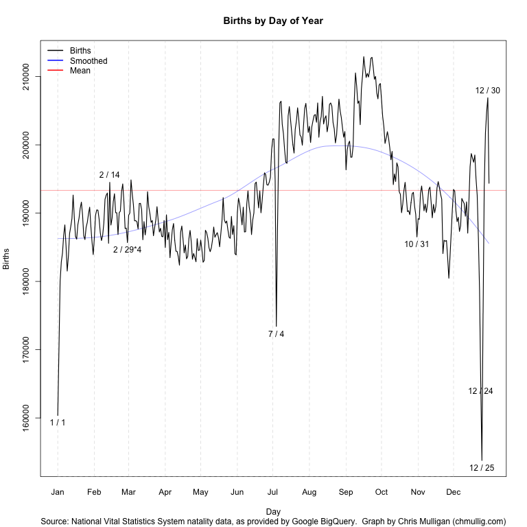
I was looking for some good stats about the White House, but then I found this which I thought was equally interesting.  It’s no West Lawn Party….but we here at Bad Data Bad do what we can with what we have.

Without further ado, here’s some (year old) fun facts, courtesy of our Census Bureau:

The Fourth of July 2011


On this day in 1776, the Declaration of Independence was approved by the Continental Congress, setting the 13 colonies on the road to freedom as a sovereign nation. As always, this most American of holidays will be marked by parades, fireworks and backyard barbecues across the country.

2.5 million

In July 1776, the estimated number of people living in the newly independent nation.
Source: Historical Statistics of the United States: Colonial Times to 1970
<http://www.census.gov/prod/www/abs/statab.html>

311.7 million

The nation’s estimated population on this July Fourth.
Source: Population clock <http://www.census.gov/main/www/popclock.html>

Flags

$3.2 million

In 2010, the dollar value of U.S. imports of American flags. The vast majority of this amount ($2.8 million) was for U.S. flags made in China.
Source: Foreign Trade Statistics <http://www.census.gov/foreign-trade/www/>
<http://www.usatradeonline.gov>

$486,026

Dollar value of U.S. flags exported in 2010. Mexico was the leading customer, purchasing $256,407 worth.
Source: Foreign Trade Statistics <http://www.census.gov/foreign-trade/www/>
<http://www.usatradeonline.gov>

$302.7 million

Annual dollar value of shipments of fabricated flags, banners and similar emblems by the nation’s manufacturers, according to the latest published economic census data.
Source: 2007 Economic Census, Series EC0731SP1, Products and Services Code 3149998231
<http://www.census.gov/econ/census07/>

Fireworks

$190.7 million

The value of fireworks imported from China in 2010, representing the bulk of all U.S. fireworks imported ($197.3 million). U.S. exports of fireworks, by comparison, came to just $37.0 million in 2010, with Japan purchasing more than any other country ($6.3 million).
Source: Foreign Trade Statistics <http://www.census.gov/foreign-trade/www>
<http://www.usatradeonline.gov>

$231.8 million

The value of U.S. manufacturers’ shipments of fireworks and pyrotechnics (including flares, igniters, etc.) in 2007.
Source: 2007 Economic Census, Series EC0731SP1, Products and Services Code 325998J108
<http://www.census.gov/econ/census07/>

Patriotic-Sounding Place Names

Thirty-one places have “liberty” in their names. The most populous one as of April 1, 2010, is Liberty, Mo. (29,149) Iowa, with four, has more of these places than any other state: Libertyville, New Liberty, North Liberty and West Liberty.
Thirty-five places have “eagle” in their names. The most populous one is Eagle Pass, Texas (26,248).
Eleven places have “independence” in their names. The most populous one is Independence, Mo. (116,830).
Nine places have “freedom” in their names. The most populous one is New Freedom, Pa. (4,464).
One place with “patriot” in the name. Patriot, Ind. (209).
Five places have “America” in their names. The most populous is American Fork, Utah (26,263).
Source: American FactFinder <www.census.gov>

Early Presidential Last Names

138

Ranking of the frequency of the surname of our first president, George Washington, among all last names tabulated in the 2000 Census. Other early presidential names that appear on the list, along with their ranking, were Adams (39), Jefferson (594), Madison (1,209) and Monroe (567).
Source: Census 2000 Genealogy <http://www.census.gov/genealogy/www/freqnames2k.html>

The British are Coming!

$98.3 billion

Dollar value of trade last year between the United States and the United Kingdom, making the British, our adversary in 1776, our sixth-leading trading partner today.
Source: Foreign Trade Statistics <http://www.census.gov/foreign-trade/statistics/highlights/top/top1012yr.html#total>
<http://www.usatradeonline.gov>

Fourth of July Cookouts

More than 1 in 4

The chance that the hot dogs and pork sausages consumed on the Fourth of July originated in Iowa. The Hawkeye State was home to 19.0 million hogs and pigs on March 1, 2011. This estimate represents more than one-fourth of the nation’s estimated total. North Carolina (8.6 million) and Minnesota (7.6 million) were also homes to large numbers of pigs.
Source: USDA National Agricultural Statistics Service
<http://usda.mannlib.cornell.edu/usda/current/HogsPigs/HogsPigs-03-25-2011.pdf>

6.8 billion pounds

Total production of cattle and calves in Texas in 2010. Chances are good that the beef hot dogs, steaks and burgers on your backyard grill came from the Lone Star State, which accounted for about one-sixth of the nation’s total production. And if the beef did not come from Texas, it very well may have come from Nebraska (4.6 billion pounds) or Kansas (4.1 billion pounds).
Source: USDA National Agricultural Statistics Service
<http://usda.mannlib.cornell.edu/usda/current/MeatAnimPr/MeatAnimPr-04-28-2011.pdf>

6

Number of states in which the value of broiler chicken production was $1 billion or greater between December 2009 and November 2010. There is a good chance that one of these states — Georgia, Arkansas, North Carolina, Alabama, Mississippi or Texas — is the source of your barbecued chicken.
Source: USDA National Agricultural Statistics Service
<http://usda.mannlib.cornell.edu/usda/current/PoulProdVa/PoulProdVa-04-28-2011.pdf>

Over 1 in 3

The odds that your side dish of baked beans originated from North Dakota, which produced 36 percent of the nation’s dry, edible beans in 2010. Another popular Fourth of July side dish is corn on the cob. Florida, California, Georgia, Washington and New York together accounted for 68 percent of the fresh market sweet corn produced nationally in 2010.
Source: USDA National Agricultural Statistics Service
<http://usda.mannlib.cornell.edu/usda/current/CropProdSu/CropProdSu-01-12-2011_new_format.pdf> and
<http://usda.mannlib.cornell.edu/usda/current/VegeSumm/VegeSumm-01-27-2011.pdf>

Please Pass the Potato

Potato salad and potato chips are popular food items at Fourth of July barbecues. Approximately half of the nation’s spuds were produced in Idaho or Washington state in 2010.
Source: USDA National Agricultural Statistics Service
<http://usda.mannlib.cornell.edu/usda/current/CropProdSu/CropProdSu-01-12-2011_new_format.pdf>

More than three-fourths

Amount of the nation’s head lettuce production in 2010 that came from California. This lettuce may end up in your salad or on your burger.
Source: USDA National Agricultural Statistics Service
<http://usda.mannlib.cornell.edu/usda/current/VegeSumm/VegeSumm-01-27-2011.pdf>

7 in 10

The chances that the fresh tomatoes in your salad came from Florida or California, which combined accounted for 71 percent of U.S. fresh market tomato production last year.
Source: USDA National Agricultural Statistics Service
<http://usda.mannlib.cornell.edu/usda/current/VegeSumm/VegeSumm-01-27-2011.pdf>

Florida

The state that led the nation in watermelon production last year (750 million pounds). Other leading producers of this popular fruit included California, Georgia and Texas, each had an estimate of more than 600 million pounds.
Source: USDA National Agricultural Statistics Service
<http://usda.mannlib.cornell.edu/usda/current/VegeSumm/VegeSumm-01-27-2011_new_format.pdf>

81 million

Number of Americans who said they have taken part in a barbecue during the previous year. It’s probably safe to assume a lot of these events took place on Independence Day.
Source: Mediamark Research & Intelligence, as cited in the Statistical Abstract of the United States: 2011
<http://www.census.gov/compendia/statab/>, Table 1239

Useful knowledge for a day in the sun

A midweek day off during a heat wave?  Time to go outside!

While I hate most infographics, I can’t hate David McCandless.  Here’s all you need to know about the sunshine vitamin:
Happy 4th of July!

Big day

To be honest, my day was dominated by big news that had nothing to do with healthcare…..we closed on our house today (the one we were buying….we closed our sale yesterday).  

I was fairly glad, as I got sick of the coverage of the decision by noon.  
I thought the coverage itself had some interesting things to say about how we process data however.  When it comes to science, so often people are just skimming over things, trying to get out a good headline.  Watching the blogs and other websites today, I saw a different angle….people trying to dissect legal jargon quickly to get to the sound bite….which of course led to this:
It was almost nice watching this happen in a different field….though I felt incredibly bad for the pundits trying to put together commentary while still trying to read the decision.
Not much with statistics to comment on, though Nate Silver has some good preliminary stats on how this will go for the election.  

Conspiracy theories and replicatability

I’m working on a theory around how many conspiracy theories a reasonable person is allowed to buy in to in their lifetime while still being completely normal.  My current thought is you’re allowed at least 3 during your teenage years, and then one every 5 – 10 years after.

When I say conspiracy theories, I will mention that I’m only including ones that do not actually change your daily life in a significant way.  

Conspiracy theories in general are a fantastic study of selective data interpretation.  All of them do it in different ways, but there are some general themes.  One of them was illustrated quite entertainingly by xkcd.com this morning:

To note: I never disbelieved the moon landing, but my (normally rational) little brother did for about 3 weeks one summer after watching a documentary on TV.  He’s now a high school science teacher, for what it’s worth.

Causes of death and perception skewing

My first job out of college was working in one of the busiest Emergency Departments in the country.  I learned a lot of interesting things about human behavior there, and some random facts about the way the ED interacts with the government as far as reporting goes.  

One of the smaller parts of my job was making sure the proper reports got filed at the appropriate times, and this included death certificates.  Contrary to what you might think, not many people actually die in the Emergency Department.  Trauma victims almost always have enough time to get to the operating room before they die, and people with more chronic illnesses tend to die in the intensive care units.  Thus, when death certificates come up, most residents have no idea how to fill them out.  I don’t remember much about them, but I will always remember one thing: heart failure is NOT a valid cause of death in Massachusetts.  You can put unknown, or heart disease or many many other things, but you can’t put heart failure.  The reason?  Everyone dies of heart failure.  If your heart is still beating, you’re not getting a death certificate.  
I’m thinking of all this because of a very cool new interactive graph put out by the New England Journal of Medicine about causes of death over the years.  I can only post the static graph, but I suggest you check out the interactive one:
Another list here, comparing 1900 and 2010 directly:
It’s interesting to see causes that have dropped due to actual dips (tuberculosis) and those that are not there any more due to medical reclassification (senility).
It’s a good study in how medical reporting can change over time for various reasons, and why changes should always viewed from both a broad view as well as up close.

Life goes on, and so does life expectancy

Life expectancy is a funny thing.  It’s a pretty often quoted statistic that not many people realize is just that – a statistic.  It’s also fairly misunderstood, in that many people presume it’s static.

Truthfully, your life expectancy changes over the course of your life based on how long you’ve already lived. Most people accept this as making sense once it’s pointed out, but it’s not often the first thought people have when they here it (and journalist’s are ABYSMAL at clarifying the “at birth” part of most life expectancy estimates).  Anyway, this week chartporn.org posted this chart, which I think illustrates the changes nicely.  I didn’t check all the other data they put on there (though I was surprised to see how low the median age for first divorces is), but I thought the overall affect was quite informative.

In particular, I like the beginning of the chart, where it shows that if you make it beyond your first year, you actually get a bump up pretty quickly.  Infant mortality is not often thought of as affecting overall life expectancy in developed countries, but it does.

Friday Fun Links 6-22-12

Why ignorance shouldn’t be a dirty word.

I think this article’s premise should be someone’s doctoral thesis.
I’ve never used Pinterest, but this version of it seems to have potential.

Work got you down?  Don’t try robbing banks.  It’s not as lucrative as it would seem.

Since that’s out, perhaps you should go on a road trip.  Weather.com has a trip planner that will show you weather for your route.

This may not be as interesting to you as it is to me at the moment, but Chris Mulligan put up this very cool graph of birth trends by day of the year:

It looks like the data used is from 1969 to 1988….I would have loved to see this graph for 100 years ago, before there were any c-sections or inducements to contend with.  I had a Coptic Egyptian roommate at one point, and she told me that when she was little, they couldn’t divide up kids by birth date when they went to sort people out.  Apparently Coptic’s are prohibited from having sex for almost 170 days out of the year, and so the babies are all born very clustered together (9 months after the end of Lent for example).  I’d imagine the data would be nearly impossible to get a hold of, but I’d love to see some cultural variations on this to see how things correlated with social norms.

Quote of the Week

Another thing I must point out is that you cannot prove a vague theory wrong. If the guess that you make is poorly expressed and rather vague, and the method that you use for figuring out the consequences is a little vague – you are not sure, and you say, ‘I think everything’s right because it’s all due to so and so, and such and such do this and that more or less, and I can sort of explain how this works’…then you see that this theory is good, because it cannot be proved wrong! Also if the process of computing the consequences is indefinite, then with a little skill any experimental results can be made to look like the expected consequences.                                      -Richard Feynman                                                                                                          “The Character of Physical Law”  1992  pp.158-159

I feel this quote should be a mandatory back drop for every political speech given, especially in election years.

Stats and Father’s and Father’s Day Stats

I spent most of yesterday driving back from somewhere on the Pennsylvania/Maryland/West Virginia border, so I didn’t have time to do a proper Father’s Day post.  I did call my dad though, so I guess I get half credit.

I wanted to do a post for my father, because he’s pretty responsible for my love of stats.  If someone uncovers a stats gene some day, I got that from him too.  He’s the only other person I know who truly finds numbers and stats a great way to unwind.  He’s also the first person who I ever remember telling me to be more careful about how I read research.
As I recall, I was probably about 13 or 14, and someone had just told me that those from lower socioeconomic classes tended to score lower on the SATs.  I repeatedly this to my father, as I was outraged as only a teenage girl can be.  My father stopped me immediately and started explaining to me that socioeconomic status is not random, and therefore this may not be as bad as it looked.  College educated people would be likely to earn more and to also have children more likely to perform well on the SATs.  Whether this was a product of genetics or a general household emphasis, both nature and nurture would likely be stacked in favor of higher incomes.  We then had a nice long talk about school districts and testing bias, but he cautioned me strongly to remember that even if those situations were made perfectly equitable, higher income kids would like still score higher.  
It’s not often that a single conversation changes your outlook so completely, but that one did.  Here we are a decade and a half later, and looking for faults in studies is still a good chunk of what goes through my head on a daily basis.  Luckily for me, I had lots of people in my life who valued truth and intellectual integrity over agenda, but my dad is the first one I remember pushing this in a way that stuck.  
My Dad is the best example I have of someone who would actually repeat or acknowledge research that contradicted his own personal beliefs.  He taught us that a win doesn’t count if you have to distort the truth to get there.  I am eternally grateful for my Dad, and all the things he added to my life, statistically and otherwise.
To show my thanks, Dad, here are some numbers for you:

These show how important it is to have a dad.  
This is some census data about dads in America.
Here’s a link to the Sabermetrics for the current Red Sox team.

So happy Father’s Day dad, I sincerely hope that your emotional and mental state were at least one standard deviation above the median on a normalized scale.  Preferably two, even when adjusted for weekend vs weekday averages.