Recently there was some interesting Twitter discourse around the perennial hot topic of todays overprotective parents, that basically revolved around the accusation that todays parents are hell bent on making themselves perennially miserable by keeping their kids too safe. This may be true – as a parent myself I’ve certainly seen many people go overboard. However, I think what’s often missing from these discussions is that a lot of overprotective parenting of the last few decades has….worked?
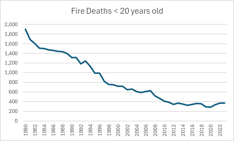
I was discussing this in person with an older acquaintance recently, who was shocked to hear that it was common to tell my sons age (13) not to use the oven when home alone. She was aghast at this, and mentioned that it never would have even occurred to her to limit her children in this manner. I pointed out that fire deaths among kids were down massively in the last few decades. She was certain that wasn’t true. It is.
Now, to be clear, I am not claiming that whole drop came because people stopped letting their tweens/early teens use ovens while in the house by themselves. However, this rule almost certainly gained popularity as part of wider fire safety pushes that improved conditions everywhere. Thus, using the data from the IHME, we see that in the US we are seeing about 1/5 the number of fire deaths in kids as we did back in 1980 when my acquaintance was raising her children:
Keep in mind these are raw numbers, and that during this time the US gained about 10 million extra children in that age range.
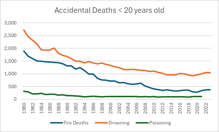
These sorts of drop offs are true for pretty much every type of accidental injury type death you can think of for kids. Here are some other causes of death:
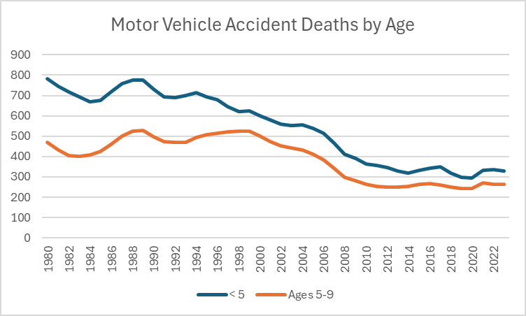
Car seat culture is much maligned, but we see a similar pattern there:
Keep in mind that in addition to the population going up during this time, the number of miles driven ALSO went up.
This is not to say that any particular intervention was worth it or was necessary, or was justified. But I have noticed that when people critique overprotective parenting culture, they often are unaware of just how much safer things have gotten. The focus on safety was not just a meaningless endeavor that improved nothing, it actually led to some visible results.
Child death is a horrible tragedy, particularly when it was preventable. I have known two families who lost a child to a preventable accident: one young teen who fell through thin ice and drowned, one toddler who swallowed rat poison. I met both families decades after the fact, and the wounds were still raw. The fallout had never stopped.
I think this is good context when we talk about trade offs, because I want to emphasize again that there are trade offs for these safety measures. Kids need independence, room to grow, room to develop and room to fail. But we can’t forget what people were working to stop when they went down this path, or how much our lives have improved now that child death is a far rarer occurrence.
I haven’t added to the GPD Lexicon in a while, but I had a phrase come up recently that I realized I’d been using mentally but had never actually used on this blog. It came up in the context of someone sending an insane statistic to a group chat that immediately all of us believed was wildly wrong. No one particularly had time to look it up, although thanks to Twitter someone was able to find pretty quickly what the issue was. I mentioned I had seen the stat flash on my screen previously but just simply didn’t have time that day to go down the rabbit hole of debunking it. That’s what I call a “Not Today, Satan statistic”, which I would define as:
Not today, Satan statistic: a statistic you see in passing that is so clearly wrong or designed as clickbait/ragebait that you decide to scroll by without even stopping to figure out where the heck they got those numbers.
Now, this one you have to be a bit careful with. You can’t use this one to dismiss statistics that are being thrown out in the context of an argument you are actually in the middle of, you actually have to deal with those. These are more the types of things you see on social media or hear in passing in conversations, where you can either go on your merry way or actually stop and push back. This is a moment of choosing to protect your peace over derailing yourself in to a follow up.
You also can’t use this one if you are the type of person who has no problem not challenging incorrect information, and just let it go regularly. If you don’t routinely hear record scratches in your head when people say wrong or unlikely things in conversations, this phrase is not for you. This is for those of us who regularly derail discussions in to a “wait is that true?” and find that a noble calling. For those people, this is an occasional permission slip to let it go sometimes. In 2026 there are any number of trash websites generating ridiculous statistics just to get you riled up.
In the immortal words of the AVI to my younger brother when he was in middle school: you know you don’t have to die on every hill.
The AVI put up a post last week about the Extreme Male Brain Theory of Autism that had some interesting commentary about the differences between the sexes on tests measuring tendencies towards empathizing (female linked) and systematizing (male linked). Skipping over the relationship to autism theories, I was particularly interested in one part of his post and it end up sending me down a bit of a rabbit hole looking up information on it:
How would Empathising and Systematising be opposite ends of a spectrum? I don’t think they are. I think two separate things are being measured that both sexes have in different proportions. To take the hormonal stereotype, I don’t think that testosterone and estrogen are “opposite” chemicals. I think they are different chemicals. I don’t think the data shows that one extra bit of empathy means a complementary drop in systematising.
I liked this part because I have been rather fascinated by people I encounter who appear to have neither of these traits, and I wondered how common that was. So I went digging, and it turns out there’s actually quite a bit of research around the whole thing I thought was interesting. Because he will read this, I will note that none of this is a particular commentary on what AVI wrote in his original post, nor should it be taken as a criticism of anything he said. His comments just sent my thoughts off in a different direction from what he was focused on, so I wrote my own post rather than continue to respond to his. That’s a major plus side of keeping up your own site IMHO. Anyway, let’s kick it off with some clarifications and some background!
The empathizing and systematizing idea was first investigated by Simon Baron-Cohen as part of his work on autism. It was developed a lot by various researchers over the years, but the original intent was really to see if people with autism were deficient in empathy in some way and if that could help classify the disorder. Typically empathizing and systematizing are measured by giving two different tests, one for each, and then assigning you an “EQ” score and an “SQ” score. For a lot of Cohen-Baron’s work he then subtracts one from the other to figure out your gap between the two.
Now before we go on, I want to point out when talking about empathizing and systemizing type tendencies, it’s really easy to start swapping those words out for the shorter and more familiar “feelings” and “logic”. Those are close to what we’re talking about what we say empathizing and systematizing, but not actually the same thing.
In the article AVI linked to where Simon Baron-Cohen wrote about his research, he described empathizing as “Empathy is the drive to recognise another person’s state of mind and to respond to another person’s state of mind with an appropriate emotion.” While this relates to feelings, it is not the same thing as having a lot of feelings yourself. In fact, when used appropriately, it can actually help you manage your own feelings.
Imagine a circumstance in which you find out a friend or family member was up all night with a sick child, and that person now snaps at you over something minor. The vast majority of people will probably let that go or choose to deal with it at some other time. “In their shoes, I would also be short tempered” we think, and we move on with our day. In that case, empathy reduced the number of our own feelings we had to deal with. If you’ve ever dealt with a person who had no ability to do this, you probably would end up annoyed at that person pretty quickly. “Good grief man, the poor guys been up all night, could you really not let that one comment go? You had to get in to it right now? Really?” Lack of empathy can absolutely stir up a lot of feelings. None of this is to say that empathy always causes you to make the right call or can’t be taken to far, just that it is a somewhat different concept from that of having “feelings”. Everyone has feelings, and people vary in their emotional regulation. All of that is different from empathy, which is how you understand and respond to other people’s states of mind.
Conversely, systematizing is also not the same as “logic”. Per the same article as above “Systemising is the drive to analyse or build a system where a system is defined as anything that follows rules or patterns.” Again, that might be close to logic, but not identical. As anyone who has ever dealt with bureaucracy knows, just because you have a system doesn’t mean you have logic. A system that doesn’t bend with reality or is impenetrable to others may follow an internal logic, but may not get you very far if you have to interact with anyone outside your own head.
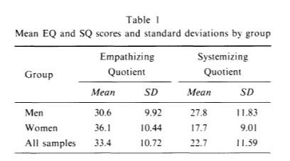
All that may sound like I’m saying empathy is better than systematizing, which is not my intention. I did want to provide a slight bit of balance to the feelings/logic shorthand, which unfortunately can unintentionally do the opposite at times, if one assumes that logic is a moral good. However, this does lead in to another distinction I was surprised to learn: good empathizing scores are more common in everyone than good systematizing scores. This gets confused easily because of a misreading of what Cohen-Baron says in his write up “The first theory, known as the empathising-systemising theory of typical sex differences, posits that, on average, females will score higher on tests of empathy than males, and that, on average, males will score higher on tests of systemising than females.” This has led many people to say that men are higher in systematizing than empathizing, but that’s actually not the case. Here’s the data from the first paper on this. The paper’s in Japanese, but the numbers are still understandable:
As you can see, women are higher than men in empathizing but men are higher in empathizing than systematizing. Men are also higher than women in systematizing, meaning women have a bigger gap between the two. But again, people as a group are higher in empathizing traits than systematizing traits. I checked out a few different papers and this is a pretty consistent finding. It might be a measurement tool artifact, but it turns out however you measure it, men score better on empathy than systematizing. So it is not strictly true to say that men have a systematizing brain and women have an empathizing brain, we really all have an empathizing brain but some people have that balanced with systematizing and some not so much.
I pondered this for a bit and went down a side road about how they were measuring this, but I came away suspecting this is measuring something real. While systematizing is an incredibly useful skill, any group of animals that lives together has to learn how to work as a group. Learning to respond to others mental states is a big part of that. Many men might say they are not great at reading others emotional states, but all the best business men who have ever lived are actually fantastic at figuring out how others are feeling and what to do about it. Ditto for any man working under a boss/superior officer/etc or pursuing a woman they really want. An inability to figure out how to work in those circumstances is actually a pretty good sign that you have a real deficit here.
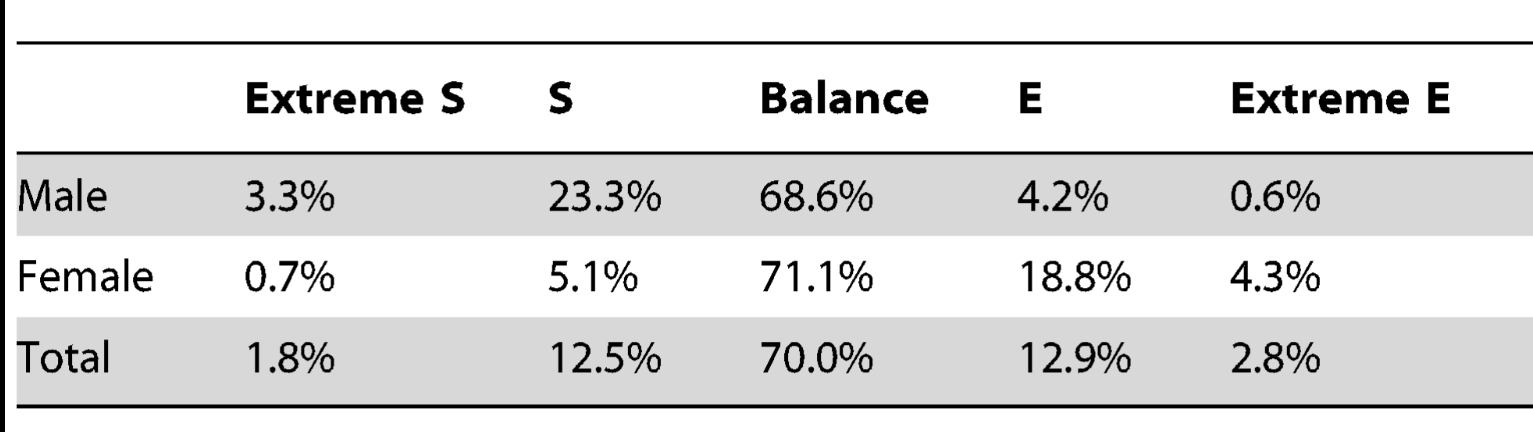
Which brings me to what I was really curious about: how many people really score very low in one or both of these categories? Baron-Cohen’s traditional research doesn’t actually tell us, since he normally just merges the two metrics in to one by subtracting one from the other and getting the gap, but thankfully for me someone else decided to looked at just that. In the paper “Measuring Empathizing and Systemizing with a Large US Sample” some researchers decided to measure a couple thousand people for empathizing and systematizing and slice up the data a few different ways. When I read through the paper I was very excited to see that all the same questions that had occurred to me were the ones they were going after, including what this this data really looked like when you drilled down in to it. That led them to go beyond the traditional “extreme S/extreme E” framing and to try to map people on to this graph:
Now this looks exactly what I’ve been trying to figure out. So where did people fall?
Well as you can see, just about half of people of both genders are actually moderate at both empathizing and systematizing. The population I was initially curious about, those low in both, are unusual but not unheard of…a little over 2% of women and just under 4% of men. People who are high in both are about 5% of each gender. There actually weren’t a lot of huge discrepancies on the diagonals here, where you see big differences is in things like the High S/Medium E combo (3 times more common in men than women) and the Medium S/High E combo (around 4 times more common in women than men). We see similar discrepancies with the Medium S/Low E category and the Medium E/Low S category.
So overall, we see that for a majority of the population these two traits move in tandem. However, when they get discordant, they tend to skew in a predictable way for your gender. This is summarized by a different table in the paper, based on a slightly different way of calculating things, the one Baron-Cohen used originally:
Here, “extreme” comes from having a large gap between EQ and SQ, it does not necessarily mean that one was the highest in E or S overall. As we saw in the data above, there are a good chunk of Medium S/low E men and Medium E/low S women. Having a gap does not connote hyper competence in either trait. There were also High S/Medium E men and High E/Medium S women, so the gap also doesn’t necessarily mean a deficiency either.
Similarly, “balance” here could mean those people were equally poor on both, or high on both….they just had to be equal. Interestingly, this was part of why the paper authors wanted to go through and break out the scores further. The original idea of taking two different measures and subtracting one from the other to create one measure was designed by Baron-Cohen to try to sus out an “empathy gap” to figure out if that was related autism. For that purpose it was an interesting idea. But for your every day person, it collapsed several extremely different categories of people in to one big group of “balanced” people that covers 70% of the population. Given that those people represent the large majority of the population and likely have radically different experiences of life, this is a questionable choice.
It also appears to have left people with the impression that empathizing and systematizing are more closely related traits than they really are. By choosing to highlight the 30% of cases where they are discordant you can give the impression that there’s some sort of trade off between these two traits. But that’s not the typical experience at all, at least according to this data. The typical experience is that you will be either low, medium or high in both. Based on your gender, you will then see 25ish% of your group be more extreme on one trait than the other, with 5% going in the other direction.
To put this in probability of superiority terms, if you pick a random male and female out of the population and make them take these tests, the authors say the female would have the higher empathizing score about 67% of the time. Males would have the higher systematizing score about 62% of the time. For comparison, if you did the same experiment with human height, men would be taller 92% of the time. So again, to call this a definitive “male brain” vs “female brain” trait you are looking at something about a third less compelling than human height. So overall, there’s evidence of a sex linkage here, but it’s good to keep in mind exactly what that looks like in practice.
Overall, this was a fun little side road to go down. I continue to be rather fascinated by people who appear to have neither empathy nor systematizing tendencies and think we need more research on how these people end up navigating the world. Are they more or less happy than the rest of us? Do they end up with some other trait they are compensating with? Do they have personality disorders? How about on the other end….is being really high on both of these an advantage? Or are these traits unconnected to life success at all?
A few months ago, I like many others, was surprised to read the article about how Oliver Sacks had made up many of his most famous stories about his patients. Printed in the New Yorker, this article hit many in the scientific community where it hurt. A lot of us had read Sacks books in undergrad or grad school, he was considered an inspiration in both the field of neurology and science communication. Discovering he had made up some of what he wrote about threw his whole body of work in to question.
Unfortunately, the problem didn’t stop there. Two months later the New Yorker published another investigative report on a different famous case study, this one about a baby who allegedly showed signs of opioid exposure from breastfeeding from a mother who was taking codeine. The problem? It was made up. But wait, it gets worse. The original case report was followed by another one published in the Canadian journal Paediatrics & Child Health, and this week they put a label on ALL their case studies in the series stating that they were fictional.
Retraction Watch has the full story here, but it turns out the story for this journal is even more confusing than you’d think. At some points (but not all) the journal actually asked authors to submit fictional case studies for learning purposes. Unfortunately this was never flagged on the published items themselves, so readers were left with the impression they were reading real stories. Adding to the confusion is that the instructions didn’t always say this, so some of these reports were real but are now marked as fictional and that can’t be undone. Confused? Me too.
So why does this matter?
Back when the Sacks thing first came up, the AVI posted on it and Grim asked a really good question in the comments:
It’s far enough outside my area that I’ve never heard of Oliver Sacks before today. Nevertheless, I believe you and bs king when you say that this sort of fraud affects the whole society. How would you characterize the effects it has had, which someone like me might be affect by without being aware of them? It obviously affected your profession and several others, which each exercise influence, for example.
My reply at that time (including some commentary on an earlier Dante comment I’d made) with some parts I think are important bolded:
From my perspective, I took Dante to mean that being a fraud victim (or even merely aware of fraud) erodes trust in society in general, so each new case will keep chipping away at how we all view each other. So if I took Sacks writing at his word and found I was deceived, I will subsequently distrust your writing more merely to ensure I’m not deceived again. It’s a reality of life I guess, but it just strikes me as sad that everything I read my first thought needs to be “is this person fabricating this”? So my comment mostly wasn’t about Sacks himself, but about how much skepticism we need to carry to operate in the world. There’s downsides to that.
For Sacks specifically, case studies are often the first step in medical research. Some diseases or problems are simply uncommon enough that the first person to notice it can’t do a whole study, so they write up a “here’s a weird thing I saw in a patient” report and then see if anyone else has seen it too. This was the first step in discovering HIV for example. Sacks writing was basically case reports, and they influenced a lot of people’s thinking about where the margins of brain function were. These are supposed to be teaching tools so you wouldn’t particularly expect people to make them up….theres no block buster finding on the other end, it’s just one persons “hey I saw some weird others should be aware of in case they see it too”. Sacks books were often assigned in classes because they were so accessible (that’s where I first read him), so a huge number of people were fed erroneous information as part of their learning. Even if it just impacts their idea of how the fringes operate, it’s still incorrect information. That it was done knowingly is even sadder. So overall I agree with AVI, it’s likely not a direct effect, but it means the foundation is shakier than we suspected.
To elaborate further: after working in hospitals for years, I can’t overstate the importance of the anecdotal “you know I saw something like this once”. It’s what separates really experienced clinicians from new ones. Published case reports tend to help that process, and people pass them around to help with their own sense of what to look for. Knowing that an anecdote is a made up example vs a real thing someone saw is pretty critical in clinical practice. We’ve all seen made up examples in textbooks that help explain concepts to us, and those are a fine teaching tool in context. But as the Retraction Watch article ends: “A narrative that is fictional but published in the format of a genuine case report, without disclosure at the time of publication, is functionally indistinguishable from fabrication in the scientific record.”
I will only add to this that case reports are the single hardest thing to fact check. There’s no statistical method to check, no data anomaly to detect. By definition you are talking about something people haven’t seen very often, and the exact details are often covered by medical privacy. Not a great situation.
Someone recently forwarded me Jonah Goldberg’s column on Alonso de Salazar Frias. That link is probably paywalled, but Wiki has a pretty good summary here. The short version: Frias was a priest and canon lawyer who ended up with a role in the Spanish Inquisition, and expressed extreme skepticism over the witchcraft accusations he was hearing. Rather than buy in to the hysteria, he decided to try to use empirical methods to test the witchcraft accusations, looking for consistency in statements, corroborating evidence. Ultimately, he concluded “I have not found one single proof nor even the slightest indication from which to infer that one act of witchcraft has actually taken place…the testimony of accomplices alone without further support from external facts substantiated by persons who are not witches is insufficient to warrant even one arrest.” This ultimately got him the nickname “the Witches Advocate” and he seemed to be rather successful in getting people freed.
For obvious reasons I am quite taken by this story, but my attempts to locate much information have failed. There appears to be one book written about this from 1980, and it’s $100+ on Amazon and totally unavailable in my local library. So I figured I’d throw it out here and see if anyone knew of any good general books on the Spanish Inquisition that might help me find more information, or if anyone had any other ideas of where to find information. Any help appreciated. Update 3/2/26: My lovely brother informed me he’s developed a talent for finding rare/old books and was able to locate a digitized copy of the specific book I was looking for for free online! The comments helped tremendously though, as I was able to find several other relevant resources and am also going to inquire with my local library about some others. Many thanks to all who weighed in!
By her own admission, the Tiktok psychic (Ashley Guillard), had no evidence that the woman she accused had anything to do with the brutal murder of 4 college students in her town. In fact, there was no evidence this professor even knew the murdered students. Per the defendants own admission, she pointed the finger at this professor (Rebecca Scofield) because when she heard about the murder she went to the college website and did a psychic reading over each member of the history department and Scofield had bad vibes.
Guillard had 80k+ followers on Tiktok when this started and gained 20k more when she started making these accusations. She put up over 100 videos, repeatedly sharing this professors contact information and home address with her fans. While you and I may not believe that a psychic can solve crimes, I will note that people who sought one out on Tiktok probably do, and thus took these accusations quite seriously. Scofield experienced harassment, had to install all sorts of security systems at her house, had her workplace flooded with calls, their social media flooded with comments about her and anyone connected to her harassed about her being “the real killer”.
Part of Guillards claim about Scofield was an extremely elaborate story about how she had been having an affair with one of the female victims, who was a student. Guillard then claimed Scofield had the 4 students murdered to cover this up. One of the sad parts of the case was Scofield pointed out that while most people at her workplace discarded the murder claim, many more seemed to give some credence to the affair claim. There did seem to be an air of “well there must be something to this, maybe the truth is in the middle”. But again, but Guillard’s own admission, she got this information from doing a psychic reading off a website photo. Sometimes where there’s smoke there is no fire.
Scofield filed this lawsuit on December 21st, 2022. It took over 3 years for her to get a judgement against someone who admitted she got her information by picking her photo off a website. Just imagine that was you or someone you love, or heck even just feel friendly towards. Guillard lives off disability and meager Tiktok revenue. Scofield will likely never get back money for her legal bills, will always have people somewhat believing she slept with a student, and for what? The crime of living in the same town a murder happened in, and catching the wrong persons eye at the wrong moment.
All of this occurred against the backdrop of a crime for which someone else ultimately pled guilty, and an accusation for which the defendant admitted she had zero actual evidence. Now imagine if the real killer hadn’t been found, or if Scofield had a more plausible connection to the victims, like if she was a neighbor. There still wouldn’t have been any evidence beyond the psychic reading, but one imagines the damage inflicted could have been exponentially greater.
Demanding empirical evidence for serious accusations, even those “just” made on TikTok, should never have gone out of style.
While looking for something else this week I found my old posts on the Carlisle method (2017) and the one year later follow up (2018). Seemed time for yet another update, so here we are.
For those of you without a photographic memory for random data controversies from 9 years ago, the Carlisle method was a statistical method by research John Carlisle who was attempting to figure out a way to identify potentially fraudulent papers more quickly than undertaking laborious investigations. His idea was to actually look at the baseline data for control groups and intervention groups and to try to detect data anomalies there, assuming that authors would have focused much more on their results than on their baseline data so anomalies would be easier to spot. He named a bunch of studies that appears to have skewed baseline data, and others took it from there.
Interestingly, while some studies did end up having to adjust, it did become clear this method was not always detecting fraud. In a few cases some of the statistics were actually just mislabeled. In the most notable case, it turned out the study authors had not been clear on how their samples were selected, and they had to update their results without some of their original data.
So what’s happened since then? Well in 2021 Carlisle decided to use his prior method and standing as a journal editor to take things up a notch. While his initial method was a quick screening, he decided to develop a screening tool to flag papers that might have a problem. This included “previous false data from one or more authors or the research institute; inconsistencies in registered protocols; content copied from published papers, including tables, figures and text; unusually dissimilar or unusually similar mean (SD) values for baseline variables; or incredible results”. If a paper flagged as having these risk factors, he would ask for a spreadsheet with the patient level data in it so he could look at it more closely to ensure it was ok.
Unsurprisingly, he found problems. But what happened next was even worse.
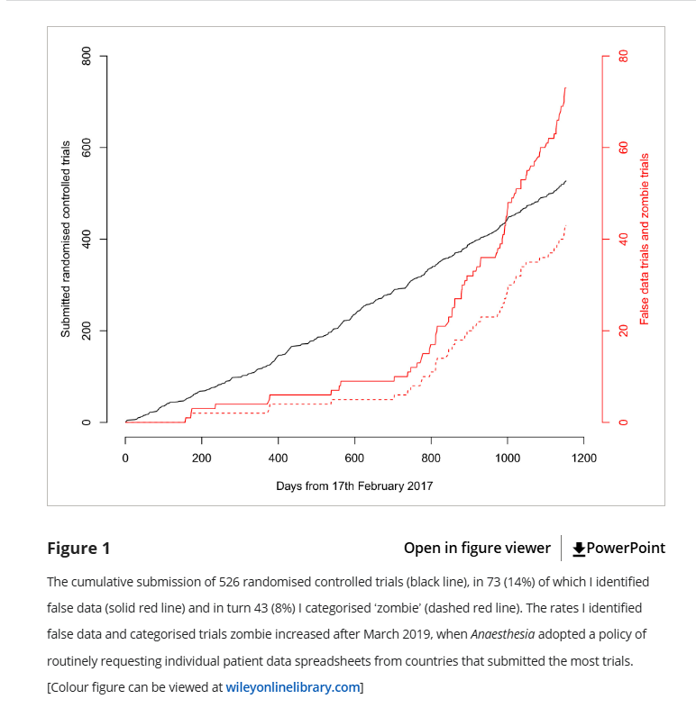
Carlisle discovered that when he followed up with the universities these papers were coming from, he discovered that the universities these authors were from actually were not overly anxious to investigate the particular concerns he was raising, which concerned even more. So starting in 2019, Carlisle decided the journal would ask for patient level data from everyone from the countries that submitted the most papers: Egypt, China, India, Iran, Japan, South Korea, and Turkey. The results were not encouraging:
Basically, when Carlisle screened for high risk papers, he found about 10 “false” papers in 2 years. When he screened everyone, he found 60+ papers in the next 2 years. Yikes. Just to clarify what he means by “false” or “zombie”, here it is in his words:
Data I categorised as false included: the duplication of figures, tables and other data from published work; the duplication of data in the rows and columns of spreadsheets; impossible values; and incorrect calculations. I have chosen the word ‘zombie’ to indicate trials where false data were sufficient that I think the trial would have been retracted had the flaws been discovered after publication. The varied reasons for declaring data as false precluded a single threshold for declaring the falsification sufficient to deserve the name ‘zombie’, although I have explicitly stated my reasoning for each trial in the online Supporting Information (Appendix S1).
So overall 14% of papers submitted had substantial flaws and 8% were retraction worthy, but that rate went way up after they started requesting data from everyone. Unfortunately Carlisle ended by mentioning a few fairly discouraging things:
He has no reason to believe his journal was attracting particularly bad papers. One might actually assume the opposite given that he very publicly was out fighting fraud for several years before this.
It took him a really long time to look through the spreadsheets, and sometimes he only caught the fake data on the 2nd, 3rd or 4th look.
Fraud can actually happen at any level of research, which makes it scary. It one case he mentions, the researchers discovered it was a med student they were working with who made up the data. We think of scientific fraud as the big name getting the credit, but you can see where it’s actually really likely it’s an overwhelmed lower level person trying to deliver results to them who might actually provide fake data.
Nothing stops people from submitting these papers to other journals that don’t have this level of scrutiny.
In the end Carlisle concludes that these types of data errors or fraud are so common that developing screening tools for them should be a primary goal of journals, lest they risk up to a quarter of their studies being retraction worthy. Not great, but thank God for people like Carlisle.
So after my therapy session a few weeks ago about why I liked writing here so much and how hard it was to translate the norms I was used to in to other places, I kept thinking about how to do what I was trying more effectively. After mulling it for a few days more, I decided that it might be worth trying a different writing project that I controlled, written more in my own voice, but aimed at a different audience.
So I have now have a new bright and shiny Substack to fool around with: Exhibit Asterisk (or Exhibit A*). The focus is going to my ideas about how statistical thinking can apply to the world of true crime, so basically a more topic specific version of what I do here, with the assumption the audience will be a bit less familiar with stats concepts. For now I plan to keep posting in both places, though their may be some cross posting. I am not doing paid subscriptions, because I do not need that kind of pressure in my life, and this is entirely experimental. For all that I rant about this topic, it may turn out I have very little left to say. We’ll see! Anyway, if you’d like to join me over there, the link to the first post is here.
Now as someone who is a bit younger than Ms Phetasy and has lived my life at a wider variety of different weights than her photos suggest she has, I was rather surprised to hear this. I have never gone to the doctors office and not had a doctor mention where my weight was in relation to the where the healthy range was. I have never had joint issues, but my friends who have all inform me you are very much told the impact weight has on your joints. Given that I work at a hospital, I decided to mention this to a few doctors/NPs I see daily, and was looked at like I had 3 heads. Who, they inquired, was ever telling anyone anywhere that weight loss wouldn’t take stress off your joints or improve your health? Obviously if someone was underweight you wouldn’t mention that, but that is not the case for most people. Weight loss is bog standard advice from every major medical organization for nearly every condition. Everyone knows this.
Finally, I saw a tweet that seemed to help shed some light on what was really going on. The problem here was one of perspective: there was a time period where the media ecosystem changed rapidly to include a push for healthy at every size type advocacy and a rapid expansion of plus size clothing in retailers and advertising. This meant those (like Bridget Phetasy) who worked in media and were themselves thin saw those things as the primary conversations around obesity. For other people (like say, myself) who mostly had these conversations with either my personal physician or at work/in a research context, the entire idea that one book from 2010 was the “real” conversation seems insane. Why would someone be listening to a non-MD political podcaster about how to resolve their joint pain? If the people whose job it is to deal with such things stayed on the right path, do the other conversations really matter? And yet, maybe they do. People’s expectations are set by culture all the time. Maybe there’s something to this.
I don’t know that I’ll resolve any of that in this post, but I do want to highlight the general problem. I am increasingly running in to discussions with people where we actually have spent a substantial part of the conversation trying to sort through if the thing we are referring to are actually happening. It was over 10 years ago that Parker Malloy first noted that she made one slightly dismissive Tweet about a lipstick color she found weird that somehow got parlayed in to several articles in major media outlets about her “major freakout”, and the problem has only gotten worse. We now have random tweets from nobodies being treated as though they are serious platforms of major political parties. Conversely, with all the various online noise going on, I have also found at times that people can now miss when major political office holders say actual terrible things because they assume it was internet snark.
So I think when you hear a “they said” type claim, it’s good to sort out the following things:
Who actually said it, someone with power? Someone with a large audience? Or a random person on Twitter? Include the claims of those on the other side only if you would find it fair if the situation was reversed.
Who matters for this claim? As I outlined above, there’s no one right answer for this, but it can help nuance the discussion.
What was the actual wording of the original claim? A lot of claims mutate somewhat between initial takes and responses.
How many people were making this claim and how many versions were there? Arguments that were really really broad often have stronger and weaker versions and it helps to zoom in on which side of the argument you’re addressing.
Who were people talking to/aiming at when they did something? In the obesity discussion above, a few people pointed out that clothing companies were getting lumped in as “advocates”. This superficially seems fair, but realistically as obesity rates grew clothing companies were going to have to expand their size offerings if they wanted to stay in business. And why would you be lecturing your customers on weight loss while trying to sell them something? Don’t confuse business practices with medical advice.
I should also add that none of these new problems did away with the age old problem of people having a strong personal connection to someone who behaves ridiculously that they then over generalize to the rest of the population, or to believe that their own social group represents the general population better than it does. So we’ve just added new issues here on top of the ones we already knew about.
Ultimately I think the best thing any of us can do is to remember that everyone is awash in commentary all the time, and we all can probably prove any point we want about what “they are saying” just by poking around for a few minutes online. It’s just the world we live in now, all noise, weak signal. It may be battling against the current, but I think by double checking a bit where we’re getting our impression of what others are saying from we can help make our senses a bit more solid than just vibes.
A little over a month ago now, I got in to a discussion about doing another post for the True Crime Times, this time about modifying some old school scientific reasoning tools like the Bradford Hill criteria to apply to true crime type stories and evidence assessments for better thinking. Amusingly, they appear to lock posts after a certain period of time so I now can’t go back and see what exactly sparked the discussion, but I liked the idea and wrote up a draft. While I enjoyed the heck out of actually writing the whole thing and it clarified a lot of stuff I had been thinking about, I ultimately wasn’t entirely convinced it worked all that well. First, it got incredibly long. The Bradford Hill criteria are pretty lengthy, and explaining the background took a while, then it took even longer to explain each criteria, then even longer to explain why I thought they applied. All told I think it ended up at like 3000 words, which on this blog I would have probably split up over at least two posts and also made some snarky commentary to lessen the blow of that many words. Writing more formally, even I felt like it was a slog by the end.
It occurred to me that this is why I’ve always liked having a blog like this, even as blogs have fallen out of fashion, because they really are a place to work out some long form ideas without having to feel like you’re trying to get subscribers or condensing your thinking in to little snippets. It’s how I process stuff. I’ve actually taken a lot of what I’ve written here over the years and polished it up to use elsewhere, and it’s somewhat rare I’ve been able to publish something in a different outlet without working it out here first. So I realized I need to come back here and work out a few things before I tried to write anything up.
One of the reasons I like writing here so much is that in a very real way, anyone who sticks around here for any length of time tends to be, on some level, one of my type of people. When I named this site Graph Paper Diaries, I was serious. I tend to think in numbers, and I like drawing lines around things. I count things when I get bored. My first question when I hear a statistic is “hold up, where did that come from”. And most importantly “is that true?”. In other words, I like quantification over feelings, I like definitions, I like numbers, I like sources, and I like to know if I have my facts straight. It was always my goal with this site to de-emphasize debates on particular hot button topics, and instead focus on the underlying data to see if we could at least get agreement there to help inform bigger discussions. It was (and still is) my belief that agreeing on baseline facts and standards of truthfulness and certainty was a way of fostering respectful debate around important topics. I’m never going to get everyone to agree with me on everything, but I can certainly try to help create a world where I enjoy the process of disagreeing with people more.
While I get some drive by comments from people who don’t understand any of this, I think anyone who sticks around here for more than a post or two generally gets the value of at least some of this stuff. You may at times question how well I actually execute any of my goals, but I don’t think most of you question the aim. That’s a lot of fun to hang out with.
What gets a little tougher is trying to jump in to a different subculture and translate all of that stuff. I have fun here because I started with a group of people who were interested the rather number based place called “Graph Paper Diaries”, but how do I translate that to a group of people interested in to the incredibly narrative driven world of true crime?
That’s what got me thinking about Sir Austin Bradford Hill. He was a British epidemiologist who helped prove smoking caused lung cancer and subsequently came up with nine “viewpoints” from which he thought all evidence should be assessed before assuming it proved that one thing caused another thing. Epidemiology seems like a pretty uniquely good analogy for true crime since epidemiology is by definition the study of disease in messy population based conditions. Unlike lab based science where you get to control your experiments, epidemiologists are often just expected to work with what they have, and there are no redoes if they get things wrong. I think you can see why the analogies to crime investigation jumped out to me. While it would be great if you could have unlimited time or resources and have it only hit perfect victims in a more ideal location at a better time of year, in both cases, you have to go where the problem is and work with what you have.
Because in both cases, the stakes are actually pretty high. Never figuring out how to stop a disease outbreak has consequences, as does never solving a crime. It’s extremely easy to get annoyed people don’t have better evidence, but we have to accept that in life some problems are just going to have messy evidence. If we don’t accept messy evidence, we’re going to settle for no evidence. And I don’t think any of us want that.
So how do we muddle through this? Well first we obviously gather as much evidence as possible. But after that what do we do with it? As I mentioned last week all the data in the world can’t save us if we don’t have a good question, so what questions should we be asking as we look at the information we have? This is where Bradford Hill comes in. He asked people to take a look at the data they had from 9 different viewpoints to evaluate evidence. I’ve gone over these before in a strict public health context, but I’ve adapted them for true crime stories.
Strength: If this person were innocent, how weird would this evidence be? When we look at heavy smokers, the likelihood of lung cancer wasn’t just a little bit higher, it was 20-30 times higher. That’s a compelling piece of evidence. Similarly in true crime, some pieces of evidence are more compelling than others. One piece of strong evidence trumps 10 small coincidences.
Consistency: Does the same story show up when the evidence comes from different places? The smoking/lung cancer connection shows up in lots of different populations in different locations. Similarly, in crime investigations, digital data agreeing with witness testimony agreeing with physical evidence is a pretty strong story.
Specificity: Does this evidence actually point to one person and one version of events? Yeah, I know “they” did it. “They” are responsible for everything. But lets narrow that down just a bit.
Temporality: Did things happen in this order, based on what people knew at the time (not what we know now)? When you learn all the evidence during a one hour podcast, it can be incredibly hard to remember the events actually unfolded over the course of several months and that people could only react to what they knew at the time. Keeping the actual timeline in mind is important.
Evidence Gradient: As more evidence is added, does the story get clearer or more complicated? When hearing new evidence that contradicts something they already believe, a lot of people start to over complicate their theories without even realizing it. “Sure that evidence looks bad, but maybe it was planted” Okay, but you just traded one problem for another. You explained away the contrary evidence at the price of now needing to explain how someone planted it. That’s not a clearer theory, that’s just shuffling your problems around.
Plausibility: How much would have to go exactly right for this story to be true? Ocean’s 11 is a fun movie, but rarely in life are things that perfectly timed.
Coherence: Does this explanation fit with the physical evidence, the timeline, and how people usually behave? Much as with plausibility, if you take a step back, does a full picture start to emerge or does it get murkier?
Experiment: Is there any part of this that could be checked or tested instead of argued about? This isn’t the most common situation but can certainly clear some points up pretty quickly if it’s possible.
Analogy: Am I convinced by the facts of this case, or because it reminds me of another one? I used to read advice columns a lot and I would always be interested to see how much people would read in to situations based on what were clear issues from their personal life. I know women like this.Men like that will always act like this. While analogies can be useful in suggesting questions to ask, they can also lead you to make assumptions about people that aren’t true.
So there they are, nine questions to help people think through messy evidence when that’s the only option. While this was never supposed to be an explicit checklist that would prevent every error, it was supposed to help you look at things from enough angles that you reduced your chances of missing something or getting hung up on a pet theory as evidence mounted pointing in other directions. Because that’s a key thing with messy evidence, it’s not an easy thing to wade through, and it’s easy to get stuck on one or two piece and to start missing the big picture.
But I suspect you already know that’s a good idea. I think this way of thinking is solid, it’s worked on some of our most important public health problems after all. I’m still workshopping the delivery.
If you have thoughts on how to introduce a framework like this to a true-crime audience, I’d love to hear them. What would you lead with, what would you lose, or what would make you actually want to keep reading? I’ll keep working on the piece in the next few days, so open to any ideas! I’ll probably publish whatever I come up with here at the very least even if I don’t find another spot for it. This is just my favorite problem to noodle on at the moment.
One of the more interesting things I’ve done at points in my career is to help field data requests from a large database. If you’ve ever had to be the gatekeeper of any type of data like that, you learn rather quickly that you are going to have to ask a lot of questions that people are going to initially see as nitpicky and obstructionist and they will be terribly annoyed with you. With any luck after some gentle prodding however, they will eventually realize that their initial question was poorly formed, and that they are actually going to have to get a lot more specific before they can get the data that will help them answer the question they are really after.
For example (conversation entirely fictitious to protect the guilty, who have given me an equally hard time over similar issues):
Researcher: Can you give me all the data you have about women of childbearing age who were transplanted in the last 5-10 years? We’re doing a study.
Beleaguered database owner: Sure. A few questions though….
Researcher, sighing: It’s not hard, just everything you have:
Beleaguered database owner:, persisting: Can you clarify the timeframe? Do you want to include all the time during the COVID slowdown?
Researcher: Oh, I guess not actually. We only admitted really sick patients then, let’s just do 5 years back.
Beleaguered database owner: Ok. Did you want women of childbearing age or of childbearing potential? We actually screen women to see if they’ve had a hysterectomy or entered menopause, so we could exclude those women, otherwise we’ll give you everyone under 54. Were you looking for pediatric patients? We can start at age 12 or at those who had their first period.
Researcher: Oh, I guess I didn’t specify. I was looking at the impact of having a menstrual cycle, so we can exclude the women who didn’t.
Beleaguered database owner: Ok, one more thing. Did you want all transplants, including those who got a second transplant? Because those patients will be listed in the database twice.
Researcher: Oh, I forgot about those people. I just want individual patients. Exclude anyone who came back twice.
And so on. This can go on for a really long time, and this is with experienced researchers accessing a huge treasure trove of information.
I bring this up because I think when we’re trying to figure out “the truth” we often jump to the fact finding portion of our mission before we’ve even properly formulated our question. I was thinking about this earlier this week when the Assistant Village Idiot posted about how we still didn’t know much about the Alex Pretti shooting, and I replied that I felt there were 3 different conversations happening simultaneously:
Were various elected officials justified/truthful/helpful in their statements about the shooting?
Was the shooting legally justified?
Was the shooting morally justified and/or otherwise preventable in the future?
You can quibble with my list or add your own questions, but my point here is much what it is to researchers I mentioned above: if you’re not clear on what your question is, you’re going to struggle to figure out which pieces of data are actually relevant to answering it. There actually is a bit of danger in just requesting “everything” and then trying to sort through it later. If you are trying to prove that Tim Walz/Kristie Noem gave a misleading press conference, that is a different set of data than reviewing the legal justifications for use of force by a border partrol agent, which is different still from a big picture review of everything that led up to the incident. All of the data is coming from one big pool and there’s certainly overlap, but in our discussions we tend to hop around a lot. Heck even in our own minds we tends to jump around a lot, but it can pay off substantially to take a moment to figure out what your actual question is.
We worry a lot these days about “misinformation”, and I certainly stand by that concern. However, I’m also starting to get worried that even when we’re all sharing the right information we’re going to keep arguing more than necessary because we’re not stopping to agree on what we’re even arguing about first. In nearly any public event there’s always going to be multiple relevant questions that need answering, and slight changes in focus can change the relevant data set substantially. My two cents.