I liked the map I put up yesterday, but then I found this one (via chartporn) which is even more fun. It’s from 1927 and it was a guide to where in California you should shoot your movie if you wanted it to look like other regions of the world. I like that “Sherwood Forest, England” is it’s own category.
Uncategorized
Weekend Moment of Zen 1-5-13
This map was produced by running all the various countries’ “History of _____” Wikipedia article through a word cloud, then writing out the most common word to fit into the country’s boundary. The result is thousands of years of human history oversimplified into 100-some words.
Reader’s guide here.
Apparently Pakistan (country) is actually India (word).
Is it better to be raised by a single mom?
Now there’s a headline that’s too irresistible not to click….”It’s better to be raised by a single mom“.
I was looking forward to this article, as my master’s program specialized in marriage and family issues…so I was expecting some new and interesting study I could take a look at.
Spoiler alert: there is no study. I’m going to talk about it anyway.
It turns out Slate.com is running a new series on single moms that they are soliciting essays for with this line:
Readers, we invite you to submit your testimonies on why being raised by a single mother, or being a single mother, has its benefits and might even be better than having both parents around.
This article is the first personal essay where the mother asserts that her kids are not doomed to failure like all the studies say, but rather they are doing better than their peers. Her primary argument is actually not a ridiculous one: her kids went through difficult times with her and developed more resilience than they would have otherwise. Almost anyone who went through a difficult time financially/emotionally/physically/all of the above when they were younger will say in adulthood it made them stronger….so I can see what she’s saying.
On the other hand, we all know the headline is enticing because you simply can’t draw any action from the conclusion without getting ridiculous. No one would divorce their spouse they were otherwise happy with in order to give their kids “more grit” like the writer asserts hers have. This is similar to people who escaped childhood poverty….it might have made them stronger, but none would purposefully go back in order to raise their kids in the same way.
But opinions on her article aside, from the data point of view, I am baffled that in 2013 we are still referencing data on “single moms” as though that group were even approaching homogeneous. When I tracked back some of the links were they were explaining why they were doing this series, it appears it all started with the study from this summer that found the majority of women under 30 who give birth are unmarried. This is an interesting stat, but it’s worth pointing out that unmarried does not necessarily mean solo, and “single” can reference either.
That being said, there are four categories of single mothers I can think of, all with different factors that affect outcomes:
- Single mothers who are single because their spouse died. Possible variables include at what point the child’s father died, how involved both families are, if there’s any trauma surrounding the circumstances of the death in particular.
- Single mothers who were married, but got divorced. Possible variables include timing of divorce, level of the father’s involvement, and how acrimonious the divorce was, and how hostile the marriage was before the divorce.
- Single mothers who were unmarried at the time they gave birth. Possible variables include how long they knew the father beforehand, commitment level/father’s involvement and cohabitation status.
- Single mothers who became mothers intentionally sans partner. This is a small category, but possibly growing. This is mostly 30s-ish women who choose to adopt or use a donor to achieve a pregnancy and child without any recognized father.
The teachers that matter
I realize that I don’t often talk about teachers or pre-college math and science education on this blog, but today I’m making an exception. You see, today is my grandmother’s birthday, and it feels only fitting to reflect on one of the most wonderful educator’s I have ever known.
Life, death and disability OR more on guns and automobiles
I was chatting with my grandmother this morning, and somehow we ended up talking about the traffic fatality study I posted about on Friday. I mentioned to her that according to the article, traffic fatalities (for 2011) were as low as they were in 1949.
Year in Review Links 2012
A few year end roundups for all of y’all. My big plans involve champagne and my pajamas, and a whole lot of gratitude for a wonderful year.
First, 5 retracted research studies. #2 is weirdly hilarious. (h/t Maggie’s Farm)
Then, best data shares of 2012. Way to represent Boston!
This list is a bit more modest….not “best of” rather “20 great” infographics.
And here are about 10 different “best science books” links, all in one place.
Unrelated to data, but good for a laugh: Dave Berry’s year in review.
That’s all for 2012.
Don’t forget that 2013 is The Year of Statistics!
Happy New Year!
Weekend Moment of Zen 12-30-12
This always makes me smile.
Traffic fatalities: in initiatives we trust
In my last post, I took a look at the idea that gun fatalities were set to surpass traffic fatalities as a cause of death in the US. In the comments, SJ pointed out that the word “surpass” was not appropriately use. The primary driver of this convergence was really the decrease in traffic fatalities, so it would have been better phrased as “traffic fatalities set to drop below firearm deaths”. The article I originally cited had this to say about the drop:
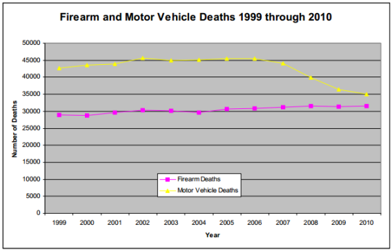
The national gun-death rate would not be approaching that of motor vehicles if it weren’t for the fact that the latter has dropped fairly drastically in the past half decade or so thanks to an increased effort to make the nation’s roads and vehicles safer. Gun-rights advocates will point to the relatively subtle rise of the gun-death’s purple line to argue that we don’t need to pass more gun restrictions. Gun-control advocates will point to the more severe drop of the yellow line to make the case for what might happen if we were to.
It got me curious though….was that drop really do to some new law or set of regulations? I’ve been a licensed driver for over a decade now, and I couldn’t recall any specific big changes in the past few years that change how I drive. Let’s take a look at that chart again:
- Be cautious in assuming that a sudden, large drop in fatalities is in response to interventions related to vehicle design. It takes about 20 years to turn over the fleet.
- Don’t expect most regulatory actions aimed at drivers to produce a sudden, huge drop in fatalities because such actions usually target only a portion of drivers (such as improvements in graduated driver licensing targeting young drivers only).
- Realize that any sudden, large reduction in fatalities is likely only an unintended byproduct of factors that influence the entire transportation system, such as a rapid change in the economy.
- Be aware that most rapid, underlying changes are transient, and therefore, their effects are mostly transient, too.
Deceptive charting: stop it with the firearm death category
On Slate this morning there was a headline about how firearm deaths have surpassed motor vehicle deaths in 10 states. The article cited a report by the Violence Policy Center that showed that between 1999 and 2010 there was a decrease in motor vehicle deaths nationwide, and a slight increase in firearm related deaths. Thus, the report and article argued, we are heading towards a day when firearm deaths surpass motor vehicle deaths.
I’ve blogged before about how deceptive I think the term “firearm deaths” is (as it lumps in police action, homicides and suicides as one group), and it turns out this is the same report that annoyed me the first time. This time however, I was struck by the chart they included in the article:
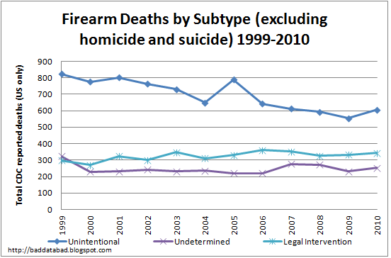
Essentially, homicides by gun have not changed in the 11 year period covered here, though they did tick up in the middle. Suicides have gone up. If you’re curious what the other three categories look like when they’re not all bunched up:
So unintentional fatalities are decreasing, and the other two categories appear to be fairly constant.
As a reference point, the population was 280 million in 1999, and was 309 million in 2010.
To be honest, I don’t have a strong opinion about gun control, but I do hold data integrity at a premium. If we’re going to talk about regulating guns in order to keep people safe, you have to either include suicide prevention as one of your foremost points, or you have to start using the homicide data only. I do not believe it is intellectually honest to quote total firearm death statistics when the national conversation is clearly focusing on homicides.
If we don’t start with the right data, how will we know if any interventions actually work?
Medical errors and reporting mechanisms
I got in to an interesting discussion today over at sciencebasedmedicine.org about medical errors and the huge variety of numbers that are out there.
It reminded me of a project I started to work on a few years ago at work, where I attempted to correlate low staffing levels to an increased error rate.
When I finished the graph, I discovered that the trend was completely in the wrong direction….low staffing levels actually appeared to be correlated with fewer errors. When I did some fishing around, it became obvious what had happened. The error reporting system is all self reporting by staff. When they don’t have enough staff to cover all the work, they also don’t have time to fill out error reports, and thus many small to mid sized errors went undocumented.* When there was more staff available, people were more compliant in their error reporting.
This is yet another risk of self reported data.
I will admit, it still amuses me that somewhere deep in my documents file, I still have a spreadsheet that suggests that the fastest way to get rid of errors would be eliminate most of the staff. Correlation does not equal causation, and graphs are only as good as the source data.
*Hospital policy dictates that we should record “near miss” errors…..situations where nothing actually went wrong, but almost did. The theory is that we need a record of these issues so we can address things before they actually cause a real problem. However, if no one documents them at the time, they are nearly impossible to find later.