My father in law is reading Nate Silver’s book. He said he was getting bogged down in the description of Bayesian statistics.
I sent him this XKCD comics to help explain it to him:
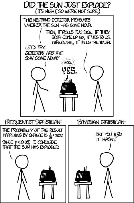
I’m not sure it helped him, but it certainly made me giggle.
My father in law is reading Nate Silver’s book. He said he was getting bogged down in the description of Bayesian statistics.
I sent him this XKCD comics to help explain it to him:
I’m not sure it helped him, but it certainly made me giggle.
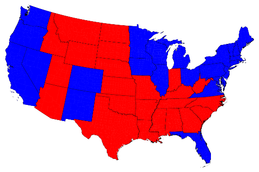
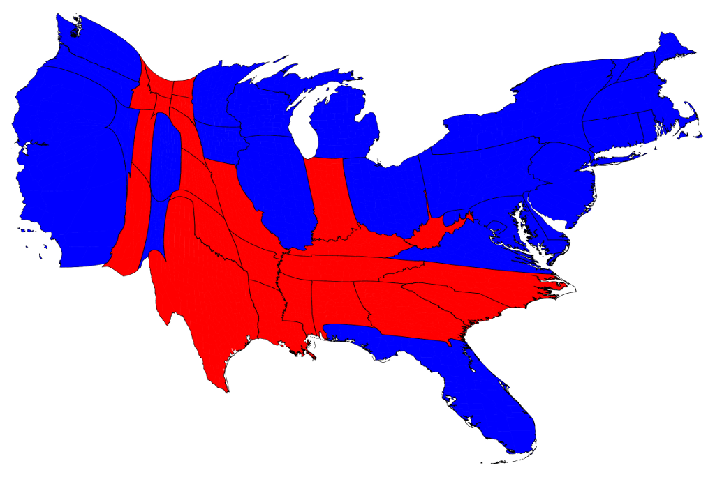
I was psyched to see a friend post this link to electoral map fun on Facebook today. Mark Newman, a professor at the University of Michigan has done a series on different representations of the electoral map. You should look at the whole thing, but here’s a sample.
It’s always been interesting to me how misleading the regular red/blue electoral map is:
Well, it appears that either there was no systematic bias against Republicans in the polls, or Nov 6th just happened to be the wrong time of the month for the Republicans.
My mother was with me on election night, and she mentioned being quite surprised that New Hampshire wasn’t a closer race (52-46 for Obama), and even more surprised that Maggie Hassan beat Ovide Lamontagne by as wide a margin as she did (55-42). Apparently the polls had showed a closer race, and many people she knew were convinced that bias meant the Republicans were actually leading.
I ended up driving back to New Hampshire with her, and I started to see where some of the problem had come up. At least on the route I take, the roads were COVERED in Romney/Ryan and Lamontagne signs. They outnumbered Obama/Biden and Hassan signs by quite a bit.
I was reflecting that I’ve heard that’s the point of signs….to give the impression that there is a majority for one candidate, and that you are going against all of your neighbors if you vote otherwise. I wondered how many people saw those signs and had at least some of that influence there opinions of the polls. There can’t be that many people voting for the other guy….I see hundreds of signs every morning that say otherwise.
This is yet another example of where proxy markers can fail. Political signs along major routes reflect the dedication of a few, not necessarily the opinion of the many.
Well it’s election eve and Nate Silver is still predicting an Obama win….with the caveat that it is possible that if Romney wins it will mean nearly all state polling might be biased against Republicans.
I don’t think he was saying this to be glib, or ruling the possibility out. He actually goes quite in depth as to where he thinks error could occur.
To me though, this brought up an interesting point…..what do we do if it’s true? If nearly all swing state polls are saying Obama, and they break Republican, we will have to do quite a bit of reworking of our polling system. But that’s not what this post is about.
This post is actually about a rather entertaining comment I saw in a discussion about this. Why haven’t there been more concentrated efforts to skew polls? Essentially, if you live in a swing state and hate political advertising, why not start a movement to get people in your state to all answer the same candidate to obscure the fact that it was a battleground state and reduce the number of dollars spent there?
This sounds wacky, but how many people would really have to buy in to this to make a difference?
Let’s take my home state of New Hampshire. As of January, there were about 770,000 registered voters. As of today, polls show they are tied for Obama and Romney. From what I can find, even the best polls only have a 10% response rate, and many are at 2 to 5%. The UNH Granite State Poll is widely reported and only surveys 500 people. It seems it would not take many people making an effort to answer their phones and state they are for a particular candidate to start to skew things. Even if word got out, it would introduce enough uncertainty in to the polls to confuse the heck out of the political consultants and the media…and wouldn’t that at least be entertaining for the rest of us?
It’s not like this is unprecedented….it was tried with Sanjaya on American Idol and there were rumors about Bristol Palin on Dancing With the Stars. Those efforts took far more people than it would take to skew the polls in a small state like New Hampshire. With 58% of adults using Facebook to get political information, it shouldn’t be too hard to mobilize people….just like Twitter was used to start chants at the Boston Garden during the playoffs last year.
This is the danger of big data. While data driven decision making is awesome, it’s also hackable. I’m just curious what the back up plan is if polls don’t work any more.
A history of film, in one graph.
With election day coming, should you make sure you’re voting for the candidate whose positions you most agree with? It’s a good quiz, with both yes/no options or more nuanced opinions…also lets you rank how important certain issues are. I was happy to see that I’m in 97% agreement with my candidate of choice for president, and my Senate choice aligned with my beliefs too, though not as strongly.
Heard about this on Tim Ferriss’s blog….they’re billing it the “Manhattan Project to End Fad Diets“. I’ll be following this.
A new study shows an increasing danger for men in our time….Tie Retraction Syndrome.
Science Ink….a compilation of geeky tattoos.
With the rise of creative data visualization, I’ve heard some commentary lately regarding the tendency of some of these creations to be high on the visuals but low on the data. While intense data visuals may look amazing, they can give the impression that complex charts are the only effective ones.
While watching a TED talk this morning, I saw a chart that reminded me this is not so. It was a talk by an ICU doctor, Peter Saul, and the charts showed the four ways people die. Excuse the poor resolution, it’s a screenshot of the video:

With the hurricane and all, this week got weird in a hurry. My darling husband is stuck in Chicago, so I chose to ride out the storm at a hotel with my in laws. Turns out this is the hotel the electric company puts it’s on call employees in, so I’m thinking we’re keeping power.
Anyway, with all the record setting weather, I thought this post from statschat was particularly interesting.
Essentially, it backs up my previous gripes that people don’t often accurately report what they spend their time on. They included this graph from the Washington Post:

The Washington Post article that provided the graph says that people who claim to work long hours are “lying”, but it’s more complicated than that. Presumably these are people who ‘typically’ work long hours but reasonably often have to leave work ‘early’ to handle some part of the rest of their lives. Conversely, the people at the low end of the distribution may have a regular part-time job that provides their ‘usual’ hours of work, but fairly often have over-time or additional jobs so that the average week has more work than a ‘usual’ week. They aren’t lying, they just aren’t answering the question you thought you wanted to ask.
The concept of people answering what they think you’re asking or responding to different wording with different answers is something all survey makers should keep in mind.
Anyway, I’m sure for all my east coast readers, this will not be a “typical” week….no exaggeration needed. Stay safe everyone!
The AVI left me an interesting link on my last post on famous social psychology studies that have not been replicated. It’s good reading….they include the famous study that found that teacher’s expectations being self fulfilling (ie kids achievement went up or down based on how smart the teacher thought they were). That was interesting to me, as I’ve heard that study quoted many times, and never heard that larger studies had failed to replicate it.
Anyway, as I was reading that article, a headline for another article floated across the top of the screen “Sleeping more than 7 hours or less than 5 1/2 hours has been found to decrease longevity”.
No.
No.
No.
I don’t even have to read the article to tell you no study found any such thing.
The only way you could actually prove that is to randomize three groups, force one to sleep more than 7 hours, one to sleep between 7 and 5.5 hours, and one less than 5.5 hours per night (for the rest of their lives) and then see how long they lived. No one did that. We know no one did this.
Sure enough I clicked on the article and found that people who reported getting more than 7 hours of sleep/night were 12% more likely to do within 6 years than those who got slightly less (again, with the raw numbers the 12% increase might not be that impressive….how many otherwise healthy people died in the 6 year time period to begin with?). So there is a correlation, but no one proved what caused it. The most obvious caveat is that people who are sick might sleep more.
Why oh why do people still write headlines like this? I can see it when it’s on the front page of Yahoo.com or something, but shouldn’t Psychology Today have slightly higher standards?
Sigh.
Four posts in two days? This is what happens when the little one starts sleeping in 7 hour stretches.
Anyway, this one was too good to pass up….a statistical breakdown of various aspects of Lord of the Rings.
The more I think about the study I commented on yesterday, the more irritated I am they didn’t include a control group (either women over 50 or women on hormonal birth control) to give some context to their claims.
