I live in Massachusetts now, but for the first 18 or so years of my life I lived in New Hampshire. I still have most of my family and many friends there, so every 4 years around primary time my Facebook feed turns in to a front row seat for the “first in the nation primary” show1. This year the primary was on Tuesday February 9th, and it promised to be an interesting time as both parties have unexpected races going on. I was interested in the results of the primary, but since I tend to go to bed early, was unsure I’d stay up late enough to see it through. Thus like many others, I was completely surprised to see CNN had called the race around 8:30 for Trump and Sanders with only 8% of the votes counted. By 8:45 I had a message in my inbox from a NH family member/Sanders supporter saying “okay, how’d they do that????”.
It’s a great question and one I was interested to learn more about. It turns out most networks keep their exact strategies secret, but I figured I’d take a look at the most likely general approach. I start with some background math stuff, but I include pictures!
Okay, first things first, what information do we need?
Whenever you’re doing any sort of polling (including voting), there are a couple things you need to think through. These are:
- What your population size is
- How confident you want to be in your guess (confidence level)
- How close you want your guess to be to reality (margin of error)
- If you have any idea what the real value is
- Sampling bias risk
#1 is pretty easy here. About 250,000 voters voted in the Democrat primary, and 280,000 voted in the Republican primary. This doesn’t matter much when it’s this large.
#2 Confidence is up to the individual network, but they’re almost ubiquitously pretty conservative. They’re skittish here because every journalist to ever pick up a pen has seen this image and lives in fear of it:
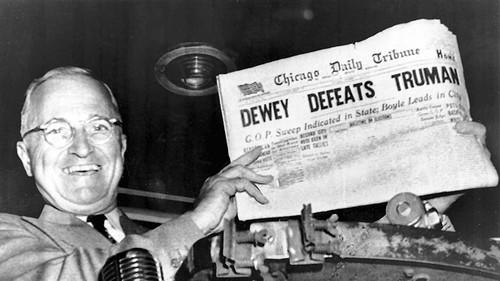
If you’re missing the reference Wikipedia’s got your back, but suffice it to say networks live in fear of a missed call.
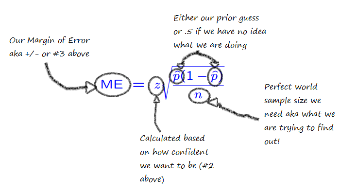
#3 is how close you want to be to reality. We’ll come back to this, but basically it’s how much you need your answer to look like the real answer. When polls say “the margin of error is +/- 3 percentage points”, this is what they’re saying. If you look at this diagram:

Margin of error is basically how close those x’s need to be to the target, confidence interval (#2) is how close you need them to be to each other.
#4 is whether or not you’re working from scratch or you have a guess. Basically, do you know ahead of time what percent of people might be voting for a candidate or are you going in blind?
#5 is all the other messy stuff that has nothing to do with math.
Okay, so what do we do with this?
Well factors 1-4 all end up in this equation:

So basically what that’s saying is that the more confident and precise you need to be, the more people you need to poll. Additionally, the larger the gap between your “percent saying yes” and “percent saying something else”, the fewer people you need before you can make a call. A landslide result may be bad for your candidate, but great for predictions.
Okay, thanks for the math lesson. Now what?
Now things get dirty. What I showed you above is basically how we’d do an estimate for each of the candidates, putting in their prior polling numbers for p one at a time. What about the other numbers though? We know we have to set our confidence high so we’re not embarrassed, but what about our margin of error? Well here’s where all those phone calls you get prior to the election help.
Going in to voting day, the pollsters had Trump in the lead at 31%, with his next closest rival at 14%. This 17 point lead means we can set our margin of error pretty wide. After all, CNN doesn’t have to know what percent of the vote Trump got as much as it needs to know that someone is really unlikely to beat him. If you split it down the middle, you get a margin of error of 8. Their count could be off by that much and still only lower Trump to 23% of the vote and raise his opponent to 22%. However, that assumes all of his error would go to his closest opponent. With so many others in the race that’s unlikely to happen, so they could probably go with +/- 10.
For the Democrats, I found the prior polls showed Sanders leading 54% to Hillary’s 41%. Splitting that difference you could go about +/- 6.
In a perfect world this means we’d need about 160 random votes to predict Trumps win and about 460 to predict Sanders win at the 99% confidence level.
Whoa that’s it? Why’d they wait so long then?
Well, remember #5 up there? That’s the killer. All those pretty equations I just showed you only work if you get a random sample, and that’s really hard to come by in a situation like this. Even in a small state like New Hampshire you will have geographic differences in the types of candidates people like. This post from smartblogs had a map shows some of the differences:

So as precincts report, we know there’s likely some bias to those numbers. If the 8% of the votes you’ve counted are from throughout the state, you have a lot more information than if those 8% are just from Manchester or Nashua. Because of this most networks have eschewed strict stats limits like that one I did above in favor of slightly messier rules.
So why’d you tell us all that other stuff?
Because frequentist probability theory is great and you should know more about it. Also, those are still the steps that underlie everything else the networks do. As we discussed above, the size of the leads made the initial/perfect world required number quite small. To highlight this, watch what would happen to that base number of votes needed as we close the margin of error:
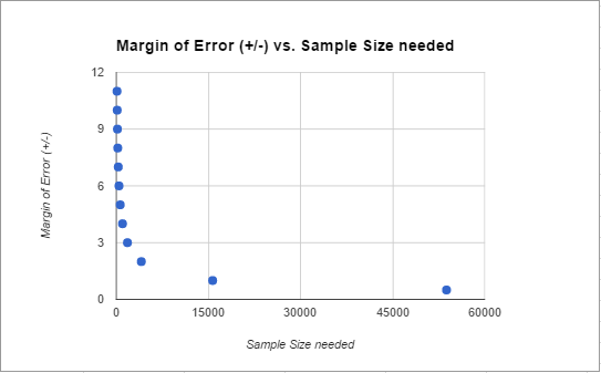
Anything lead closer than about +/- 4 (or about an 8 point difference) gets increasingly more difficult to call. If you’re over that though, you can act a little faster. In this case, both leads were bigger than that from the get go.
To hedge their bets against bias, the networks likely produce some models of the state based on past elections, polling, exit polls and demographic shifts, call the election the day before, then spend election night validating their models/predictions. Bayesian inference would come in handy here, as the networks could rapidly update their guesses with new information. So they’re not really calculating “what is the probability that Trump is winning” they’re calculating “given that the polls said Trump was winning, what are the chances he is also winning now”. That sounds like semantics, but it can actually make a huge difference. If they saw anything unusual happening or any conflicting information, they could delay (justifying a few veteran election watchers hanging out to pick up on this stuff), but in this case all their information sources were agreeing.
As the night went on, it became apparent that Trump and Sanders were actually out performing the pre-election polls, so this probably increased the network’s confidence rapidly. In pre-election polls, the most worrying thing is non-response bias. You get concerned that those answering the polls are not the same as those who are going to vote. Voting results eliminate this bias….in a democracy we only count the opinions of those who show up at the polls. So if you get two different types of samples with different error sources saying the same things, you increase your confidence.
Overall, I don’t totally know all the particulars about how the networks do it, but they almost certainly use some of the methods above in addition to some gut reactions. With today’s computing power, they could be individually computing probabilities for every precinct or have very advanced models to predict which areas that were most likely to go rogue. It’s worth noting that the second place Clinton and Kasich won very few individual districts, so this strategy would have produced results quickly as well.
So there you have it. The more accurate the prior polling, the greater the gap between candidates, the more regions reporting at least some of their votes, and the less inter-region variability, the faster the call. An hour and a half after the polls close seems speedy until you consider that statistically they probably could have called it accurately after the first 1% came in. No matter how mathematically backed however, that definitely would have gotten them the same level of love that my over-zealous-in-class-question-answering habits got me in middle school. They had to be quick, but not too quick. My guess is that last half hour was more a debate over the respectability of calling so soon rather than the math. Life’s annoying like that some times.
Got a stats question? Send it in here!
Updated to add: Based on a Facebook conversation about this post, I thought I should add that if the race is REALLY close, the margin of error with the vote counting itself starts to come in to play. Typically things like absentee ballots aren’t even counted if it won’t make a difference, but in very close races when every ballot matters, which ballots are valid becomes a big deal. The weirdest example of this I know of is the Al Franken/Minnesota senate seat election from 2008. It took 8 months to resolve which votes were valid and get someone sworn in.
1. This is the quadrennial tradition where New Hampshire acts like a hot girl in a bar who totally hates the fact that she’s getting so much attention yet never seems to want to leave.↩