Calling BS Read-Along Week 4: Causality

Welcome to the Calling Bullshit Read-Along based on the course of the same name from Carl Bergstorm and Jevin West  at the University of Washington. Each week we’ll be talking about the readings and topics they laid out in their syllabus. If you missed my intro and want the full series index, click here or if you want to go back to Week 3 click here.

Well hello week 4! We’re a third of the way through the class, and this week we’re getting a crash course in correlation/causation confusion, starting with this adapted comic:

Man, am I glad we’re taking a look at this. Correlating variables is one of the most common statistical techniques there is, but it is also one of the most commonly confused. Any time two variables are correlated, there are actually quite a few possible explanations such as:

  1. Thing A caused Thing B (causality)
  2. Thing B caused Thing A (reversed causality)
  3. Thing A causes Thing B which then makes Thing A worse (bidirectional causality)
  4. Thing A causes Thing X causes Thing Y which ends up causing Thing B (indirect causality)
  5. Some other Thing C is causing both A and B (common cause)
  6. It’s due to chance (spurious or coincidental)

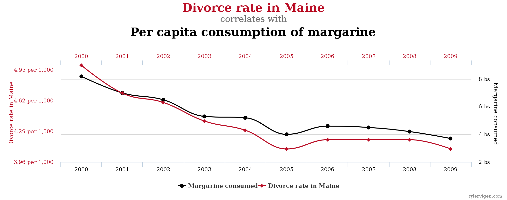
You can find examples of each here, but the highlight is definitely the Spurious Correlations website.  Subjects include the theory that Nicolas Cage movies cause drownings and why you don’t want to eat margarine in Maine.

With that framing, the first reading is an interesting anecdote that highlights both correlation/causation confusion AND why sometimes it’s the uncorrelated variables that matter. In Milton Friedman’s thermostat analogy, Friedman ponders what would happen if you tried to analyze the relationship between indoor temperature, outdoor temperature and energy usage in a home. He points out that indoor temperature would be correlated with neither variable, as the whole point is to keep that constant. If you weren’t familiar with the system, you could conclude that using energy caused a drop in temperatures, and that the best way to stay warm would be to turn off the furnace. A good anecdote to keep in mind as it illustrates quite a few issues all at once.

Next up is the awesomely named paper “Storks Deliver Babies (p = 0.008)“. In it, Robert Mathews takes the birth rates in 17 European countries and correlates them with the approximate number of storks in each country and finds a correlation coefficient of .62.  As the title of the paper suggests, this correlation is statistically significant. The author uses this to show the weaknesses of some traditional statistical analyses, and how easy it is to get ridiculous results that sound impressive.

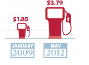
Misleading statistics is also the subject of the Traffic Improvements case study, where a  Seattle news station complained that a public works project cost $74 million but only made the average commute 2 seconds faster, leading to the conclusion that the spending was not correlated with any improvements. When you dig a bit deeper though, you discover that the volume the highway could accomodate rose by 30,000 cars/day.  If you take cars/day as a variable, the spending was correlated with an improvement. This is a bit like the Milton Friedman thermostat example: just because a variable stays constant doesn’t mean it’s not involved. You have to look at the whole system.

Speaking of the whole system, I was interested to note that part way through the case study the Calling BS overlords cited Boston’s own Big Dig and mention that “Boston traffic got better”. As a daily commuter in to Boston, I would like to mention that looking at the whole system here also gives a slightly more complicated picture. While it is true that the Big Dig allowed more cars to move through the city underground, a Boston Globe report noted that this only helped traffic along the route that got worked on. Traffic elsewhere in the city (like say, the area I commute to) got much worse during this time frame, and Boston never lost it’s ranking as one of the most congested cities. Additionally, while the improvements made it possible to handle more cars on the road, the cost overrun severely hampered the cities ability to build or maintain it’s public transportation. Essentially by overspending on getting more cars through, the Big Dig made it necessary for more people to drive. Depending on which metric you pick, the Big Dig is both correlated with success AND failure…plus a tax bill I’m still chipping in money towards on TOP of what I pay for subpar commuter rail service. Not that I’m bitter or anything.

One interesting issue to note here is that sometimes even if journalists do a good job reporting on the nuances of correlation/causation, editors or headline writers can decide to muddy the issue. For example, Slate Star Codex did a great piece on how 4 different news outlets wrote a headline on the same study: 

Unless you were pretty on top of things, I don’t think most people would even recognize those middle two headlines were about the same study as the first and fourth. The Washington Post had to take a headline down after they had declared that if women wanted to stop violence against them they should get married. The new improved headline is below, but the original is circled in red:

It’s easy to think of headlines as innocuous if the text is good, but subtle shifts in headlines do color our perception of anything that comes after it. (I’ve collected most of my links on this research here)

Alright, back to the readings.

Our last piece goes back to 1897 and is written by Mr Correlation Coefficient himself: Karl Pearson. The math to work out the correlation coefficients had no sooner been done than Pearson started noticing people were misusing it. He was particularly concerned about people attributing biological causality to things that actually came from a common cause. Glad to see we’ve moved beyond that. Interestingly, history tells us that in Pearson’s day this was the fault of statisticians who used different methods to get correlations they wanted. After Pearson helped make correlations more rigorous, the problem flipped to people over-attributing meaning to correlations they generated. In other words, 100 years ago people put in correlations that didn’t belong, now they fail to take them out.

Okay, that’s it for this week! We’ll see you back here next week for Statistical traps and trickery.

Week 5 is up! Read it here.


Selection Bias: The Bad, The Ugly and the Surprisingly Useful

Selection bias and sampling theory are two of the most unappreciated issues in the popular consumption of statistics. While they present challenges for nearly every study ever done, they are often seen as boring….until something goes wrong. I was thinking about this recently because I was in a meeting on Friday and heard an absolutely stellar example of someone using selection bias quite cleverly to combat a tricky problem. I get to that story towards the bottom of the post, but first I wanted to go over some basics.

First, a quick reminder of why we sample: we are almost always unable to ask the entire population of people how they feel about something. We therefore have to find a way of getting a subset to tell us what we want to know, but for that to be valid that subset has to look like the main population we’re interested in. Selection bias happens when that process goes wrong. How can this go wrong? Glad you asked! Here’s 5 ways:

  1. You asked a non-representative group Finding a truly “random sample” of people is hard. Like really hard. It takes time and money, and almost every researcher is short on both. The most common example of this is probably our personal lives. We talk to everyone around us about a particular issue, and discover that everyone we know feels the same way we do. Depending on the scope of the issue, this can give us a very flawed view of what the “general” opinion is. It sounds silly and obvious, but if you remember that many psychological studies rely exclusively on W.E.I.R.D. college students for their results, it becomes a little more alarming. Even if you figure out how to get in touch with a pretty representative sample, it’s worth noting that what works today may not work tomorrow. For example, political polling took a huge hit after the introduction of cell phones. As young people moved away from landlines, polls that relied on them got less and less accurate. The selection method stayed the same, it was the people that changed.
  2. A non-representative group answered Okay, so you figured out how to get in touch with a random sample. Yay! This means good results, right? No, sadly. The next issue we encounter is when your respondents mess with your results by opting in or opting out of answering in ways that are not random. This is non-response bias, and basically it means “the group that answered is different from the group that didn’t answer”. This can happen in public opinion polls (people with strong feelings tend to answer more often than those who feel more neutrally) or even by people dropping out of research studies(our diet worked great for the 5 out of 20 people who actually stuck with it!). For health and nutrition surveys, people also may answer based on how good they feel about their response, or how interested they are in the topic.  This study from the Netherlands,for example, found that people who drink excessively or abstain entirely are much less likely to answer surveys about alcohol use than those who drink moderately.   There’s some really interesting ways to correct for this, but it’s a chronic problem for people who try to figure out public opinion.
  3. You unintentionally double counted This example comes from the book Teaching Statistics by Gelman and Nolan. Imagine that you wanted to find out the average family size in your school district. You randomly select a whole bunch of kids and ask them how many siblings they have, then average the results. Sounds good, right? Well, maybe not. That strategy will almost certainly end up overestimating the average number of siblings, because large families are by definition going to have a better chance of being picked in any sample.  Now this can seem obvious when you’re talking explicitly about family size, but what if it’s just one factor out of many? If you heard “a recent study showed kids with more siblings get better grades than those without” you’d have to go pretty far in to the methodology section before you might realize that some families may have been double (or triple, or quadruple) counted.
  4. The group you are looking at self selected before you got there Okay, so now that you understand sampling bias, try mixing it with correlation and causation confusion. Even if you ask a random group and get responses from everyone, you can still end up with discrepancies between groups because of sorting that happened before you got there. For example, a few years ago there was a Pew Research survey that showed that 4 out of 10 households had female breadwinners, but that those female breadwinners earned less than male breadwinner households. However, it turned out that there were really 2 types of female breadwinner households: single moms and wives who outearned their husbands. Wives who outearned their husbands made about as much as male breadwinners, while single mothers earned substantially less. None of these groups are random, so any differences between them may have already existed.
  5. You can actually use all of the above to your advantage. As promised, here’s the story that spawned this whole post: Bone marrow transplant programs are fairly reliant on altruistic donors. Registries that recruit possible donors often face a “retention” problem….i.e. where people initially sign up, then never respond when they are actually needed. This is a particularly big problem with donors under the age of 25, who for medical reasons are the most desirable donors. Recently a registry we work with at my place of business told us their new recruiting tactic used to mitigate this problem. Instead of signing people up in person for the registry, they get minimal information from them up front, then send them an email with further instructions about how to finish registering. They then only sign up those people who respond to the email. This decreases the number of people who end up registering to be donors, but greatly increases the number of registered donors who later respond when they’re needed. They use selection bias to weed out those who were least likely to be responsive….aka those who didn’t respond to even one initial email. It’s a more positive version of the Nigerian scammer tactic.

Selection bias can seem obvious or simple, but since nearly every study or poll has to grapple with it, it’s always worth reviewing. I’d also be remiss if I didn’t  include a link here for those ages 18 to 44 who might be interested in registering to be a potential bone marrow donor.

Medical Marijuana and Painkiller Overdoses: Does One Reduce the Other?

I’ve talked before here about the issues with confusing correlation and causation, and more recently I’ve also talked about the steps needed to establish a causal link between two things.

Thus I was interested to see this article in the Washington Post recently about the attempts to establish a causal link between access to medical marijuana and a decrease in painkiller related deaths. There had been studies suggesting that access to medical marijuana was associated with lower rates of overdose related deaths since this JAMA paper was published in 2014, and those findings were repeated and broadened in 2015 with this paper. Both papers found increased access to medical marijuana reduced painkiller related deaths by up to 25% over states with no such access. This showed at least some promise of moving towards a causal link, as it established a reproducible consistent association.

This was not without it’s critics. When the Washington Post covered the story about the 2015 paper, they interviewed a skeptical researcher who pointed out that painkiller users are at higher risk for overdose when they use medical marijuana as well. Proponents of medical marijuana pointed out that this only studied those who were prescribed painkillers. If it could be established that access to medical marijuana reduced the number of painkiller prescriptions being written, then you could actually start to establish a plausible and coherent theory….2 more links on the chain of causality.

Long story short, that’s what this new paper did. They took a look at how many prescriptions your average physician wrote in states with legal medical marijuana vs those without, and found this:

As a balance, they also looked at other drugs that had nothing to do with medical marijuana (like antibiotics or blood thinners) and discovered there was no difference in those prescription rates.

While the numbers for anxiety and depression medication are interesting, they may only translate in to a handful of patients per year. That pain medication number on the other hand is pretty damn impressive. 1,826 doses of painkillers could actually translate in to at least half a dozen patients per physician (if you’re assuming daily use for a year) or more if you’re assuming less frequent use. This gives some pretty hefty proof that medical marijuana could be lowering overdose rates by lowering the number of patients getting a different painkiller prescription to begin with.

I’d be interested to see if there’s a dose response relationship here….within the states that have legal medical marijuana, do states with looser laws/more access see even lower death rates? And do those states with the lower overdose death rates see an increase in any other death rates, like motor vehicle accidents?

Interesting data to ponder, especially since full legalization is on my state ballot this November. Regardless of the politics however, it’s a great example of how to slowly but surely make a case for causality.

6 Examples of Correlation/Causation Confusion

When I first started blogging about correlation and causation (literally my third and fourth post ever), I asserted that there were three possibilities whenever two variables were correlated. Now that I’m older and wiser, I’ve expanded my list to six:

  1. Thing A caused Thing B (causality)
  2. Thing B caused Thing A (reversed causality)
  3. Thing A causes Thing B which then makes Thing A worse (bidirectional causality)
  4. Thing A causes Thing X causes Thing Y which ends up causing Thing B (indirect causality)
  5. Some other Thing C is causing both A and B (common cause)
  6. It’s due to chance (spurious or coincidental)

The obvious conclusion is that years spent blogging about statistics directly correlates to the number of possible ways of confusing correlation and causation you recognize.

Anyway, I’ve talked about this a lot over the years, and this lesson is pretty fundamental in any statistics class…though options #3 and #4 up there aren’t often covered at all. It’s easily forgotten, so I wanted to use this post to pull together an interesting example of each type.

  1. Smoking cigarettes cause lung cancer (Thing A causes Thing B): This is an example I use in my Intro to Internet Science talk I give to high school students. Despite my continued pleading to be skeptical of various claims, I like to point out that sometimes disbelieving a true claim also has consequences. For years tobacco companies tried to cast doubt on the link between smoking and lung cancer, often using “correlation is not causation!” type propaganda.
  2. Weight gain in pregnancy and pre-eclampsia (Thing B causes Thing A): This is an interesting case of reversed causation that I blogged about a few years ago. Back in the 1930s or so, doctors had noticed that women who got pre-eclampsia (a potentially life threatening condition) also had rapid weight gain. They assumed the weight gain was causing the pre-eclampsia, and thus told women to severely restrict their weight gain. Unfortunately it was actually the pre-eclampsia causing the weight gain, and it is pretty likely the weight restrictions did more harm than good.
  3. Dating and desperation (Thing A causes Thing B which makes Thing A worse): We’ve all had that friend. The one who strikes out with everyone they try to date, and then promptly doubles down on their WORST behaviors. This is the guy who stops showering before he takes girls out because “what’s the point”. Or the girl who gets dumped after bringing up marriage on the third date, so she brings it up on the first date instead. This  is known as “bidirectional causality” and is less formally known as “a vicious cycle”. In nature this can cause some really amusing graph behavior, as in the case of predators and prey.  An increase in prey can cause an increase in predators, but an increase in predators will cause a decrease in prey. Thus, predator and prey populations can be both positively AND negatively correlated, depending on where you are in the cycle.
  4. Vending machines in Schools and obesity (Thing A causes Thing X causes Thing Y which then causes Thing B): One obvious cause of obesity is eating extra junk food. One obvious source of extra junk food is vending machines. One obvious place to find vending machines is in many schools. So remove vending machines from schools and reduce obesity, right? No, sadly, not that easy.  In a longitudinal study that surprised even the authors, it was found that kids who moved from schools without vending machines to those with vending machines don’t gain weight. What’s interesting is that you can find a correlation between kids who were overweight and eating food from vending machines, but it turns out the causal relationship is convoluted enough that removing the vending machines doesn’t actually fix the original end point.
  5. Vitamins and better health (Some other Thing C is causing Thing A and Thing B):This one is similar to #4, but I consider it more applicable when it turns out Thing A and Thing B weren’t even really connected at all. Eating a bag of chips out of a vending machine every day CAN cause you to gain weight, even if removing the vending machine doesn’t help you lose it again. With many vitamin supplements on the other hand, initial correlations are often completely misleading. Many people who get high levels of certain vitamins (Thing A) are actually just those who pay attention to their health (Thing C), and those people tend to have better health outcomes (Thing B).  Not all vitamins should be tarred with the same brush though, this awesome visualization shows where the evidence stands for 100 different supplements.
  6. Spurious Correlations (spurious or due to chance): There’s a whole website of these, but my favorite is this one:  NicCage

Causal inference, not for the faint of heart.


Proof: Using Facts to Deceive (Part 5)

Note: This is part 5 in a series for high school students about reading and interpreting science on the internet. Read the intro and get the index here, or go back to part 4 here.

Okay! So we’re almost half way done with the series, and we’re finally reaching the article!  Huzzah! It may seem like overkill to spend this much time talking about articles without, you know, talking about the articles, but the sad truth is by the time you’ve read the headline and looked at the picture, a huge amount of your opinion will already be forming. For this next section, we’re going to talk about the next thing that will probably be presented to you: a compelling anecdote. That’s why I’m calling this section:

The Anecdote Effect

Okay, so what’s the problem here?

The problem here isn’t really a problem, but a fundamental part of human nature that journalists have known for just about forever: we like stories. Since our ancestors gathered around fires, we have always used stories to illustrate and emphasize our points. Anyone who has even taken high school journalism has been taught something like this. I Googled “how to write an article”, and this was one of the first images that came up:

Check out that point #2 “Use drama, emotion, quotations, rhetorical questions, descriptions, allusions, alliteration and metaphors”. That’s how journalists are being taught to reel you in, and that’s what they do. It’s not necessarily a problem, but a story is designed to set your impressions from the get go.  That’s not always bad (and pretty much ubiquitous) but it is difficult when it leaves you with an impression that the numbers are different than they actually are.

What should we be looking out for?

Repeat after me: the plural of anecdote is not data.

From smbc.com

Article writers want you to believe that the problem they are addressing is big and important, and they will do everything in their power to make sure that their opening paragraph leaves you with that impression. This is not a bad thing in and of itself (otherwise how would any lesser known disease or problem get traction?), but it can be abused.  Stories can leave you with an exaggerated impression of the problem, and exaggerated impression of the solution, or an association between two things that aren’t actually related.  If you look hard enough, you can find a story that backs up almost any point you’re trying to make.  Even something with a one in a million chance happens 320 times a day in the US alone.

So don’t take one story as evidence. It could be chance. They could be lying, exaggerating, or mis-remembering.  I mean, I bet I could find a Mainer who could tell me a very sad story about how their wife changing their shopping habits to less processed food led to their divorce.  I could even include this graph with it:

chart

Source.  None of this however, would mean that margarine consumption was actually driving divorce rates in any way.

Why do we fall for this stuff?

Nassim Taleb has dubbed this whole issue “the narrative fallacy”, the idea that if you can  tell a story about something, you can understand it. Stories allow us to tie a nice bow around things and see causes and effects where they don’t really exist.

Additionally, we tend to approach stories differently than we approach statistics. One of the most interesting meditations on the subject is from John Allen Paulos in the New York Times here. He has a great quote about this:

In listening to stories we tend to suspend disbelief in order to be entertained, whereas in evaluating statistics we generally have an opposite inclination to suspend belief in order not to be beguiled.

I think that sums it up.

So what can we do about it?

First and foremost, always remember that story or statistic that opens an article is ultimately trying to sell you something, even if that something is just the story itself.  Tyler Cowen’s theory is that the more you like the story, the more you should distrust it.

Even under the best of circumstances, people can’t always be trusted to accurately interpret events in their own life:

Source.

Of course, this almost always works the opposite way. People can be very convinced that the Tupperware they used while pregnant caused their child’s behavior problems, but that doesn’t make it true. Correlation does not prove causation in even a large data set, and especially not when it’s just one story.

It also helps to be aware of words that are used, and to think about the numbers behind them. Words like “doubled” can mean a large increase, or that your chances went from 1 in 1,000,000,000 to 1 in 500,000,000. Every time you hear a numbers word, ask what the underlying number was first.  This isn’t always nefarious, but it’s worth paying attention to.

One final thing with anecdotes: it’s an unfortunate fact of life that not everyone is honest. Even journalists with fact checkers and large budget can totally screw up when presented with a sympathetic sounding source. This week, I had the bizarre experience of seeing a YouTube video of a former patient whose case several coworkers worked on. She was eventually “cured” by some alternative medicine, and has taken to YouTube to tell her story.  Not. One. Part. Of. What. She. Said. Was. True. I am legally prohibited from even pointing you in her direction, but I was actually stunned at the level of dishonesty she showed. She lied about her diagnosis, prognosis and everything in between. I had always suspected that many of these anecdotes were exaggerated, but it was jarring to see someone flat out lie so completely. I do believe that most issues with stories are more innocent than that, but don’t ever rule out “they are making it up”, especially in the more random corners of the internet.

By the way, at this point in the actual talk, I have a bit of break the fourth wall moment. I point out that I’ve been using the “tell a story to make your point” trick for nearly every part of this talk, and that they are most certainly appreciating it more than if I just came in with charts and equations. The more astute students are probably already thinking this, and if they’re not thinking it, it’s good to point out how it immediately relates.

Until next week!  Read Part 6 here.

Pictures: Trying to Distract You (Part 4)

Note: This is part 4 in a series for high school students about reading and interpreting science on the internet. Read the intro and get the index here, or go back to part 3 here.

When last we met, we covered what I referred to as “narrative pictures”, or pictures that were being used to add to the narrative part of the story.  In this section, we’re going to start looking at pictures where the problems are more technical in nature…ie graphs and sizing. This is really a blend of a picture problem and a proof problem, because these deceptions are using numbers not narratives.   Since most of these issues are a problem of scales or size, I’m calling this section:

Graphs: Changing the View

Okay, so what’s the problem here?

The problem, once again, is a little bit of marketing. Have you ever judged the quality of a company based on how slick their website looks? Or judged a book by it’s cover, to coin a phrase? Well, it turns out we’re very similar when it comes to judging science. In a 2014 study, (Update: this lab that performed this study has come under review for some questionable data practices. It is not clear if this study is affected, but you can read the details of the accusations here and here) researchers gave people two articles on the effectiveness of a made up drug. The text of both articles was the same, but one had a graph that showed the number of people the drug helped, the other did not.  Surprisingly, 97% of the people who saw the graph believed the drug worked, whereas only 68% of people who read the text did. The researchers did a couple of other experiments, and basically found that not just graphs, but ANY “science-ish” pictures (chemical formulas, etc) influenced what people thought of the results.

So basically, adding graphs or other “technical” pictures to things to lend credibility to their articles or infographic, and you need to watch out.

Okay, so what kind of things should we be looking out for?

Well, in many cases, this isn’t a really a problem. Graphs or charts that reiterate the point of the article are not necessarily bad, but they will influence your perception. If the data warrants it, a chart reiterating the point is fantastic. It’s how nearly every scientific paper written operates, and it’s not inherently deceptive….but you may want to be aware that these pictures by themselves will influence your perception of the data. Not necessarily a problem, but good to be aware of under any circumstance.

There are some case though, where the graph is a little trickier.  Let’s go through a few:

Here’s one from Jamie Bernstein over at Skepchick, who showed this great example in a Bad Chart Thurday post:pica

Issue: The graph y-axis shows percent of growth, not absolute value. This makes hospitalized pica cases look several times larger than anorexia or bulimia cases. In reality, hospitalized anorexia cases are 5 times as common and bulimia cases are 3 times as common as pica cases. These numbers are given at the bottom, but the graph itself could be tricky if you don’t read it carefully.

How about this screen shot from Fox News, found here?

 Issue: Visually, this chart shows the tax rate will quadruple or quintuple if the Bush tax cuts aren’t extended. If the axis started at zero however, the first bar would be about 90% the size of the second one.

How about this tweeted graph from shared by the National Review?

Issue: The problem with this one is the axis does start with zero. The Huffington Post did a good cover of this graph here, along with what some other graphs would look like if you set the scale that large. Now of course there can be legitimate discussion over where a fair axis scale would be, but you should make sure the visual matches the numbers.

And one more example that combines two issues in one:

See those little gas pumps right there? They’ve got two issues going on. The first is a start date that had an unusually low gas price:

gas

The infographic implies that Obama sent gas prices through the roof….but as we can see gas prices were actually bizarrely low the day he took office.  Additionally, the gas pumps involved are deceptive:

b1fb2-gas

If you look, they’re claiming to show that prices doubled. However, the actual size of the second one is four times the one of the first one.  They doubled the height and the width:

76fed-gas2

While I used a lot of political examples here, this isn’t limited to politics. Andrew Gelman caught the CDC doing it here, and even he couldn’t figure out why they’d have mucked with the axis.

There’s lots of repositories for these, and Buzzfeed even did a listicle here if you want more. It’s fun stuff.

Why do we fall for this stuff?

Well, as we’ve said before, visual information can reinforce or skews your perceptions, and visual information with numbers can intensify that effect. This isn’t always a bad thing…after all nearly every scientific paper ever published includes charts and graphs. When you’re reading for fun though, it’s easy to let these things slip by. If you’re trying to process text, numbers, implications AND read the x and y axis and make sure the numbers are fairly portrayed, it can be a challenge.

So what can we do about it?

A few years ago, I asked a very smart colleague how he was able to read and understand so many research papers so quickly. He seemed to read and retain a ton of highly technical literature, while I always found my attention drifting and would miss things. His advice was simple: start with the graphs. See I would always try to read papers from start to finish, looking at graphs when they were cited. He suggested using the graphs to get a sense of the paper, then read the paper with an eye towards explaining the graphs. I still do this, even when I’m reading for fun. If there’s a graph, I look at it first when I know nothing, then read the article to see if my questions about it get answered. It’s easier to notice discrepancies this way. At the very least, it reminds you that the graph should be there to help you. Any evidence that it’s not should make you suspicious of the whole article and the author’s agenda.

So that wraps up our part on Pictures! In part 5, we’ll finally reach the text of the article.

Read Part 5 here.

Pacifiers and baby boys

I’m a bit behind on this one, but this study was too interesting to pass up.

Apparently, research suggests that pacifier use by boys limits their social development.

So we’ll start with the bias alert.  I have a baby boy, and he does use a pacifier to help him go to sleep.  I didn’t have any particular feelings about this, I just gave it a whirl and liked the way it helped him calm down when he was tired.  Give it 5 minutes, and he tends to spit it out and go to sleep.  That seemed rational to me, I actually was unaware there was much controversy about this until I got reading this article (reiterating Dubbahdee’s point that I should never read parenting advice on the internet….oops).

Obviously, I don’t yet know what his social development is going to turn out like (though at the moment he’s astoundingly unsympathetic to my lack of sleep), but I generally hope it’s okay.   End bias alert.

It took me a while to find the actual paper (why oh why do so many news sources not link to the actual paper????), but after scanning the whole thing I had a couple thoughts.

The headlines about this paper were stupid, of course.  The author actually had a pretty good theory based on actual science (babies learn emotions in part through mimicry, she wondered if a pacifier would make this harder for babies because their facial muscles were occupied), and of course it got over reported. Most headlines just mentioned “pacifier use” in general, but she clarifies pretty quickly that they only studied pacifier use during baby wake time….specifically excluding the type of pacifier use I described above (as a sleep aid).  This makes sense (the woman does have 3 boys herself after all) because you don’t have to spend very long around babies before you realize they’re probably not learning much when they’re trying to fall asleep.  They’re mostly just crying.

Anyway, the set up for the study was pretty good.  They assessed both 6 and 7 year olds and their emotional reactions vs pacifier use, and then later college students who were questioned about their history of pacifier usage to tie it to adult development.

For that second, I was curious about the length of pacifier use we were talking about, as this was based on the recollection of college students and their parents, and I was wondering how accurate that would be.  This graph sums it up nicely:

I’m not familiar with the emotional intelligence scale they’re using, so I’ll take their word for it that 4.7 to 4.4 is statistically significant….but wow, daytime use of a pacifier until 5 years of age?  That does seem like it should cause some concern.  Also, it seems as those the recollection bias here would be clustered at either end.  Parents would remember more accurately either remarkably short or remarkably long pacifier use…but that’s just a guess.

Overall, I thought it was annoying that “daytime use of pacifiers until kindergarten” got labeled as just “pacifier use”, but I thought the research was certainly intriguing.  I especially liked that they tested both younger children and adults to help prove their theory, as emotional development is most definitely a complex process that takes decades to work through.

What I actually liked about this study the most was Ann Althouse’s take on it.  She wondered if this meant you could stop overly emotional women from being overly emotional by giving them Botox so they couldn’t mimic those around them.  I’d say it’s worth a shot.

Does egg = cigarette?

Oh CNN, your headlines make me sad sometimes.

Is eating egg yolks as bad as smoking?

No.  No it is not.  The study you’re reporting on does in fact claim that eating egg yolks accelerate heart disease about 2/3rds as much as smoking does, but acceleration of heart disease is not actually the health problem smoking is most known for.  But you know that.  Sigh.

Not that I’m buying the study anyway.  They asked people, who already had heart disease, to report their egg yolk consumption over the course of their lives.  How accurately can you recall your average egg yolk consumption over the course of your life?  Additionally, people who have heart disease have most likely been told to cut down on consumption of saturated fat and cholesterol.  Those still eating more eggs have likely heard this advice, and disregarded it.  What are the chances that they’re disregarding other advice as well?  Lastly, it does not appear the study asked about the consumption of any other food, meaning egg consumption could actually just be co-occuring with the consumption of something else that was even worse.  Surveys that ask only about very specific foods tend to see what they want to see.

So basically, another correlation/causation issue here, combined with those terrible consumption recollection surveys, with a sprinkle obnoxious headline writing.   Yeehaw.

Rich Mom Poor Mom

I have a sleeping baby in my lap, so you’ll forgive me if I have a one track mind.

Yesterday we met with a nurse who let us know that in Sweden, they have now set minimums for skin to skin contact between mom and babies during hospital stays.  If you don’t do the minimum, you pay the hospital bill.  This morning, in my first perusal around the internet in a few days, I see that Mayor Bloomberg is trying to find ways of encouraging new mother’s to breastfeed.

A note on research regarding babies and various practices in infancy:  Babies are a lot of work.  I realize I’m preaching to the choir on this, as many of my readers have successfully raised quite a few children, but it’s true.  Many of the practices that show lots of benefits for babies (skin to skin contact, breastfeeding, etc) take even more time than the alternatives.  While I believe these things are good for babies on their own, all data collected on these practices will be complicated by the fact that parents who engage in them tend to have more time, resources, and support than those who don’t.  Pushing these practices on those who are already particularly stressed may not have as profound an outcome as it did in the study, as the groups went from self selecting to random.

Something to think about for the policy makers.

Sorry, I’ve been reading over a lot of hospital literature and getting mildly annoyed.  I think that means the pain medication has worn off.  Nurse!

Correlation and Causation – Abortion and Suicide meet the 8th circuit

Perhaps it’s lawyer’s daughter in me, but I think watching courts rule on presentation of data is totally fascinating to me.

Today, the 8th Circuit Court of Appeals had to make just such a call.

The case was Planned Parenthood v Mike Rounds and was a challenge to a 2005 law that required doctors to inform patients seeking abortions that there was “an increased risk of suicide ideation and suicide”.  This was part of the informed consent process under the “all known medical risks” section.

Planned Parenthood challenged on the grounds that this was being presented as a causal link, and was therefore was a violation of the doctor’s freedom of speech.

It’s a hot topic, but I tried to get around the controversy to the nuts and bolts of the decision. I was interested how the courts evaluated what research should be included and how.

Apparently the standard is as follows:

…while the State cannot compel an individual simply to speak the State’s ideological message, it can use its regulatory authority to require  a  physician to provide  truthful,  non-misleading  information relevant to a patient’s decision to have an abortion, even if that information might also encourage the patient to choose childbirth over abortion.”  Rounds, 530 F.3d at 734-35; accord Tex. Med. Providers Performing Abortion Servs. v. Lakey, 667 F.3d 570, 576-77 (5th Cir. 2012).  

So in order to be illegal, disclosures must be proven to be ““either  untruthful, misleading or not relevant to the patient’s decision to have an abortion.”


It was the misleading part that the challenge focused on.  The APA has apparently endorsed the idea that any link between abortion and suicide is NOT causal.  The theory is that those with pre-existing mental health conditions are both more likely to have unplanned pregnancies and to later commit suicide. It was interesting to read the huge debate over whether the phrase “increased risk” implied causation (the court ruled causation was not implicit in this statement).


Ultimately, it was decided that this statement would be allowed as part of informed consent.  The conclusion was an interesting study in what the courts will and will not vouch for:

We acknowledge that these studies, like the studies relied upon by the State and Intervenors, have strengths as well as weaknesses. Like all studies on the topic, they must make use of imperfect data that typically was collected for entirely different purposes, and they must attempt to glean some insight through the application of sophisticated statistical techniques and informed assumptions. While the studies all agree that the relative risk of suicide is higher among women who abort compared to women who give birth or do not become pregnant, they diverge as to the extent to which other underlying factors account for that link.  We express no opinion as to whether some of the studies are more reliable than others; instead, we hold only that the state legislature, rather than a federal court, is in the best position to weigh the divergent results and come to a conclusion about the best way to protect its populace.  So long as the means chosen by the state does not impose an unconstitutional burden on women seeking abortions or their physicians, we have no basis to interfere.

I did find it mildly worrisome that the presumption is that the state legislators are the ones evaluating the research.  On the other hand, it makes sense to put the onus there rather than the courts. It’s good to know what the legal standards are though….it’s not always about the science.