One of my favorite stats-esque topics is graphs. Specifically how we misrepresent with graphs, or how we can present data better. This weeks gun control debate provided a lot of good examples of how we present these things….starting with this article at Slate States With Tighter Gun Control Laws Have Fewer Gun Deaths. It came with this graph:
Now my first thought when looking at this graph was two-fold:
- FANTASTIC use of color
- That’s one heck of a correlation
Now because of point #2, I looked closer. I was sort of surprised to see that the correlation was almost a perfect -1….the line went almost straight from (0,50) to (50,0). But that didn’t make much sense….why are both axes using the same set of numbers? That’s when I looked at the labels and realized they were both ranks, not absolute numbers. Now for gun laws, this makes sense. You can’t count number of laws due to variability in the scope of laws, so you have to use some sort of ranking system. The gun control grade (the color) also gives a nice overview of which states are equivalent to each other. Not bad.
For gun deaths on the other hand, this is a little annoying. We actually do have a good metric for that: deaths per 100,000. This would help us maintain the sense of proportion as well. I decided to grab the original data here to see if the curve change when using the absolute numbers. I found those here. This is what I came up with:
Now we see a more gradual slope, and a correlation of probably around -.8 or so (Edited to add: I should be clear that because we are dealing with ordinal data for the ranking, a correlation is not really valid…I was just describing what would visually jump out at you.). We also get a better sense of the range and proportion. I didn’t include the state labels, in large part because I’m not sure if I’m using the same year of data the original group was.1
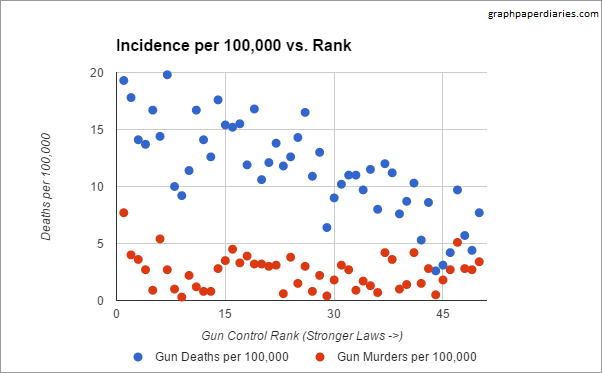
The really big issue here though, is that this graph with it’s wonderful correlation reflects gun deaths, not gun homicides….and of course the whole reason we are currently having this debate is because of gun homicides. I’m not the only one who noticed this, Eugene Volokh wrote about it at the Washington Post as well. I almost canned this post, but then I realized I didn’t particularly like his graph either. No disrespect to Prof Volokh, it’s really mostly that I don’t understand what the Brady Campaign means when it gives states a negative rating. So I decided to plot both sets of data on the same graph and see what happened. I got the data on just gun homicides here.
That’s a pretty big difference. Now I think there’s some good discussion to have around what accounts for this difference – suicides and accidents – and if that’s something to take in to account when reviewing gun legislation, but Volokh most certainly handles that discussion better than I. I’m just a numbers guy.
1. I also noticed that Slate flipped the order the Law Center to prevent Gun Violence had originally used, so if you look at the source data you will see a difference. The originally rankings had 1 as the strongest gun laws and 50 as the weakest. However, Slate flipped every state rank to reflect this change, so no meaning was lost. I think it made the graph easier to read.↩


