State Level Excess Mortality – 6/1/22

Well hello again! Apparently I’m just falling behind all over the place with this. An update a month was a nice aspiration, but not one I’m managing. Moving on! Last time I posted we were just under 1.1 million excess deaths since 2/1/20, and as of 6/1, we are at 1.125 million. That actually seems….pretty good comparatively? I only have the numbers from 6/1 because the CDC is doing some sort of work on their database and won’t have updated numbers until next week. We’ll see when I get around to looking at those.

Alright, on with what we have!

Excess Mortality Above Average

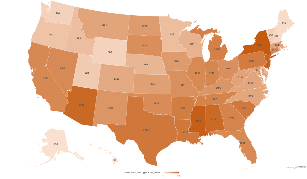
First up, the map. When I posted on 3/23, the range at the bottom was 1020-5729 deaths/million residents. Now it’s 1047-5823 deaths/million. For a 10 week gap that is….not a bad change. Certainly better than we’ve seen since I’ve been doing this. So where are the bad states?

Interesting. West Virginia is….not doing well? I don’t remember it popping out like that before. Sure enough, here’s what it looked like in my last map:
So where are they at numbers-wise? Well, here’s our top 10:
StateExcess Deaths
Above Average
2/1/20-6/1/22
Change from
3/23/22
Change in Rank
Mississippi5823+94No change
West Virginia5622+912+2
Arizona5153+205+1
New Mexico4848+206+1
Alabama4841+73-2
Louisiana4506+237+2
Tennessee4480+80+1
Arkansas4467+104-1
Wyoming4353+186+2
South Carolina4287+85-1

Wow…so that was a jump. They jumped last time as well, so they are moving quite rapidly. What other big movers were there?

State6/1/22 Excess3/23/22 ExcessChangeJune RankMarch Rank
West Virginia5622471091224
North Carolina336925568132442
Puerto Rico197214075654851
Alaska320829272812834
Louisiana4506426923768
New Mexico4848464220645
Arizona5153494820532
Oklahoma426740771901112
Wyoming43534167186911
Kentucky415539711841313

Interesting, so West Virginia and North Carolina are our two big jumpers here. I’m not clear why that is, but it’s worth noting that North Carolina had been outperforming it’s neighbors for quite some time, and is still outperforming them now. Peurto Rico was also doing very well and it’s jump has it doing only slightly less well.

It’s also worth noting that 9 states lost excess deaths in the last 10 weeks. We had wondered if we were going to see this effect start to happen, as this is something that could occur if some of the people who died initially were those who were close to death already. These states were: Rhode Island (-205), Ohio (-72), Maryland (-62), New Jersey (-52), Massachusetts (-34), Michigan (-31), Illinois (-20), Idaho (-19) and Pennsylvania (-17).

It will be interesting to see if more states start to slip backward as the summer goes on.

Percent Excess Mortality – 2020 and 2021

Alright, so hopefully most states are done updating their numbers from 2020 and 2021 by this point right? Who’s still at it? Well, really only Alaska (+2%), North Carolina (+7%), North Dakota (+8%) and West Virginia (+4%). All other states have very small changes or no change in the last 10 weeks. Top 10 states for each year are highlighted and bolded below, though 2021 had a 3 way tie for 10th so there are actually 12 states there.

State2020 deaths – expected2020 deaths – actual% change2021 deaths – expected2021 deaths – actual% change
Alabama548396255014%550366750823%
Alaska4462497111%4552603733%
Arizona626227595521%637978252029%
Arkansas334243743212%334064001520%
California28426431543011%27523833653422%
Colorado416214716113%412894891218%
Connecticut324163773016%32910344795%
Delaware10016108628%102471129510%
District of Columbia695973786%6495713010%
Florida21392324076513%21993126481220%
Georgia8787510246417%8931911257326%
Hawaii11893119901%12343128394%
Idaho15138163408%152821829920%
Illinois10882312744017%10844412059211%
Indiana694747829313%691717919814%
Iowa309463541814%31547338097%
Kansas268823077314%273923097513%
Kentucky50994551458%501366020620%
Louisiana472085632019%480575746920%
Maine15070155043%153471704511%
Maryland531195904811%53311573968%
Massachusetts610096839012%62383637482%
Michigan9874811451016%10017611552415%
Minnesota460845173212%47005512259%
Mississippi322843882520%323154034825%
Missouri666437551413%682077641312%
Montana106511190312%104001277123%
Nebraska171731954714%17863190527%
Nevada28547310069%275463397423%
New Hampshire13127134352%13464137752%
New Jersey766869462123%78694834976%
New Mexico191802284219%196162443325%
New York10170511827416%10317911583812%
New York City548708166049%556226325914%
North Carolina999771089169%10029811889319%
North Dakota7233879322%750880657%
Ohio1304871422119%13005614710913%
Oklahoma407314581412%410864921420%
Oregon37707399476%371714482521%
Pennsylvania14098915462210%13929415627312%
Puerto Rico30574320565%30695330908%
Rhode Island103991205416%10877115987%
South Carolina513805967616%527846426022%
South Dakota84561005219%8447936211%
Tennessee783708741812%789569515521%
Texas21267025091718%21483527177327%
United States2956302335378913%2958796346855317%
Utah200422202710%200692345417%
Vermont585361164%5791661714%
Virginia716367868010%727818487817%
Washington59364625585%598896841514%
West Virginia230332532310%236052867921%
Wisconsin545836194013%55622605329%
Wyoming4324549727%4867595122%

So there we go! The good news is things actually do look to be finally slowing down quite substantially in most places. A few states still look to be struggling, though at this point it’s unclear what’s driving that.

As always, add any questions in the comments or shoot me a message!

State Level Excess Mortality Data

A Warm Hello!

Well hello there! It’s been a while. Unfortunately I’ve been dealing with some (non-COVID related) health issues that have made reading and writing rather difficult, so blogging has been taking a back seat to things like um, paid employment. You know how it goes. I’ve missed you guys though, and thank you to those who reached out with nice messages asking how I was doing. That was appreciated.

Anyway, for the first time in a long time I recently fell down a rabbit hole of data and started putting together an exceptionally lengthy email with graphs for a small email group, when I realized I may as well just turn this in to a blog post in case any one was still poking around here and might be interested. So here we are.

Some Background About Data That’s Currently Interesting Me

So despite the aforementioned reading/writing troubles, I have of course been interested in the data coming out of the COVID-19 pandemic. I could go on and on about many things, but one of my top fixations is the difference between the state level reported COVID deaths (compiled by the CDC here) and the overall excess mortality across the US compiled by the CDC here.

Essentially the first set of numbers is exactly what it sounds like: the number of people in a state that the state says have died of COVID-19. The second number is a little more interesting. Basically the CDC has years and years worth of data about how many people die each week in 1) the USA as a whole (51k-60k depending on the time of year) and 2) individual states. Thus they can predict each year how many people are going to die in a given week and then say if we are right on track with that number or if we are wildly above that number (95% confidence interval) for both the country as a whole and each state individually.

They published this data prior to COVID as well….if you’ve ever heard someone say we had a “really bad flu year” this data is probably why. If an outbreak of the flu (or anything) pushes the country above the 95% CI for expected deaths, the CDC will generally raise an alert. For example, the flu season in the winter of 2017/2018 pushed us above the 95% CI from December 23rd 2017 – February 3rd 2018. Currently the country has had excess deaths from all cause mortality since March 28th, 2020. We have yet to drop back below the 95% CI for more than a week. The graph for the whole US looks like this (recent weeks trail off as jurisdictions are still reporting):

Since 2/1/20 this comes out to 595,688 deaths above the 95% CI (yellow line) or 758,749 deaths above average.

Now while seeing the entire country interests me, what really interested me about this data is that sometimes the excess mortality data from all causes and the COVID-19 reported death data for a particular state don’t match. That’s something I wanted to look in to.

COVID-19 Deaths vs All Cause Excess Mortality

I first got interested in this topic because the first time I looked at excess mortality data, I noticed that my state (Massachusetts) had a MUCH higher number listed for COVID-19 deaths than it does for excess mortality. Checking the CDC website today, they have us listed at 18,131 deaths, or 236 COVID deaths/100k residents. However, our excess mortality since 2/1/20 is only listed as between 8,780 and 11,369. I started running the numbers because the overall COVID number puts us at 3rd worst in the nation. The lower number would rank us somewhere between #31 and #40.

I Googled a bit and as close as I could find, we’ve changed our counting method twice to better align with federal standards, but don’t appear to have subtracted the “overcounts” back off our total. This article suggests we were overcounting nursing home deaths (take that Cuomo!) until April of 2021 and this article suggests that we also included more “probable” deaths than other states until October 2020.

So given that every state counts COVID deaths differently but (presumably) counts all deaths, how common is it that a states COVID deaths exceed their excess mortality? Which states have the highest “overcounts” and “undercounts” and what does it look like if you just compare excess mortality and remove COVID classifications entirely? Well I’m glad you asked! That’s what I wanted to know too!

The Overcounts

Pulling from the CDC website here through 8/11 and taking their upper and lower guesses for excess mortality and converting to deaths/million, I found 5 states that have reported more COVID deaths (as of today 8/14) than they have excess mortality:

  1. Massachusetts (+1,015/million – #3 ranked)
  2. Rhode Island (+690/million – #5 ranked)
  3. Minnesota (+145/million – #37 ranked)
  4. New Jersey (+143/million – #1 ranked)
  5. Connecticut (+41/million -#9 ranked)

Now it is important to note that not all the death data is in. It is possible that these states are simply really good at reporting COVID deaths and less good at reporting other deaths, or that something else is going on. COVID could be killing people in these states who would have died anyway, and thus it could be failing to add to the excess mortality in the way it is in other states, or some mitigation effort the states took could be reducing other types of mortality in a way that is balancing COVID out. The CDC won’t close out this data for quite some time, but it will be interesting to see what happens when all the accounts are settled.

What is notable here though is that 4 of these 5 states are in the top 10 for worst death counts. If these are truly over-reported, that means the pandemics were not as bad there as commonly believed. Additionally, several of those states had fairly strict lockdowns. If excess mortality is caused by lockdowns, it is not showing up in these states data so far.

The Undercounts

Now undercounting is tricky. The CDC notes that some states have extra process in place to ensure accurate coding of COVID deaths, so it’s possible these states are just behind. It’s also possible that excess mortality in these states is from something other than COVID, so they just wouldn’t have as much COVID death as they would excess mortality. Here’s the list, there were also 5 states here. Well, 4 states and DC:

  1. Washington DC (-294/million – #34 ranked)
  2. Texas (-147/million – #26 ranked)
  3. California (-76/million – #32 ranked)
  4. South Carolina (-51/million – #21 ranked)
  5. Vermont (-33/million -#50 ranked)

To my point about other causes of death, Washington DC in particular would be potentially impacted by a jump in homicides (up 19% last year) and opioid deaths (hit a record in 2020). For the other states, we’ll continue to see what happens as the data trickles in.

Overall, it’s interesting that 40 states COVID deaths counts fell somewhere in between their states upper and lower bound estimate for excess mortality. So how did every state do when compared for excess mortality so far? Let’s check it out?

About the Data

A few things to keep in mind before I show state level graphs:

  1. The data is excess mortality from ALL CAUSES since 2/1/20.
  2. There’s one graph for amount above lower bound (excess above average) and amount above upper bound (excess above 95% CI). I’ll discuss the differences a bit below.
  3. Some of this is estimated. Since every state reports at a different pace, they estimate where states will be at to bring everyone up to the same level. I’ve been watching this for a few months and they rarely have to take many people away, so the estimates look pretty good.
  4. The data is from here. I download the “National and State Estimates of Excess Deaths” csv file and then use the “Total Excess Lower Estimate” and “Total Excess Higher Estimate” (Column J and K on my spreadsheet) for each state.
  5. To convert to per capita, I used the 2020 census numbers for each state. I included Puerto Rico and DC, so all rankings are out of 52.

There’s been a lot of talk about how the pandemic impacted other types of deaths, so it’s notable to see where the highest excess mortality has been.

Excess Mortality Over Average by State

Without further ado, here’s the excess mortality over the average, by state. Sorry about the small font, click on it to embiggen:

So for deaths above average from ALL CAUSES, per capita the top ten states are:
StateExcess Deaths Over Average/Million (2/1/20-8/11/21)
Mississippi3635
District of Columbia3541
Arizona3138
Alabama3121
Louisiana3101
Arkansas3012
New York3010
South Carolina2889
New Jersey2861
South Dakota2708

Now this is just deaths over average. Some states have more yearly variation than others, and thus look a little different if you only take the deaths above the 95%CI interval. That’s next.

Excess Mortality Over Upper Bound by State

Again, click to make that bigger.

As you can see, going over the upper bound mostly evens out the smaller states. This makes sense. For example, Massachusetts and Montana had surprisingly similar excess mortality across the timespan represented. However, Montana is 1/7th the size of Massachusetts. They typically hover around 200 deaths per week statewide, and Massachusetts generally has 1,100-1,200. With 200 deaths, slight differences in reporting (like someone in one hospital forgetting to send the numbers for a week) could skew things quite a bit. That’s less likely over larger populations. So here are the new top 10:

StateExcess Deaths Over Upper Bound/Million (2/1/20-8/11/21)Prior Rank
New York25517
Mississippi24801
New Jersey23959
Arizona22943
Alabama22734
Texas202316
Louisiana20185
South Carolina20018
Pennsylvania194317
Arkansas19256

As expected, the two places with the smallest populations (DC and South Dakota) dropped off this list and were replaced with two much larger places: Texas and and Pennsylvania.

Other States of Interest and Possible Posts Going Forward?

Now throughout the pandemic, it seems everyone gets fixated on some subgroup of “the big four”: California, Florida, New York and Texas. If you want to know how they’re doing, here they are pulled out:

StateExcess Deaths Over Upper Bound/MillionExcess Deaths Over Average/MillionRank in Excess Deaths Over AverageRank in Excess Deaths Over Upper Bound
New York2551301071
Texas20232507166
California171121933017
Florida169423392318

Here are the states I track, as they are all approximately the same size as Massachusetts (around 7 million people):

StateExcess Deaths Over Upper Bound/MillionExcess Deaths Over Average/MillionRank in Excess Deaths Over AverageRank in Excess Deaths Over Upper Bound
Arizona2294313834
Tennessee178726361114
Massachusetts124916173931

If people are interested in particular other states, I’d be happy to post them in the comments as time/health allow. Additionally, the CDC updates this data weekly. Now that I have the explanation typed out and my spreadsheet set up I can fairly easily post updates every few weeks (sans lengthy intro) if there’s interest. Let me know what you all think! Hope everyone is staying well.

5 Things to Remember About Prescription Drugs

This past week, I had the tremendous pleasure of seeing one of my brother’s articles on the cover of the December issue of Christianity Today as part of a feature on pain killers. While my brother has done a lot of writing for various places over the years, his article “How Realizing My Addiction Had Chosen Me Began My Road to Recovery” was particularly special to see. In it, he recounts his story of getting addicted to pain killers after a medical crisis, and details his road to recovery. Most of the story is behind a paywall, but if you want a full copy leave me a comment or use the get in touch form and I’ll send you the word document.

As someone who was intimately involved with all of the events relayed in the article, it’s pretty self evident why I enjoyed reading it as much as I did. On a less personal note though, I thought he did a great job bringing awareness to an often overlooked pathway to addiction: a legitimate medical crisis. My brother’s story didn’t start at a party or with anything even remotely approaching “a good time”. His story started in the ER, moved to the ICU, and had about 7 months of not being able to eat food by mouth at the end. His bout with necrotizing pancreatitis was brutal, and we were on edge for several months as his prognosis shifted between “terrible” and “pretty bad”.

Through all that, the doctors had made decisions to put him on some major pain killers. Months later, when things were supposed to be improving, he found that his stomach was still having trouble, and went back to his doctor for more treatment. It was only then that he was told he had become an addict. The drugs that had helped save his life were now his problem.

Obviously he tells the rest of the story (well, all of the story) better than I do, so you should really go read it if your interested. What I want to focus on is the prescribing part of this. When talking about things like “the opioid crisis”, it’s tempting for many people to label these drugs as “good” or “bad”, and I think that misses the point (note to my brother who will read this: you didn’t make this mistake. I’m just talking in general here. Don’t complain about me to mom. That whole “stop sciencing at your brother” lecture is getting old). There’s a lot that goes in to the equation of whether or not a drug should be prescribed or even approved by the FDA, and a shift in one can change the whole equation.  Also, quick note, I’m covering ideal situations here. I am not covering when someone just plain screws up, though that clearly does happen:

  1. Immediate risk (acute vs chronic condition) In the middle of a crisis when life is on the line, it shouldn’t surprise anyone that “keeping you alive” because the primary endpoint. This should be obvious, but after a few years of working in an ER, I realized it’s not always so clear to people. For example, you would not believe the number of people who come in to the ER unconscious after a car accident or something who later come in and complain that their clothes were cut off. In retrospect it feels obvious to them that a few extra minutes could have been taken to preserve their clothing, but the doctors who saw them in that moment almost always feel differently. Losing even one life because you were attempting to preserve a pair of jeans is not something most medical people are willing to do. A similar thing happens with medications. If there is a concern your life is in danger, the math is heavily weighted in favor of throwing the most powerful stuff we have at the problem and figuring out the consequences later. This is what kicked off the situation my brother went through. At points in his illness they put his odds of making it through the night at 50-50. Thinking about long term consequences was a luxury he wasn’t always able to afford.
  2. Side effects vs effect of condition The old saying “the cure is worse than the disease” speaks to this one, and sometimes it’s unfortunately true. Side effects of a drug always have to be weighed against the severity of the condition they are treating. The more severe the condition, the more severe the allowable side effects. A medication that treats the common cold has to be safer than a medication that treats cancer. However, just because the side effects are less severe than the condition doesn’t mean they are okay or can’t be dangerous themselves (again, think chemotherapy for cancer), but for severe conditions trade offs are frequently made.  My brother had the misfortune of having one of the most painful conditions we know of, and the pain would have literally overwhelmed his system if nothing had been done. Prescription drugs don’t appear out of nowhere, and always must be compared to what they are treating when deciding if they are “good” or “bad”.
  3. Physical vs psychological/emotional consequences One of the more interesting grey areas of prescription drug assessment is the trade off between physical consequences vs psychological and emotional consequences. For better or worse, physical consequences are almost always given a higher weight than psychological/emotional consequences. This is one of the reasons we don’t have male birth control. For women, pregnancy is a physical health risk, for men, it’s not. If hormonal birth control increases a woman’s chances of getting blood clots, that’s okay as long as it’s still less impactful than pregnancy. For men however, there’s no such physical consequence and therefore the safety standards are higher. The fact that many people might actually be willing to risk physical consequences to prevent the emotional/psychological/financial consequences isn’t given as much weight as you might think. The fact that my brother got a doctor who helped him manage both of these was fantastic. His physical crutch had become a mental and emotional crutch, and the beauty of his doctor was that he didn’t underestimate the power of that.
  4. Available alternatives Drugs are not prescribed in vacuum, and it’s important to remember they are not the end all be all of care. If other drugs (or lifestyle changes) are proven to work just as well with fewer side effects, those may be recommended. In the case of my brother, his doctor helped him realize that mild pain was actually better than the side effects of the drugs he was taking. For those with chronic back pain, yoga may be preferable. This of course is also one of the arguments for things like legalized marijuana, as it’s getting harder to argue that those side effects are worse than those of opioids.
  5. Timing (course of condition and life span) As you can see from 1-4 above, there are lots of balls in the air when it comes to prescribing various drugs. Most of these factors actually vary over time, so a decision that is right one day may not be right the next. This was the crux of my brother’s story. Prescribing him high doses of narcotics was unequivocally the right choice when he initially got sick. However as time went on the math changed and the choice became different. One of the keys to his recovery was having his doctor clearly explain that this was not a binary….the choice to take the drug was right for months, and then it became wrong. No one screwed up, but his condition got better and the balance changed. This also can come in to play in the broader lifespan…treatments given to children are typically screened more carefully for long term side effects than those given to the elderly.

Those are the basic building blocks right there. As I said before, when one shifts, the math shifts. For my brother, I’m just glad the odds all worked in his favor.

Proving Causality: Who Was Bradford Hill and What Were His Criteria?

Last week I had a lot of fun talking about correlation/causation confusion, and this week I wanted to talk about the flip side: correctly proving causality. While there’s definitely a cost to incorrectly believing that Thing A causes Thing B when it does not, it can also be quite dangerous to NOT believe Thing A causes Thing B when it actually does.

This was the challenge that faced many public health researchers when attempting to establish a link between smoking and lung cancer. With all the doubt around correlation and causation, how do you actually prove your hypothesis?  British statistician Austin Bradford Hill was quite concerned with this problem, and he established a set of nine criteria to help prove causal association. While this criteria is primarily used for proving causes for medical conditions, it is a pretty useful framework for assessing correlation/causation claims.

Typically this criteria is explained using smoking (here for example), as that’s what is was developed to assess. I’m actually going to use examples from the book The Ghost Map, which documents the cholera outbreak in London in 1854 and the birth of modern epidemiology.  A quick recap: A physician named John Snow witnessed the start of the cholera outbreak in the Soho neighborhood of London, and was desperate to figure out how the disease was spreading. The prevailing wisdom at the time was that cholera and other diseases were  transmitted by foul smelling air (miasma theory), but based on his investigation Snow began to believe the problem was actually a contaminated water source. In the era prior to germ theory, the idea of a water-borne illness was a radical one, and Snow had to vigorously document his evidence and defend his case….all while hundreds of people were dying. His investigation and documentation is typically acknowledged as the beginning of the field of formal epidemiology, and it is likely he saved hundreds if not thousands of lives by convincing authorities to remove the handle of the Broad Street pump (the contaminated water source).

With that background, here are the criteria:

  1. Strength of Association: The first criteria for proof is basic. People who do Thing A must have a higher rate of Thing B than those who don’t. This is basically a request for an initial correlation. In the case of cholera, this was where John Snow’s “Ghost Map” came in. He created a visual diagram showing that the outbreak of cholera was not necessarily purely based on location, but by proximity to one particular water pump. Houses that were right next to each other had dramatically different death rates IF the inhabitants typically used different water pumps. Of those living near the water pump, 127 died. Of those living nearer to other pumps, 10 died. That’s one hell of an association.
  2. Temporality: The suspected cause must come before the effect. This one seems obvious, but must be remembered. It’s clear that both water and air are consumed frequently, so either method of transmission passed this criteria. However, if you looked closely, it was clear that bad smells often came after disease and death, not before. OTOH, there were a lot of open sewer systems in London at the time, so everything probably smelled kinda bad. We’ll call this one a draw.
  3. Consistency: Different locations must show the same effects. This criteria is a big reason why miasma theory (the theory that bad smells caused disease) had taken hold. When disease outbreaks happened, the smells were often unbearable. This appeared to be very consistent across locations and different outbreaks. Given John Snow’s predictions however, it would have been beneficial to see if cholera outbreaks had unusual patterns around water sources, or if changing water sources changes the outbreak trajectory.
  4. Theoretical Plausibility This one can be tricky to establish, but basically it requires that you can propose a mechanism for cause. It’s designed to help keep out really out there ideas about crystals and star alignment and such. Ingesting a substance such as water quite plausibly could cause illness, so this passed.  Inhaling air also passed this test, since we now know that many diseases are actually transmitted through airborne germs. Cholera didn’t happen to have this method of transmission, but it wasn’t implausible that it could have. Without germ theory, plausibility was much harder to establish. Plausibility is only as good as current scientific understanding.
  5. Coherence The coherence requirement looks at whether the proposed cause agrees with other knowledge, especially laboratory findings. John Snow didn’t have those, but he did gain coherence when the pump handle was removed and the outbreak stopped. That showed that the theory was coherent, or that things proceeded the way you would predict they would if he was correct. Conversely, the end of the outbreak caused a lack of coherence for miasma theory…if bad air was the cause, you would not expect changing a water source to have an effect.
  6. Specificity in the causes The more specific or direct the relationship between Thing A and Thing B, the clearer the causal relationship and the easier it is to prove. Here again, by showing that those drinking the water were getting cholera at very high rates and those not drinking the water were not getting cholera as often, Snow offered a very straightforward cause and effect. If there had been other factors involved….say water drawn at a certain time of day….this link would have been more difficult to establish.
  7.  Dose Response Relationship The more exposure you have to the cause, the more likely you are to have the effect. This one can be tricky. In the event of an infectious disease for example, one exposure may be all it takes to get sick. In the case of John Snow, he actually doubted miasma theory because of this criteria. He had studied men who worked in the sewers, and noted that they must have more exposure to foul air than anyone else. However, they did not seem to get cholera more often than other people. The idea that bad air made you sick, but that lots of bad air didn’t make you more likely to be ill troubled him. With the water on the other hand, he noted that those using the pump daily became sick immediately.
  8. Experimental Evidence While direct human experiments are almost never possible or ethical to run, some experimental evidence may used as support for the theory. Snow didn’t have much to experiment on, and it would have been unethical if he had. However, he did note people who had avoided the pump and noted if they got sick or not. If he had known of animals that were susceptible to cholera, he could have tested the water by giving one animal “good” water and another animal “bad” water.
  9. Analogy If you know that something occurs one place, you can reasonably assume it occurs in other places. If Snow had known of other water-borne diseases, one suspects it would have been easier for him to make his case to city officials. This one can obviously bias people at times, but is actually pretty useful. We would never dream of requiring a modern epidemiologist to prove that a new disease could be water-borne….we would all assume it was at least a possibility.

Even though Snow didn’t have this checklist available to him, he ended up checking most of the boxes anyway. In particular, he proved his theory using strength of association, coherence, consistency and specificity. He also raised questions about the rival theory by pointing to the lack of dose-response relationship. Ultimately, the experiment of removing the pump handle succeeded in halting the outbreak.

Not bad for a little data visualization:

While some of these criteria have been modified or improved, this is a great fundamental framework for thinking about causal associations. Also, if you’re looking for a good summer read, I would recommend the book I referenced here: The Ghost Map. At the very least it will help you stop making “You Know Nothing John Snow” jokes.

5 Things You Should Know About Medical Errors and Mortality

Medical Errors are No. 3 Cause of US Deaths“.  As someone who has spent her entire career working in hospitals, I was interested to see this headline a few weeks ago. I was intrigued by the data, but a little skeptical. Not only have I seen a lot of patient deaths, but it seems relatively rare in my day-to-day life that I see someone reference a death by medical error.  However, according to Makary et al in the BMJ this month, it happens over 250,000 times a year.

Since the report came out, two of my favorite websites (Science Based Medicine and Health News Review ) have come out with some critiques of the study. The pieces are both excellent and long, so I thought I’d go over some highlights:

  1. This study is actually a review, combined with some mathematical modeling. Though reported as a study in the press, this was actually an extrapolation based off of 4 earlier studies from 1999, 2002, 2004 and 2010. I don’t have access to the full paper, but according to the Skeptical Scalpel, the underlying papers found 35 preventable deaths. It’s that number that got extrapolated out to 250,000.
  2. No one needs to have made an error for something to be called an error. When you hear the word “error” you typically think of someone needing to do “x” but instead doing “y” or doing nothing at all. All 4 studies used in the Makary analysis had a different definition of “error”, and it wasn’t always that straightforward and required a lot of judgment calls to classify. Errors were essentially defined as “preventable adverse events”, even in cases where no one could say how you would have prevented it. For example, in one study serious post-surgical hemorrhaging was  always considered an error, even when there was no error identified. Essentially some conditions were assumed to ALWAYS be caused by an error, even if they were a known risk of the procedure. That definition wasn’t even the most liberal one used by the way….at least one of the studies called ALL “adverse events” during care preventable. That’s pretty broad.
  3. Some of the samples were skewed. The largest paper included actually looked exclusively at Medicare recipients (aka those over 65), and at least according to the Science Based Medicine review, it doesn’t seem they controlled for the age issue when extrapolating for the country as a whole. The numbers ultimately suggest that 1/3 of all deaths occurring in a hospital are due to error…..which seems a bit high.
  4. Prior health status isn’t known or reported. One of the primary complaints of the authors of the study is that “medical error” isn’t counted in official cause of death statistics, only the underlying condition. This means that someone seeking treatment for cancer they weren’t otherwise going to die from who dies of a medical error gets counted as a cancer death. On the other hand, this means that someone who was about to die of cancer but also has a medical error gets counted as a cancer death. Since sick people receive far more treatment, we do know most of these errors are happening to already sick people. Really the ideal metric here would be “years of life lost” to help control for people who were severely ill prior to the error.
  5. Over-reporting of medical errors isn’t entirely benign. A significant amount of my job is focused on improving the quality of what we do. I am always grateful when people point out that errors happen in medicine, and draw attention to the problem. On the other hand, there is some concern that stories like this could leave your average person with the impression that avoiding hospitals is safer than actually seeking care. This isn’t true. One of the reasons we have so many medical errors in this country is because medicine can actually do a lot for you. It’s not perfect by any means, but the more options we have and the longer we keep people alive using medicine, the more likely it is that someone administering that care is going to screw up. In many cases, delaying or avoiding care will kill you a heck of a lot faster even the most egregiously sloppy health care provider.

Again, none of this is to say that errors aren’t a big deal. No matter how you define them, we should always be working to reduce them. However, as with all data, it’s good to know exactly what we’re looking at here.

Skin cancer, sunscreen, and connecting the dots

There is skin cancer in my family.  My grandfather has had it, and occasionally a doctor will try to tell me that I am genetically predisposed to it because of this.  While I try to practice good sun habits, I am dubious about the “genetic predisposition” argument.  You see, my grandfather spent several years in the early 40’s hanging out in the sun in the Phillipines while monitoring Japanese aircraft activity.  He thinks that’s more responsible for his skin cancer than genes.  I do too.

Regardless, you might say, it’s a good idea to wear sunscreen right?  Of course.  Except it may not help.

As it turns out, sunscreen formulas that prevent sunburn may not be equally good at preventing cancer.  And you may not be putting enough on.  And they may have chemicals in them that actually increase your cancer risk rather than decrease it.  Huh.

I’ve talked before about making sure you connect all the dots, not just proving disjointed ideas.  We know that sunscreen prevents sunburn, and people who get sunburns are more likely to get skin cancer.  The troubling part is that there is no proof that people who wear sunscreen get less skin cancer.  It’s tempting to jump from A to C, but you have to remember things can go wonky when you don’t remember the stop at B.

Regardless of the data, sunburns are painful, and I’m still very Irish, so I would recommend sunscreen in general…but lets not oversell the good it might be doing.

Review and redraft – research in government

A few months ago, my father let me know that New Hampshire had passed a law that required the various government agencies to update their rules/statutes every few years (5 years? 7 years? Dad, help me out here).  I’m not entirely sure what the scope of this law was, but my Dad mentioned that it was actually quite helpful for his work at the DMV.  It had surprised him how many of their rules did not actually reflect the changing times, and how helpful it was to update them.  One of the biggest rules they had found to update was that in certain situations, they were still only allowed to accept doctor’s notes from M.D.s….so anyone who used a nurse practitioner for primary care couldn’t get an acceptable note….despite NPs being perfectly qualified to comment on the situations they were assessing.  It wasn’t that the note needed to be from an MD, it was just that when the rule was written, very few people had anything other than a primary care MD.  I found the entire idea pretty good and proactive.

I was thinking about that after my post yesterday on South Dakota’s law regarding abortion risk disclosure.  I was wondering how many, if any, states require that laws based primarily on current scientific research  review those laws in any given time period.

Does anyone know if any states require this?  Or is this solely up to those who oppose certain laws to challenge things later?  

Correlation and Causation – Abortion and Suicide meet the 8th circuit

Perhaps it’s lawyer’s daughter in me, but I think watching courts rule on presentation of data is totally fascinating to me.

Today, the 8th Circuit Court of Appeals had to make just such a call.

The case was Planned Parenthood v Mike Rounds and was a challenge to a 2005 law that required doctors to inform patients seeking abortions that there was “an increased risk of suicide ideation and suicide”.  This was part of the informed consent process under the “all known medical risks” section.

Planned Parenthood challenged on the grounds that this was being presented as a causal link, and was therefore was a violation of the doctor’s freedom of speech.

It’s a hot topic, but I tried to get around the controversy to the nuts and bolts of the decision. I was interested how the courts evaluated what research should be included and how.

Apparently the standard is as follows:

…while the State cannot compel an individual simply to speak the State’s ideological message, it can use its regulatory authority to require  a  physician to provide  truthful,  non-misleading  information relevant to a patient’s decision to have an abortion, even if that information might also encourage the patient to choose childbirth over abortion.”  Rounds, 530 F.3d at 734-35; accord Tex. Med. Providers Performing Abortion Servs. v. Lakey, 667 F.3d 570, 576-77 (5th Cir. 2012).  

So in order to be illegal, disclosures must be proven to be ““either  untruthful, misleading or not relevant to the patient’s decision to have an abortion.”


It was the misleading part that the challenge focused on.  The APA has apparently endorsed the idea that any link between abortion and suicide is NOT causal.  The theory is that those with pre-existing mental health conditions are both more likely to have unplanned pregnancies and to later commit suicide. It was interesting to read the huge debate over whether the phrase “increased risk” implied causation (the court ruled causation was not implicit in this statement).


Ultimately, it was decided that this statement would be allowed as part of informed consent.  The conclusion was an interesting study in what the courts will and will not vouch for:

We acknowledge that these studies, like the studies relied upon by the State and Intervenors, have strengths as well as weaknesses. Like all studies on the topic, they must make use of imperfect data that typically was collected for entirely different purposes, and they must attempt to glean some insight through the application of sophisticated statistical techniques and informed assumptions. While the studies all agree that the relative risk of suicide is higher among women who abort compared to women who give birth or do not become pregnant, they diverge as to the extent to which other underlying factors account for that link.  We express no opinion as to whether some of the studies are more reliable than others; instead, we hold only that the state legislature, rather than a federal court, is in the best position to weigh the divergent results and come to a conclusion about the best way to protect its populace.  So long as the means chosen by the state does not impose an unconstitutional burden on women seeking abortions or their physicians, we have no basis to interfere.

I did find it mildly worrisome that the presumption is that the state legislators are the ones evaluating the research.  On the other hand, it makes sense to put the onus there rather than the courts. It’s good to know what the legal standards are though….it’s not always about the science.

Causes of death and perception skewing

My first job out of college was working in one of the busiest Emergency Departments in the country.  I learned a lot of interesting things about human behavior there, and some random facts about the way the ED interacts with the government as far as reporting goes.  

One of the smaller parts of my job was making sure the proper reports got filed at the appropriate times, and this included death certificates.  Contrary to what you might think, not many people actually die in the Emergency Department.  Trauma victims almost always have enough time to get to the operating room before they die, and people with more chronic illnesses tend to die in the intensive care units.  Thus, when death certificates come up, most residents have no idea how to fill them out.  I don’t remember much about them, but I will always remember one thing: heart failure is NOT a valid cause of death in Massachusetts.  You can put unknown, or heart disease or many many other things, but you can’t put heart failure.  The reason?  Everyone dies of heart failure.  If your heart is still beating, you’re not getting a death certificate.  
I’m thinking of all this because of a very cool new interactive graph put out by the New England Journal of Medicine about causes of death over the years.  I can only post the static graph, but I suggest you check out the interactive one:
Another list here, comparing 1900 and 2010 directly:
It’s interesting to see causes that have dropped due to actual dips (tuberculosis) and those that are not there any more due to medical reclassification (senility).
It’s a good study in how medical reporting can change over time for various reasons, and why changes should always viewed from both a broad view as well as up close.