Government benefits OR definitions and the census strike again

Last week I got a little fascinated by the census bureau data…..and this weekend I was sent an article from the Wall Street Journal regarding yet another set of Census Bureau Data that was getting passed around.

This one addressed the number of households in the US receiving “government benefits”….apparently it’s up to 49.1%.
Now that’s a scary number, but I am always wary of the phrase “government benefits” when it’s used in a statistical context.  The problem is that it’s an incredibly vague term, and can be used to cover a myriad of programs….not all of which are what initially spring to mind.  
I first learned to be wary of this term when my dear liberal brother mentioned that some group he had been following had claimed that there was some ludicrous number of government handout programs in place today.  The number struck him as high, so he got on their website and found out that they were actually counting both federal assistance programs AND tax breaks (such as home interest deductions, student loan interest deductions, dependent credits, etc) as “entitlements”.  Thus in this case I am extra vigilant about my “find the definition” rule.
I took a look around the census website (we’ve become good friends lately) and found the list they were using as of 2008*:
  • Dept of Veteran’s Affairs – Compensation, Pension, Education Assistance
  • Medicare
  • Social Security
  • Unemployment
  • Workman’s Comp
  • Food Stamps
  • Free/Reduced-Price School Lunch and Breakfast Program
  • Housing Assistance
  • Federal and State Supplemental Security Income (SSI)
  • Medicaid
  • Temporary Assistance for Needy Families (TANF)
  • Supplemental Nutrition Program for Women, Infants, and Children (WIC)
Not a terribly surprising list, though I wouldn’t have realized that Veteran’s benefits were on there.  Even without the economy going down hill or any other expansion of programs, the Veteran’s benefits most certainly would have expanded in the past few years as people continue

Additionally, it would be important to note that only one member of the household needed to receive this in order to be counted.  That struck me because my parents and my grandmother all live in the same house, which means both of my dear hard working parents are lumped in to that 49.1% number.

Whatever your feeling about government benefits, it’s important to know exactly which ones are being counted in any list.  I’d imagine that many people who might dislike Medicaid might not care to eliminate Veteran’s Benefits, and those who don’t like TANF may very well support workman’s comp.  Just something to be aware of, especially in an election year.

*To note: the latest data I could find was from 2008.  I really hate that the WSJ doesn’t link to where the heck it got it’s numbers.  I couldn’t find the stuff they put up anywhere on the census bureau website.  I’m not doubting them, I just wonder if it would have killed them to include a link????

The (ACS) Devil and Daniel Webster

As a New Hampshire native, I am prone to liking people named Daniel Webster.

It is thus with some interest that I realized that the Florida Congressman who is sponsoring the bill to eliminate the American Community Survey happens to share a name with the famous NH statesman.  I have been following this situation since I read about it on the pretty cool Civil Statistician blog, run by a guy who runs stats for the census bureau.

Clearly there’s some interesting debate going on here about data, analysis, role of the government, and the classic “good of the community vs personal liberty” debate.

I’m going to skip over most of that.

So why then, do I bring up Daniel Webster?

Well, I was intrigued by this comment from him , as reported in the NYT article on the ACS:

“We’re spending $70 per person to fill this out. That’s just not cost effective,” he continued, “especially since in the end this is not a scientific survey. It’s a random survey.”

It was that last part of the sentence that caught my eye.

I was curious, first of all, what the background was of someone making that claim.  I took a look at his website, and was pleased to discover that Rep. Webster is an engineer.   It’s always interesting to see one of my own take something like this on (especially since Congress only has 6 of his kind!).

That being said, is a random survey unscientific?

Well, maybe.

In grad school, we actually had to take a whole class on surveys/testing/evaluations, and the number one principal for polling methods is that there is no one size fits all.  The most scientifically accurate way to survey a group is based on the group you’re trying to capture.  All survey methods have pitfalls.   One very interesting example our professor gave us was the students who tried to capture a sample of their college by surveying the first 100 students to walk by them in the campus center.  What they hadn’t realized was that a freshman seminar was just letting out, so their “random” survey turned out to be 85% freshman.  So over all, it’s probably worse when your polling methodology isn’t random than when it is.

There’s all kinds of polling methods that have been created to account for these issues:

  • simple random sampling – attempts to be totally random
  • systematic sampling – picking say, every 5th item on a list
  • stratified sampling – dividing population in to groups and then picking a certain percentage from each one (above this would have meant picking 25 random people from each class year)
  • convenience sampling – grabbing whoever is closest
  • snowball sampling – allowing sampled parties to refer/lead to other samples
  • cluster sampling – taking one cluster of participants (one city, one classroom, etc) and presuming that’s representative of the whole
There are others, though most subtypes off of these types (see more here).
So what does the ACS use?  
As best I can tell, they use stratified sampling.  They compile as comprehensive a list as they can, then they assign geocodes, and select from there.  So technically, their sampling is both random and non-random.   

Now, NYT analysis aside, I wonder if this is really what Webster was questioning.  The other meaning one could take from his statement is that he was challenging the lack of scientific method.  As an engineer, he would be more familiar with this than with sampling statistics (presuming his coursework looked like mine).  What would a scientific survey look like there?  Well, here’s the scientific method in a flowchart (via Sciencebuddies.org):

So it seems plausible he was actually criticizing the polling being done, not the specific polling methodology.  It’s an important distinction, as all data must be analyzed on two levels: integrity of data, and integrity of concept.   When discussing “randomness” in surveys, we must remember to acknowledge that there are two different levels going on, and criticisms can potentially have dual meanings.

Some infographic love for my little brother

My wonderfully liberal little brother is having a rough week, so I thought I’d cheer him up in the best way I know how….by criticizing a Republican infographic.

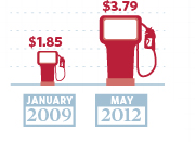
He sent me this one this morning, and while it’s a little sparse, the bottom right hand corner caught my eye:

Now, I have no idea how much was given to Solyndra, or how many jobs wind energy has left, but I do know a thing or two about gas prices and infographic figures.

First, those gas pumps are totally deceptive. $3.79 is almost exactly 2 times $1.85.   Fine.  However, let’s look closely at those gas pumps:

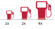
I pulled out the ruler when I cropped the photo, and confirmed my suspicions.  The larger pump in the picture doubles both the height and the width of the first pump.  That’s not twice as big….that’s four times as big.  I’m sure they’d defend it by pointing to the dashed lines in the background and saying only the height was supposed to be reflective, but it’s still deceptive.  Curious what a gas pump actually twice as big would look like?  Here you go….original low price on the left, original “double” price on the right, actual double in the middle.

Graphics aside, let’s look at the numbers.

2009 was just not that long ago, and I know that $1.85 was quite the anomalous price at the time.  I’ve seen that stat more than once recently, and I have been annoyed by it every time.  Tonight, I decided to check my memory on it, and see if that dip really was the aberration I remember it being.  Don’t remember either?  Here’s the graph of average gas prices since 1978, per the BLS generator:

That dip towards the end there with the arrow?  That hit right as Obama was taking office.  In July of 2008, gas was an average of  $4.15 per gallon.  By January of 2009, it was $1.84.    I have not a clue why that drop happened, but I do know that to treat that $1.85 number as though it was standard at the time is a misrepresentation.

You can see this a bit better if you isolate George W Bush’s presidency:

Now, you could accurately say that George Bush took office with gas prices at $1.53 and left with them at $1.74….but clearly that would ignore a whole lot of data in between.  
Now here’s the averages and standard deviations for each term of the presidencies:
GWB – 1st term GWB – 2nd term BHO – current term
Average Gas Price 1.63 2.78 2.99
Standard Deviation 0.22 0.56 0.56
Now, none of this adjusted for inflation.  By adjusting the yearly averages to 2010 dollars, I got the second term of GWB to $2.99, and the current term for BHO to $3.00.  
You don’t have to like Barack Obama, and you certainly don’t have to like gas prices.  No matter what your political affiliation, I think we can all agree on one thing: ALWAYS beware of infographics.

Who represents you best?

Another day, another infographic:
Via: TakePart.com

 Sigh. It’s an election year, so I know I’m going to be seeing a lot of these types of things and I should just get over it but…I can’t.

I really dislike this one, because while the data may be good (I haven’t checked it), I think the premise is all wrong and perpetuates faulty ideas.

Congress is a nationally governing body that is split up by state.  Thus, even if Congress was perfectly representative on a state to state basis, it would still very likely not look like the USA as a whole.  

For example, let’s take Asian Americans and Pacific Islanders.  According to the census bureau, 51% of this demographic lives in just 3 states:  California, New York and Hawaii. Nine states pull fewer than 1% of their population from this demographic:  Alabama, Kentucky, Mississippi, West Virginia, North Dakota and South Dakota, Montana, Wyoming and Maine.  4.2% may be the national average, but Hawaii is 58% Asian, and West Virginia is 0.7% Asian.  For one, it would be ethnically representative to have at least half of their reps be Asian every year, for the other it’s statistically unlikely to happen.

If you wanted a really impressive infographic, you’d take each state’s individual ethnic breakdown and cross reference it with how many representatives they had in Congress to figure out what a representative sample should be.  Adding those up would give you the totals for racial diversity when judged on a state level, not a national level.

Of course, that’s only the racial numbers, though the same could apply to the religion questions.  This doesn’t work for the gender disparity…gender ratios are pretty close to 50/50 (Alaska has the highest percentage of men, Mississippi has the lowest).  I think that’s a more complex issue, since you have to take in to account the number of women desiring to run for office (lower than men), and then the counterargument that fewer women want to run because they believe they’re less likely to win or more likely to be crticized.  It’s a tough call how many women there should be to be truly representative since both sides can argue the data.

The income, age, and education numbers I’d argue are all due to the nature of the job.  Campaigning is expensive, and neither Representative nor Senator are not exactly entry level jobs.

As the comments from yesterday’s post showed,  one of the least representative parts of Congress is profession.  Lawyers make up 0.38% of the population, and yet 222 members of Congress have law degrees (38% of the House, 55% of the Senate).  That seems highly unrepresentative right there.

At the end of the day, we vote for people who represent our state, not necessarily our gender, religion or race.  In Massachusetts, our current Senate race is between a 52 year old white male lawyer and a 62 year old white female lawyer. The biggest difference demographically in my eyes?  One has lived in Massachusetts for decades, and the other….lived here long enough to qualify to run.  No one’s going make a pretty picture out of that factor, but it’s pretty important when it comes to getting adequately represented.

Are Republicans Stupid?

One of my favorite things about blogging is it’s potential to actually change the way I personally think about things.  I don’t mean just through the comments section, though that is immensely helpful, but more so through the process of researching, writing, posting and following up.  A few posts on one topic, and suddenly I find myself passionate on topics that had previously been mere blips on my radar.  God bless the internet.

All that is to say, a month ago I didn’t really care what people said about politics and science.  Sure, in my own blog rules, rule number 2 said I would stay non-partisan:

I will attempt to remain non-partisan. I have political opinions.  Lots of them.  But really, I’m not here to try to go after one party or another.  They both fall victim to bad data, and lots of people do it outside of politics too.  Lots of smart people have political blogs, and I like reading them…I just don’t feel I’d be a good person to run one.  My point is not to change people’s minds about issues, but to at least trip the warning light that they may be supporting themselves with crap. 

Even so, if someone had casually made the comment that Republicans were anti-science, I probably would have let it go.  After all, I spent most of my pre-adulthood years in a Baptist school that had plenty of Republican voting ignorants to color my view.

But…..then I did this post.
And this one.
And of course this one.

And now I don’t feel those comments are quite as innocuous as I once did.

My feelings on this were backed up by this article from Forbes magazine (where this posts title came from), which I really really recommend if you have the time.

I’m not going back on my non-partisan premise, but as Mr Entine so eloquently posits, one party laying claim to “science” does nobody any good.  Science never fares well when put in the hands of politicians (does anything really?) and giving one party the moral upper hand in a subject as broad as “science” can cause damaging oversights.

To be honest, I don’t know which party is more “pro-science”.  The data required to prove that one way or the other would require compiling a complete list of scientific topics, ranking them in order of possible impact to both people and the world at large, ranking the conclusiveness of the data, and conducting public opinion polls broken down by party and controlled for race, class and gender.  That’s an enormous amount of work, and nobody has done it.

Thus, until further research is done, I will stick with the following conclusions:

  1. Politicians will exploit everything they can if they think it will get them more votes
  2. Ditto for journalists (sub “readers” for “votes”)
  3. Saying you’re “pro-science” is not the only requirement for being “pro-science”
  4. Increasing the general level of knowledge around research methods, data gathering and statistical analysis is probably a good thing
Seriously though, read the Forbes article.  

Hey, at least someone’s thinking

Best idea I’ve seen all day….people taking Congress to task for having no system for vetting scientific testimony.  (H/T to Maggie’s Farm)

Apparently what sent them over the edge was when a scientist misquoted his own paper during testimony,  skewing his own research.  Yikes.

One of the authors website is here….haven’t had time to look around much.

Stand Back! I’m going to try SCIENCE!

Today I discovered that my favorite webcomic (xkcd.com) actually has a special comic up if you check it from my employer’s server.  Turns out the artist’s wife is a patient, doing well, and he wanted to show some love.  This post is thus titled for this shirt, which would make an awesome Christmas present for me, even in April.

Anyway, this weekend I saw this story with the headline “Study: Conservatives’ Trust In Science At Record Low”.

My first thought on seeing this was that the word “science” is a loaded word.  I mean, I’m as much a science geek as anyone.  Math’s my favorite, but science will always be a close second.  But do I trust science? I’m not sure.  Something really bothered me about that question, but I couldn’t quite put my finger on it until I read this post on the study from First Things today.  

My love of science makes me a skeptic.  I makes me question relentlessly and then continuously revisit to figure what got left out.  I don’t trust science because not trusting your assumptions is science done right.  If we could all trust our assumptions, what would we need science for?  This is the problem with vague questions and loaded words.  Much like the discussion in the comments section of this post where several commenters weighed in on the word “delegate” in relation to household tasks, it’s clear that people will interpret the phrase “trust science” in many different ways.

Some might say it means the scientific method, scientists, science as a career, science’s role in the world, or something else not springing to mind.  Given the vagueness of the question though, I would have a hard time actually calling anyone’s interpretation wrong.  Mine is based on my own bias, but I would wager everyone’s is.  So isn’t this survey more about how we’re defining a phrase than about anything else?

I thought my annoyance was going to end there, I really did.

Then I looked at the graph with the story, and had no choice but to get annoyed all over again.

That’s what I get for just reading headlines.

So over the course of this survey, moderates have consistently trusted science less than conservatives for all but four data points?  Why didn’t this get mentioned?  I found the original study and took a quick look for the breakdown: 34% self identified as conservative, 39% as moderate, and 27% as liberal.  So 73% of the population has shown a significant drop off in “trust of science” and yet they’re somehow portrayed as the outliers?  Science and technology have changed almost unimaginably since 1974, and yet liberal’s opinions about all that haven’t changed*?  Does that strike anyone else as the more salient feature here?

*Technically this may not be true.  I don’t know what the self identified proportions were in 1974, so it could be a self-identification shift.  Still.  This might be that media bias everyone’s always talking about.

It’s not the question, it’s how you ask it

Data gathering is a lot harder than most people imagine.  It’s an interesting exercise to take a study and prior to reading it start asking yourself “how would I, if pressed, get the data they claim to have gotten?”.  It’s amazing how many fall apart quickly when you realize how bad the source data is.

I face this all the time at work.  The simplest questions…what is our demand for transplants? can be a never ending labyrinth of opinion, observation, anecdote, and data….all completely enmeshed.  I spend much of my day trying to untangle these strings, and I never underestimate how difficult getting a simple answer can be.

Factcheck.org ran a great piece today illustrating this challenge.  In a post titled “How Many Would Repeal Obamacare?”  they review 4 different surveys that all try to get to the same number: how many people think healthcare reform should be repealed?

It’s a great article that covers sampling practices, question phrasing, date of the poll, and history of the polling organization.

If you looking at the numbers, it shows up pretty quickly that when given dichotomous choices (repeal/keep), people often look like they gave a strong opinion.  In the polls where more moderate answers are given (“it may need small modifications, but we should see how it works), people trend towards that answer.

The phrasing was extremely intriguing though:
“Turning to the health care law passed last year, what is your opinion of the law?”
“If a Republican is elected president in this November’s election, would you strongly favor, favor, oppose, or strongly oppose him repealing the healthcare law when he takes office?”
“Do you think Congress should try to repeal the health care law, or should they let it stand?”

In one, the question focuses on personal opinion, in the next the focus is the presidency, in the third it’s Congress.  All of this for a law that most Americans have yet to feel the effects of in any practical way.

Of course this is not to say that a public opinion poll (or 4) makes one side right or wrong. If constitutionality or effectiveness are your concern, nothing here addresses either.  I am enjoying it immensely for the educational value though, and kind of wishing I was teaching a class so I could use this as an example.  Those of us in Massachusetts do have the luxury of sitting back and just sort of pondering all of this….as this has been our world for 7 years now.

That reminds me….were these samples controlled for that????