Welcome to Grade the Infographic, which is pretty much exactly what it sounds like. I have three criteria I’m looking for in my grading: source of data, accuracy of data and accuracy of visuals. While some design choices annoy me, I’m not a designer, couldn’t do any better, and won’t be commenting unless I think it’s skewing the perception of the information. I’m really only focused with what’s on the graphic, so I also don’t assess stats that maybe should have been included but weren’t. If you’d like to submit an infographic for grading, go here. If you’d like to protest a grade for yourself or someone else, feel free to do so in the comments or on the feedback page.
When I first started doing any stats/data blogging, an unexpected thing happened: people started sending me their infographics. Despite my repeated assertions that I actually hated infographics, companies seemed to troll the web attempting to find people to post their infographics on various topics. It gets a little weird because they’re frequently not related to my topics, but apparently I’m not the only blogger who has had this problem. Long story short, I actually got sent this infographic back in 2013. 
Click to enlarge.
Since one of my favorite readers is a teacher (hi Erin!) who also shares my displeasure with infographics, I thought I’d start off by grading this one. It’s pretty long so I chopped it up in to pieces. Because I’m a petty despot and all, I actually start with the end. Grading the reference section first is a bit backwards, but it gives me an idea of how much work I’m going to have to do to figure out the accuracy of the rest of it.

Oooh, not off to a great start. The maximum grade you can get from me if you don’t give me a source I can track is in the B range. Giving a website is good, but when it’s as big as the National Center for Education Statistics, it’s also nearly useless.

Okay, this is good! That’s a decent selection of countries. Not sure if there was a particular reason, but there doesn’t appear to be any cherry picking going on.

Hmmm….this got a little funky. I couldn’t actually locate this source data, though I did locate some from the World Bank that backed up the elementary school numbers. I’m guessing this is real data, but saddened they didn’t let me know where they got it! If you do the work, get the credit! Also, the 4 year gap confused me. Where are 2001 – 2004? It doesn’t look like it particularly matters for this trend, so I only subtracted 2 points for not indicating the gap or better spacing the years.
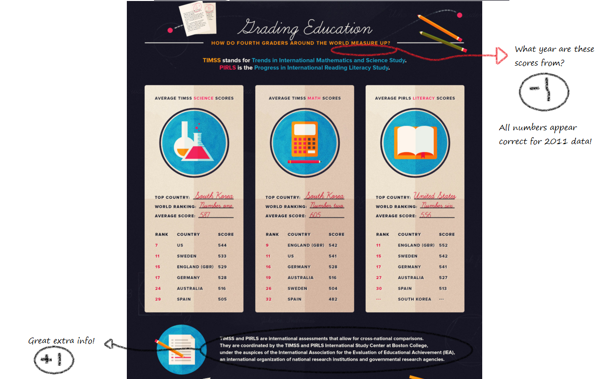
This part broke even. I was hoping for a year (source again!) but did get some good context about what kind of test this was. That was really helpful, so it got an extra point. The data’s all accurate and it’s from 2011.
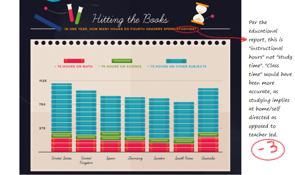
Oooh, now here’s a bit of a snafu. The graphic said “hours spent studying” which surprised me because that’s 3 hours/day for the US kids. When I found the source data (page 114) it turns out those are actually classroom hours. That made more sense. I docked three points because I don’t think that’s what most people mean by “time spent studying”. It’s not totally wrong, but not totally accurate either. Class hours are normally referred to as such. I felt there was a bit of wiggle room on the definition of “study” though, so I didn’t know it down the 5 points I was going to.
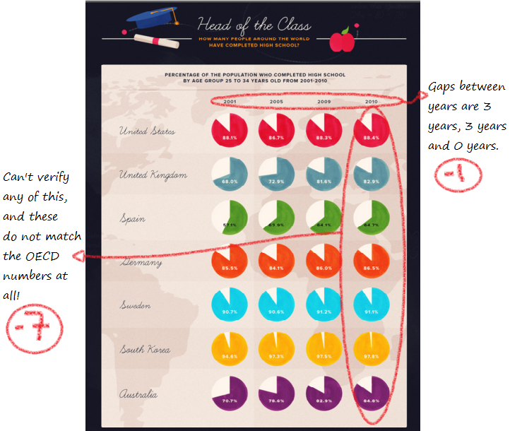
Oof. That’s not good. Where did these numbers come from? I went to the OECD report to check out the 2010 numbers, and they were WAY off.
| Country | Infographic 2010 number | OECD 2010 number |
|---|---|---|
| United States | 88.4% | 77% |
| United Kingdom | 82.9% | 91% |
| Spain | 64.7% | 80% |
| Germany | 86.5% | 87% |
| Sweden | 91.1% | 75% |
| South Korea | 91.1% | 92% |
| Australia | 84.8% | No numbers |
Now graduation rates have lots of different ways of being calculated (mostly due to differences in what counts as “secondary education”, so it’s plausible those numbers came from somewhere. This is the risk you run when you don’t include sources.

And there you have it. Cite your sources!

*checks “make it to Favorite Reader level in Bethany’s blog” off bucket list*
Love this! Also, this is totally something I would do with fellow nerd friends for fun. No big surprise there, though. My college suitemate & I used to write complicated sentences on the other’s hall whiteboard as an ongoing sentence diagramming challenge.
LikeLike
Any time you want to have a “grade an infographic” party, count me in.
LikeLike
You touched on the subject of why these seven are in the same group, but I would hit it harder. The other six are monoracial, and nearly monoethnic, the US is not. Our automatic picture – the personal infographic in our brains, if you will – is of US students as white, because they are the mode.
LikeLike
I probably would have gone harder if I’d seen a definitive agenda, but I really didn’t feel like there was one. I may take a point off in the future though. GOVERN YOURSELVES ACCORDINGLY.
LikeLike