People: Our Own Worst Enemy (Part 8)

Note: This is part 8 in a series for high school students about reading and interpreting science on the internet. Read the intro and get the index here or go back to Part 7 here.

I love this part of the talk because I get to present my absolute favorite study of all time. Up until now I’ve mostly been covering things about how other people are trying to fool you to get them to your side, but now I’m going to wade in to how we seek to fool ourselves.  That’s why I’m calling this part:

Biased Interpretations and Motivated Reasoning

Okay, so what’s the problem here?

The problem here my friend, is you. And me. Well, all of us really…..especially if you’re smart.  The unfortunate truth is that for all the brain power we put towards things, our application of that brain power can vary tremendously when we’re evaluating information that we like, that we’re neutral towards, or that we don’t like.  How tremendously? Well, in 2013 the working paper “Motivated Numeracy and Enlightened Self-Government“, some researchers decided to ask if people with a rash got better if they used a new skin cream.  They provided this data:

Pt8matrix

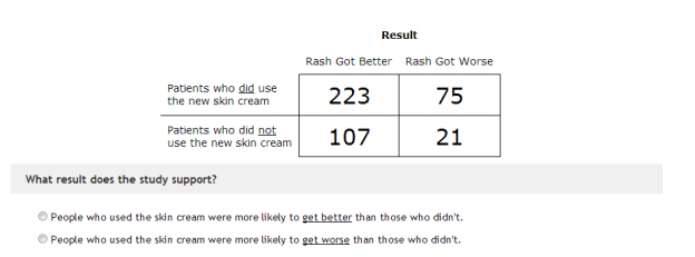
The trick here is that you are comparing absolute value to proportion.  More people got better in the “use the skin cream” group, but more people also got worse. The proportion is better for those who did not use the cream (about 5:1) as opposed to those who did use it (about 3:1). This is a classic math skills problem, because you have to really think through what question you’re trying to answer before you calculate, and what you are actually comparing. Baseline about 40% of people in the study got this right.

What the researchers did next was really cool. For some participants, they took the original problem, kept the numbers the same, but changed “patients” to “cities”, “skin cream” to “strict gun control laws” and “rash” to “crime”.  They also flipped the outcome around for both problems, so participants had one of four possible questions.  In one the skin cream worked, in one it didn’t, in one strict gun control worked, in one it didn’t. The numbers in the matrix remained the same, but the words around them flipped.  They also asked people their political party and a bunch of other math questions to get a sense of their overall mathematical ability. Here’s how people did when they were assessing rashes and skin cream:

rashgraph

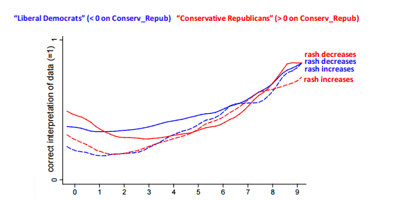
Pretty much what we’d expect. Regardless of political party, and regardless of the outcome of the question, people with better math skills did better1.

Now check out what happens when people were shown the same numbers but believed they were working out a problem about the effectiveness of gun control legislation:

gunproblem

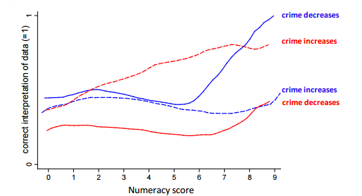
Look at the end of that graph there, where we see the people with a high mathematical ability. If using their brain power got them an answer that they liked politically, the did it. However, when the answer didn’t fit what they liked politically, they were no better than those with very little skill at getting the right answer.  Your intellectual capacity does NOT make you less likely to make an error….it simply makes you more likely to be a hypocrite about your errors.  Yikes.

Okay, so what kind of things should we be looking out for?

Well, this sort of thing is most common on debates where strong ethical or moral stances intersect with science or statistics. You’ll frequently see people discussing various issues, then letting out a sigh and saying “I don’t know why other people won’t just do their research!”. The problem is that if you believe something strongly already, you’re quite likely to think any research that agrees with you is more compelling than it actually is. On the other hand, research that disagrees with you will look less compelling than it may be.

This isn’t just a problem for the hoi polloi either. I just wrote earlier this week about two research groups who were accusing the other of choosing statistical methods that would support their own pet conclusions. We all do it, we just see it more clearly when it’s those we disagree with.

Why do we fall for this stuff?

Oh so many reasons.  In fact Carol Tarvis has written an excellent book about this (Mistakes Were Made (but Not by Me): Why We Justify Foolish Beliefs, Bad Decisions, and Hurtful Acts) that should be required reading for everyone. In most cases though it’s pretty simple: we like to believe that all of our beliefs are perfectly well reasoned and that all the facts back us up. When something challenges that assumption, we get defensive and stop thinking clearly.  There’s also some evidence that the internet may be making this worse by giving us access to other people who will support our beliefs and stop us from reconsidering our stances when challenged.

In fact, researchers have found that the stronger your stance towards something, the more likely you are to hold simplistic beliefs about it (ie “there are only two types of people, those who agree with me and those who don’t”).

An amusing irony: the paper I cited in that last paragraph was widely reported on because it showed evidence that liberals are as bad about this as conservatives. That may not surprise most of you, but in the overwhelmingly liberal field of social psychology this finding was pretty unusual. Apparently when your field is >95% liberal, you mostly find that bias, dogmatism and simplistic thinking are conservative problems. Probably just a coincidence.

So what can we do about it?

Richard Feynman said it best:

If you want to see this in action, watch your enemy. If you want to really make a difference, watch yourself.

Well that got heavy.  See you next week for Part 9!

Read Part 9 here.

1. You’ll note this is not entirely true at the lowest end. My guess is if you drop below a certain level of mathematical ability, guessing is your best bet.


Grading an Education Infographic

Welcome to Grade the Infographic, which is pretty much exactly what it sounds like. I have three criteria I’m looking for in my grading: source of data, accuracy of data and accuracy of visuals. While some design choices annoy me, I’m not a designer, couldn’t do any better, and won’t be commenting unless I think it’s skewing the perception of the information. I’m really only focused with what’s on the graphic, so I also don’t assess stats that maybe should have been included but weren’t.  If you’d like to submit an infographic for grading, go here. If you’d like to protest a grade for yourself or someone else, feel free to do so in the comments or on the feedback page.

When I first started doing any stats/data blogging, an unexpected thing happened: people started sending me their infographics.  Despite my repeated assertions that I actually hated infographics, companies seemed to troll the web attempting to find people to post their infographics on various topics.  It gets a little weird because they’re frequently not related to my topics, but apparently I’m not the only blogger who has had this problem.  Long story short, I actually got sent this infographic back in 2013. 

Click to enlarge.

Since one of my favorite readers is a teacher (hi Erin!) who also shares my displeasure with infographics, I thought I’d start off by grading this one. It’s pretty long so I chopped it up in to pieces.  Because I’m a petty despot and all, I actually start with the end. Grading the reference section first is a bit backwards, but it gives me an idea of how much work I’m going to have to do to figure out the accuracy of the rest of it.

Pt1

Oooh, not off to a great start.  The maximum grade you can get from me if you don’t give me a source I can track is in the B range. Giving a website is good, but when it’s as big as the National Center for Education Statistics, it’s also nearly useless.

Pt2

Okay, this is good! That’s a decent selection of countries. Not sure if there was a particular reason, but there doesn’t appear to be any cherry picking going on.

Pt3

Hmmm….this got a little funky. I couldn’t actually locate this source data, though I did locate some from the World Bank that backed up the elementary school numbers. I’m guessing this is real data, but saddened they didn’t let me know where they got it! If you do the work, get the credit! Also, the 4 year gap confused me. Where are 2001 – 2004? It doesn’t look like it particularly matters for this trend, so I only subtracted 2 points for not indicating the gap or better spacing the years.

Pt4

This part broke even.  I was hoping for a year (source again!) but did get some good context about what kind of test this was. That was really helpful, so it got an extra point. The data’s all accurate and it’s from 2011.

Pt5

Oooh, now here’s a bit of a snafu. The graphic said “hours spent studying” which surprised me because that’s 3 hours/day for the US kids. When I found the source data (page 114) it turns out those are actually classroom hours. That made more sense. I docked three points because I don’t think that’s what most people mean by “time spent studying”. It’s not totally wrong, but not totally accurate either. Class hours are normally referred to as such. I felt there was a bit of wiggle room on the definition of “study” though, so I didn’t know it down the 5 points I was going to.

Pt6

Oof. That’s not good. Where did these numbers come from? I went to the OECD report to check out the 2010 numbers, and they were WAY off.

Country Infographic 2010 number OECD 2010 number
United States 88.4% 77%
United Kingdom 82.9% 91%
Spain 64.7% 80%
Germany 86.5% 87%
Sweden 91.1% 75%
South Korea 91.1% 92%
Australia 84.8% No numbers

Now graduation rates have lots of different ways of being calculated (mostly due to differences in what counts as “secondary education”, so it’s plausible those numbers came from somewhere. This is the risk you run when you don’t include sources.

Finalgrade

And there you have it.  Cite your sources!


Women, Ovulation and Voting in 2016

Welcome to “From the Archives” where I revisit old posts  to see where the science (or my thinking) has gone since I put them up originally.

Back in good old October of 2012, it was an election year and I was getting irritated1. First, I was being bombarded with Elizabeth Warren vs Scott Brown for Senate ads, and then I was confronted with this study:The fluctuating female vote: politics, religion, and the ovulatory cycle (Durante, et al), which purported to show that women’s political and religious beliefs varied wildly around their monthly cycle, but in different ways if they were married or single. For single women they claimed that being fertile caused them to get more liberal and less religious, because they had more liberal attitudes toward sex. For married women, being fertile made them more conservative and religious so they could compensate for their urge to cheat.  The swing was wide too: about 20%.  Of note, the study never actually observed any women changing their vote, but compared two groups of women to find the differences. The study got a lot of attention because CNN initially put it up, then took it back down when people complained.  I wrote two posts about this, one irritated and ranty, and one pointing to some more technical issues I had.

With a new election coming around, I was thinking about this paper and wanted to take a look at where it had gone since then. I knew that Andrew Gelman had ultimately taken shots at the study for reporting an implausibly large effect2 and potentially collecting lots of data/comparisons and only publishing some of them, so I was curious how this study had subsequently fared.

Well, there are updates!  First, in 2014, a different group tried to replicate their results in a paper called  Women Can Keep the Vote: No Evidence That Hormonal Changes During the Menstrual Cycle Impact Political and Religious Beliefs by Harris and Mickes.  This paper recruited a different group, but essentially recreated much of the analysis of the original paper with one major addition. They conducted their survey prior to the 2012 election AND after, to see predicted voting behavior vs actual voting behavior.  A few findings:

  1. The first paper (Durante et al) had found that fiscal policy beliefs didn’t change for women, but social policy beliefs did change around ovulation. The second paper (Harris and Mickes) failed to replicate this finding, and also failed to detect any change in religious beliefs.
  2. In the second paper, married women had a different stated preference for Obama (high when low feritility, lower when high fertility), but that difference went away when you looked at how they actually voted. For single women, it was actually the opposite. They reported the same preference level for Obama regardless of fertility, but voted differently based on the time of the month.
  3. The original Durante study had taken some heat for how they assessed fertility level in their work. There were concerns that self reported fertility level was so likely to be inaccurate that it would render any conclusions void. I was interested to see that Harris and Mickes clarified that the Durante paper actually didn’t accurately describe how they did fertility assessments in the original paper, and that they had both ultimately used the same method. This was supposed to be in the supplementary material, but I couldn’t find a copy of that free online. It’s an interesting footnote.
  4. A reviewer asked them to combine the pre and post election data to see if they could find a fertility/relationship interaction effect. When pre and post election data were kept separate, there was no effect. When they were combined, there was.

Point #4 is where things got a little interesting. The authors of the Harris and Mickes study said combining their data was not valid, but Durante et al hit back and said “why not?”. There’s an interesting piece of stat/research geekery about the dispute here, but the TL;DR version is that this could be considered a partial replication or a failure to replicate, depending on your statistical strategy. Unfortunately this is one of those areas where you can get some legitimate concern that a person’s judgement calls are being shaded by their view of the outcome. Since we don’t know what either researchers original plan was, we don’t know if either one modified their strategy based on results. Additionally the “is it valid to combine these data sets” question is a good one, and would be open for discussion even if we were discussing something totally innocuous. The political nature of the discussion intensifies the debate, but it didn’t create it.

Fast forward now to 2015, when yet another study was published: Menstrual Cycle Phase Does Not Predict Political Conservatism. This study was done using data ALSO from the 2012 election cycle3, but with a few further changes.  The highlights:

  1. This study, by Scott and Pound, addressed some of the “how do you measure fertility when you can’t test” concerns by asking about medical conditions that might influence fertility to screen out women whose self reporting might be less accurate. They also ranked fertility on a continuum as opposed to the dichotomous “high” and “low”. This should have made their assessment more accurate.
  2. The other two studies both asked for voting in terms of Romney vs Obama. Scott and Pound were concerned that this might capture a personal preference change that was more about Obama and Romney as people rather than a political change. They measured both self-reported political leanings and a “moral foundations” test and came up with an overall “conservatism” rank, then tracked that with chances of conception.
  3. They controlled for age, number of children, and other sociological factors.

So overall, what did this show? Well, basically, political philosophy doesn’t vary much no matter where a woman is in her cycle.

The authors have a pretty interesting discussion at the end about the problems with Mechanical Turk (where all three studies recruited their participants in the same few months), the differences of measuring person preference (Obama vs Romney) vs political preference (Republican vs Democrat), and some statistical analysis problems.

So what do I think now?

First off, I’ve realized that getting all ranty when someone brings up women’s hormones effecting things may be counterproductive. Lesson learned.

More seriously though, I find the hypothesis that our preferences for individuals may change with hormonal changes more compelling than the hypothesis that our overall philosophy of religion or government changes with our hormones. The first simply seems more plausible to me. In a tight presidential election though, this may be hopelessly confounded by the candidates actual behavior. It’s pretty well known that single women voted overwhelmingly for Obama, and that Romney had a better chance to capture the votes of married women. Candidates know this and can play to it, so if a candidate makes a statement playing to their base, you may see shifts that have nothing to do with hormones of the voters but are an actual reaction to real time statements. This may be a case where research in to the hypothetical (i.e. made up candidate A vs B) may be helpful.

The discussions on fertility measures and statistical analysis were interesting and a good insight in to how much study conclusions can change based on how we define particular metrics.  I was happy to see that both follow up papers hammered on clear and standard definitions for “fertility”. If that is one of  the primary metrics you are assessing, then the utmost care must be taken to assess it accurately, or else the signal to noise ratio can go through the roof.

Do I still think CNN should have taken the story down? Yes….but just as much as I believe that they should take most sensational new social/psych research stories down. If you follow the research for just two more papers, you see the conclusion go from broad (women change their social, political and religious views and votes based on fertility!) to much narrower (women may in some cases change their preference or voting patterns for particular candidates based on fertility, but their religious and political beliefs do not appear to change regardless). I’ll be interested to see if anyone tries to replicate this with the 2016 election, and if so what the conclusions are.

This concludes your trip down memory lane!
1. Gee, this is sounding familiar
2. This point was really interesting. He pointed out that around elections, pollsters are pretty obsessive about tracking things, and short of a major scandal breaking literally NOTHING causes a rapid 20 point swing. The idea that swings that large were happening regularly and everyone had missed it seemed implausible to him. Statistically of course, the authors were only testing that there was a difference at all, not what it was….but the large effect should possibly have given them pause. It would be like finding that ovulation made women spend twice as much on buying a house. People don’t change THAT dramatically, and if you find that they do you may want to rerun the numbers.
3. Okay, so I can’t be the only one noticing at this point that this means 3 different studies all recruited around 1000 American women not on birth control, not pregnant, not recently pregnant or breastfeeding but of child bearing age, interested in participating in a study on politics, all at the same time and all through Amazon’s Mechanical Turk. Has anyone asked the authors to compare how much of their sample was actually the same women? Does Mechanical Turk have any barriers for this? Do we care? Oh! Yes, turns out this is actually a bit of a problem.