I am rather notoriously skeptical of infographics, but I found this one from Wait But Why today and it’s completely fascinating. It’s a comparison of how many people die/have died by various causes, some natural, some not so natural.
The whole thing is huge, but here’s a taste:
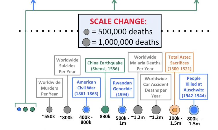
I’ve been perusing this for about half an hour now, and I’ve learned about the Masada suicides, the Shensi Earthquake, and the Mao Era in China. It’s not a definitive list, but a really interesting one!
