In honor of Halloween, please enjoy the only stats based/horror 80s music video I know of:
From 3-2-1 Contact, one of the more formative shows of my childhood.
In honor of Halloween, please enjoy the only stats based/horror 80s music video I know of:
From 3-2-1 Contact, one of the more formative shows of my childhood.
I’ve been thinking a lot about the law and evidence this week, for 3 reasons:
First, this article my lawyer father sent me about the Supreme Court’s aversion to math. It reviews a case about gerrymandering I’ve mentioned before, and the attempts of statisticians/computer guys to convince the court that their mathematical models are worth using. While the case hasn’t been decided yet, some researchers were fairly annoyed at how reflexively some of the justices dismissed the models presented, and their invocation of the “gobbledygook” doctrine.
Second was this article I stumbled on that discussed an effort to fact-check supreme court decisions, and found a rather alarming number of them contain factual errors. This one was concerning for two reasons: some of the errors actually appeared to be related to the ultimate decision and some of the errors appear to have come from the Justices doing their own research.
Finally, this article about yet another evidence scandal in my state. Apparently our state lab has been systematically withholding evidence of failed breathalyzer calibrations, calling in to question hundreds of DUI convictions. This is not an aberration…for those of you not from around here, Massachusetts has been on a bad run with our state crime/forensics lab. This is our 3rd major scandal in the past few years, and we now have the dubious distinction of being cited in every report about the problems with forensics.
This got me thinking about a few things:
I am thinking there’s a presentation in here somewhere. If you have any more good articles, send them my way!
Yes, another short post. There’s a longer one coming Wednesday I promise.
A friend (Ben, of the Pop Science series) put up a challenge on Twitter this week, where he promised that if you replied to his Tweet he would introduce you like you were a character in a novel. I thought you all would appreciate the one he came up with for me;
Now there’s an intro I can get behind. The only thing I’m trying to figure out what genre of book it is. I got kind of a Western vibe, but since I can’t think of a Western plot that involves numbers, I’m thinking space western? Open to other thoughts on this.
Related: when I’ve had the “who would die first in a horror movie” discussion with friends, it’s pretty much been determined that I’m the pessimist who’s been warning everyone of the danger all along. My death is almost certainly ironic/inevitable. Kind of a cross between a Cassandra and a Harbinger of Impending Doom. Sounds about right.
Not a new comic (source here), but the problem with population maps doesn’t seem to be ebbing:

Maps don’t often get included on “deceptive graphs” lists, but it’s good to remember that they can be tinkered with just as easily as any other data presentation method.
Well folks, it’s another Sunday in October and another day for me to rue how cursed my fantasy football team is this year. Both my QBs are hurt, I’ve had two players with season ending injuries, and I am getting to that level of irritated where I barely want to watch anymore.
On the plus side, I’ve just discovered that the NFL/National Anthem protests are providing me with a few new interesting statistical anecdotes.
First up, we have this interesting brand survey that shows the NFL is now one of the most divisive brands in the US. Here “divisive” really means “politically discordant”…..basically the two parties have very different current favorability ratings for them. To give you a flavor, they were more divisive than the Huffington Post, but less divisive than Fox News.
This ranking system is kind of interesting, but the article points out how unstable it is for certain brands. Getting in the headlines may give you a temporary hit, but they are starting to gather evidence that the long term impact of those hits is less than it used to be. For example, after bad press this past spring, United Airlines is now not viewed any differently by consumers than it was before the incident. It would be interesting to add some sort of weighting factor to “divisive” brands to account for temporary divisiveness vs long term.
Next up was this article, that reviewed public perception of the NFL protests based on how the polling question was asked. As is often seen with contentious issues, there is a 10 point swing when we change the wording. In this case, including the reason for the protest in the question garners more support for the cause vs a question that just mentions the protest. To note: the discrepancy came from those who support the protests, the % who opposed stayed steady regardless. This backs up my general theory that most people are only half paying attention most of the time anyway.
They also have some interesting poll numbers that show that most people support broad issues (like being against police brutality) more than they support specific actions (like kneeling during the anthem to protest police brutality), which is another way certain polls can skew the results.
It’s still amazing to me how small differences in wording can change the results of polling, and how under-reported this effect often is, and it is still stunning to me that all of my obsession with stats and details never seems to translate in to a good fantasy football team. Sigh.
I continue to be swamped with work, my capstone project, and a bad fantasy football team. En lieu of a real post, please accept this cartoon-I-can’t-find-a-source-for about social stigma among bar charts:

Kinda catty, aren’t they?
I’m swamped with thesis writing this weekend, but I saw this on Twitter this week and thought it was worth a repost:

It’s from a series from WNYC, and it was actually originally posted over 4 years ago. They have a whole series of these, which I have not looked through, but it would be interesting to click on them every time something bad happens and see how the advice holds up.
My son (age 5) has developed the most fascinating (for both of us) new hobby of creating his own Lego superheroes by rearranging the ones that he has. He’s spent hours on this recently, meticulously dismantling them and looking for exactly the right piece to create the character he wants. Behold, a few recent versions:
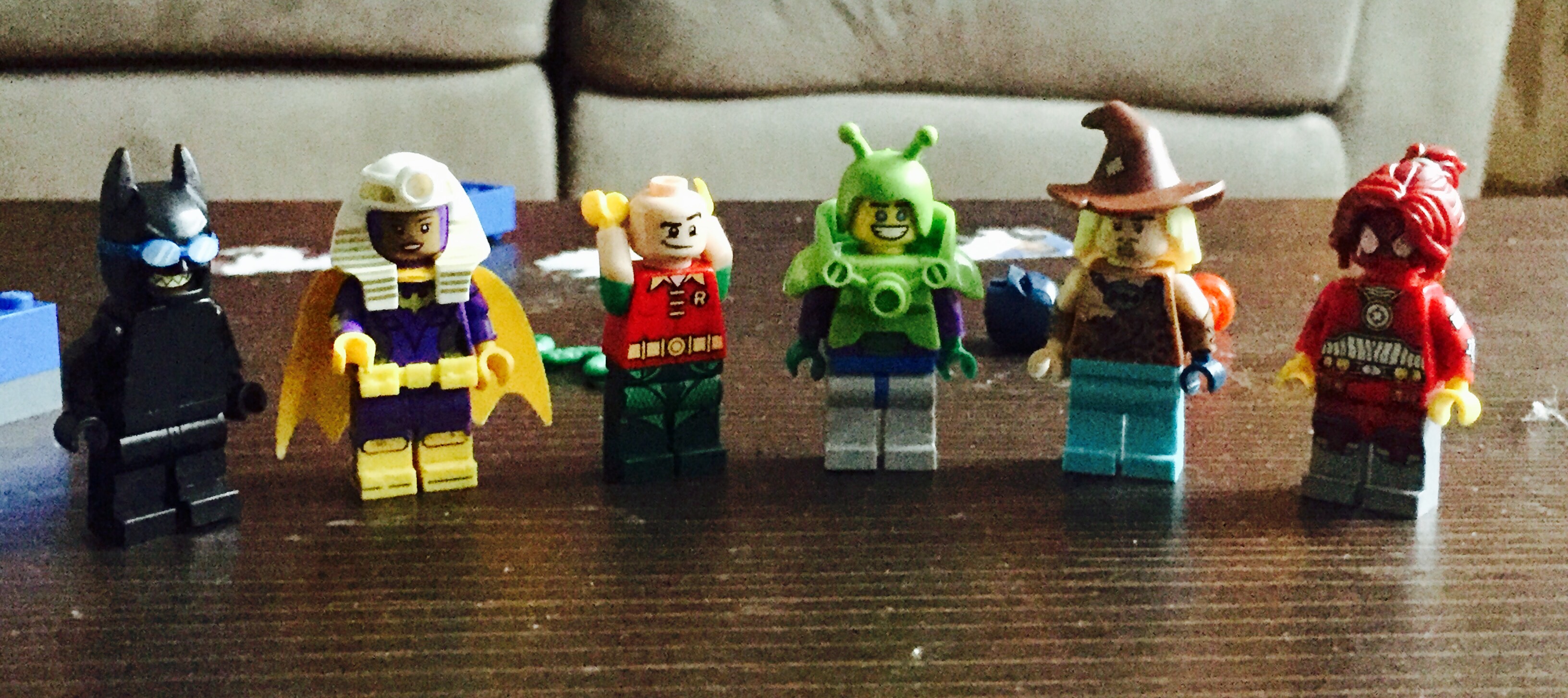
He refused to tell me their names and got shy when I asked, but from what I can put together it’s (from right to left): Joker in disguise, Queen Tut/Barbara Gordon, Robin ripping his pants off, Happy Bug Man, Caveman Scarecrow and Spidergirl.
Never one to let a good analogy go, I attempted to explain to him that he’s figuring out how many combinations there are for any group of Legos. For example, if we wanted to know how many unique creations we could make out of the pieces in the picture above, we could make over 70,000 unique characters. He informed me “yes, but they wouldn’t be cool guys.” The kid’s got an aesthetic.
So I tried it a different way, and used it to explain to him the difference between a permutation and a combination. If I told him he could only take 2 out of these 6 creations in the car, he has 15 different groups of two he could select. That’s a combination.
If, however, he has a friend over and I tell them they can take two creations in the car and they each get one, they now have 30 possibilities….the original 15 possibilities x 2 ways of splitting them. That’s a permutation….the order matters in addition to the picks, so the number is always higher.
Of course, they will actually just want the same one, and then we will move on to a lesson in sharing. Also, he’s 5, and he kinda just wandered off part way through permutations and then asked if he could be a baby turtle. That’s when I figured I’d move this lesson to the blog, where I was slightly less likely to get turtle related commentary as a response.
Anyway, the history of using Lego’s to illustrate mathematical concepts is actually pretty robust, and can get really interesting. For more on permutations and combinations, try here. For why stepping on a Lego hurts so much, try this:
Okay, this is going to be another one of those posts where I make up a term for something I’m seeing that annoys me. You’ve been warned.
When I was a little kid, I remember one of the first times I ever saw a buoy in the ocean. I don’t remember how old I was, but I was probably 5 or so, and I thought the buoy was actually somebody’s ball that had floated away. As the day went on, I remember being amazed that it managed to stay so close to the same spot without moving…it was far from shore (at least to a 5 year old) but somehow it never disappeared entirely. I think my Dad must have noticed me looking at it because he teased me about it for a bit, but he finally told me it was actually anchored with a chain I couldn’t see. Life lessons.
I think about that feeling sometimes when I see statistics quoted in articles with little context. It’s always something like “75% of women do x, which is more than men”, and then everyone makes comments about how great/terrible women are for awhile. 5 paragraphs down you find out that 72% of men also do x, meaning all of the previous statements were true, but are a little less meaningful in context. What initially looked like a rather interesting free floating statistic was actually tied to something bigger. It may not stop being interesting or useful, but it certainly changes the presentation a bit. In other words:
Buoy statistic: A statistic that is presented on its own as free-floating, while the context and anchoring data is hidden from initial sight.
I see buoy statistics most often when it comes to group differences. Gender, racial groups, political groups….any time you see a number with what one group does without the number for the other half, I’d get suspicious.
For example, a few years ago, a story broke that the (frequently trolling) Public Policy Polling Group had found that 30% of Republican voters supported bombing the fictional city of Agrabah from the movie Aladdin. This got some people crowing about how dumb Republicans were, but a closer read showed that 36% of Democrats opposed it. Overall, an almost identical number of each party (43% vs 45%) had an opinion about a fictional city. Now this was a poll question designed to get people to say dumb things, and the associated headlines were pure buoy statistics.
Another example was around a Github study from a few years ago that showed that women had a lower acceptance rate of their pull requests if their user name made it clear they were female (71.8% to 62.5%). Some articles ended up reporting that they got far fewer requests accepted than men, but it turns out that men actually got about 64% of their requests accepted. While it was true the drop off was bigger from gender-neutral names (men went from about 68% to about 64%), 62.5% vs 64% is not actually “far fewer”. (Note: numbers are approximate because, annoyingly, exact numbers were not released)
I’m sure there are other examples, but basically any time you get impressed by a statistic, only to feel a bit of a let down when you hear the context, you’ve hit a buoy statistic. Now, just like with buoys, these statistics are not without any use. One of the keys to this definition is that they are real statistics, just not always as free-floating as you first perceive them. Frequently they are actually the mark of something legitimately interesting, but you have to know how to take them. Context does not erase usefulness, but it can make it harder to jump to conclusions.
I mentioned a few posts ago that I’m finally (finally!) working on my final capstone project for my degree. It’s going well so far, but it struck me this weekend exactly how much my process of wading through data resembles my process of cleaning out my closets:


 Hope fervently the reduced pile size will quell my growing sense of panic.
 I mean, it seemed like a good idea at the time.


The end.
