Linguistic vs Numeric Probability

It will probably come as a surprise to absolutely no one that I grew up in the kind of household where the exact range of probabilities covered by the phrase “more likely than not” was a topic of heavy and heated debate. While the correct answer to that question is obviously 51%-60%1, I think it’s worth noting for everyone that this sort of question that actually has some scholarly resources for it.

Sherman Kent, a researcher for the CIA decided to actually poll NATO officers to see how they interpreted different statements about probability and came up with this:

Interesting that the term “probable” itself seems to cause the widest range of perceptions in this data set.

A user on reddit’s r/samplesize decided to run a similar poll and made a much prettier graph that looked like this:

The results are similar, though with some more clear outliers. Interestingly, they also took a look at what people thought certain “number words” meant, and got this:

This is some pretty interesting data for any of us who attempt to communicate probabilities to others. While it’s worth noting that people had to assign just one value rather than a range, I still think it gives some valuable insight in to how different people perceive the same word.

I also wonder if this should be used a little more often as a management tool. Looking at the variability, especially within the NATO officers, one realizes that some management teams actually do use the word “probable” to mean different things. We’ve all had that boss who used “slight chance” to mean “well, maybe” and didn’t use “almost no chance” until they were really serious. Some of the bias around certain terms may be coming from a perfectly rational interpretation of events.

Regardless, it makes a good argument for putting the numeric estimate next to the word if you are attempting to communicate in writing, just to make sure everyone’s on the same page.

1. Come at me Dad.

Using Data to Fight Data Fraud: the Carlisle Method

I’m creating a new tag for my posts “stories to check back in on”, for those times when I want to remember to see how a sensational headline played out once the dust settled.

The particular story prompting this today is the new paper “Data fabrication and other reasons for non-random sampling in 5087 randomised, controlled trials in anaesthetic and general medical journals” that is getting some press under headlines like “Dozens of recent clinical trials may contain wrong or falsified data, claims study“. The paper author (John Carlisle) is one of the people who helped expose the massive fraud by Yoshitaka Fujii, an anesthesiologist who ended up having 183 papers retracted due to fabricated results.

While his work previously focused on the work of anesthesiologists, Carlisle decided to use similar statistical techniques on a much broader group of papers. As he explains in the paper, he started to question if anesthesiology journals were retracting more papers because anesthesiologists were more likely to fabricate, or if the community was simply keeping a sharper eye out for fabrications. To test this out he examined over 5,000 papers published in both specialty anesthesia journals and major medical journals like the New England Journal of Medicine and the Journal of the American Medical Association, looking for data anomalies that might point to fraud or errors.

The method Carlisle used to do this is an interesting one. Rather than look at the primary outcomes of the papers for evidence of fabrication, he looked at the baseline variables like height and weight of the patients in the control groups vs the intervention groups. In a proper randomized control trial, they should be about the same. His statistical methods are described in depth here, but in general his calculations  focuses on the standard deviation of both populations.  The bigger the difference between the control group and the intervention group, the more likely your numbers are wrong. The math isn’t simple, but the premise is: data frauds will probably work hard to make the primary outcome realistic, but likely not pay much attention to the more boring variables. Additionally, most of us reading papers barely glance at patient height and weight, particularly the standard deviations associated with them. It’s the data fraud equivalent of a kid telling their mom they cleaned their room when really they just shoved everything in the closet….you focus on where people will look first, and ignore everything else.

This paper gets REALLY  interesting because Carlisle not only opened the closets, but he published the names (or rather the journal locations) of the studies he thinks are particularly suspect….about 90 in all or 1-2% of the total. He also mentions that some authors have multiple studies that appear to have anomalous baseline data. Given the information he provided, the journals will most certainly have to investigate and people will likely be combing over the work of those named. If you want to see at least some of the named papers, check out this post.

Now I definitely am a fan of finding and calling out data frauds, but I do have to wonder about the broad net cast here. I have not looked up the individual studies, nor do I know enough about most of the fields to know the reputations of the authors in question, but I do wonder what the explanations for the issue with the 90 trials will be. With all the care taken by Carlisle (ie setting his own p-value cutoff at < .0001) It seems likely that a large number of these will be real fraud cases, and that’s great! But it seems likely at least some will have a different explanation, and I’m not sure how many will be in each bucket. The paper itself raises these possibilities, but it will be interesting to see what proportion of the sample was innocent mistakes vs fraud.

This is an interesting data point in the whole ethics of calling BS debate. While the paper is nuanced in its conclusions and raises multiple possibilities for the data issues, it’s hard to imagine the people named won’t have a very rough couple of months. This is why I want to check back in a year to see what happened. For more interesting discussion of the ethics and possible implications, see here. Some interesting point raised there include a discussion about statute of limitations (are we going back for decades?) and how to judge trials going forward now that the method has been released to the public.

To note: Carlisle has published a sensational paper here, but he actually has a great idea about how to use this going forward. He recommends all journals should do this analysis on papers submitted or accepted for publication, so they can inquire about discrepancies with authors up front. This would make sure that innocent mistakes were caught before being published, and that possible frauds would know there were extra safeguards in place. That seems a nice balance of addressing a problem while not overreaching, and apparently has already been implemented by the journal Anaesthesia.


Evangelical Support for Trump: A Review of the Numbers

This is not a particularly new question, but a few friends and readers have asked me over the past few months about the data behind the “Evangelicals support Trump” assertions. All of the people who asked me about this are long term Evangelicals who attend church regularly and typically vote Republican, but did not vote for Trump. They seemed to doubt that Evangelical support for Trump was as high as was being reported, but of course weren’t sure if that was selection bias on their part.

The first data set of interest is the exit polling from right after Election Day. This showed that Evangelical support had gone up from 78% for Romney to 81% for Trump. The full preliminary analysis is here, but I thought it would be interesting to see how all of the tracked religions had changed over the years, so I turned the table in to a bar chart. This shows the percent of people who claimed affiliation with a particular religious group AND said the voted for the Republican candidate:Since some religions tend to show large disparities along racial lines (such as Catholicism), race is included. White evangelical Christian was added as its own affiliation after the 2000 election, when those voters were given credit for putting Bush in office. Mormonism has not been consistently tracked, which is why the 2008 data is missing.

Anyway, I thought it was interesting to see that while support for Trump did increase over Romney’s support, it wasn’t a huge change. On the other hand, Mormons saw a fairly substantial drop in support for Trump as opposed to Romney or Bush. Hispanic Catholics and “other faiths” saw the biggest jump in support for Trump over Romney. However, white Evangelicals remained the most likely to vote for Trump at a full 21 points higher than the next closest group, white Catholics.

So with those kind of numbers, why aren’t my friends hearing this in their churches? A few possible reasons:

We don’t actually know the true percentage of Evangelicals who voted for Trump Even with a number like 81% , we still have to remember that about half of all people don’t vote at all. I couldn’t find data about how likely Evangelicals were to vote, but if it is at the same rate as other groups then only 40% of those sitting in the pews on Sunday morning actually cast a vote for Trump.

Some who have raised this objection have also objected that we don’t know if those calling themselves “Evangelical” actually were sitting in the pews on Sunday morning, so Pew decided to look at this question specifically. At least as of April, Evangelicals stating that they attended church at least once a month were actually the most likely to support Trump and the job he is doing, at 75%. Interestingly, that survey also found that there are relatively few people (20%) who call themselves Evangelical but don’t attend church often.

The pulpit and the pews may have a difference of opinion While exit polls capture the Evangelical vote broadly, some groups decided to poll Evangelical pastors specifically. At least a month before the election, only 30% of Evangelical pastors said they were planning on voting for Trump and 44% were still undecided. While more of them may have ended up voting for him, that level of hesitancy suggests they are probably not publicly endorsing him on Sunday mornings. Indeed, that same poll found that only 3% of pastors had endorsed a candidate from the pulpit during this election.

People weren’t voting based on things you hear sermons about After the data emerged about the Evangelical voting, many pundits hypothesized that the Supreme Court nomination and abortion were the major drivers of Evangelical voting. However, when Evangelicals were actually asked what their primary issues were, they told a different story. When asked to pick their main issues, they named “improving the economy”and “national security”, with the Supreme Court nominee ranking 4th with 10% picking it and abortion ranking 7th, with 4%.  Even when allowed to name multiple issues, the Supreme Court and abortion were ranked as less concerning than terrorism, the economy, immigration, foreign policy and gun policy.

Now the motivation may seem minor, but think about what people actually discuss in church on Sunday morning. Abortion or moral concerns are far more likely to come up in that context than terrorism. Basically, if Evangelicals are voting for Trump based on their beliefs about things that aren’t traditionally talked about on Sunday morning, you are not likely to hear about this on Sunday morning.

National breakdowns may not generalize to individual states I couldn’t find an overall breakdown of the white Evangelical vote by state, but it was widely reported that in some key states like Florida,  Evangelical voters broke for Trump at even higher rates than the national average (85%), which obviously means some states went lower. What might skew the data even further however, is the uneven distribution of Evangelicals themselves. The Pew Research data tells us that about 26% of the voting public is white Evangelical, and Florida is very close to that at 23%.  The states where my friends are from however (New Hampshire and Massachusetts) are much lower at 13% and 9% respectively.  This means some small shifts in Evangelical voting in Florida could be the equivalent of huge shifts in New Hampshire.

As an example: According to the Election Project numbers, Florida had 9.5 million people cast votes and New Hampshire had 750,000. If Evangelicals were represented proportionally in the voting population, that means about 2.18 million Evangelicals cast a vote in Florida, and about 97,500 cast their vote in NH. That’s 22 times as many Evangelical voters in Florida as NH. Roughly speaking, this means a 1% change in Florida would be about 20,000 people….almost 20% of the NH Evangelical population. Massachusetts Evangelicals are similarly outnumbered at about 7 to 1 in comparison to Florida. If 0% of NH/MA Evangelical voters went for Trump but 85% of Florida Evangelicals did vote for him, that would still average out to 71% of Evangelicals voting for Trump across the three states. New England states just really don’t have the population to move the dial much, and even wildly divergent voting patterns wouldn’t move the national average.

Hopefully that sheds a bit of light on the numbers here, even if it is about 7 months too late to be a hot take.

4 Examples of Confusing Cross-Cultural Statistics

In light of my last post about variability in eating patterns across religious traditions, I thought I’d put together a few other examples of times when attempts to compare data across international borders got a little more complicated than you would think.

Note: not all of this confusion changed the conclusions that people were trying to get to, but it did make things a little confusing.

  1. Who welcomes the refugee  About a year or so ago, when Syrian refugees were making headlines, there was a story going around that China was the most welcoming country for people fleeing their homeland. The basis of the story was an Amnesty International survey that showed a whopping 46% of Chinese citizens saying they would be willing to take a refugee in to their home…..far more than any other country. The confusion arose when a Quartz article pointed out that there is no direct Chinese translation for the word “refugee” and the word used in the survey meant “person who has suffered a calamity” without clarifying whether that person is international or lives down the street. It’s not clear how this translation may have influenced the response, but a different question on the same survey that made the “international” part clearer received much lower support.
  2. The French Paradox (reduced by 20%) In the process of researching my last post, I came across a rather odd tidbit I’d never heard of before regarding the “French Paradox”. A term that originated in the 80s, the French Paradox is the apparent contradiction that French people eat lots of cholesterol/saturated fat and yet don’t get heart disease at the rates you would expect based on data from other countries. Now I had heard of this paradox before, but the part I hadn’t heard  was the assertion that French doctors under-counted deaths from coronary heart disease. When you compared death certificates to data collected by more standardized methods, they found that this was true:

    They suspect the discrepancy arose because doctors in many countries automatically attribute sudden deaths in older people to coronary heart disease, whereas the French doctors were only doing so if they had clinical evidence of heart disease. This didn’t actually change the rank of France very much; they still have a lower than expected rate of heart disease. However, it did nearly double the reported incidence of CHD and cuts the paradox down by about 20%.

  3. Crime statistics of all sorts This BBC article is a few years old, but it has some interesting tidbits about cross-country crime rate comparisons. For example, Canada and Australia have the highest kidnapping rates in the world. The reason? They count all parental custody disputes as kidnappings, even if everyone knows where the child is. Other countries keep this data separate and only use “kidnapping” to describe a missing child. Countries that widen their definitions of certain crimes tend to see an uptick in those crimes, like Sweden saw with rape when it widened its definition in 2005.
  4. Infant mortality  This World Health Organization report has some interesting notes about how different countries count infant mortality, and it notes that some countries (such as Belgium, France and Spain) only count infant mortality in infants who survive beyond a certain time period after birth, such as 24 hours. Those countries tend to have lower infant mortality rates but higher stillbirth rates than countries that don’t set such a cutoff. Additionally, as of 2008 approximately 3/4 of countries lack the infrastructure to count infant mortality through hospitals and do so through household surveys instead.

Like I said, not all of these change the conclusions people come to, but they are good things to keep in mind.

Dietary Variability and Fasting Traditions

This is one of those posts that started with a conversation with friends then sort of spiraled in to way too much time with Google, then I realized there’s a stats tie in and a post was born. Bear with me.

Some background:  Ramadan started this week, so I’ve been thinking a lot about dietary traditions in different cultures. In the book Antifragile, there is a moment where author Nicholas Nassim Taleb takes a surprising detour in to the world of human health and nutrition. As an economist/statistician who is best known for making predictions about the stability of financial markets, this seems like an odd road to go down. His take on diet is, unsurprisingly, unique: every Wednesday and Friday, he is vegan. Apparently in the Greek Orthodox tradition on Wednesdays, Fridays, Lent (48 days) and in the lead up to Christmas (40 days), you give up all animal products and oil. I am not clear how widely this is followed, but the US Greek Orthodox website calendar confirms this is the general set up. Since the thesis of the book is that some things actually improve when subject to disorder/inconsistency, Taleb wonders if the much touted benefits of the Mediterranean diet are due to the overall consumption, or the inherent variability in the diet due to the religious practices in the area.

Research tie in: I was interested by this point, as I’d definitely heard about the Mediterranean diet and its health benefits, but I’d never heard that this tradition was so common in that area. When it came back up last week I decided to ask a few other people if they’d ever heard of it. It was hardly a scientific poll, but out of the dozen or so people I asked, everyone knew the Mediterranean diet was supposed to be very healthy but no one had heard of the Wednesday/Friday fasting tradition. I even asked a few vegetarian and vegan friends, and they were similarly surprised. Given that two days a week plus all of Lent works out to over a third of the year, this seemed relevant.

Of course I am not sure what this might prove, but it did strike me as an interesting example of a time an average might be lying to you. The Greek Orthodox adherents who spawned the interest in the Mediterranean diet didn’t have one way of eating…they really had 2: normal days and fasting days. (Note: It appears not many American Greek Orthodox still follow the fasting calendar, but since Crete got on the map 70 years ago with the 7 countries study, it’s likely those who kicked this whole Mediterranean craze off were following it). By hearing only the average recommendations, it seems like some information got lost. Given that food recall questionnaires and epidemiological reports tend to only come up with one set of recommendations, I decided to take a look around and see if I could find other examples of populations whose “average” consumption might be deceptive. While many religions have a tradition of fasting, I’m only including the ones where the duration is substantial according to my own arbitrary standards. I’m also not including traditions that prohibit or discourage certain foods all the time, as that’s not the type of variability I was interested in.

Greek Orthodox I was curious if Taleb’s question had been addressed by any research, and it actually has been. This group noticed the same gap he did, and decided to follow a bunch of people on the island of Crete for 1 year. They all were eating the same famous Mediterranean diet, but those who followed the fasting traditions had better health markers after the holy days. This gives some credibility to the idea that something about the fasting that effects the health outcomes, though it could be that those who follow the fasting traditions are different in some other way.

Muslims This paper shows some interesting effects of Ramadan (no eating during daylight hours for 28-30 days) on health outcomes, but reaches no direct conclusions. Many of the studies didn’t include things like smoking status, so it’s hard to tell if there’s any benefit. Still, changing your eating patterns dramatically for a full month every year is probably enough to throw your “average” consumption a bit.

Ethiopian Orthodox According to this NPR story, the Ethiopian Orthodox Church observes a 40 day vegan fast prior to Christmas, where they only eat one meal a day.

Vacations and Holidays On the flip side, there are also occasions where people seem to consistently overeat in such a way that may change their “average”. Vacations appear to be correlated with weight gain that doesn’t immediately disappear, as does the holiday season. Interestingly, neither of these gains are that much (a little less than a pound overall for each), but if those persist after each holiday season and vacation, you could eventually see a real increase. Regardless, few of us call our vacation or holiday eating “typical”, but since holiday eating and vacations actually can take up a lot of days (November, December, 2 week vacation or so), this very well might skew our perception on what’s “typical”.

I’d be interested to hear any other examples anyone has.


A Loss for so Many

I was greatly saddened to hear late on Monday that a long time friend of mine, Carolyn Scerra, died on Monday of ovarian cancer. She was 35, and leaves behind a husband and a two year old daughter.

Carolyn was a high school science teacher, and she had promoted my Intro to Internet Science series and given me feedback based on her experiences in the classroom. A year ago, before her illness had made its ugly appearance, I got to speak to her class in person and see her at work. A fire alarm went off half way through my presentation, and we actually finished most of it in the parking lot. We laughed as she held her laptop up so they could see my slides and I talked about lizard people, while other classes looked on in confusion. Through it all she kept the class orderly, calm, and engaged. We had a great discussion about science education and how to support kids and science teachers, and it was a great day despite the interruptions. She was great at what she did, and I was honored to be part of it.

When she got sick in November, she ended up at my workplace for her treatment. I was able to see her a few times during some of her hospitalizations and chemo treatments, and we still talked about science. I would tell her about the latest clinical trials we were working on and we would talk about genetics research and cancer, some of which I turned in to a post. For many people that would not have been a soothing conversation, but it was for Carolyn. She liked to think about the science behind what was going on and where the science was going, even as the best science was failing her. When another friend taught her how to paint, she started painting representations of how the chemotherapy looked in her blood and would interact with the cancer cells. That’s the kind of person she was.

This is a huge loss for so many, and I will truly miss her. Science has lost an advocate, a community has lost an amazing person, kids lost a great teacher, her family has lost a daughter/sister/cousin, and her husband and daughter have lost a wife and mother. A fundraiser has been set up for her family here.

May peace find all of them.

Calling BS Read-Along Week 12: Refuting Bullshit

Welcome to the Calling Bullshit Read-Along based on the course of the same name from Carl Bergstorm and Jevin West  at the University of Washington. Each week we’ll be talking about the readings and topics they laid out in their syllabus. If you missed my intro and want the full series index, click here or if you want to go back to Week 11 click here.

Well guys, we made it! Week 12, the very last class. Awwwwwwwe, time flies when you’re having fun.

This week we’re going to take a look at refuting bullshit, and as usual we have some good readings to guide us. Amusingly, there’s only 3 readings this week, which puts the course total for “readings about bullshit”  at an order of magnitude higher than the count for “readings about refuting bullshit”.  I am now dubbing this the “Bullshit Assignment Asymmetry Principle: In any class about bullshit, the number of readings dedicated to learning about bullshit will be an order of magnitude higher than the number of readings dedicated to refuting it”. Can’t refute what you can’t see.

Okay, so first up in the readings is the short-but-awesome “Debunking Handbook” by John Cook and Stephan Lewandowsky. This pamphlet lays out a compelling case that truly debunking a bad fact is a lot harder than it looks and must be handled with care. When most of us encounter an error, we believe throwing information at the problem will help. The Debunking Handbook points out a few issues:

  1. Don’t make the falsehood familiar A familiar fact feels more true than an unfamiliar one, even if we’re only familiar with it because it’s an error
  2. Keep it simple Overly complicated debunkings confuse people and don’t work
  3. Watch the worldview Remember that sometimes you’re arguing against a worldview rather than a fact, and tread lightly
  4. Supply an alternative explanation Stating “that’s not true” is unlikely to work without replacing with an alternative

They even give some graphic/space arranging advice for those trying to put together a good debunking. Check it out.

The next paper is a different version of calling bullshit that starts to tread in to the academic trolling territory we discussed a few weeks ago, but stops short by letting everyone be in on the joke. It’s the paper “Neural correlates of interspecies perspective taking in the post-mortem Atlantic Salmon: An argument for multiple comparisons correction“, and it answers the age old question of “what happens when you put a dead fish in an MRI machine”. As it turns out, more than you’d think. It turns out they discovered statistically significant brain activity, even after death.

Or did they?

As the authors point out, when you are looking at 130,000 voxels, there’s going to be “significant” noise somewhere, even in a dead fish. Even using a p-value of .001, you still will get some significant voxel activity and some of those will almost certainly be near each other, leading to the “proof” that there is brain activity. There are statistical methods that can be used to correct for this, and they are widely available, but often underused.

By using traditional methods in such an absurd circumstance, the authors are able to call out a bad practice while not targeting anyone individually. Additionally, they make everyone a little more aware of the problem (reviewers and authors) in a memorable way. They also followed the debunking schema above and immediately provided alternative methods for analysis. Overall, a good way of calling bullshit with minimal fallout.

Finally, we have one more paper “Athletics:  Momentous sprint at the 2156 Olympics?” and its corresponding Calling Bullshit Case Study. This paper used a model to determine that women would start beating men in the 100 meter dash on an Olympic level in 2156. While the suspicion appears to be that the authors were not entirely serious and meant this to be a critique of modeling in general, some of the responses were pretty great. It turns out this model also proves that by 2636 races will end before they begin. I, for one, am looking forward to this teleportation breakthrough.

Yet again here we see a good example of what is sometimes called “highlighting absurdity by being absurd”. Saying that someone is extrapolating beyond the scope of their model sounds like a nitpicky math argument (ask me how I know this), but pointing out the techniques being used can prove ridiculous things makes your case pretty hard to argue with.

Ultimately, a lot of calling bullshit in statistics or science gets down to a lot of the same things we have to consider when confronting any other bad behavior in  life. Is it worth it? Is this the hill to die on? Is the problem frequent? Are you attacking the problem or the person? Do you know the person? Is anyone listening to the person/do they have a big platform? Is there a chance of making a difference? Are you sure you are not guilty of the same thing you’re accusing someone else of? Can humor get the job done?

While it’s hard to set any universal rules, these are about as close as I get:

  1. Media outlets are almost always fair game They have a wide reach and are (at least ostensibly) aiming to inform, so they should have bullshit called whenever you see it, especially for factual inaccuracies.
  2. Don’t ascribe motive I’ve seen a lot of people ruin a good debunking by immediately informing the person that they shared some incorrect fact because they are hopelessly biased/partisan/a paid shill/sheeple. People understandably get annoyed by that, and they react more defensively because of it. Even if you’re right about the fact in question, if you’re wrong about their motive that’s all they’ll remember. Don’t go there.
  3. Watch what you share Seriously, if everyone just did this one, we wouldn’t be in this mess.
  4. Your field needs you Every field has its own particular brand of bullshit, and having people from within that field call bullshit helps immensely.
  5. Strive for improvement Reading things like the debunking handbook and almost any of the readings in this course will help you up your game. Some ways of calling bullshit simply are more effective than others, and learning how to improve can be immensely helpful.

Okay, well that’s all I’ve got!

Since this is the end of the line for the class, I want to take this opportunity to thank Professors Bergstrom and West for putting this whole syllabus and class together,  for making it publicly available, and for sharing the links to my read-along. I’d also like to thank all the fun people who have commented on Twitter, the blog or sent me messages….I’m glad people enjoyed this series!

If you’d like to keep up with the Calling Bullshit class, they have  twitter,  facebook, and a  mailing list.

If you’d like to keep up with me, then you can either subscribe to the blog in the sidebar, or follow me on Twitter.

Thanks everyone and happy debunking!

Final Exam Rollercoasters

Last week I managed to take what I think is the last exam of my current degree program. I only have a practicum left, and since those are normally papers and projects, I’m feeling pretty safe in this assumption.

Now as someone who has gotten off and on the formal education carousel more than a few times, wracked up a few degrees and has been in the workforce for over a decade, you’d think I’d have learned how to control my emotions around test taking.

You’d be wrong.

I literally have the exact same reaction to tests that I had in first grade, though I use more profanity now. Every time I get near a test, my emotions go something like this:

I should note that this reaction is entirely unrelated to the following variables:

  1. How much I like the class
  2. How well I am doing prior to the test
  3. How much I have studied
  4. How much the test is worth
  5. How I actually do on the test

The following things are also true:

  1. Every time a test is put in front of me, I have a dreamlike moment where I believe I have sat down in the wrong class and that’s why nothing looks familiar. For language related tests, I believe all the words are in a different language.
  2. I have doubted every grade I have ever been given, believing that both good grades and bad grades are mistakes the professor is about to correct.
  3. The question “how do you think you did?” is completely flummoxing for me. I struggle to answer something other than “I have envisioned scenarios everywhere between a 20% and 100%, and they all feel equally plausible at the moment.”

Once I realized this pattern wasn’t going to stop, I actually felt much better. Now when I get the test I merely do one of those CBT type things where I go “ah yes, this is the part where I believe the test is written in Chinese. It’ll pass in a few minutes, just slog on until then”. It’s not that bad if you know it’s coming.

(I did fine by the way, thanks for asking)

Calling BS Read-Along Week 11: Fake News

Welcome to the Calling Bullshit Read-Along based on the course of the same name from Carl Bergstorm and Jevin West  at the University of Washington. Each week we’ll be talking about the readings and topics they laid out in their syllabus. If you missed my intro and want the full series index, click here or if you want to go back to Week 10 click here.

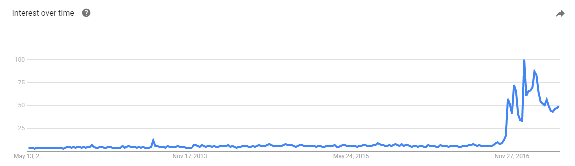
Guys, guys, it’s week 11! We’re down to our second to last read-along, and this week we’re tackling the topic that has recently skyrocketed in popularity public awareness: fake news. To give you a sense of how new this term is to public discussion, check out the Google trends history:

Now Google trends isn’t always the best way of figuring out how popular a search term is (the x-axis is a comparison of the term to its own peak of popularity) but it does let us know the interest in this term really took off after the US election in November and has not settled back down. Apparently when online fake news started prompting real life threats of nuclear war, people took notice.

But what is fake news exactly, and is it really a new phenomena? That’s the question our first reading sets out to answer. The article “Before Fake News Came False Prophecy” uses some British history to frame our current debate, and makes the assertion that “prophecy” about ones political opponents was the old time version of fake news. I hadn’t previously connected the idea of prophecy to the idea of fake news, but it really is the historic equivalent: guarantees that dark and terrible things will happen (or may already be happening) if your enemies are allowed to be (or remain) in charge. As the article says “Prophecy didn’t describe the world as it was, but as it was to be—or as it might become. That fantasy was more powerful than any lived reality. People killed and died for fantasies. People didn’t act politically because of what they had lost but because of what, in their most potent fantasy, they feared losing.”

With that framing, fake news becomes not just a tool of misinformation, but actually something that’s playing off our imagination. It blurs the line between “this is true because it happened” and “this is true because it might happen”.

Okay, so fake news is bad, but what is it really? The next reading from Factcheck.org actually takes that on a bit before they go in to the ever important “how to spot it” topic. They quote the guy who started Snopes and point out that “fake news” or fake stories made up by websites trying to make money is really a subset of “bad news” which is (as he puts it) “shoddy, unresearched, error-filled, and deliberately misleading reporting that does a disservice to everyone”.  I think the “this is just one branch of a tree of bad” point is an important point to keep in mind, and I’ll circle back to it later. That being said, there is something a little bit different about entirely fictitious stories, and there are some red flags you should look for. Factcheck gives a list of these,  such as anonymous authors, lots of exclamation points, links to sources that don’t support the story, and quoting “Fappy the Anti-Masturbation Dolphin” as a source. They also caution that you should always check the date on stories, as sometimes people attempt to connect true older stories to current events as though they were more recent. They also highlight people who don’t realize known satirists are satire (see the website Literally Unbelievable for a collection of people who don’t know about the Onion).

So why are we so worried about fake news? Can’t we just ignore it and debunk as needed? Well….maybe, but some of this is a little more organized than you may think. The next reading “The Agency” is a long but chilling New York Times investigation in to, some real world accounts of some rather scary fake news moments.  They start with a bizarre case of a reported but non-existent chemical plant explosion in Louisiana. This story didn’t just get reported to the media but was texted to people who lived nearby the plant, posted on Twitter with doctored local Louisiana news reports and the whole thing started trending on Twitter and getting picked up nationally while the actual chemical plant employees were still pulling themselves out of bed and trying to figure out what was going on. While no one really identified a motivation for that attack, the NYTs found links to suggest it was orchestrated by a group from Russia that employs 400 people to do nothing but spread fake news. This group works 12 hour days trolling the internet causing chaos in comments sections on various sites all over the place for purposes that aren’t clear to almost anyone, but with an end result of lots of aggravation for everyone.

Indeed, this appears to be part of the point. Chen’s investigation suggests that after the internet was used to mobilize protests in Russia few years ago, the government decided to hit back. If you could totally bog down political websites and comments sections with angry dreck, normal people wouldn’t go there. At best, you’d convince someone that the angry pro-government opinions were the majority and that they should play along. Failing that, you’d cut off a place where people might have otherwise gathered to express their discontent. Chen tracks the moves of the Russian group in to US events, which ultimately ends up including a campaign against him. The story of how they turned him from a New York Times reporter in to a neo-Nazi CIA recruiter is actually so bizarre and incredible I cannot do it justice, so go read the article.

Not every fake news story is coming out of a coordinated effort however, as yet another New York Times article discusses. Some of it is just from regular people who discovered that this is a really good way of making money. Apparently bullshit is a fairly lucrative business.

Slight tangent: After the election, a close family member of mine was reading an article on the “fake news” topic, and discovered he had actually gone to college with one of the people interviewed. The guy had created a Facebook group we had heard of that spewed fake and inflammatory political memes and was now making (allegedly) a six figure monthly salary to do so. The guy in question was also fairly insane (like “committed assault over a minor dorm dispute” type insane), and had actually expressed no interest in politics during college. In real life, he had trouble making friends or influencing people, but on the internet he turned his knack for conflict and pissing people off in to a hefty profit. Now I know this is just a friend of a friend story and you have now real reason to believe me, but I think the fundamental premise of “these news stories/memes might have creators who you wouldn’t let spend more than 5 minutes in your living room” is probably a good thing to keep in mind.

So why do people share these things? Well, as the next reading goes in to, the answer is really social signaling. When you share a news story that fits your worldview, you proclaim allegiance to your in-group. When you share a fake news story, you also probably enrage your out-group. By showing your in-group that you are so dedicated to your cause that you’re willing to sacrifice your reputation with your out-group, you increase your ties with them. The deeper motivations here are why simply introducing contradictory facts doesn’t always work (though they sometimes do – more on the most recent research on the “backfire effect” here), particularly if you get snarky about it. People may not see it as a factual debate, but rather a debate about their identity. Yikes. The article also mentions three things you can personally do to help 1) Correct normal errors, but don’t publicly respond to social signalling. 2) Make “people who value truth” your in-group and hold yourself to high standards 3) Leave room for satire, including satire of your own beliefs.

I endorse this list.

Finally, we take a look at how technology is adding to the problem, not just by making this stuff easier to share, but sometimes by promoting it. In the reading “Google’s Dangerous Identity Crisis“, we take a look at Google’s “featured” search results. These are supposed to be used to highlight basic information like “what time does the Superbowl start” but can also end up highlighting things like “Obama is planning a coup”. The identity crisis in question is whether Google exists simply to index sites on the web or whether it is verifying some of those sites as more accurate than others. The current highlighting feature certainly looks like an endorsement of a fact, but it’s really just an advanced algorithm that can be fooled pretty easily. What Google can or should be doing about that is up for debate.

Whew, okay, that was a lot of fake news, and a lot of depressing stuff. What would I add to this whole mess? Well, I really liked the list given in the CNN article. Not boosting people’s signalling, watching your own adherence to truth and keeping a sense of humor are all good things. They other thing I’ve found very effective is to try to have more discussions about politics with people I know and trust. I think online news stories (fake or not) are frequently like junk food: easy to consume and easy to overdo it with. Even discussions with friends who don’t agree with me can never match the quick hit vitriolic rush of 100 Twitter hot takes.

The second thing I’d encourage is to not let the “fake news” phenomena distract from the “bad news” issues that can be perpetuated by even respectable news sources. The FactCheck article quoted the guy from Snopes.com on this topic, and I think it’s important. Since the rise of the “fake news” phenomena, I’ve had a few people tell me that fact checking traditional media is no longer as important. That seems horribly off to me. Condemning fake news should be part of a broader movement to bring more accuracy to all of our news.

Okay, that’s all I’ve got for today. Check back in next week for the last class!

Mistakes Were Made, Sometimes By Me

A few weeks ago, I put out a call asking for opinions on how a blogger should correct errors in their own work. I was specifically interested in errors that were a little less clear cut than normal: quoting a study that later turned out to be less convincing it initially appeared (failed to replicate), studies whose authors had been accused of misconduct, or studies that had been retracted.

I got a lot of good responses, so thanks to everyone who voted/commented/emailed me directly. While I came to realize there is probably not a perfect solution, there were a few suggestions I think I am going to follow up on:

  1. Updating the individual posts (as I know about them) It seemed pretty unanimous that updating old posts was the right thing to do. Given that Google is a thing and that some of my most popular posts are from over a year ago, I am going to try to update old posts if I know there are concerns about them. My one limitation is not always indexing well what studies I have cited where, so this one isn’t perfect. I’ll be putting a link up in the sidebar to let people know I correct stuff.
  2. Creating a “corrected” tag to attach to all posts I have to update. This came out of jaed’s comment on my post and seemed like a great idea. This will make it easier to track which type of posts I end up needing to update.
  3. Creating an “error” page to give a summary of different errors, technical or philosophical, that I made in individual posts, along with why I made them and what the correction was. I want to be transparent about the type of error that trip me up. Hopefully this will help me notice patterns I can improve upon. That page is up here, and I kicked it off with the two errors I caught last month. I’m also adding it to my side bar.
  4. Starting a 2-4 times a year meta-blog update Okay, this one isn’t strictly just because of errors, though I am going to use it to talk about them. It seemed reasonable to do a few posts a year mentioning errors or updates that may not warrant their own post. If the correction is major, it will get its own post, but this will be for the smaller stuff.

If you have any other thoughts or want to take a look at the initial error page (or have things you think I’ve left off), go ahead and meander over there.