5 Things About Introverts

I am fascinated by personality testing. Myers-Briggs, Big 5, Enneagram, Buzzfeed quiz, yes please. I’ll take them. There’s something about assigning humanity to little boxes that just, I don’t know, appeals to me. Maybe that’s the ENTJ in me, or my moderate conscientiousness, or the fact that according to this quiz I’m a sea monster. Given this, I realized it was high time I did a bit of a research roundup on some of the better known facets of personality testing. This week I’m taking on introverts, and if all goes well next week will be extroverts.

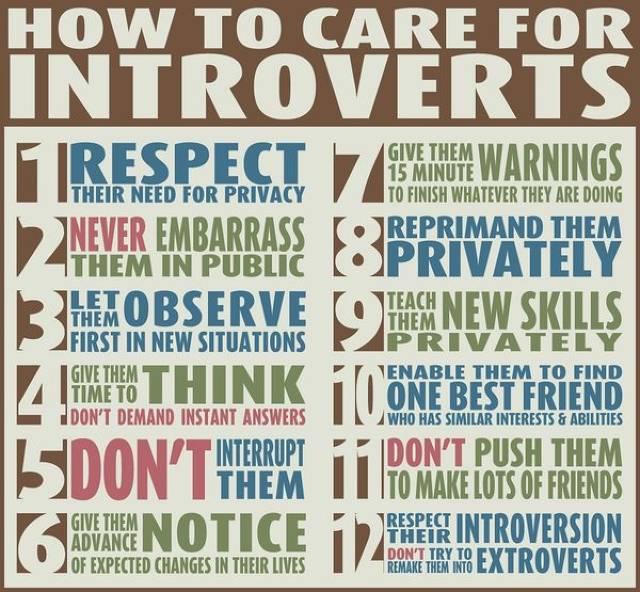
A few things up front: first, on introvert/extrovert scales, I score right in the middle. This makes me one of the dreaded “ambiverts” who apparently can’t make up their minds. Second, while the definition of introvert is sometimes a little lacking (see point #1 below) it’s generally defined as someone who gets their energy from being alone. With the rise of the internet, introverts started kind of having a moment, and there’s been a rash of books/memes/Buzzfeed lists about how unappreciated they all are. So what’s going on here, and what does the research say?

  1. Introversion doesn’t always have a definition One of the first rather odd things I learned about introverts is that the most commonly used academic  definition is….”not an extrovert”. For example, in the Big Five Personality scale “introversion” is not technically a trait but “low extraversion” is. This may not seem like a big deal, but it can mean that we are lumping different things under “introvert” that may not necessarily be similar to one another. As introversion has become more trendy, I have seen more and more people lump normal social or physical limitations under “introversion”. For example, a rather extroverted friend of mine recently announced she was pretty sure she was actually an introvert. When asked why she thought this, she mentioned that she had been out 3 different nights the week before and that by the weekend she had been too exhausted to go to another party. When I inquired if maybe this was simply lack of sleep, she responded “but extroverts get their energy from people, so I should have been fine!”.  No. People get their energy from rest. Almost no one can substitute human interaction for sleep too often and feel good about it. Wanting to sleep isn’t “introverted” merely because you’re not socializing while you do it.
  2. There may be 4 types of introversion  When psychologists started actually looking in to introversion, they developed a theory that there may actually be 4 types of behavior we’ve been lumping under “introvert”: social introversion, thinking introversion, anxious introversion and restrained introversion. This was a helpful list for me, as I am moderately socially introverted (I prefer small groups), highly introverted in my thinking, but I have very little social anxiety and I’m not very restrained. Thus it makes sense that I strongly resonate with some descriptions of introversion and not others. The social anxiety piece can also be important to recognize as a separate category. I have a few friends who thought they were introverted when they were in high school only to discover that they really just didn’t like their classmates. While most introverts fight the perception that introversion = shyness, it’s probably good to note that most shy or socially anxious people will end up self selecting as introverts.
  3. Stimulation matters The four categories mentioned in #2 are still in the research phase, but there are other ways of looking at introversion as well. Some of the very first literature on introversion (and extroversion) actually defined it as an aversion to (or need for) extra environmental stimulation.   I like this framing a bit better than the social framing, because it includes things like loud noises or fast music or why coffee only helps extroverts (basically it increases your sensitivity to stimulation, which is the last thing most introverts need when they’re trying to get things done). This explains why I’ve occasionally had introverted coworkers complain that I talked to much, even when I was studiously avoiding talking to them, or why an introvert I mentioned this to always has to tell her (extrovert) husband to shut the TV off. Social situations may not be taxing because of social issues, but rather just the stimulation of hearing so many people talk.
  4. This can lead to some judginess With all the recent attention on introverts in the workplace, it’s interesting to note that there’s some evidence that  introverts actually judge extroverts more harshly than the other way around. In some studies done by Florida State University, they found introverted MBA students were more likely to give low marks to extroverted students, recommended they get lower bonuses, and declined to recommend them for promotions. This was true even when they manufactured the scenarios and controlled for performance. The extroverts in the study awarded bonuses/promotions/high marks much more in line with actual performance on the tasks and did not penalize introverts. The researchers hypothesize that due to the stimulation issue (#3) introverts may just have a harder time working with extroverts regardless of their competence. I also have to wonder if there’s a bit of the Tim Tebow Fallacy going on here….with all the press about how extroverts do better in business, many introverts (especially in MBA programs, as these research subjects were) could feel that by marking extroverts down they are balancing the scales a bit. We don’t know how this works in the general population, but it is worth keeping in mind.
  5. Introverts may (wrongly) think they’re the minority  There’s a bit of confusion over what percentage of the population is introverted….which is not particularly surprising when you consider the weird definitions we considered in #1-#3. At this point though, most estimates put it at about 50% (unless you consider “ambivert” a category). So why do introverts tend to feel outnumbered?  Well, it’s a statistical quirk called the majority illusion. Basically, because extroverts are more likely to have lots of friends, people are more likely to be friends with lots of extroverts. This artificially skews the perception of the numbers, and leaves people with the impression that they know more extroverts because there are more extroverts. So introverts, take heart. There are more of you out there than you think.

Come back next week and we’ll take a look at extroverts!

On Outliers, Black Swans, and Statistical Anomolies

Happy Sunday! Let’s talk about outliers!

Outliers have been coming up a lot for me recently, so I wanted to put together a few of my thoughts on how we treat them in research. In the most technical sense, outliers are normally defined as any data point that is far outside the expected range for a value. Many computer programs (including Minitab and R) automatically define an outlier as a point that lies more than 1.5 times the interquartile range outside the interquartile range as an outlier. Basically any time you look at a data set and say “one of these things is not like the others” you’re probably talking about an outlier.

So how do we handle these? And how should we handle these? Here’s a couple things to consider:

  1. Extreme values are the first thing to go When you’re reviewing a data set and can’t review every value, almost everyone I know starts by looking at the most extreme values. For example, I have a data set I pull occasionally that tells me how long people stayed in the hospital after their transplants. I don’t scrutinize every number, but I do scrutinize every number higher than 60. While occasionally patients stay in the hospital that long, it’s actually equally likely that some sort of data error is occurring. Same thing for any value under 10 days….that’s not really even enough time to get a transplant done. So basically if a typo or import error led to a reasonable value, I probably wouldn’t catch it. Overly high or low values pretty much always lead to more scrutiny.
  2. Is the data plausible? So how do we determine whether an outlier can be discarded? Well the first is to assess if the data point could potentially happen. Sometimes there are typos, data errors, someone flat out misread the question, or someone’s just being obnoxious. An interesting example of implausible data points possibly influencing study results was in Mark Regenerus’ controversial gay parenting study. A few years after the study was released, his initial data set was re-analyzed and it was discovered that he had included at least 9 clear outliers….including one guy who reported he was 8 feet tall, weighed 88 lbs, had been married 8 times and had 8 children. When one of your outcome measures is “number of divorces” and your sample size is 236, including a few points like that could actually change the results. Now, 8 marriages is possible, but given the other data points that accompanied it, they are probably not plausible.
  3. Is the number a black swan? Okay, so lets move out of run of the mill data and in to rare events. How do you decide whether or not to include a rare event in your data set? Well….that’s hard to. There’s quite a bit of controversy recently over black swan type events….rare extremes like war, massive terrorist attacks or other existential threats to humanity. Basically, when looking at your outliers, you have to consider if this is an area where something sudden, unexpected and massive could happen to change the numbers. It is very unlikely that someone in a family stability study could suddenly get married and divorced 1,000 times, but in public health a relatively rare disease can suddenly start spreading more than usual. Nicholas Nassim Taleb is a huge proponent of keeping an eye on data sets that could end up with a black swan type event, and thinking through the ramifications of this.
  4. Purposefully excluding or purposefully including can both be deceptive In the recent Slate Star Codex post “Terrorist vs Chairs“, Scott Alexander has two interesting outlier cases that show exactly how easy it is to go wrong with outliers. The first is to purposefully exclude them. For example, since September 12th, 2001, more people in the US have been killed by falling furniture than by terrorist attacks. However, if you move the start line two days earlier to September 10th, 2001, that ratio completely flips by an order of magnitude. Similarly, if you ask how many people die of the flu each year, the average for the last 100 years is 1,000,000. The average for the last 97 years? 20,000.  Clearly this is where the black swan thing can come back to haunt you.
  5. It depends on how you want to use your information Not all outlier exclusions are deceptive. For example, if you work for the New York City Police Department and want to review your murder rate for the last few decades, it would make sense to exclude the September 11th attacks. Most charts you will see do note that they are making this exclusion. In those cases police forces are trying to look at a trends and outcomes they can affect….and the 9/11 attacks really weren’t either. However, if the NYPD were trying to run numbers that showed future risk to the city, it would be foolish to leave those numbers out of their calculations. While tailoring your approach based on your purpose can open you up to bias, it also can reduce confusion.

Take it away Grover!

What I’m Reading: September 2016

My book for this month was supposed to be “In Pursuit of the Unknown: 17 Equations That Changed the World“, but I actually read that a few months ago.  It was really good though….an interesting history of mathematical thought, and how some of the famous equations you here about actually influenced human development.

This article is a few years old, but it covers the role of “metascience” in helping with the replication crisis. Metascience is essentially the science of studying science, and it would push researchers to study both their topic AND how experiments about their topic could go wrong. The first suggestion is to have another lab attempt replication before you publish, so you can include possible replication issue in your actual paper right up front.

….and here’s a person actually doing metascience! Yoni Freedhoff, MD is one of my favorite writers on the topic of diet and obesity. He has  a great piece up for the Lancet on everything that’s wrong with research in those areas.

On another note entirely….for reasons I’m not even going to try to explain, I am now the proud owner of a Tumblr dedicated to rewriting famous literary quotes to include references to Pumpkin Spice Lattes. It’s called Pumpkin Spiced Literature (obviously), and it’s, um, an acquired taste.

Okay, a doctoral thesis focused on how politicians delete their Tweets is kind of awesome. And yes, Anthony Weiner gets a mention by name. Related: a model of alcoholism that takes Twitter in to account.

On the one hand, I am intrigued by this app. On the other hand, I get sad when people want to shortcut their way out of building better problem solving skills.

This Vanity Fair article about the destruction of Theranos and the downfall of Elizabeth Holmes is incredible, fascinating and a little sad. Particularly intriguing was the quote that undid her: “a chemistry is performed so that a chemical reaction occurs and generates a signal from the chemical interaction with the sample, which is translated into a result, which is then reviewed by certified laboratory personnel.” That made WSJ reporter John Carreyou sit up and say “Huh, I don’t think she knows what she’s talking about”. Seems obvious, but he apparently was the only reporter to figure that out.

Underrated political moment of last week: the New York Times wrote a story about Gary Johnson’s “What is Aleppo?” moment, then has to issue two corrections when it turns out they’re actually not entirely sure what Aleppo is either. 


5 Possible Issues With Genomics Research

Ah, fall. A new school year, and a new class on my way to finish this darn degree of mine. This semester I’m taking “Statistical Analysis of Genomics Data”, and the whole first was dedicated to discussing reproducible research. As you can imagine, I was psyched. I’ve talked quite a bit about reproducible research, but genomics data has some twists I hadn’t previously considered.  In addition to all the usual replication issues, here are a few issues that come up when you try to replicate genomics studies:

  1. Different definitions of “raw data” In the paper “Repeatability of published microarray gene expression analyses” John Ioannidis et al attempted to reproduce one figure from 18 different papers that used microarray data. They succeeded on 2 of them. The number one reason for failure to replicate? Not being able to access the raw data that was used. In most cases the data had been deposited (as required by the journal) but it had not really been reviewed to see if it was just summary data or even particularly identifiable. Six out of 18 research groups had deposited data that you couldn’t even attempt to use, and other groups had data so raw it was basically useless. Makes me shudder just to think about it.
  2. Large and unwieldy data files Even in papers where the data was available, it was not always useable. Ioannidis et al had trouble reproducing the about 8 papers due to unclear data decisions. Essentially the files and data were there, but they couldn’t figure out how someone actually had waded through them to produce the results they got. To give you a picture of how big these data files are, my first homework for this class required a “practice” file that was 20689×37….or almost 800,000 data points. Unless that data is very well labeled, you will have trouble recreating what someone else did.
  3. Non-reproducible workflow Anyone who’s ever attempted to tame an unweildy data set knows it’s a trek and a half. I swear to god I have actually emerged from my office sweating after one of those bouts. That’s not so terrible, but what can kick it to the seventh circle of hell is finding out there was an error in the data set and now you have to redo the whole thing. In 8 of the papers Ioannidis et al looked at, they couldn’t figure out what the authors actually did to generate their figures. Turns out, sometimes authors can’t figure out what they did to generate their figures….which is why we end up with videos like this:

    All that copy/pasting and messing around is just ASKING for an error.

  4. Software version changes Another non-glamorous way things can get screwed up: you update your software part way through and the original stuff you wrote gets glitchy. This is an enormous headache if you notice it, and a huge issue if you don’t. 2 of the papers Ioannidis et al looked at didn’t include software version and couldn’t be reproduced. R is the most commonly used software for things like this and it’s open source, so updates aren’t always compatible with each other.
  5. Excel issues Okay, so you loaded your data, made a reproducible workflow, figured out your version of R, and now you are awesome right? Not necessarily. It turns out that Excel, one of the most standard computer programs on the planet, can seriously screw you up. In a recent paper, it was discovered that 20% of all genomics papers with Excel data files had inadvertently converted gene names to either dates or floating point numbers. This almost certainly means those renamed genes didn’t end up being included in the final research, but what effect that had is unknown. Sadly, the rate of this error is actually increasing by about 15%. Oof.

I am tempted to summarize all this by saying “Mo’ Data Mo’ Problems”, but…..no, actually, that sounds about right. Any time you can’t actually personally review all the data, you are putting your faith in computer systems and the organization of the files. Good organization is key, and it’s hard to focus on that when you’re wading through data files. Semper vigilans.

The Signal and the Noise: Chapter 11

Chapter 11 has a lot on bubbles and why they develop. Interestingly, Silver actually uses the whole “two ways to be wrong” thing directly, in order to point out that a trader who loses money in one way (selling only to have the market go up) is much more likely to be penalized than a trader who loses money with everyone else (buying only to have the market crash). This is why traders are so hesitant to acknowledge a bubble….they know that going against the crowd will get them far more penalized than making the same mistake as everyone else. Explains a lot, if you think about it.SignalNoiseCh11

5 Fun Intersections of Math and Birthdays

Well hi there! Guess what? Today’s my birthday! Hurray for another trip around the sun! This of course reminded me of all the great birthday related math things that are out there, so I thought I’d go ahead and put a few together just for kicks:

  1. The birthday paradox A classic problem in statistics, the birthday paradox asks some form of the question “If you have 23 people in a room, what are the chances at least two of them have the same birthday?”. The answer is 50%, and it’s not really a paradox but just a thing people have trouble understanding. Better Explained has a nice breakdown of the problem here, which reminds readers that exponents are hard and that part of you immediately focused on your own birthday. As always, the chances of something happening somewhere are higher than any particular thing happening to you. My favorite way of viewing this problem came from the Assistant Village Idiot, who explains it by asking people to imagine they’re throwing darts randomly at squares and inquiring how long  they think it would take before two darts wind up in the same square.
  2. Cheryl’s birthday I love when math puzzles go viral, and Cheryl’s birthday was a pretty good one. If you missed it, here it is: And here is the Guardian’s explanation of the answer.
  3. Common birthdays This graphic of common birthdays is both an interesting infographic and a cautionary tale of using ordinal data on the uninitiated. Basically, the author put together a visual representation/heat map of the most common birthdays by rank (as in 1-366), had it go viral, then had people complaining to him that it “wasn’t accurate”.  He was rightfully irritated since it was just something he’d done for fun, but it’s a good reminder to fully think through visuals you see on the internet and to read the original sources for proper context.
  4. When is the old/young tipping point? Well, if you define “old” vs “young” as “when is over half the global population younger than me”, the 538 says the tipping point is somewhere in your late 20s. If you’re limiting yourself to just the US though, you have until you’re 37. Nathan Yau has a great visual here, and you can break it down by gender.
  5. And of course, one of the most compelling statistical truths of all time: 

Can’t argue with that one. I’m gonna go have some cake.

Internet Science: Some Updates

Well, it’s that time of year again: back to school. Next week I am again headed back to high school to give the talk that spawned my Intro to Internet Science series last year.

This is my third year talking to this particular class, and I have a few updates that I thought folks might be interested in. It makes more sense if you read the series (or at least the intro to what I try to do in this talk), so if you missed that you can check it out here.

Last year, the biggest issue we ran in to was kids deciding they can’t believe ANY science, which I wrote about here. We’re trying to correct that a bit this year, without losing the “be skeptical” idea. Since education research kinda has a replication problem, all the things we’re trying are generally just a discussion between the teacher and I.

  1. Skin in the game/eliminating selection bias In order to make the class a little more interactive, I’ve normally given the kids a quiz to kick things off. We’ve had some trouble over the years getting the kids answers compiled, so this year we’re actually giving them the quiz ahead of time. This means I’ll be able to have the results available before the talk, so I can show them during the talk. I’m hoping this will help me figure out my focus a bit. When I only know the feedback of the kids who want to raise their hands, it can be hard to know which issues really trip the class up.
  2. Focus on p-values and failure to replicate In the past during my Crazy Stats Tricks part, I’ve tried to cram a lot in. I’ve decided this is too much, so I’m just going to include a bit about failed replications. Specifically, I’m going to talk about how popular studies get repeated even when it turns out they weren’t true. Talking about Wonder Woman and power poses is a pretty good attention getter, and I like to point out that the author’s TED talk page contains no disclaimer that her study failed to replicate (Update: As of October 2016, the page now makes note of the controversy). It does however tell us it’s been viewed 35,000,000 times.
  3. Research checklist As part of this class, these kids are eventually going to have to write a research paper. This is where the whole “well we can’t really know anything” issue got us last year. So to end the talk, we’re going to give the kids this research paper checklist, which will hopefully help give them some guidance. Point #2 on the checklist is “Be skeptical of current findings, theories, policies, methods, data and opinions” so our thought is to basically say “okay, I got you through #2….now you have the rest of the year to work through the rest”. I am told that many of the items on that list meet the learning objectives for the class, so this should give the teacher something to go off of for the rest of the year as well.

Any other thoughts or suggestions (especially from my teacher readers!) are more than welcome. Wish me luck!

The Signal and the Noise: Chapter 10

Chapter 10 was about poker, and how to make money playing poker. Apparently the key is to make it easy for lots of inexperienced people to play. When websites that made it easy to play got shut down, fewer inexperienced people made the effort and many previously “successful” players discovered they were now the fish. It’s a good reminder to keep an eye on the skill level of your competition in addition to your own.SignalNoiseCh10

5 Interesting Things Research Tells Us About Internet Trolls

I got in an interesting discussion this weekend with some folks about internet trolls. One person had made an offhanded comment about “anonymity bringing out the worst in people”, and was surprised when I informed them that the current research didn’t really support them in that. Depending on your perspective I am either the best or worst person to ever get in one of these discussions with, because I decided to do a little roundup of the current research on internet trolls. Hang in there with me, and you get a bonus SHEEPLE at the end:

  1. Defining trolling is actually kind of hard While most of us would say that trolling is a sort of “you know it when you see it” issue, the definitions used actually vary a bit. For example this study found trolls by asking participants directly “do you like to troll”, this study just counted Tweets that contained “bad words”, this study had researchers read through individual posts and had rank their “trollishness”, and this study had researchers track whole comment histories of banned forum users. None of those are necessarily wrong, but they all will catch slightly different sets of behavior and groups of commenters.
  2. Trolls who cause chaos online also like to cause chaos for researchers.  To the surprise of no one, those who admit they like to troll online also get a kick out of messing with researchers. When Whitney Phillips was writing her book about trolling, she tried to interview self professed trolls to see what motivated them. Unfortunately they kept making up stories then hanging up on her. That makes you wonder about research where people had to self define as trolls, like this widely reported study that said trolls tend to be sadists. Are trolls really sadists, or do those who say “yes I like to troll” also like to answer “yes” to questions on sadism quizzes? And is answering “yes” as a joke substantively different from answering “yes” in all seriousness?
  3. Who gets targeted is a complicated question One of the issues that arises due to the different definitions of trolls (see #1) is the question of “who gets targeted”. At this point “trolling” can be used to define anything from irritating but benign behavior to criticism of all types to abuse, threats and harassment. With so many varieties of trolling, figuring out who the targets are can be more difficult than it first appears. For example, this British marketing group found that male celebrities got twice the Twitter harassment as female celebrities. To note, the standard for “harassment” used there was a “bad word” filter, and the number or content of the celebrities Tweets were not rated. Given that Piers Morgan, Ricky Gervais, and Katie Hopkins ended up as the top three receivers of abuse, content appears to matter. Anyway, Cathy Young has this to say about the gender breakdown and Amanda Hess replied with this. We do know that young people (18-24) are the most likely to have problems, and there is a gender difference in type of harassment. From Pew Research:This is all age ranges:  Note: all of those terms were self defined and self reported, and there was no controlling for where those things occurred. In other words, people being called offensive names out of the blue in an innocuous situation were counted the same as someone calling you a name in the middle of a heated debate.
  4. Real names don’t necessarily help. Nearly as long as trolls have been discussed, people have been mentioning the enabling role of anonymity. A recent study suggests that may be less important than we think. A recent study of German social media showed that using real names frequently made people more hostile, not less. It turns out that the social signaling/credibility gained from online posts actually can empower people to get meaner. Oh boy.
  5. Controlling your own emotions might actually help The most common advice dispensed on this whole topic is of course “don’t feed the trolls”.  However, it can be a little tough figuring out what that means. When these researchers tried to create a predictive algorithm to see if they could identify trolls by their first ten posts on a site, they discovered that trolls tend to escalate when they have posts unfairly deleted. In order to find “unfair” deletions, they blinded an assessor to the identity of the poster, and asked them if it was offensive or not. It turns out that trolls really were more likely to have inoffensive posts deleted, and that their postings worsened significantly after that happened. Now of course this may have been the goal….moderators who are sick of someones posts entirely may get capricious with the hopes that they’ll get so mad they’ll leave, but it is an interesting insight. Also interesting from the paper: trolls comment more often but in fewer threads, they have worse overall writing quality, and they get more responses than other users. Yup, designed to irritate.

Unfortunately none of my research turned up any guidance on how likely this is to happen:

Stay safe out there.

5 Examples of Bimodal Distributions (None of Which Are Human Height)

Of all the strange things about statistics education in the US (and other countries for all I know) is the way we teach kids about the bimodal distribution. A bimodal distribution is a set of data that has two peaks (modes) that are at least as far apart as the sum of the standard deviations. It looks like this:

It’s an important distribution to know about, because if your data looks like this, your calculations for the average are going to be totally useless. For the distribution above for example, we’d get an average of (around) zero, which would tell us nearly nothing about the data itself, and would completely miss both peaks. So far so good. However, when this is taught in stats classes, the “real world” example most kids are given is human height….and human height is not bimodal. Bummer.

Given that it’s the start of the school year and all, I thought it would be a good time to provide teachers with some new examples. Now, depending on the underlying data set you might use, some of these examples may not make the “peaks separated by the length of the combined standard deviations” cutoff either…..but at least you’ll be wrong in new ways. That’s got to count for something, right?

  1. Starting salaries for lawyers On average new lawyers do well. In reality there are big winners and losers in the whole “getting a good job after graduation” game, and it shows in the salary distributions. Read the Above The Law complaint here.
  2. Book prices Book prices cluster around different price points, depending on whether your looking at paperbacks or hardcovers as God Plays Dice explains. If the gap between paperback and hardcovers isn’t wide enough for you, imagine you could pull price data for every book available on Amazon.com. You’d end up with a two modes, one for regular books and one for textbooks.
  3. Peak restaurant hours If you plotted a histogram of when every customer entered a restaurant on a given day, you’d end up with a bimodal distribution around 2 points: lunch and dinner. This type of histogram also tends to appear when you map road usage (morning and afternoon rush hours) and residential water/electricity usage (before and after work).
  4. Speed limits This one I actually couldn’t find much data on, but I’m guessing if you mapped out all the speed limits on every mile of road in the US (or maybe just your state), your distribution would end up clustered around 30/35 and then again around 60/65. Basically highways or regular roads. This distribution would also have the additional wrinkle of skewing differently based on whether we used miles of road or number of roads, but that’s a different matter entirely.
  5. Disease patterns There’s a rather fascinating two part blog post  by Jules J Berman that discusses bimodal cancer patters here and here. Basically these are cancers that appear similar but tend to hit rather different ages groups. For example Karposi’s sarcoma hits young men with AIDS and older men who do not have AIDS, and Berman argues that seeing these patterns should give us important clues about the diseases themselves. Possible explanations from Berman’s post:  1. Multiple environmental causes targeting different ages 2. Multiple genetic causes with different latencies 3. Multiple diseases classified under one name 4. Faulty or insufficient data 5. Combinations of 1,2,3 and 4.

Bimodal distributions are also a great reason why the number one rule of data analysis is to ALWAYS take a quick look at a graph of your data before you do anything. As you can see from the above examples, the peaks almost always contain their own important sets of information, and must be understood both separately and together in order be understood at all.

So what’s your favorite non-human height example?