5 Interesting Reasons Priming Studies Go Wrong

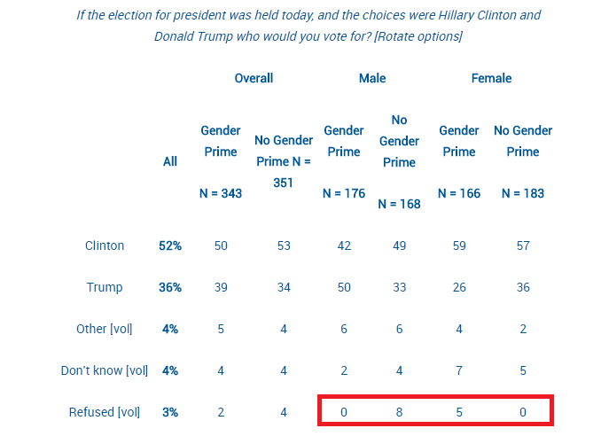
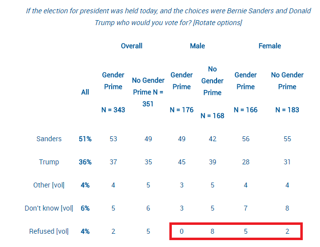
Last week, commenter Christopher B left an interesting comment on my post about masculinity threats and voting that made me realize I wanted to do a bigger post on priming studies in general. Priming studies have come under a lot of fire in the past few years, and they have the unfortunate distinction of being called (by some) the “poster child for doubts about the integrity of psychological research“. So what’s going on here? What are these studies and why do they go wrong so often?

Well, as Christopher B pointed out, it’s not because priming isn’t a thing. Priming is typically defined as “an implicit memory effect in which exposure to one stimulus (i.e., perceptual pattern) influences the response to another stimulus“. In other words, something you see or do at one point unconsciously biases you to act differently at a later date. Some of these could be pretty straightforward. If you see a list of words that containing the word “dog” and then someone asks you to name an animal that starts with the letter w, you will probably be more likely to say “wolf” than “walrus”. Lots of marketers attempt to use priming-like effects to get people to buy more or differently than they would have otherwise. There’s even some efforts to see if getting alcoholics to physically (well, in the form of video games) practice pushing away drinks helps lead to lower rates of relapse. I think most of us would accept that your brain does have a bit of an auto-suggest type system, and most people would accept it can probably be manipulated subtly. So where’s the problem? Well, in addition to the p-value and replication issues I’ve raised before, here’s some other reasons things have gone haywire:

  1. A lot of work gets done at the edges The examples I’ve given above are pretty straightforward, much more straightforward than most of the priming studies that get attention. It’s unsurprising that most researchers aren’t as interested in obvious and straightforward effects, but rather increasingly subtle and indirect effects. For example, in the study I talked about last week, the researchers didn’t ask men to consider a world where women reigned supreme, but rather asked “who makes more money, you or your wife?” The effects they’re interested in are subtle and subconscious, and obviously there’s a limit to how far that can be stretched. Finding that limit is part of the goal. Unfortunately, the edges of any phenomena are going to be those most susceptible to signal and noise problems, and priming researchers got in the habit of casting a broad net at the edges of their conceptual field. Let’s just say that if your field ends up lending itself to parody this pointed, you may want to take a step back.
  2. Primes themselves are subject to bias There’s a great paper on priming studies out of Stanford called “Why many priming results don’t (and won’t) replicate: A quantitative analysis” that points out a lot of logistical reasons priming studies don’t work. One of the more interesting issues they raise is that it’s really freaking hard to actually establish how strong a prime is, and the choices are made by things that are obvious to the researcher, not necessarily the subjects. For example, the most famous priming study primed undergrads with words associated with the elderly like “Florida” or “sentimental”. The authors of the quantitative analysis paper pointed out that the frequency of those words being associated with “elderly people” has actually been decreasing in the past several decades. So basically things that will be “obvious” associations to a 40 year old researcher may not be as obvious to their 18 year old students. To give a more run of the mill example of this, think of celebrity names. If I ask you to name an actor whose first name is “Alan”, many baby boomers might say “Alda”, whereas younger  Harry Potter fans may say “Rickman”. This issue also explains why these studies don’t tend to replicate in other languages.
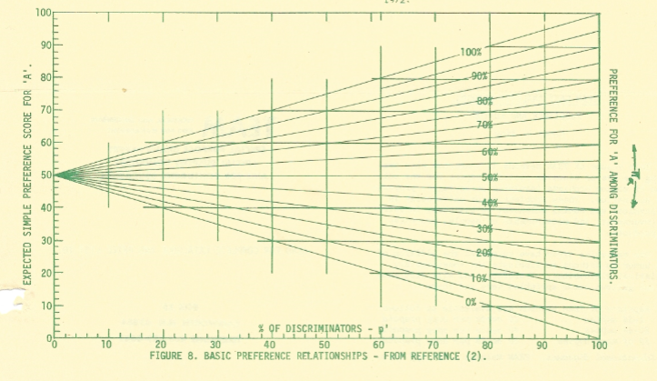
  3. Age of subjects matters In addition to the word choice bias, there’s some good evidence that our susceptibility to priming may actually change as we age. When attempts have been made to actually create new word association relationships for people, age is a confounder:ageandprimingImage from the quantitative analysis paper. The authors in that paper propose that this will translate in to young people being much more susceptible to subtle primes, with older people only responding to more direct ones. This age discrepant behavior is not always accounted for.
  4. Experimenters can prime just as well as their actual primes One of the main blows to priming studies came when a group of researchers attempted to replicate the “hear words about old people/subsequently walk more slowly” study. In a study called “Behavioral Priming: It’s All in the Mind, but Whose Mind?”, researchers found that priming the researcher to believe the subjects had been primed to walk more slowly caused the participants to walk more slowly. In fact the researcher’s belief made a bigger difference than the priming itself:Turns out subjects aren’t the only ones susceptible to subtle and unconscious biases. You can read the original studies author rather grouchy response to the whole thing here, and Andrew Gelman’s eyeroll back here.
  5. The field did attract an unfortunate number of frauds. Maybe it was due to the headline grabbing nature of many of these priming studies, but there have been some absolutely audacious fraud cases in priming research. Diederik Staples published over 20 big studies with  made up data. Dirk Smeesters also had seven. Lawrence Sanna is up to 8. Is this worse than other fields? Maybe, or maybe it’s just that these studies tended get a lot of attention. It’s not so much the fraud that casts a shadow, but the alarming realization that so many made up studies got through without question. This has led to calls for standards involving immediate replication attempts and other measures to stop bad research before it starts.

Now keep in mind, all of these reasons are over and above the normal file drawer effect and p-hacking that all fields face. Hopefully this gives you a little insight in to a few of the less obvious ways these studies can go wrong, and will trigger you to think about these things when you hear the word “prime”….see what I did there????


5 Things You Should Know About the Great Flossing Debate of 2016

I got an interesting reader question a few days ago, in the form of a rather perplexed/angry/tentatively excited message asking if he could stop flossing. The asker (who shall remain nameless) was reacting to a story from the Associated Press called “The Medical Benefits of Dental Floss Unproven“.  In it, the AP tells their tale of trying to find out why the government was recommending daily flossing, given that it appeared there was no evidence to support the practice. They filed a Freedom of Information Act request, and not only did they never receive any evidence, but they later discovered the Department of Health and Human Services had dropped the recommendation. The reason? The effectiveness had never been studied. Oops.

So what do you need to know about this controversy? Is it okay to stop flossing? Here’s 5 things to help you make up your mind:

  1. The controversy isn’t new. While the AP story seems to have brought this issue in the public eye, it’s interesting to note that people have tried to call attention to this issue for a few years now. The article I linked to is from 2013, and it cites research from the last decade attempting to figure out if flossing actually works or not. While flossing has been recommended by dentists since about 1902 and by the US government since the 1970s, it has not gone unnoticed that it’s never been studied.
  2. The current studies are a bit of a mess. Okay, so if everyone kinda knew this was a problem, why hasn’t it been resolved? Well it turns out it’s actually really freaking difficult to resolve something like this. The problem is two-fold: people hate flossing and flossing is hard to do correctly. Some studies have had people get flossed by a hygienist every day, and those folks had fewer cavities. However, when the same study looked at people who had been trained to floss themselves, they found no difference between them and those who didn’t floss. Many other studies found only tiny effects, and a meta-analysis concluded that there was no real evidence it prevented gingivitis or plaque build up. Does this require more time investment? Better technique? Or is it just that conscientious people who brush are pretty much okay either way? We don’t actually know….thus the controversy.
  3. Absence of evidence isn’t evidence of absence. All that being said, it’s important to note that no one is saying flossing is bad for you. At worst it may be useless, or at least useless the way most of us actually do it.  However, most dentists agree that you need to do something to remove bacteria and plaque from between your teeth, and that shouldn’t be taken lightly. It’s absolutely great for people to call out the American Dental Association and the Department of Health and Human Services for recommendations without evidence, but we shouldn’t make the mistake of believing that this proves flossing is useless. That assertion also has no evidence.
  4. Don’t underestimate the Catch-22 of research ethics. Okay, so now that everyone’s aware of this, we can do a really great rigorous study on this right? Well…maybe not. Clinical trial research ethics dictate that research should have a favorable cost benefit ratio for participants. Since every major dental organization endorses flossing, they’d have to knowingly ask some participants to do something they actually thought was damaging to them. That would be extremely tough to get by an Institutional Review Board for more than a few months. This leaves observational studies, which of course are notorious for being unable to settle correlation/causation issues and probably won’t end the debate. Additionally, some dentists commenting are concerned about how many of the limited research dollars available should be spent on proving something they already believe to be true. None of these are easy questions to answer.
  5. There may not be a precise answer. As with many health behaviors, it’s important to remember that flossing isn’t limited to a binary yes/no. It may turn out that flossing twice a week is just as effective as flossing every day, or it may turn out they’re dramatically different. There’s some evidence that using mouthwash every day may actually be more effective than flossing, but would some of each be even better or the same? Despite the lack of evidence for the “daily” recommendation, I do think it’s worth listening to your dentist on this one and at least attempting to keep it in your routine. Unlike oh, say, the supplement industry, I’m not really sure “Big Floss” is making a lot of money on the whole thing. On the other hand, it doesn’t appear anyone should feel bad for missing a few days, especially if you use mouthwash regularly.

So after reviewing the controversy, I have to say I will probably keep flossing daily. Or rather, I’ll keep aiming to floss daily because that has literally never translated in to more than 3 times/week. I will probably increase my use of mouthwash based on this study, but that’s something I was meaning to do anyway.  Whether it causes a behavior change or not though, we should all be happy with a push for more evidence.

Men, Masculinity Threats and Voting in 2016

Back in February I did a post called Women, Ovulation and Voting in 2016, about various researchers attempts to prove or disprove a link between menstrual cycles and their voting preferences. As part of that critique, I had brought up a point that Andrew Gelman made about the inherently dubious nature of anyone claiming to find a 20+ point swing in voting preference. People just don’t tend to vary their party preference that much over anything, so they claim on it’s face is suspect.

I was thinking of that this week when I saw a link to this HBR article from back in April that sort of gender-flips the ovulation study.  In this research (done in March), they asked men whether they would vote for Trump or Clinton if the election were today. For half of the men they first asked them a question about how much their wives made in comparison to them. For the other half, they got that question after they’d stated their political preference. The question was intended to be a “gender prime” to get men thinking about gender and present a threat to their sense of masculinity. Their results showed that men who had to think about gender roles prior to answering political preference showed a 24 point shift in voting patterns. The “unprimed” men (who were asked about income after they were asked about political preference) had preferred Clinton by 16 points, and the “primed” men preferred Trump by 8 points. If the question was changed to Sanders vs Trump, the priming didn’t change the gap at all. For women, being “gender primed” actually increased support for Clinton and decreased support for Trump.

Now given my stated skepticism of 20+ point swing claims, I decided to check out what happened here. The full results of the poll are here, and when I took a look at the data there was one thing that really jumped out at me: a large percent of the increased support for Trump came from people switching from “undecided/refuse to answer/don’t know” to “Trump”.  Check it out, and keep in mind the margin of error is +/-3.9:

ClintonvTrump

So basically men who were primed were more likely to give an answer (and that answer was Trump) and women who were primed were less like to answer at all. For the Sanders vs Trump numbers, that held true for men as well:

SandersvTrump

In both cases there was about a 10% swing in men who wouldn’t answer the question when they were asked candidate preference first, but would answer the question if they were “primed” first. Given the margin of error was +/-3.9 overall, this swing seems to be the critical factor to focus on…..yet it was not mentioned in the original article. One could argue that hearing about gender roles made men get more opinionated, but isn’t it also plausible the order of the questions caused a subtle selection bias? We don’t know how many men hung up on the pollster after being asked about their income with respect to their wives, or if that question incentivized other men to stay on the line. It’s interesting to note that men who were asked about their income first were more likely to say they outearned their wives, and less likely to say they earned “about the same” as them…..which I think at least suggests a bit of selection bias.

As I’ve discussed previously, selection bias can be a big a big deal…and political polls are particularly susceptible to it. I mentioned Andrew Gelman previously, and he had a great article this week about his research on “systemic non-response” in political polling. He took a look at overall polling swings, and used various methods to see if he could differentiate between changes in candidate perception and changes in who picked up the phone. His data suggests that about 66-85% of polling swings are actually due to a change in the number of Republicans and Democrats who are willing to answer pollsters questions as opposed to a real change in perception. This includes widely reported on phenomena such as “post convention bounce” or “post debate effects”. This doesn’t mean the effects studied in these polls (or the studies I covered above) don’t exist at all, but that they may be an order of magnitude more subtle than suggested.

So whether you’re talking about ovulation or threats to male ego, I think it’s important to remember that who answers is just as important as what they answer. In this case 692 people were being used to represent the 5.27 million New Jersey voters, so any the potential for bias is, well, gonna be yuuuuuuuuuuuuuuuuuuge.

The Signal and the Noise: Chapter 6

I’ve been going through the book The Signal and the Noise, and pulling out some of the anecdotes in to contingency matrices. Chapter 6 covers margin of error and communicating uncertainty.

There’s a great anecdote in the opening of this chapter about flood heights and margin of error. If your levee is only built to contain 51 feet of water, then you REALLY need to know that the weather service prediction is 49 feet +/- 9, not just 49 feet.

SignalNoiseCh6

This is bad enough, but Silver also points out that we almost never get a margin of error or uncertainty for economic predictions. This is probably why they’re all terrible, especially if they come from a politically affiliated group.

The lesson here is knowing what you don’t know is sometimes more important than knowing what you do know.

What I’m Reading: August 2016

This month my stats book is Teaching Statistics: A Bag of Tricks by Andrew Gelman and Deborah Nolan. I’m part way through it, but it’s really good. If you’ve ever had to explain statistical concepts to a group of uninterested people, this is GREAT.

Recently someone on Facebook mentioned that they were surprised that increased knowledge of unethical politician behavior seems to change the mind of absolutely no one. Turns out it may be even worse than that….there’s evidence that informing people of your potential conflicts of interest makes them more likely to follow your recommendations.

Somewhat related to that, I’m still chewing on this piece from the Atlantic about how our political process went insane. It seems over hyped to me, but if even a quarter of it’s real we should probably be nervous.

This New York Times story about a skinny woman with all of the markers of obesity was one of the more fascinating health stories I read this month.

Another good NYTs story about bad concussion data the NFL has been using. Apparently the group who did the study gave them the preliminary results, but never told them that the final results actually didn’t bear out the initial findings.

Speaking of initial data, I was bummed to hear that the reports of the Ice Bucket Challenge leading to a major ALS breakthrough are probably jumping the gun.

The six types of peer reviewers made me laugh more than a little.

Okay, some of these experiments aren’t quite as straightforward as presented here (see the Stanford Prison Experiment), but this was a really weird list.

Selection Bias: The Bad, The Ugly and the Surprisingly Useful

Selection bias and sampling theory are two of the most unappreciated issues in the popular consumption of statistics. While they present challenges for nearly every study ever done, they are often seen as boring….until something goes wrong. I was thinking about this recently because I was in a meeting on Friday and heard an absolutely stellar example of someone using selection bias quite cleverly to combat a tricky problem. I get to that story towards the bottom of the post, but first I wanted to go over some basics.

First, a quick reminder of why we sample: we are almost always unable to ask the entire population of people how they feel about something. We therefore have to find a way of getting a subset to tell us what we want to know, but for that to be valid that subset has to look like the main population we’re interested in. Selection bias happens when that process goes wrong. How can this go wrong? Glad you asked! Here’s 5 ways:

  1. You asked a non-representative group Finding a truly “random sample” of people is hard. Like really hard. It takes time and money, and almost every researcher is short on both. The most common example of this is probably our personal lives. We talk to everyone around us about a particular issue, and discover that everyone we know feels the same way we do. Depending on the scope of the issue, this can give us a very flawed view of what the “general” opinion is. It sounds silly and obvious, but if you remember that many psychological studies rely exclusively on W.E.I.R.D. college students for their results, it becomes a little more alarming. Even if you figure out how to get in touch with a pretty representative sample, it’s worth noting that what works today may not work tomorrow. For example, political polling took a huge hit after the introduction of cell phones. As young people moved away from landlines, polls that relied on them got less and less accurate. The selection method stayed the same, it was the people that changed.
  2. A non-representative group answered Okay, so you figured out how to get in touch with a random sample. Yay! This means good results, right? No, sadly. The next issue we encounter is when your respondents mess with your results by opting in or opting out of answering in ways that are not random. This is non-response bias, and basically it means “the group that answered is different from the group that didn’t answer”. This can happen in public opinion polls (people with strong feelings tend to answer more often than those who feel more neutrally) or even by people dropping out of research studies(our diet worked great for the 5 out of 20 people who actually stuck with it!). For health and nutrition surveys, people also may answer based on how good they feel about their response, or how interested they are in the topic.  This study from the Netherlands,for example, found that people who drink excessively or abstain entirely are much less likely to answer surveys about alcohol use than those who drink moderately.   There’s some really interesting ways to correct for this, but it’s a chronic problem for people who try to figure out public opinion.
  3. You unintentionally double counted This example comes from the book Teaching Statistics by Gelman and Nolan. Imagine that you wanted to find out the average family size in your school district. You randomly select a whole bunch of kids and ask them how many siblings they have, then average the results. Sounds good, right? Well, maybe not. That strategy will almost certainly end up overestimating the average number of siblings, because large families are by definition going to have a better chance of being picked in any sample.  Now this can seem obvious when you’re talking explicitly about family size, but what if it’s just one factor out of many? If you heard “a recent study showed kids with more siblings get better grades than those without” you’d have to go pretty far in to the methodology section before you might realize that some families may have been double (or triple, or quadruple) counted.
  4. The group you are looking at self selected before you got there Okay, so now that you understand sampling bias, try mixing it with correlation and causation confusion. Even if you ask a random group and get responses from everyone, you can still end up with discrepancies between groups because of sorting that happened before you got there. For example, a few years ago there was a Pew Research survey that showed that 4 out of 10 households had female breadwinners, but that those female breadwinners earned less than male breadwinner households. However, it turned out that there were really 2 types of female breadwinner households: single moms and wives who outearned their husbands. Wives who outearned their husbands made about as much as male breadwinners, while single mothers earned substantially less. None of these groups are random, so any differences between them may have already existed.
  5. You can actually use all of the above to your advantage. As promised, here’s the story that spawned this whole post: Bone marrow transplant programs are fairly reliant on altruistic donors. Registries that recruit possible donors often face a “retention” problem….i.e. where people initially sign up, then never respond when they are actually needed. This is a particularly big problem with donors under the age of 25, who for medical reasons are the most desirable donors. Recently a registry we work with at my place of business told us their new recruiting tactic used to mitigate this problem. Instead of signing people up in person for the registry, they get minimal information from them up front, then send them an email with further instructions about how to finish registering. They then only sign up those people who respond to the email. This decreases the number of people who end up registering to be donors, but greatly increases the number of registered donors who later respond when they’re needed. They use selection bias to weed out those who were least likely to be responsive….aka those who didn’t respond to even one initial email. It’s a more positive version of the Nigerian scammer tactic.

Selection bias can seem obvious or simple, but since nearly every study or poll has to grapple with it, it’s always worth reviewing. I’d also be remiss if I didn’t  include a link here for those ages 18 to 44 who might be interested in registering to be a potential bone marrow donor.

Probability Paper and Polling Corrections

This is another post from my grandfather’s newsletter (intro to that here). When I first mentioned his newsletter, I mentioned that he manufactured probability paper for people who needed to do advanced calculations in the days before computers. I found some cool examples while looking through the 1975 issues recently, so I thought I’d show them off here.  First was this paper, used to determine what the “true” polling percentage is when you have a lot of undecided voters. He was using an equation he called Seder’s method to adjust the pollsters predictions:

Probabilitypaper

To use it, you find the percent of people who responded to the survey with a definite answer as the x-axis, then look to the right to find the percentage of people who made a particular choice. Once you have that data point, you draw a line to the left (the traditional y-axis to find out how many people will probably end up going with a particular choice once they have to make one.

I decided to try it based on a recent Quinnipiac presidential election poll (from June 29th, 2016). This has Clinton polling at 39%, Trump at 37%, Johnson at 8% and Stein at 4%, with 12% answering some combination of Unknown/Undecided/Maybe Won’t Vote/Maybe someone else. Here what this would look like filled out:

Probabilitypaperpolls

As you can see, it adjusts everyone a little upward, with a little more going toward those polling with the low numbers. Whether or not this is the correct adjustment is up for debate, but it’s a fun little tool to use for those who don’t like equations.

This particular one was actually one of his easy ones. Here’s the paper for getting confidence intervals for Bernoulli probabilities:

Bernoullipaper

It looks complicated, but compared to doing it by hand, this was MUCH easier. To show how much time we have on our hands now that computers do the complicated stuff, check out my take on the Bernoulli distribution here. That’s what I do while SAS is importing my files. Ah, technology.

The Signal and The Noise: Chapter 5

Apparently we’re terrible at predicting earthquakes.

That’s what Chapter 5 is about, and it makes sense. Predicting rare events (Black Swans as Taleb would call them) is terribly difficult because you may only be working with a theoretical possibility and a limited data set. Even though we can get a general sense of where earthquakes may hit, we still don’t get much data on the major ones. This map from Wired shows some interesting regional information:

So with limited data points, the tendency for predictions is going to be to take every data point seriously and risk overfitting the model. The other problem is not going far enough back with the data. In Japan prior to the Fukashima disaster,  evidence that major earthquakes had hit thousands of years ago was left off the risk assessment.

SignalNoiseCh5

My most memorable earthquake experience was actually a few weeks after my son was born. I was feeding him, and I thought a large truck had gone by. Something felt off though, and he seemed surprisingly confused by it. When I went downstairs again, I checked the news and realized that “truck” had been an earthquake.

5 Things You Should Know About the Body Mass Index

This post comes from a reader question I got asking for my opinion on  the Body Mass Index (BMI). Quick intro for the unfamiliar: the BMI is a calculated value that related your height and weight. It takes your weight (in kilograms) and divides it by your height (in meters) squared. For those of you in the US, that’s weight (in pounds) times 703, divided by height (in inches) squared. Automatic calculator here.  A BMI score of less than 18.5 is considered underweight, 18.5-24.9 is normal, 25-29.9 is overweight, and >30 is obese. So what’s the deal with this thing?

  1. It was developed for use in population health, and it’s been around longer than you might think. The BMI was invented by Adolphe Quetlet in between 1830 and 1850. He was a statistician who needed an easy way of comparing population weights that actually took height in to account. Now this makes a lot of sense….height is more strongly correlated with weight than any other variable. In fact as a species we’re about 4 inches taller than we were when the BMI was invented. Anyway, it was given the name “Body Mass Index” by Ancel Keys in 1972. Keys was conducting research on the relative obesity of different populations throughout the world, and was sorting through all the various equations that related height and weight and how they correlated with measured body fat percentage. He determined this was the best, though his comparisons did not include women, children or those over 65, or non-Caucasians.
  2. Being outside the normal range means more than being inside of it. So if Keys was looking for something that correlated to body fat percent, how does the BMI do? Well, a 2010 study found that the correlation is about r = .66 for men and r=.84 for women. However, the researchers also looked at it’s usefulness as a screening test….how often did it accurately sort people in to “high body fat” or “not-high body fat”? Well, for those with BMIs greater than 30, the positive predictive value is better than the negative predictive value. So basically, if you know you have a BMI over 30, you are also likely to have excess body fat (87% of men, 99% of women). However, if you have a BMI of under 30, about 40% of men and 46% of women still had excess body fat.  If you move the line down to a BMI of 25, some gender differences show up: 69% of men with BMIs over 25 actually have excess body fat, compared to 90% of women. This means a full 30% of “overweight” males are actually fine. About 20% of both genders with BMIs under 25 actually have excess body fat. So basically if you’re above 30, you almost certainly have excess body fat, but being below that line doesn’t necessarily let you off the hook.
  3. It doesn’t always take population demographics into account One possible reason for the gender discrepancy above is height….BMI is actually weaker the further you fall outside the 5’5”-5’9” range. I would love to see the data from #2 actually rerun not by gender but by height, to see if the discrepancy holds. In terms of health predictions though, BMI cutoffs show variability by race. For example, a white person with a BMI of 30 carries the same diabetes risk as a South Asian with a BMI of 22 or a Chinese person with a BMI of 24. That’s a huge difference, and is not always accounted for in worldwide obesity tables.
  4. Overall it’s a pretty well correlated with early mortality. So with all the inaccuracies, why do we use it? Well, this is why:Obesitycurve That graph is from this 2010 paper that looked at 1.46 million white adults in the US. The hazard ratio is for their all cause mortality at the ten year mark (median start age was 58). Particularly for the higher numbers, that’s a pretty big difference. To note: some other observational studies have had a slightly different shaped curve, especially at the lower end (25-30 BMI) that suggested an “obesity paradox”. More recent studies haven’t found this, and there’s some controversy about how to correctly interpret these studies.  The short version is that correlation isn’t causation, and we don’t know if losing weight helps with these numbers.
  5. For individuals on the borderline, you need another metric Back to individuals though….should you take your BMI seriously? Well maybe. It’s pretty clear if you’re getting a number over 30 you probably should. There’s always the “super muscled athlete” exception, but you pretty much would know if that were you. If you need another quick metric to assess disease risk though, it looks like using a combination of waist circumference and BMI may yield a better picture of health than BMI alone, especially for men.  Here’s the suggested action range from that paper:ActionlevelWhile waist circumference is obviously not something that most people know off the top of their head, it should be easy enough for doctors to take in an office visit.

Overall, it’s important to remember that metrics like the BMI or waist circumference are really just screening tests and you get what you pay for. While we hope they catch most people who are at high risk, there will always be false positives and false negatives. While in population studies these may balance each other out, for any individual it’s important to take a look at all the various factors that go in to health. So, um, talk to your doctor and avoid over-interpretation.