Two Ways to Be Wrong: I Swallowed Batman

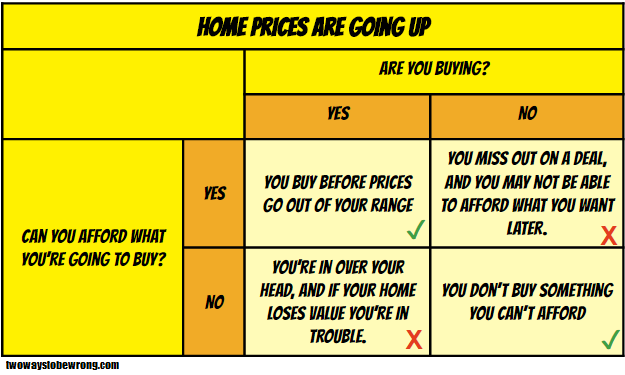
I’ve often repeated on this blog that there are really two ways to be wrong. I bring it up so often because it’s important to remember that being right does not always mean preventing error, but at times requires us to consider how we would prefer to err.

I bring all this up because I had to make a very tough decision this past Saturday, and it all started with Batman.

It was 3 am or so when I heard my 4 year old son crying. This wasn’t terribly unusual…between nightmares or other middle of the night issues this happens just about every other week. I went out in the hall to see what was happening, and I found him crying hysterically. I picked him up and asked him what was wrong, noticing that he seemed particularly upset and very red. “Mama, I swallowed Batman and he’s stuck in my throat and I can’t get him out” he wailed. My heart shot to my throat. He had a small Batman action figure he had taken to bed with him. I had thought it was too big to swallow, and he was a little old for swallowing toys….but in his sleep I had no idea what he could have done. Before I could even look in his mouth he started making a horrible coughing/choking sound l’d never heard before and was gasping for air through the tears. I looked in his mouth and saw nothing, but thought I felt something.

I woke my husband up, and we briefly debated what to do. Our son was still breathing, but he sounded horrible. I was unsure what, if anything was in his throat. I had never called 911 to my own house before, and I ran down the other options. Call the pediatrician? They could take an hour to call back. Drive to the ER? What if something happened in the middle of the highway? Call my mother? She couldn’t do much over the phone.  Google? Seriously? Does “Google hypochondriac” have an antonym that means “person googling something that’s way to important for Google”?

Realizing I had no way of getting a better read on the situation and with my son still horrifically coughing and gasping in the background, I took a deep breath and thought about being wrong. Would I rather risk calling 911 unnecessarily, or risk my child starting to fully choke on an object that might be a funny shape and tough get out with the Hemleich manuever? Phrased that way, the answer was immediately clear. I made the call. The whole train of thought plus discussion with my husband took less than two minutes.

The police and EMTs arrive a few minutes later. My son had started to calm down, and they were great with him. They examined his mouth and throat, and were relatively sure there was nothing in the airway. They found the Batman toy still in his bed. Knowing that his breathing was safe, we drove to the ER ourselves to make sure he hadn’t swallowed anything that was now in his stomach, and that his throat hadn’t gotten irritated or reactive. He still had the horrible sounding cough. He brought Batman with him.

In the end, there was nothing in his stomach. He had spasmodic croup (first time he’s  had croup at all), and the doctor thinks that his “I swallowed Batman” statement was his way of trying to explain to us that he woke up with either a spasm or painful mucus blockage in his throat. The crying had made it worse, which was why he sounded so bad when I went to him. While we were there he picked up Batman, pointed to the tiny cloth cape and said “see, that’s what was in my throat!”. We got some steroids to calm his throat down, and we were on our way home. We all went back to bed.

In the end, I was wrong. I didn’t really need to call 911, and we could have just driven to the hospital ourselves. We needed the stomach x-ray for reassurance and the steroids so he could get some sleep, but there was no emergency. But I tell this whole story because this is where examining up front the preferred way of being wrong comes in handy: I had already acknowledged that being wrong in this way was  something I could live with. My decision making rested in part on being wrong in the right direction. I can live with an unnecessary call. I couldn’t have lived with the alternative way of being wrong.

911

Written out here, this seems so simplistic. However in a (potential) emergency, the choices that go in to each box can vary the calculation wildly.

  1. Can you get more information to increase your chances of being right? (I couldn’t, it was 3 in the morning)
  2. How soon will the consequences occur if you’re wrong? (Choking is a minutes and seconds issue)
  3. How prepared are you to deal with the worst outcome? (I know the Heimlich, but have never done it on a child and was worried that an oddly shaped object might make it difficult)
  4. How severe are the consequences? (Don’t even want to think about this one)

That’s a lot to think about in the middle of the night, but I was glad I had the general mental model on hand. I think it helped save some extra panic, and if I had it to do over again I’d make the same decision.

As for my son, the next morning he informed me that from now on “I’m going to keep my coughs in my mouth. They scare mama.” Someone clearly needs his own contingency matrix.

Type III Errors: Another Way to Be Wrong

I talk a lot about ways to be wrong on this blog, and most of them are pretty recognizable logical fallacies or statistical issues. For example, I’ve previously talked about the two ways of being wrong when hypothesis testing that are generally accepted by statisticians.  If you don’t feel like clicking, here’s the gist: Type I errors are also known as false positives, or the error of believing something to be true when it is not. Type II errors are the opposite, false negatives, or the error of believing an idea to be false when it is not.

Both of those definitions are really useful when testing a scientific hypothesis, which is why they have formal definitions. Today though, I want to bring up the proposal for there to be a recognized Type III error: correctly answering the wrong question.

Here are a couple of examples:

  1. Drunk Under a Streetlight: Most famously, this could be considered a variant of the streetlight effect. It’s named after this anecdote: “A policeman sees a drunk man searching for something under a streetlight and asks what the drunk has lost. He says he lost his keys and they both look under the streetlight together. After a few minutes the policeman asks if he is sure he lost them here, and the drunk replies, no, and that he lost them in the park. The policeman asks why he is searching here, and the drunk replies, “this is where the light is.”
  2. Blame it on the GPS: In my “All About that Base Rate” post, I talked about a scenario where the police were testing trash cans for the presence of drugs. A type I error is getting a positive test on a trash can with no drugs in it. A type II error is getting a negative test on a trash can with drugs in it. A type III error would be correctly finding drugs in a trash can at the wrong house.
  3. Stressing about string theory: James recently had a post about the failure to prove some key aspects of string theory which was great timing since I just finished reading “The Trouble With Physics” and was feeling a bit stressed out by the whole thing. In the book, the author Lee Smolin makes a rather concerning case that we are putting almost all of our theoretical physics eggs in the string theory basket, and we don’t have much to fall back on if we’re wrong. He repeatedly asserts that good science is being done, but that there is very little thought given to the whole “is this the right direction” question.
  4. Blood Transfusions and Mental Health:The book “Blood Work: A Tale of Medicine and Murder in the Scientific Revolution” provides another example, as it recounts the history of the blood transfusion. Originally, the idea was that transfusions could be used as psychiatric treatments. For many many reasons, this use failed spectacularly enough that they weren’t used again for almost 150 years. At that point someone realized they should try using them to treat blood loss, and the science improved from there.

No matter how good the research was in all of these cases, the answer still wouldn’t have helped answer the larger questions at hand. Like a swimmer in open water, the best techniques in the world don’t help if you’re not headed in the right direction. It sounds obvious, but formalizing a definition like this and teaching it while you teach other techniques might help remind scientists/statisticians to look up every once in a while. You know, just to see where you’re going.


Death and Destruction: The Infographic

I am rather notoriously skeptical of infographics, but I found this one from Wait But Why today and it’s completely fascinating. It’s a comparison of how many people die/have died by various causes, some natural, some not so natural.

The whole thing is huge, but here’s a taste:

Deathtoll

I’ve been perusing this for about half an hour now, and I’ve learned about the Masada suicides, the Shensi Earthquake, and the Mao Era in China. It’s not a definitive list, but a really interesting one!

The Signal and the Noise: Chapter 2

This is a series of posts featuring anecdotes from the book The Signal and the Noise by Nate Silver.  Read the Chapter 1 post here.

Chapter 2 of The Signal and the Noise focuses on why political pundits are so often wrong. When TV channels select for those making crazy predictions, it turns out accuracy rates go way down. You can either get bold, or you can be right, but very rarely can you be both.

SignalNoiseCh2

Basically, networks don’t care about false positives….big predictions that don’t come true. What they do care about is false negatives….possibilities that don’t get raised. They consider the first just understandable bluster, but the second is unforgivable. So next time you wonder why there’s so many stupid opinions on TV, remember that’s a feature not a bug.

Read all The Signal and the Noise posts here, or go back to Chapter 1 here.

What I’m Reading: July 2016

This month my book was The Signal and the Noise,  which I enjoyed enough that I’m doing a chapter by chapter contingency matrix series on it over at the other blog.

Sampling strategy and research design can sound really boring, until you blow through $1.3 billion dollars and have nothing to show for it. This article on the long slow death of the National Children’s Study should be assigned reading for anyone who ever wanted to know why it was so damn hard to get good research done.

Did you hear the one about all the Brexit voters furiously Googling “What is the EU?” after they voted to leave it? Yeah? That was pretty bogus. It was about 1000 people total, no one knows if their Googling was “furious”, how they voted, or if those people were even eligible to vote.

This article is from a few months ago, but it’s an interesting look at motivations and political bias. It turns out people do better on “political fact” tests when you offer them money for right answers than when they take them with no incentives.  The Volokh Conspiracy discusses implications for our understanding of political ignorance.

Also from a few months ago: the Quartz guide to bad data. More properly it might be called “guide to cleaning up your spreadsheet”. If you ever actually get a large data file and don’t know how to find potential problems before you analyze it, this is a good start.

Another good guide is this list of data science books from Stitch Fix. Stitch Fix is an online personal stylist service that I just so happen to use to get most of my work clothes. They also have a REALLY active data science division that helps come up with clothing recommendations. Good stuff.

This is an interesting data visualization of the changing American obesity rates.

I actually listened to this one, but there was an interesting piece on Science Friday about “differential privacy” and response randomization. The transcript is available here,  and there’s some interesting discussion about honesty, privacy, and research in the big data era.


Proving Causality: Who Was Bradford Hill and What Were His Criteria?

Last week I had a lot of fun talking about correlation/causation confusion, and this week I wanted to talk about the flip side: correctly proving causality. While there’s definitely a cost to incorrectly believing that Thing A causes Thing B when it does not, it can also be quite dangerous to NOT believe Thing A causes Thing B when it actually does.

This was the challenge that faced many public health researchers when attempting to establish a link between smoking and lung cancer. With all the doubt around correlation and causation, how do you actually prove your hypothesis?  British statistician Austin Bradford Hill was quite concerned with this problem, and he established a set of nine criteria to help prove causal association. While this criteria is primarily used for proving causes for medical conditions, it is a pretty useful framework for assessing correlation/causation claims.

Typically this criteria is explained using smoking (here for example), as that’s what is was developed to assess. I’m actually going to use examples from the book The Ghost Map, which documents the cholera outbreak in London in 1854 and the birth of modern epidemiology.  A quick recap: A physician named John Snow witnessed the start of the cholera outbreak in the Soho neighborhood of London, and was desperate to figure out how the disease was spreading. The prevailing wisdom at the time was that cholera and other diseases were  transmitted by foul smelling air (miasma theory), but based on his investigation Snow began to believe the problem was actually a contaminated water source. In the era prior to germ theory, the idea of a water-borne illness was a radical one, and Snow had to vigorously document his evidence and defend his case….all while hundreds of people were dying. His investigation and documentation is typically acknowledged as the beginning of the field of formal epidemiology, and it is likely he saved hundreds if not thousands of lives by convincing authorities to remove the handle of the Broad Street pump (the contaminated water source).

With that background, here are the criteria:

  1. Strength of Association: The first criteria for proof is basic. People who do Thing A must have a higher rate of Thing B than those who don’t. This is basically a request for an initial correlation. In the case of cholera, this was where John Snow’s “Ghost Map” came in. He created a visual diagram showing that the outbreak of cholera was not necessarily purely based on location, but by proximity to one particular water pump. Houses that were right next to each other had dramatically different death rates IF the inhabitants typically used different water pumps. Of those living near the water pump, 127 died. Of those living nearer to other pumps, 10 died. That’s one hell of an association.
  2. Temporality: The suspected cause must come before the effect. This one seems obvious, but must be remembered. It’s clear that both water and air are consumed frequently, so either method of transmission passed this criteria. However, if you looked closely, it was clear that bad smells often came after disease and death, not before. OTOH, there were a lot of open sewer systems in London at the time, so everything probably smelled kinda bad. We’ll call this one a draw.
  3. Consistency: Different locations must show the same effects. This criteria is a big reason why miasma theory (the theory that bad smells caused disease) had taken hold. When disease outbreaks happened, the smells were often unbearable. This appeared to be very consistent across locations and different outbreaks. Given John Snow’s predictions however, it would have been beneficial to see if cholera outbreaks had unusual patterns around water sources, or if changing water sources changes the outbreak trajectory.
  4. Theoretical Plausibility This one can be tricky to establish, but basically it requires that you can propose a mechanism for cause. It’s designed to help keep out really out there ideas about crystals and star alignment and such. Ingesting a substance such as water quite plausibly could cause illness, so this passed.  Inhaling air also passed this test, since we now know that many diseases are actually transmitted through airborne germs. Cholera didn’t happen to have this method of transmission, but it wasn’t implausible that it could have. Without germ theory, plausibility was much harder to establish. Plausibility is only as good as current scientific understanding.
  5. Coherence The coherence requirement looks at whether the proposed cause agrees with other knowledge, especially laboratory findings. John Snow didn’t have those, but he did gain coherence when the pump handle was removed and the outbreak stopped. That showed that the theory was coherent, or that things proceeded the way you would predict they would if he was correct. Conversely, the end of the outbreak caused a lack of coherence for miasma theory…if bad air was the cause, you would not expect changing a water source to have an effect.
  6. Specificity in the causes The more specific or direct the relationship between Thing A and Thing B, the clearer the causal relationship and the easier it is to prove. Here again, by showing that those drinking the water were getting cholera at very high rates and those not drinking the water were not getting cholera as often, Snow offered a very straightforward cause and effect. If there had been other factors involved….say water drawn at a certain time of day….this link would have been more difficult to establish.
  7.  Dose Response Relationship The more exposure you have to the cause, the more likely you are to have the effect. This one can be tricky. In the event of an infectious disease for example, one exposure may be all it takes to get sick. In the case of John Snow, he actually doubted miasma theory because of this criteria. He had studied men who worked in the sewers, and noted that they must have more exposure to foul air than anyone else. However, they did not seem to get cholera more often than other people. The idea that bad air made you sick, but that lots of bad air didn’t make you more likely to be ill troubled him. With the water on the other hand, he noted that those using the pump daily became sick immediately.
  8. Experimental Evidence While direct human experiments are almost never possible or ethical to run, some experimental evidence may used as support for the theory. Snow didn’t have much to experiment on, and it would have been unethical if he had. However, he did note people who had avoided the pump and noted if they got sick or not. If he had known of animals that were susceptible to cholera, he could have tested the water by giving one animal “good” water and another animal “bad” water.
  9. Analogy If you know that something occurs one place, you can reasonably assume it occurs in other places. If Snow had known of other water-borne diseases, one suspects it would have been easier for him to make his case to city officials. This one can obviously bias people at times, but is actually pretty useful. We would never dream of requiring a modern epidemiologist to prove that a new disease could be water-borne….we would all assume it was at least a possibility.

Even though Snow didn’t have this checklist available to him, he ended up checking most of the boxes anyway. In particular, he proved his theory using strength of association, coherence, consistency and specificity. He also raised questions about the rival theory by pointing to the lack of dose-response relationship. Ultimately, the experiment of removing the pump handle succeeded in halting the outbreak.

Not bad for a little data visualization:

While some of these criteria have been modified or improved, this is a great fundamental framework for thinking about causal associations. Also, if you’re looking for a good summer read, I would recommend the book I referenced here: The Ghost Map. At the very least it will help you stop making “You Know Nothing John Snow” jokes.

The Fallibility of Journalistic Memory, a Play in Three Acts

If you’re looking for a little fun reading on this long holiday weekend, I would like to point you to a series of posts Ann Althouse has put up over the past couple of days. It’s not stats related, but touches on some of my other favorite topics: bias, certainty, and memory.

Act 1: Poetic Justices and Questionable Citations

Linda Greenhouse writes an Op-Ed for the New York Times, in which she complains about the “lack of poetry” in the recent Supreme Court Whole Women’s Health vs Hellerstedt decision.  Greenhouse compares it to the decision Planned Parenthood vs Casey, written 24 years earlier.

The next day, Ann Althouse blogs about the article, noting that Greenhouse attributed the line “Liberty finds no refuge in a jurisprudence of doubt” from Planned Parenthood vs Casey  to Anthony Kennedy.  Althouse points out that the line was taken from a jointly written decision, and that to attribute it to only one justice (Kennedy) is not correct.

Act 2: Challenge Accepted

Ann Althouse posts a follow-up post after Linda Greenhouse emails her to dispute the quote mis-attribution charge. In her email, Greenhouse cites her source for attributing the line to Kennedy: the Jeffrey Toobin book “The Nine” and her own presence in the courtroom the day the justices read the Planned Parenthood vs Casey decision 24 years earlier. She recounts Kennedy leading off with the line in question, and the stir it created in the courtroom. She asserts that the act of reading the line verifies that he was the author. She ends the email with the line “Of course you are completely free to trash my opinions and my writing style.  I would caution you against challenging my facts.”

Althouse, choosing to ignore that last part,  located the original recording of the reading of the decision. She discovers that not only did Kennedy not lead off, but neither he nor anyone else reads the line that Greenhouse so clearly remembers hearing.

The book in question does attribute the line to him, but has no named source for that information.

Part 3: We’re All a Little Wrong Sometimes, Aren’t We Though?

Confronted with the recording that shows her memory was incorrect, Greenhouse emails Althouse again, conceding that “I guess it’s fair to say that each of us was right and each of us was wrong.”

Althouse posts that email, along with her complete rejection of Greenhouse’s conclusion here. She (Althouse) ends her post with “I didn’t say anything that was wrong. I have a way of blogging that keeps me out of trouble like that. I don’t make assertions about things I don’t know.”

Epilogue: One of my favorite books is Mistakes Were Made (But Not By Me) by Carol Tavris1. There’s a tremendous amount of research in to how and why we rewrite memories, and the book covers a lot of those reasons. The main takeaway here though is that we all need to guard against created memories and overconfidence in our facts….ESPECIALLY if you’re going to be writing for the New York Times and PARTICULARLY if you’re challenged.

The point of who exactly wrote that original line is a minor one to many people. Kennedy was certainly involved in with the decision, so naming him as a solo author isn’t that out there. If Greenhouse had merely cited the book that mentioned the line as his, I would never have thought twice about it. However, when she cited her own vivid recollection that turned out to be completely wrong I have to imagine nearly everyone reading the saga started questioning her more seriously.

To her credit, Greenhouse did fully admit her shock at discovering her memory was incorrect. Hopefully the lesson for all of us here is to be very cautious when we rely on an emotionally charged memory, and  EXTRA cautious when we tell someone not to challenge our facts.

1. Conservative readers be warned: in the very first chapter of the book Tavris lets some pretty liberal biased statements through as fact. She cuts this out (I think) after the first chapter, but it’s really bugged at least one person I’ve recommended the book to. I think it’s worthwhile despite that, but YMMV.

Projections, Predictions and Guns vs Cars

Welcome to “From the Archives”, where I dig up old posts and see what’s changed in the years since I originally wrote them.

Last week, while researching my post about definitions you should remember while discussing mass shootings, I came across a post from January of 2013 that warranted further investigation. It was my take on a Bloomberg News article that projected that by 2015 automotive deaths would surpass gun deaths. They had showed this chart:

My primary grouse was that they seemed to be extrapolating the 2015 data from the 2008 and 2009 data. I decided to take a look and see how the Bloomberg prediction had turned out.

Interestingly enough, at this point it appears to be a statistical tie. The Violence Policy Center has a chart up through 2014 showing a slight lead for motor vehicle deaths:

The Washington Post OTOH, gave them a tie (rates reported per 100,000 people):

According to this post, the numbers for gun deaths ended up being 33,599 and the car deaths were 33,736. It is interesting to note that Bloomberg underestimated the car deaths by a little less than 2,000 /year, and the gun deaths by about 600/year. So they were wrong in their assumption that motor-vehicle deaths would continue to drop at the same pace they had been, but right in their assumption gun deaths would continue to rise. I’ll give myself half credit on this one.  Of course, we do have one more year to go before we get the 2015 data, so I could still entirely eat crow.

It’s worth noting that the rise in firearm death through 2014 was entirely due to an increase in suicide rates. Homicide rates actually decreased during that time:

Someone remind me to check back in next year to see where we went with this!

6 Examples of Correlation/Causation Confusion

When I first started blogging about correlation and causation (literally my third and fourth post ever), I asserted that there were three possibilities whenever two variables were correlated. Now that I’m older and wiser, I’ve expanded my list to six:

  1. Thing A caused Thing B (causality)
  2. Thing B caused Thing A (reversed causality)
  3. Thing A causes Thing B which then makes Thing A worse (bidirectional causality)
  4. Thing A causes Thing X causes Thing Y which ends up causing Thing B (indirect causality)
  5. Some other Thing C is causing both A and B (common cause)
  6. It’s due to chance (spurious or coincidental)

The obvious conclusion is that years spent blogging about statistics directly correlates to the number of possible ways of confusing correlation and causation you recognize.

Anyway, I’ve talked about this a lot over the years, and this lesson is pretty fundamental in any statistics class…though options #3 and #4 up there aren’t often covered at all. It’s easily forgotten, so I wanted to use this post to pull together an interesting example of each type.

  1. Smoking cigarettes cause lung cancer (Thing A causes Thing B): This is an example I use in my Intro to Internet Science talk I give to high school students. Despite my continued pleading to be skeptical of various claims, I like to point out that sometimes disbelieving a true claim also has consequences. For years tobacco companies tried to cast doubt on the link between smoking and lung cancer, often using “correlation is not causation!” type propaganda.
  2. Weight gain in pregnancy and pre-eclampsia (Thing B causes Thing A): This is an interesting case of reversed causation that I blogged about a few years ago. Back in the 1930s or so, doctors had noticed that women who got pre-eclampsia (a potentially life threatening condition) also had rapid weight gain. They assumed the weight gain was causing the pre-eclampsia, and thus told women to severely restrict their weight gain. Unfortunately it was actually the pre-eclampsia causing the weight gain, and it is pretty likely the weight restrictions did more harm than good.
  3. Dating and desperation (Thing A causes Thing B which makes Thing A worse): We’ve all had that friend. The one who strikes out with everyone they try to date, and then promptly doubles down on their WORST behaviors. This is the guy who stops showering before he takes girls out because “what’s the point”. Or the girl who gets dumped after bringing up marriage on the third date, so she brings it up on the first date instead. This  is known as “bidirectional causality” and is less formally known as “a vicious cycle”. In nature this can cause some really amusing graph behavior, as in the case of predators and prey.  An increase in prey can cause an increase in predators, but an increase in predators will cause a decrease in prey. Thus, predator and prey populations can be both positively AND negatively correlated, depending on where you are in the cycle.
  4. Vending machines in Schools and obesity (Thing A causes Thing X causes Thing Y which then causes Thing B): One obvious cause of obesity is eating extra junk food. One obvious source of extra junk food is vending machines. One obvious place to find vending machines is in many schools. So remove vending machines from schools and reduce obesity, right? No, sadly, not that easy.  In a longitudinal study that surprised even the authors, it was found that kids who moved from schools without vending machines to those with vending machines don’t gain weight. What’s interesting is that you can find a correlation between kids who were overweight and eating food from vending machines, but it turns out the causal relationship is convoluted enough that removing the vending machines doesn’t actually fix the original end point.
  5. Vitamins and better health (Some other Thing C is causing Thing A and Thing B):This one is similar to #4, but I consider it more applicable when it turns out Thing A and Thing B weren’t even really connected at all. Eating a bag of chips out of a vending machine every day CAN cause you to gain weight, even if removing the vending machine doesn’t help you lose it again. With many vitamin supplements on the other hand, initial correlations are often completely misleading. Many people who get high levels of certain vitamins (Thing A) are actually just those who pay attention to their health (Thing C), and those people tend to have better health outcomes (Thing B).  Not all vitamins should be tarred with the same brush though, this awesome visualization shows where the evidence stands for 100 different supplements.
  6. Spurious Correlations (spurious or due to chance): There’s a whole website of these, but my favorite is this one:  NicCage

Causal inference, not for the faint of heart.


The Signal and the Noise: Chapter 1

I’ve been reading Nate Silver’s “The Signal and the Noise” recently, and pretty much every chapter seems to lend itself to a contingency matrix. Each chapter is focused around a different prediction issue, and Chapter 1 is around the housing bubble and the incorrect valuation of the CDO market.

I wasn’t going to get in to CDO ratings, but here’s the housing bubble:

SignalNoiseCh1

It should be noted that swapping the word “home” in the title for any other product describes pretty much every market bubble ever. Color scheme taken from the cover art of the hardcover version, or maybe the Simpsons.

See all The Signal and the Noise posts here, or go to Chapter 2 here.