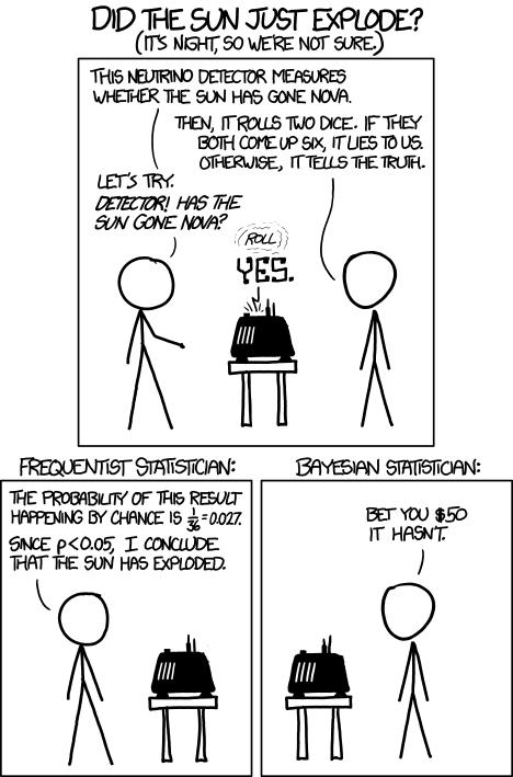
The headline right there was my favorite quote of the whole election cycle.
I got a special request from a coworker of my father’s who suggested to him that I should wade in to the murky water of the gerrymandering controversy. There’s a lot of data being thrown around*, but here’s the gist:
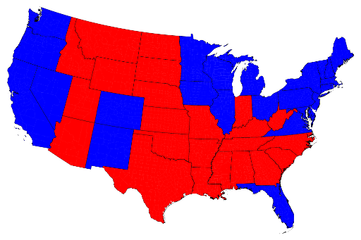
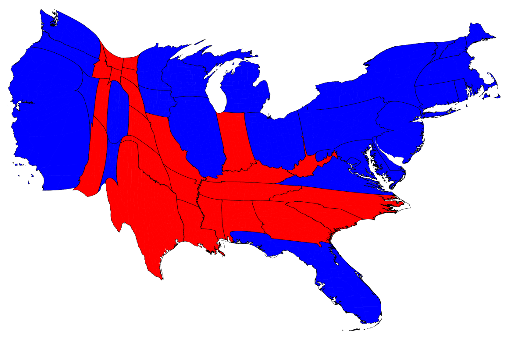
Some Democrats are claiming that the Obama victory and the victory in the Senate have given the Dems a mandate….basically claiming that the country agrees with their policies and they should push forward with them no matter how much resistance from the other side. Resistance is considered irrelevant, because the people didn’t vote their opposition in. Some Republicans on the other hand point to their victory in the House to say that actually they have the mandate, or at the very least that Obama/Dems do not have any sort of consensus. The Dems counterpoint is that the Republicans only kept the house because of clever gerrymandering (redistricting) they orchestrated in 2010. Thus, the Democrat mandate is even stronger than it appears because the Republicans cheated to get theirs.
So, was it all chicanery? How do we assess election and gerrymandering data?
Well, the first step is to look at the popular vote. I couldn’t find any updates, but as of Nov 9th, the Democrats got more votes for their house candidates than the Republicans did (by a very small margin).
However, this may or may not mean much.
State politics are a funny thing. In many states, people run unopposed, or with only token opposition. It’s hard to count popular vote when many races are foregone conclusions. Additionally, on the state level I’d wager people are more likely to vote for incumbents, if only for the extra power they believe it gives them to have more senior congressional members representing them. Adding to the difficulty of interpreting the numbers is California’s new system of doing run off races….so we can’t presume that all house seats were decided in Rep vs Dem contests.
Alright, so where does that leave us?
Ultimately, we have to cut through the mess and ask ourselves what a fairer system would be, and what the results would have been under said fairer system would have been. This blog post over at ballotlines does that quite nicely. The short version is this: even if the House seats were broken down based on popular vote by state, the Republicans would have kept the majority, though not by as wide a margin.
Another interesting take is here at the Monkey Cage blog, which revisits the 2008 district map, and shows the Republicans still winning the house, though again by a smaller margin.
So Dad, you were right, gerrymandering likely does NOT explain the house win, though it does seem to explain the magnitude. That’s just math you do as a Democrat to make yourself feel better**.
*Along with data being thrown around, there’s also some FANTASTIC conspiracy theories. The two best I’ve read in comments sections so far are: (Republican) “Polls clearly show almost twice as many people self identify as conservative vs liberal. For Obama to win raises some serious questions. Given that Silicone Valley is in California, and Californians are liberal, I think we should check how the voting machines were programmed. I believe Mitt Romney won 60% to 40% and the computer programmers changed millions of votes.” (Democrat) “I understand that Romney does better among married women than single women. Does anyone else think that’s because so many conservative men are abusive and probably force their wives to vote Republican? At my polling place I saw people enter the voting booth together, my guess is it was men making sure their wives voted the way they wanted”. Actually, that first one is mostly just kind of tinfoil hat paranoid, the second one I found pretty disgusting. Believing that many conservative men are capable of domestic violence is a kind of chilling way to view the world.
**All of the analysis here of course sidesteps the issue of how voter turnout would change if a new system were implemented. We live in a country where (at last count) 42% of eligible voters didn’t vote. Since we can only guess at what those voters would have done, we can’t know for sure how any new or different system would effect any of this.
**All of the analysis here of course sidesteps the issue of how voter turnout would change if a new system were implemented. We live in a country where (at last count) 42% of eligible voters didn’t vote. Since we can only guess at what those voters would have done, we can’t know for sure how any new or different system would effect any of this.