Calling BS Read-Along Week 12: Refuting Bullshit

Welcome to the Calling Bullshit Read-Along based on the course of the same name from Carl Bergstorm and Jevin West  at the University of Washington. Each week we’ll be talking about the readings and topics they laid out in their syllabus. If you missed my intro and want the full series index, click here or if you want to go back to Week 11 click here.

Well guys, we made it! Week 12, the very last class. Awwwwwwwe, time flies when you’re having fun.

This week we’re going to take a look at refuting bullshit, and as usual we have some good readings to guide us. Amusingly, there’s only 3 readings this week, which puts the course total for “readings about bullshit”  at an order of magnitude higher than the count for “readings about refuting bullshit”.  I am now dubbing this the “Bullshit Assignment Asymmetry Principle: In any class about bullshit, the number of readings dedicated to learning about bullshit will be an order of magnitude higher than the number of readings dedicated to refuting it”. Can’t refute what you can’t see.

Okay, so first up in the readings is the short-but-awesome “Debunking Handbook” by John Cook and Stephan Lewandowsky. This pamphlet lays out a compelling case that truly debunking a bad fact is a lot harder than it looks and must be handled with care. When most of us encounter an error, we believe throwing information at the problem will help. The Debunking Handbook points out a few issues:

  1. Don’t make the falsehood familiar A familiar fact feels more true than an unfamiliar one, even if we’re only familiar with it because it’s an error
  2. Keep it simple Overly complicated debunkings confuse people and don’t work
  3. Watch the worldview Remember that sometimes you’re arguing against a worldview rather than a fact, and tread lightly
  4. Supply an alternative explanation Stating “that’s not true” is unlikely to work without replacing with an alternative

They even give some graphic/space arranging advice for those trying to put together a good debunking. Check it out.

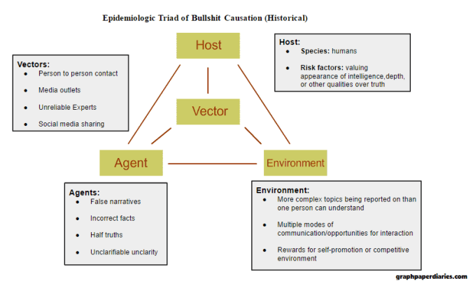
The next paper is a different version of calling bullshit that starts to tread in to the academic trolling territory we discussed a few weeks ago, but stops short by letting everyone be in on the joke. It’s the paper “Neural correlates of interspecies perspective taking in the post-mortem Atlantic Salmon: An argument for multiple comparisons correction“, and it answers the age old question of “what happens when you put a dead fish in an MRI machine”. As it turns out, more than you’d think. It turns out they discovered statistically significant brain activity, even after death.

Or did they?

As the authors point out, when you are looking at 130,000 voxels, there’s going to be “significant” noise somewhere, even in a dead fish. Even using a p-value of .001, you still will get some significant voxel activity and some of those will almost certainly be near each other, leading to the “proof” that there is brain activity. There are statistical methods that can be used to correct for this, and they are widely available, but often underused.

By using traditional methods in such an absurd circumstance, the authors are able to call out a bad practice while not targeting anyone individually. Additionally, they make everyone a little more aware of the problem (reviewers and authors) in a memorable way. They also followed the debunking schema above and immediately provided alternative methods for analysis. Overall, a good way of calling bullshit with minimal fallout.

Finally, we have one more paper “Athletics:  Momentous sprint at the 2156 Olympics?” and its corresponding Calling Bullshit Case Study. This paper used a model to determine that women would start beating men in the 100 meter dash on an Olympic level in 2156. While the suspicion appears to be that the authors were not entirely serious and meant this to be a critique of modeling in general, some of the responses were pretty great. It turns out this model also proves that by 2636 races will end before they begin. I, for one, am looking forward to this teleportation breakthrough.

Yet again here we see a good example of what is sometimes called “highlighting absurdity by being absurd”. Saying that someone is extrapolating beyond the scope of their model sounds like a nitpicky math argument (ask me how I know this), but pointing out the techniques being used can prove ridiculous things makes your case pretty hard to argue with.

Ultimately, a lot of calling bullshit in statistics or science gets down to a lot of the same things we have to consider when confronting any other bad behavior in  life. Is it worth it? Is this the hill to die on? Is the problem frequent? Are you attacking the problem or the person? Do you know the person? Is anyone listening to the person/do they have a big platform? Is there a chance of making a difference? Are you sure you are not guilty of the same thing you’re accusing someone else of? Can humor get the job done?

While it’s hard to set any universal rules, these are about as close as I get:

  1. Media outlets are almost always fair game They have a wide reach and are (at least ostensibly) aiming to inform, so they should have bullshit called whenever you see it, especially for factual inaccuracies.
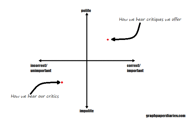
  2. Don’t ascribe motive I’ve seen a lot of people ruin a good debunking by immediately informing the person that they shared some incorrect fact because they are hopelessly biased/partisan/a paid shill/sheeple. People understandably get annoyed by that, and they react more defensively because of it. Even if you’re right about the fact in question, if you’re wrong about their motive that’s all they’ll remember. Don’t go there.
  3. Watch what you share Seriously, if everyone just did this one, we wouldn’t be in this mess.
  4. Your field needs you Every field has its own particular brand of bullshit, and having people from within that field call bullshit helps immensely.
  5. Strive for improvement Reading things like the debunking handbook and almost any of the readings in this course will help you up your game. Some ways of calling bullshit simply are more effective than others, and learning how to improve can be immensely helpful.

Okay, well that’s all I’ve got!

Since this is the end of the line for the class, I want to take this opportunity to thank Professors Bergstrom and West for putting this whole syllabus and class together,  for making it publicly available, and for sharing the links to my read-along. I’d also like to thank all the fun people who have commented on Twitter, the blog or sent me messages….I’m glad people enjoyed this series!

If you’d like to keep up with the Calling Bullshit class, they have  twitter,  facebook, and a  mailing list.

If you’d like to keep up with me, then you can either subscribe to the blog in the sidebar, or follow me on Twitter.

Thanks everyone and happy debunking!

Calling BS Read-Along Week 11: Fake News

Welcome to the Calling Bullshit Read-Along based on the course of the same name from Carl Bergstorm and Jevin West  at the University of Washington. Each week we’ll be talking about the readings and topics they laid out in their syllabus. If you missed my intro and want the full series index, click here or if you want to go back to Week 10 click here.

Guys, guys, it’s week 11! We’re down to our second to last read-along, and this week we’re tackling the topic that has recently skyrocketed in popularity public awareness: fake news. To give you a sense of how new this term is to public discussion, check out the Google trends history:

Now Google trends isn’t always the best way of figuring out how popular a search term is (the x-axis is a comparison of the term to its own peak of popularity) but it does let us know the interest in this term really took off after the US election in November and has not settled back down. Apparently when online fake news started prompting real life threats of nuclear war, people took notice.

But what is fake news exactly, and is it really a new phenomena? That’s the question our first reading sets out to answer. The article “Before Fake News Came False Prophecy” uses some British history to frame our current debate, and makes the assertion that “prophecy” about ones political opponents was the old time version of fake news. I hadn’t previously connected the idea of prophecy to the idea of fake news, but it really is the historic equivalent: guarantees that dark and terrible things will happen (or may already be happening) if your enemies are allowed to be (or remain) in charge. As the article says “Prophecy didn’t describe the world as it was, but as it was to be—or as it might become. That fantasy was more powerful than any lived reality. People killed and died for fantasies. People didn’t act politically because of what they had lost but because of what, in their most potent fantasy, they feared losing.”

With that framing, fake news becomes not just a tool of misinformation, but actually something that’s playing off our imagination. It blurs the line between “this is true because it happened” and “this is true because it might happen”.

Okay, so fake news is bad, but what is it really? The next reading from Factcheck.org actually takes that on a bit before they go in to the ever important “how to spot it” topic. They quote the guy who started Snopes and point out that “fake news” or fake stories made up by websites trying to make money is really a subset of “bad news” which is (as he puts it) “shoddy, unresearched, error-filled, and deliberately misleading reporting that does a disservice to everyone”.  I think the “this is just one branch of a tree of bad” point is an important point to keep in mind, and I’ll circle back to it later. That being said, there is something a little bit different about entirely fictitious stories, and there are some red flags you should look for. Factcheck gives a list of these,  such as anonymous authors, lots of exclamation points, links to sources that don’t support the story, and quoting “Fappy the Anti-Masturbation Dolphin” as a source. They also caution that you should always check the date on stories, as sometimes people attempt to connect true older stories to current events as though they were more recent. They also highlight people who don’t realize known satirists are satire (see the website Literally Unbelievable for a collection of people who don’t know about the Onion).

So why are we so worried about fake news? Can’t we just ignore it and debunk as needed? Well….maybe, but some of this is a little more organized than you may think. The next reading “The Agency” is a long but chilling New York Times investigation in to, some real world accounts of some rather scary fake news moments.  They start with a bizarre case of a reported but non-existent chemical plant explosion in Louisiana. This story didn’t just get reported to the media but was texted to people who lived nearby the plant, posted on Twitter with doctored local Louisiana news reports and the whole thing started trending on Twitter and getting picked up nationally while the actual chemical plant employees were still pulling themselves out of bed and trying to figure out what was going on. While no one really identified a motivation for that attack, the NYTs found links to suggest it was orchestrated by a group from Russia that employs 400 people to do nothing but spread fake news. This group works 12 hour days trolling the internet causing chaos in comments sections on various sites all over the place for purposes that aren’t clear to almost anyone, but with an end result of lots of aggravation for everyone.

Indeed, this appears to be part of the point. Chen’s investigation suggests that after the internet was used to mobilize protests in Russia few years ago, the government decided to hit back. If you could totally bog down political websites and comments sections with angry dreck, normal people wouldn’t go there. At best, you’d convince someone that the angry pro-government opinions were the majority and that they should play along. Failing that, you’d cut off a place where people might have otherwise gathered to express their discontent. Chen tracks the moves of the Russian group in to US events, which ultimately ends up including a campaign against him. The story of how they turned him from a New York Times reporter in to a neo-Nazi CIA recruiter is actually so bizarre and incredible I cannot do it justice, so go read the article.

Not every fake news story is coming out of a coordinated effort however, as yet another New York Times article discusses. Some of it is just from regular people who discovered that this is a really good way of making money. Apparently bullshit is a fairly lucrative business.

Slight tangent: After the election, a close family member of mine was reading an article on the “fake news” topic, and discovered he had actually gone to college with one of the people interviewed. The guy had created a Facebook group we had heard of that spewed fake and inflammatory political memes and was now making (allegedly) a six figure monthly salary to do so. The guy in question was also fairly insane (like “committed assault over a minor dorm dispute” type insane), and had actually expressed no interest in politics during college. In real life, he had trouble making friends or influencing people, but on the internet he turned his knack for conflict and pissing people off in to a hefty profit. Now I know this is just a friend of a friend story and you have now real reason to believe me, but I think the fundamental premise of “these news stories/memes might have creators who you wouldn’t let spend more than 5 minutes in your living room” is probably a good thing to keep in mind.

So why do people share these things? Well, as the next reading goes in to, the answer is really social signaling. When you share a news story that fits your worldview, you proclaim allegiance to your in-group. When you share a fake news story, you also probably enrage your out-group. By showing your in-group that you are so dedicated to your cause that you’re willing to sacrifice your reputation with your out-group, you increase your ties with them. The deeper motivations here are why simply introducing contradictory facts doesn’t always work (though they sometimes do – more on the most recent research on the “backfire effect” here), particularly if you get snarky about it. People may not see it as a factual debate, but rather a debate about their identity. Yikes. The article also mentions three things you can personally do to help 1) Correct normal errors, but don’t publicly respond to social signalling. 2) Make “people who value truth” your in-group and hold yourself to high standards 3) Leave room for satire, including satire of your own beliefs.

I endorse this list.

Finally, we take a look at how technology is adding to the problem, not just by making this stuff easier to share, but sometimes by promoting it. In the reading “Google’s Dangerous Identity Crisis“, we take a look at Google’s “featured” search results. These are supposed to be used to highlight basic information like “what time does the Superbowl start” but can also end up highlighting things like “Obama is planning a coup”. The identity crisis in question is whether Google exists simply to index sites on the web or whether it is verifying some of those sites as more accurate than others. The current highlighting feature certainly looks like an endorsement of a fact, but it’s really just an advanced algorithm that can be fooled pretty easily. What Google can or should be doing about that is up for debate.

Whew, okay, that was a lot of fake news, and a lot of depressing stuff. What would I add to this whole mess? Well, I really liked the list given in the CNN article. Not boosting people’s signalling, watching your own adherence to truth and keeping a sense of humor are all good things. They other thing I’ve found very effective is to try to have more discussions about politics with people I know and trust. I think online news stories (fake or not) are frequently like junk food: easy to consume and easy to overdo it with. Even discussions with friends who don’t agree with me can never match the quick hit vitriolic rush of 100 Twitter hot takes.

The second thing I’d encourage is to not let the “fake news” phenomena distract from the “bad news” issues that can be perpetuated by even respectable news sources. The FactCheck article quoted the guy from Snopes.com on this topic, and I think it’s important. Since the rise of the “fake news” phenomena, I’ve had a few people tell me that fact checking traditional media is no longer as important. That seems horribly off to me. Condemning fake news should be part of a broader movement to bring more accuracy to all of our news.

Okay, that’s all I’ve got for today. Check back in next week for the last class!

Calling BS Read-Along Week 10: The Ethics of Calling Bullshit

Welcome to the Calling Bullshit Read-Along based on the course of the same name from Carl Bergstorm and Jevin West  at the University of Washington. Each week we’ll be talking about the readings and topics they laid out in their syllabus. If you missed my intro and want the full series index, click here or if you want to go back to Week 9 click here.

Wow, week 10 already? Geez, time flies when you’re having fun. This week the topic is “the ethics of Calling Bullshit” and man is that a rich topic. With the advent of social media, there are more avenues than ever for both the perpetuation and correction of bullshit than ever before. While  most of us are acutely aware of the problems that arise with the perpetuating of bullshit, are there also concerns with how we go about correcting bullshit? Spoiler alert: yes. Yes there are. As the readings below will show, academia has been a bit rocked by this new challenge, and the whole thing isn’t even close to being sorted out yet. There are a lot more questions than answers raised this week.

Now, as a blogger who frequently blogs about things I think are kinda bullshit, I admit I have a huge bias in the “social media can be a huge force for good” direction. While I doubt this week’s readings will change my mind on that, I figured pointing out how biased I am and declaring my intention to fairly represent the opposing viewpoint might help keep me honest. We’ll see how it goes.

For the first reading, we’re actually going to take a look at a guy who was trolling before trolling was a thing and who may have single handedly popularized the concept of “scientific trolling”: Alan Sokal.  Back in 1994, long before most of the folks on 4chan were born, Sokal became famous for having created a parody paper called “Transgressing the Boundaries: Toward a Transformative Hermeneutics of Quantum Gravity” that and getting it published in the journal Social Text as a serious work. His paper contained claims like “physical reality is a social construct” and that quantum field theory is the basis for psychoanalysis. Unfortunately for Social Text, they published it in a special “Science Wars” edition of their journal unchallenged. Why did he do this? In his own words: “So, to test the prevailing intellectual standards, I decided to try a modest (though admittedly uncontrolled) experiment: would a leading North American journal of cultural studies….publish an article liberally salted with nonsense if (a) it sounded good and (b) it flattered the editors’ idealogical preconceptions?” When he discovered the answer was yes, he published his initial response here.

Now whether you consider this paper a brilliant and needed wake up call or a cheap trick aimed at tarring a whole swath of people with the same damning brush depends largely on where you’re sitting. The oral history of the event is here (for subscribers only, I found a PDF copy here), does a rather fair job of getting a lot of perspectives on the matter. On the one hand, you have the folks who believe that academic culture needed a wake up call, and that they should be deeply embarrassed that no one knew the difference between a serious paper and one making fun of the whole field of cultural studies. On the other hand, you have those who felt that Sokal exploited a system that was acting in good faith and  gave its critics an opportunity to dismiss everything that comes out of that field. Both sides probably have a point. Criticizing the bad parts of a field while encouraging people to maintain faith in the good parts is an incredibly tough game to play. I got a taste of this after my first presentation to a high school class, when some of the kids walked away declaring that the best course action was to never believe anything scientific. Whether you agree with Sokal or not, I will suspect every respectable journal editor has been on the look out for hoaxes a little more vigilantly ever since that incident.

Next up is an interesting example of a more current scientific controversy that appears to be spinning way out of control: nano-imaging.  I’ll admit, I had no idea this feud was even going on, but this article reads more like a daytime TV plot than typical science reporting. There are accusations of misconduct, anonymous blog postings, attacks and counter attacks, all over the not particularly well known controversy of whether or not you can put stripes on nanoparticles. While the topic may be unfamiliar to most of us, the debate over how the argument is being approached is pretty universal. If you have a problem with someone else’s work and believe traditional venues for resolution are too slow, what do you do? Alternatively, what do you make of a critic who is mostly relying on social media to voice their concerns? These are not simple questions. As we’ve seen in many areas of life (most recently the airline industry), traditional venues do at times love to cover up their issues, silence critics and impede progress. On the other hand, social media is easily abused and sometimes can enable people with an agenda to spread a lot of criticism with minimal fact checking. From the outside, it’s hard to know what’s what. I had no opinion on the “stripes on nanoparticles” debate, and I have no way of judging who has the better evidence. I’m left with going with my gut on who’s sounding more convincing, which is completely the opposite of how we’re supposed to evaluate evidence. I’m intrigued for all the wrong reasons.

Going even further down the rabbit hole of “lots of questions not many answers”, the next reading is from Susan Fiske “Mob Rule or Wisdom of the Crowds” where she explains exactly how bad the situation is getting in psychology. She explains (though without names or sources) many of the vicious attacks she’s seen on people’s work and how concerning the current climate is. She sees many of the attacks as personal vendettas more focused on killing people’s careers than improving science, and calls the criticizers “methodological terrorists”. Her basic thesis is that hurting people is not okay, drives good people out of the field, and makes things more adversarial than they need to be.

Fiske’s letter got a lot of attention, and had some really good response opinions posted as well. One is from a researcher, Daniel Lakens, who wrote about his experience being impolitely called out on an error in his work. He realized that the criticism stung and felt unfair, but the more he thought about it the more true he realized it was. He changed his research practices going forward, and by the time a meta-analysis showed that the original criticism was correct, he wasn’t surprised or defensive. So really what we’re talking about here is a setup that looks like this:

Yeah, this probably should have had a z-axis for the important/unimportant measure, but my computer wasn’t playing nice.

It is worth noting that (people being people and all) it is very likely we all think our own critiques are more polite and important than they are, and that our critics are less polite  and their concerns less important than they may be.

Lakens had a good experience in the end, but he also was contacted privately via email. Part of Fiske’s point was that social media campaigns can get going, and then people feel attacked from all sides. I think it’s important that we don’t underestimate the social media effect here either, as I do think it’s different from a one on one conversation. I have a good friend who has worked in a psychiatric hospital for years, and he tells me that one of the first things they do when a patient is escalating is to get everyone else out of the room. The obvious reason for this is safety, but he said it is also because having an audience tends to amp people up beyond where they will go on their own. A person alone in a room will simply not escalate as quickly as someone who has a crowd watching. With social media of course, we always have a crowd watching. It’s hard to dial things back once they get going.

Some fields have felt this acutely. Andrew Gelman responds to Fiske’s letter here by giving his timeline of how quickly the perspective on the replication crisis changed, fueled in part by blogs and Twitter. From something that was barely talked about in 2011, to something that is pretty much a given now, we’ve seen people come under scrutiny they’ve never had before. Again, this is an issue shared by many fields….just ask your local police officer about cell phone cameras….but the idea that people were caught off guard by the change is pretty understandable. Gelman’s perspective however is that this was a needed ending to an artificially secure spot. People were counting on being able to cut a few corners with minimal criticism, then weren’t able to anymore. It’s hard to feel too much sympathy for that.

Finally we have an article that takes a look at PubPeer, a site that allows users to make anonymous post-publication comments on published articles. This goes about as well as you’d expect: some nastiness, some usefulness, lots of feathers ruffled. The site has helped catch some legitimate frauds, but has also given people (allegedly) an outlet to pick on their rivals without fear of repercussion or disclosing conflicts of interest. The article comes out strongly against the anonymity provided and calls the whole thing “Vigilante Science”. The author goes particularly hard after the concept that anonymity allows people to speak more freely than they would otherwise, and points out that this also allows people to be much meaner, more petty, and possibly push an agenda harder than they could otherwise.

Okay, so we’ve had a lot of opinions here, and they’re all over the graph I made above. If you add in the differences in perception of tone and importance of various criticisms, you can see easily why even well meaning people end up all over the map on this one. Additionally, it’s worth nothing that there actually are some non-well meaning people exploiting the chaos in all of this, and they complicate things too. Some researchers really are using bad practices and then blaming others when they get called out. Some anonymous commenters really are just mouthing off or have other motivations for what they’re saying.

As I said up front, it should not come as a shock to anyone that I tend to fall on the side of appreciating the role of social media in science criticism. However, being a blogger, I have also received my fair share of criticism  from anonymous sources and have a lot of sympathy for the idea that criticism is not always productive as well. The graph I did a few paragraphs ago really reflects my three standards for criticism I give and receive. There’s no one size fits all recommendation for every situation, but in general I try to look at these three things:

  1. Correct/incorrect This should be obvious, but your criticism should be correct. If you’re going to take a shot at someone else’s work, for the love of God make sure you’re right. Double points if you have more than your own assertion to back you up. On the other hand, if you screw up, you can expect some criticism (and you will screw up at some point). I’m doing a whole post on this later this week.
  2. Polite/impolite In general, polite criticism is received better than impolite criticism. It’s worth noting of course that “polite” is not the same as “indirect”, and that frequently people confuse “direct” for “rude”. Still, politeness is just….polite. Particularly if you’ve never raised the criticism before, it’s probably best to start out polite.
  3. Important/unimportant How important is it that the error be pointed out? Does it change the conclusions or the perspective?

These three are not necessarily independent variables. A polite note about a minor error is almost always fine. On the other hand it can be hard to find a way of saying “I think you’ve committed major fraud” politely, though if you’re accusing someone of that you DEFINITELY want to make sure you have your ducks in a row.  I think the other thing to consider is how easy the criticism is to file through other means. If you create a system where people have little recourse, where all complaints or criticisms are dismissed or minimized, people will start using other means to make complaints. This was part of Sokal’s concern in the first reading. How was a physicist supposed to make a complaint with the cultural studies department and actually be listened to? I’m no Sokal, but personally I started this blog because I was irritated with the way numbers and science were getting reported in the media, and putting all my thoughts in one place seemed to help more than trying to email journalists who almost never seemed to update anything.

When it comes to the professional realm, I think similar rules apply. We’re all getting used to the changes social media has brought, and it is not going away any time soon. We’re headed in to a whole new world of ethics where many good people are going to disagree. Whether you’re talking about research you disagree with or just debating with your uncle at Thanksgiving, it is worth thinking about where your lines are and what battles you want to fight and how you want to fight them.

Okay, that wraps up a whole lot of deep thoughts for the week, see you next week for some Fake News!

Week 11 is up! Get your fake news here!

Calling BS Read-Along Week 9: Predatory Publishing and Scientific Misconduct

Welcome to the Calling Bullshit Read-Along based on the course of the same name from Carl Bergstorm and Jevin West  at the University of Washington. Each week we’ll be talking about the readings and topics they laid out in their syllabus. If you missed my intro and want the full series index, click here or if you want to go back to Week 8 click here.

Welcome back to Week 9 of the Calling Bullshit Read-Along! This week our focus is on predatory publishing and scientific misconduct. Oh boy. This is a slight change of focus from what we’ve been talking about up until now, and not for the better. In week one we established that in general, bullshit is different than lying in that it is not solely attempting to subvert the truth. Bullshit may be characterized by a (sometimes reckless) disregard for truth, but most bullshitters would be happy to stick to the truth if it fit their agenda. The subjects of this weeks readings are not quite so innocent, as most of our focus is going to be on misconduct by people who should have known better. Of course sometimes the lines between intentional and unintentional misconduct are a little less clear than one would hope, but for our purposes the outcome (less reliable research) is the same.  Let’s take a look.

To frame the topic this week, we start with a New York Times article “A Peek Inside the Strange World of Fake Academia“, which takes a look at, well, Fake Academia. In general “fake academia” refers to conferences and journals set up with very little oversight (one man runs 17 of them) or review but high price tags. The article looks at a few examples that agreed to publish abstracts created using the iPhone autocomplete feature or “featuring” keynote speakers who never agreed to speak. Many of these are run by a group called OMICS International, which has gotten in to legal trouble over their practices. However, some groups/conferences are much harder to classify. As the article points out, there’s a supply and demand problem here. More PhDs need publication credits than can get their work accepted by legitimate journals or conferences, so anyone willing to loosen the standards can make some money.

To show how bad the problem of “pay to play” journals/conferences are, the next article (by the same guys who brought us Retraction Watch) talks about a professor who decided to make up some scientists just to see if there was any credential checking going on at these places. My favorite of these was his (remarkably easy) quest to get Borat Sagdiyev (a senior researcher at the University of Kazhakstan) on the editorial board of the journal Immunology and Vaccines. Due to the proliferation of journals and conferences with low quality control, these fake people ended up with surprisingly impressive sounding resumes.  The article goes on to talk about researchers who make up co-authors, and came to the troubling conclusion that fake co-authors seemed to help publication prospects. There are other examples provided of “scientific identify fraud”: researchers finding their data has been published by other scientists (none of whom are real), researchers recommending that made up scientists review their work (the email addresses route back to themselves), and the previously mentioned pay-for-publication journals. The article wraps up with a discussion of even harder to spot chicanery: citation stuffing and general metrics gaming. As we discussed in Week 7 with Jevin West’s article, attempting to rank people in a responsive system will create incentives to maximize your ranking. If there is an unethical way of doing this, at least some people will find it.

That last point is also the focus of one of the linked readings “Academic Research in the 21st Century: Maintaining Scientific Integrity in a Climate of Perverse Incentives and Hypercompetition“. The focus of this paper is on the current academic climate and its negative effect on research practices. To quote Goodhart’s law “when a measure becomes a target, it ceases to be a good measure”. It covers a lot of ground including increased reliance on performance metrics, decreased access to funding, and an oversupply of PhDs.  My favorite part of the paper was this table:

That’s a great overview of how the best intentions can go awry. This is all a set up to get to the meat of the paper: scientific misconduct. In a high stakes competitive environment, the question is not if someone will try to game the system, but how often it’s already happening and what you’re going to do about it. Just like in sports, you need to acknowledge the problem (*cough* steroid era *cough*) then come up with a plan to address it.

Of course the problem isn’t all on the shoulders of researchers, institutions or journals. Media and public relations departments tend to take the problem and run with it, as this Simply Statistics post touches on. According to them, the three stories that seem to get the most press are:

  1. The exaggerated big discovery
  2. Over-promising
  3. Science is broken

Sounds about right to me. They then go on to discuss how the search for the sensational story or the sensational shaming seems to be the bigger draw at the moment. If everyone focuses on short-term attention to a problem rather than the sometimes boring work of making actual tiny advancements or incremental improvements, what will we have left?

With all of this depressing lead in, you may be wondering how you can tell if any study is legitimate. Well, luckily the Calling Bullshit overlords have a handy page of tricks dedicated to just that! They start with the caveat that any paper anywhere can be wrong, so no list of “things to watch for” will ever catch everything. However, that doesn’t mean that every paper is at equal risk, so there are some ways to increase your confidence that the study you’re seeing is legitimate:

  1. Look at the journal As we discussed earlier, some journals are more reputable than others. Unless you really know a field pretty well, it can be pretty tough to tell a prestigious legitimate journal from a made up but official sounding journal. That’s where journal impact factor can help…it gives you a sense of how important the journal is to the scientific community as a whole. There are different ways of calculating impact factors, but they all tend to focus on how often the articles published in the various journals end up being cited by others, which is a pretty good way of figuring out how others view the journal. Bergstorm and West also give a link to their Google chrome extension the Eigenfactorizer, which color codes journals that appear in PubMed searches based on their Eigenfactor ranking.  I downloaded this and spent more time playing around with it than I probably want to admit, and it’s pretty interesting. To give you a sense of how it works, I typed in a few key words from my own field (stem cell transplant/cell therapies) and took a look at the results. Since it’s kind of a niche field, it wasn’t terribly surprising to see that most of the published papers are in yellow or orange journals. The journals under those colors are great and very credible, but most of the papers have little relevance to anyone not in the hem malignancies/transplant world. A few recent ones on CAR-T therapy showed up in red journals, as that’s still pretty groundbreaking stuff. That leads us to the next point…
  2. Compare the claim to the venue As I mentioned, the most exciting new thing going in the hematologic malignancies world right now is CAR-T and other engineered cell therapies. These therapies hold promise for previously incurable leukemias and lymphomas, and research institutions (including my employer) are pouring a lot of time, money and effort in to development. Therefore it’s not surprising that big discoveries are getting published in top tier journals, as everyone’s interested in seeing where this goes and what everyone else is doing. That’s the normal pattern. Thus, if you see a “groundbreaking” discovery published in a journal that no one’s ever heard of, be a little skeptical. It could be that the “establishment” is suppressing novel ideas, or it could be that the people in the field thought something was off with the research. Spoiler alert: it’s probably that second one.
  3. Are there retractions or questions about the research? Just this week I got pointed to an article about 107 retracted papers from the journal Tumor Biology due to a fake peer review scandal, the second time this has happened to this journal in the last year. No matter what the field, retractions are worth keeping an eye on.
  4. Is the publisher predatory? This can be hard to figure out without some inside knowledge, so check out the resources they link to.
  5. Preprints, Google Scholar, and finding out who the authors are Good tips and tricks about how to sort through your search results. Could be helpful the next time someone tells you it’s a good idea to eat chocolate ice cream for breakfast.

Whew, that’s a lot of ground covered. While it can be disappointing to realize how many instances/ways  of committing scientific misconduct there are, it’s worth noting that we currently have more access to more knowledge than at nearly any other time in human history. In week one, we covered that the more opportunities for communication there are, the more bullshit we will encounter. Science is no different.

At the same time, the sciences have a unique opportunity to lead the way in figuring out how to correct for the bullshit being created within it’s ranks and to teach the public how to interpret what gets reported. Some of the tools provided this week do point in a hopeful direction (not to mention the existence of this class!) are a great step in the right direction.

Well, that’s all I have for this week! Stay tuned for next week when we cover some more ethics, this time from the perspective of the bullshit-callers as opposed to the bullshit producers.

Week 10 is up! Read it here.

Calling BS Read-Along Week 8: Publication Bias

Welcome to the Calling Bullshit Read-Along based on the course of the same name from Carl Bergstorm and Jevin West  at the University of Washington. Each week we’ll be talking about the readings and topics they laid out in their syllabus. If you missed my intro and want the full series index, click here or if you want to go back to Week 7 click here.

Well hello Week 8! How’s everyone doing this week? A quick programming note before we get going: the videos for the lectures for the Calling Bullshit class are starting to be posted on the website here. Check them out!

This week we’re taking a look at publication bias, and all the problems that can cause. And what is publication bias? As one of the readings so succinctly puts it, publication bias  “arises when the probability that a scientific study is published is not independent of its results.” This is a problem because it not only skews our view of what the science actually says, but also is troubling because most of us have no way of gauging how extensive an issue it is.  How do you go about figuring out what you’re not seeing?

Well, you can start with the first reading, the 2005 John Ioannidis paper “Why Most Published Research Findings are False“.  This  provocatively titled yet stats heavy paper does a deep dive in to the math behind publication and why our current research practices/statistical analysis methods may lead to lots of false positives reported in the literature. I find this paper so fascinating/important I actually did a seven part deep dive in to it a few months ago, because there’s a lot of statistical meat in there that I think is important. If that’s TL;DR for you though, here’s the recap: the statistical methods we use to control for false positives and false negatives (alpha and beta) are insufficient to capture all the factors that might make a paper more or less likely to reach an erroneous conclusion.  Ioannidis lays out quite a few factors we should be looking at more closely such as:

  1. Prior probability of a positive result
  2. Sample size
  3. Effect size
  4. “Hotness” of field
  5. Bias

Ioannidis also flips the typical calculation of “false positive rate” or “false negative rate” to one that’s more useful for those of us reading a study: positive predictive value. This is the chance that any given study with a “positive” finding (as in a study that reports a correlation/significant difference, not necessarily a “positive” result in the happy sense) is actually correct. He adds all of the factors above (except hotness of field) in to the typical p-value calculation, and gives an example table of results. (1-beta is study power which includes sample size and effect size, R is his symbol for probability of a positive result, u is bias factor):

Not included is the “hotness” factor, where he points out that multiple research teams working on the same question will inevitably produce more false positives than just one team will. This is likely true even if you only consider volume of work, before you even get to corner cutting due to competition.

Ultimately, Ioannidis argues that we need bigger sample sizes, more accountability aimed at reducing bias (such as telling others your research methods up front or trial pre-registration), and to stop rewarding researchers only for being the first to find something (this is aimed at both the public and at journal editors). He also makes a good case that fields should be setting their own “pre-study odds” numbers and that researchers should have to factor in how often they should be getting null results.

It’s a short paper that packs a punch, and I recommend it.

Taking the issues a step further is a real life investigation contained in the next reading “Selective Publication of Antidepressant Trials and Its Influence on Apparent Efficacy” from Turner et al in the New England Journal of Medicine. They reviewed all the industry sponsored antidepressant trials that had pre-registered with the FDA, and then reviewed journals to see which ones got published. Since the FDA gets the results regardless of publication, this was a chance to see what was made it to press and what didn’t. The results were disappointing, but probably not surprising:

Positive results that showed the drugs worked were almost always published, negative results that showed no difference from placebo  often went unpublished. Now the study authors did note they don’t know why this is, they couldn’t differentiate between the “file drawer” effect (where researchers put negative findings in their drawer and don’t publish them) and journals that rejected papers with null results. It seems likely both may be a problem. The study authors also found that the positive papers were presented as very positive, whereas some of the negative papers had “bundled” their results.

In defense of the anti-depressants and their makers, the study authors did find that a meta-analysis of all the results generally showed the drugs were superior to a placebo. Their concern was the magnitude of the effect may have been overstated. By not having many negative results to look it, the positive results are never balanced out and it appears the drugs are much more effective than they actually are.

The last reading is “Publication bias and the canonization of false facts.“by Nissen et al, a pretty in depth look at the effects of publication bias on our ability to distinguish between true and false facts. They set out to create a model of how we move an idea between theory and “established fact” through scientific investigation and  publication, and then test what publication bias would do to that process. A quick caveat from the end of the paper I want to give up front: this model is supposed to represent the trajectory of investigations in to “modest” facts, not highly political or big/sticky problems. Those beasts have their own trajectory, much of which has little to do with publication issues. What we’re talking about here is the type of fact that would get included in a textbook with no footnote/caveat after 12 or so supportive papers.

They start out by looking at the overwhelming bias towards publishing “positive” findings. Those papers that find a correlation, reject the null hypothesis, or find statistically significant differences are all considered “positive” findings. Almost 80% of all published papers are “positive” findings, and in some fields this is as high as 90%. While hypothetically this could mean that researchers just pick really good questions, the Turner et al paper and the Ioannidis analysis suggest that this is probably not the full story. “Negative” findings (those that fail to reject the null or find no correlation or difference) just aren’t published as often as positive ones. Now again, it’s hard to tell if this is the journals not publishing or researchers not submitting, or a vicious circle where everyone blames everyone else, but here we are.

The paper goes on to develop a model to test how often this type of bias may lead to the canonization of false facts. If negative studies are rarely published and almost no one knows how many might be out there, it stands to reason that at least some “established facts” are merely those theories whose counter-evidence is sitting in a file drawer. The authors base their model on the idea that every positive publication will increase belief, and negative ones will decrease it, but they ALSO assume we are all Bayesians about these things and constantly updating our priors. In other words, our chances of believing in a particular fact as more studies get published probably look a bit like that line in red:

This is probably a good time to mention that the initial model was designed only to look at publication bias, they get to other biases later. They assumed that the outcomes of studies that reach erroneous conclusions are all due to random chance, and that the beliefs in question were based only on the published literature.

The building of the model was pretty interesting, so you should definitely check that out if you like that sort of thing. Overall though, it is the conclusions that I want to focus on. A few things they found:

  1. True findings were almost always canonized
  2. False findings were canonized more often if the “negative” publication rate was low
  3. High standards for evidence and well designed experiments are not enough to overcome publication bias/reporting negative results

That last point is particularly interesting to me. We often ask for “better studies” to establish certain facts, but this model suggests that even great studies are misleading if we’re seeing a non-random sample. Indeed, their model showed that if we have a negative publication rate of under 20%, false facts would be canonized despite high evidence standards. This is particularly alarming since the antidepressant study found around a 10% negative publication rate.

To depress us even further, the authors then decided to add researcher bias in to the mix and put some p-hacking in to play. Below is their graph of the likelihood of canonizing a false fact vs the actual false positive rate (alpha). The lightest line is what happens wehn alpha = .05 (a common cut off), and each darker line shows what happens if people are monkeying around to get more positive results than they should:

Figure 8 from “Research: Publication bias and the canonization of false facts”

Well that’s not good.

On the plus side, the paper ends by throwing yet another interesting parameter in to the mix. What happens if people start publishing contradictory evidence when a fact is close to being canonized? While it would be ideal if negative results were published in large numbers up front, does last minute pushback work? According to the model, yes, though not perfectly. This is a ray of hope because it seems like in at least some fields, this is what happens. Negative results that may have been put in the file drawer or considered uninteresting when a theory was new can suddenly become quite interesting if they contradict the current wisdom.

After presenting all sorts of evidence that publishing more negative findings is a good thing, the discussion section of the paper goes in to some of the counterarguments. These are:

  1. Negative findings may lead to more true facts being rejected
  2. Publishing too many papers may make the scientific evidence really hard to wade through
  3. Time spent writing up negative results may take researchers away from other work

The model created here predicts that #1 is not true, and #2 and #3 are still fairly speculative. On the plus side, the researchers do point to some good news about our current publication practices that may make the situation better than the model predicts:

  1. Not all results are binary positive/negative They point out that if results are continuous, you could get “positive” findings that contradict each other. For example, if a correlation was positive in one paper and negative in another paper, it would be easy to conclude later that there was no real effect even without any “negative” findings to balance things out.
  2. Researchers drop theories on their own Even if there is publication bias and p-hacking, most researchers are going to figure out that they are spending a lot more time getting some positive results than others, and may drop lines of inquiry on their own.
  3. Symmetry may not be necessary The model assumes that we need equal certainty to reject or accept a claim, but this may not be true. If we reject facts more easily than we accept them, the model may look different.
  4. Results are interconnected The model here assumes that each “fact” is independent and only reliant on studies that specifically address it. In reality, many facts have related/supporting facts, and if one of those supporting facts gets disproved it may cast doubt on everything around it.

Okay, so what else can we do? Well, first recognize the importance of “negative” findings. While “we found nothing” is not exciting, it is important data. They call on journal editors to consider the possible damage of considering such papers uninteresting. Next, they point to new journals springing up dedicated just to “negative results” as a good trend. They also suggest that perhaps some negative findings should be published as pre-prints without peer review. This wouldn’t help settle questions, but it would give people a sense of what else might be out there, and it would settle some of the time commitment problems.

Finally a caveat which I mentioned at the beginning but is worth repeating: this model was created with “modest” facts in mind, not huge sticky social/public health problems. When a problem has a huge public interest/impact (like say smoking and lung cancer links) people on both sides come out of the woodwork to publish papers and duke it out. Those issues probably operate under very different conditions than less glamorous topics.

Okay, over 2000 words later, we’re done for this week! Next week we’ll look at an even darker side of this topic: predatory publishing and researcher misconduct. Stay tuned!

Week 9 is up! Read it here.

Calling BS Read-Along Week 7: Big Data

Welcome to the Calling Bullshit Read-Along based on the course of the same name from Carl Bergstorm and Jevin West  at the University of Washington. Each week we’ll be talking about the readings and topics they laid out in their syllabus. If you missed my intro and want the full series index, click here or if you want to go back to Week 6 click here.

Well hello week 7! This week we’re taking a look at big data, and I have to say this is the week I’ve been waiting for. Back when I first took a look at the syllabus, this was the topic I realized I knew the least about, despite the fact that it is rapidly becoming one of the biggest issues in bullshit today. I was pretty excited to get in to this weeks readings, and I was not disappointed. I ended up walking away with a lot to think about, another book to read, and a decent amount to keep me up at night.

Ready? Let’s jump right in to it!

First, I suppose I should start with at least an attempt at defining “big data”. I like the phrase from the Wiki page here “Big data usually includes data sets with sizes beyond the ability of commonly used software tools to capture, curate, manage, and process data within a tolerable elapsed time.” Forbes goes further and compiles 12 definitions here. If you come back from that rabbit hole, we can move in to the readings.

The first reading for the week is “Six Provocations for Big Data” by danah boyd and Kate Crawford. The paper starts off with a couple of good quotes (my favorite: ” Raw data is both an oxymoron and a bad idea; to the contrary, data should be cooked with care”) and a good vocab word/warning for the whole topic: apophenia, the tendency to see patterns where none exist. There’s a lot in this paper (including a discussion about what Big Data actually is), but the six provocations the title talks about are:

  1. Automating Research Changes the Definition of Knowledge Starting with the example of Henry Ford using the assembly line, boyd and Crawford question how radically Big Data’s availability will change what we consider knowledge. If you can track everyone’s actual behavior moment by moment, will we end up de-emphasizing the why of what we do or broader theories of development and behavior? If all we have is a (big data) hammer, will all human experience end up looking like a (big data) nail?
  2. Claims to Objectivity and Accuracy are Misleading I feel like this one barely needs to be elaborated on (and is true of most fields), but it also can’t be said often enough. Big Data can give the impression of accuracy due to sheer volume, but every researcher will have to make decisions about data sets that can introduce bias. Data cleaning, decisions to rely on certain sources, and decisions to generalize are all prone to bias and can skew results. An interesting example given was the original Friendster (Facebook before there was Facebook for the kids, the Betamax to Facebook’s VHS for the non-kids). The developers had read the research that people in real life have trouble maintaining social networks of over 150 people, so they capped the friend list at 150. Unfortunately for them, they didn’t realize that people wouldn’t use online networks the same way they used networks in real life. Perhaps unfortunately for the rest of us, Facebook did figure this out, and the rest is (short term) history.
  3. Bigger Data are Not Always Better Data Guys, there’s more to life than having a large data set. Using Twitter data as an example, they point out that large quantities of data can be just as biased (one person having multiple accounts, non-representative user groups) as small data sets, while giving some people false confidence in their results.
  4. Not all Data are Equivalent With echos of the Friendster example from the second point, this point flips the script and points out that research done using online data doesn’t necessarily tell us how people interact in real life. Removing data from it’s context loses much of it’s meaning.
  5. Just Because it’s Accessible Doesn’t Make it Ethical The ethics of how we use social media isn’t limited to big data, but it definitely has raised a plethora of questions about consent and what it means for something to be “public”. Many people who would gladly post on Twitter might resent having those same Tweets used in research, and many have never considered the implications of their Tweets being used in this context. Sarcasm, drunk tweets, and tweets from minors could all be used to draw conclusions in a way that wouldn’t be okay otherwise.
  6. Limited Access to Big Data Creates New Digital Divides In addition to all the other potential problems with big data, the other issue is who owns and controls it. Data is only as good as your access to it, and of course nothing obligates companies who own it to share it, or share it fairly, or share it with people who might use it to question their practices. In assessing conclusions drawn from big data, it’s important to keep all of those issues in mind.

The general principles laid out here are a good framing for the next reading the Parable of the Google Flu, an examination of why Google’s Flu Trends algorithm consistently overestimated influenza rates in comparison to CDC reporting. This algorithm was set up to predict influenza rates based on the frequency of various search terms in different regions, but over 108 weeks examined it overestimated rates 100 times, sometimes by quite a bit. The paper contains a lot of interesting discussion about why this sort of analysis can err, but one of the most interesting factors was Google’s failure to account for Google itself. The algorithm was created/announced in 2009, and some updates were announced in 2013. Lazer et al point out that over that time period Google was constantly refining its search algorithm, yet the model appears to assume that all Google searches are done only in response to external events like getting the flu. Basically Google was attempting to change the way you search, while assuming that no one could ever change the way you search. They call this internal software tinkering “blue team” dynamics, and point out that it’s going to be hell on replication attempts. How do you study behavior across a system that is constantly trying to change behavior? Also considered are “red team” dynamics, where external parties try to “hack” the algorithm to produce results they want.

Finally we have an opinion piece from a name that seems oddly familiar, Jevin West, called “How to improve the use of metrics: learn from game theory“. It’s short, but got a literal LOL from me with the line “When scientists order elements by molecular weight, the elements do not respond by trying to sneak higher up the order. But when administrators order scientists by prestige, the scientists tend to be less passive.” West points out that when attempting to assess a system that can respond immediately to your assessment, you have to think carefully about what behavior your chosen metrics reward. For example, currently researchers are rewarded for publishing a large volume of papers. As a result, there is concern over the low quality of many papers, since researchers will split their findings in to the “least publishable unit” to maximize their output. If the incentives were changed to instead have researchers judged based on only their 5 best papers, one might expect the behavior to change as well. By starting with the behaviors you want to motivate in mind, you can (hopefully) create a system that encourages those behaviors.

In addition to those readings, there are two recommend readings that are worth noting. The first is Cathy O’Neil’s Weapons of Math Destruction (a book I’ve started but not finished), which goes in to quite a few examples of problematic algorithms and how they effect our lives. Many of O’Neil’s examples get back to point #6 from the first paper in ways most of don’t consider. Companies maintaining control over their intellectual property seems reasonable, but what if you lose your job because your school system bought a teacher ranking algorithm that said you were bad? What’s your recourse? You may not even know why you got fired or what you can do to improve. What if the algorithm is using a characteristic that it’s illegal or unethical to consider? Here O’Neil points to sentencing algorithms that give harsher jail sentences to those with family members who have also committed a crime. Because the algorithm is supposedly “objective”, it gets away with introducing facts (your family members involvement in crimes you didn’t take part in) that a prosecutor would have trouble getting by a judge under ordinary circumstances. In addition, some algorithms can help shape the very future they say they are trying to predict. Why are Harvard/Yale/Stanford the best colleges in the US News rankings? Because everyone thinks they’re the best. Why do they think that? Look at the rankings!

Finally, the last paper is from Peter Lawrence with “The Mismeasurement of Science“. In it Lawrence lays out an impassioned case that the current structure around publishing causes scientists to spend too much time on the politics of publication and not enough on actual science. He also questions heavily who is rewarded by such a system, and if those are the right people. It reminded me of another book I’ve started but not finished yet “Originals: How Non-Conformists Move the World”. In that book Adam Grant argues that if we use success metrics based on past successes, we will inherently miss those who might have a chance at succeeding in new ways. Nicholas Nassim Taleb makes a similar case in Antifragile, where he argues that some small percentage of scientific funding should go to “Black Swan” projects….the novel, crazy, controversial destined-to-fail type research that occasionally produces something world-changing.

Whew! A lot to think about this week and these readings did NOT disappoint. So what am I taking away from this week? A few things:

  1. Big data is here to stay, and with it come ethical and research questions that may require new ways of thinking about things.
  2. Even with brand new ways of thinking about things, it’s important to remember the old rules and that many of them still apply
  3. A million plus data points does not  =/= scientific validity
  4. Measuring systems that can respond to being measured should be approached with some idea of what you’d like that response to be, along with some plans for change if you have unintended consequences
  5. It is increasingly important to scrutinize sources of data, and to remember what might be hiding in “black box” algorithms
  6. Relying too heavily on the past to measure the present can increase the chances you’ll miss the future.

That’s all for this week, see you next week for some publication bias!

Week 8 is up! Read it here.

Calling BS Read-Along Week 6: Data Visualization

Welcome to the Calling Bullshit Read-Along based on the course of the same name from Carl Bergstorm and Jevin West  at the University of Washington. Each week we’ll be talking about the readings and topics they laid out in their syllabus. If you missed my intro and want the full series index, click here or if you want to go back to Week 5 click here.

Oh man oh man, we’re at the half way point of the class! Can you believe it? Yup, it’s Week 6, and this week we’re going to talk about data visualization. Data visualization is an interesting topic because good data with no visualization can be pretty inaccessible, but a misleading visualization can render good data totally irrelevant. Quite the conundrum. [Update: a sentence that was originally here has been removed. See bottom of the post for the original sentence and the explanation] It’s easy to think of graphics as “decorations” for the main story, but as we saw last week with the “age at death graph”, sometimes those decorations get far more views than the story itself.

Much like last week, there’s a lot of ground to cover here, so I’ve put together a few highlights:

Edward Tufte The first reading is the (unfortunately not publicly available) Visual Display of Quantitative Information by the godfather of all data viz Edward Tufte.  Since I actually own this book I went and took a look at the chapter, and was struck by how much of his criticism was really a complaint about the same sort of “unclarifiable unclarity” we discussed in Week 1 and 2. Bad charts can arise because of ignorance of course, but frequently they exist for the same reason verbal or written bullshit does. Sometimes people don’t care how they’re presenting data as long as it makes their point, and sometimes they don’t care how confusing it is as long as they look impressive. Visual bullshit, if you will. Anything from Tufte is always worth a read, and this book is no exception.

Next up are the “Tools and Tricks” readings which are (thankfully) quite publicly available. These cover a lot of good ground themselves, so I suggest you read them.

Misleading axes The first reading goes through the infamous but still-surprisingly-commonly-used case of the chopped y-axis. Bergstrom and West put forth a very straightforward rule that I’d encourage the FCC to make standard in broadcasting: bar charts should have a y-axis that starts at zero, line charts don’t have to. Their reasoning is simple: bar charts are designed to show magnitude, line charts are designed to show variation, therefore they should have different requirements. A chart designed to show magnitude needs to show the whole picture, whereas one designed to show variation can just show variation. There’s probably a bit of room to quibble about this in certain circumstances, but most of the time I’d let this bar chart be your guide:

They give several examples of charts, sometimes published or endorsed by fairly official sources screwing this up, just to show us that no one’s immune. While the y-axis gets most of the attention, it’s worth noting the x-axis should be double check too. After all, even the CDC has been known to screw that up. Also covered are the problems with multiple y-axes, which can give impressions about correlations that aren’t there or have been scaled-for-drama. Finally, they cover what happens when people invert axes and just confuse everybody.

Proportional Ink The next tool and trick reading comes with a focus on “proportional ink” and is similar to the “make sure your bar chart axis includes zero” rule the first reading covered. The proportional ink rule is taken from the Tufte book and it says: “The representation of numbers, as physically measured on the surface of the graphic itself, should be directly proportional to the numerical quantities represented”. 

[Added for clarity: While Tufte’s rule here can refer to all sorts of design choices, the proportional ink rule hones in on just one aspect: the shaded area of the graph.] This rule is pretty handy because it gives some credence to the assertion made in the misleading axes case study: bar charts need to start at zero, line charts don’t. The idea is that since bar charts are filled in, not starting them at zero violates the proportional ink rule and is misleading visually. To show they are fair about this, the case study also asserts that if you fill in the space under a line graph you should be starting at zero. It’s all about the ink.

Next, we dive in to the land of bubble charts, and then things get really murky. One interesting problem they highlight is that in this case following the proportional ink rule can actually lead to some visual confusion, as people are pretty terrible at comparing the sizes of circles. Additionally, there are two different ways to scale circles: area and radius. Area is probably the fairer one, but there’s no governing body enforcing one way or the other. Basically, if you see a graph using circles, make sure you read it carefully. This goes double for doughnut charts. New rule of thumb: if your average person can’t remember how to calculate the area of a shape, any graph made with said shape will probably be hard to interpret. Highly suspect shapes include:

  • Circles
  • Anything 3-D
  • Pie charts (yeah, circles with angles)
  • Anything that’s a little too clever

To that last point, they also cover some of the more dense infographics that have started popping up in recent years, and how carefully you must read what they are actually saying in order to judge them accurately. While I generally applaud designers who take on large data sets and try to make them accessible, sometimes the results are harder to wade through than a table might have been. My dislike for infographics is pretty well documented, so I feel compelled to remind everyone of this one from Think Brilliant:

Lots of good stuff here, and every high school math class would be better off if they taught a little bit more of this right from the start. Getting good numbers is one thing, but if they’re presented in a deceptive or difficult to interpret way, people can still be left with the wrong impression.

Three things I would add:

  1. Track down the source if possible One of the weird side effects of social media is that pictures are much easier to share now, and very easy to detach from their originators. As we saw last week with the “age at death” graph, sometimes graphs are created to accompany nuanced discussions and then the graph gets separated from the text and all context is lost. One of the first posts I ever had go somewhat viral had a graph in it, and man did that thing travel. At some point people stopped linking to my original article and started reporting that the graph was from published research. Argh! It was something I threw together in 20 minutes one morning! It even had axis/scale problems that I pointed out in the post and asked for more feedback! I gave people the links to the raw data! I’ve been kind of touchy about this ever since….and I DEFINITELY watermark all my graphs now. Anyway, my personal irritation aside, this happens to others as well. In my birthday post last year I linked to a post by Matt Stiles who had put together what he thought was a fun visual (now updated) of the most common birthdays. It went viral and  quite a few people misinterpreted it, so he had to put up multiple amendments.  The point is it’s a good idea find the original post for any graph you find, as frequently the authors do try to give context to their choices and may provide other helpful information.
  2. Beware misleading non-graph pictures too I talk about this more in this post, but it’s worth noting that pictures that are there just to “help the narrative” can skew perception as well. For example, one study showed that news stories that carry headlines like “MAN MURDERS NEIGHBOR” while showing a picture of the victim cause people to feel less sympathy for the victim than headlines that say “LOCAL MAN MURDERED”. It seems subconsciously people match the picture to the headline, even if the text is clear that the picture isn’t of the murderer. My favorite example (and the one that the high school students I talk to always love) is when the news broke that only .2% of Tennessee welfare applicants tested under a mandatory drug testing program tested positive for drug use. Quite a few news outlets published stories talking about how low the positive rate was, and most of them illustrated the story with a picture of a urine sample or blood vial. The problem? The .2% positive rate came from a written drug test. The courts in Tennessee had ruled that taking blood or urine would violate the civil rights of welfare applicants, and since lawmakers wouldn’t repeal the law, they had to test them somehow. More on that here. I will guarantee you NO ONE walked away from those articles realizing what kind of drug testing was actually being referenced.
  3. A daily dose of bad charts is good for you Okay, I have no evidence for that statement, I just like looking at bad charts. Junk Charts by Kaiser Fung and the WTF VIZ tumblr and Twitter feed are pretty great.

Okay, that’s all for Week 6! We’re headed in to the home stretch now, hang in there kids.

Week 7 is up! Read it here.

Update from 4/10/17 3:30am ET (yeah, way too early): This post originally contained the following sentence in the first paragraph: “Anyway it’s an important issue to keep in mind since there’s evidence that suggests that merely seeing a graph next to text can make people perceive a story as more convincing and data as more definitive, so this is not a small problem.”  After I posted, it was pointed out to me that the study I linked to in that  sentence is from a lab whose research/data practices have recently come in for some serious questioning.  The study I mentioned doesn’t appear to be under fire at the moment, but the story is still developing and it seems like some extra skepticism for all of their results is warranted. I moved the explanation down here so as to not interrupt the flow of the post for those who just wanted a recap. The researcher under question (Brian Wansink) has issued a response here.

Calling BS Read-Along Week 5: Statistical Traps and Trickery

Welcome to the Calling Bullshit Read-Along based on the course of the same name from Carl Bergstorm and Jevin West  at the University of Washington. Each week we’ll be talking about the readings and topics they laid out in their syllabus. If you missed my intro and want the full series index, click here or if you want to go back to Week 4 click here.

Well hi there! Welcome to week 5 of the Calling Bullshit Read-Along. An interesting program note before we get started: there is now a “suitable for high school students” version of the Calling Bullshit website here. Same content, less profanity.

This week we dive in to a topic that could be its own semester long class “Statistical Traps and Trickery“. There are obviously a lot of ways of playing around with numbers to make them say what you want, so there’s not just one topic for the week. The syllabus gives a fairly long list of tricks, and the readings hit some highlights and link to some cool visualizations. One at a time these are:

Simpson’s Paradox This is a bit counterintuitive, so this visualization of the phenomena is one of the more helpful ones I’ve seen. Formally, Simpson’s paradox is when “the effect of the observed explanatory variable on the explained variable changes directions when you account for the lurking explanatory variable”. Put more simply, it is when the numbers look like there is bias in one direction, but when you control for another variable the bias goes in the other  direction. The most common real life example of this is when UC Berkeley got sued for discriminating against women in grad school admissions, only to have the numbers show they actually slightly favored women. While it was true they admitted more men than women, when you controlled for individual departments a higher proportion of women were getting in to those programs. Basically a few departments with lots of female applicants were doing most of the rejecting, and their numbers were overshadowing the other departments. If you’re still confused, check out the visual, it’s much better than words.

The Will Rogers Phenomenon I love a good pop culture reference in my statistics (see here and here), and thus have a soft spot for the Will Rogers Phenomenon.  Based on the quote “When the Okies left Oklahoma and moved to California, they raised the average intelligence level in both states”, this classic paper points to an interesting issue raised by improvements in diagnostic technology. In trying to compare outcomes for cohorts of lung cancer patients from different decades, Feinstein realized that new imaging techniques were resulting in more patients being classified as having severe disease. While these patients were actually more severe than their initial classification, they were also less severe than their new classification. In other words, the worst grade 1 patients were now the best grade 3 patients , making it look like survival rates were improving for both the grade 1 group (who lost their highest risk patients) and group 3 (who gained less severe patients). Unfortunately for all of us, none of this represented a real change in treatment, it was just numerical reshuffling.

Lead time bias Also mentioned in the reading above, this is the phenomena of “improving” survival rates simply by catching diseases earlier. For example, let’s say you were unfortunate enough to get a disease that would absolutely kill you 10 years from the day you got it. If you get diagnosed 8 years in, it looks like you survived for 2 years. If everyone panics about it and starts testing everyone for this disease, they might start catching it earlier. If improved testing now means the disease is caught at the 4 year mark instead of the 8 year mark, it will appear survival has improved by 4 years. In some cases though, this doesn’t represent a real increase in the length of survival, just an increase in the length of time you knew about it.

Case Study: Musicians and mortality This case study combines a few interesting issues, and examines a graph of musician “average age at death” which went viral.

As the case study covers, there are a few issues with this graph, most notably that it right-censors the data. Basically, musicians in newer genres die young because they still are young. While you can find Blues artists in their 80s, there are no octogenarian rappers. Without context though, this graph is fairly hard to interpret correctly. Most notably quite a few people (including the Washington Post) confused “average age at death” with “life expectancy”, which both appear on the graph but are very different things when you’re discussing a cohort that is still mostly alive. While reviewing what went wrong in this graph is interesting, the best part of this case study comes at the end where the author of the original study steps in to defend herself. She points out that she herself is the victim of a bit of a bullshit two step. In her paper and the original article, she included all the proper caveats and documented all the shortcomings of her data analysis, only to have the image go viral without any of them. At that point people stopped looking at the source and misreported things, and she rightly objects to being blamed for that. This reminds me of something someone sent me a few years ago:

Case Study: On Track Stars Cohort Effects and Not Getting Cocky In this case study, Bergstrom quite politely takes aim at one of his own graphs, and points out a time he missed a caveat for some data. He had created a graph that showed how physical performance for world record holders declines with age:

He was aware of two possible issues in the data: 1) that it represents only the world records, not how individuals vary and 2) that it only showed elite athletes. What a student pointed out to him is that there was probably a lot of sample size variation in here too.  The cohort going for the record in the 95-100 year old age group is not the same size as the cohort going for the record in the 25-30 year old age group. It’s not an overly dramatic oversight, but it does show how data issues can slip in without you even realizing it.

Well those are all the readings for the week, but there were a few other things mentioned in the list of stats tricks that I figured I’d point to my own writings on:

Base Rate Fallacy: A small percentage of a large number is often larger than a large percentage of a small number. I wrote about this in “All About that Base Rate“.

Means vs Medians: It truly surprises me how often I have to point out to people how that average might be lying to you.

Of course the godfather of all of this is How to Lie With Statistics, which should be recommended reading for every high school student in the country.

While clearly I could go on and on about this, I will stop here. See you next week when we dive in to visualizations!

Week 6 is up, read it here!

Calling BS Read-Along Week 4: Causality

Welcome to the Calling Bullshit Read-Along based on the course of the same name from Carl Bergstorm and Jevin West  at the University of Washington. Each week we’ll be talking about the readings and topics they laid out in their syllabus. If you missed my intro and want the full series index, click here or if you want to go back to Week 3 click here.

Well hello week 4! We’re a third of the way through the class, and this week we’re getting a crash course in correlation/causation confusion, starting with this adapted comic:

Man, am I glad we’re taking a look at this. Correlating variables is one of the most common statistical techniques there is, but it is also one of the most commonly confused. Any time two variables are correlated, there are actually quite a few possible explanations such as:

  1. Thing A caused Thing B (causality)
  2. Thing B caused Thing A (reversed causality)
  3. Thing A causes Thing B which then makes Thing A worse (bidirectional causality)
  4. Thing A causes Thing X causes Thing Y which ends up causing Thing B (indirect causality)
  5. Some other Thing C is causing both A and B (common cause)
  6. It’s due to chance (spurious or coincidental)

You can find examples of each here, but the highlight is definitely the Spurious Correlations website.  Subjects include the theory that Nicolas Cage movies cause drownings and why you don’t want to eat margarine in Maine.

With that framing, the first reading is an interesting anecdote that highlights both correlation/causation confusion AND why sometimes it’s the uncorrelated variables that matter. In Milton Friedman’s thermostat analogy, Friedman ponders what would happen if you tried to analyze the relationship between indoor temperature, outdoor temperature and energy usage in a home. He points out that indoor temperature would be correlated with neither variable, as the whole point is to keep that constant. If you weren’t familiar with the system, you could conclude that using energy caused a drop in temperatures, and that the best way to stay warm would be to turn off the furnace. A good anecdote to keep in mind as it illustrates quite a few issues all at once.

Next up is the awesomely named paper “Storks Deliver Babies (p = 0.008)“. In it, Robert Mathews takes the birth rates in 17 European countries and correlates them with the approximate number of storks in each country and finds a correlation coefficient of .62.  As the title of the paper suggests, this correlation is statistically significant. The author uses this to show the weaknesses of some traditional statistical analyses, and how easy it is to get ridiculous results that sound impressive.

Misleading statistics is also the subject of the Traffic Improvements case study, where a  Seattle news station complained that a public works project cost $74 million but only made the average commute 2 seconds faster, leading to the conclusion that the spending was not correlated with any improvements. When you dig a bit deeper though, you discover that the volume the highway could accomodate rose by 30,000 cars/day.  If you take cars/day as a variable, the spending was correlated with an improvement. This is a bit like the Milton Friedman thermostat example: just because a variable stays constant doesn’t mean it’s not involved. You have to look at the whole system.

Speaking of the whole system, I was interested to note that part way through the case study the Calling BS overlords cited Boston’s own Big Dig and mention that “Boston traffic got better”. As a daily commuter in to Boston, I would like to mention that looking at the whole system here also gives a slightly more complicated picture. While it is true that the Big Dig allowed more cars to move through the city underground, a Boston Globe report noted that this only helped traffic along the route that got worked on. Traffic elsewhere in the city (like say, the area I commute to) got much worse during this time frame, and Boston never lost it’s ranking as one of the most congested cities. Additionally, while the improvements made it possible to handle more cars on the road, the cost overrun severely hampered the cities ability to build or maintain it’s public transportation. Essentially by overspending on getting more cars through, the Big Dig made it necessary for more people to drive. Depending on which metric you pick, the Big Dig is both correlated with success AND failure…plus a tax bill I’m still chipping in money towards on TOP of what I pay for subpar commuter rail service. Not that I’m bitter or anything.

One interesting issue to note here is that sometimes even if journalists do a good job reporting on the nuances of correlation/causation, editors or headline writers can decide to muddy the issue. For example, Slate Star Codex did a great piece on how 4 different news outlets wrote a headline on the same study: 

Unless you were pretty on top of things, I don’t think most people would even recognize those middle two headlines were about the same study as the first and fourth. The Washington Post had to take a headline down after they had declared that if women wanted to stop violence against them they should get married. The new improved headline is below, but the original is circled in red:

It’s easy to think of headlines as innocuous if the text is good, but subtle shifts in headlines do color our perception of anything that comes after it. (I’ve collected most of my links on this research here)

Alright, back to the readings.

Our last piece goes back to 1897 and is written by Mr Correlation Coefficient himself: Karl Pearson. The math to work out the correlation coefficients had no sooner been done than Pearson started noticing people were misusing it. He was particularly concerned about people attributing biological causality to things that actually came from a common cause. Glad to see we’ve moved beyond that. Interestingly, history tells us that in Pearson’s day this was the fault of statisticians who used different methods to get correlations they wanted. After Pearson helped make correlations more rigorous, the problem flipped to people over-attributing meaning to correlations they generated. In other words, 100 years ago people put in correlations that didn’t belong, now they fail to take them out.

Okay, that’s it for this week! We’ll see you back here next week for Statistical traps and trickery.

Week 5 is up! Read it here.


Calling BS Read-Along Week 3: The Natural Ecology of BS

Welcome to the Calling Bullshit Read-Along based on the course of the same name from Carl Bergstorm and Jevin West  at the University of Washington. Each week we’ll be talking about the readings and topics they laid out in their syllabus. If you missed my intro and want the full series index, click here or if you want to go back to Week 2 click here.

Well hi there! It’s week 3 of the read-along, and this week we’re diving in to the natural ecology of bullshit. Sounds messy, but hopefully by the end you’ll have a better handle on where bullshit is likely to flourish.

So what exactly is the ecology of bullshit and why is it important? Well, I think it helps to think of bullshit as a two step process. First, bullshit gets created. We set the stage for this in week one when we discussed the use of bullshit as a tool to make yourself sound more impressive or more passionate about something. However, the ecology of bullshit is really about the second step: sharing, spreading and enabling the bullshit. Like rumors in middle school, bullshit dies on the vine if nobody actually repeats it. There’s a consumer aspect to all of this, and that’s what we’re going to cover now. The readings this week cover three different-but-related conditions that allow for the growth of bullshit: psuedo-intellectual climates, psuedo-profound climates, and social media. Just like we talked about in week one, it is pretty easy to see when the unintelligent are propagating bullshit, but it is a little more uncomfortable to realize how often the more intelligent among us are responsible for their own breed of  “upscale bullshit”.

And where do you start if you have to talk about upscale bullshit? By having a little talk about TED. The first reading is a Guardian article that gets very meta by featuring a TED talk about how damaging the TED talk model can be. Essentially the author argues that we should be very nervous when we start to judge the value of information by how much it entertains us, how much fun we have listening to it, or how smart we feel by the end of it. None of those things are bad in and of themselves, but they can potentially crowd out things like truth or usefulness. While making information more freely available and thinking about how to communicate it to a popular audience is an incredibly valuable skill, leaving people with the impression that un-entertaining science is less valuable or truthful is a slippery slope.1

Want a good example of the triumph of entertainment over good information? With almost 40 million views, Amy Cuddy’s Wonder Woman/power pose talk is the second most watched TED talk of all time. Unfortunately, the whole thing is largely based on a study that  has (so far) failed to replicate. The TED website makes no note of this [Update: After one of the original co-authors publicly stated they no longer supported the study in Oct 2016, TED added the following note to the summary of the talk “Note: Some of the findings presented in this talk have been referenced in an ongoing debate among social scientists about robustness and reproducibility. Read Amy Cuddy’s response under “Learn more” below.”], and even the New York Times and Time magazine fail to note this when it comes up. Now to be fair, Cuddy’s talk wasn’t bullshit when she gave it, and it may not even be bullshit now. She really did do a study (with 21 participants) that found that power posing worked. The replication attempt that failed to find an effect (with 100 participants) came a few years later, and by then it was too late, power posing had already entered the cultural imagination. The point is not that Cuddy herself should be undermined, but that we should be really worried about taking a nice presentation as the final word on a topic before anyone’s even seen if the results hold up.

The danger here of course is that people/things that are viewed as “smart” can have a much farther reach than less intellectual outlets. Very few people would repeat a study they saw in a tabloid, but if the New York Times quotes a study approvingly most people are going to assume it is true. When smart people get things wrong, the reach can be much larger. One of the more interesting examples of the “how a smart person gets things wrong” vs “how everyone else gets things wrong” phenomena I’ve ever seen is from the 1987 documentary “A Private Universe”. In the opening scene Harvard graduates are interviewed at their commencement ceremony and asked a simple question quite relevant to anyone in Boston: why does it get colder in the winter? 21 out of 23 of them get it wrong (hint: it isn’t the earth’s orbit)….but they sound pretty convincing in their wrongness. The documentary then interviews 9th graders, who are clearly pretty nervous and stumble through their answers. About the same number get the question wrong as the Harvard grads, but since they are so clearly unsure of themselves that you wouldn’t have walked away convinced. The Harvard grads weren’t more correct, just more convincing.

Continuing with the theme of “not correct, but sounds convincing”, our next reading is the delightfully named  “On the reception and detection of pseudo-profound bullshit” from Gordon Pennycook.  Pennycook takes over where Frankfurt’s “On Bullshit” left off and actually attempts to empirically study our tendency to fall for bullshit. His particular focus is what others have called “obscurantism” defined as “[when] the speaker… [sets] up a game of verbal smoke and mirrors to suggest depth and insight where none exists”…..or as commenter William Newman said in response to my last post “adding zero dollars to your intellectual bank”. Pennycook proposes two possible reasons we fall for this type of bullshit:

  1. We generally like to believe things rather than disbelieve them (incorrect acceptance)
  2. Purposefully vague statements make it hard for us to detect bullshit (incorrect failure to reject)

It’s a subtle difference, but any person familiar with statistics at all will immediate recognize this as a pretty classic hypothesis test. In real life, these are not mutually exclusive. The study itself took phrases from two websites I just found out existed and am now totally amused by (Wisdom of Chopra and the New Age Bullshit Generator), and asked college students to rank how profound the (buzzword filled but utterly meaningless) sentences were2. Based on the scores, the researchers assigned a “bullshit receptivity scale” or BSR to each participant. They then went through a series of 4 studies that related bullshit receptivity to other various cognitive features. Unsurprisingly, they found that bullshit receptivity was correlated with belief in other potentially suspect beliefs (like paranormal activity), leading them to believe that some people have the classic “mind so open their brain falls out”. They also showed that those with good bullshit detection (i.e. those who could rank legitimate motivational quotes as profound while also ranking nonsense statements as nonsense) scored higher on analytical thinking skills. This may seem like a bit of a “well obviously” moment, but it does suggest that there’s a real basis to Sagan’s assertion that you can develop a mental toolbox to detect baloney. It also was a good attempt at separating out those who really could detect bullshit from those who simply managed to avoid it by saying nothing was profound. Like with the psuedo-intellectualism, the study authors hypothesized that some people are particularly driven to find meaning in everything, so they start finding it in places that it doesn’t exist.

Last but not least, we get to the mother of all bullshit spreaders: social media. While it is obvious social media didn’t create bullshit, it is undeniably an amazing bullshit delivery system. The last paper “Rumor Cascades“, attempts to quantify this phenomena by studying how rumors spread on Facebook. Despite the simple title, this paper is absolutely chock full of interesting information about how rumors get spread and shared on social media, and the role of debunking in slowing the spread of false information. To track this, they took rumors found on Snopes.com and used the Snopes links to track the spread of their associated rumors through Facebook. Along the way they pulled the number of times the rumor was shared, time stamps to see how quickly things were shared (answer: most sharing is done within 6 hours of a post going up), and if responding to a false rumor by linking to a debunking made a difference (answer: yes, if the mistake was embarrassing and the debunking went up quickly). I found this graph particularly interesting, as it showed a fast linking to Snopes (they called it being “snoped”) was actually pretty effective in getting the post taken down:

Snopetoreshare.png
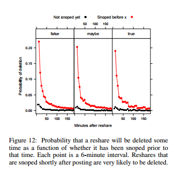
In terms of getting people to delete their posts, the most successful debunking links were things like “those ‘photos of Trayvon Martin the media doesn’t want you to see’ are not actually of Trayvon Martin“. They also found that while more false rumors are shared, true rumors spread more widely. Not a definitive paper by any means but a fascinating initial look at the new landscape. Love it or hate it, social media is not going away any time soon, and the more we understand about how it is used to spread information, the better prepared we can be3.

Okay, so what am I taking away from this week?

  1. If bullshit falls in the forest and no one hears it, does it make a sound? In order to fully understand bullshit, you have to understand how it travels. Bullshit that no one repeats does minimal damage.
  2. Bullshit can grow in different but frequently overlapping ecosystems Infotainment, the psuedo-profound, and close social networks all can spread bullshit quickly.
  3. Analytical thinking skills and debunking do make a difference The effect is not as overwhelming as you’d hope, but every little bit helps

I think separating out how bullshit grows and spreads from bullshit itself is a really valuable concept. In classic epidemiology disease causation is modeled using the “epidemiologic triad“, which looks like this (source):epidemiologictriad

If we consider bullshit a disease, based on the first three weeks I would propose its triad looks something like this:

triadofbullshit

And on that note, I’ll see you next week for some causality lessons!

Week 4 is up! If you want to read it, click here.

1. If you want  a much less polite version of this rant with more profanity, go here.
2. My absolute favorite part of this study is that part way through they included an “attention check” that asked the participants to skip the answers and instead write “I read the instructions” in the answer box. Over a third of participants failed to do this. However, they pretty much answered the rest of the survey the way the other participants did which kinda calls in to question how important paying attention is if you’re listening to bullshit.
3. It’s not a scientific study and not just about bullshit, but for my money the single most important blog post ever written about the spread of information on the internet is this one right here. Warning: contains discussions of viruses, memetics, and every controversial political issue you can think of. It’s also really long.