Yes, another short post. There’s a longer one coming Wednesday I promise.
A friend (Ben, of the Pop Science series) put up a challenge on Twitter this week, where he promised that if you replied to his Tweet he would introduce you like you were a character in a novel. I thought you all would appreciate the one he came up with for me;
"We need you to come back," I said from the doorway. "The numbers have gone bad." Her eyes met mine, and I flinched involuntarily. "I told you this would happen," she said. "There's no point in passing blame," I said. "You just say that because you're wrong," she replied calmly. https://t.co/mcNhr5nAxL
Now there’s an intro I can get behind. The only thing I’m trying to figure out what genre of book it is. I got kind of a Western vibe, but since I can’t think of a Western plot that involves numbers, I’m thinking space western? Open to other thoughts on this.
Related: when I’ve had the “who would die first in a horror movie” discussion with friends, it’s pretty much been determined that I’m the pessimist who’s been warning everyone of the danger all along. My death is almost certainly ironic/inevitable. Kind of a cross between a Cassandra and a Harbinger of Impending Doom. Sounds about right.
Well folks, it’s another Sunday in October and another day for me to rue how cursed my fantasy football team is this year. Both my QBs are hurt, I’ve had two players with season ending injuries, and I am getting to that level of irritated where I barely want to watch anymore.
On the plus side, I’ve just discovered that the NFL/National Anthem protests are providing me with a few new interesting statistical anecdotes.
First up, we have this interesting brand survey that shows the NFL is now one of the most divisive brands in the US. Here “divisive” really means “politically discordant”…..basically the two parties have very different current favorability ratings for them. To give you a flavor, they were more divisive than the Huffington Post, but less divisive than Fox News.
This ranking system is kind of interesting, but the article points out how unstable it is for certain brands. Getting in the headlines may give you a temporary hit, but they are starting to gather evidence that the long term impact of those hits is less than it used to be. For example, after bad press this past spring, United Airlines is now not viewed any differently by consumers than it was before the incident. It would be interesting to add some sort of weighting factor to “divisive” brands to account for temporary divisiveness vs long term.
Next up was this article, that reviewed public perception of the NFL protests based on how the polling question was asked. As is often seen with contentious issues, there is a 10 point swing when we change the wording. In this case, including the reason for the protest in the question garners more support for the cause vs a question that just mentions the protest. To note: the discrepancy came from those who support the protests, the % who opposed stayed steady regardless. This backs up my general theory that most people are only half paying attention most of the time anyway.
They also have some interesting poll numbers that show that most people support broad issues (like being against police brutality) more than they support specific actions (like kneeling during the anthem to protest police brutality), which is another way certain polls can skew the results.
It’s still amazing to me how small differences in wording can change the results of polling, and how under-reported this effect often is, and it is still stunning to me that all of my obsession with stats and details never seems to translate in to a good fantasy football team. Sigh.
I continue to be swamped with work, my capstone project, and a bad fantasy football team. En lieu of a real post, please accept this cartoon-I-can’t-find-a-source-for about social stigma among bar charts:
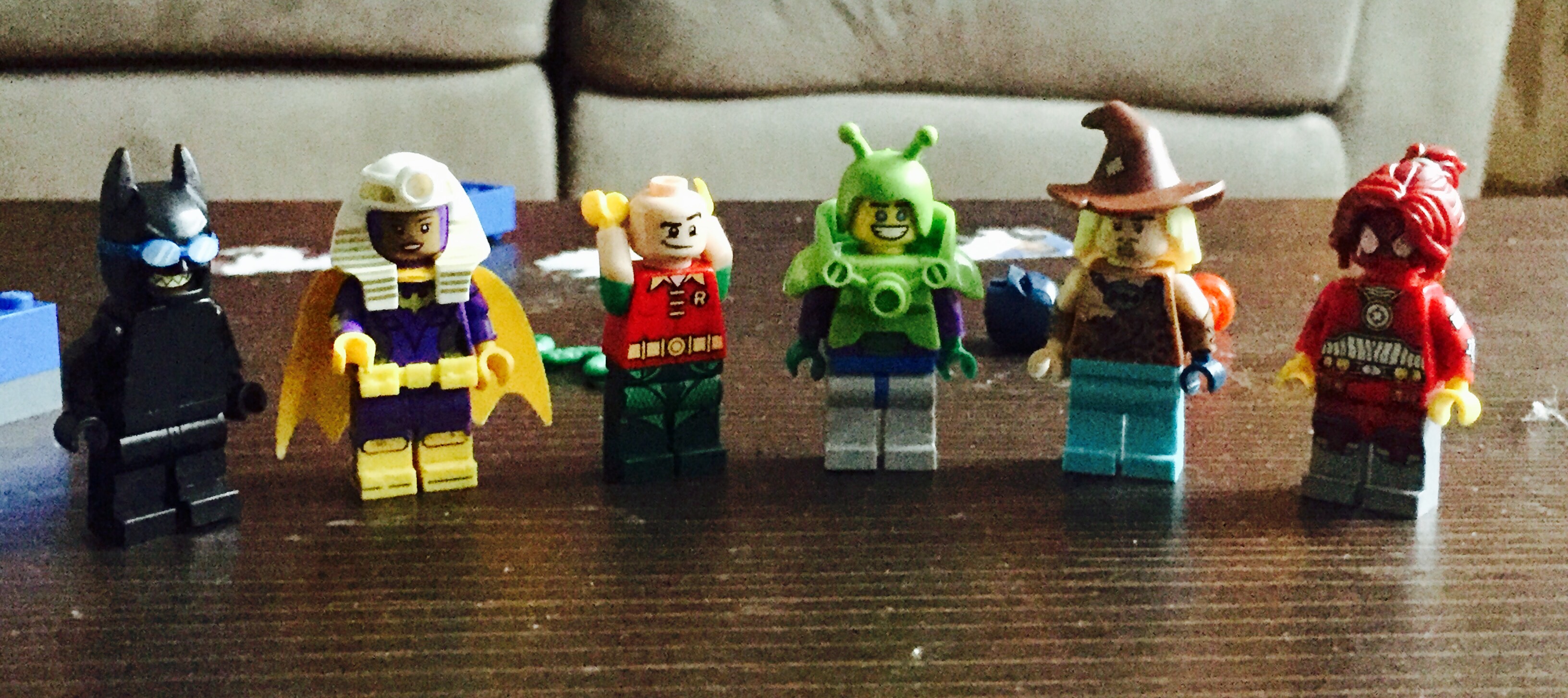
My son (age 5) has developed the most fascinating (for both of us) new hobby of creating his own Lego superheroes by rearranging the ones that he has. He’s spent hours on this recently, meticulously dismantling them and looking for exactly the right piece to create the character he wants. Behold, a few recent versions:
He refused to tell me their names and got shy when I asked, but from what I can put together it’s (from right to left): Joker in disguise, Queen Tut/Barbara Gordon, Robin ripping his pants off, Happy Bug Man, Caveman Scarecrow and Spidergirl.
Never one to let a good analogy go, I attempted to explain to him that he’s figuring out how many combinations there are for any group of Legos. For example, if we wanted to know how many unique creations we could make out of the pieces in the picture above, we could make over 70,000 unique characters. He informed me “yes, but they wouldn’t be cool guys.” The kid’s got an aesthetic.
So I tried it a different way, and used it to explain to him the difference between a permutation and a combination. If I told him he could only take 2 out of these 6 creations in the car, he has 15 different groups of two he could select. That’s a combination.
If, however, he has a friend over and I tell them they can take two creations in the car and they each get one, they now have 30 possibilities….the original 15 possibilities x 2 ways of splitting them. That’s a permutation….the order matters in addition to the picks, so the number is always higher.
Of course, they will actually just want the same one, and then we will move on to a lesson in sharing. Also, he’s 5, and he kinda just wandered off part way through permutations and then asked if he could be a baby turtle. That’s when I figured I’d move this lesson to the blog, where I was slightly less likely to get turtle related commentary as a response.
Anyway, the history of using Lego’s to illustrate mathematical concepts is actuallypretty robust, and can get really interesting. For more on permutations and combinations, try here. For why stepping on a Lego hurts so much, try this:
I mentioned a few posts ago that I’m finally (finally!) working on my final capstone project for my degree. It’s going well so far, but it struck me this weekend exactly how much my process of wading through data resembles my process of cleaning out my closets:
Step 1: Take everything out and throw it all in a pile. For this project, my pile is 21,000 response sets from the American Time Use Survey. For my closet, well, it’s a little bit of everything, possibly including a request to participate in the American Time Use Survey (sorry BLS!). Once everything’s in a pile, frolic around a bit feel good about myself for taking such a large and productive step.
Step 2: Stare at the pile I just created. Poke around at it a bit. Wonder suddenly if I’ve bitten off more than I can chew, or if perhaps I should have taken things more slowly. Swear quietly while maintaining outward calm.
Step 3: Start spreading things out to see what I’ve got. Decide to start with getting rid of what I KNOW I don’t need and can throw out. Hope fervently the reduced pile size will quell my growing sense of panic.
Step 4: Start sorting things in to a few broad categories . Figure out if there are any core assumptions I need to validate like “can we assume a normal distribution of the data” or “realistically will I ever be able to pull off carrying a bright pink sparkle purse with a tassel”? I mean, it seemed like a good idea at the time.
Step 5: I don’t actually know how to describe this step (for my closet or my data) but this is the part where I start sort of communing with the data. I basically plop myself in the middle of it, and examine whatever catches my interest. I set up analysis schemes, then decide I don’t like them and rearrange things again. Much work and rework occurs, but I’m going where my gut takes me. I probably have one or more glasses of wine to maintain proper zen. If my energy begins to flag, I explore remote corners of Stack Exchange or, uh, Pinterest I guess, for inspiration. Nothing in this part makes sense to anyone else, but that’s okay. Data, like art, sometimes takes a little time.
Step 6: This step has changed over the years, for both my house cleaning and my work habits. This used to be where I looked up from my data cleaning/bopping around and realized I was now running short on time and everything was still a mess. Fortunately I have now learned to set a reminder on my phone that alerts me when I need to wrap up the play/go with my gut part and start freaking writing things down/putting things away. Gotta be stern with myself or I’ll never get there.
Step 7: Write a bad first draft. Part of why I used to delay so much on #6 is I was worried that I had to write a good first draft. Now I purposely write a bad one. Since there’s not a lot intimidating about doing shoddy work, it gets me moving faster and makes sure I have SOMETHING down on paper when I’m out of time. Not fun, but I get through it.
Step 8: Revise and perfect details as time allows. Does that graph need a new label/color scheme? Should I order my shoes by color? Once the dust has settled, I work on these details until I am either out of time, or totally sick of everything. When “careful tweaking” moves in to “reckless rearrangement” I take it as a sign I need to call it quits.
One of the most common running themes on this blog is discussions of human bias, a topic I clearly believe deserves quite a bit of attention. In recent years though, I have started thinking a lot more about machine bias, and how it is slowly influencing more of our lives. In thinking about machine bias though, I’ve noticed recently that many people (myself included) actually tend to anthropomorphize machine bias and attempt to evaluate it as though it was bias coming from a human with a particularly wide-spread influence. Since anthropomorphism is actually a cognitive bias itself, I thought I’d take a few minutes today to talk about things we should keep in mind when talking about computers/big data algorithms/search engine results. Quite a few of my points here will be based off of the recent kerfluffle around Facebook offering to target your ads to “Jew haters”, the book Weapons of Math Destruction, and the big data portion of the Calling BS class. Ready? Here we go!
Algorithm bias knows no “natural” limit. There’s an old joke where someone, normally a prankster uncle, tells a child that they’ll stop pouring their drink when they “say when”. When the child subsequently says “stop” or “enough” or someone other non-when word, the prankster keeps pouring and the glass overflows. Now, a normal prankster will pour a couple of extra tablespoons of milk on the table. An incredibly dedicated prankster might pour the rest of the container. An algorithm in this same scenario would not only finish the container but go run out to the store and buy more so they could continue pouring until you realized you were supposed to say when. Nearly every programming 101 class starts at some point with a professor saying “the nice part is, computer’s do what you tell them. The downside is, computers do what you tell them”. Thus, despite the fact that no sane person, even a fairly anti-Semitic one, would request an advertising group called “Jew haters”, a computer will return a result like this if it hits the right criteria.
Thoroughness does not indicate maliciousness. Back in the 90s, there was a sitcom on called “Spin City” about a fictional group of people in the mayor’s office in New York City. At one point the lone African American in the office discovered that you could use their word processing software to find certain words and replace them with others, so in an attempt to make the office more PC, he sets them up to replace the word “black” with “African-American”. This of course promptly leads to the mayor’s office inviting some constituents to an “African-American tie dinner”, and canned laughter ensues. While the situation is fictional, this stuff happens all the time. When people talk about the widespread nature of an algorithm bias, there’s always a sense that some human had to put extra effort in to making the algorithm do absurd things, but it’s almost always the opposite. You have to think of all the absurd things the algorithm could do ahead of time in order to stop them. Facebook almost certainly got in to this mess by asking its marketing algorithm to find often-repeated words in people’s profiles and aggregate those for its ads. In doing so, it forgot that the algorithm would not filter for “clearly being an asshole” and exclude that from the results.
While algorithms are automatic, fixing them is often manual. Much like your kid blurting out embarrassing things in public, finding out your algorithm has done something embarrassing almost certainly requires you to intervene. However, this can be like a game of whack-a-mole, as you still don’t know when these issues are going to pop up. Even if you exclude every ad group that goes after Jewish people, the chances that some other group has a similar problem is high. It’s now on Facebook to figure out who those other groups are and wipe the offending categories from the database one by one. The chances they’ll miss some iteration of this is high, and then it will hit the news again in a year. With a human, this would be a sign they didn’t really “learn their lesson” the first time, but with an algorithm it’s more a sign that no one foresaw the other ways it might screw up.
It is not overly beneficial to companies to fix these things, EXCEPT to avoid embarrassment. Once they’re up and running, algorithms tend to be quite cheap to maintain, until someone starts complaining about them. As long as their algorithms are making money and no one is saying anything negative, most companies will assume everything is okay. Additionally, since most of these algorithms are proprietary, people outside the company almost never get insight in to their weaknesses until they see a bad result so obvious they realize what happened. In her book Weapons of Math Destruction , Cathy O’Neill tells an interesting story about one teachers attempt (and repeated failure) to get an explanation for why an algorithm called her deficient despite excellent reviews, and why so much faith was put in it that she was fired. She never got an answer, and ultimately got rehired by a (ironically better funded, more prestigious) district. One of O’Neills major take-aways is that people will put near unlimited trust in algorithms, while not realizing that the algorithms decision making process could be flawed. It would be nearly impossible for a human to wield that much power while leaving so little trace, as every individual act of discrimination or unfairness would leave a trail. With a machine, it’s just the same process applied over and over.
Some groups have more power than others to get changes made, because some people who get discriminated against won’t be part of traditional groups. This one seems obvious, but hear me out here. Yes, if your computer program ends up tagging photos of black people as “gorillas”, you can expect the outcry to be swift. But with many algorithms, we don’t know if there are new groups we’ve never thought of that are being discriminated against. I wrote a piece a while ago about a company that set their default address for unknown websites to the middle of the country, and inadvertently caused a living nightmare for the elderly woman who happened to own the house closest to that location. This woman had no idea why angry people kept showing up at her door, and had no idea what questions to ask to find out why they got there. We’re used to traditional biases that cover broad groups, but what if a computer algorithm decided to exclude men who were exactly age 30? When would someone figure that out? We have no equivalent in human bias for more oddly specific groups, and probably won’t notice them. Additionally, groups with less computer savvy will be discriminated against, solely due to the “lack of resources to trouble-shoot the algorithm” issues. The poor. Older people. Those convicted of crimes.The list goes on.
Overall, things aren’t entirely hopeless. There are efforts underway to come up with software that can systematically test “black box” algorithms on a larger scale to help identify biased algorithms before they can cause problems. However, until something reliable can be found, people should be aware that the biases we’re looking for are not the ones you would normally see if humans were running the show. One of the reasons AI freaks me out so much is because we really do all default to anthropomorphizing the machines and only look out for the downsides that fit our pre-conceived notions of how humans screw up. While this comes naturally to most of us, I would argue it’s on of the more dangerous forms of underestimating a situation we have going today. So uh, happy Sunday!
Twice recently I’ve seen minor characters on both sides of the political spectrum claim that they foresaw/predicted some recent event with “eerie precision”, on topics where their predictions had actually appeared (to me at least) only loosely connected to what actually happened.
While I was annoyed by these people, I was more annoyed by the fans of theirs who rushed to agree that it was clear that they had amazing foresight in making their calls. While obviously some of that is just in-group defensiveness, some of them really seem to believe that this person had done something amazing. While none of those fans are people who read my blog, I figured I’d blow off some steam by reminding everyone of two things:
Redefining words makes improbably results quite common. In the John Ionnaidis paper “Why Most Published Research Findings Are False”, one of his 6 corollaries for published research is “Corollary 4: The greater the flexibility in designs, definitions, outcomes, and analytical modes in a scientific field, the less likely the research findings are to be true.” This is true in research, and more true in political pontificating/predictions. Allowing yourself any latitude at all in redefining words will give you nearly unlimited predictive power after the fact. This is not a “minor quibble”, that’s literally the whole trick.
Making lots of predictions has no consequences for a pundits career. Making predictions as a pundit is like playing roulette with the house’s money. You can’t actually lose. In “The Signal and the Noise” (a book which I once owned and have now lost to lending), Nate Silver reviews how often some pundits known for their “amazing predictions” actually make predictions. Answer: a lot. Most of them are wrong. However, the career of the pundit takes almost no hit for those wrong answers, yet skyrockets every time they are right. Thus they have no motivation to stop making crazy predictions, as they lose nothing for a wrong one and gain everything for a right one. When I read TSATN initially, I made this matrix to illustrate:
So yes, next time you see someone make an “amazing prediction”, take a deep breath and ask yourself how much redefining is going on and how many predictions they had to throw out to get to that one that hit. Well, probably not you specifically dear reader, you’re probably fine. This is almost certainly one of those “if you’re thinking about it enough to read this post, you’re probably not the problem” things. Regardless, thanks for letting me get that off my chest.
This past week I was having a discussion with my high school teacher brother about an experiment his class was running and appropriate statistical methods for analyzing the data. We were discussing using the chi square statistic to compare data from an in class calorimetry experiment to the expected/published values (this is the point where the rest of my family wandered off), and he asked what other statistical analysis his kids could do that might help them understand their results. I mentioned that I was a big fan of confidence intervals for understanding data like this, and started to rattle off my reasons. While testing that produces a p-value is more commonly used in scientific work, I think for most people confidence intervals are more intuitive to use and should be worked in to the mix. Since we were talking about all this at around 7am (prior to both the second cup of coffee AND a trip out to move the cows at his farm), I figured I’d use my blog post today to more thoroughly lay out a few reasons confidence intervals should be more widely used (particularly by teachers) and provide a few helpful links.
The foundations of my argument comes from a paper published a few years ago called “Why the P-value culture is bad and confidence intervals a better alternative“, which gets in to the weeds on the stats, but makes a good overall case for moving away from a reliance on p-values and towards a focus on confidence intervals. The major reasons are:
Confidence intervals use values you already have p-values and confidence intervals are mathematically similar and take the same basic variables in to account: number of observations (n) and variation of those observations (standard error or SE). More observations and lower variability within those observations generally are considered good things. If you can get a p-value, you can get a confidence interval.
Confidence intervals give you more information than the p-value Where a p-value tells you just the statistical significance of the difference, the confidence interval tells you something about the magnitude of the difference. It gives an upper and lower limit, so you get a sense of what you’re really see. For kids learning about variation, I also thinks this can give them a better sense of how each of their experimental values affects the overall outcome. For example, if you’re doing a calorimetry experiment and know that the expected outcome is 100, and your class of 30 kids gets an average of 98 with a standard deviation of 5, you would tell them that p=.03 and thus this a significant difference. Using the confidence interval however, you would give them the range 96.2 to 99.8. This gives a better sense of how different the difference really is, as opposed to just accepting or rejecting a binary “is there a difference” assumption.
Confidence intervals are more visual. The paper I mentioned above has a great figure with it that illustrates what I’m talking about:On this graph you can draw lines to show not just “is it different” but also “when do we really care”. I think this is easier to show kids than just a p-value by itself, as there’s no equivalent visual to show p-values.
It’s easier to see the effect of sample size with a confidence interval. For the calorimetry experiment mentioned above, let’s show what happens if the class is different sizes, all with the same result of 98 with a standard deviation of 5:
n
95% Confidence interval
p-value
10
94.9-101.1
.2377
15
95.5-100.5
.1436
20
95.8-100.2
.0896
25
96-100
.0569
30
96.2-99.8
.0366
I think watching the range shrink is clearer than watching a p-value drop, and again, this can easily be converted in to a graph. If you’re running the experiment with multiple classes, comparing their results can also help show kids a wider range of what the variation can look like.
Confidence intervals reiterate that some variation is to be expected. One of the harder statistical concepts for people to grasp is how predictable a bit of unpredictability really is. For some things we totally get this (like our average commute times), but for other things we seem to stumble (like success of medical treatments) and let outliers color our thinking. In the calorimetry experiment, if 1 kid gets 105 as a value, confidence intervals make it much easier to see how that one outlier fits in with a bigger picture than a single p-value.
So there you go. Confidence intervals are a superior way of presenting effect size, significance of the finding, and are easy to visualize for those who have trouble with written numbers. While they don’t do away with all of the pitfalls of p-values, they really don’t add any new pitfalls to the mix, and they confer some serious benefits for classroom learning. I used Graphpad to quickly calculate the confidence intervals I used here, and they have options for both summary and individual data.
I got a little behind in my reading list this year, but I’m just finishing up Ben Goldacre’s Bad Pharma and it’s really good. Highly recommended if you want to know all sorts of excruciating detail about how we get the drugs we do, and lose faith in most everything.
The book introduced me to a paper from 2007 called “Following the Script: How Drug Reps Make Friends and Influence Doctors“, where a former pharma salesman lays out the different categories of doctors he encountered and how he worked to sell to each of them. This includes a whole table with doctor categories including “The friendly and outgoing doctor” and the “aloof and skeptical” doctor, along with the techniques used to sell to each.
Since Goldacre is the absolute epitome of “aloof and skeptical” he added his own explanation of the tactic they use on evidence based doctors:
“If they think you’re a crack, evidence-based medicine geek, they’ll only come to you when they have a strong case, and won’t bother promoting their weaker drugs at you. As a result, in the minds of bookish, sceptical evidence geeks, that rep will be remembered as a faithful witness to strong evidence; so when their friends ask about something the rep has said, they’re more likely to reply, ‘Well, to be fair, the reps from that company have always seemed pretty sound whenever they’ve brought new evidence to me…’ If, on the other hand, they think you’re a soft touch, then this too will be noted.”
Maybe it’s just because I’ve never been in sales, but it really had not occurred to me that was a sales technique a person could use. Sneaky.
Of course I then realized I’ve seen other, similar things in other situations. While most people know better than to come to me with shoddy stats during political debates, I’ve definitely seen people who told me that they personally agree certain numbers are shoddy later use those same numbers in Facebook arguments with others who aren’t quite as grouchy. It’s an offshoot of the old “be pleasant while the boss/parent is in the room, show your true colors later” thing. Like a data Eddie Haskell. I may have a new bias name here. Gotta work on this one.


 Hope fervently the reduced pile size will quell my growing sense of panic.
 I mean, it seemed like a good idea at the time.


 On this graph you can draw lines to show not just “is it different” but also “when do we really care”. I think this is easier to show kids than just a p-value by itself, as there’s no equivalent visual to show p-values.