This is another post from my grandfather’s newsletter (intro to that here). When I first mentioned his newsletter, I mentioned that he manufactured probability paper for people who needed to do advanced calculations in the days before computers. I found some cool examples while looking through the 1975 issues recently, so I thought I’d show them off here. First was this paper, used to determine what the “true” polling percentage is when you have a lot of undecided voters. He was using an equation he called Seder’s method to adjust the pollsters predictions:
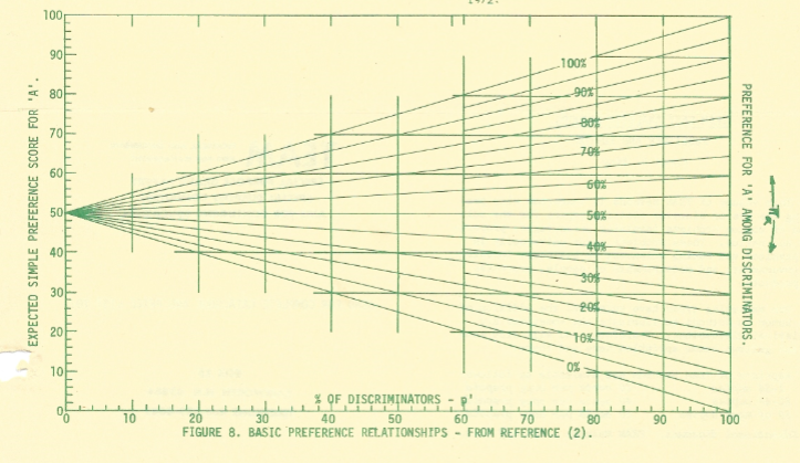
To use it, you find the percent of people who responded to the survey with a definite answer as the x-axis, then look to the right to find the percentage of people who made a particular choice. Once you have that data point, you draw a line to the left (the traditional y-axis to find out how many people will probably end up going with a particular choice once they have to make one.
I decided to try it based on a recent Quinnipiac presidential election poll (from June 29th, 2016). This has Clinton polling at 39%, Trump at 37%, Johnson at 8% and Stein at 4%, with 12% answering some combination of Unknown/Undecided/Maybe Won’t Vote/Maybe someone else. Here what this would look like filled out:
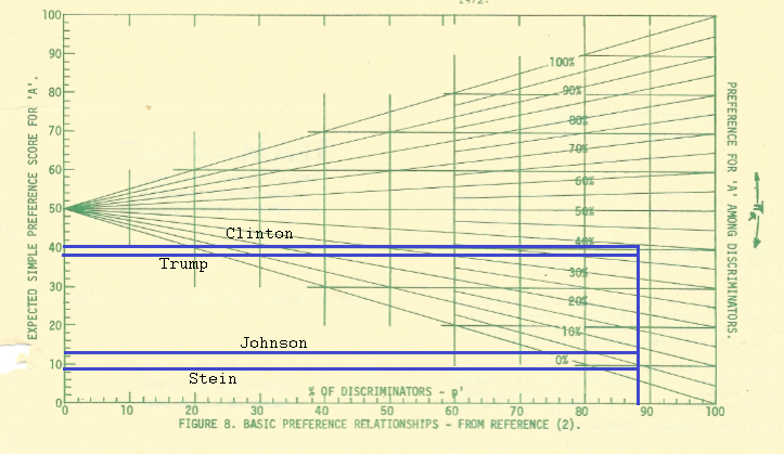
As you can see, it adjusts everyone a little upward, with a little more going toward those polling with the low numbers. Whether or not this is the correct adjustment is up for debate, but it’s a fun little tool to use for those who don’t like equations.
This particular one was actually one of his easy ones. Here’s the paper for getting confidence intervals for Bernoulli probabilities:
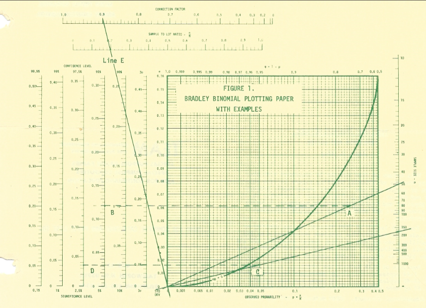
It looks complicated, but compared to doing it by hand, this was MUCH easier. To show how much time we have on our hands now that computers do the complicated stuff, check out my take on the Bernoulli distribution here. That’s what I do while SAS is importing my files. Ah, technology.

