I’ve seen a lot of talk about the Electoral College this past week, and discussion about whether or not the system is fair. I’m not particularly going to wade in to this one, but I did get curious if the closeness of the presidential race in a state influenced voter turnout overall. Under the current system, it would stand to reason that voters in states that have large gaps between the two parties (and thus know ahead of time which way their state is going to go) would be less motivated to vote than those living in states with close races. While other races are typically happening in most states that could drive voter turnout, we know that elections held during the presidential election have better turnout than midterm elections by a significant margin. The idea that being able to cast a vote for the president is a big driver of turnout seems pretty solid.
What I wanted to know is if the belief that you’re going to count a potentially “meaningful” vote in an election an even further driver of turnout. With all the commentary about the popular vote vs electoral college and with some petitioning to retroactively change the way we count the votes, it seemed relevant to know if the system we went in to voting day with had a noticeable impact on who voted.
While not all the numbers are final yet, I found voter turnout by state here, and the state results here. I took the percent of the vote of the winning candidate and subtracted the percent of the vote of the second place candidate to get the % lead number, and plotted that against the voter turnout. Here’s the graph:
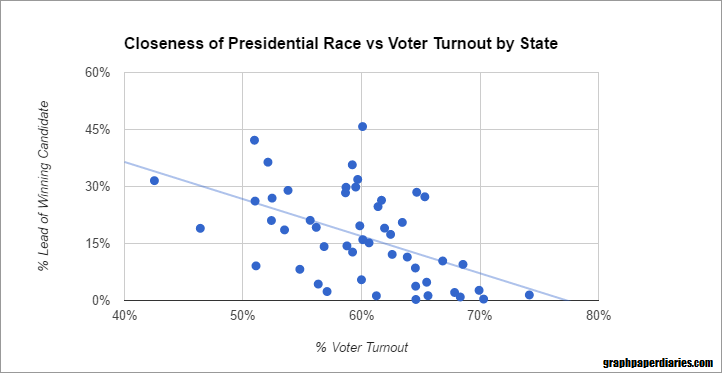
The r-squared is about 26.5% for an r of .5. I didn’t take in to account any other races on the ballot, but I think it’s safe to at least theorize that believing your state is a lock in one direction or the other influences voter turnout. Obviously this provides no comment on how other systems would change things from here, only how people behave under the system we have today.
For those curious, here’s an uglier version of the same graph with state names:
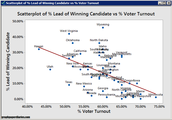
It’s interesting to note that the Utah vote got split by McMullin, so the percent lead there is a bit skewed.
A few other fun facts:
- The average turnout in states where the presidential race was close (<5% between the winning candidate and second place) was 65% vs 58% for all other states. A quick ANOVA tells me this is a statistically significant difference.
- Once the gap between the winner and second place gets over 10%, things even out. States with a gap of 10-20% have about 58% voter turnout, and those with an over 20% gap have about a 57% voter turnout. Some of this may be even out as states with large gaps also likely take their time with counting their votes.
- My state (Massachusetts) is one of the weird lopsided but high turnout states, and we had some really contentious ballot questions: charter schools expansion and recreational marijuana.
Again, none of this speaks to whether or not the process we have is a good one, but it’s important to remember that the rules in play at the time people make a decision tend to influence that decision.
I’ll update the post if these margins change significantly as more votes are counted.


