The Forrest Gump Fallacy

Back in July, I took my first crack at making up my own logical fallacy. I enjoyed the process, so today I’m going to try it again. With election season hanging over us, I’ve seen a lot of Facebook-status-turned-thinkpieces, and I’ve seen this fallacy pop up more and more frequently. I’m calling it “The Forrest Gump Fallacy”. Yup, like this guy:

For those of you not prone to watching movies or too young to have watched this one, here’s some background: Forrest Gump is a movie from 1994 about a slow-witted but lovable character who manages to get involved in a huge number of political and culturally defining moments over the course of his life from 1944 to 1982. Over the course of the film he meets almost every US president for that time period, causes Watergate, serves in Vietnam and speaks at anti-war rallies, and starts the smiley face craze.  It has heaps of nostalgia and an awesome soundtrack.

So how does this relate to Facebook and politics? Well, as I’ve been watching people attempt to explain their own political leanings recently, I’ve been noticing that many of them seem to assume that the trajectory of their own life and beliefs mirrors the trajectory of the country as a whole. To put it more technically:

Forrest Gump Fallacy: the belief that your own personal cultural and political development and experiences are generalizable to the country as a whole.

There are a lot of subsets of this obviously….particularly things like “this debate around this issue didn’t start until I was old enough to understand it” and “my immediate surroundings are nationally representative”. Fundamentally this is sort of a hasty generalization fallacy, where you draw conclusions from a very limited sample size. Want an example? Okay, let me throw myself under the bus.

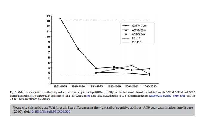
If you had asked me a few years ago to describe how conservative vs liberal the US was in various decades that I’d lived through, I probably would have told you the following: the 1980s were pretty conservative, the 1990s also had a strong conservative influence, mostly pushing back against Clinton. Things really liberalized more around the year 2000, when people started pushing back against George W Bush. I was pretty sure this was true, and I was also not particularly right. Here is party affiliation data from that time:

Republican affiliation actually dropped during the 90s and rose again after 2000. Now, I could make some arguments about underdogs and the strength of cultural pushback, but here’s what really happened: I went to a conservative private Baptist school up through 1999, then went to a large secular university for college in the early 2000s. The country didn’t  liberalize in the year 2000, my surroundings did.  This change wasn’t horribly profound, after all engineering profs are not particularly known for their liberalism, but it still shifted the needle. I could come up with all the justifications in the world for my biased knee jerk reaction, but I’d just be self justifying. In superimposing the change in my surroundings and personal development over the US as a whole, I committed the Forrest Gump Fallacy.

So why did I do this? Why do others do this? I think there’s a few reasons:

  1. We really are affected by the events that surround us Most fallacies start with a grain of truth, and this one does too. In many ways, we are affected by watching the events that surround us, and we do really observe the country change around us. For example, most people can quite accurately describe how their own feelings and the feelings of the country changed after September 11th, 2001. I don’t think this fallacy arises around big events, but rather when we’re discussing subtle shifts on more divisive issues.
  2. Good cultural metrics are hard to come by A few paragraphs ago, I used party affiliation as a proxy for “how liberal” or “how conservative” the country was during certain decades. While I don’t think that metric is half bad, it’s not perfect. Specifically, it tells us very little about what’s going on with that “independent” group…and they tend to have the largest numbers. Additionally, it’s totally possible that the meaning of “conservative” or “liberal” will change over time and on certain issues. Positions on social issues don’t always move in lock step with positions on fiscal issues and vice versa. Liberalizing on one social issue doesn’t mean you liberalize on all of them either. In my lifetime, many people have changed their opinion on gay marriage but not on abortion. When it’s complicated to get a good picture of public opinion, we rely on our own perceptions more heavily. This sets us up for bias.
  3. Opinions are not evenly spread around This is perhaps the biggest driver of this fallacy, and it’s no one’s fault really. As divided as things can get, the specifics of the divisions can vary widely in your personal life, your city and your state. While the New Hampshire I grew up in generally leaned conservative, it was still a swing state. My school however was strongly conservative and almost everyone was a Republican, and certainly almost all of the staff. Even with only 25% of people identifying themselves as Republican there are certainly many places where someone could be the only Democrat and vice versa. Ann Althouse (a law professor blogger who voted for Obama in 2008) frequently notes that her law professor colleagues consider her “the conservative faculty member”. She’s not conservative compared to the rest of the country, but compared to her coworkers she very much is. If you don’t keep a good handle on the influence of your environment, you could walk away with a pretty confused perception of “normal”.

So what do we do about something like this? I’m not really sure. The obvious answer is to try to mix with people who don’t think like you, aren’t your age and have a different perspective from you, but that’s easier said than done. There’s some evidence that conservatives and liberals legitimately enjoy living in different types of places and that the polarization of our daily lives is getting worse. Sad news. On the other hand, the internet does make it easier than ever to seek out opinions different from your own and to get feedback on what you might be missing. Will any of it help? Not sure. That’s why I’m sticking with just giving it a name.

5 Things About the Doomsday Algorithm

I mentioned last week that I’m currently reading a biography of John Conway, and I came across something interesting during the discussion of his version of the Doomsday Algorithm. Otherwise known as the “perpetual calendar” problem, it’s a method for mentally calculating what day of the week any given date fell on. Conway was so obsessed with this problem and improving his time for the mental math that he had his computer set up to make him solve ten of these before he got in. Supposedly his record was 10 dates in 15 seconds. #lifegoals. Anyway, this whole discussion got me poking around about this mental math trick, and I wanted to share a few things that I found:

  1. Lewis Carroll published on this problem Yeah, the guy who wrote Alice in Wonderland also came up with a perpetual calendar algorithm, and it was published in Nature in 1887.
  2. By “Doomsday” we mean “anchor day” John Conway has an excellent flare for the dramatic, and the title of this algorithm proves it. However, it’s a misleading title for what’s really going on. Basically, Conway realized that a whole bunch of easy to remember days (4/4, 6/6, 8/8, 10/10 and 12/12) all fall on the same day of the week in any given year. If you can figure out what day that was, you get an “anchor day” in those months. From there, he realized that 5/9, 9/5, 7/11 and 11/7 all fall on the same day as well, so you now have one known date in each month. As you can see, this simplifies further calculations considerably.
  3. Do you bite your thumb at us sir? Conway does. One of his tricks for remembering his full trick is to use his fingers as prompts and bite his thumb to remember the number he got there. This link also has some very helpful videos of Conway explaining his method.
  4. Others have improved on the method The gamesmanship of this method has been inspiring to a lot of mathy folks, and some of them continue to try to find simpler/better/faster ways for people to calculate the day of the week. This method looks like the current favorite for simplicity, and is the one I think I’m going to start with.
  5. Don’t try to calculate anything from 1752 At least if you’re in the US or England, this is a trap. September 2nd-Sept 14th of that year don’t exist. Now there’s a trivia question for you.


5 Interesting Examples of Self Reporting Bias

News flash! People lie. Some more than others. Now there are all sorts of reasons why we get upset when people don’t tell the truth, but I’m not here to talk about those today. No, today I’m here to give a few interesting examples of where self-reporting bias can really kinda screw up research and how we perceive the world.

Now, self reporting bias can happen for all sorts of reasons, and not all of them are terrible. Some bias happens because people want to make themselves look better, some happens because people really think they do things differently than they do, some happens because people just don’t remember things well and try to fill in gaps. Regardless of the reason, here’s 5 places bias may pop up:

  1. Nutrition/Food Intake Self reported nutrition data may be the worst example of research skewed by self reporting. For most nutrition/intake surveys, about 67% of respondents give implausibly low answers….an effect that actually shows up cross culturally. Interestingly there are some methods known to improve this (doubly labeled water for example), but they tend to be more expensive and thus are used less often. Unfortunately this effect isn’t random, so it’s hard to know exactly how bad they effect is across the board.
  2. Height While it’s pretty ubiquitous that people lie about their weight, lying about height is a less recognized but still interesting problem. It’s pervasive in online dating for both men AND women, both of whom exaggerate by about 2 inches. On medical/research surveys we all get slightly more honest, with men overestimating their height by about .5 inches, and women by .33 inches.
  3. Work hours Know anyone who says they work a 70 hour week? Do they do this regularly? Yeah, they’re probably not remembering that correctly.  Edit: My snark got ahead of me here, and I got called out in the comments, so I’m taking it back. I also added some text in bold to clarify what the problem is. When people are asked how much they work per week, they tend to give much higher answers than when they are asked to list out the hours they worked during the week. The more they say they work, the more likely to have inflated the number. People who say they work 75+ hours work an average of 50 hours/week, and  those who say they work 40 hours/week tend to work about 37. Added: While some professions do actually require crazy hours (especially early in your career….looking at you medical residencies, and first year teachers are notorious for never going home), very few keep this up forever. Additionally, what people work most weeks almost never equals what they work when averaged over the course of a year. That 40 hour a week office worker almost certainly gets some vacation time, and even 2 weeks of vacation and a few paid holiday take that yearly average down to 37 hours per week…and that’s before you add in sick time.  Some of this probably gets confusing because of business travel or other “grey areas” like professional development time, but it also speaks to our tendency to remember our worst weeks better than our good ones.
  4. Childhood memories It is not uncommon in psychological/developmental research that adults will be asked various questions about the state of their life currently while also being queried about their upbringing. This typically leads to conclusions about parenting type x leading to outcome y in children. I was recently reading a paper about various discipline methods and long term outcomes in kids, when I ran across a possible confounder I hadn’t considered: sex differences in the recollection of childhood memories. Apparently overall men are not as good at identifying family dynamics from their childhoods, and the authors wondered if that led to some false findings. They didn’t have direct evidence, but it’s an interesting thing to keep in mind.
  5. Base 10 madness You wouldn’t think our fingers would cause a reporting bias, but they probably do. Our obsession with doing things in multiples of 5 or 10 probably comes from our use of our hands for counting. When it comes to surveys and self reports, this leads to a phenomena called “heaping”, where people tend to round their reports to multiples of 5 and 10.  There’s some interesting math you can use to try to correct for this, but given that rounding tends to be non-constant (ie we round smaller numbers to 5 and larger numbers to 10) this can actually affect some research results.

Base 10 aside: one of the more interesting math/pop-culture videos I’ve seen is this one, where they explore why the Simpson’s (who have 4 fingers on each hand) still use base 10 counting (7:45 mark):


The Cynical Cartoonist Correlation Factor

I love a good creative metric:

dilbertplan

From the book “Results Without Authority” by Tom Kendrick.

In case you’re curious, this hangs on the wall behind my desk at work:

Happy Friday everyone!

What I’m Reading: October 2016

My stats book for the month is “Statistics Done Wrong“, which honestly I haven’t actually started yet. I got sidetracked in part by a different math related book “Genius at Play: the Curious Mind of John Horton Conway”  He’s a pretty amazing (still living!) mathematician, and the book about him is pretty entertaining. If you’ve never seen a simulation of his most famous invention  “Game of Life”, check it out here. Deceptively simple yet endlessly fascinating.

Moving on, this Atlantic article about why for profit education fails was really interesting. Key point: education does best when it’s targeted to local conditions, which means it actually becomes less efficient when you scale it up.

This list of the “7 deadly sins of research” was also delightful. It specifically mentions basic math errors, which is good, because those are happening a really concerning amount of the time.

Related to deadly sins, Andrew Gelman gives his history of the replication crisis.

Related to the replication crisis, holy hell China, get it together.

More replication/data error issues, but this time with a legal angle. Crossfit apparently is suing a researcher and journal who 1. worked for a competitor 2. published data that made Crossfit look bad that they later clarified was incorrect 3. had evidence that the journal/reviewers implied that they wouldn’t publish the paper unless it made Crossfit look bad. The judge has only ruled that this can proceed to trial, but it’s an interesting case to watch.

This paper on gender differences in math scores among highly gifted students was pretty interesting. It takes a look at the gender ratios for different SAT (and ACT) scores over the years (for 7th graders in the Duke Gifted and Talented program) and the trends are interesting. For the highest scorers in math (>700), it went from extremely male dominated (13:1 in 1981) to “just” very male dominated (4:1 by 1991) and then just stayed there. Seriously, that ratio hasn’t gone lower than 3.55 to 1 in the 25 years since. Here’s the graph:

mathbygender

In case you’re curious, top verbal scores are closer to 1:1. Curious what the recruitment practices are for the Duke program.

Also, some old data about Lyme Disease resurfaces, and apparently there may be a second cause? An interesting look at the “Swiss Agent” and why it got ignored.


Vanity Sizing: The Visual Edition

I’m swamped with homework this week, but after my post about vanity sizing a few weeks ago, I thought this picture might amuse a few people: fullsizerender-1

The white-ish sparkly dress on the top is one my grandmother gave me when I was a little kid to play “princess dress up” in (it was a floor length gown when I was 5!). Someone set it aside for me after she died, and I found it this week while sorting through some boxes. I checked the tag out, and it’s marked as a size 14. The dress below it is a bridesmaids dress I wore about 6 years ago at my brothers wedding….also marked a size 14. I don’t know how long my grandmother had the top dress when she gave it to me in the 80s, but my guess is it’s from the late 70s.  That’s 4 decades of size inflation right there folks.

If it followed this chart at all, the top dress would be a size 4 by today’s standards. The bottom dress would have been a size 20 in the late 70s.

My own vanity now compels me to mention that I don’t actually fit in the 2010 size 14 any more, I’m a 1987 size 14 thank-you-very-much.

5 Things About Ambiverts

Okay, so after writing 5 Things about Introverts and 5 Things About Extroverts, it has come time for me to talk about MY people: the ambiverts. Sometimes referred to as an introverted extrovert or an extroverted introvert, ambiverts are the people who don’t really fit either mold.  So what’s up with this category? Is it a real thing? If it is real is it a good thing? Let’s take a look!

  1. Ambiversion has been around for a while Okay, so when I first heard about ambiversion, I thought it was a made up thing. Apparently though Carl Jung actually did write about this category when he originally developed the introvert/extrovert scale, though he didn’t name it. According to the Wall Street Journal, the name came about in the 1940s. And to think, I was just blaming Buzzfeed.
  2. Most people are probably ambiverts If you think of introversion and extroversion as a spectrum of traits, ambiverts are the ones in the middle. It makes sense that most people would be there, though the exact percentage is a little in question: some say 1/3rd of all people, some say 2/3rds. The exact percentage is probably in question because it depends where you draw the line. If you’re 40-60% extroverted, does that make you an ambivert, or is it 35-65%? Regardless, it’s probably not a small number.
  3. The Big 5 recognizes them, Myers Briggs not so much One of the reasons ambiversion doesn’t get much press is because Myers Briggs (the 500 lb gorilla in the personality testing room) doesn’t really recognize it. Where the Big 5 Personality Scale is based on a sliding scale and generally recognizes “low” “moderate” and “high” scores, Myers Briggs insists on binary classifications.
  4. The ability to recognize both sides is probably helpful Not a lot of research has been done in to ambiversion, but the little that has been done suggests good things. When studying salespeople, it was found that ambiverts actually made more money than either introverts or extroverts. The researchers think this is because they can work with both types of people and adapt their style more easily to fit the customer. Obviously there would still be a social intelligence aspect to this, but the ability to vary the approach does seem to have it’s benefits.
  5. The need for both types of recharging can lead to burnout In my previous posts, I asserted that introverts want people to pay more attention to their strengths, and extroverts want people to pay less attention to their faults. Reading through the things written about ambiverts, I realized that their biggest problem seemed to be paying attention to themselves. If you know you need quiet to recharge, that’s straightforward. If you know you need noise, that’s also straightforward. However, if it kind of depends, you have to make a judgment call…..and you very well could be wrong. A lot.

So there you have it! Research in this area is clearly a little light, but I still think it’s interesting to think about how we classify these things. Also, fun fact I learned after writing this….there apparently is an introverted, ambivert and an extroverted facial type:

The article was a little unclear on how good the correlation between facial structure and actual personality type was, but it did raise some questions about the chicken and egg nature of how others perceive us. If someone looks like an extrovert are they more likely to be treated like one and therefore become one? Or is there some “extrovert gene” that determines both? Since all introversion/extroversion measures are self reported it’s hard to know, but it’s an interesting thought. Now I’m gonna go look in the mirror and figure out which type of face I have.

How the Sausage Gets Made and the Salami Gets Sliced

Ever since James the Lesser pointed me to this article about some problems with physics,  I’ve been thinking a lot about salami slicing. For those of you who don’t know, salami slicing (aka using the least publishable unit) is the practice of taking one data set and publishing as many papers as possible from it. Some of this is done through data dredging, and some if it is just done by breaking up one set of conclusions in to a series of much smaller conclusions in order to publish more papers. This is really not a great practice, as it can give potentially shaky conclusions more weight (500 papers can’t be wrong!) and multiply the effects of any errors in data gathering.  This can then have other effects like increasing citation counts for papers or padding resumes.

A few examples:

  1. Physics: I’ve talked about this before, but the (erroneous) data set mentioned here resulted in 500 papers on the same topic. Is it even possible to retract that many?
  2. Nutrition and obesity research: John Ioannidis took a shot at this practice in his paper on obesity research, where he points out that the PREDIMED study (a large randomized trial looking at the Mediterranean diet)  has resulted in 95 published papers.
  3. Medical findings: In this paper, it was determined that nearly 17% of papers on specific topics had at least some overlapping data.

To be fair, not all of this is done for bad reasons. Sometimes grants or other time pressures encourage researchers to release their data in slices rather than in one larger paper. The line between “salami slicing” and “breaking up data in to more manageable parts” can be a grey one….this article gives a good overview of some case studies and shows it’s not always straightforward. Regardless, it’s worth keeping in mind if you see multiple studies supporting the same conclusion that you should at least check for independence among the data sources. This paper breaks down some of the less obvious problems with salami slicing:

  1. Dilution of content/reader fatigue More papers mean a smaller chance anyone will actually read all of them
  2. Over-representation of some findings Fewer people will read these papers, but all the titles will make it look like there are lots of new findings
  3. Clogging journals/peer review Peer reviewers and journal space is still a limited resource. Too many papers on one topic does take resources from other topics
  4. Increasing author fatigue/sanctions An interesting case that this is actually bad for the authors in the long run. Publishing takes a lot of work, and publishing two smaller papers is twice the work of one. Also, duplicate publishing increases the chance you’ll be accused of self-plagiarism and be sanctioned.

Overall, I think this is one of those possibilities many lay readers don’t even consider when they look at scientific papers. We assume that each paper equals one independent event, and that lots of papers means lots of independent verification. With salami slicing, we do away with this element and increase the noise. Want more? This quick video give a good overview as well:

A Quick Warning About Biotin Supplements (aka Numbers Still Aren’t Magic)

Now that I have my new shiny “Numbers Aren’t Magic” tag, I thought I’d use it for a bit of a PSA. I’m on a lot of laboratory testing related email lists for work, and I recently got a notification from the College of American Pathologists with a rather intriguing headline “Beauty Fad’s Ugly Downside: Test Interference“.

The story was about biotin (also called Vitamin H) a supplement widely touted as a beauty aid because it (allegedly) makes your hair and nails look better (example here). Unfortunately, it turns out that quite a few widely used immunoassays actually use biotin  to capture their target antibodies during testing, and unusually high levels in the blood interfere with this. In other words, high doses of biotin in your supplement could interfere with your lab results. Uh oh.

The news of this first broke in January, when it was discovered that some patients were getting bad thyroid test results that had resulted in an incorrect diagnosis of Graves’ disease. Since then, the awareness among endocrinologists has grown, but there’s concern that other potentially affected tests are being missed. Apparently cardiac markers, HIV and HCV tests could also be affected.

The problem here is really megadoses. These assays were designed to work with normal blood levels of biotin. The recommended daily amount is only 30 micrograms, but supplements like the one I linked to above actually give doses of 5000 micrograms….166 times higher, and in to the range of test interference. You only have to stop taking it for a day or two before the interference issues go away, but most people and doctors don’t know this.

I’m bringing this up for two reasons:

  1. I didn’t know it, and I think more people should be aware of this.
  2. It’s a good reminder that almost every number ever generated is based on a certain set of assumptions that you may or may not be aware of.

Numbers don’t often spring out of the head of Zeus fully formed, they are almost always assessed and gathered in ways that have vulnerabilities. For anyone attempting to make sense of those numbers, recognizing vulnerabilities is critical. If even lab tests (some of the most highly regulated medical products we have) can have issues like this, imagine what numbers with less stringent requirements could fall prey to.

PS: I couldn’t find biotin on the Information is Beautiful Supplement Visualization, but here’s the link anyway because it’s still pretty cool.

On Clothing Sizes (aka Numbers Aren’t Magic)

Last week I wrote a post that was sort of about denominators and sort of about abortion. At the end of that post I touched briefly on the limits of data, what the data will never tell us, and how often people attempt to use data to bolster beliefs they already have. That’s been a bit of a running theme on this blog, and it’s something I think about a lot. People seem to give numbers almost a magical power at times, and I’m not entirely sure why. It seems to get down to the  idea that numbers and statistics are objective information and that as long as their on your side, you can’t be too wrong. Now, I really wish this sort of confidence was well founded, but quite frankly anyone who’s spent any time with numbers knows that they’re a little too easily influenced to be trusted without some investigation.

I was thinking about that this week when I got in a discussion with a coworker about one of the worst examples of “numbers are magic when they tell me what I want to hear”: vanity sizing.

For those of you not aware of this phenomena, vanity sizing is when clothing manufacturers increase the size of their clothes, but keep the number of the smaller size on it.  The theory is that people like to say/believe they are a certain size, so they will gravitate towards brands that allow them to stay in that size even as they gain weight.

This is not a small problem. The Washington Post ran an article on this last year that showed the trend with women’s clothes:

Keep that in mind next time someone tells you Marilyn Monroe was a size 12.

While individual clothing manufacturers vary, my friends and I have definitely noticed this. Most of us are in smaller sizes than we were a decade ago, despite the fact that it’s really not supposed to work like that.

Anyway, this makes discussing women’s clothing a little difficult. It was recently reported that the average American woman wears a size 16 , but which size 16 is it?  A size 16 from 2011 has a waist size 4 inches bigger than the 16 from 2001. Tim Gunn recently wrote an op-ed in which he blasted the fashion industry for not designing for anyone over a size 12, but he never mentions this trend. If you look at that chart again, you realize that any retailer accommodating a size 12 today is covering would would have been a size 16 a decade ago. Weirdly, this means the attempt to cater to vanity means the fashion industry isn’t getting credit for what they are actually doing.

And lest you think this is a women only problem men, sorry, that “36 inch” waist thing? Not at all accurate unless you’re shopping high end retail. Here’s what a “36 inch” waist can mean:

I think that’s actually worse than women’s clothes, because at least we all sort of know “Size 8” has no real definition. “36 inches” does leave one with the strong impression that you’re actually getting a specific measurement.

Anyway, I don’t really care what the fashion industry does or doesn’t get credit for, or what the sizes actually are. The broader point I’m trying to make is that we do give numbers a bit of a magical power and that we heavily gravitate towards numbers that make us feel good rather than numbers that tell us the truth.

Keep this in mind the next time someone says “the numbers are clear”.