5 Examples of Linear Relationships (That are Only Partially Linear)

Man, that title probably isn’t winning me any clickbait awards.

Anyway, I was catching up on my blog reading this past weekend, and I was intrigued by the Assistant Village Idiot’s “Conservation of Fear” post. In it, he mentions the idea that most of us probably have some sort of baseline disposition towards the world, and that circumstances aren’t always as important as we think they are.  We frequently assume that as good things increase so does our mood, and as bad things increase our mood goes lower, but he asserts this may not always be the case. Of course this being the AVI, he immediately then walks back on that assertion and points out that some circumstances are really important, and that fixing those can make a big difference in mood. So basically as some good circumstances increase we could get a nice linear gain in happiness, but at a certain point the relationship probably cuts out.

This uneven effect issue is not actually all that uncommon in human behavior. While generally people want to find (or recite) nice linear relationships between things (ie x causes y), we often run in to situations where things aren’t that simple. Sometimes x makes y go up….but then you get to a certain level of x and suddenly x is totally irrelevant to y. Sometimes above a certain level x makes y go down. You get the picture. Or maybe you don’t. Regardless, here are some examples!

  1. Income and Personal Happiness We all know the famous saying “money can’t buy happiness”. However, as anyone who has ever gone without money can tell you, that’s crap. Well, partial crap. A few years ago an investment group did some analysis and figured out that more money does make you happier, but only up to a certain household income. After that, it’s pretty much a wash. Overall for the US the cutoff was $75K. Basically an increase in salary from $30K to $40K will make you happier, but one from $110K to $120K doesn’t have the same effect. The linear relationship occurs for low numbers, but not high ones. For the curious, here’s the state to state breakdown:  If you think about it, this makes a lot of sense. If money is a struggle, it affects your happiness. Once you’ve stopped struggling, it stops having the same effect. So basically it’s more accurate to say that money can’t buy happiness, but a lack of money sure can stress you out.
  2. GDP and Subjective Well Being Related to #1, but slightly different: it’s not just your personal income that helps your well being, your country’s GDP can play a role too. Again though, only to a point. Check out this graph from Our World in Data
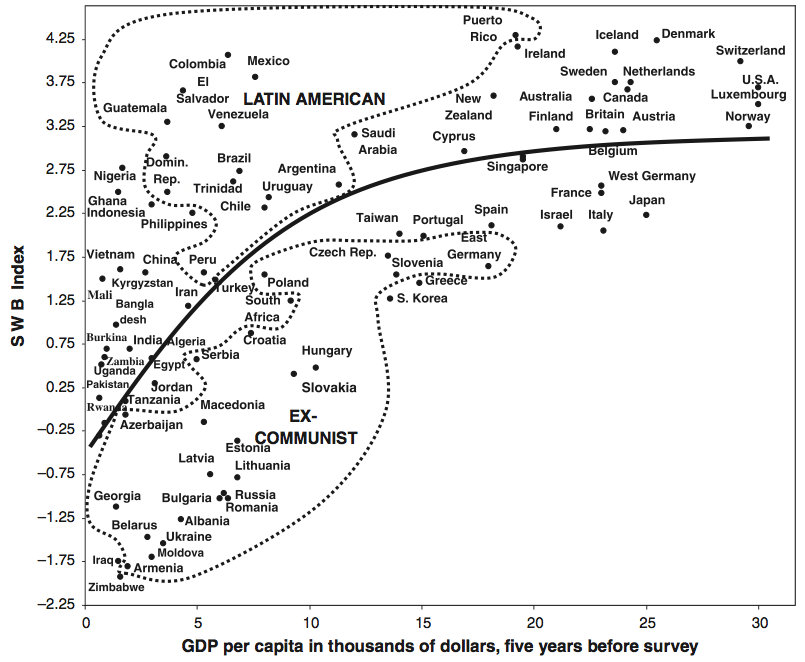
So countries that struggle to develop do take their toll on their citizens, but at some point development stops yielding returns in well being. It would be interesting to see if the effect of personal wealth varied with country GDP, but alas I can’t find that data.
  3. Sexual frequency and housework divisions If my ranting about linear relationships that aren’t entirely linear sound familiar, it’s because I’ve brought this up before in my (oft Googled, less often read) Sex, Models and Housework post and the follow up. My first post was about a study that caused a stir when it claimed that men who did more housework had less sex. The follow up covered a study that rejected a linear model, and instead grouped respondents in to “traditional”, “egalitarian” and “counter-cultural” couples. Despite the claims of the original study, they found that the relationships were only really linear within the groups, but that it was 3 different linear relationships. Egalitarian couples had the most sex and satisfaction, traditional couples had slightly less, and counter-cultural couples did the worst. The model worked much better when the three groups were treated separately than when they were treated as a continuous group.
  4. Age at first marriage The conventional wisdom states that waiting a bit to get married is good for you. It turns out that’s true, until a point. For each year you wait to get married past the age of 20, your chance of divorce goes down 11%. However, once you get to 32, your chance of divorce actually starts going back up. Basically the divorce risk curve is now a parabola:
  5. Expenses and income I found a couple examples of this in this technical paper for statisticians on how to handle partially linear logistic regressions. Basically, the consumption of many household items goes up with household income until a certain point where it stays pretty steady. Things like gas, electricity, and many consumer goods fall in this category.  Interestingly, overall income and expenses actually increase sort of linearly with age from 20-44, then decrease sort of linearly with age from 45-75+

This is a good thing to watch out for in general, as it makes summarizing the trends a little trickier. If you leave out a key modifier or the limits, you could end up giving someone a wrong impression or encouraging people to extrapolate beyond the scope of the model, and that will make the statistician in your life very sad. Know your limits people, and the limits of your data set!

So Why ARE Most Published Research Findings False? Bias and Other Ways of Making Things Worse

Welcome to “So Why ARE Most Published Research Findings False?”, a step by step walk through of the John Ioannidis paper “Why Most Published Research Findings Are False”. It probably makes more sense if you read this in order, so if you missed the intro, check it out here and check out Part 1 here.

First, a quick recap: Last week we took a look at the statistical framework that helps us analyze the chances that any given paper we are reading found a relationship that actually exists. This first involves turning the study design (assumed Type 1 and Type 2 error rate) in to a positive predictive value….aka given the assumed error rate, what is the chance that a positive result is actually true. We then added in a variable R or “pre-study odds” which sought to account for the fact that some fields are simply more likely to find true results than others due to the nature of their work. The harder it is to find a true relationship, the less likely it is that any apparently true relationship you do find is actually true. This is all just basic math (well, maybe not basic math), and provides us the coat hook on which to hang some other issues which muck things up even further.

Like bias.

Oh, bias: Yes, Ioannidis talks about bias right up front. He gives it the letter “u” and defines it as “the proportion of probed analyses that would not have been “research findings,” but nevertheless end up presented and reported as such, because of bias“. Note that he is specifically focusing on research that is published claiming to have found a relationship between to things. He does mention that bias could be used to bury true findings, but that is beyond the current scope. It’s also probably less common simply because positive findings are less common. Anyway, he doesn’t address reasons for bias at this point, but he does add it in to his table to show how much it mucks about with the equations:

This pretty much confirms our pre-existing beliefs that bias makes everything messy. Nearly everyone knows that bias screws things up and makes things less reliable, but Ioannidis goes a step further and seeks to answer the question “how much less reliable?”  He helpfully provides these graphs (blue line is low bias of .05, yellow is high bias of .8):

Eesh. What’s interesting to note here is that good study power (the top graph) has a pretty huge moderating effect on all levels of bias over studies with low power (bottom graph). This makes sense since study power is influenced by sample size and the size of the effect your are looking for. While even small levels of bias (the blue line) influence the chance of a paper being correct, it turns out good study design can do wonders for your work.  To put some numbers on this, a well powered study with 30% pre-study odds with a positive finding has a 83% chance of being correct with no bias. If that bias is 5%, the chances drop to about 80%. If the study power is dropped, you have about a 70% chance of a true finding being real. Drop the study power further and you’re under 60%. Keep your statisticians handy folks.

Independent teams, or yet another way to muck things up: Now when you think about bias, the idea of having independent teams work on the same problems sounds great. After all, they’re probably not all equally biased, and they can confirm each other’s findings right?

Well, sometimes.

It’s not particularly intuitive to think that having lots of people working on a research question would make results less reliable, but it makes sense. For every independent team working on the same research question, the chances that one of them gets a false positive finding goes up. This is a more complicated version of the replication crisis, because none of these teams necessarily have to be trying the same method to address the question. Separating out what’s a study design issue and what’s a false positive is more complicated than it seems. Mathematically, the implications of this are kind of staggering. The number of teams working on a problem (n) actually increase some of the factors exponentially. Even if you leave bias out of the equation, this can have an enormous impact on the believability of positive results:

If you compare this to the bias graph, you’ll note that having 5 teams working on the same question actually decreases the chances of have a true positive finding more than having a bias rate of 20% does….and that’s for well designed studies. This is terrible news because while many people have an insight in to how biased a field might be and how to correct for it, you rarely hear people discuss how many teams are working on the same problem.  That Indeed, researchers themselves may not know how many people are researching their question. I mean, think about how this is reported in the press “previous studies have not found similar things”.  Some people take that as a sign of caution, but many more take that as “this is groundbreaking”. Only time can tell which one is which, and we are not patient people.

Now we have quite a few factors to take in to account. Along with the regular alpha and beta, we’ve added R (pre-study odds),  u (bias) and n (number of teams). So far we’ve looked at them all in isolation, but next week we’re going to review what the practical outcomes are of each and how they start to work together to really screw us up. Stay tuned.

Part 3 is up! Click here to read “The Corollaries”

You Are Number Six

Happy almost Thanksgiving everyone! I hope your travels are safe, your turkey is well done, and that your refrigerator doesn’t die with all of your Thanksgiving meal contributions in it like mine did yesterday.

If the thought of me cleaning a Popsicle sludge flood off my floor doesn’t cheer you, perhaps this will:

At a recent family party, an older relative asked my son how old he was. My son, currently 4, looked at her and said “I am NOT a number!”

My husband is convinced he’s quoting the Prisoner, which is a pretty advanced pop culture reference for a 4 year old IMHO, even if there is an Iron Maiden song that uses the clip. I personally think he’s either lashing out at me or following in my footsteps. One of the two.

Regardless, that kid has a way with words. Happy Thanksgiving!

And for those of you getting shown up on your pop culture knowledge by someone born in 2012, here you go:

So Why ARE Most Published Research Findings False? A Statistical Framework

Welcome to “So Why ARE Most Published Research Findings False?”, a step by step walk through of the John Ioannidis paper bearing that name. If you missed the intro, check it out here.

Okay, so last week I gave you the intro to the John Ioannidis paper Why Most Published Research Findings are False. This week we’re going to dive right in with the first section, which is excitingly titled “Modeling the Framework for False Positive Findings“.

Ioannidis opens the paper with a review of the replication crisis (as it stood in 2005 that is) and announces his intention to particularly focus on studies that yield false positive results….aka those papers that find relationships between things where no relationship exists.

To give a framework for understanding why so many of these false positive findings exists, he creates a table showing the 4 possibilities for research findings, and how to calculate how large each one is. We’ve discussed these four possibilities before, and they look like this:

Now that may not look too shocking off the bat, and if  you’re not in to this sort of thing you’re probably yawning a bit. However, for those of us in the stats world, this is a paradigm shift.  See historically stats students and researchers have been taught that the table looks like this:

basic2by2

This table represents a lot of the decisions you make right up front in your research, often without putting much thought in to it. Those values are used to drive error rates, study power and confidence intervals:

type1andtype2

The alpha value is used to drive the notorious “.05” level used in p-value testing, and is the chances that you would see a relationship more extreme than the one you’re seeing due to random chance.

What Ioannidis is adding in here is c, or the overall number of relationships you are looking at, and the R, which is the overall proportion of true findings to false findings in the field. Put another way, this is the “Pre-Study Odds”. It asks researchers to think about it up front: if you took your whole field and every study ever done in it, what would you say the chances of a positive finding are right off the bat?

Obviously R would be hard to calculate, but it’s a good add in for all researchers. If you have some sense that your field is error prone or that it’s easy to make false discoveries, you should be adjusting your calculations accordingly. Essentially he is asking people to consider the base rate here, and to keep it front and center.  For example, a drug company that has carefully vetted it’s drug development process may know that 30% of the drugs that make it to phase 2 trials will ultimately prove to work. On the other hand, a psychologist attempting to create a priming study could expect a much lower rate of success. The harder it is for everyone to find a real relationship, the greater the chances that a relationship you do find will also be a false positive. I think requiring every field to come up with an R would be an enormously helpful step in and of itself, but Ioannidis doesn’t stop there.

Ultimately, he ends up with an equation for the Positive Predictive Value (aka the chance that a positive result is true aka PPV aka the chance that a paper you read is actually reporting a real finding) which is PPV = (1 – β)R/(R – βR + α). For a study with a typical alpha and a good beta (.05 and .2, respectively), here’s what that looks like for various values of R:

prestudyvspoststudy

So the lower the pre-study odds of success, the more likely it is that a finding is a false positive rather than a true positive. Makes sense right?

Now most readers will very quickly note that this graph shows that you have a 50% chance of being able to trust the result at a fairly low level of pre-study odds, and that is true. Under this model, the study is more likely to be true than false if (1 – β)R > α. In the case of my graph above, this translates in to pre-study odds that are greater than 1/16. So where do we get the “most findings are false” claim?

Enter bias.

You see, Ioannidis was setting this framework up to remind everyone what the best case scenario was. He starts here to remind everyone that even within a perfect system, some fields are going to be more accurate than others simply due to the nature of the investigations they do, and that no field should ever expect that 100% accuracy is their ceiling. This is an assumption of the statistical methods used, but this assumption is frequently forgotten when people actually sit down to review the literature. Most researchers would not even think of claiming that their pre-study odds were more than 30%, yet very few would say off the top “17% of studies finding significant results in my field are wrong”, yet that’s what the math tells us. And again, that’s in a perfect system. Going forward we’re going to add more terms to the statistical models, and those odds will never get better.

In other words, see you next week folks, it’s all down hill from here.

Click here to go straight to part 2.

Voter Turnout vs Closeness of Race

I’ve seen a lot of talk about the Electoral College this past week, and discussion about whether or not the system is fair. I’m not particularly going to wade in to this one, but I did get curious if the closeness of the presidential race in a state influenced voter turnout overall. Under the current system, it would stand to reason that voters in states that have large gaps between the two parties (and thus know ahead of time which way their state is going to go) would be less motivated to vote than those living in states with close races. While other races are typically happening in most states that could drive voter turnout, we know that elections held during the presidential election have better turnout than midterm elections by a significant margin. The idea that being able to cast a vote for the president is a big driver of turnout seems pretty solid.

What I wanted to know is if the belief that you’re going to count a potentially “meaningful” vote in an election an even further driver of turnout. With all the commentary about the popular vote vs electoral college and with some petitioning to retroactively change the way we count the votes, it seemed relevant to know if the system we went in to voting day with had a noticeable impact on who voted.

While not all the numbers are final yet, I found voter turnout by state here, and the state results here.  I took the percent of the vote of the winning candidate and subtracted the percent of the vote of the second place candidate to get the % lead number, and plotted that against the voter turnout. Here’s the graph:

votingdiff

The r-squared is about 26.5% for an r of .5.  I didn’t take in to account any other races on the ballot, but I think it’s safe to at least theorize that believing your state is a lock in one direction or the other influences voter turnout. Obviously this provides no comment on how other systems would change things from here, only how people behave under the system we have today.

For those curious, here’s an uglier version of the same graph with state names:

votediffstatenames

It’s interesting to note that the Utah vote got split by McMullin, so the percent lead there is a bit skewed.

A few other fun facts:

  • The average turnout in states where the presidential race was close (<5% between the winning candidate and second place) was 65% vs 58% for all other states. A quick ANOVA tells me this is a statistically significant difference.
  • Once the gap between the winner and second place gets over 10%, things even out. States with a gap of 10-20% have about 58% voter turnout, and those with an over 20% gap have about a 57% voter turnout. Some of this may be even out as states with large gaps also likely take their time with counting their votes.
  • My state (Massachusetts) is one of the weird lopsided but high turnout states, and we had some really contentious ballot questions: charter schools expansion and recreational marijuana.

Again, none of this speaks to whether or not the process we have is a good one, but it’s important to remember that the rules in play at the time people make a decision tend to influence that decision.

I’ll update the post if these margins change significantly as more votes are counted.

What I’m Reading: November 2016

Like everyone else in the US, I’ve been reading a decent amount about the election. I have a few links of interest on that topic, but out of respect for the totally burned out folks, I have put those together at the end. I will however reiterate that I think this 2014 post from Slate Star Codex remains the most important blog post about the current political climate I have ever read.

Speaking of important blog posts, the Assistant Village Idiot’s “Underground DSM” post has been updated for 2016 and it continues to be one of the best pieces on mental health I have read. This needs to be a whole book AVI.

This month my book is “The Joy of X“, which I haven’t started reading yet. I’m hopping on a plane tomorrow morning though, so I plan on getting through most of it then. Also, I’m trying to put together a list of math or stats related books I want to read in 2017 (like this one from 2016), so if you have any recommendations I want to hear them!

An interesting piece on testing for fake data in research. The testing exploits the fact that making up realistic “random” data is a hell of a lot harder than it sounds.

For my teacher friends: the Mathematica Policy Research group took a look at teacher quality to see if that drove performance differences between low income and high income students, and it doesn’t. Poor kids and rich kids are actually equally likely to have good or bad math teachers:

On an academic note, here’s a ranking of colleges and their acceptance of viewpoint diversity.

I have no idea how accurate this primate hands family tree is, but it’s kind of awesome.

Ben, who I collaborated with on a Pop Science series earlier this year, did a series on the (possible?) death knell of the Pumpkin Spice craze by buying every Pumkin Spice product his store had to offer.

Okay, now below this line be politics:

*********************************************************************************************

This NYTs article is from August, but it covers a lot of interesting ground about how Facebook is skewing the way we talk about politics. I’ve put myself on FB timeouts more than once this election season, and I’ve enjoyed it every time.

There’s been a lot of talk about the electoral college this week, and whether or not it’s fair. This is one of those discussions that is sort of about numbers, but really about something else, so I’m not going in to that here. What I am interested in is Maine’s new experiment with ranked choice voting. More labor intensive to tally, but it’s got some interesting quirks that may change incentives for campaigns. A full explanation of how it works here.

A second Slate Star Codex link, but it’s too good not to share. Written the night before the election, he reminds everyone that in a close election over interpretation of the outcome is a dangerous game.

Also, I’ve gotten a request to start holding “Controversial Opinion” dinner parties. I kind of want to do this. There will be wine.

So Why ARE Most Published Research Findings False? (An Introduction)

Well hello hello! I’m just getting back from a conference in Minneapolis and I’m completely exhausted, but I wanted to take a moment to introduce a new Sunday series I’ll be rolling out starting next week. I’m calling it my “Important Papers” series, and it’s going to be my attempt to cover/summarize/explain the important points and findings in some, well, important papers.

I’m going to start with the 2005 John Ioannidis paper “Why Most Published Research Findings are False“.  Most people who have ever questioned academic findings have heard of this one, but fewer seem familiar with what it actually says or recommends. Given the impact this paper has had, I think it’s a vital one for people to understand.  I got this idea when my professor for this semester made us all read it to kick off our class, and I was thinking how helpful it was to use that as a framework for further learning. It will probably take me 6 weeks or so to get through the whole thing, and I figured this week would be a good time to do a bit of background. Ready? Okay!

John Ioannidis is Greek physician who works at Stanford University. In 2005 he published the paper “Why Most Published Research Findings Are False”. This quickly became the most cited paper from PLOS Medicine, and is apparently one of the most accessed papers of all time with 1.5 million downloads. The paper is really the godfather of the meta-research movement…i.e. the push to research how research goes wrong. The Atlantic did a pretty cool breakdown of Ioannidis’s career and work here.

The paper has a few different sections, and I’ll going through each of them. I’ll probably group a few together based on length, but I’m not sure quite yet how that will look.  However, up front I’m thinking the series will go like this:

  1. The statistical framework for false positive findings
  2. Bias and failed attempts at corrections
  3. Corollaries (aka uncomfortable truths)
  4. Research and Bias
  5. A Way Forward
  6. Some other voices/complaints

I’ll be updating that list with links as I write them.

We’ll kick off next week with that first one. There will be pictures.

Week one is up! Go straight to it here.


5(ish) Posts About Elections, Bias, and Numbers in Politics

It’s election day here in the US, so I thought I’d do a roundup of my favorite posts I’ve done in the past year about the political process and it’s various statistical pitfalls. Regular readers will recognize most of these, but I figured there were worth a repost before they stopped being relevant for another few years.  As always, these posts are meta/about the process type posts, and no candidates or positions are endorsed. The rest of you seem to have that covered quite nicely.

  1. How Do They Call Elections So Early? My most popular post so far this year, I walk through the statistical methods used to call elections before all the votes are counted. No idea if this will come in to play today, but if it does you’ll be TOTALLY prepared to explain this at your next cocktail party or whatever it is the kids do these days.
  2. 5 Studies About Politics and Bias to Get You Through Election Season In this post I do a roundup of my favorite studies on, well, politics and bias. Helpful if you want to figure out what your opponents are doing wrong, but even MORE helpful if you use it to re-examine some of your own beliefs.
  3. Two gendered voting studies. People love to study the secret forces driving individual genders to vote certain ways, but are those studies valid? I examined one study that attempted to link women’s voting patterns and menstrual cycles here, and one that attempted to link threats to men’s masculinity and their voting patterns here. Spoiler alert: I was underwhelmed by both.
  4. Two new logical fallacies (that I just made up) Not specific to politics, but aimed in that direction. I invented the Tim Tebow Fallacy for those situations when someone defends a majority opinion as though they were an oppressed minority. The Forrest Gump Fallacy I made up for those times when someone believes that their own personal life is actually reflective of a greater trend in America….when it doesn’t.
  5. My grandfather making fun of statistical illiteracy of political pundits 40 years ago. The original stats blogger in my family also got irritated by this stuff. Who would have thought.

As a final thought, if you’re in the US, go vote! No, it won’t make a statistically significant difference on the national, but I think there’s a benefit to being part of the process.

What Can Your Dentist Tell You About Your Cancer Risk?

Welcome to “From the Archives”, where I dig up old posts and see what’s changed in the years since I originally wrote them.

From time to time something fun reminds me of an old post of mine and I get all excited to go back and research what’s changed since I originally wrote them.

This is not one of those times.

A past post popped in to my head last week, but not for a good reason. A childhood friend of mine was diagnosed with ovarian cancer recently, which is a bit of a shock since she’s only 35, and hits close to home since she has a daughter just a bit younger than my son. Working at a cancer hospital I am unfortunately used to seeing early and unfair diagnoses, but it still has an extra sting when it’s someone you know and when they’re in the same phase of life you are. This friend actually has an interesting intersection with this blog, as she’s a science teacher  whose class I’ve visited and given a version of my Intro to Internet Science talk to. She does great work with those kids, and I loved meeting her class. If you’re the prayers/good thoughts type, send some her way.

Not the happiest of introductions, but the whole experience did remind me about how important it is for people to know the signs of ovarian cancer, as it can be easily missed. Additionally, it made me think of my 2013 post “What Can Your Dentist Tell You About Your Risk For Ovarian Cancer?” where I blogged about the link between congenitally missing teeth and ovarian cancer. I wondered if there had been any updates since then, and it looks like there are! Both scientifically and with a couple dozen spammers who left comments on my original post. Cosmetic dentistry folks apparently have a lot of bots working for them. Anyway, let’s take a look! At the science, not the spammers that is.

First, some background: For those of you who didn’t read the original post, it covered a study that found that women who have ovarian cancer are 8 times more likely to have congenitally missing teeth than women who don’t have ovarian cancer. Since I have quite a few congenitally (ie born that way not knocked out or pulled) missing teeth (both mandibular second molars and both mandibular second bicuspids), I was pretty interested in this fact. I used it as a good example of a correlation/causation issue, because there is likely a hidden third variable (like a gene mutation) causing both the missing teeth and the cancer as opposed to one of those two things causing the other one.

So why missing teeth? Well, first, because it’s kind of fascinating to think of tooth abnormalities being linked to your cancer risk. Dental medicine tends to be pretty separate from other types of medicine, so exploring possible overlaps feels pretty novel. When someone has teeth that fail to develop (also known as hypodontia or angenesis), it’s thought to be a sign of either an early developmental interruption or a gene mutation. Missing teeth are an intriguing disease marker because they are normally spotted early and conclusively. Knowing up front that you are at a higher risk for certain types of cancer could help guide screening guidelines for years.

So what’s the deal with the ovarian cancer link? Well, it’s been noted for a while that women are more likely to have hypodontia then men. Since hypodontia is likely caused by some sort of genetic mutation or disruption in development, it made a certain amount of sense to see if it was linked with cancer specific to women. The initial study linking missing teeth and ovarian cancer showed women with ovarian cancer were 8 times as likely to have missing teeth, but subsequent studies were less certain.  A 2016 meta-analysis showed that overall it appears about 20% of ovarian cancer patients have evidence of hypodontia, as opposed to the general population rate of 2-11%. Unfortunately there’s still not a definitive biological mechanism (ie a gene that clearly drives both), and there’s not enough data to say how predictive missing teeth are (ie what my risk as a healthy person with known hypodontia is). We also don’t know if more missing teeth means greater risk, or if it’s only certain teeth that prove the risk. So while we’re part way there, we’re missing a few steps in the proving causality chain.

Are there links to other cancers here too? Why yes! This paper from 2013 reviewed the literature and discovered that all craniofacial abnormalities (congenitally missing teeth, cleft palate, etc) seem to be associated with a higher family cancer risk.  That paper actually interviewed people about all their family members cancer histories, to cast a wider net for genetic mutations. Interestingly, the sex-linked cancers (prostate, breast, cervical and ovarian) were significantly associated with missing teeth, as was brain cancer. In some families it looks like there is a link to colorectal cancer, but this doesn’t appear to be broadly true.

So where does this leave us? While the evidence isn’t yet completely clear, it does appear that people who are missing teeth should be on a slightly higher alert for signs of ovarian or prostate cancer. Additionally, I’ve sent my dentist and my PCP the literature to review, since neither of them had ever heard of this link. Both found it noteworthy. It’s probably not worth losing sleep over, since we don’t know what the absolute increase is at this point. However, it’s good to keep in the back of your mind. Early detection saves lives.

3 More Examples of Self Reporting Bias

Right after I put up my self reporting bias post last week, I saw a few more examples that were too good not to share. Some came from commenters, some were random stories I came across, but all of them could have made the original list. Here you go:

  1. Luxury good ratings Commenter Uncle Bill brought this one up in the comments section on the last post, and I liked it. The sunk cost fallacy  says that we have a hard time abandoning money we’ve already spent, and this kicks in when we have to say how satisfied we are with our luxury goods. No one wants to admit a $90,000 vehicle actually kind of sucks, so it can be hard to figure out if the self reported reliability ratings reflect reality or a desired reality.
  2. Study time Right after I put my last self reporting bias post up, this study came across my Twitter feed. It was a study looking in to “time spent on homework” vs grades, and initially it found that there was no correlation between the two. However, the researchers had given the college students involved pens that actually tracked what they were doing so they double checked the students reports. With the pen-measured data, there actually was a correlation between time on homework and performance in the class. It turned out that many of the low performing kids wildly overestimated how much time they were actually spending on their homework, much more so than the high performing kids. This bias is quite possibly completely unintentional….kids who were having a tough time with the material probably felt like they were spending more time than they were.
  3. Voter preference I mentioned voter preference in my Forest Gump Fallacy post, and I wanted to specifically call out Independent voters here. Despite the name and the large number of those who self identify as such, when you look at voting patterns many independent voters are actually what they call “closet partisans”. Apparently someone who identifies as Independent but has a history of voting Democrat is actually less likely to ever vote GOP than someone who identifies as a “weak Democrat”.  So Independent is a tricky group of Republicans who don’t want to say they’re Republicans, Democrats who don’t want to say they’re Democrats, 3rd party voters, voters who don’t care, and voters who truly have no party affiliation. I’m sure I left someone out, but you can see where it gets messy. This actually also effects how we view Republicans and Democrats, as those groups are normally polled based on self identification. By removing the Independents, it can make one or both parties look like their views are changing, even if the only change is who checked the box on the form.

If you see any more good ones, feel free to send them my way!