Chapter 9 has some interesting anecdotes about the quest to create a chess program that could beat Gary Kasparov. It covers some of the limits of humans and machines, and how they are almost better when used in tandem.

Chapter 9 has some interesting anecdotes about the quest to create a chess program that could beat Gary Kasparov. It covers some of the limits of humans and machines, and how they are almost better when used in tandem.
With the Olympics officially coming to a close this past Sunday, a reader contacted me and asked about the performance of the female athletes of Team USA. He was curious if the number of medals won by US women in the Olympics had increased as a percentage, absolute count or both since the passing of Title IX. In a year that female athletes got a substantial amount of coverage, this seemed like an interesting question so I ran a few numbers.
Some caveats: Figuring out how many events there are each year is tougher than I thought, especially for the early Olympics. Because some of my data sources disagreed, some of these percentages might be off. Additionally, I may be slightly off on the percent won by women by a few points. In both the winter and summer Olympics, there are some mixed gender events…think paired figure skating. I couldn’t figure out how the data I pulled below was counting that, so it could vary a bit. Since there’s only 3 of those events in the winter Olympics and 9 in the summer, I decided to let it go. Finally, this only counts events, not athletes. Michael Phelps counts as a medal in each of his events, but the relay team also only counts as one. So basically, this reflects the gender breakdown by medal count, not by the number of male or female medalists we have. So Team USA basketball is one medal for each gender, despite making quite a few people “gold medalists”. All data sources at the bottom of the post
Okay, so let’s take a look!
First, how has the percent of Team USA medals won by women changed over time?
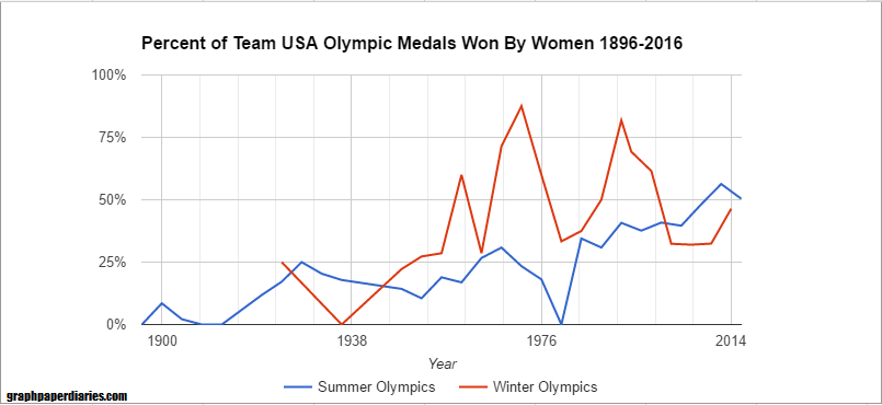
Each of the lines is 8 years, if you’re trying to orient yourself. For the youngsters, the dip in 1980 is because we boycotted that year. As you can see though, the percentage has gone steadily up.
But what was the driver of this? The initial asker suggested the driver was Title IX, but I wondered if it might be more closely correlated with the expansion of women’s events. Of course neither of these would be entirely independently causal….we know the social forces that drove one likely drove the other. Anyway, here’s how the percentage of medals available to women varied with the percentage of medals won by women on Team USA for the Summer Olympics:

And winter:

The winter medals variability is almost all because of the low medal counts. The two years they were high were actually not very high medal count years (5 and 9), but basically the men only got 2. I ran a quick regression and the r-squared for the Summer Olympics is around .75, and the Winter about .4.
For juxtaposition, here’s the number of female NCAA Div 1 athletes superimposed on a different scale: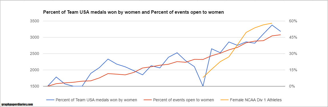
I’m not going to do the overall regression because correcting for the multicollinearity (aka, a regression with two factors that are correlated) can be a bit of a hassle, but I’m guessing it’s the expansion of events driving the medal count more than the number of D1 female athletes. However, it may be the increased number of athletes allowed the US to immediately take advantage of every expansion in medal events. Additionally having more talented female athletes probably incentivized the IOC to add more events.
Confusing correlation, but a great question!
The Team USA Medal Count came from here. The count for female athletes came from here. The number of events came from here for winter and here for summer. The number of events available to women is here. NCAA athlete counts are here.
After my comment last week that I’d sort of friend-zoned physics, I got to thinking about how many different subjects/career choices I stumbled through during my 20s. It’s incredibly interesting to me that even though society has started allowing (and frequently even encouraging) people to wait longer and longer before finding “the one” for marriage, we still put a lot of pressure on people to know exactly what they’re interested in by the age of 18…or 22 if you’re a little behind. Clearly college debt is a huge driver of this, but I do meet a bizarre number of high school students who really think most people figure out “their passion” before they’re even old enough to drink. While clearly there are plenty of people who find what topics they want to study early, I’d like to propose that the whole thing is a little more like dating then we normally think of it.
When I mention “subjects” here and “study”, I am covering a lot of ground. Studying could mean formally studying in school, or getting books out of the library, watching documentaries or talking to a lot of people in the field. While I mention careers, I’m not directly equating intellectual pursuits to careers or work because some people really don’t get to equate those two. It’s an unfortunate reality that many of us have to prioritize paying the bills over feeding our minds, and if you ever find yourself doing both at once you are incredibly lucky. With those caveats, and the knowledge that this is based on nothing but my own experience and that of my friends, here’s the 10 types of subjects you study before you find “the one”:
Of course the nice thing about intellectual pursuits is that you actually can juggle multiple different subjects at once with a lot less potential for drama than if you tried that while dating. For example, my current job is a mash up of my true love (statistics, analytics and process improvement) my friend with benefits (quality and regulatory) and the safe one (computer systems). My blogging is The Artist, and it gives me a place to research all my thoughts that don’t fit in any other box. I think acknowledging how many different types of intellectual pursuits there are (and how much you can learn from all of them!) could be useful for kids still trying to figure things out. Just like dating can help you hone in on what you want in a spouse, studying a lot of subjects can help you find that sweet spot of “things you want to talk about” and “things people want to pay you to talk about”.
Plus, isn’t the world a little more fun when you consider every new book a low key blind date?

The eternal struggle continues.
One of my favorite things about getting an engineering degree was the amount of basic science classes I had to take. It gave me at least a dilettante’s knowledge of quite a few scientific fields, and I’ve always enjoyed using that background to keep at least half an eye on other scientific fields. Of all of those fields, my particular favorite is physics. I always loved physics in that “I’m so glad to see you, but let’s just be friends” kind of way, and I try to make sure I read at least a book or two a year about it.
A few months ago I read Lee Smolin’s book “The Trouble With Physics“, and was intrigued to read a breakdown of some of the current (well, ten years ago now) problems in the field. It got me pretty stressed out about string theory, which is not a problem I had expected to have that week. I digress. Anyway, this physics anxiety got a little worse when James over at I Don’t Know But posted about how physics needed some new ideas, and then he left me this link about the rather embarrassing 750 GeV diphoton excess incident. He compared the whole debacle to priming studies, which seemed fair. Anyway, since blogging is the primary way I deal with my science and statistics related anxiety problems, I thought I’d put together a post on why I actually love reading about issues in physics. Ready? Let’s go!
So there you have it, and if you have any good physics book recommendations, I’m always looking!
Last week, commenter Christopher B left an interesting comment on my post about masculinity threats and voting that made me realize I wanted to do a bigger post on priming studies in general. Priming studies have come under a lot of fire in the past few years, and they have the unfortunate distinction of being called (by some) the “poster child for doubts about the integrity of psychological research“. So what’s going on here? What are these studies and why do they go wrong so often?
Well, as Christopher B pointed out, it’s not because priming isn’t a thing. Priming is typically defined as “an implicit memory effect in which exposure to one stimulus (i.e., perceptual pattern) influences the response to another stimulus“. In other words, something you see or do at one point unconsciously biases you to act differently at a later date. Some of these could be pretty straightforward. If you see a list of words that containing the word “dog” and then someone asks you to name an animal that starts with the letter w, you will probably be more likely to say “wolf” than “walrus”. Lots of marketers attempt to use priming-like effects to get people to buy more or differently than they would have otherwise. There’s even some efforts to see if getting alcoholics to physically (well, in the form of video games) practice pushing away drinks helps lead to lower rates of relapse. I think most of us would accept that your brain does have a bit of an auto-suggest type system, and most people would accept it can probably be manipulated subtly. So where’s the problem? Well, in addition to the p-value and replication issues I’ve raised before, here’s some other reasons things have gone haywire:
 Image from the quantitative analysis paper. The authors in that paper propose that this will translate in to young people being much more susceptible to subtle primes, with older people only responding to more direct ones. This age discrepant behavior is not always accounted for.
Now keep in mind, all of these reasons are over and above the normal file drawer effect and p-hacking that all fields face. Hopefully this gives you a little insight in to a few of the less obvious ways these studies can go wrong, and will trigger you to think about these things when you hear the word “prime”….see what I did there????
Chapter 7 was about extrapolation and predictions that influence their own accuracy. One of my favorite examples was predictions about disease spread:
I got an interesting reader question a few days ago, in the form of a rather perplexed/angry/tentatively excited message asking if he could stop flossing. The asker (who shall remain nameless) was reacting to a story from the Associated Press called “The Medical Benefits of Dental Floss Unproven“. In it, the AP tells their tale of trying to find out why the government was recommending daily flossing, given that it appeared there was no evidence to support the practice. They filed a Freedom of Information Act request, and not only did they never receive any evidence, but they later discovered the Department of Health and Human Services had dropped the recommendation. The reason? The effectiveness had never been studied. Oops.
So what do you need to know about this controversy? Is it okay to stop flossing? Here’s 5 things to help you make up your mind:
So after reviewing the controversy, I have to say I will probably keep flossing daily. Or rather, I’ll keep aiming to floss daily because that has literally never translated in to more than 3 times/week. I will probably increase my use of mouthwash based on this study, but that’s something I was meaning to do anyway. Whether it causes a behavior change or not though, we should all be happy with a push for more evidence.
Back in February I did a post called Women, Ovulation and Voting in 2016, about various researchers attempts to prove or disprove a link between menstrual cycles and their voting preferences. As part of that critique, I had brought up a point that Andrew Gelman made about the inherently dubious nature of anyone claiming to find a 20+ point swing in voting preference. People just don’t tend to vary their party preference that much over anything, so they claim on it’s face is suspect.
I was thinking of that this week when I saw a link to this HBR article from back in April that sort of gender-flips the ovulation study. In this research (done in March), they asked men whether they would vote for Trump or Clinton if the election were today. For half of the men they first asked them a question about how much their wives made in comparison to them. For the other half, they got that question after they’d stated their political preference. The question was intended to be a “gender prime” to get men thinking about gender and present a threat to their sense of masculinity. Their results showed that men who had to think about gender roles prior to answering political preference showed a 24 point shift in voting patterns. The “unprimed” men (who were asked about income after they were asked about political preference) had preferred Clinton by 16 points, and the “primed” men preferred Trump by 8 points. If the question was changed to Sanders vs Trump, the priming didn’t change the gap at all. For women, being “gender primed” actually increased support for Clinton and decreased support for Trump.
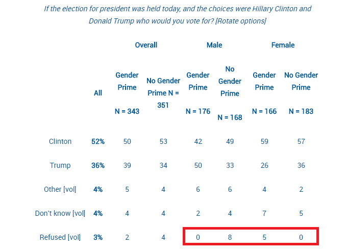
Now given my stated skepticism of 20+ point swing claims, I decided to check out what happened here. The full results of the poll are here, and when I took a look at the data there was one thing that really jumped out at me: a large percent of the increased support for Trump came from people switching from “undecided/refuse to answer/don’t know” to “Trump”. Check it out, and keep in mind the margin of error is +/-3.9:
So basically men who were primed were more likely to give an answer (and that answer was Trump) and women who were primed were less like to answer at all. For the Sanders vs Trump numbers, that held true for men as well:
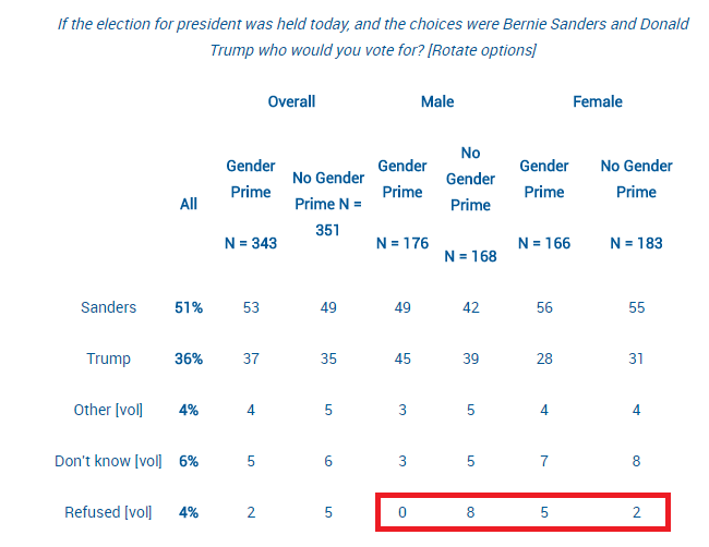
In both cases there was about a 10% swing in men who wouldn’t answer the question when they were asked candidate preference first, but would answer the question if they were “primed” first. Given the margin of error was +/-3.9 overall, this swing seems to be the critical factor to focus on…..yet it was not mentioned in the original article. One could argue that hearing about gender roles made men get more opinionated, but isn’t it also plausible the order of the questions caused a subtle selection bias? We don’t know how many men hung up on the pollster after being asked about their income with respect to their wives, or if that question incentivized other men to stay on the line. It’s interesting to note that men who were asked about their income first were more likely to say they outearned their wives, and less likely to say they earned “about the same” as them…..which I think at least suggests a bit of selection bias.
As I’ve discussed previously, selection bias can be a big a big deal…and political polls are particularly susceptible to it. I mentioned Andrew Gelman previously, and he had a great article this week about his research on “systemic non-response” in political polling. He took a look at overall polling swings, and used various methods to see if he could differentiate between changes in candidate perception and changes in who picked up the phone. His data suggests that about 66-85% of polling swings are actually due to a change in the number of Republicans and Democrats who are willing to answer pollsters questions as opposed to a real change in perception. This includes widely reported on phenomena such as “post convention bounce” or “post debate effects”. This doesn’t mean the effects studied in these polls (or the studies I covered above) don’t exist at all, but that they may be an order of magnitude more subtle than suggested.
So whether you’re talking about ovulation or threats to male ego, I think it’s important to remember that who answers is just as important as what they answer. In this case 692 people were being used to represent the 5.27 million New Jersey voters, so any the potential for bias is, well, gonna be yuuuuuuuuuuuuuuuuuuge.
I’ve been going through the book The Signal and the Noise, and pulling out some of the anecdotes in to contingency matrices. Chapter 6 covers margin of error and communicating uncertainty.
There’s a great anecdote in the opening of this chapter about flood heights and margin of error. If your levee is only built to contain 51 feet of water, then you REALLY need to know that the weather service prediction is 49 feet +/- 9, not just 49 feet.
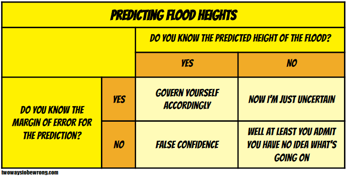
This is bad enough, but Silver also points out that we almost never get a margin of error or uncertainty for economic predictions. This is probably why they’re all terrible, especially if they come from a politically affiliated group.
The lesson here is knowing what you don’t know is sometimes more important than knowing what you do know.
