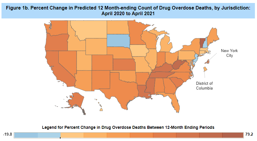
I’d like to take a break from posting on all cause mortality in the US and its relationship to COVID deaths to post about a different subset of deaths. Drug overdose deaths are unequivocally on the rise this year, going from about 78,056 between May 2019 and April 2020 to 100,306 in between May 2020 to April 2021. Since I am obsessed with state level data, here’s the CDC breakdown of where the jumps occurred:
This was of interest to me because (as I have posted previously) my brother has an unfortunate amount of experience with opioid addiction, and has written a book about it. With the opioid crisis in the US continuing to worsen, it’s no surprise he’s started trying to look at other countries to see how they have addressed things and if anything they’ve done has made a difference.
Enter Portugal.
If you read anything about our handling of drugs, particularly any of the cases around drug legalization, Portugal is bound to get cited. The basic narrative goes something like this: in 2001 Portugal decriminalized the consumption of all drugs. Most critics thought this would lead to worsening drug abuse/deaths, but instead drug related deaths fells, incarceration rates fell, and drug use was not impacted. Here’s an advocacy organization making this case. Here’s Time Magazine making this case. Here’s the Cato Institute making this case. Here’s the Obama White House complaining about everyone who’s making this case.
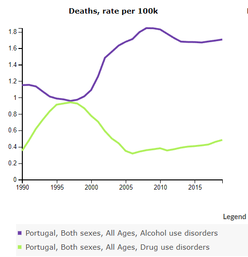
When I first heard about Portugal, I’ll admit I took this all at face value. After all, even the White House resorted to kind of nitpicking the statistics. But a few weeks ago I stumbled on to this Twitter thread from Lyman Stone that left me with more questions than answers. He started by pointing to the Global Health Data Exchange, where you can pull all sorts of mortality data for all sorts of countries. First, here’s Portugal’s deaths from drug use disorders:
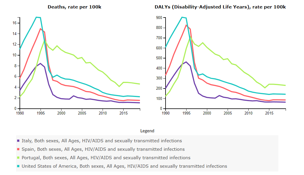
Not bad. Looking at the source data, nothing for 2000 is available, so we skip from 1999 to 2001 and we do see a drop between those two years. So far so good. However, Lyman pointed out that drug use disorder deaths are one of two types of deaths filed under “substance use disorder deaths”. The other is alcohol related deaths. Here they are plotted together:So….the same year the drug related deaths started to drop, alcohol deaths went up by an approximately equal amount. So what happened here? Did people start taking alcohol less seriously when drugs were legalized, or did some deaths that previously would have been called drug deaths get filed as alcohol deaths? Or is it all a coincidence? I actually don’t know. I couldn’t find anyone addressing this. It does appear Portugal has a legitimately alarming rate of alcohol consumption, so any explanation appears somewhat plausible. What we do know is that other countries nearby did not see the same increase in alcohol related deaths, even as they saw their drug deaths decrease:If you lump them all together, we see that Spain has seen a decrease (though is higher) and Portugal has been steadily increasing since 1990. If you use the DALY’s (those account for age), things look even worse for Portugal:I went to Wikipedia to see if I could get any general insight on the topic, and the opening paragraph caught my eye. Per Wiki, the purpose of the policy change in 2001 was actually to focus on HIV deaths. There isn’t a solid citation for this so I’m not sure if this is true, but I will note other articles tend to say this was “part of a broader health initiative” so it seems plausible. If it is true, then it’s actually pretty confusing what happened next:Throwing in a few comparison countries (including the US), we note that every other country had a precipitous drop in HIV deaths in the late 90s. Portugal has had a much slower decline. Note the order of magnitude as well: right now Portugal appears to have over twice as many people dying of HIV as they do of substance use. I have no idea what happened here, but we did not see this in Spain or Italy.
Wiki did add to the drug overdose death mystery as well, noting that in this 2010 paper it stated that “the subsequent increase has been attributed by local informants to a shift in measurement practices, namely an increase in the number of toxicological autopsies performed (from 1,166 in 2002 to 2,805 in 2008), which increased the probability that people would be found to have drugs in their bodies at death.” To note: I have no idea if Portugal is now testing more people than most countries or fewer. This is why international comparisons are hard.
The same paper actually clarifies a different question that I had. Lyman Stone brought up the fact that despite decriminalizing everything in 2001, in 2008 the laws were amended to recriminalize large amounts of drugs. Not being very familiar with drugs/amounts, I wasn’t clear how much a “large amount” was. It turns out it’s a “10 day supply” which is apparently defined as “0.1 g heroin, 0.1 g ecstasy, 0.1 g amphetamines, 0.2 g cocaine or 2.5 g cannabis”. Now obviously there is not a super standardized measurement for heroin, but based on a bunch of Googling (that may have permanently flagged my account somewhere) I found that in Ithaca, New York one gram of heroin is typically divided in to 20 bags. A bag is $20, or a bundles for $180. So two bags of heroin would land you back in criminal territory.
This clarifies why the incarceration/conviction rate went up, as I assume 2 bags may not be a super unusual occurrence.
So basically, here are the questions I’m left with: why did Portugal experience such a spike in alcohol deaths right after they decriminalized the consumption of drugs? Why haven’t their HIV deaths come down like most other countries? Did the recriminalization really only catch dealers, or were a lot of regular users caught up in this as well? If anyone knows any good sources on any of this, I would appreciate hearing from you!
Well hello there! Another month has flown right by, and it’s time for another US excess mortality update. I’ve actually spent my week arguing about Portugal’s death counts (substance use related, not COVID related), but that’s a story for another post.
It’s been quite the month, and I was interested to look back and realize that when I first started doing these posts in August, the estimates for excess mortality put us at between 595,688 and 758,749 excess deaths since 2/1/2020. As of the most recent data release earlier this week, the US is now somewhere between 791,202 and 962,125. The 1 million mark is getting pretty close. If you have questions about these numbers, see prior posts.
Excess Mortality in 20-50 year olds
After my last post, bluecat57 left me a few comments about the concerns about excess mortality specifically in the younger adult age ranges. These are concerning deaths because 1. They are on the rise and 2. There is debate where they are coming from. It will be a while until all the data is in, but here’s the US trend for deaths through the end of September:
So basically during the pandemic we gained about 600ish extra deaths in the 25-44 year old age range, with a sudden jump in July of this year that took us to about 1800 extra deaths every week over baseline.
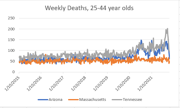
One of the links went to a clip of someone speculating on the reasons for these deaths, with several possible explanations. One explanation is that this is COVID. One is that something else is killing young people. One was that the vaccines were killing younger adults. Now this was an interesting claim, as the timeframe doesn’t entirely match up. July was on the later side for most people getting vaccinated, but perhaps the claim is there’s a delay. I decided to take a look at my 3 states I go back to: Massachusetts, Arizona and Tennessee. These are interesting states because they are in 3 totally different areas of the country, and have very different vaccination rates. In Arizona, 53.7% of the population is fully vaccinated. In Massachusetts, 70.3% and in Tennessee it’s 48.8%. That’s of the total population (kids excluded until recently) so we can assume that translates in to a somewhat higher number for this slice of the population. So how are these states doing? Here you go:
Starting around May of 2020, Arizona and Tennessee show gains here, whereas Massachusetts does not. Per the state report, around 80% of 25-44 year olds in Massachusetts are vaccinated, and we do not see much of a gain (if any) in young person deaths. As someone in that age group, it is of course relieving to see that my risk of death is basically unchanged since 2019. In Arizona and Tennessee, there are points where your risk of death was 1.5-2x as likely.
It seems unlikely the vaccines are causing these deaths, when we see bigger spikes in more unvaccinated populations than in largely vaccinated ones. I wanted to compare these to the overall deaths in each state, so here is that:
Interesting that each spike in overall mortality correlates to a similar spike in 25-44 deaths except the initial Massachusetts spike. This backs up the theory that the very first COVID spike hit nursing homes hard, and that has not been as much of a problem since then. I was also interested to note that despite COVID appearing fairly seasonal, death rates for Arizona and Tennessee exceed those of Massachusetts last winter.
So basically, I think it’s unlikely that vaccines are playing a role. I would speculate many of these are COVID deaths, or something else potentially related to COVID. As far as I’m aware, Massachusetts had the toughest lockdowns/restrictions of the 3 states (though lockdowns have been done in MA for over a year, unless you count mask mandates as lockdowns) so I’d suspect it’s not lockdown related either. Let me know if you have evidence Tennessee or Arizona were tougher though, as I obviously know my own state better than those two.
Excess Mortality Over Average Updates
Okay, so here’s the visual:
Who moved the most this month? Not a lot of major changes
State
Excess Deaths Above Average/Million 2/1/20-11/10/21 (change from 10/6)
Change from 10/6 rank
Mississippi
4784 (+160)
No change
Alabama
4325 (+325)
No change
Louisiana
4086 (+286)
No change
Arkansas
4086 (+303)
No change
DC
3946 (+201)
No change
Arizona
3846 (+251)
No change
Tennessee
3803 (+422)
+1
Florida
3655 (+290)
+1
South Carolina
3588 (+135)
-2
Nevada
3480(+324)
+1
Of note, New York fell off the top ten list entirely, and currently sites at #17. It’s good to see the top states slowing down though, it’s been a tough go of it.
Most of the states with the biggest gains this month actually did not make the top 10. The top 5 gainers were Idaho (#32, +596), Puerto Rico (#31, +563), Montana (#13, +535), Kentucky (#12, +516) and Wyoming (#36, +500).
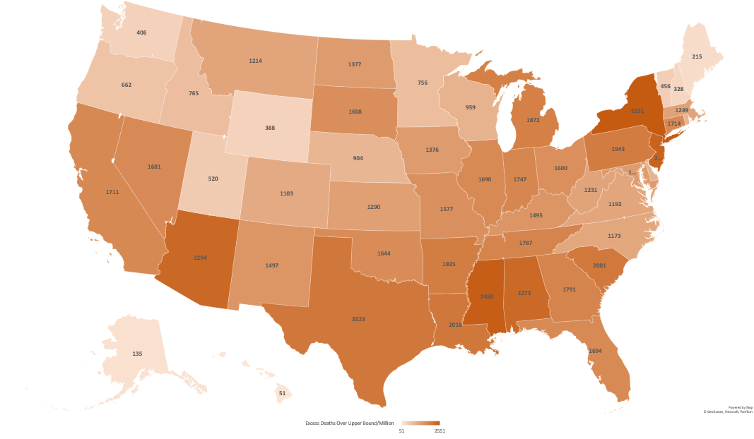
Excess Mortality Over Upper Bound by State
Graphical representation here:
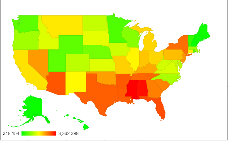
Okay, here’s the top 10 list:
State
Excess Deaths/Million Over Upper Bound (change from 10/6)
Change from 10/6 rank
Mississippi
3362 (+60)
No change
Alabama
3280 (+276)
No change
Florida
2912 (+265)
+1
Arizona
2860 (+201)
-1
Arkansas
2829 (+236)
+1
Louisiana
2810 (+324)
+1
Texas
2793 (+244)
+1
Tennessee
2784 (+361)
+3
New York
2760 (+60)
-4
Georgia
2599 (+280)
+2
Again, not a lot of motion except for NY running off the list. This seems fairly consistent with a falling peak: states simply aren’t adding huge numbers at the moment. The biggest changes are again (mostly) coming in states that have actually had lower pandemic numbers up until now: Idaho (#29, +521), Puerto Rico (#40, +496), Kentucky (#15, +457), Montana (#23, +396), Tennessee (#8, +361).
Again, given the nature of COVIDs seasonal interaction here, I’m going to continue to keep this updated for at least Dec/Jan/Feb. With acquired immunity and vaccines going on, it’s hard to know if we’ll see a substantial 4th (or 5th, depending how you count) wave of deaths in the US. Stay healthy everyone!
I can’t believe another month has gone by, but here we are! I am back to update state level excess mortality data from the CDC website, pulled on 06OCT21. See previous posts for more details about this data.
First up though, here’s an interesting gif someone made that shows the spread of COVID cases over time by region. Definitely shows some interesting seasonality, and also some interesting data anomalies.
Excess Mortality – How bad has it been?
As I’ve talked to a few people about state level data over the past few months, one of the things I’ve noticed is that some people’s perceptions of the pandemic do not match their individual state. I started wondering if this has anything to do with when the peak excess mortality is, and how long the states spend at high levels of excess mortality. Using the same CDC data I’ve been using, I decided to pull the number of weeks each state has a mortality rate >50% above their average. The data goes back to 2017, so we can see that this phenomena only happened three times between January of 2017 and March 28th, 2020: once to Puerto Rico in September 2017 (Hurricane Maria), and twice in Wyoming (October 2018 and January 2020). I’m not totally clear what happened those weeks.
So this happened 3 times in a little over 3 years. How often has it occurred since the end of March 2020? A total of 363 times in 45 states. The only 5 states that haven’t reached that level since the pandemic began are Alaska, Hawaii, Maine, New Hampshire and Oregon. The US as a whole spent 6 weeks in that range, with 25 states exceeding the national average. Here are those states, and how many weeks they spent at that level (so far):
State
# of weeks at >50% excess mortality
Texas
19
Mississippi
17
DC
16
Alabama, Arizona
14
Nevada, North Dakota
13
Oklahoma
12
Georgia, Louisiana, Montana, South Dakota, Tennessee
10
Arkansas, California, Florida,
9
Indiana, New Mexico, New York City (city only)
8
Iowa, Michigan, New Jersey, Pennsylvania, New York (excluding city
7
Just a note on NYC vs NY: only one of those weeks wasn’t overlapping. If we raise the bar and look at only states that have at least one week where they had DOUBLE the number of deaths they usually do, we find only 9 states have hit that bar:
State
# of weeks at >100% excess mortality
New York City (city only)
7
New Jersey, South Dakota
5
California, Connecticut, Massachusetts
3
Florida, New York (excluding city), North Dakota
2
DC
1
Another note on NYC vs NY: the 2 weeks for NY are also in the 7 week stretch for NYC. Not clear why the CDC reports these separately.
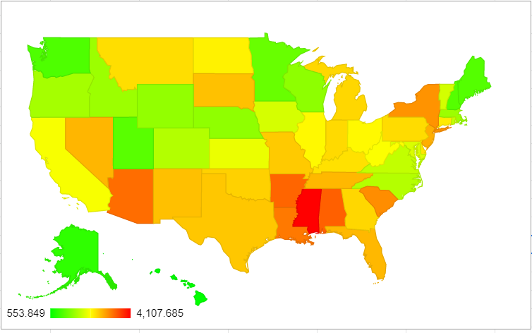
Excess Mortality Over Average Updates
First up, here’s the whole US. It’s worth noting that when I did this graph a month ago, the lowest value was 554 excess deaths/million. Now it’s 739 excess deaths/million. The brightest red a month ago was 4107/million, now it’s 4624/million. The greens and the reds mean more than before:
So who were the top movers this month? Let’s see:
State
Excess Deaths Above Average/Million 2/1/20-10/6/21 (change from 9/8)
Change from 9/8 rank
Mississippi
4624 (+516)
No change
Alabama
4000 (+559)
+1
Louisiana
3801 (+534)
+3
Arkansas
3404 (+379)
No change
DC
3749 (+97)
-3
Arizona
3597 (+251)
-1
South Carolina
3453 (+326)
No change
Tennessee
3381 (+326)
+3
Florida
3365 (+538)
+3
New York
3177 (+91)
-2
Note: the NY data here is all of NY, state and city combined. Seems incredible that New York may actually fall out of the top 10 for excess mortality since the pandemic started. To note: there were 4 states that saw substantial gains but are not yet at top 10 level. These were: Georgia (+471, 14th place), Oklahoma (+442, 13th place), Peurto Rico (+407, 37th place) and Kentucky (+390, 17th place).
Excess Mortality Over Upper Bound by State
Okay, here are the states that most exceeded 2 standard deviations from the mean mortality:
And now the top 10:
State
Excess Deaths Over Upper Bound (change from 9/8)
Change from 9/8 rank
Mississippi
3302 (+443)
No change
Alabama
3004 (+502)
+1
Arizona
2659 (+210)
+1
Florida
2647 (+499)
+5
New York
2646 (+56)
-3
Arkansas
2582 (+324)
No change
Louisiana
2574 (+449)
+3
Texas
2549 (+345)
-1
South Carolina
2471 (+280)
-1
New Jersey
2452 (+52)
-5
To note, there are again 4 states who had a top 10 gain in excess mortality, but didn’t make the overall top 10. These are: Tennessee (+483, 11th place), Georgia (+420, 12th place), Oklahoma (+380, 14th place), Kentucky (+327, 21st place).
As always, let me know if there are any questions and I’ll be back in a few weeks! Given seasonality, I’m going to try to keep this up monthly. I’d also ideally like to see if some states start to regress at all. There is a lot of commentary that COVID mostly killed people who were going to die anyway, but so far that is not what we are seeing. If that’s true, at some point some states excess mortality should start to decrease below the norm. So far I’m only seeing slight decreases for Connecticut, Rhode Island and Minnesota, but those are small and could be adjustments.
Well hello again folks! When last we left off about 4 weeks ago, I had updated the state level mortality data provided by the CDC for 2/1/2020 – 8/11/2021. Today I’m updating through 9/8/2021, about 4 extra weeks. All the caveats from my prior post still apply, so go there for any more explanation.
First though, I wanted to clarify some things from my prior post. I find excess mortality data interesting because every state counts COVID deaths differently. There are varying reasons for this, some more valid than others. There are also lots of theories about what the non-COVID excess deaths are. I like looking at state level data because it forces us to think more critically about what those deaths might be and to avoid making sweeping generalizations. In the national press, only the biggest 4 states (California, Texas, Florida and New York) seem to get any air time. Other states may occasionally be cherry picked if something interesting is going on, but otherwise they are mostly ignored.
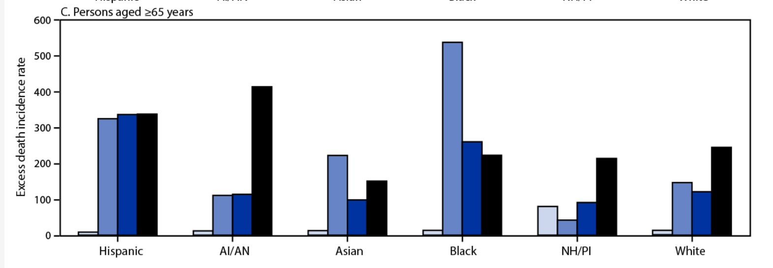
There is some good work going on with excess mortality, both in trying to estimate it and trying to track it. First up, some good analysis of the 2020 death data, including racial breakdown. While the early phase of the pandemic (when it hit NYC hard) was very skewed towards black and Hispanic deaths, it appears things got far more even as we got towards the winter. For example, here’s the excess death incidence rate for those > 65 years old. Bars are quarters of the year 2020:
Next up is an interesting link (explanation here, site here) to someone trying to catalogue excess mortality in real time, with the concerning hypothesis that we may be seeing an uptick in other kinds of deaths too. Now there are two competing hypotheses here: people could have put off getting treated for other medical conditions due to the pandemic, or people could be more susceptible to other medical conditions after having COVID. Actually, those aren’t competing. It could be both. We know that with the flu there is a well established link between getting the flu and subsequently having a heart attack, and there’s no reason COVID-19 couldn’t act similarly. We also know that in many places hospitals are full and it makes sense people may put off care. We will know more as the data comes in I’m sure, but it’s unfortunate. On that happy note, on to the next updates!
Excess Mortality Over Average by State
I made a more multi colored graph this time:
Now here are the updates for the top 10:
State
Excess deaths above average/million 2/1/20 – 9/8/21 (change from 8/11)
Change from 8/11 rank
Mississippi
4108 (+473)
No change
District of Columbia
3652 (+111)
No change
Alabama
3441 (+320)
+1 spots
Arkansas
3404 (+392)
+2 spots
Arizona
3346 (+208)
-2 spots
Louisiana
3267 (+166)
-1 spots
South Carolina
3127 (+238)
+1 spot
New York
3086 (+76)
-1 spot
New Jersey
2894 (+33)
No change
Nevada
2842 (+281)
+3 spots
Mississippi’s struggling here guys.
Excess Mortality Over Upper Bound by State
Okay, here’s the updated numbers for deaths only falling outside the upper bound:
And here are the top 10:
State
Excess deaths over upper bound 2/1/20-9/8/21 (change from 8/11)
Change from 8/11 rank
Mississippi
2859 (+379)
+1 spot
New York
2590 (+39)
-1 spot
Alabama
2502 (+229)
+2 spots
Arizona
2449 (+155)
no change
New Jersey
2400 (+5)
-2 spots
Arkansas
2258 (+333)
+4 spots
Texas
2204 (+181)
-1 spot
South Carolina
2191 (+190)
no change
Florida
2148 (+454)
+8 spots
Louisiana
2125 (+107)
-3 spots
There was more motion on this ranking than I expected to see, which is sad because it means there are multiple places where we are seeing truly unusual death tolls.
States of Interest
Since everyone’s always interested in the Big 4, here they are. Change from 8/11 in parentheses:
Excess Deaths Over Upper Bound/Million
Excess Deaths Over Average/Million
Rank in Excess Deaths Over Average
Rank in Excess Deaths Over Upper Bound
New York
2590 (+39)
3860 (+76)
8
2
Florida
2148 (+454)
2827 (+488)
12
9
Texas
2204 (+181)
2723 (+216)
15
7
California
1761 (+50)
2285 (+92)
30
20
And because I’m always interested in my state and those of similar size, here they are:
Excess Deaths Over Upper Bound/Million
Excess Deaths Over Average/Million
Rank in Excess Deaths Over Average
Rank in Excess Deaths Over Upper Bound
Arizona
2449 (+155)
3346 (+208)
5
4
Massachusetts
1240 (-9)
1642 (+25)
40
34
Tennessee
1904 (+117)
2660 (+193)
13
11
Age Adjustments?
So on my last post Kyle Watson made an interesting point that there should be some sort of age adjustment if we were going to compare things on the state level. While some of this is sort of inherent to the entire concept of excess mortality (states with older populations likely have more expected deaths in a given year), we would expect a disease like COVID to hit states with older populations harder even if everything else was equal.
Interestingly there was some work done on this by a group using the raw COVID numbers, which also looked at international data. They found that states like Texas actually had a worse pandemic than previously reported due to their young population:
I had to ponder a bit what the fairest way of doing this was though. It turns out the CDC also publishes the numbers by week by age group, so I took a look at the US as a whole from 2015-2021:
So every age group from 45 years on showed a fairly noticeable bump last year. Actually every age group showed an increase in mortality when compared to the previous years, and it wasn’t entirely the groups I expected. It’s hard to see on the graph, but here’s the increase for each age group over the average from 2015-2019:
Age Group
% Increase Over 2015-2019 Average
Under 25 years
5%
25-44 years
33%
45-64 years
20%
65-74 years
30%
75-84 years
27%
85 years and older
19%
I was surprised so many of these increases were so close together, it was just the starting numbers that were different. Please note the bin sizes are different however. There are twice as many ages contained in the 45-64 year old group as the 65-74 group, which is how you get a similar number of deaths in the younger age category.
It’s also interesting to note that while the data for this year is obviously still highly incomplete and anything could happen, there’s a chance the 85+ group may not show a large jump for 2021. Almost certainly not as large as last year.
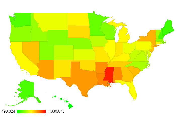
Back to age adjustments though: I couldn’t find a great source to give me state by state age breakdowns matching the ones above, but I did find a breakdown of how many people in each state are over 65. I assumed that excess mortality followed roughly the same pattern as the overall mortality numbers, and adjusted from there. Here are the new leaders for excess deaths above average:
State
Age-Adjusted (albeit crudely) Excess Mortality above Average 2/1/20-9/8/21
DC
4330
Mississippi
4100
Louisiana
3328
Alabama
3303
Arkansas
3253
Texas
3183
Arizona
3136
New York
3009
South Carolina
2915
New Jersey
2864
The map overall shows there’s a pretty substantial dropoff between Mississippi, DC and everywhere else:
Now here’s the big 4:
State
Adjusted Rank for Excess Mortality Over Average (previous rank)
Adjusted Rank for Excess Mortality Over Upper Bound (previous rank)
New York
8 (8)
3 (2)
Florida
24 (12)
15 (9)
Texas
6 (15)
2 (7)
California
22 (30)
13 (20)
Interestingly, the states most helped/hurt by this adjustment aren’t necessarily the ones you’d think of. For deaths above the upper bound, 4 states added on more than 150 deaths/million and 4 states lost more than that after the adjustment. The ones that gained deaths were: Texas, DC, Georgia and Utah. The ones that lost the most post-adjustment were Arizona, Florida, Pennsylvania and West Virginia. As mentioned, only Texas and Florida receive much air time nationally, and since this worked out differently for both of them I wouldn’t expect to see much on this any time soon.
As always, let me know if there’s more you want to see! I have a lot left on spreadsheets for individual states. Stay safe out there.
Well hello there! It’s been a while. Unfortunately I’ve been dealing with some (non-COVID related) health issues that have made reading and writing rather difficult, so blogging has been taking a back seat to things like um, paid employment. You know how it goes. I’ve missed you guys though, and thank you to those who reached out with nice messages asking how I was doing. That was appreciated.
Anyway, for the first time in a long time I recently fell down a rabbit hole of data and started putting together an exceptionally lengthy email with graphs for a small email group, when I realized I may as well just turn this in to a blog post in case any one was still poking around here and might be interested. So here we are.
Some Background About Data That’s Currently Interesting Me
So despite the aforementioned reading/writing troubles, I have of course been interested in the data coming out of the COVID-19 pandemic. I could go on and on about many things, but one of my top fixations is the difference between the state level reported COVID deaths (compiled by the CDC here) and the overall excess mortality across the US compiled by the CDC here.
Essentially the first set of numbers is exactly what it sounds like: the number of people in a state that the state says have died of COVID-19. The second number is a little more interesting. Basically the CDC has years and years worth of data about how many people die each week in 1) the USA as a whole (51k-60k depending on the time of year) and 2) individual states. Thus they can predict each year how many people are going to die in a given week and then say if we are right on track with that number or if we are wildly above that number (95% confidence interval) for both the country as a whole and each state individually.
They published this data prior to COVID as well….if you’ve ever heard someone say we had a “really bad flu year” this data is probably why. If an outbreak of the flu (or anything) pushes the country above the 95% CI for expected deaths, the CDC will generally raise an alert. For example, the flu season in the winter of 2017/2018 pushed us above the 95% CI from December 23rd 2017 – February 3rd 2018. Currently the country has had excess deaths from all cause mortality since March 28th, 2020. We have yet to drop back below the 95% CI for more than a week. The graph for the whole US looks like this (recent weeks trail off as jurisdictions are still reporting):
Since 2/1/20 this comes out to 595,688 deaths above the 95% CI (yellow line) or 758,749 deaths above average.
Now while seeing the entire country interests me, what really interested me about this data is that sometimes the excess mortality data from all causes and the COVID-19 reported death data for a particular state don’t match. That’s something I wanted to look in to.
COVID-19 Deaths vs All Cause Excess Mortality
I first got interested in this topic because the first time I looked at excess mortality data, I noticed that my state (Massachusetts) had a MUCH higher number listed for COVID-19 deaths than it does for excess mortality. Checking the CDC website today, they have us listed at 18,131 deaths, or 236 COVID deaths/100k residents. However, our excess mortality since 2/1/20 is only listed as between 8,780 and 11,369. I started running the numbers because the overall COVID number puts us at 3rd worst in the nation. The lower number would rank us somewhere between #31 and #40.
I Googled a bit and as close as I could find, we’ve changed our counting method twice to better align with federal standards, but don’t appear to have subtracted the “overcounts” back off our total. This article suggests we were overcounting nursing home deaths (take that Cuomo!) until April of 2021 and this article suggests that we also included more “probable” deaths than other states until October 2020.
So given that every state counts COVID deaths differently but (presumably) counts all deaths, how common is it that a states COVID deaths exceed their excess mortality? Which states have the highest “overcounts” and “undercounts” and what does it look like if you just compare excess mortality and remove COVID classifications entirely? Well I’m glad you asked! That’s what I wanted to know too!
The Overcounts
Pulling from the CDC website here through 8/11 and taking their upper and lower guesses for excess mortality and converting to deaths/million, I found 5 states that have reported more COVID deaths (as of today 8/14) than they have excess mortality:
Massachusetts (+1,015/million – #3 ranked)
Rhode Island (+690/million – #5 ranked)
Minnesota (+145/million – #37 ranked)
New Jersey (+143/million – #1 ranked)
Connecticut (+41/million -#9 ranked)
Now it is important to note that not all the death data is in. It is possible that these states are simply really good at reporting COVID deaths and less good at reporting other deaths, or that something else is going on. COVID could be killing people in these states who would have died anyway, and thus it could be failing to add to the excess mortality in the way it is in other states, or some mitigation effort the states took could be reducing other types of mortality in a way that is balancing COVID out. The CDC won’t close out this data for quite some time, but it will be interesting to see what happens when all the accounts are settled.
What is notable here though is that 4 of these 5 states are in the top 10 for worst death counts. If these are truly over-reported, that means the pandemics were not as bad there as commonly believed. Additionally, several of those states had fairly strict lockdowns. If excess mortality is caused by lockdowns, it is not showing up in these states data so far.
The Undercounts
Now undercounting is tricky. The CDC notes that some states have extra process in place to ensure accurate coding of COVID deaths, so it’s possible these states are just behind. It’s also possible that excess mortality in these states is from something other than COVID, so they just wouldn’t have as much COVID death as they would excess mortality. Here’s the list, there were also 5 states here. Well, 4 states and DC:
Washington DC (-294/million – #34 ranked)
Texas (-147/million – #26 ranked)
California (-76/million – #32 ranked)
South Carolina (-51/million – #21 ranked)
Vermont (-33/million -#50 ranked)
To my point about other causes of death, Washington DC in particular would be potentially impacted by a jump in homicides (up 19% last year) and opioid deaths (hit a record in 2020). For the other states, we’ll continue to see what happens as the data trickles in.
Overall, it’s interesting that 40 states COVID deaths counts fell somewhere in between their states upper and lower bound estimate for excess mortality. So how did every state do when compared for excess mortality so far? Let’s check it out?
About the Data
A few things to keep in mind before I show state level graphs:
The data is excess mortality from ALL CAUSES since 2/1/20.
There’s one graph for amount above lower bound (excess above average) and amount above upper bound (excess above 95% CI). I’ll discuss the differences a bit below.
Some of this is estimated. Since every state reports at a different pace, they estimate where states will be at to bring everyone up to the same level. I’ve been watching this for a few months and they rarely have to take many people away, so the estimates look pretty good.
The data is from here. I download the “National and State Estimates of Excess Deaths” csv file and then use the “Total Excess Lower Estimate” and “Total Excess Higher Estimate” (Column J and K on my spreadsheet) for each state.
To convert to per capita, I used the 2020 census numbers for each state. I included Puerto Rico and DC, so all rankings are out of 52.
There’s been a lot of talk about how the pandemic impacted other types of deaths, so it’s notable to see where the highest excess mortality has been.
Excess Mortality Over Average by State
Without further ado, here’s the excess mortality over the average, by state. Sorry about the small font, click on it to embiggen:
So for deaths above average from ALL CAUSES, per capita the top ten states are:
State
Excess Deaths Over Average/Million (2/1/20-8/11/21)
Mississippi
3635
District of Columbia
3541
Arizona
3138
Alabama
3121
Louisiana
3101
Arkansas
3012
New York
3010
South Carolina
2889
New Jersey
2861
South Dakota
2708
Now this is just deaths over average. Some states have more yearly variation than others, and thus look a little different if you only take the deaths above the 95%CI interval. That’s next.
Excess Mortality Over Upper Bound by State
Again, click to make that bigger.
As you can see, going over the upper bound mostly evens out the smaller states. This makes sense. For example, Massachusetts and Montana had surprisingly similar excess mortality across the timespan represented. However, Montana is 1/7th the size of Massachusetts. They typically hover around 200 deaths per week statewide, and Massachusetts generally has 1,100-1,200. With 200 deaths, slight differences in reporting (like someone in one hospital forgetting to send the numbers for a week) could skew things quite a bit. That’s less likely over larger populations. So here are the new top 10:
State
Excess Deaths Over Upper Bound/Million (2/1/20-8/11/21)
Prior Rank
New York
2551
7
Mississippi
2480
1
New Jersey
2395
9
Arizona
2294
3
Alabama
2273
4
Texas
2023
16
Louisiana
2018
5
South Carolina
2001
8
Pennsylvania
1943
17
Arkansas
1925
6
As expected, the two places with the smallest populations (DC and South Dakota) dropped off this list and were replaced with two much larger places: Texas and and Pennsylvania.
Other States of Interest and Possible Posts Going Forward?
Now throughout the pandemic, it seems everyone gets fixated on some subgroup of “the big four”: California, Florida, New York and Texas. If you want to know how they’re doing, here they are pulled out:
State
Excess Deaths Over Upper Bound/Million
Excess Deaths Over Average/Million
Rank in Excess Deaths Over Average
Rank in Excess Deaths Over Upper Bound
New York
2551
3010
7
1
Texas
2023
2507
16
6
California
1711
2193
30
17
Florida
1694
2339
23
18
Here are the states I track, as they are all approximately the same size as Massachusetts (around 7 million people):
State
Excess Deaths Over Upper Bound/Million
Excess Deaths Over Average/Million
Rank in Excess Deaths Over Average
Rank in Excess Deaths Over Upper Bound
Arizona
2294
3138
3
4
Tennessee
1787
2636
11
14
Massachusetts
1249
1617
39
31
If people are interested in particular other states, I’d be happy to post them in the comments as time/health allow. Additionally, the CDC updates this data weekly. Now that I have the explanation typed out and my spreadsheet set up I can fairly easily post updates every few weeks (sans lengthy intro) if there’s interest. Let me know what you all think! Hope everyone is staying well.
I don’t often make New Year’s resolutions, but this year I’ve decided to join Gretchen Rubin (of happiness project fame) in resolving to go on a 20 minutes walk every day in 2020. Her theory is that if you aren’t getting much exercise, resolving to get a little bit daily will provide big benefits. She has research on her side on this one, and it doesn’t hurt that walking seems to be the only form of exercise that makes my migraines better rather than worse. We’ll see how this goes.
I tried to find some from other countries, and it seems like Germans may put stress reduction and family time at the top of their list. My googling for other European and north and south American countries didn’t turn up much.
I did however, find this blog post from Duolingo, that had some really interesting insights about one particular New Year’s resolution. Duolingo is an app that helps you learn a second language, and they have a distinctive peak in sign ups and account usage just before the first of the year. They discovered that the countries their users normally came from changed a bit around the first of the year:
Apparently users who sign up around the first of the year actually are slightly more likely to continue using the app than those who sign up at other times.
Overall, I’ll admit I was a little surprised that I couldn’t find more research on the subject of New Year’s resolutions. It seems like this would be an interesting study in how priorities change across countries or time. If anyone knows of any good resources that I didn’t find, please let me know! In the meantime, happy new year everyone!
Back when this blog was in its first incarnation, I used to occasionally do some challenge questions. I stumbled across one this week that seemed like a good candidate, and since my computer is still broken I figured I’d throw it out there.
As part of their religious landscape survey, Pew Research has put together a racial diversity ranking of religions and major denominations in the US. Six groups were found to be more diverse than the U.S. general population. What are they?
A few clarifications and one hint to help:
1. The diversity ranking measures the spread across 5 racial groups: White, Black, Asian, Latino and Mixed/Other. A perfect score would be 20% in each category. In other words, a group dominated by one group would not be considered diverse even if that group was a minority group in the US.
2. Pew breaks Christianity down in to major denominations and includes several types of unaffiliated (aka not religious) groups in their survey. If you want to see the groups included, see this page.
3. The survey also only looked at people in the US, so diversity is only based solely on that. Groups may have more diversity in other countries, but only their US members were counted.
4. If you need a hint: 3 of the top 6 groups are Christian or Christian-adjacent* and 3 were other religions or unaffiliated groups.
*For purposes of this question, Christian adjacent means that the members of the group might consider themselves Christians, but a majority of Christians in other denominations do not.
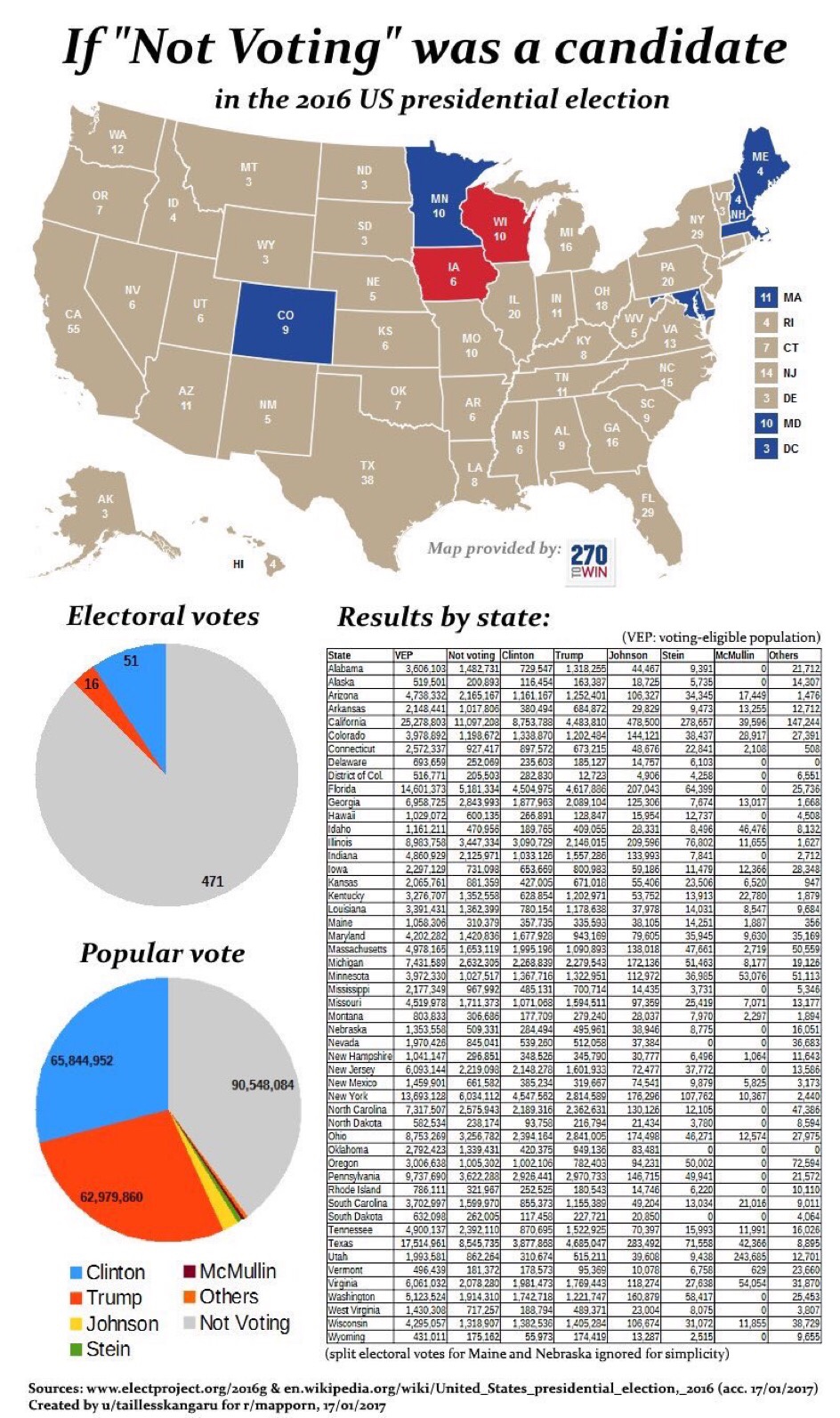
My computer is still having problems, so another short post today. I saw this graphic on Twitter this week, and thought it was interesting:
Our voting certainly leaves a wide margin of error with regards to public opinion.
What’s interesting of course is that we have no idea how those people would vote if they were forced to, though many people seem to think they know. From experiences in other countries it seems like it might increase support for left leaning policies and higher tax brackets. However in other countries it boosted fringe third parties, and doing away with it increased support for major parties. Other countries have not seen a difference.
Point being, a non-random sample doesn’t always tell you much about what’s not in the sample. Keep that in mind with any initiatives aimed at changing voting requirements.
So I dropped my laptop 2 weeks ago and the internet connection has been off and on, dying completely yesterday. Until I either fix it or get a new one, posts will be limited to what I can type on my phone without getting aggravated.
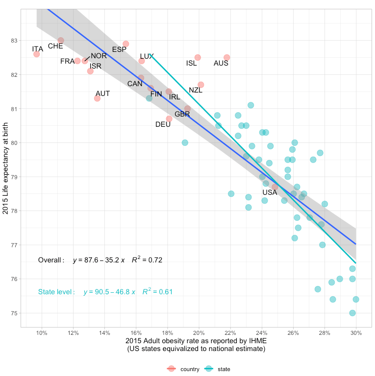
To further the point, he breaks down the states individually and shows that this holds within our countries as well:
In other words, low obesity Colorado has a life expectancy in with the other developed countries, while higher obesity states are much lower. He also redid the analysis by splitting other countries up in to regions, and found this pattern holds for other countries as well. The post then goes on to build the causal chain, and it’s pretty fascinating. It even throws in maternal mortality, and shows that if we adjust for BMI, we’re right on par there as well.
I obviously suggest reading the whole post, but it’s a good reminder that this factor has been under discussed in the conversation about healthcare. We often say “other countries have figured out how to deliver healthcare more effectively than we have”, but no country has figured out how to do that with a population as obese as ours. In other words, it seems that unless we really start finding some good ways of preventing obesity or facilitating weight loss, it may be hard to ever reduce our costs. Sobering thought.
The Assistant Village Idiot has re-posted one of my favorite anecdotes of his. For those not familiar with him, he has 40+ years experience in a state mental hospital. It’s short, so I’ll repost it in its entirety here (source):
A paranoid patient of ours had taken the book 1984 out of the patient library. His particular paranoia is very much concerned with thought reading and thought broadcasting. He is not a person one might expect to have good general knowledge of literature and political culture, and he did not have much preconceived notion what it might be about. He had heard somewhere it was an important book. We were a little concerned what he might take away from the book, but we don’t get much involved in people’s selections.
He found it sad. This guy had a girlfriend, but he lost her.
He didn’t really notice the paranoia-inducing parts of the book. Those were just normal background to him
I think about that a lot, most often when I see a poll question asking people how they feel about current events or to compare previous years to this one. Getting people’s impressions without knowing their baseline can be highly misleading.