More Explanation and Some Links
Well hello again folks! When last we left off about 4 weeks ago, I had updated the state level mortality data provided by the CDC for 2/1/2020 – 8/11/2021. Today I’m updating through 9/8/2021, about 4 extra weeks. All the caveats from my prior post still apply, so go there for any more explanation.
First though, I wanted to clarify some things from my prior post. I find excess mortality data interesting because every state counts COVID deaths differently. There are varying reasons for this, some more valid than others. There are also lots of theories about what the non-COVID excess deaths are. I like looking at state level data because it forces us to think more critically about what those deaths might be and to avoid making sweeping generalizations. In the national press, only the biggest 4 states (California, Texas, Florida and New York) seem to get any air time. Other states may occasionally be cherry picked if something interesting is going on, but otherwise they are mostly ignored.
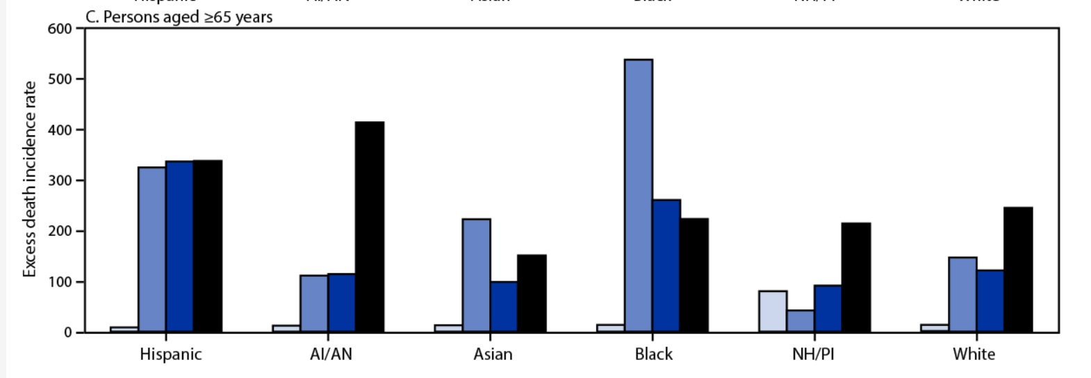
There is some good work going on with excess mortality, both in trying to estimate it and trying to track it. First up, some good analysis of the 2020 death data, including racial breakdown. While the early phase of the pandemic (when it hit NYC hard) was very skewed towards black and Hispanic deaths, it appears things got far more even as we got towards the winter. For example, here’s the excess death incidence rate for those > 65 years old. Bars are quarters of the year 2020:

Next up is an interesting link (explanation here, site here) to someone trying to catalogue excess mortality in real time, with the concerning hypothesis that we may be seeing an uptick in other kinds of deaths too. Now there are two competing hypotheses here: people could have put off getting treated for other medical conditions due to the pandemic, or people could be more susceptible to other medical conditions after having COVID. Actually, those aren’t competing. It could be both. We know that with the flu there is a well established link between getting the flu and subsequently having a heart attack, and there’s no reason COVID-19 couldn’t act similarly. We also know that in many places hospitals are full and it makes sense people may put off care. We will know more as the data comes in I’m sure, but it’s unfortunate. On that happy note, on to the next updates!
Excess Mortality Over Average by State
I made a more multi colored graph this time:
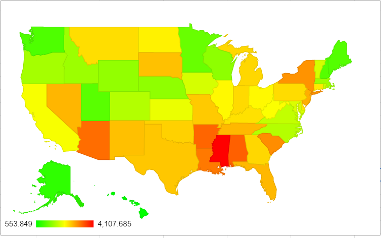
| State | Excess deaths above average/million 2/1/20 – 9/8/21 (change from 8/11) | Change from 8/11 rank |
| Mississippi | 4108 (+473) | No change |
| District of Columbia | 3652 (+111) | No change |
| Alabama | 3441 (+320) | +1 spots |
| Arkansas | 3404 (+392) | +2 spots |
| Arizona | 3346 (+208) | -2 spots |
| Louisiana | 3267 (+166) | -1 spots |
| South Carolina | 3127 (+238) | +1 spot |
| New York | 3086 (+76) | -1 spot |
| New Jersey | 2894 (+33) | No change |
| Nevada | 2842 (+281) | +3 spots |
Mississippi’s struggling here guys.
Excess Mortality Over Upper Bound by State
Okay, here’s the updated numbers for deaths only falling outside the upper bound:

| State | Excess deaths over upper bound 2/1/20-9/8/21 (change from 8/11) | Change from 8/11 rank |
| Mississippi | 2859 (+379) | +1 spot |
| New York | 2590 (+39) | -1 spot |
| Alabama | 2502 (+229) | +2 spots |
| Arizona | 2449 (+155) | no change |
| New Jersey | 2400 (+5) | -2 spots |
| Arkansas | 2258 (+333) | +4 spots |
| Texas | 2204 (+181) | -1 spot |
| South Carolina | 2191 (+190) | no change |
| Florida | 2148 (+454) | +8 spots |
| Louisiana | 2125 (+107) | -3 spots |
There was more motion on this ranking than I expected to see, which is sad because it means there are multiple places where we are seeing truly unusual death tolls.
States of Interest
Since everyone’s always interested in the Big 4, here they are. Change from 8/11 in parentheses:
| Excess Deaths Over Upper Bound/Million | Excess Deaths Over Average/Million | Rank in Excess Deaths Over Average | Rank in Excess Deaths Over Upper Bound | |
| New York | 2590 (+39) | 3860 (+76) | 8 | 2 |
| Florida | 2148 (+454) | 2827 (+488) | 12 | 9 |
| Texas | 2204 (+181) | 2723 (+216) | 15 | 7 |
| California | 1761 (+50) | 2285 (+92) | 30 | 20 |
And because I’m always interested in my state and those of similar size, here they are:
| Excess Deaths Over Upper Bound/Million | Excess Deaths Over Average/Million | Rank in Excess Deaths Over Average | Rank in Excess Deaths Over Upper Bound | |
| Arizona | 2449 (+155) | 3346 (+208) | 5 | 4 |
| Massachusetts | 1240 (-9) | 1642 (+25) | 40 | 34 |
| Tennessee | 1904 (+117) | 2660 (+193) | 13 | 11 |
Age Adjustments?
So on my last post Kyle Watson made an interesting point that there should be some sort of age adjustment if we were going to compare things on the state level. While some of this is sort of inherent to the entire concept of excess mortality (states with older populations likely have more expected deaths in a given year), we would expect a disease like COVID to hit states with older populations harder even if everything else was equal.
Interestingly there was some work done on this by a group using the raw COVID numbers, which also looked at international data. They found that states like Texas actually had a worse pandemic than previously reported due to their young population:

I had to ponder a bit what the fairest way of doing this was though. It turns out the CDC also publishes the numbers by week by age group, so I took a look at the US as a whole from 2015-2021:

So every age group from 45 years on showed a fairly noticeable bump last year. Actually every age group showed an increase in mortality when compared to the previous years, and it wasn’t entirely the groups I expected. It’s hard to see on the graph, but here’s the increase for each age group over the average from 2015-2019:
| Age Group | % Increase Over 2015-2019 Average |
|---|---|
| Under 25 years | 5% |
| 25-44 years | 33% |
| 45-64 years | 20% |
| 65-74 years | 30% |
| 75-84 years | 27% |
| 85 years and older | 19% |
I was surprised so many of these increases were so close together, it was just the starting numbers that were different. Please note the bin sizes are different however. There are twice as many ages contained in the 45-64 year old group as the 65-74 group, which is how you get a similar number of deaths in the younger age category.
It’s also interesting to note that while the data for this year is obviously still highly incomplete and anything could happen, there’s a chance the 85+ group may not show a large jump for 2021. Almost certainly not as large as last year.
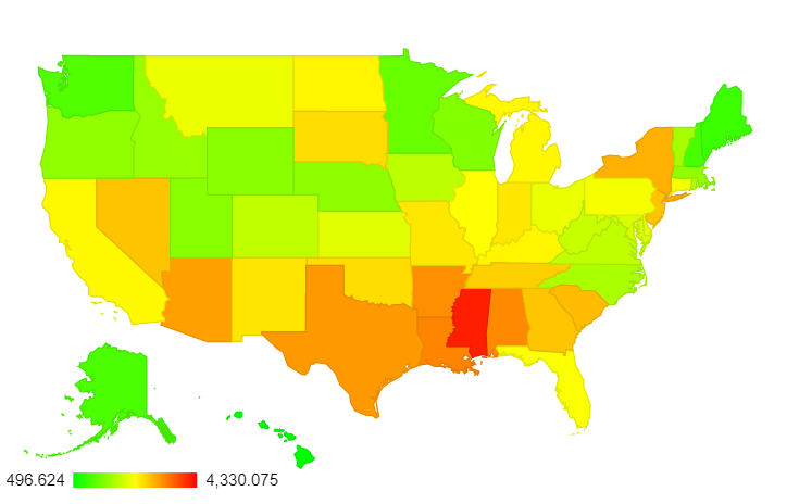
Back to age adjustments though: I couldn’t find a great source to give me state by state age breakdowns matching the ones above, but I did find a breakdown of how many people in each state are over 65. I assumed that excess mortality followed roughly the same pattern as the overall mortality numbers, and adjusted from there. Here are the new leaders for excess deaths above average:
| State | Age-Adjusted (albeit crudely) Excess Mortality above Average 2/1/20-9/8/21 |
|---|---|
| DC | 4330 |
| Mississippi | 4100 |
| Louisiana | 3328 |
| Alabama | 3303 |
| Arkansas | 3253 |
| Texas | 3183 |
| Arizona | 3136 |
| New York | 3009 |
| South Carolina | 2915 |
| New Jersey | 2864 |
The map overall shows there’s a pretty substantial dropoff between Mississippi, DC and everywhere else:
Now here’s the big 4:
| State | Adjusted Rank for Excess Mortality Over Average (previous rank) | Adjusted Rank for Excess Mortality Over Upper Bound (previous rank) |
|---|---|---|
| New York | 8 (8) | 3 (2) |
| Florida | 24 (12) | 15 (9) |
| Texas | 6 (15) | 2 (7) |
| California | 22 (30) | 13 (20) |
Interestingly, the states most helped/hurt by this adjustment aren’t necessarily the ones you’d think of. For deaths above the upper bound, 4 states added on more than 150 deaths/million and 4 states lost more than that after the adjustment. The ones that gained deaths were: Texas, DC, Georgia and Utah. The ones that lost the most post-adjustment were Arizona, Florida, Pennsylvania and West Virginia. As mentioned, only Texas and Florida receive much air time nationally, and since this worked out differently for both of them I wouldn’t expect to see much on this any time soon.
As always, let me know if there’s more you want to see! I have a lot left on spreadsheets for individual states. Stay safe out there.

Thank you again
LikeLike
To follow up on my previous post regarding BMI and more generally co-morbidities. This graph (https://www.cdc.gov/obesity/data/maps/brfss_2019_ob_white.svg) doesn’t address all co-morbidities but it does address obesity which is itself a co-morbidity but also highly correlated with other co-morbidities so a decent proxy. Full site: https://www.cdc.gov/obesity/data/prevalence-maps.html
Note a pretty strong correlation between your graphs and the obesity prevalence graph from the CDC.
LikeLike
I’d be curious to just see a simple scatter plot of states’ obesity prevalence on one axis and Covid excess mortality on the other. I’d bet there’s an R2 above ~0.5. Or a dual factor correlation with obesity and fraction of population over 65 years old I bet would explain ~80% of the excess mortality.
LikeLike
Hmm it seems while logging in my first post was lost. Well to try again… Thanks for the post and I’m glad someone is bothering to post this information. What I find frustrating about most of the analysis these days is whenever different states are brought up it’s usually done in order to attempt to assess the efficacy of different non-pharmaceutical interventions. But the most rudimentary of analysis would have to correct for underlying differences of the states first before trying to imply a cause effect relationship between interventions and mortality. Two of the the huge factors would obviously have to be age and co-morbidities.
A question on the graph you posted and the age adjusted mortality from the CDC. The graph doesn’t really make sense to me. One would expect the age-adjusted mortality to roughly straddle the raw mortality when looking across the states. For example Florida’s age adjusted mortality (since it’s an above average aged state) would be lower than it’s raw mortality number and then a younger state like California should have a higher age adjusted mortality than it’s raw number. The fact that all the age adjusted mortality numbers are lower than their respective raw numbers is very odd to me. Do you know how they are actually calculating it. The standard way is discussed here: https://www-doh.state.nj.us/doh-shad/view/sharedstatic/AgeAdjustedDeathRate.pdf.
LikeLike
Oh man, a lot of good questions here. Apologies in advance if I miss anything.
First, the age adjustment graph. So I should clarify, that didn’t come from the CDC, it’s actually a group out of Santiago, Chile. They didn’t age adjust to standard US data (what I did with my calculations), they age adjusted to World Health Organization international age standardization data so they could compare across countries. They through in individual states just to show how it would work in the US, but that really should be read as “if this state were it’s own country”. Every state looks “better” because all US states have older populations than the world average, if that makes sense.
Second, BMI is an interesting factor, and one that could probably use its own post. At least in the US it’s highly correlated with age so it’s not quite fair to treat them both as independent variables. I did a quick scatter of it solo and it appears the R2 between obese BMI and excess mortality is about .1 (for some reason it won’t let me post it in the comments). The problem is there are a few states with very low obesity rates and very high or higher than average excess mortality (DC, NY, Montana) and some with high obesity that have lower than average excess mortality (WV, Alaska, Iowa). I may update the post with the graph later with that and the age scatterplot.
This is not to say these things aren’t important, as you note. I do think taking individual state characteristics in to account before we talk about the success/failure of various interventions is really important. For example, the initial OPENsafely data from the UK noted that black and Hispanic populations seem to have worse outcomes even after controlling for other factors:
https://www.nature.com/articles/s41586-020-2521-4/tables/4
My personal bias is that there is likely a genetic component to who gets severe COVID, in which case some states may simply have more people of particular ancestries. I may be proven wrong, but I like to keep it in mind as a possible confounder. To note: it’s not as simple as white/non-white, as the R2 there is .07. But I’m not ruling out there’s a possible predisposition towards bad COVID that may be out of anyone’s control.
LikeLike
Yeah, great stuff. Just to throw in a few things I know, Alaska has a large percentage of Natives who are obese and also many with severe alcohol issues, but they have a low covid rate, likely due to isolation and underreporting. Native Hawaiians show something similar. What is happening? Dunno. A great example of why state-level data is important. Significant local factors can mask other trends.
Any obesity or other metabolic syndrome understanding is going to veer instantly into blaming and ethnic data. I can separate that out in the discussion personally, but Kyle and Bethany might both hesitate to put forth contentious things they can be later kicked for, however undeservedly. I’m retired and can say “Screw it.” I will understand if you have to be exquisitely careful. It’s probably good practice for you anyway. As the hostess has been sharing interesting info with me in another forum on the brain chemical influences on obesity, which kick into another gear around 1980 , it starts to get complicated. Such as, If your brain is telling you “You’re not fat and you’re still hungry” because something has screwed with your leptin levels, (Example: WV’s high obesity rate may owe something to exposures resulting from strip mining, and thus unintentional blaming for increased covid vulnerability in that population.) Or increased obesity the farther down you go down in the watershed…why, exactly? Messy. Eludes simple answers, at a time when even a few simple answers that explained 10% of what is happening would be most valuable.
I have also noted that American states and Canadian provinces that border each other are similar in many covid rates (though the Canadian rates are lower) – except for an intriguing few. I am not saying this to offer a new theory, but only to caution both of you not to leap to an hypothesis without noting that possible disconfirmation.
Yes, i made things more messy instead of moving the discussion to an answer. I wish it were otherwise, but that’s about all I’m good at.
LikeLike