Alright folks! It’s been a good summer but it went by too quickly and I’m realizing it has yet again been too long since I’ve posted an update. And this is still a pretty good update! When I posted for 6/1, we were at 1.125 million excess deaths. Now 3 months later we are at 1.18 million excess deaths. That’s is not bad at all!
We also confirmed that from around Feb-April country-wide we actually had no excess mortality at all, the first time we’ve been there for that long since the pandemic hit. Pretty good! So how does this look on a state level? Let’s see!
Excess Mortality Above Average
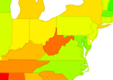
First up, the map. When I posted on 6/19, the range at the bottom was 1047-5823 deaths/million residents. Now it’s 1188-6139 deaths/million.
A quick eyeball suggests we are not seeing substantial changes in relative position. Will this play out when we look at the numbers? Let’s see!
State
Total Excess Mortality per million 2/1/20-9/1/22
Change from 6/1/22
Change in Rank
Mississippi
6139
316
0
West Virginia
5856
234
0
Arizona
5353
200
0
New Mexico
5115
267
0
Alabama
4979
138
0
South Carolina
4708
421
+4
Arkansas
4704
237
+1
Louisiana
4651
145
-2
Tennessee
4622
142
-2
Wyoming
4610
257
-1
Not a lot of change in rank going on! I took a look and out of the 52 regions listed (50 states + Puerto Rico and DC), 40 were within +/- 2 spots of where they were 3 months ago. So basically we are no longer seeing the strong swings we saw before, it seems like things have settled in to somewhat of a pattern
This raises an interesting point Henry Willmore raised to me a few weeks ago: how well correlated are vaccination rates and things like obesity by state? And if we can get both of those teased out, how much excess mortality seems to be explained by both? I had looked at obesity vs excess mortality about a year ago, but it seems like a good time to look at it again, huh? Let’s go!
Excess Mortality, Obesity and Vaccination
So first up, when I looked at state level obesity rates vs excess mortality a year ago, the correlation was pretty weak. Some high obesity states (like Alaska) still had low excess mortality then, so it wasn’t clear how much this was impacting things. Now the correlation is much higher. Here are the graphs of obesity rate and vaccination rate next to each other. To save you the math, correlation for obesity vs excess mortality is r=.57 and for vaccination rate vs excess mortality it’s r=-.63. Vaccination rates by state pulled from here, obesity rates pulled from here.
So how well correlated are obesity and vaccination rates with each other? Even more strongly correlated than either are with excess mortality, r = -.71:
So can we predict approximate excess mortality using obesity rates and vaccination rates? Well, setting up a model here is a little tricky because our two independent variables are correlated (multicollinearity), but we should end up with a model that looks something like this:
So a percent drop in obesity is better than a percent increase in vaccination (58 vs 50), though of course vaccination rates have changed quite a bit since 2/1/20.
Testing the model out for MA, we get:
=5045+5876(.24)+5016(.81)
=5045+1410-4062
=2393
Which is not too far from our actual total of 2063!
Now this model is only moderately well fit. Some states outperformed this by quite a bit: New Hampshire, Hawaii, Nebraska, Iowa, Utah, and Minnesota all had far fewer deaths than this model would predict. On the other end, New Mexico, Arizona, West Virginia, Mississippi, Vermont and New York all had quite a bit more excess mortality than this model would predict. I don’t have a lot of theories for what these particular states have going on, but it is interesting to note that in general those two factors do a moderately job at predicting all cause excess mortality.
Alright, that’s all I have for now! Stay safe our there.
Well hello again! Apparently I’m just falling behind all over the place with this. An update a month was a nice aspiration, but not one I’m managing. Moving on! Last time I posted we were just under 1.1 million excess deaths since 2/1/20, and as of 6/1, we are at 1.125 million. That actually seems….pretty good comparatively? I only have the numbers from 6/1 because the CDC is doing some sort of work on their database and won’t have updated numbers until next week. We’ll see when I get around to looking at those.
Alright, on with what we have!
Excess Mortality Above Average
First up, the map. When I posted on 3/23, the range at the bottom was 1020-5729 deaths/million residents. Now it’s 1047-5823 deaths/million. For a 10 week gap that is….not a bad change. Certainly better than we’ve seen since I’ve been doing this. So where are the bad states?
Interesting. West Virginia is….not doing well? I don’t remember it popping out like that before. Sure enough, here’s what it looked like in my last map:So where are they at numbers-wise? Well, here’s our top 10:
State
Excess Deaths Above Average 2/1/20-6/1/22
Change from 3/23/22
Change in Rank
Mississippi
5823
+94
No change
West Virginia
5622
+912
+2
Arizona
5153
+205
+1
New Mexico
4848
+206
+1
Alabama
4841
+73
-2
Louisiana
4506
+237
+2
Tennessee
4480
+80
+1
Arkansas
4467
+104
-1
Wyoming
4353
+186
+2
South Carolina
4287
+85
-1
Wow…so that was a jump. They jumped last time as well, so they are moving quite rapidly. What other big movers were there?
State
6/1/22 Excess
3/23/22 Excess
Change
June Rank
March Rank
West Virginia
5622
4710
912
2
4
North Carolina
3369
2556
813
24
42
Puerto Rico
1972
1407
565
48
51
Alaska
3208
2927
281
28
34
Louisiana
4506
4269
237
6
8
New Mexico
4848
4642
206
4
5
Arizona
5153
4948
205
3
2
Oklahoma
4267
4077
190
11
12
Wyoming
4353
4167
186
9
11
Kentucky
4155
3971
184
13
13
Interesting, so West Virginia and North Carolina are our two big jumpers here. I’m not clear why that is, but it’s worth noting that North Carolina had been outperforming it’s neighbors for quite some time, and is still outperforming them now. Peurto Rico was also doing very well and it’s jump has it doing only slightly less well.
It’s also worth noting that 9 states lost excess deaths in the last 10 weeks. We had wondered if we were going to see this effect start to happen, as this is something that could occur if some of the people who died initially were those who were close to death already. These states were: Rhode Island (-205), Ohio (-72), Maryland (-62), New Jersey (-52), Massachusetts (-34), Michigan (-31), Illinois (-20), Idaho (-19) and Pennsylvania (-17).
It will be interesting to see if more states start to slip backward as the summer goes on.
Percent Excess Mortality – 2020 and 2021
Alright, so hopefully most states are done updating their numbers from 2020 and 2021 by this point right? Who’s still at it? Well, really only Alaska (+2%), North Carolina (+7%), North Dakota (+8%) and West Virginia (+4%). All other states have very small changes or no change in the last 10 weeks. Top 10 states for each year are highlighted and bolded below, though 2021 had a 3 way tie for 10th so there are actually 12 states there.
State
2020 deaths – expected
2020 deaths – actual
% change
2021 deaths – expected
2021 deaths – actual
% change
Alabama
54839
62550
14%
55036
67508
23%
Alaska
4462
4971
11%
4552
6037
33%
Arizona
62622
75955
21%
63797
82520
29%
Arkansas
33424
37432
12%
33406
40015
20%
California
284264
315430
11%
275238
336534
22%
Colorado
41621
47161
13%
41289
48912
18%
Connecticut
32416
37730
16%
32910
34479
5%
Delaware
10016
10862
8%
10247
11295
10%
District of Columbia
6959
7378
6%
6495
7130
10%
Florida
213923
240765
13%
219931
264812
20%
Georgia
87875
102464
17%
89319
112573
26%
Hawaii
11893
11990
1%
12343
12839
4%
Idaho
15138
16340
8%
15282
18299
20%
Illinois
108823
127440
17%
108444
120592
11%
Indiana
69474
78293
13%
69171
79198
14%
Iowa
30946
35418
14%
31547
33809
7%
Kansas
26882
30773
14%
27392
30975
13%
Kentucky
50994
55145
8%
50136
60206
20%
Louisiana
47208
56320
19%
48057
57469
20%
Maine
15070
15504
3%
15347
17045
11%
Maryland
53119
59048
11%
53311
57396
8%
Massachusetts
61009
68390
12%
62383
63748
2%
Michigan
98748
114510
16%
100176
115524
15%
Minnesota
46084
51732
12%
47005
51225
9%
Mississippi
32284
38825
20%
32315
40348
25%
Missouri
66643
75514
13%
68207
76413
12%
Montana
10651
11903
12%
10400
12771
23%
Nebraska
17173
19547
14%
17863
19052
7%
Nevada
28547
31006
9%
27546
33974
23%
New Hampshire
13127
13435
2%
13464
13775
2%
New Jersey
76686
94621
23%
78694
83497
6%
New Mexico
19180
22842
19%
19616
24433
25%
New York
101705
118274
16%
103179
115838
12%
New York City
54870
81660
49%
55622
63259
14%
North Carolina
99977
108916
9%
100298
118893
19%
North Dakota
7233
8793
22%
7508
8065
7%
Ohio
130487
142211
9%
130056
147109
13%
Oklahoma
40731
45814
12%
41086
49214
20%
Oregon
37707
39947
6%
37171
44825
21%
Pennsylvania
140989
154622
10%
139294
156273
12%
Puerto Rico
30574
32056
5%
30695
33090
8%
Rhode Island
10399
12054
16%
10877
11598
7%
South Carolina
51380
59676
16%
52784
64260
22%
South Dakota
8456
10052
19%
8447
9362
11%
Tennessee
78370
87418
12%
78956
95155
21%
Texas
212670
250917
18%
214835
271773
27%
United States
2956302
3353789
13%
2958796
3468553
17%
Utah
20042
22027
10%
20069
23454
17%
Vermont
5853
6116
4%
5791
6617
14%
Virginia
71636
78680
10%
72781
84878
17%
Washington
59364
62558
5%
59889
68415
14%
West Virginia
23033
25323
10%
23605
28679
21%
Wisconsin
54583
61940
13%
55622
60532
9%
Wyoming
4324
5497
27%
4867
5951
22%
So there we go! The good news is things actually do look to be finally slowing down quite substantially in most places. A few states still look to be struggling, though at this point it’s unclear what’s driving that.
As always, add any questions in the comments or shoot me a message!
Well hello and happy new year! I hope everyone has had a delightful holiday season and is doing well. As promised, I am back with a state level excess mortality update. Now, I didn’t get to this for a few weeks due to some aforementioned personal life things, and while I was gone I discovered the CDC had update the way they calculated excess mortality and was releasing slightly different numbers from the ones I was previously looking at. You can read their full explanation here, but here’s the gist:
Excess mortality is calculated by taking the prior 4 years worth of deaths and averaging them together to get a baseline of how many people you’d expect to die in a state in any given week. When the pandemic started, the CDC stopped including new deaths in their baseline, because of course we’re all hoping this current mortality level doesn’t become the baseline. Now that the pandemic has gone on for nearly 2 years however, this meant that they were only using 2 years worth of data to determine the “expected” number of deaths. So they decided to go back 6 years (while still excluding our 2 pandemic years, so basically 4 years of data) to get a better baseline. This changed everyone’s excess counts a bit because the baseline was now a bit different. They note that on average this slightly lowered excess mortality estimates by about 2%. In this post I’m going to take a look at if the new calculations substantially changed anything we were seeing before.
To note: they are now only releasing “deaths above average” so that’s what I’m posting here, rather than both deaths above 2SD and above average like I was before. Additionally, this death count is probably going to go up quite a bit in the next 4 weeks as it includes deaths that were reported during Christmas week, which tend to be artificially low.
Excess Mortality Above Average
Alright, first, here’s the map. When I last posted this 6 weeks ago, the range was about 953-4784 excess deaths/million residents. Now it’s 872-4962. So some states clearly lost and some gained:
The hotspots appears approximately the same, with some states changing a bit.
Here are the top 10, along with their change from the mid-November data:
I looked at Wyoming and West Virginia in particular to see if the change in rank was due to the recalculation or reported deaths, and both states have been running at 50-75% excess mortality since September. With reporting delays, those are likely real increases.
I also looked at the top 10 states that increased their excess mortality count. The ones that showed big increases but didn’t make the top 10 overall were: Alaska (+864, 35th place), Vermont (+362, 25th place), Maine (+331, 45th place), Wisconsin (+314, 41st place), Michigan (+274, 17th place), and Minnesota (+231, 48th place).
I was quite thrilled to see Massachusetts is now 49th in the nation, though the CDC list includes Puerto Rico and DC, so that’s out of 52. New Hampshire is 51st.
Percent Excess Mortality, 2020 vs 2021
A new metric included in the data is the percent excess for each state by week. I thought this was interesting, because some states had a very different 2020 vs 2021. The average percent excess mortality for all states in from 2/1/20 to 12/31/2020 was 16.4%, the average so far for 2021 is 15.6%. Here are the top states in 2020, and how they fared in 2021:
State/Territory
% Excess 2/1/2020 to 12/31/2020
% Excess 2021 (reported so far)
Difference
New York City
53.6
14.6
-38.9
New Jersey
27.3
8.2
-19.2
Mississippi
24.9
23.8
-1.1
North Dakota
24.6
8.2
-16.4
South Dakota
24.1
9.2
-14.9
Wyoming
23.3
23.0
-0.3
Arizona
22.2
28.1
+5.9
Texas
22.0
26.2
+4.2
Louisiana
22.0
18.9
-3.0
New Mexico
21.6
21.5
-0.1
Now here’s the reverse: top % excess in 2021, vs how they did in 2020.
State/Territory
Average % Excess 2/1/2020 to 12/31/2020
Average % Excess 2021 (reported so far)
Difference
Arizona
22.2
28.1
+5.9
Texas
22.0
26.2
+4.2
Alaska
14.0
25.9
+11.9
Georgia
18.2
24.9
+6.7
Mississippi
24.9
23.8
-1.1
Nevada
14.8
23
+8.2
Alabama
17.8
23
+5.2
Wyoming
23.3
23
-0.3
Vermont
11.0
22.4
+11.5
Idaho
12.3
22.3
+9.9
Unsurprisingly, having 2 bad years appears to land you on the overall top 10 list pretty quickly. I’ll be updating this again to see what 2021 comes in at when we have more reported. With the holidays and the pre-existing reporting delays, this should be relatively straightforward to get.
As always, let me know if there are any questions! Stay safe out there.
I can’t believe another month has gone by, but here we are! I am back to update state level excess mortality data from the CDC website, pulled on 06OCT21. See previous posts for more details about this data.
First up though, here’s an interesting gif someone made that shows the spread of COVID cases over time by region. Definitely shows some interesting seasonality, and also some interesting data anomalies.
Excess Mortality – How bad has it been?
As I’ve talked to a few people about state level data over the past few months, one of the things I’ve noticed is that some people’s perceptions of the pandemic do not match their individual state. I started wondering if this has anything to do with when the peak excess mortality is, and how long the states spend at high levels of excess mortality. Using the same CDC data I’ve been using, I decided to pull the number of weeks each state has a mortality rate >50% above their average. The data goes back to 2017, so we can see that this phenomena only happened three times between January of 2017 and March 28th, 2020: once to Puerto Rico in September 2017 (Hurricane Maria), and twice in Wyoming (October 2018 and January 2020). I’m not totally clear what happened those weeks.
So this happened 3 times in a little over 3 years. How often has it occurred since the end of March 2020? A total of 363 times in 45 states. The only 5 states that haven’t reached that level since the pandemic began are Alaska, Hawaii, Maine, New Hampshire and Oregon. The US as a whole spent 6 weeks in that range, with 25 states exceeding the national average. Here are those states, and how many weeks they spent at that level (so far):
State
# of weeks at >50% excess mortality
Texas
19
Mississippi
17
DC
16
Alabama, Arizona
14
Nevada, North Dakota
13
Oklahoma
12
Georgia, Louisiana, Montana, South Dakota, Tennessee
10
Arkansas, California, Florida,
9
Indiana, New Mexico, New York City (city only)
8
Iowa, Michigan, New Jersey, Pennsylvania, New York (excluding city
7
Just a note on NYC vs NY: only one of those weeks wasn’t overlapping. If we raise the bar and look at only states that have at least one week where they had DOUBLE the number of deaths they usually do, we find only 9 states have hit that bar:
State
# of weeks at >100% excess mortality
New York City (city only)
7
New Jersey, South Dakota
5
California, Connecticut, Massachusetts
3
Florida, New York (excluding city), North Dakota
2
DC
1
Another note on NYC vs NY: the 2 weeks for NY are also in the 7 week stretch for NYC. Not clear why the CDC reports these separately.
Excess Mortality Over Average Updates
First up, here’s the whole US. It’s worth noting that when I did this graph a month ago, the lowest value was 554 excess deaths/million. Now it’s 739 excess deaths/million. The brightest red a month ago was 4107/million, now it’s 4624/million. The greens and the reds mean more than before:
So who were the top movers this month? Let’s see:
State
Excess Deaths Above Average/Million 2/1/20-10/6/21 (change from 9/8)
Change from 9/8 rank
Mississippi
4624 (+516)
No change
Alabama
4000 (+559)
+1
Louisiana
3801 (+534)
+3
Arkansas
3404 (+379)
No change
DC
3749 (+97)
-3
Arizona
3597 (+251)
-1
South Carolina
3453 (+326)
No change
Tennessee
3381 (+326)
+3
Florida
3365 (+538)
+3
New York
3177 (+91)
-2
Note: the NY data here is all of NY, state and city combined. Seems incredible that New York may actually fall out of the top 10 for excess mortality since the pandemic started. To note: there were 4 states that saw substantial gains but are not yet at top 10 level. These were: Georgia (+471, 14th place), Oklahoma (+442, 13th place), Peurto Rico (+407, 37th place) and Kentucky (+390, 17th place).
Excess Mortality Over Upper Bound by State
Okay, here are the states that most exceeded 2 standard deviations from the mean mortality:
And now the top 10:
State
Excess Deaths Over Upper Bound (change from 9/8)
Change from 9/8 rank
Mississippi
3302 (+443)
No change
Alabama
3004 (+502)
+1
Arizona
2659 (+210)
+1
Florida
2647 (+499)
+5
New York
2646 (+56)
-3
Arkansas
2582 (+324)
No change
Louisiana
2574 (+449)
+3
Texas
2549 (+345)
-1
South Carolina
2471 (+280)
-1
New Jersey
2452 (+52)
-5
To note, there are again 4 states who had a top 10 gain in excess mortality, but didn’t make the overall top 10. These are: Tennessee (+483, 11th place), Georgia (+420, 12th place), Oklahoma (+380, 14th place), Kentucky (+327, 21st place).
As always, let me know if there are any questions and I’ll be back in a few weeks! Given seasonality, I’m going to try to keep this up monthly. I’d also ideally like to see if some states start to regress at all. There is a lot of commentary that COVID mostly killed people who were going to die anyway, but so far that is not what we are seeing. If that’s true, at some point some states excess mortality should start to decrease below the norm. So far I’m only seeing slight decreases for Connecticut, Rhode Island and Minnesota, but those are small and could be adjustments.
Well hello again folks! When last we left off about 4 weeks ago, I had updated the state level mortality data provided by the CDC for 2/1/2020 – 8/11/2021. Today I’m updating through 9/8/2021, about 4 extra weeks. All the caveats from my prior post still apply, so go there for any more explanation.
First though, I wanted to clarify some things from my prior post. I find excess mortality data interesting because every state counts COVID deaths differently. There are varying reasons for this, some more valid than others. There are also lots of theories about what the non-COVID excess deaths are. I like looking at state level data because it forces us to think more critically about what those deaths might be and to avoid making sweeping generalizations. In the national press, only the biggest 4 states (California, Texas, Florida and New York) seem to get any air time. Other states may occasionally be cherry picked if something interesting is going on, but otherwise they are mostly ignored.
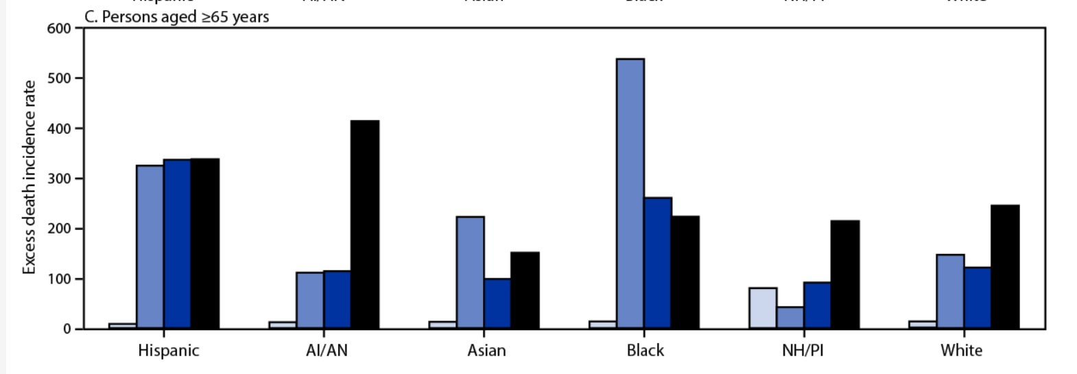
There is some good work going on with excess mortality, both in trying to estimate it and trying to track it. First up, some good analysis of the 2020 death data, including racial breakdown. While the early phase of the pandemic (when it hit NYC hard) was very skewed towards black and Hispanic deaths, it appears things got far more even as we got towards the winter. For example, here’s the excess death incidence rate for those > 65 years old. Bars are quarters of the year 2020:
Next up is an interesting link (explanation here, site here) to someone trying to catalogue excess mortality in real time, with the concerning hypothesis that we may be seeing an uptick in other kinds of deaths too. Now there are two competing hypotheses here: people could have put off getting treated for other medical conditions due to the pandemic, or people could be more susceptible to other medical conditions after having COVID. Actually, those aren’t competing. It could be both. We know that with the flu there is a well established link between getting the flu and subsequently having a heart attack, and there’s no reason COVID-19 couldn’t act similarly. We also know that in many places hospitals are full and it makes sense people may put off care. We will know more as the data comes in I’m sure, but it’s unfortunate. On that happy note, on to the next updates!
Excess Mortality Over Average by State
I made a more multi colored graph this time:
Now here are the updates for the top 10:
State
Excess deaths above average/million 2/1/20 – 9/8/21 (change from 8/11)
Change from 8/11 rank
Mississippi
4108 (+473)
No change
District of Columbia
3652 (+111)
No change
Alabama
3441 (+320)
+1 spots
Arkansas
3404 (+392)
+2 spots
Arizona
3346 (+208)
-2 spots
Louisiana
3267 (+166)
-1 spots
South Carolina
3127 (+238)
+1 spot
New York
3086 (+76)
-1 spot
New Jersey
2894 (+33)
No change
Nevada
2842 (+281)
+3 spots
Mississippi’s struggling here guys.
Excess Mortality Over Upper Bound by State
Okay, here’s the updated numbers for deaths only falling outside the upper bound:
And here are the top 10:
State
Excess deaths over upper bound 2/1/20-9/8/21 (change from 8/11)
Change from 8/11 rank
Mississippi
2859 (+379)
+1 spot
New York
2590 (+39)
-1 spot
Alabama
2502 (+229)
+2 spots
Arizona
2449 (+155)
no change
New Jersey
2400 (+5)
-2 spots
Arkansas
2258 (+333)
+4 spots
Texas
2204 (+181)
-1 spot
South Carolina
2191 (+190)
no change
Florida
2148 (+454)
+8 spots
Louisiana
2125 (+107)
-3 spots
There was more motion on this ranking than I expected to see, which is sad because it means there are multiple places where we are seeing truly unusual death tolls.
States of Interest
Since everyone’s always interested in the Big 4, here they are. Change from 8/11 in parentheses:
Excess Deaths Over Upper Bound/Million
Excess Deaths Over Average/Million
Rank in Excess Deaths Over Average
Rank in Excess Deaths Over Upper Bound
New York
2590 (+39)
3860 (+76)
8
2
Florida
2148 (+454)
2827 (+488)
12
9
Texas
2204 (+181)
2723 (+216)
15
7
California
1761 (+50)
2285 (+92)
30
20
And because I’m always interested in my state and those of similar size, here they are:
Excess Deaths Over Upper Bound/Million
Excess Deaths Over Average/Million
Rank in Excess Deaths Over Average
Rank in Excess Deaths Over Upper Bound
Arizona
2449 (+155)
3346 (+208)
5
4
Massachusetts
1240 (-9)
1642 (+25)
40
34
Tennessee
1904 (+117)
2660 (+193)
13
11
Age Adjustments?
So on my last post Kyle Watson made an interesting point that there should be some sort of age adjustment if we were going to compare things on the state level. While some of this is sort of inherent to the entire concept of excess mortality (states with older populations likely have more expected deaths in a given year), we would expect a disease like COVID to hit states with older populations harder even if everything else was equal.
Interestingly there was some work done on this by a group using the raw COVID numbers, which also looked at international data. They found that states like Texas actually had a worse pandemic than previously reported due to their young population:
I had to ponder a bit what the fairest way of doing this was though. It turns out the CDC also publishes the numbers by week by age group, so I took a look at the US as a whole from 2015-2021:
So every age group from 45 years on showed a fairly noticeable bump last year. Actually every age group showed an increase in mortality when compared to the previous years, and it wasn’t entirely the groups I expected. It’s hard to see on the graph, but here’s the increase for each age group over the average from 2015-2019:
Age Group
% Increase Over 2015-2019 Average
Under 25 years
5%
25-44 years
33%
45-64 years
20%
65-74 years
30%
75-84 years
27%
85 years and older
19%
I was surprised so many of these increases were so close together, it was just the starting numbers that were different. Please note the bin sizes are different however. There are twice as many ages contained in the 45-64 year old group as the 65-74 group, which is how you get a similar number of deaths in the younger age category.
It’s also interesting to note that while the data for this year is obviously still highly incomplete and anything could happen, there’s a chance the 85+ group may not show a large jump for 2021. Almost certainly not as large as last year.
Back to age adjustments though: I couldn’t find a great source to give me state by state age breakdowns matching the ones above, but I did find a breakdown of how many people in each state are over 65. I assumed that excess mortality followed roughly the same pattern as the overall mortality numbers, and adjusted from there. Here are the new leaders for excess deaths above average:
State
Age-Adjusted (albeit crudely) Excess Mortality above Average 2/1/20-9/8/21
DC
4330
Mississippi
4100
Louisiana
3328
Alabama
3303
Arkansas
3253
Texas
3183
Arizona
3136
New York
3009
South Carolina
2915
New Jersey
2864
The map overall shows there’s a pretty substantial dropoff between Mississippi, DC and everywhere else:
Now here’s the big 4:
State
Adjusted Rank for Excess Mortality Over Average (previous rank)
Adjusted Rank for Excess Mortality Over Upper Bound (previous rank)
New York
8 (8)
3 (2)
Florida
24 (12)
15 (9)
Texas
6 (15)
2 (7)
California
22 (30)
13 (20)
Interestingly, the states most helped/hurt by this adjustment aren’t necessarily the ones you’d think of. For deaths above the upper bound, 4 states added on more than 150 deaths/million and 4 states lost more than that after the adjustment. The ones that gained deaths were: Texas, DC, Georgia and Utah. The ones that lost the most post-adjustment were Arizona, Florida, Pennsylvania and West Virginia. As mentioned, only Texas and Florida receive much air time nationally, and since this worked out differently for both of them I wouldn’t expect to see much on this any time soon.
As always, let me know if there’s more you want to see! I have a lot left on spreadsheets for individual states. Stay safe out there.
Well hello there! It’s been a while. Unfortunately I’ve been dealing with some (non-COVID related) health issues that have made reading and writing rather difficult, so blogging has been taking a back seat to things like um, paid employment. You know how it goes. I’ve missed you guys though, and thank you to those who reached out with nice messages asking how I was doing. That was appreciated.
Anyway, for the first time in a long time I recently fell down a rabbit hole of data and started putting together an exceptionally lengthy email with graphs for a small email group, when I realized I may as well just turn this in to a blog post in case any one was still poking around here and might be interested. So here we are.
Some Background About Data That’s Currently Interesting Me
So despite the aforementioned reading/writing troubles, I have of course been interested in the data coming out of the COVID-19 pandemic. I could go on and on about many things, but one of my top fixations is the difference between the state level reported COVID deaths (compiled by the CDC here) and the overall excess mortality across the US compiled by the CDC here.
Essentially the first set of numbers is exactly what it sounds like: the number of people in a state that the state says have died of COVID-19. The second number is a little more interesting. Basically the CDC has years and years worth of data about how many people die each week in 1) the USA as a whole (51k-60k depending on the time of year) and 2) individual states. Thus they can predict each year how many people are going to die in a given week and then say if we are right on track with that number or if we are wildly above that number (95% confidence interval) for both the country as a whole and each state individually.
They published this data prior to COVID as well….if you’ve ever heard someone say we had a “really bad flu year” this data is probably why. If an outbreak of the flu (or anything) pushes the country above the 95% CI for expected deaths, the CDC will generally raise an alert. For example, the flu season in the winter of 2017/2018 pushed us above the 95% CI from December 23rd 2017 – February 3rd 2018. Currently the country has had excess deaths from all cause mortality since March 28th, 2020. We have yet to drop back below the 95% CI for more than a week. The graph for the whole US looks like this (recent weeks trail off as jurisdictions are still reporting):
Since 2/1/20 this comes out to 595,688 deaths above the 95% CI (yellow line) or 758,749 deaths above average.
Now while seeing the entire country interests me, what really interested me about this data is that sometimes the excess mortality data from all causes and the COVID-19 reported death data for a particular state don’t match. That’s something I wanted to look in to.
COVID-19 Deaths vs All Cause Excess Mortality
I first got interested in this topic because the first time I looked at excess mortality data, I noticed that my state (Massachusetts) had a MUCH higher number listed for COVID-19 deaths than it does for excess mortality. Checking the CDC website today, they have us listed at 18,131 deaths, or 236 COVID deaths/100k residents. However, our excess mortality since 2/1/20 is only listed as between 8,780 and 11,369. I started running the numbers because the overall COVID number puts us at 3rd worst in the nation. The lower number would rank us somewhere between #31 and #40.
I Googled a bit and as close as I could find, we’ve changed our counting method twice to better align with federal standards, but don’t appear to have subtracted the “overcounts” back off our total. This article suggests we were overcounting nursing home deaths (take that Cuomo!) until April of 2021 and this article suggests that we also included more “probable” deaths than other states until October 2020.
So given that every state counts COVID deaths differently but (presumably) counts all deaths, how common is it that a states COVID deaths exceed their excess mortality? Which states have the highest “overcounts” and “undercounts” and what does it look like if you just compare excess mortality and remove COVID classifications entirely? Well I’m glad you asked! That’s what I wanted to know too!
The Overcounts
Pulling from the CDC website here through 8/11 and taking their upper and lower guesses for excess mortality and converting to deaths/million, I found 5 states that have reported more COVID deaths (as of today 8/14) than they have excess mortality:
Massachusetts (+1,015/million – #3 ranked)
Rhode Island (+690/million – #5 ranked)
Minnesota (+145/million – #37 ranked)
New Jersey (+143/million – #1 ranked)
Connecticut (+41/million -#9 ranked)
Now it is important to note that not all the death data is in. It is possible that these states are simply really good at reporting COVID deaths and less good at reporting other deaths, or that something else is going on. COVID could be killing people in these states who would have died anyway, and thus it could be failing to add to the excess mortality in the way it is in other states, or some mitigation effort the states took could be reducing other types of mortality in a way that is balancing COVID out. The CDC won’t close out this data for quite some time, but it will be interesting to see what happens when all the accounts are settled.
What is notable here though is that 4 of these 5 states are in the top 10 for worst death counts. If these are truly over-reported, that means the pandemics were not as bad there as commonly believed. Additionally, several of those states had fairly strict lockdowns. If excess mortality is caused by lockdowns, it is not showing up in these states data so far.
The Undercounts
Now undercounting is tricky. The CDC notes that some states have extra process in place to ensure accurate coding of COVID deaths, so it’s possible these states are just behind. It’s also possible that excess mortality in these states is from something other than COVID, so they just wouldn’t have as much COVID death as they would excess mortality. Here’s the list, there were also 5 states here. Well, 4 states and DC:
Washington DC (-294/million – #34 ranked)
Texas (-147/million – #26 ranked)
California (-76/million – #32 ranked)
South Carolina (-51/million – #21 ranked)
Vermont (-33/million -#50 ranked)
To my point about other causes of death, Washington DC in particular would be potentially impacted by a jump in homicides (up 19% last year) and opioid deaths (hit a record in 2020). For the other states, we’ll continue to see what happens as the data trickles in.
Overall, it’s interesting that 40 states COVID deaths counts fell somewhere in between their states upper and lower bound estimate for excess mortality. So how did every state do when compared for excess mortality so far? Let’s check it out?
About the Data
A few things to keep in mind before I show state level graphs:
The data is excess mortality from ALL CAUSES since 2/1/20.
There’s one graph for amount above lower bound (excess above average) and amount above upper bound (excess above 95% CI). I’ll discuss the differences a bit below.
Some of this is estimated. Since every state reports at a different pace, they estimate where states will be at to bring everyone up to the same level. I’ve been watching this for a few months and they rarely have to take many people away, so the estimates look pretty good.
The data is from here. I download the “National and State Estimates of Excess Deaths” csv file and then use the “Total Excess Lower Estimate” and “Total Excess Higher Estimate” (Column J and K on my spreadsheet) for each state.
To convert to per capita, I used the 2020 census numbers for each state. I included Puerto Rico and DC, so all rankings are out of 52.
There’s been a lot of talk about how the pandemic impacted other types of deaths, so it’s notable to see where the highest excess mortality has been.
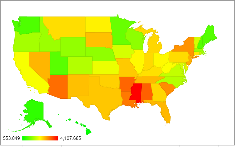
Excess Mortality Over Average by State
Without further ado, here’s the excess mortality over the average, by state. Sorry about the small font, click on it to embiggen:
So for deaths above average from ALL CAUSES, per capita the top ten states are:
State
Excess Deaths Over Average/Million (2/1/20-8/11/21)
Mississippi
3635
District of Columbia
3541
Arizona
3138
Alabama
3121
Louisiana
3101
Arkansas
3012
New York
3010
South Carolina
2889
New Jersey
2861
South Dakota
2708
Now this is just deaths over average. Some states have more yearly variation than others, and thus look a little different if you only take the deaths above the 95%CI interval. That’s next.
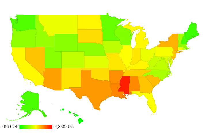
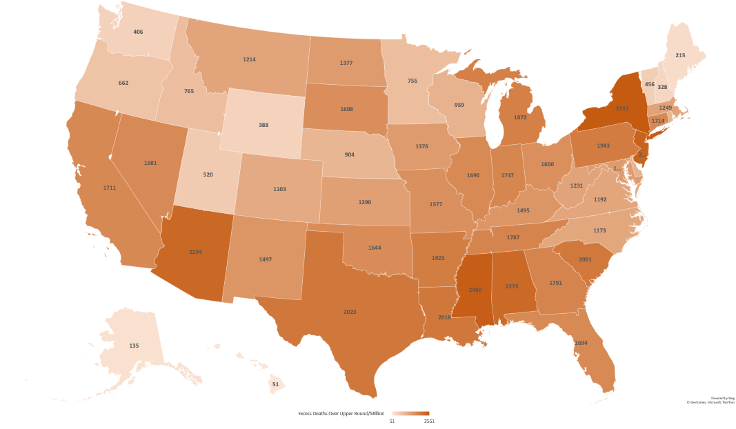
Excess Mortality Over Upper Bound by State
Again, click to make that bigger.
As you can see, going over the upper bound mostly evens out the smaller states. This makes sense. For example, Massachusetts and Montana had surprisingly similar excess mortality across the timespan represented. However, Montana is 1/7th the size of Massachusetts. They typically hover around 200 deaths per week statewide, and Massachusetts generally has 1,100-1,200. With 200 deaths, slight differences in reporting (like someone in one hospital forgetting to send the numbers for a week) could skew things quite a bit. That’s less likely over larger populations. So here are the new top 10:
State
Excess Deaths Over Upper Bound/Million (2/1/20-8/11/21)
Prior Rank
New York
2551
7
Mississippi
2480
1
New Jersey
2395
9
Arizona
2294
3
Alabama
2273
4
Texas
2023
16
Louisiana
2018
5
South Carolina
2001
8
Pennsylvania
1943
17
Arkansas
1925
6
As expected, the two places with the smallest populations (DC and South Dakota) dropped off this list and were replaced with two much larger places: Texas and and Pennsylvania.
Other States of Interest and Possible Posts Going Forward?
Now throughout the pandemic, it seems everyone gets fixated on some subgroup of “the big four”: California, Florida, New York and Texas. If you want to know how they’re doing, here they are pulled out:
State
Excess Deaths Over Upper Bound/Million
Excess Deaths Over Average/Million
Rank in Excess Deaths Over Average
Rank in Excess Deaths Over Upper Bound
New York
2551
3010
7
1
Texas
2023
2507
16
6
California
1711
2193
30
17
Florida
1694
2339
23
18
Here are the states I track, as they are all approximately the same size as Massachusetts (around 7 million people):
State
Excess Deaths Over Upper Bound/Million
Excess Deaths Over Average/Million
Rank in Excess Deaths Over Average
Rank in Excess Deaths Over Upper Bound
Arizona
2294
3138
3
4
Tennessee
1787
2636
11
14
Massachusetts
1249
1617
39
31
If people are interested in particular other states, I’d be happy to post them in the comments as time/health allow. Additionally, the CDC updates this data weekly. Now that I have the explanation typed out and my spreadsheet set up I can fairly easily post updates every few weeks (sans lengthy intro) if there’s interest. Let me know what you all think! Hope everyone is staying well.