…and now for something completely different.

I don’t normally get that involved with sports statistics, if only because it’s the one place in the stats world where you could study them for an hour every day and still be barely a rookie.  However, something awfully strange is happening in my house recently, and I feel it’s worth mentioning:  the Orioles are leading the AL East (in fact the whole American League), and the Red Sox are last.

Now, this is particularly interesting to my household, as my husband happens to be a lifelong Orioles fan.  I on the other hand, have always been a Red Sox fan.  Since we met almost 6 years ago, this has pretty much meant that I have had exclusive bragging rights when it came to baseball.  I know it’s not even a quarter of the way in to the season, but this is the longest we’ve gone so far, and it’s surreal.

Yesterday, Grantland put up an article on the Orioles under .500 curse.  Apparently they have not finished over .500 since 1997….more than enough seasons for the baseball stats guys to go nuts with.  I was curious exactly how bad it was, so I looked around until I found this graph generator*.

For those of you who don’t know much about the Orioles, here’s what they’ve looked like since 1998

Yowza.  Even if this season doesn’t hang in there, it’s still the most encouraging thing to happen in 7 years or so.
Now, here’s the Red Sox in the same time period:
Yikes.  If they don’t pick it up soon this will be the worst they’ve started off in 15 years.  
Sweetly enough, if the Sox win tonight against the Rays, that will both increase the Oriole’s lead in the AL East, and look good for the Red Sox.  
Honey, the data proves it, tonight we’re both Red Sox fans.
*If it shows you how crazy sports stats people are, I found that graph generator in exactly one try on google.  Conversely, when I tried to find historic gas prices for this post, I searched for almost half an hour trying to find an official source for anything pre-1978.  Didn’t happen.  

Correlation and Causation: the Teen Pregnancy Edition

One of the first posts I ever did was on correlation and causation.  In it, I spelled out the three rules to consider whenever two variables (x and y) are linked:

  1. X is causing Y
  2. Y is causing X
  3. Something else is causing both X and Y
While most people jump to the conclusion that it’s number 1, Matthew Yglesias wrote a piece for Slate.com this week where he rather awkwardly jumps to conclusion number 2.  
He starts off well with the second paragraph, but then goes to very strange place in the third: 

Delivering the commencement address last weekend at the evangelical Liberty University, Mitt Romney naturally stuck primarily to “family values” and religious themes. He did, however, make one economic observation that intersects with some fascinating new research. “For those who graduate from high school, get a full-time job, and marry before they have their first child,” he said, “the probability that they will be poor is 2 percent. But if [all] those things are absent, 76 percent will be poor.”
These are striking numbers, but they raise the age-old question of correlation and causation. Does this mean that the representative high-school dropout would be doing much better had he stuck it out in school for a few more years? Or is it instead the case that the population of high-school dropouts is disproportionately composed of people who have attributes that lead to low earnings?
When it comes to early pregnancy, surprising new evidence indicates that Romney and most everyone else have it backward: Having a baby early does not hamper a young woman’s economic prospects, as Romney implies. Rather, young women choose to become mothers because their economic outlook is so objectively bleak.

Say what?

As a former teenage girl myself, this is a strange conclusion….I certainly never met a teen mom who would have put it that way.  But surely there was some wonderful evidence to support this scathing conclusion?

Well, not really.  Here’s the original paper….and  here’s how the authors conveyed their thoughts:

We describe some recent analysis indicating that the combination of being poor and living in a more unequal (and less mobile) location, like the United States, leads young women to choose early, non-marital childbearing at elevated rates, potentially because of their lower expectations of future economic success. …These findings lead us to conclude that the high rate of teen childbearing in the United States matters mostly because it is a marker of larger, underlying social problems.

The emphasis was mine….but notice how much more careful they are in their language.  If you take my list above, you see that they are challenging possibility number 1, seeing if #2 is a feasible conclusion, but ultimately pointing the finger at #3….i.e. “larger, underlying social problems”.

For example, the cite low maternal education as a risk factor for teen pregnancy…which one could presume could be either the result of or the cause of low income.

Teen pregnancy is complicated, and honestly I would be very surprised if you could ever figure out a way to pin it on just one factor.  Additionally, so much information is unavailable that it can be hard to parse through what you have left.  A key factor in all of this would be to determine if higher income girls weren’t having babies because they weren’t getting pregnant or because they were having abortions….data which could lead to very different conclusions.

I fully support this study, by the way, questioning the prevailing wisdom is always a good thing. What I resent is when people think just by flipping the order of a normal conclusion that they’re being clever.

X could cause Y, Y could cause X, something else could be causing both.

Then again, it could also just be a coincidence.  

The price of bad data

Yesterday Instapundit linked to a story on “the perfect data storm”.

Thinking that sounded up my alley, I went and read the article.  It’s from a professor named David Clemens at Monterey Peninsula College, complaining about the use of data in higher education:

While knowing full well data’s vulnerability, education managers cannot resist the temptation to be data driven because data absolves them of responsibility; to be data driven lets them say “the data made me do it” (hat tip to Flip Wilson).

That made me sad.  
He cited a few numbers floating around his campus that he knew were bad…transfer rates that only counted transfers to state schools for example….and yet they were still being included in policy decisions as though they were comprehensive.
That made me really sad.
While I enjoy mocking bad data, it’s important to remember that there is a real price to it.  That’s why I think it’s important to empower people to question the data they’re hearing and to know what weaknesses to look for when you hear numbers that sound implausible.  
Clemens continues:

….we discover that information does not touch any of the important problems of life. If there are children starving in Somalia, or any other place, it has nothing to do with inadequate information. If our oceans are polluted and the rain forests depleted, it has nothing to do with inadequate information. 

I am going to make a radical suggestion about data and higher education:  colleges and universities will be better served if they avoid kneeling at the altar of data and instead fill key positions with people driven by intuition, experience, values, conviction, and principle.  A good place to start would be looking for leadership guided by a transcendent educational narrative.

I both agree and take issue with this statement.  Data doesn’t solve problems, but in a world of limited resources, data can guide us on where to put our efforts.  It’s not that most of us don’t agree children shouldn’t starve in Somalia, it’s that the “act first figure out if it works later” approach has the potential to cause as much harm as good.  That’s why health care is data driven by necessity…..courts are notoriously unsympathetic to the excuse “I treated the patient this way because my transcendent narrative said it was a good idea”.  Data is a good idea when you have an outcome you can’t afford to take a chance with.

In the end, I don’t think data is to blame for this backlash.  I am relatively sure that the same people who “kneel at the altar of data” to justify their own behavior are the same people who would, absent data, pursue their own gut feelings to the exclusion of rationality.  Intuition is very easily confused with emotion, experience can lead to falsely limiting possibilities, values can be misguided, conviction is dangerous in the wrong hands, and principle is easily warped.  No amount of data can change the way people are, but the more people who can spot the flaws in data and call BS, the better.

*Steps off soap box*

Trudge on friends, and don’t let the weasels get you down.

Why most marriage statistics are completely skewed

Apparently Slate.com is now doing a “map of the week”.  This week, it was a map of states by marriage rate.  Can’t get it to format well….click on the map and drag to see other states.

http://a.tiles.mapbox.com/v3/slate.marriage.html#4.00/40.65/-95.45

It shows Nevada as the overwhelming winner, with Hawaii second.  This reminded me about my annoyance at most marriage data.

Marriage data is often quoted, but fairly poorly understood.  The top two states in the map above should tip you off as to the major problem with marriage data derived from the CDC in particular….it’s based on the state that issued the marriage license, not the state where the couple resides.  Since all (heterosexual) marriages affirmed by one state are currently recognized by every other state, state of residence information is not reported to the CDC.  This means that states with destination wedding type locations (Las Vegas anyone?) skew high, and all others are presumably a bit lower than they should be.  Anecdotally, it’s also conceivable that states with large meccas for young people (New York City, Boston, DC) may be artificially low because many young people return to their childhood home states to marry.  This

The other problem with marriage data is the resulting divorce data is even more skewed.  Quite a few states don’t report divorce statistics at all (California, Georgia, Hawaii, Indiana, Louisiana, Minnesota) and the statistics from the remaining states are often misinterpreted.  One of the most commonly quoted statistics is that “50% of marriages end in divorce”.  This isn’t true.

In any given year, there are about twice as many marriages as there are divorces….but thanks to changing population, changing marriage rates, people with multiple divorces, and the pool of the already married, this does not mean that half of all marriages end in divorce.  In fact, if you change the stat to “percent of people who have been married and divorced”, you wind up at only about 33%.  More explanation here.

Ultimately, when considering any marriage data, it is important to remember that there are no national databases for this stuff.  All data has to come from somewhere, and if the source is spotty, the conclusions drawn from the data will likely be wrong.  This all applies to quite a few types of data….but marriage data is used with such confidence that it’s tough to remember how terrible the sources are.  A few people have let me know that I’ve ruined infographics for them forever, and I’m hoping to do the same with all marriage data.

You’re welcome.

Compensation Data for Mother’s Day

This year for Mother’s Day, use data to figure out how much you owe your mother for her pregnancy and labor.

It turns out I owe mine $99.28*.  I got some good discounts for my low birth weight and my early arrival.  I also got a decent “good offspring” discount for calling her this morning to wish her a happy Mother’s Day, so that was positive.  
Of course, one could quibble that perhaps a mother should not be charging her child for a pregnancy that the child did not have a say in….though the idea of issuing a bill to my own child in 12 weeks or so when he shows up is tempting.  For now though, I think I’ll pass the bill off to my Dad and see if he’d like to chip in.  I’m pretty sure the Edible Arrangement I sent her should cover my half. 
Good luck with the rest Dad.

Love you Mom!

*I am not even going to try to criticize this number.  There is absolutely no explanation for any of the numbers or why they vary the way they do.  This is actually somewhat refreshing to me.  Normally you have overly precise numbers being justified by vague guesses.  Here they don’t even pretend to have reasons.  I like the tacit admission of complete BS.  

Historical accuracy, ngram style

I’ve used google ngram’s a few times on this blog already, mostly for silly things, but this website has the best use of it I’ve seen so far.

He takes the scripts of Downton Abbey (WWI) and Mad Men (1960’s) and feeds them through the ngram to find out which phrases are the most anachronistic.

I find the whole project pretty cool, because apparently he took the whole project on as a response to a few magazine articles about phrases that wouldn’t have been said at the time.  It struck him that those phrases were just the ones that people could hear and think “hey, that sounds modern!”, but no one was thinking through what phrases we might have gotten so used to we weren’t even recognizing as out of place.

I’ve never seen Downton Abbey, and only seen an episode or two of Mad Men, but I still found it interesting what they got wrong.  The last episode of Mad Men apparently had an aspiring actress use the phrase “got a callback”, which apparently was barely used in a theater context at the time (he cross references the OED).  He also makes pretty charts, which I loved (this one is for Downton Abbey):

Overall, a very fun use of data.

Some infographic love for my little brother

My wonderfully liberal little brother is having a rough week, so I thought I’d cheer him up in the best way I know how….by criticizing a Republican infographic.

He sent me this one this morning, and while it’s a little sparse, the bottom right hand corner caught my eye:

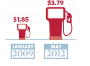
Now, I have no idea how much was given to Solyndra, or how many jobs wind energy has left, but I do know a thing or two about gas prices and infographic figures.

First, those gas pumps are totally deceptive. $3.79 is almost exactly 2 times $1.85.   Fine.  However, let’s look closely at those gas pumps:

I pulled out the ruler when I cropped the photo, and confirmed my suspicions.  The larger pump in the picture doubles both the height and the width of the first pump.  That’s not twice as big….that’s four times as big.  I’m sure they’d defend it by pointing to the dashed lines in the background and saying only the height was supposed to be reflective, but it’s still deceptive.  Curious what a gas pump actually twice as big would look like?  Here you go….original low price on the left, original “double” price on the right, actual double in the middle.

Graphics aside, let’s look at the numbers.

2009 was just not that long ago, and I know that $1.85 was quite the anomalous price at the time.  I’ve seen that stat more than once recently, and I have been annoyed by it every time.  Tonight, I decided to check my memory on it, and see if that dip really was the aberration I remember it being.  Don’t remember either?  Here’s the graph of average gas prices since 1978, per the BLS generator:

That dip towards the end there with the arrow?  That hit right as Obama was taking office.  In July of 2008, gas was an average of  $4.15 per gallon.  By January of 2009, it was $1.84.    I have not a clue why that drop happened, but I do know that to treat that $1.85 number as though it was standard at the time is a misrepresentation.

You can see this a bit better if you isolate George W Bush’s presidency:

Now, you could accurately say that George Bush took office with gas prices at $1.53 and left with them at $1.74….but clearly that would ignore a whole lot of data in between.  
Now here’s the averages and standard deviations for each term of the presidencies:
GWB – 1st term GWB – 2nd term BHO – current term
Average Gas Price 1.63 2.78 2.99
Standard Deviation 0.22 0.56 0.56
Now, none of this adjusted for inflation.  By adjusting the yearly averages to 2010 dollars, I got the second term of GWB to $2.99, and the current term for BHO to $3.00.  
You don’t have to like Barack Obama, and you certainly don’t have to like gas prices.  No matter what your political affiliation, I think we can all agree on one thing: ALWAYS beware of infographics.

What I missed

Apparently in my travels, I missed the series premier of a new History channel show: United Stats of America.

I was hoping it would be up my alley, but reading the synopsis makes me suspicious it’s going to be more about reciting cool numbers than figuring out if those numbers have any accuracy.  Sigh.