This past week I was complaining about pie charts to a friend of mine, and I was trying to locate this image to show what I was complaining about:
I knew I had come across this on Twitter, and in finding the original thread, I ALSO discovered all sorts of people defending/belittling the lowly pie chart. Now I generally fall in the anti-pie chart camp, but these made me happy. I sourced what I could find a source on, but will update if anyone knows who I should credit.
First, we have the first and best use for a pie chart:
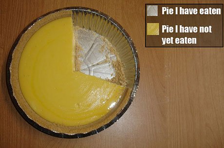
No other chart represents that data set quite as well.
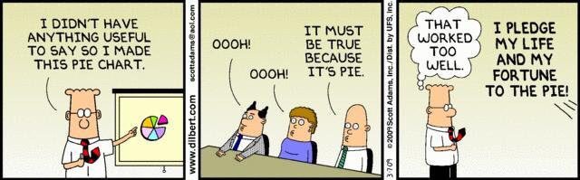
Sometimes though, you feel like people are just using them to mess with you:
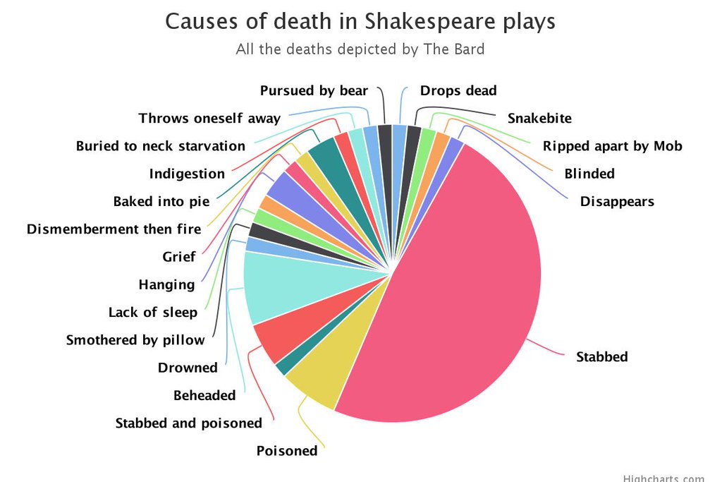
Sometimes the information they convey can be surprising:

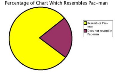
But sometimes the conclusions are just kind of obvious:
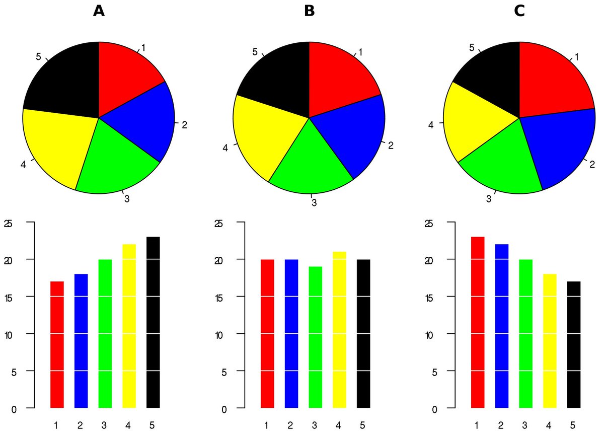
And you have to know how to use them correctly:

They’re not all useless, there are some dramatic exceptions:
If you want more on pie charts, try these 16, uh, creative combinations, or read why they’re just the worst here.

They do look impressive. I wrote about a particular one leading up to the 2008 NH primary
https://assistantvillageidiot.blogspot.com/2007/11/why-would-they-lie-huh.html
LikeLike